Background:
COVID-19, the disease caused by the novel coronavirus, is now a worldwide pandemic. The number of infected people has continually increased, and currently, this pandemic continues to present challenges to public health. Scatter plots are frequently used to interpret the impact in relation to confirmed cases. However, the 95% confidence intervals are rarely given to the scatter plot. The objective of this study was to; Develop 95% control lines on daily confirmed cases and infected days for countries/regions in COVID-19 (DCCIDC) and; Examine their impacts on public health (IPH) using the hT-index.
Methods:
All relevant COVID-19 data were downloaded from GitHub. The hT-index, taking all DCCIDCs into account, was applied to measure the IPHs for counties/regions. The 95% control lines were proposed to highlight the outliers of entities in COVID-19. The hT-based IPHs were compared among counties/regions between 2020 and 2021 using the choropleth map and the forest plot. The features of the hT-index were explained using the line chart and the box plot.
Results:
The top 2 countries measured by hT-based IPHs were India and Brazil in 2020 and 2021. The outliers beyond the 95% confidence intervals were Hubei (China), with a lower hT-index favoring 2021 ( = 6.4 in 2021 vs 15.55 in 2020) and higher hT indices favoring 2021 in Thailand (28.34 vs 14,77) and Vietnam (27.05 vs 10.88). Only 3 continents of Africa, Asia, and Europe had statistically and significantly fewer DCCIDCs (denoted by the hT-index) in 2021. The hT-index generalizes the h-index and overcomes the disadvantage without taking all elements (e.g., DCCIDCs) into account in features.
Conclusions:
The scatter plot combined with the 95% control lines was applied to compare the IPHs hit by COVID-19 and suggested for use with the hT-index in future studies, not limited to the field of public health as we did in this research.
Keywords: 95% control line, COVID-19, daily confirmed case, forest plot, h-index, hT-index, impact on public health, infected day
Key points.
-
•
The hT-index (taking all elements into account) generalizes and complements the h-index in bibliometrics to measure the impacts on public health in COVID-19, which was unique and modern in the literature.
-
•
A scatter plot combined with 95% control lines is rarely illustrated in public health. The outliers of entities can be visually highlighted with a quick glance in a short moment.
-
•
Visualizations with scatter plots and forest plots were applied to inspect the impacts on public health in COVID-19, which are worthy of application in other future relevant studies.
1. Introduction
Over 0.44 billion confirmed cases and 6 million deaths during the COVID-19 pandemic have been reported as of March 10, 2022.[1] The total number of deaths (6,007,315) substantially surpassed the severe acute respiratory syndrome in 2003 (final death toll of 774) and the Middle East respiratory syndrome in 2012 (final death toll of 858).[2–4]
1.1. Overall composite scores are required to measure the impact on public health
When a new disease (e.g., COVID-19) is spread, an overall composite score is required to measure the impact on public health (IPH),[4,5] such as the number of cumulative infected cases or death toll, the case fatality rate,[5] and the inflection point to represent the extent of struggle to fight against COVID-19.[6–8] Nonetheless, the daily confirmed cases and the infected days in COVID-19 (DCCIDC) should be jointly combined to measure the IPH as the h-index,[9] and the variants take both publications (quantity) and citations (impact) into account in bibliographical studies.[10–18]
1.2. DCCIDC is denoted by bibliometric indices to measure the IPH
Although the h-index[9] is one of the most popular indicators to evaluate the individual research achievements (IRAs), there are 2 major concerns with the disadvantage, including; The integer nature of the h-index, making it very hard to differentiate the entities[10,11] and; Too simple to take all citations and publication counts into account when measuring the IRAs.[17,18] Anderson et al[17] proposed a new Hirsch-type index called the tapered h-index, denoted as hT-index, taking all citations into account, yet the contribution of the h-core is not changed,[18] having a high Pearson correlation coefficient ( = 0.993) with the h-index.[19] The first research question is whether the hT-index can be applied to measure the IPH for each county/region on the DCCIDC.
1.3. Scatter plot with the 95% control lines on DCCIDC using the hT-index
A scatter plot[20] is a type of plot using Cartesian coordinates to display relations for 2 continuous variables (e.g., average height to weight chart for Babies), each having the value on either the horizontal axis or the vertical axis.[21,22] If the points are coded (color/shape/size), 1 additional variable can be displayed as a bubble plot.[23]
Numerous studies[24–26] drew a line of best fit (alternatively called the trend line) to study the relationship between the variables and examine a linear correlation between the 2 variables in the scatter plot. However, few studies applied the 95% control lines to the scatter plot, such as 2 control lines with both universal health coverage index and global health security index for 183 countries on a scatter plot to show the outliers beyond the limit bands.[24] The second research question is how to draw the 95% control lines for highlighting the outliers regarding the IPH on the DCCIDC using the hT-index to measure.
1.4. The aims of this study
The current study aims to; Develop the 95% control lines on DCCIDC for countries/regions and; Examine their IPHs using the hT-index.
2. Methods
2.1. Data source
All relevant COVID-19 data for 299 countries/regions were downloaded from GitHub.[27] A series of daily confirmed cases (DCC) in 2020 and 2021 were collected and then transformed into a logarithmic scale (or log scale) using the function ln () (or log (N, e), where N is the DCC and e 2.7182) in Microsoft Excel.
All downloaded data are publicly released on the website.[27] Ethical approval was thus waived according to the guidance of the Welfare Department in the Taiwan Government.
2.2. Reasons for using the log (N, 2.7182) transformation
Exponential growth has been proposed to construct the COVID-19 prediction model at an early outbreak stage.[28,29] The most common visual strategy to convey information about the spread of COVID-19 is to display a time-series graph of the cumulative number of cases in 2 forms using either a linear scale or a logarithmic scale [via the formula ( = log (N, 2.7182)] on the vertical axis.[30,31] The e( 2.7182)-based exponential growth in use is better and more efficient than other nature numbers ( = x = 2, 3, 4, or more shown in Eqs. 1–3) that can be proved:
| (1) |
| (2) |
| (3) |
where N denotes the DCC (>0 in an integer number). The 1-order differential equation in Equation 3 shows that the maximal value is always at × approaching 2.7182 no matter what the number of DCC ( = N) is. As such, the log (N + 1, e) is ranged from 1 to 9 [e.g., round (ln (10,001), 0) = 9, round (ln (2), 0) = 1], applicable to the hT-index or other bibliometric metrics taking both quantity (e.g., days of infection) and impact (e.g., DCCIDCs) into account).
2.3. How to calculate the hT-index
All DCCs (e.g., {6, 4, 4, 2, 1} with 5 infected days) for a country/region were sorted in descending order. The hT-index is 4.03 via Equations 4 to 6. We can see that all DCCs across infected days are involved in the computation. The weights decrease from 1 to on day 1, from to on day 2,…., on day 4 due to 2<=4, and from on day 5.
| (4) |
| (5) |
| (6) |
where h is the h-index denoted in Equation 4, e is the excess parts (< = h), t is the tail part (<h), and nj is the DCC on the j-th day. Weights are decreased by DCC and day.
Now, if a county has N days with DCCs n1, n2, n3, …, nN (ranked in descending order), the hT score for any single day ranked j in the list (with nj DCCs), denoted as hT (j) in Equation 2. The hT-index for the whole list of DCCs on days is then calculated by summing all weights (allocated in Eqs. 4 and 5) through Equation 6. As such, the resulting sum is the hT-index. Reader are invited to practice it on their own at the link[32] (e.g., input 10 to get 2.13 for a single day with DCC = 10, 3.28 for DCC = 100, 4.44 for DCC = 1000, 5.59 for DCC = 10,000, or a vector (e.g., {6, 4, 4, 2, 1} in 5 days to get the hT = 4.03). It is worth noting that all DCCs have been transformed into a logarithmic scale via the formula ( = log (DCC, e) in Microsoft Excel.
2.4. How to draw the 95% control lines
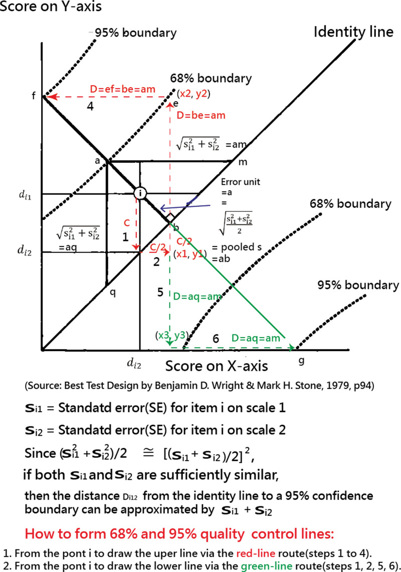
Figure 1 shows how such 95% control lines are drawn. Each plot compares a series of paired values (e.g., hT indices in 2020 and 2021). Each country/region has an hT (denoted by dj) and a standard error (sj) from each of 2 independent hT computations. Thus, for each country/region i, we have (di1, si1) and (di2, si2). Since each pair of hTs applies to 1 country/region, we expect the 2 hT related di1 and di2 to have an identical hT. We also expect the error of these hTs to be gained by si1 and si2[35].
Figure 1.
How to form 95% confidence interval lines when the SEs are known[33].
This gives us a statistic for testing the extent to which the 2 hTs have the same hT value shown in Equation 7:
| (7) |
in which is the expected standard error of the difference between the 2 independent hTs (denoted by di1 and di2). We can apply this test to the quality of each country/region in the plot by drawing quality control boundaries at approximately 2 of these standard errors away from the identity line on each side.
Since the standard unit of difference error parallel to either axis of the plot is , the unit of error perpendicular to the 45-degree identity line must be . Two of these error units perpendicular to the identity line in each direction yield a pair of approximately 95% quality control lines. The perpendicular distance Di12 between these quality control lines and the identity line thus becomes.
| (8) |
When Si1 and si2 are sufficiently similar, the mean of their squares is approximately the same as the square of their mean, that is,
| (9) |
Then, the distance Di12 from the identity line to a 95% confidence boundary can be.
| (10) |
We can then draw the 95% control lines from dot i (as a country/region) in the red and green directions shown in Figure 1. Readers are invited to practice it on their own at the link[34] when the 95% confidence interval (CI) line has been selected in the combo box.
2.5. Two goals to reach with visualizations
2.5.1. Develop the 95% control lines on DCCIDC for countries/regions
Pair comparisons of ht indices on DCCIDC for countries/regions were made using choropleth maps[35] and scatter plots between 2020 and 2021. Both h-/hT indices in 2020 and 2021 were compared using scatter plots. The changes in hT indices in 2020 and 2021 on continents/countries were observed using a forest plot.[36]
2.5.2. Examine the IPHs and features of the hT-index
Through the link[32] and box plot, the IPHs and the features of the hT-index were interpreted. Whether the weights in the tail parts are greater than those in the excess parts in Equation 5 were verified.
2.6. Statistical tools and data analysis
The mean and standard deviation were extracted to compare the standardized mean difference in the forest plot. A significance level of type I error was set at 0.05.
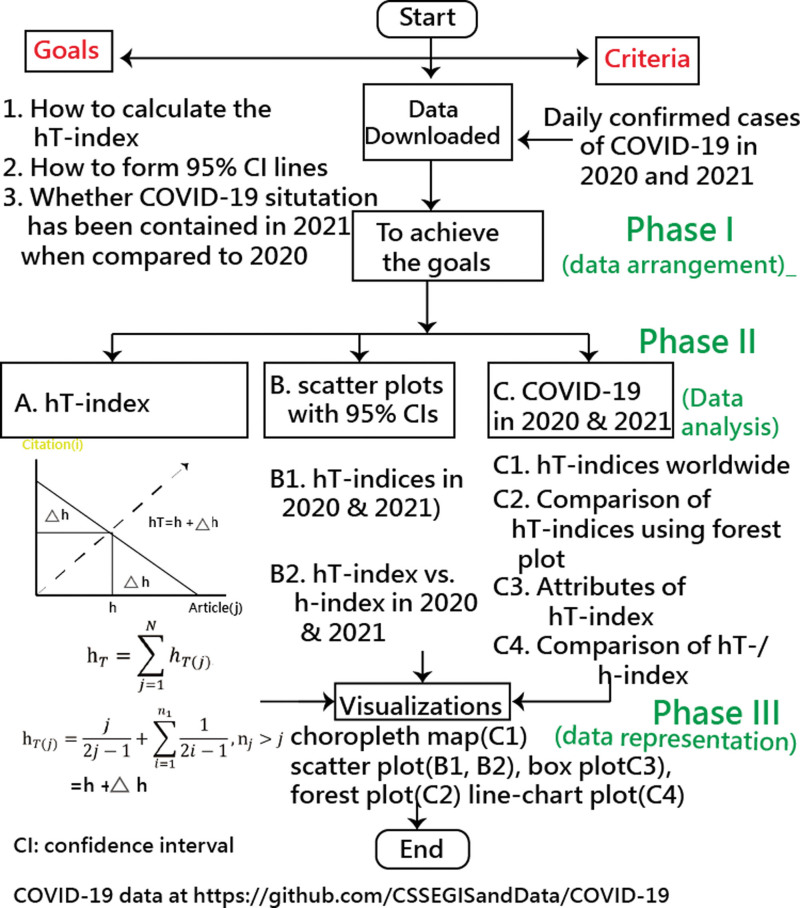
Visual representations of forest plots, scatter plots, and choropleth maps display the comparison of the differences in hTs among countries/regions. All visualizations were plotted online on Google Maps. The dataset and modules for hT computations were deposited in Microsoft Excel (Supplemental Digital Content 1, http://links.lww.com/MD/I964). The study flowchart is shown in Figure 2.
Figure 2.
Study flow chart.
3. Results
3.1. Part I: Develop the 95% control lines on DCCIDC for countries/regions
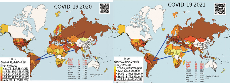
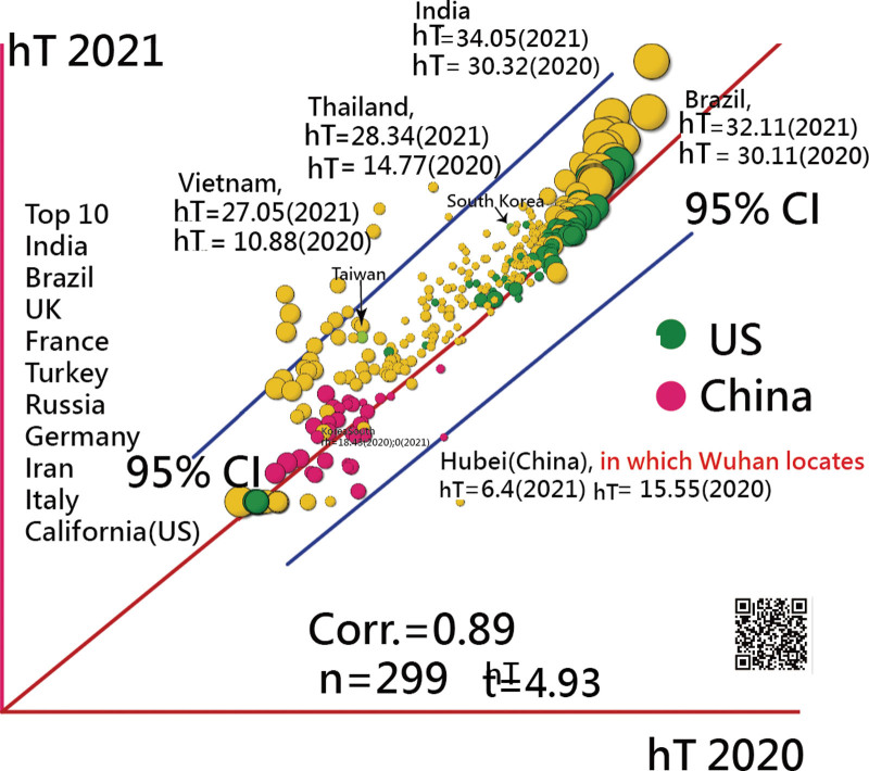
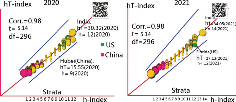
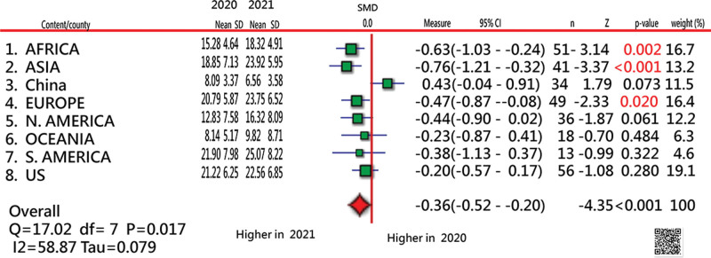
The top 2 countries measured by the hT-based IPHs were India and Brazil in 2020 and 2021 (Fig. 3). The outliers beyond the 95% CIs were Hubei (China), with a lower hT-index favoring 2021 ( = 6.4 in 2021 vs 15.55 in 2020) and higher hT indices favoring 2021 in Thailand (28.34 vs 14,77) and Vietnam (27.05 vs 10.88) (Fig. 4). The hT indices were substantially lower in China than in the US (Fig. 4). The Pearson correlation coefficient was extremely high ( = 0.98) between the h and hT indices in 2020 and 2021 (Fig. 5). Only 3 continents of Africa, Asia, and Europe had statistically and significantly fewer DCCIDCs (denoted by the hT-index) in 2021.
Figure 3.
Comparison of top 3 countries/regions hit by COVID-19 using hT-index [top 4 in DCC were the US (19,899,082), India (10,266,674), Brazil (10,266,674), and Russia (7,675,973) in 2020 and the US (54,533,878), India (34,861,579), Brazil (22,291,839), and the UK (13,010,849) in 2021]. DCC = daily confirmed case.
Figure 4.
Comparison of hT indices among countries/regions in 2020 and 2021.
Figure 5.
Comparison of hT-/h-indices among countries/regions in 2020 and 2021 (each entity with h infected days has at least exp(h) daily confirmed cases).
3.2. Part I: Examine the IPHs and features of the hT-index
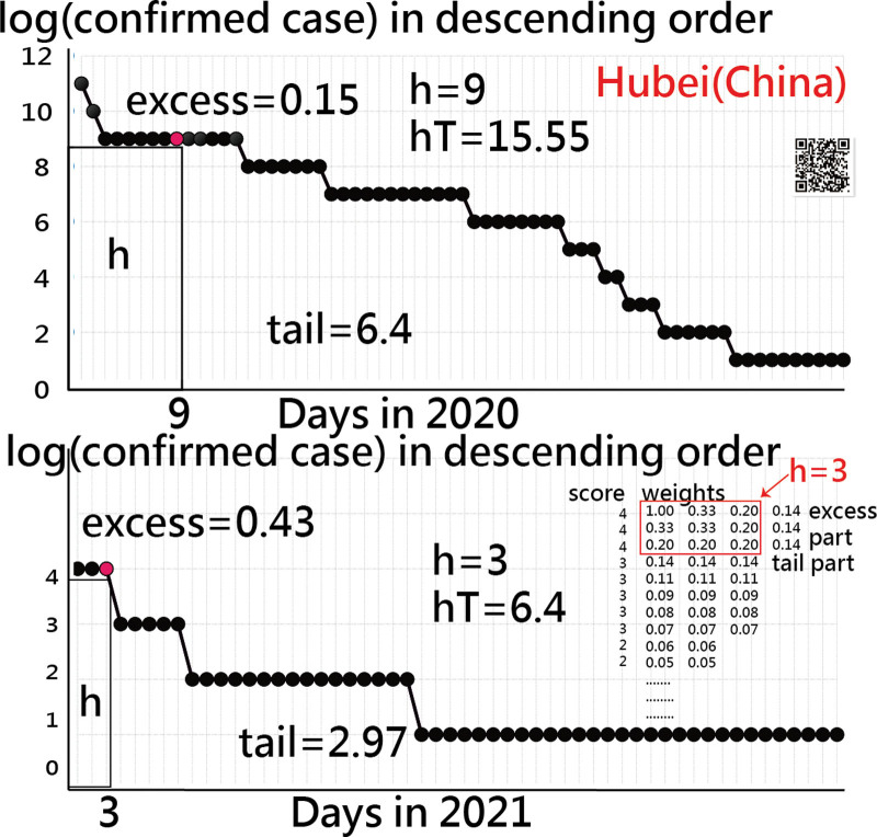
The hT indices of Hubei (China) in 2020 (15.55) and 2021 (6.4) are presented in Figure 6. The tail parts were larger than the excess parts (6.4:0.15 and 2.97:0.43), but smaller than the h (6.4:9 and 2.97:3), in Hubei (China), where Wuhan city is located. The feature of hT-index is that the parts of excess and tail have been weakly weighted according to Equations 4 and 5 when compared to the areas that tail parts are substantially larger than the h parts in Figure 6.
Figure 6.
How to calculate the hT-index (e.g., Huan with h infected days has at least exp (h) daily confirmed cases).
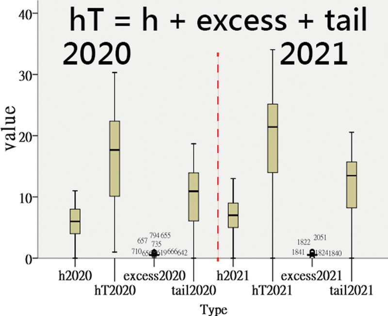
In Figure 7, we verify that the mean weights in the tail parts are greater than those counterparts in the excess parts based on Equation 5, regardless of whether the hT indices are in 2020 or 2021.
Figure 7.
Comparison of h-/hT indices and the patterns of excess and tail parts.
3.3. Online dashboards shown on google maps
All the QR codes in the figures are linked to the dashboards. Readers are suggested to examine the displayed dashboards on Google Maps.
4. Discussion
We observed that the top 2 countries of India and Brazil had higher hT indices in 2020 and 2021. The outliers beyond the 95% CIs were Hubei (China), with a lower hT-index favoring 2021 ( = 6.4 in 2021 vs 15.55 in 2020) and higher hT indices favoring 2021 in Thailand (28.34 vs 14,77) and Vietnam (27.05 vs 10.88). Only 3 continents of Africa, Asia, and Europe had statistically and significantly fewer DCCIDCs (denoted by the hT-index) in 2021. The hT-index generalizes the h-index and overcomes the disadvantage without taking all elements (e.g., DCCIDCs) into account in features.
4.1. Additional information
The top 2 countries using the hT-index to measure IPH were India and Brazil in 2020 and 2021, similar to India (= 379,308 cases per day) and Brazil (= 79,726 cases per day in 2020) based on confirmed cases.[37–40] We referred to the study data and combined the US states in the count. The top 4 in DCC were the US (19,899 082), India (10,266,674), Brazil (10,266,674), and Russia (7,675,973) in 2020 and the US (54,533,878), India (34,861,579), Brazil (22,291,839), and the UK (13,010,849) in 2021. The results are consistent with the IPH denoted by the hT-index in this study, indicating that the hT-index is viable, feasible, and applicable when the hT-index takes into account both the impact (DCC) and quantity (infected days) perspectives.
With a quick look at the forest plot in Figure 8, all IPHs, except China, are higher in 2021 than in 2020, indicating that China has fewer confirmed cases in 2021, consistent with the data: 115,042 (2020) vs 95,967 (2021). Nonetheless, the hT-index takes all DCCs into account (see Eqs. 4–6) and involves 2 perspectives of impact (DCC) and quantity (infected days), which are superior to the bibliometric index merely considering citations in IRAs (e.g., journal impact factor (JIF) = citations/publications). Similarly, the negative impact of COVID-19 cannot be determined by the DCCs alone.
Figure 8.
Comparison of hT indices among continents/countries in 2020 and 2021 (note. Significant in Africa, Asia, and Europe in favor of 2021).
From Figures 6 and 7, we found that the weights in the tail part are much greater than those in the h-index and excess part, indicating that a longer length of infected days exists when compared to the shorter h-core (e.g., h vs tail of 9: 356 in 2020 and 3:362 in 2021 in Figure 6).
Many other indices have been proposed in bibliometrics, such as the JIF ( = citations/publications).[12] the x-index[15] and the g-index,[16] hT is more meaningful. For instance, the 3 scenarios with identical x-indices ( = 10)[15] are unfair and doubtful: 1 publication with 100 citations; 10 publications with 10 citations each, and; 100 publications with 1 citation each. They have h-indices[9] of 1, 10, and 1, responding to hT indices of 3.28, 10, and 3.28, respectively. In contrast, they have g-indices of 1, 10, and 1, responding to JIFs of 100, 10, and 1.
4.2. Implications and changes
We break the walls of the scatter plot without 95% control lines, as in many academic studies,[41–43] and propose the hT-index to measure the IPH for countries/regions for comparison. There are several features in this study. First, each country/region has its own daily epidemic score with the hT-index to denote. The hT-index can be used to measure both the length of infected days and the impact of COVID-19. The hT-index correlates with the h-index.[17,18] The hT-index used to measure the IPH is defined as the maximum value of h such that the given country/region has at least exp(h) DCCs that have each been observed to have at least exp(h) daily cases. The remaining e and t parts in Eq. 5 complement the h-index to make the measure meaningful and reasonable to the impact hit by COVID-19.
The second feature is that the 95% control lines applied to the scatter plot are unique and modern when highlighting the outliers from the data. The procedures of making the 96% control lines are listed in Figure 1 and demonstrated at the link,[34] which helps readers who are interested in drawing their data in the future.
The third feature is the use of the forest plot shown in Figure 8, providing readers with a quick and easy look at the findings of pair comparison in 2 panels.
In addition to the 3 aforementioned features, visual displays shown on Google Maps are the light spot of this study (see Figs. 3–8). The logarithmic scale was applied to this study and addressed with the reasons for use in COVID-19 data that was never described and interpreted before in the literature.
4.3. Limitations and suggestions
Several issues should be considered thoroughly in further studies. The first concern is given to the computation of hT-index. Although somewhat more complex than other indices, the speed for calculating the hT-index is within seconds (see link[32]). Future studies are encouraged to apply the hT-index to other epidemics, not limited to the COVID-19 pandemic.
Second, the 95% control lines are shown on Google Maps. The lines are adjusted by algorithms to make the curves in earth coordinates as linear as possible. If the scheme of drawing the 95% control lines on the scatter plot on the plane would be easier than we did on Google Maps.
Third, the hT-index determined by the summation of weights in the Ferrers tableau (i.e., those all DCCs in the list) consumes time to calculate). The 20-line program codes are easy to read. We provided codes,[32] helping the use of hT-index in other fields in the future, such as awards, funding proposals, and competition results in groups (e.g., Olympic games).
Fourth, although the scatter plot with 95% control lines can be produced online on Google Maps,[34] the 5 columns are given to the format by the copy-paste method from Microsoft Excel, including; Country title; Normalized data in the y-axis; Corresponding standard errors ;Normalized data in the x-axis, and; Corresponding standard errors Readers who are interested in the plot can practice it on their own at the link.[34]
Fifth, we have not interpreted more in detail the outliers beyond the 95% control lines. The visual representations are easy for readers to examine the outliers on dashboards.
Finally, although the hT-index is considered useful and applicable in nature, the comparison of the difference in the hT-index between groups should be used with caution because the hT-index does not always follow a normal distribution. The bootstrapping method[44–46] was recommended for readers in comparison of IPHs among groups. Otherwise, collecting and ranking all DCCs on the logarithmic scale for a specific group (e.g., all data for countries/regions in Asia put together and ranked) to compute the hT-index is necessary and essential, as we did in this study.
5. Conclusion
We demonstrated the hT-index applied to highlight the outliers in IPHs for countries/regions in 2020 and 2021 based on both angles of impactful DCCs and infected days. Quantitative and inferential statistics were provided to break the walls of descriptive statistics (e.g., the scatter plot without the 95% control lines) alone in traditional epidemic studies. With advanced computer science, IPH assessed by hT indices and visualized by scatter plots are suggested for use in future epidemic studies, not limited to COVID-19 research as we did in this study.
Acknowledgments
We thank Enago (www.enago.tw) for the English language review of this manuscript.
Author contributions
Conceptualization: Hua-Ying Chuang.
Investigation: Wei-Chih Kan, Chia-Liang Tsai.
Methodology: Tsair-Wei Chien.
Supplementary Material
Abbreviations:
- CI
- confidence interval
- DCC
- daily confirmed case
- DCCIDC
- daily confirmed cases and infected days for countries/regions in COVID-19
- IPH
- impact on public health
- IRA
- individual research achievement
- JIF
- journal impact factor
Supplemental Digital Content is available for this article.
The datasets generated during and/or analyzed during the current study are publicly available.
The authors have no funding and conflicts of interest to disclose.
How to cite this article: Chuang H-Y, Kan W-C, Chien T-W, Tsai C-L. The 95% control lines on both confirmed cases and days of infection with COVID-19 were applied to compare the impact on public health between 2020 and 2021 using the hT-index. Medicine 2023;102:20(e33570).
Contributor Information
Hua-Ying Chuang, Email: 851139@mail.chimei.org.tw.
Wei-Chih Kan, Email: rockiekan@ntu.edu.tw.
Tsair-Wei Chien, Email: smile@mail.chimei.org.tw.
References
- [1].JHC. Coronavirus disease 2019 (COVOD-19) outbreak. 2022. Available at: http://www.healthup.org.tw/kpiall/covid19dashboard.asp.
- [2].Suwantarat N1, Apisarnthanarak A. Risks to healthcare workers with emerging diseases: lessons from MERS-CoV, Ebola, SARS, and avian flu. Curr Opin Infect Dis. 2015;28:349–61. [DOI] [PubMed] [Google Scholar]
- [3].NBC News. Are coronavirus diseases equally deadly? Comparing the latest coronavirus to MERS and SARS. 2020. Available at: https://www.nbcnews.com/health/health-news/coronavirus-diseases-comparing-covid-19-sars-mers-numbers-n1150321.
- [4].Majumder MS, Rivers C, Lofgren E, et al. Estimation of MERS-coronavirus reproductive number and case fatality rate for the Spring 2014 Saudi Arabia outbreak: insights from publicly available data. PLoS Curr 2014;6. [DOI] [PMC free article] [PubMed] [Google Scholar]
- [5].Chang CS, Yeh YT, Chien TW, et al. The computation of case fatality rate for novel coronavirus (COVID-19) based on Bayes theorem: an observational study. Medicine (Baltim). 2020;99:e19925. [DOI] [PMC free article] [PubMed] [Google Scholar]
- [6].Lee KW, Chien TW, Yeh YT, et al. An online time-to-event dashboard comparing the effective control of COVID-19 among continents using the inflection point on an ogive curve: observational study. Medicine (Baltim). 2021;100:e24749. [DOI] [PMC free article] [PubMed] [Google Scholar]
- [7].Wang LY, Chien TW, Chou W. Using the IPcase index with inflection points and the corresponding case numbers to identify the impact hit by COVID-19 in China: an observation study. Int J Environ Res Public Health. 2021;18:1994. [DOI] [PMC free article] [PubMed] [Google Scholar]
- [8].Ho SY, Chien TW, Shao Y, et al. Visualizing the features of inflection point shown on a temporal bar graph using the data of COVID-19 pandemic. Medicine (Baltim). 2022;101:e28749. [DOI] [PMC free article] [PubMed] [Google Scholar]
- [9].Hirsch JE. An index to quantify an individual’s scientific research output. Proc Natl Acad Sci USA. 2005;102:16569–72. [DOI] [PMC free article] [PubMed] [Google Scholar]
- [10].Huang MH, Chi PS. A comparative analysis of the application of h-index, g-index, and a-index in institutional-level research evaluation. J Libr Inf Stud. 2010;8:1–0. [Google Scholar]
- [11].Yeh YT, Chien TW, Kan WC, et al. The use of hx-index to compare research achievements for ophthalmology authors in Mainland China, Hong Kong, and Taiwan since 2010. Medicine (Baltim). 2021;100:e24868. [DOI] [PMC free article] [PubMed] [Google Scholar]
- [12].Pan RK, Fortunato S. Author impact factor: tracking the dynamics of individual scientific impact. Sci Rep. 2014;4. [DOI] [PMC free article] [PubMed] [Google Scholar]
- [13].Sahel JA. Quality versus quantity: assessing individual research performance. Sci Transl Med. 2011;3:84 cm13. [DOI] [PMC free article] [PubMed] [Google Scholar]
- [14].Hausken K. The ranking of researchers by publications and citations: using RePEc data. J Econ Bibliography. 2016;3:530–58. [Google Scholar]
- [15].Fenner T, Harris M, Levene M, et al. A novel bibliometric index with a simple geometric interpretation. PLoS One. 2018;13:e0200098. [DOI] [PMC free article] [PubMed] [Google Scholar]
- [16].Egghe L. Theory and practice of the g-index. Scientometrics. 2006;69:131–52. [Google Scholar]
- [17].Anderson TR, Hankin RKS, Killworth PD. Beyond the Durfee square: enhancing the h-index to score total publication output. Scientometrics. 2008;76:577–88. [Google Scholar]
- [18].Hua PH, Wan JK, Wu JH. A perfect hirsch-type index? Experiences using the tapered h-index (hT). He Chin J Sci Tech Periodicals. 2010;21:33–7. [Google Scholar]
- [19].Song Y, Park JH, Shim J. The evaluation of web contents by user “likes” count: an usefulness of hT-index for topic preference measurement. J Korean Soc Libr Inf Sci. 2015;49:27–49. [Google Scholar]
- [20].Jarrell Stephen B. Basic Statistics (Special prepublication ed.). Dubuque, Iowa: Wm. C. Brown Pub; 1994. 492. [Google Scholar]
- [21].Utts Jessica M. Seeing Through Statistics. 3rd Edition. Cole: Thomson Brooks; 2005. 166–167. [Google Scholar]
- [22].Puniya M, Sing RB. Correlation and regression analysis. Int J Res Eng Sci Manage. 2019;2:456–8. [Google Scholar]
- [23].Chien TW, Lin YF, Chang CH, et al. Using a bubble chart to enhance adherence to quality-of-care guidelines for colorectal cancer patients. Eur J Cancer Care (Engl). 2012;21:712–21. [DOI] [PubMed] [Google Scholar]
- [24].Assefa Y, Hill PS, Gilks CF, et al. Global health security and universal health coverage: understanding convergences and divergences for a synergistic response. PLoS One. 2020;15:e0244555. [DOI] [PMC free article] [PubMed] [Google Scholar]
- [25].Yang TY, Chen CH, Chien TW, et al. Predicting the number of article citations on the topic of pemphigus vulgaris with the 100 top-cited articles since 2011: a protocol for systematic review and meta-analysis. Medicine (Baltim). 2021;100:e26806. [DOI] [PMC free article] [PubMed] [Google Scholar]
- [26].Lin CH, Chien TW, Yan YH. Predicting the number of article citations in the field of attention-deficit/hyperactivity disorder (ADHD) with the 100 top-cited articles since 2014: a bibliometric analysis. Ann Gen Psychiatry. 2021;20:6. [DOI] [PMC free article] [PubMed] [Google Scholar]
- [27].GitHub. COVID-19 data. Available at https://github.com/CSSEGISandData/COVID-19. [accessed on March 10, 2022].
- [28].Shang C, Yang Y, Chen G-Y, et al. A simple transmission dynamics model for predicting the evolution of COVID-19 under control measures in China. Epidemiol Infect. 2021;149:1–10. [DOI] [PMC free article] [PubMed] [Google Scholar]
- [29].Tsai KT, Chien TW, Lin JK, et al. Comparison of prediction accuracies between mathematical models to make projections of confirmed cases during the COVID-19 pandamic by country/region. Medicine (Baltim). 2021;100:e28134. [DOI] [PMC free article] [PubMed] [Google Scholar]
- [30].Romano A, Sotis C, Dominioni G, et al. The scale of COVID-19 graphs affects understanding, attitudes, and policy preferences. Health Econ. 2020;29:1482–94. [DOI] [PMC free article] [PubMed] [Google Scholar]
- [31].Sevi S, Avina MM, Peloquin-Skulski G, et al. Logarithmic versus linear visualizations of COVID-19 cases do not affect citizens support for confinement. Can J Polit Sci. 2020:1–6. [Google Scholar]
- [32].Chien TW. The computation of hT-index on the website. Available at http://www.healthup.org.tw/kpiall/hTindexurl.asp. [accessed on March 3, 2022].
- [33].Wright BD, Stone MH. Best Test Design (Rasch Measurement Series). Chicago, IL: MESA Press; 1979. 94. [Google Scholar]
- [34].Chien TW. How to draw the 95% control lines. Available at http://www.healthup.org.tw/kpiall/forestplot.asp. [accessed on March 10, 2022].
- [35].Chien TW, Wang HY, Hsu CF, et al. Choropleth map legend design for visualizing the most influential areas in article citation disparities: a bibliometric study. Medicine (Baltim). 2019;98:e17527. [DOI] [PMC free article] [PubMed] [Google Scholar]
- [36].Yan YH, Chien TW. The use of forest plot to identify article similarity and differences in characteristics between journals using medical subject headings terms: a protocol for bibliometric study. Medicine (Baltim). 2021;100:e24610. [DOI] [PMC free article] [PubMed] [Google Scholar]
- [37].Yang DH, Chien TW, Yeh YT, et al. Using the absolute advantage coefficient (AAC) to measure the strength of damage hit by COVID-19 in India on a growth-share matrix. Eur J Med Res. 2021;26:61. [DOI] [PMC free article] [PubMed] [Google Scholar]
- [38].Chaturvedi D, Chakravarty U. Predictive analysis of COVID-19 eradication with vaccination in India, Brazil, and USA. Infect Genet Evol. 2021;92:104834. [DOI] [PMC free article] [PubMed] [Google Scholar]
- [39].James N, Menzies M, Bondell H. Comparing the dynamics of COVID-19 infection and mortality in the United States, India, and Brazil. Physica D. 2022;432:133158. [DOI] [PMC free article] [PubMed] [Google Scholar]
- [40].Greer SL, Jarman H, Falkenbach M, et al. Social policy as an integral component of pandemic response: learning from COVID-19 in Brazil, Germany, India and the United States. Glob Public Health. 2021;16:1209–22. [DOI] [PubMed] [Google Scholar]
- [41].Assefa Y, Gilks CF, Reid S, et al. Analysis of the COVID-19 pandemic: lessons toward a more effective response to public health emergencies. Global Health. 2022;18:10. [DOI] [PMC free article] [PubMed] [Google Scholar]
- [42].Ho KM. Scatter plot and correlation coefficient. Anaesth Intensive Care. 2012;40:730–1. [PubMed] [Google Scholar]
- [43].Halder B, Bandyopadhyay J, Banik P. COVID-19 pandemic: a health challenge for commoners during the first unlock phase in India [published online ahead of print, 2021 Mar 20]. Z Gesundh Wiss. 2021;31:427–33. [DOI] [PMC free article] [PubMed] [Google Scholar]
- [44].Kung SC, Chien TW, Yeh YT, et al. Using the bootstrapping method to verify whether hospital physicians have different h-indices regarding individual research achievement: a bibliometric analysis. Medicine (Baltim). 2020;99:e21552. [DOI] [PMC free article] [PubMed] [Google Scholar]
- [45].Kuo SC, Yeh YT, Kan WC, et al. The use of bootstrapping method to compare research achievements for ophthalmology authors in the US since. Scientometrics. 2020;126:509–20. [Google Scholar]
- [46].Efron B. Bootstrap methods: another look at the jackknife. Ann Stat. 1979;7:1–26. [Google Scholar]


