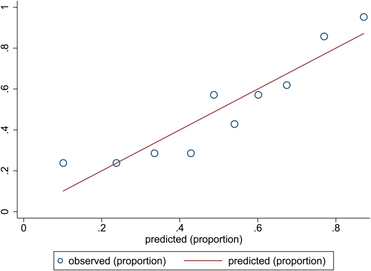
Figure 4. Calibration plots of predictive model in the development set.
The x-axis is the predicted occurrence of PEW. The y-axis is the observed outcomes. The diagonal dotted line represents an ideal predictive outcome by an ideal model. The solid line represents the performance of nomogram. It better predicts that a solid line is close to a diagonal dotted line. The figure shows that nomogram have a good predictive ability.

