Fig. 5.
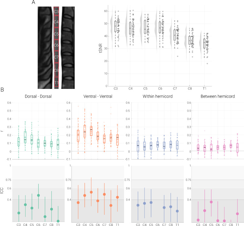
Segment-specific functional connectivity. A. The midsagittal cross-section on the left (from the T2-weighted PAM50 template image) shows the thresholded probabilistic segments overlaid as outlines. Segment-wise tSNR values are depicted via box-plots for which the median is denoted by the central mark and the bottom and top edges of the boxes represent the 25th and 75th percentiles, respectively, with the whiskers encompassing ∼99% of the data. The circles represent individual participants and half-violin plots show the distribution across participants. B. The top panel depicts Pearson correlation values (averaged across two sessions) between different ROIs with one box plot per segmental level. For the box plots, the median and mean are denoted by the central black mark and the colored mark, respectively. The bottom and top edges of the boxes represent the 25th and 75th percentiles, respectively, with the whiskers encompassing ∼99% of the data. The circles represent individual participants. The bottom panel depicts ICC values for each connection with the dot and the lines denote 95% confidence intervals; please note that the ICC for within hemicord connectivity for level C6 is far below zero, resulting in it not being visible here (see Table 4 for all ICC values). The gray scale background reflects the ICC ranges (as defined by Cicchetti & Sparrow (1981) and Hallgren (2012)): poor <0.4, fair 0.4–0.59, good 0.6–0.74, excellent ≥0.75.

