PURPOSE
Clinical trial adverse event (AE) data are increasingly complex and high-dimensional, especially for trials evaluating novel targeted agents and immunotherapies. Standard approaches to summarize and analyze AEs remain generally tabular, failing to describe the nature of AEs. Novel dynamic and data visualization methods are needed to enable a more comprehensive assessment of the overall toxicity profile of treatments.
METHODS
We developed methods for visualizing the numerous categorizations and types of AEs along with a dynamic approach to better reflect its highly dimensional nature without sacrificing the reporting of rare events. Circular plots displaying the proportion of maximal-grade AEs by system organ classes (SOCs) and butterfly plots displaying the proportion of AEs by severity for each AE term were developed to enable comparisons of AE patterns by treatment arm. These approaches were applied to a randomized phase III trial (S1400I; ClinicalTrials.gov identifier: NCT02785952) comparing nivolumab with nivolumab plus ipilimumab in patients with stage IV squamous non–small-cell lung cancer.
RESULTS
Our visualizations revealed that patients randomly assigned to nivolumab and ipilimumab had higher rates of grade 3 or higher AEs compared with nivolumab alone for several SOCs, including musculoskeletal (5.6% v 0.8%), skin (5.6% v 0.8%), vascular (5.6% v 1.6%), and cardiac (4% v 1.6%) toxicities. They also suggested a pattern of higher prevalence of moderate GI and endocrine toxicities and showed that although the rates of cardiac and neurologic toxicities were similar, the types of events were discordant.
CONCLUSION
The graphical approaches we proposed enable a more comprehensive and intuitive evaluation of toxicity types by treatment groups, which is not apparent in tabular and descriptive reporting methods.
BACKGROUND
Accurate and comprehensive analysis and reporting of adverse events (AEs) is crucial for understanding toxicity profiles of cancer treatments and to ensure patient safety and drug tolerability. Oncology clinical trials rely on the National Cancer Institute Common Terminology Criteria for Adverse Events (CTCAE) to collect and report AEs.1 The CTCAE is a descriptive terminology that defines toxicity severity on a scale from 1 to 5 for each AE term. The current version 5.0 includes over 1,000 AE terms organized into 26 system organ classes (SOCs). Depending on the treatments being evaluated, AEs can differ in their type, frequency, duration, and severity. Given the large number of AEs observed in cancer trials, a myriad of data is generally collected.
CONTEXT
Key Objective
To develop methods for visualization of the numerous categorizations and types of adverse events (AEs) along with a dynamic approach to better reflect its highly dimensional nature without sacrificing the reporting of rare events.
Knowledge Generated
Circular plots displaying the proportion of maximal-grade AEs by system organ classes and butterfly plots displaying the proportion of AEs by severity for each AE term enable the comparison of AE patterns by treatment. These plots allowed for the inclusion of mild and moderate AEs and rare events which are often omitted using current descriptive and tabular approaches.
Relevance
Circular and butterfly plots along with the proposed dynamic approach enable a more comprehensive and intuitive evaluation of toxicity types by treatment groups. These new proposed approaches can improve our understanding of the toxicity profile of cancer treatments.
Recently, AE data have become increasingly complex as a result of clinical trials evaluating novel targeted agents and immunotherapies alone and in combination with other chemotherapies. However, the analysis and reporting of AEs remains generally tabular, with the goal of profiling individual treatment-related AEs with greatest severity. Although most published randomized clinical trials in top-tier journals report at least a subset of AEs on the basis of severity or prevalence, the criteria for inclusion are often not consistent or clear.2 For example, studies may list the frequency of grade 3 or higher treatment-related AEs or the frequency of grade 2 or higher AEs with a prevalence of 10% or higher. Similar practices are generally followed in phase I and II clinical trials. These limited depictions of AEs may give clinicians a misleading or incomplete picture of the toxicity profile of a treatment and the aggregate differences by treatment arm.
To help understand the toxicity profile of novel agents, a few visualization and analysis methods have been proposed for displaying individual AEs to allow for easier comparison by treatments and to depict the longitudinal trajectories of individual AEs.3-6 Methods have been proposed for visualization of the timing and occurrence of AEs using time stream plots of the average toxicity grade for individual toxicities across cycles, time-to-event analysis for time to onset of AEs, and event charts for patient-level severity and timing of AEs.4,5 These methods are informative for understanding individual AEs, but do not address the high dimensionality in the types of AEs reported in current clinical trials, as the number of AEs that are reported can range from 10 to more than a hundred. The selection of AEs to report may obscure the presence of rare serious AEs or more common AEs of moderate severity. Moreover, the use of tabular formats and text description alone can limit the capacity to interpret the overall safety profile of a treatment and especially the comparison of safety profiles between treatment groups. Data visualization methods, particularly dynamic visualization methods, allow for the more effective display of high-dimensional data that can improve the interpretation of the various dimensions of AEs, including both their toxicity-specific and aggregate direction and magnitude. As such, these methods can aid in identifying and depicting patterns of AEs to establish potential differences in the AE profile of treatments. This is especially relevant given the infrequency with which aggregate toxicity patterns between treatment groups are formally tested. In this article, we propose novel approaches for visualizing the numerous types of AEs and SOCs that are observed in clinical trials to ensure the accurate and comprehensive reporting of AEs. These graphical approaches are available in an R Shiny Web Application available on the web and applied to a randomized phase III trial to compare the AE profile of two immunotherapy regimens (nivolumab v nivolumab plus ipilimumab) and illustrate their utility in practice.
METHODS
Study Design
We used the AE data from a phase III randomized trial recently completed by the SWOG Cancer Research Network to illustrate the proposed novel approaches. The clinical trial, S1400I,7 was conducted within the Lung Cancer Master Protocol (Lung-MAP), which, to our knowledge, is a first-of-its-kind, large-scale, master protocol to evaluate molecularly targeted therapies in patients previously treated for stage IV or recurrent non–small-cell lung cancer. Lung-MAP was designed as a biomarker-driven protocol with a screening approach to define biomarker eligibility to match patients to specific substudies evaluating the targeted therapies.8 S1400I randomly assigned patients who were not eligible for a biomarker-matched substudy to nivolumab plus ipilimumab versus nivolumab alone. Nivolumab was given once at 3 mg/kg every 2 weeks, and ipilimumab was given once at 1 mg/kg every 6 weeks. Treatment continued until disease progression or intolerable toxicity. A total of 275 patients were enrolled from December 18, 2015, to April 23, 2018, of whom 252 were eligible, 127 in the nivolumab arm and 125 in the nivolumab plus ipilimumab arm. The trial was stopped at an interim analysis because of a futility finding. The overall survival was not statistically significantly different between the groups. AEs were collected using National Cancer Institute-CTCAE version 4.0 every 2 weeks starting from the third week of treatment and continued until progression. At each visit, AEs were captured using AE terms with the respective SOC, severity grade, and attribution. The trial was institutional review board–approved and was registered with ClinicalTrials.gov (identifier: NCT02785952).
Statistical Analysis
The analysis was limited to AEs that were determined to be possibly, probably, or definitely related to treatment. The frequency of AEs by severity was calculated and reported. Per patient, the AEs were then summarized across treatment cycles using all available AE data into the maximal grade (ie, highest severity grade reported over all available time points) for each AE term and, separately, into the maximal grade for each SOC (ie, highest severity grade reported across AE terms [within each SOC] and available time points). We calculated the percentage of patients in each treatment group with maximal AE of grade 1-5 by AE term and SOC. These data are presented in the traditional tabular form by treatment arm for all grade 3, 4, or 5 separately, for all grade 1 or higher or grade 2 or higher AEs with a prevalence of 10% or greater (for presentation purposes) in at least one treatment group or for all grade 3 or higher AEs combined in both treatment groups. The frequency of maximal grade across all AE terms and SOCs was also calculated by severity grade and treatment for comparison with the data visualization methods.
Data Visualization
Given numerous severity categorizations and types of AEs, summary of AE counts and percentages can be visualized in various ways. Maximal grade of AEs by SOC categories can be visualized using circular plots to display the proportion of AE by severity for each SOC. For visual treatment comparison, the treatment arms can be displayed side by side within the same circular plot for each SOC category using different color schemes for the treatment arms, with darker color intensity indicating greater AE severity. Alternatively, the information can be displayed using two circular plots side by side with the exactly same position for the SOC categories using the same color. These graphical displays are useful to identify differences by SOC categories that can be grossly compared before consideration of more granular information on individual AE terms.
To visualize the proportion of AEs by severity with a larger number of categories, butterfly plots are used to display the proportion of AEs by severity for each AE term and to allow the visual comparison of AEs across treatment arms by mirroring the data across a central axis (either vertically or horizontally). The bars are sorted on the basis of (in descending order) the frequency of the events by SOC—and then by AE term within SOC—in one arm. Color intensity is used to depict the various grades of toxicity. To allow for easier visual comparison of the distribution of AEs, the AE terms are displayed as a legend.
In the dynamic form, once investigators have reviewed all AE terms, the Web Application allows users to focus on specific SOC categories and to select the severity grades they would like to view. In this more detailed view of specific SOC categories, the Web Application displays the tabular form of the data including the count and frequency of the events next to the graph. We have created a GitHub Repository that includes the link to the Web R Shiny application, the code, the instructions for creating and customizing the plots, and sample data sets.9
Visualization of AE Resolution
Butterfly plots can also be used to display, for each AE term, the proportion of AEs for which the designation of severity is not resolved by the last follow-up and to allow the visual comparison of AE resolution by treatment arms. The bars are then sorted on the basis of (in descending order) the frequency of the nonresolved AE by SOC—and then by AE term within SOC. The GitHub repository includes code on how to format and visualize the data for AE resolution, along with an example.
RESULTS
Of the 252 eligible patients, a total of 8,301 treatment-related AEs were reported (6,354 grade 1, 1,693 grade 2, 230 grade 3, 21 grade 4, and 3 grade 5). One hundred ninety-three AE terms were observed across 22 SOC categories. Of these, only 19 AE terms of any grade (grade ≥1) occurred in at least 10% of patients in at least one treatment arm and only five AE terms of grade 2 or higher occurred in at least 10% of patients in at least one of the treatment arms (fatigue, anemia, anorexia, dyspnea, and hypothyroidism). Grade 3 or higher toxicities were reported for 69 of the AE terms, with six occurring in at least 5% (fatigue, hyponatremia, AST increased, lipase increased, lung infection, and pneumonitis) and 31 occurring in at least 1% of patients in at least one treatment arm.
Tabular Form
In the original manuscript for S1400I, the reporting of AEs consisted of the comparison between the ipilimumab plus nivolumab and the nivolumab arms using tables and text.7 More specifically, the manuscript reported in the text the proportion of patients with grade 3 or higher treatment-related AEs (39.5% nivolumab plus ipilimumab v 33.3% nivolumab) and treatment-related deaths. Moreover, the manuscript provided a table with the frequency of grade 3, 4, and 5 events as well as the frequency of grade 3 or higher events for the 22 treatment-related AEs with a prevalence of at least 5% or at least one grade 4 or 5 event. The publication also highlighted the frequency of the two most common grade 3 or higher treatment-related AEs in patients who received either treatment, which were fatigue (8.9% v 5.7%) and pneumonitis (7.3% v 4.9%). Given that this was an immunotherapy trial, the manuscript also reported the information for immune-related events and provided a bar graph of the number of immune-related AEs by grade and treatment in the supplementary materials.
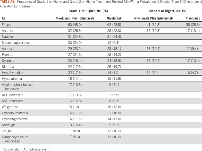
In addition to the tables provided in the original publication of the trial, other potential tabular descriptions of the data include a list with the frequency of all 31 AE types of grade 3 or higher AEs occurring in at least 1% of patients by treatment (Appendix Table A1) to provide a more comprehensive list of AEs and a table of all AEs grade 1 or higher or grade 2 or higher AEs occurring in at least 10% of the patients in at least one arm, for providing a sense of rate of moderate and mild AEs (Appendix Table A2). The tabular detailed display of the data, in general, suggests that the prevalence of specific grade 3 or higher toxicities was low and was slightly higher by 1%-3% or similar between treatment arms. The prevalence of the most common grade 2 or higher AEs was also similar between the two arms, except for hypothyroidism that occurred more commonly in the nivolumab plus ipilimumab arm (12% v 4.7%). Moreover, the occurrence of the most common AEs of any grade was, in general, similar, with the exception of eight AEs, which differed by 5% or more between the two treatments (maculopapular rash [24% v 9.4%], anorexia [23.2% v 18.1%], pruritus [21.6% v 14.2%], hypothyroidism [17.6% v 11%], increased alkaline phosphate [13.6% v 7.1%], increased ALT [13.6% v 5.5%], increased AST [12.8% v 6.3%], and hypoalbuminemia [11.2% v 16.5%]). For each of these (except for hypoalbuminemia), the AEs were more common for patients treated with nivolumab in combination with ipilimumab.
Graphics Displays
Circular plots.
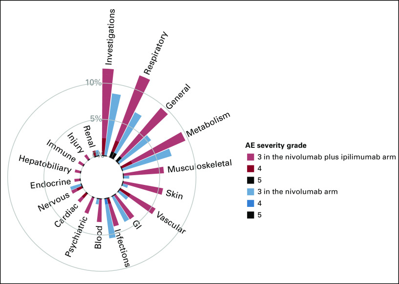
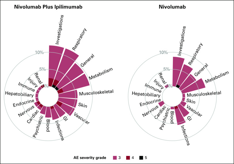
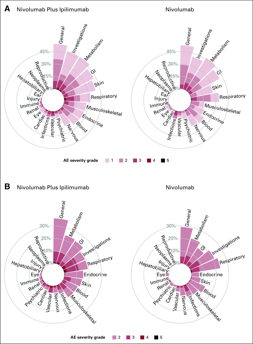
To illustrate the novel visualization approaches proposed, we first constructed circular plots for SOC categories for grade 3 or higher AEs. Given the sparsity of events across many AE terms, by summarizing the maximal AE across the SOC, we now do not overlook the 41 AEs terms which occurred in <1% of patients. These additional AEs are now aggregated and included into their respective SOC categories. Figure 1 displays the proportion of maximal grade of AEs for grade 3 or higher AEs, with one circular plot differentiating treatment arms using color. The side-by-side bars display allows for an easy comparison of the height of the bars by treatment arms and the proportion of AEs by severity. On the basis of the height of the bar, in this graph, we can visually observe that patients in the nivolumab and ipilimumab arm reported higher rates of grade 3 or higher AEs compared with nivolumab for investigations (12.0% v 8.7%), respiratory (12.0% v 7.1%), general (9.6% v 5.5%), musculoskeletal (5.6% v 0.8%), skin (5.6% v 0.8%), vascular (5.6% v 1.6%), blood (3.2% v 0.8%), psychiatric (4% v 2.4%), and cardiac (4% v 1.6%) toxicities. Moreover, patients treated with nivolumab plus ipilimumab also experienced more higher-grade AEs for many SOC categories, as illustrated by the darker color shades for reds compared with blues. Figure 2 displays the same information using a side-by-side display of circular plots. These SOC circular graphs can also be generated for grade 2 or higher AEs and grade 1 or higher AEs (Fig 3). Here, it is more apparent that patients in the nivolumab and ipilimumab arm also had higher prevalence of mild investigations and moderate general SOC categories, but particularly moderate or higher GI (23.2% v 16.5%), skin (14.4% v 7.9%), and endocrine (15.2% v 6.3%) toxicities, whereas the nivolumab arm had higher rates of moderate respiratory toxicities. A similar interpretation can be made with respect to grade 3 or higher AEs. To more finely evaluate the particular AEs within these particular categories, we proposed the use of butterfly plots below.
FIG 1.
Circular plot of system organ classes for grade 3 or higher AEs by treatment using different colors. AE, adverse event.
FIG 2.
Circular plots of system organ classes for grade 3 or higher AEs by treatment side by side. AE, adverse event.
FIG 3.
Circular plots of system organ classes for (A) grade 1 or higher AEs and (B) grade 2 or higher AEs by treatment side by side. AE, adverse event.
Butterfly plots.
The proportion of AEs by severity for SOC categories can also be displayed using butterfly plots (Fig 4). Figure 4 shows that the AE profiles of the two treatments are different with nivolumab plus ipilimumab having a higher proportion of grade 3 or higher AEs for various SOCs and a higher proportion of grade 4 AEs. A butterfly plot may be useful when the number of categories to display is large. Figure 5 shows the proportion of AEs by severity for all 69 AE terms with at least one grade 3 or higher event and provides—at even just a quick glance—a more complete understanding of the differences in the distribution of AEs by arm. For example, although the proportion of patients with generalized muscle weakness was only slightly higher in the nivolumab plus ipilimumab arm compared with nivolumab, patients who received nivolumab plus ipilimumab also reported other grade 3 musculoskeletal AEs such as arthralgia, myalgia, and myositis; these AEs were not observed among patients in the nivolumab arm. Similarly, for skin AEs, although the proportion of patients with maculopapular rash was only slightly higher in the nivolumab plus ipilimumab arm compared with nivolumab, patients who received nivolumab plus ipilimumab also reported other grade 3 skin AEs such as pruritus, erythroderma, edema, and other skin disorders, which were not observed among patients in the nivolumab arm. It is also more readily apparent that patients treated with nivolumab plus ipilimumab experienced four grade 4 cardiac events (one each of AV block, cardiac arrest, heart failure, and myocarditis) compared with none among patients treated with nivolumab alone. This graph also allows us to visualize SOC categories with similar rates by arm overall, but comprise different AEs within the SOC. For example, although the proportion of grade 3 or higher nervous system AEs was similar between the groups, the types of events were discordant, stroke, and syncope among patients treated with nivolumab plus ipilimumab, compared with headache and memory impairment among patients treated with nivolumab.
FIG 4.
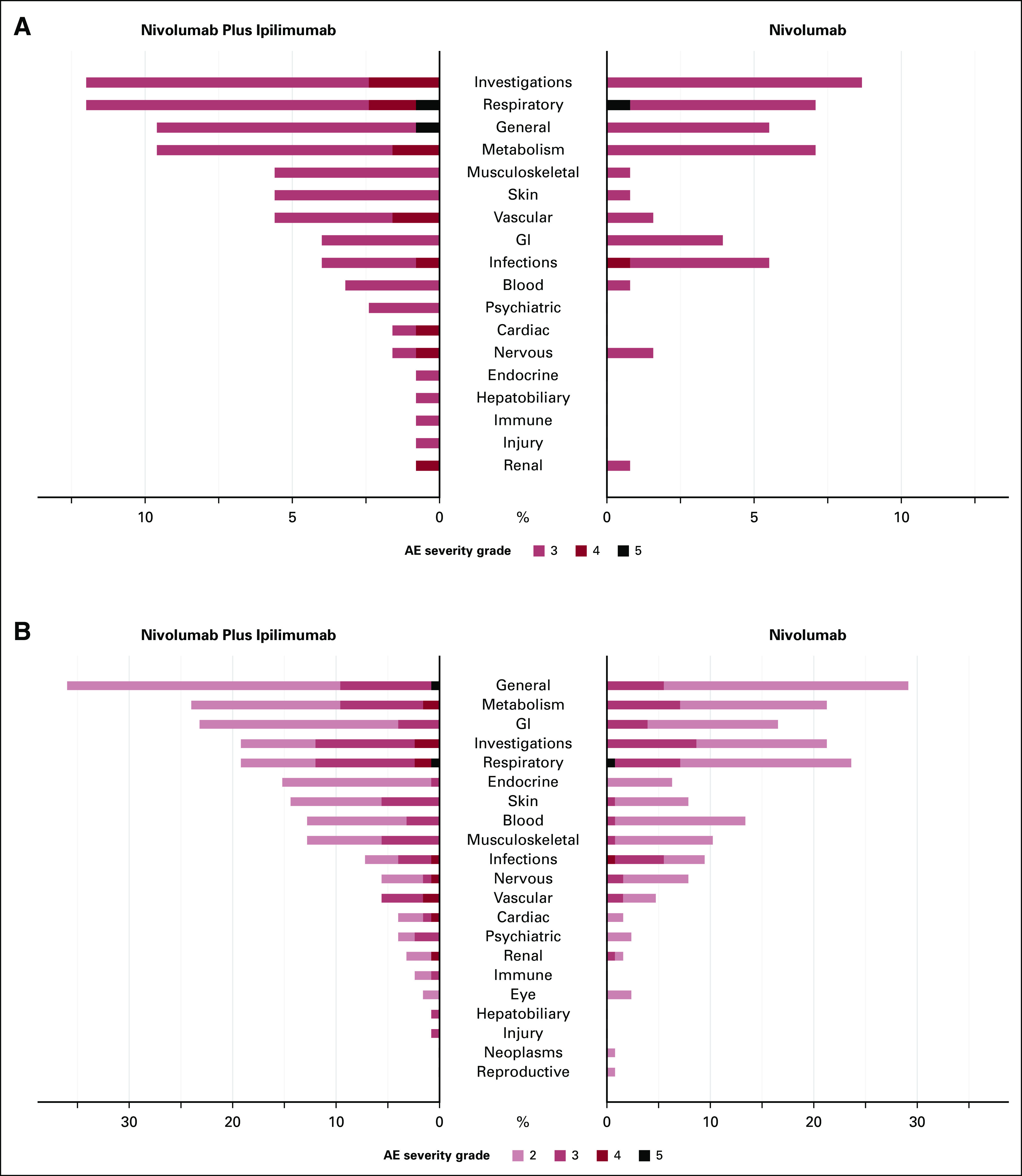
Butterfly plot of system organ classes for (A) grade 3 or higher AEs and (B) grade 2 or higher AEs by treatment. AE, adverse event.
FIG 5.
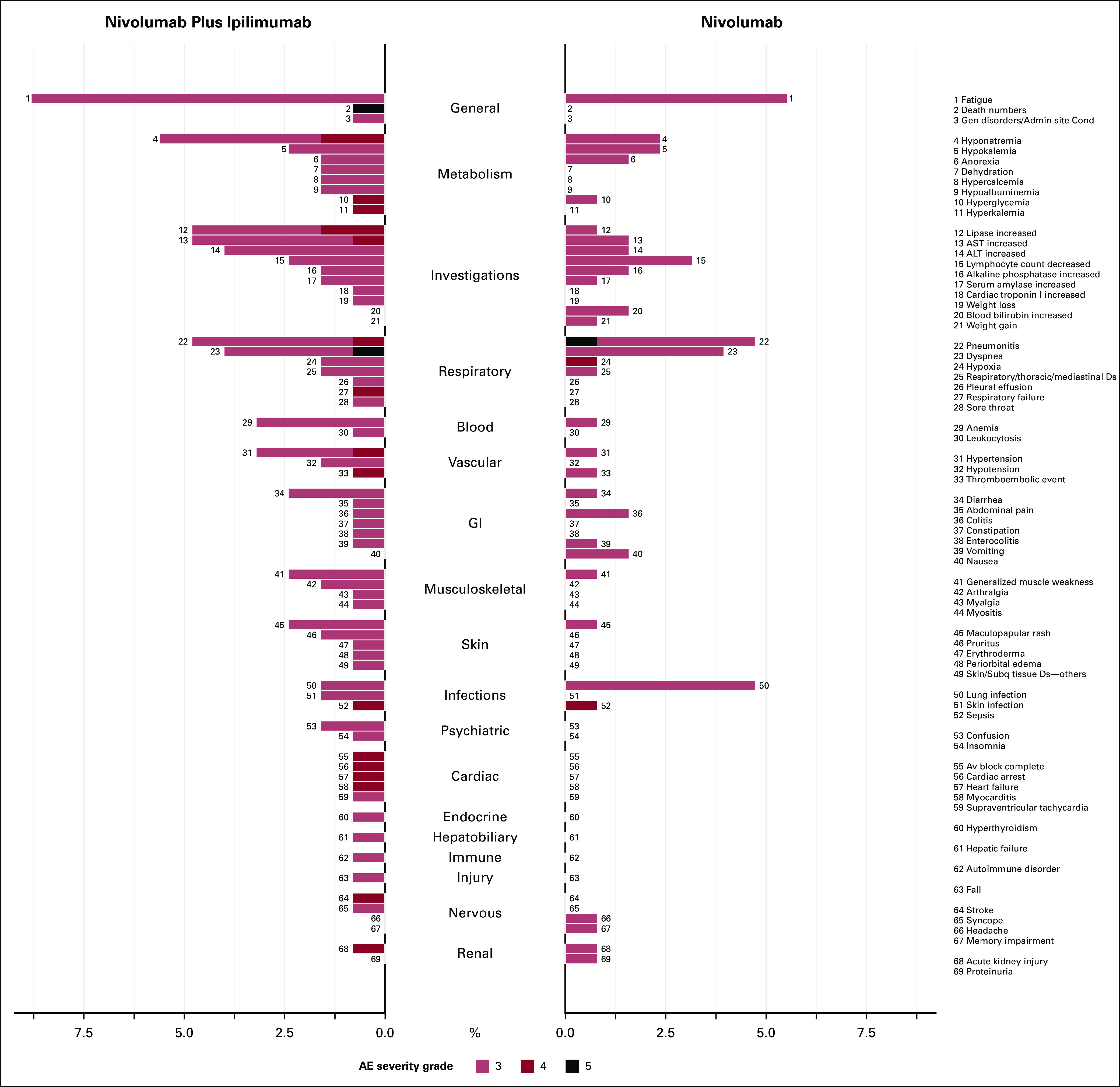
Butterfly plot for system organ classes categories and AE terms by treatment for grade 3 or higher AEs. AE, adverse event.
Butterfly plots can be used for even higher-dimensional data. For instance, all grade 2 or higher AEs can be readily displayed (Appendix Fig A1). Such depictions can be used to examine and report a large number of AE terms in a concise manner. This type of graphical display would also be appropriate to use dynamically within the Web Application to identify, at a glance, patterns of AEs that may differ between treatments, which may also point to subsequent statistical testing. For example, from these plots, we see that the increase in moderate AEs in the general category was due to higher frequency in not only fatigue, which was present in both arms, but also edema, malaise, and fever, which were only present in the nivolumab plus ipilimumab arm.
DISCUSSION
The analysis and reporting of AEs for most clinical trials is largely descriptive and tabular, with an emphasis on individual and common AEs. The increased use of newer cancer treatments—which are associated with distinct and sometimes rare events—necessitates more modern approaches for the reporting of AEs, with the ultimate goal of improving the interpretation of study results. We propose novel data visualization methods that better reflect the high dimensionality of AE data without sacrificing the reporting of rare events. These graphical tools are important aids for better understanding the differences in the types of AEs by treatment that tabular and descriptive reporting methods may not provide.
The outputs from our R Shiny Web Application provide quick, at-a-glance treatment comparisons through data visualization and comprehensive visual comparison of all reported AEs. In addition to the outputs, the application also allows for dynamic setting of various criteria to hone in on specific SOCs and to constrain to higher-grade AEs. For instance, in our case example using data from S1400I, our approach of first displaying the maximal grade of AEs by SOCs identified treatment differences that were not readily apparent in tabular format given the sparsity of the AEs in this trial. We have introduced several approaches for visualizing the high dimensionality of AEs, and the selection of the optimal graph will depend on the treatment setting. These graphical displays are aimed to improve our overall understanding of the toxicity profile of treatments to aid in toxicity mitigation and guide practitioners and patients in their decision making process. The web application is straight forward, and an input data set can be easily formatted for use with the graphical tools.
Given the complexity and high dimensionality of AE data, it is necessary to adopt innovative methods for analysis and reporting to more clearly interpret and compare the AE profiles of novel cancer treatments. The proposed visualization methods can be applied in practice for the reporting of AE data for both data monitoring purposes and publications. Among the barriers to the adoption of novel methods is the availability of tools for their implementation. Thus, we have developed a web application and a GitHub repository with the code. Moreover, these methods were developed with feedback from a comprehensive set of stakeholders including statisticians, clinicians, clinical trialists, and patient advocates, improving the likelihood that they will be used in practice. Recommendations for the use of these novel AE visualization methods by regulatory agencies and journals would further enhance their adoption.
This article focuses on the visualization of occurrence of the various types of AEs. However, an important limitation is that our method does not incorporate the duration of AEs. More research is needed to evaluate methods for analyzing and visualizing the duration of toxicity and the inclusion of patient-reported outcomes in addition to physician-reported outcomes to provide an inclusive and complete picture of the toxicity profile of treatments. The analysis and visualization of duration of toxicity will require time-to-event approaches given that patients may be censored. In addition, statistical tests are generally not performed for the comparison of AEs by treatment given the sparseness of the data particularly for individual events, the need for a large number of tests, and the issues with multiple comparisons. Thus, more research is needed to develop methods for statistically testing differences in aggregate patterns of AEs between arms. While our methods have been developed for the comparison of treatments, they could also be used for early-stage single-arm trials. Applying these innovations in the analysis and visualization of AE data earlier in the drug development process could improve our understanding of the overall toxicity profile of treatments. These methods can also be applied in postmarketing settings to systematically evaluate the toxicity profile of treatments.
APPENDIX
FIG A1.
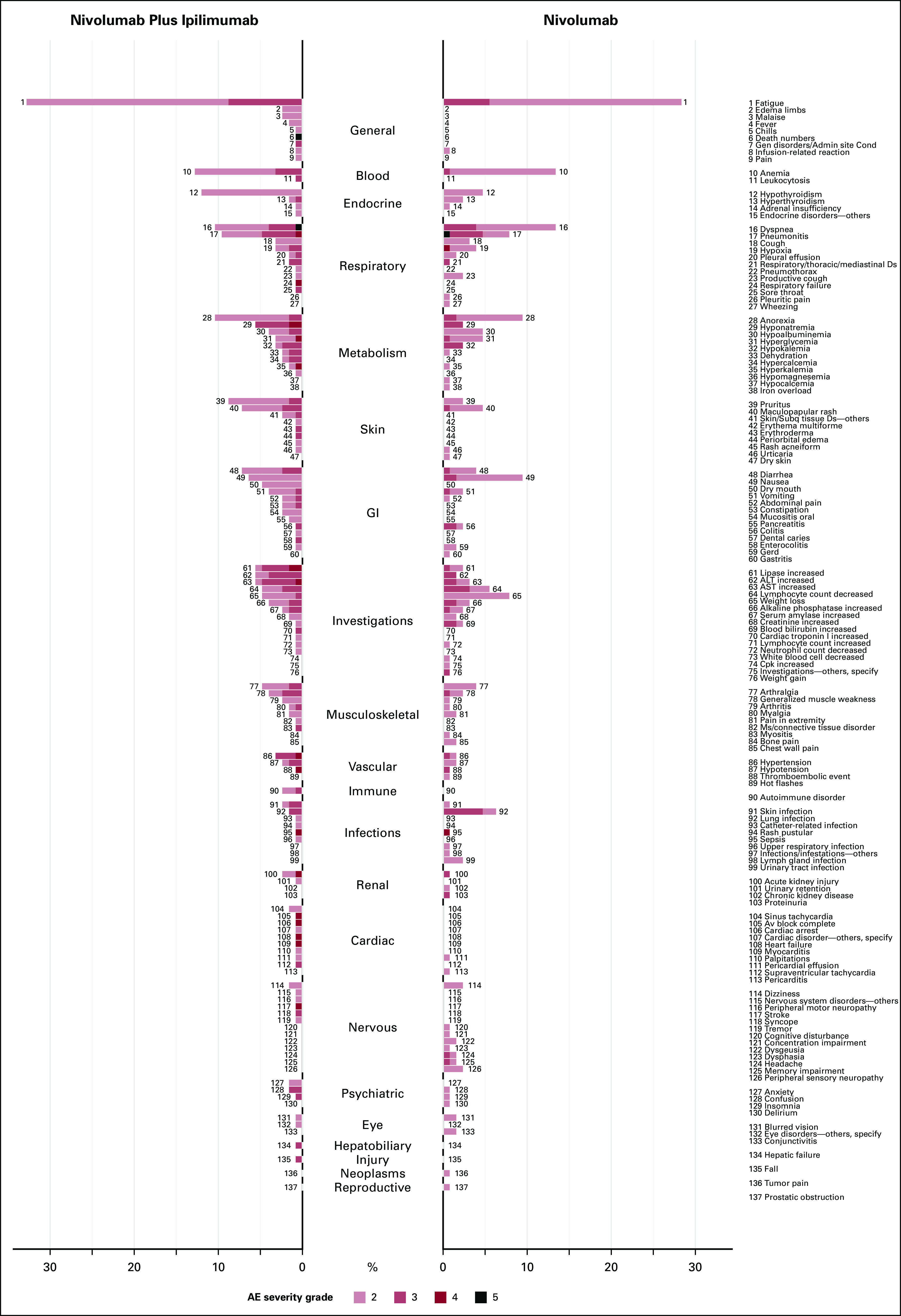
Butterfly plot for system organ class categories and AE terms by treatment for grade 2 or higher AEs. AE, adverse event.
TABLE A1.
Frequency of Grade 3 or Higher Treatment-Related AEs With a Prevalence of Greater Than 1% in at Least One Arm by Treatment
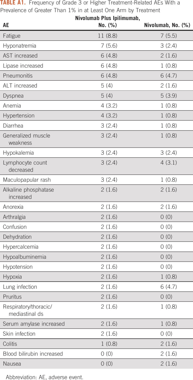
TABLE A2.
Frequency of Grade 1 or Higher and Grade 2 or Higher Treatment-Related AEs With a Prevalence of Greater Than 10% in at Least One Arm by Treatment
Shing M. Lee
Consulting or Advisory Role: PTC Therapeutics
Research Funding: Merck (Inst), Karyopharm Therapeutics (Inst), AstraZeneca (Inst), Genentech/Roche (Inst)
Scott N. Gettinger
Research Funding: Bristol Myers Squibb (Inst), Genentech (Inst), ARIAD/Takeda (Inst), Iovance Biotherapeutics (Inst), NextCure (Inst), Merck (Inst)
Lyudmila Bazhenova
Stock and Other Ownership Interests: Epic Sciences
Consulting or Advisory Role: Genentech/Roche, Regeneron, Merck, Johnson & Johnson, Daichi, Neuvogen, Bayer, Sanofi, ORCIC, Novocure, Mirati Therapeutics, Turning Point Therapeutics, AbbVie, InterVenn Biosciences, Elevation Oncology
Roy S. Herbst
Leadership: Junshi Pharmaceuticals, Immunocore
Consulting or Advisory Role: AstraZeneca, Genentech/Roche, Merck, Pfizer, AbbVie, Biodesix, Bristol-Myers Squibb, Lilly, EMD Serono, Heat Biologics, Junshi Pharmaceuticals, Loxo, Nektar, NextCure, Novartis, Sanofi, Seagen, Shire, Spectrum Pharmaceuticals, Symphogen, TESARO, Neon Therapeutics, Infinity Pharmaceuticals, ARMO Biosciences, Genmab, Halozyme, Tocagen, Bolt Biotherapeutics, I-Mab, Mirati Therapeutics, Takeda, Cybrexa Therapeutics, eFFECTOR Therapeutics, Candel Therapeutics, Oncternal Therapeutics, STCube Pharmaceuticals Inc, WindMIL, Xencor, Bayer, Checkpoint Therapeutics, DynamiCure Biotechnology, Foundation Medicine, Gilead/Forty Seven, HiberCell, Immune-Onc Therapeutics, Johnson & Johnson, Ocean Biomedical, OncoCyte, Refactor Health, Ribon Therapeutics, Ventana Medical Systems
Research Funding: AstraZeneca, Merck, Lilly, Genentech/Roche
Dawn L. Hershman
Consulting or Advisory Role: AIM Specialty Health
No other potential conflicts of interest were reported.
DISCLAIMER
The content is solely the responsibility of the authors and does not necessarily represent the official views of the National Institutes of Health.
PRIOR PRESENTATION
Presented at the SWOG Fall 2022 meeting, Chicago, IL, October 20, 2022.
SUPPORT
Supported by Hope Foundation for Cancer Research, ACS Clinical Research Professorship (ACSCRP-20-098-01-CPHPS-664612), and National Institutes of Health/NCI grant award Nos. U10CA180888 and U10CA180819.
DATA SHARING STATEMENT
This is a secondary analysis of the Lung-MAP (S1400-I) clinical trial. The Lung-MAP (S1400) master protocol and all of the substudies conducted within the master protocol were partially funded by the NCI and conducted by the SWOG Cancer Research Network, one of the NCTN Groups. The policies and procedures for requesting data are available at https://www.swog.org/sites/default/files/docs/2019-12/Policy43_0.pdf. Study data are or will be available for sharing as soon as the primary publication for each study has been published. Additionally, data from randomized phase III studies are available through the NCI's data archives.
AUTHOR CONTRIBUTIONS
Conception and design: Shing M. Lee, Mary W. Redman, Scott N. Gettinger, Lyudmila Bazhenova, Roy S. Herbst, Dawn L. Hershman, Joseph M. Unger
Financial support: Shing M. Lee, Dawn L. Hershman, Joseph M. Unger
Provision of study materials or patients: Mary W. Redman, Scott N. Gettinger, Lyudmila Bazhenova, Roy S. Herbst, Dawn L. Hershman
Collection and assembly of data: Mary W. Redman, Scott N. Gettinger, Lyudmila Bazhenova, Joseph M. Unger
Data analysis and interpretation: Shing M. Lee, Weijia Fan, Aijin Wang, Riha Vaidya, Mary W. Redman, Scott N. Gettinger, Lyudmila Bazhenova, Roy S. Herbst, Dawn L. Hershman, Joseph M. Unger
Manuscript writing: All authors
Final approval of manuscript: All authors
Accountable for all aspects of the work: All authors
AUTHORS' DISCLOSURES OF POTENTIAL CONFLICTS OF INTEREST
The following represents disclosure information provided by authors of this manuscript. All relationships are considered compensated unless otherwise noted. Relationships are self-held unless noted. I = Immediate Family Member, Inst = My Institution. Relationships may not relate to the subject matter of this manuscript. For more information about ASCO's conflict of interest policy, please refer to www.asco.org/rwc or ascopubs.org/cci/author-center.
Open Payments is a public database containing information reported by companies about payments made to US-licensed physicians (Open Payments).
Shing M. Lee
Consulting or Advisory Role: PTC Therapeutics
Research Funding: Merck (Inst), Karyopharm Therapeutics (Inst), AstraZeneca (Inst), Genentech/Roche (Inst)
Scott N. Gettinger
Research Funding: Bristol Myers Squibb (Inst), Genentech (Inst), ARIAD/Takeda (Inst), Iovance Biotherapeutics (Inst), NextCure (Inst), Merck (Inst)
Lyudmila Bazhenova
Stock and Other Ownership Interests: Epic Sciences
Consulting or Advisory Role: Genentech/Roche, Regeneron, Merck, Johnson & Johnson, Daichi, Neuvogen, Bayer, Sanofi, ORCIC, Novocure, Mirati Therapeutics, Turning Point Therapeutics, AbbVie, InterVenn Biosciences, Elevation Oncology
Roy S. Herbst
Leadership: Junshi Pharmaceuticals, Immunocore
Consulting or Advisory Role: AstraZeneca, Genentech/Roche, Merck, Pfizer, AbbVie, Biodesix, Bristol-Myers Squibb, Lilly, EMD Serono, Heat Biologics, Junshi Pharmaceuticals, Loxo, Nektar, NextCure, Novartis, Sanofi, Seagen, Shire, Spectrum Pharmaceuticals, Symphogen, TESARO, Neon Therapeutics, Infinity Pharmaceuticals, ARMO Biosciences, Genmab, Halozyme, Tocagen, Bolt Biotherapeutics, I-Mab, Mirati Therapeutics, Takeda, Cybrexa Therapeutics, eFFECTOR Therapeutics, Candel Therapeutics, Oncternal Therapeutics, STCube Pharmaceuticals Inc, WindMIL, Xencor, Bayer, Checkpoint Therapeutics, DynamiCure Biotechnology, Foundation Medicine, Gilead/Forty Seven, HiberCell, Immune-Onc Therapeutics, Johnson & Johnson, Ocean Biomedical, OncoCyte, Refactor Health, Ribon Therapeutics, Ventana Medical Systems
Research Funding: AstraZeneca, Merck, Lilly, Genentech/Roche
Dawn L. Hershman
Consulting or Advisory Role: AIM Specialty Health
No other potential conflicts of interest were reported.
REFERENCES
- 1.National Cancer Institute : Common Terminology Criteria for Adverse Events (CTCAE) Version 4.0, Volume 4. Bethesda, MD, National Institutes of Health, National Cancer Institute, 2009 [Google Scholar]
- 2.Phillips R, Hazell L, Sauzet O, et al. : Analysis and reporting of adverse events in randomised controlled trials: A review. BMJ Open 9:e024537, 2019 [DOI] [PMC free article] [PubMed] [Google Scholar]
- 3.Amit O, Heiberger RM, Lane PW: Graphical approaches to the analysis of safety data from clinical trials. Pharm Stat 7:20-35, 2008 [DOI] [PubMed] [Google Scholar]
- 4.Thanarajasingam G, Atherton PJ, Novotny PJ, et al. : Longitudinal adverse event assessment in oncology clinical trials: The toxicity over time (ToxT) analysis of Alliance trials NCCTG N9741 and 979254. Lancet Oncol 17:663-670, 2016 [DOI] [PMC free article] [PubMed] [Google Scholar]
- 5.Thanarajasingam G, Leonard JP, Witzig TE, et al. : Longitudinal toxicity over time (ToxT) analysis to evaluate tolerability: A case study of lenalidomide in the CALGB 50401 (Alliance) trial. Lancet Haematol 7:e490-e497, 2020 [DOI] [PMC free article] [PubMed] [Google Scholar]
- 6.Lineberry N, Berlin JA, Mansi B, et al. : Recommendations to improve adverse event reporting in clinical trial publications: A joint pharmaceutical industry/journal editor perspective. BMJ 355:i5078, 2016 [DOI] [PubMed] [Google Scholar]
- 7.Gettinger SN, Redman MW, Bazhenova L, et al. : Nivolumab plus ipilimumab vs nivolumab for previously treated patients with stage IV squamous cell lung cancer: The lung-MAP S1400I phase 3 randomized clinical trial. JAMA Oncol 7:1368-1377, 2021 [DOI] [PMC free article] [PubMed] [Google Scholar]
- 8.Redman MW, Papadimitrakopoulou VA, Minichiello K, et al. : Biomarker-driven therapies for previously treated squamous non-small-cell lung cancer (Lung-MAP SWOG S1400): A biomarker-driven master protocol. Lancet Oncol 21:1589-1601, 2020 [DOI] [PMC free article] [PubMed] [Google Scholar]
- 9.Fan W: Two-group adverse event data visualization. https://github.com/wf2213/TwoGroupAEVisualization [Google Scholar]
Associated Data
This section collects any data citations, data availability statements, or supplementary materials included in this article.
Data Availability Statement
This is a secondary analysis of the Lung-MAP (S1400-I) clinical trial. The Lung-MAP (S1400) master protocol and all of the substudies conducted within the master protocol were partially funded by the NCI and conducted by the SWOG Cancer Research Network, one of the NCTN Groups. The policies and procedures for requesting data are available at https://www.swog.org/sites/default/files/docs/2019-12/Policy43_0.pdf. Study data are or will be available for sharing as soon as the primary publication for each study has been published. Additionally, data from randomized phase III studies are available through the NCI's data archives.


