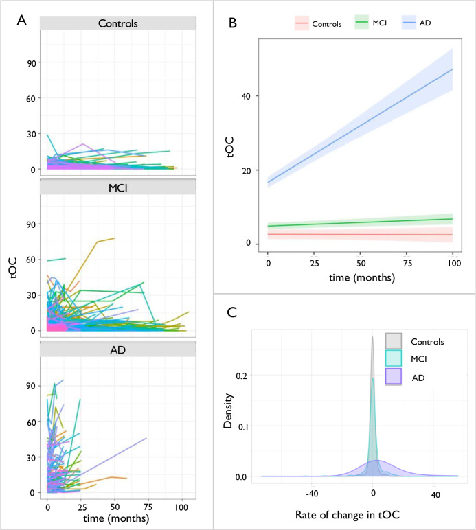
Fig. 3. Change in total outlier count according to diagnostic group.
(a) Spaghetti plot of tOC according to diagnostic group. Each line represents an individual participants trajectory of tOC scores over the scanning period (b) Linear growth model for each diagnostic group (c) Density plot of the rate of change in tOC in diagnostic groups. Across the whole sample the rate of change ranged from −73.18 to 56.29, mean = 1.16, SD= 7.6.

