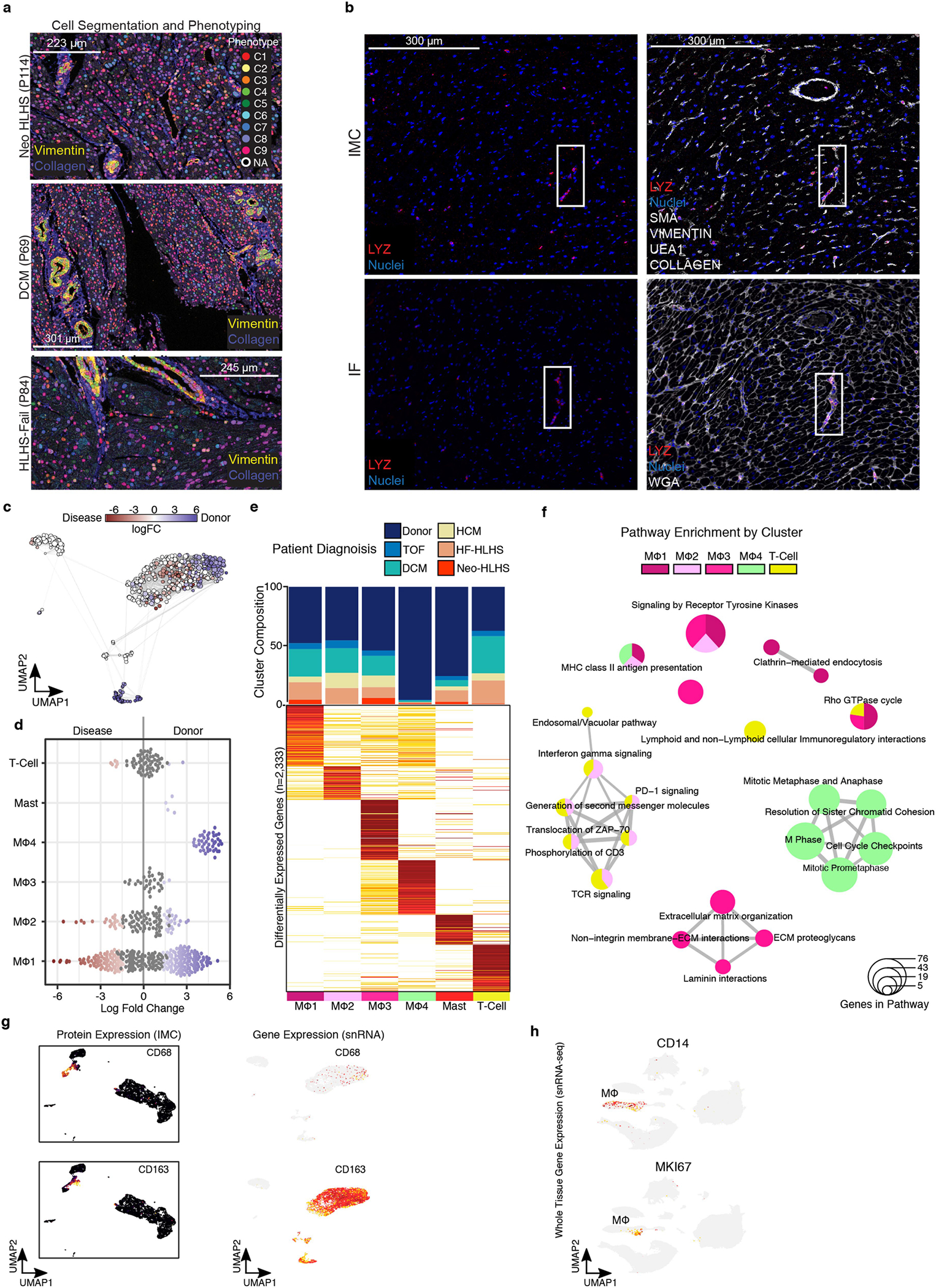
Extended Data Fig. 7 |. Transcriptional profiling of pediatric cardiac immune cell populations.

a, Representative images of cell-segmentation and phenotyping analysis performed on imaging mass cytometry (IMC) images. b, Representative images of IMC (top) and immunofluorescence (bottom)of LYZ marker expression. Solid boxes indicate same regions with LYZ expression. c, Embedding of the Milo K-NN differential abundance testing results for cardiac immune cell populations. All nodes represent neighborhoods, colored by their log fold changes for disease versus Donor. Neighborhoods with insignificant log fold changes (FDR 10%) are white. Layout of nodes determined by UMAP embedding, shown in Fig. 6f. d, Beeswarm plot showing the log-fold distribution of changes across disease and donors in neighborhoods from different immune cell clusters. Differentially abundant neighborhoods are shown in color. Compiled from Extended Data Fig. 7a. (e) Top, cluster composition bar plot colored by patient diagnosis. Bottom, heatmap displaying average expression for all differentially expressed genes for myeloid and lymphoid cell clusters. (f) Enrichment map for gene pathway overrepresentation analysis colored by cardiac immune cell cluster. (g) Left, protein expression from IMC data across UMAP embedding. Right, feature plot displaying gene expression from snRNA-seq. (h) Feature plot displaying gene expression from snRNA-seq. Related to Fig. 1b.
