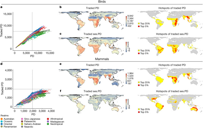
Fig. 1. Levels of traded PD across the world for birds and mammals.
a–c, Birds. d–f, Mammals. b,e, Map (b) and hotspots (e) of PD of traded species within each grid cell, with cells highlighted yellow representing the top 25% of grid cells and those in red representing the top 5%. c,f, Map (c) and hotspots (f) of traded ses.PD, with cells highlighted yellow representing the top 25% of grid cells and those in red representing the top 5%. a,d, Plots showing the relationship between traded PD and overall PD levels of each cell. Cells are colour coded by biogeographic realm. Black lines in scatterplots indicate locally estimated scatterplot smoothing (LOESS) fit (see Supplementary Fig. 2 for greater clarity on trends within each biogeographic realm). Units for PD denote the sum of all phylogenetic branch lengths.

