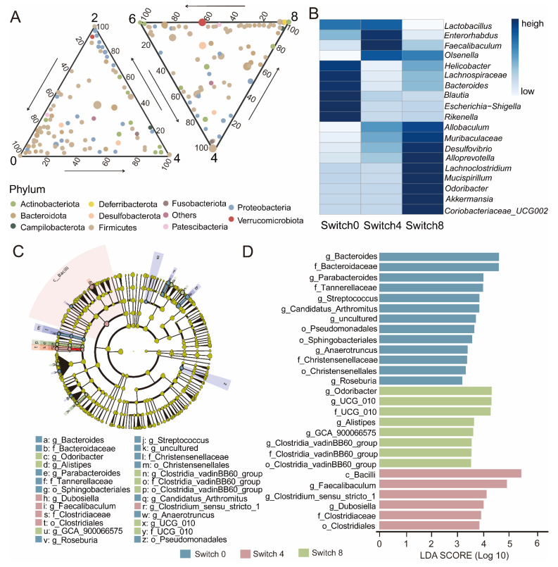
Figure 3.
Changes in bacterial community dynamics of the Switch group over experiment time and LEfSe analysis of taxonomy with significant differences. (A) The ternary plot showed the changes in microbial composition of the Switch group at the genus level over experimental time. The size of each symbol represents its relative abundance and its color represents its phylum. (B) Heatmap showing the top 20 genera in terms of abundance in the Switch group. The color bar represents the relative abundance of the genus. (C) Evolutionary branching diagram. Regions with different colors represent different groups. Nodes in different colors represent significant changes in relative abundance in different groups. Yellow nodes indicate no significant changes in the corresponding group. (D) Histogram of LDA value. Taxa with significantly different abundances in different groups are shown, and the length of the bar graph represents the effect size of the significantly.

