

Abstract
Healthcare delivery systems are widely accepted as socio-technical systems. Unlike other socio-technical systems, healthcare systems leave very little decision-making to technical automation and control. Instead, the healthcare delivery system relies on human healthcare resources for decision-making. Human decision-making is imperative to the clinical delivery of care to patients and to the operational processes that support care delivery, quality improvement, and other organizational management activities. For these clinical and operational activities, human resources make healthcare decisions using healthcare data typically housed in electronic medical records (EMRs). Unfortunately, EMR systems were first designed with the functional capability to store data, and, second to a lesser degree, to retrieve data. The literature recognizes the need to improve the retrieval of information from EMR systems. More specifically, there remains the need to directly view a patient’s holistic health and healthcare trajectory. At this time, decision-makers are left to mentally build this holistic picture in their mind by sequentially clicking through many sections of the EMR. Therefore, in this paper, we develop a visualization tool to organize and present an individual’s health and healthcare trajectory by describing a patient record holistically from a system architecture perspective. This approach is based on a previously developed system model for healthcare delivery and individual health outcomes.
Keywords: system architecture, systems modeling, system visualization, medical systems
I. Introduction
Healthcare delivery systems are widely accepted as socio-technical systems [1]. Unlike other socio-technical systems such as transportation and energy, healthcare systems leave very little decision-making to technical automation and control. Instead, the healthcare delivery system relies on human healthcare resources for decision-making.
Human decision-making is imperative to the clinical delivery of care to patients and to the organizational processes that support care delivery. The former describes provider clinical decision-making in support of patient care. The latter describes human resources operational decision-making for organizational activities that support care delivery, quality improvement, and other organizational management activities.
For these clinical and operational activities, human resources make healthcare decisions using healthcare data typically housed in electronic medical records (EMRs). Electronic medical records were introduced in 1972 and mandated by the American Recovery and Reinvestment Act of 2009 [2]. In today’s digital age, electronic medical records are touted with the ability to significantly support clinical and operational activities over paper records. However, there is minimal evidence to suggest that this claim has fully materialized [3].
Unfortunately, EMR systems were designed, first, with the functional capability to store data, and, second to a lesser degree, to retrieve data. EMR systems are designed with a database and with a front-end user interface (UI) for data input and review. One of the primary functions of the EMR UI is for data input. The EMR literature recognizes the importance of improving EMR systems to support the functional needs of EMR users, including the need for information retrieval [4]. Recent literature highlights continued attempts to redesign EMR systems [5].
Interactive visualization tools can be defined as computational technologies that use visual representations to amplify human cognition when working with data [6]. Temporal visual tools have been applied to EMR data to interpret machine learning of patient histories [7], create temporal queries [8], compare patient histories [9], visualize data [10], explore event sequences (LifeFlow) [11], compare cohorts of event sequences (CoCo) [12], and support personal reminiscence [13].
More specifically, there remains the need to directly view a patient’s holistic health and healthcare trajectory. At this time, decision-makers are left to mentally build this holistic picture in the human mind by sequentially clicking in many sections of the EMR. While the EMR UI can present historical information for previously entered data, the data tends to be quantitative and focused on lab work, because it is easier to develop a plot of historical values captured in the EMR database. Unfortunately, even quantitative visualizations present historical information poorly [4]. It is important to recognize that visualizing historical lab work is a very small portion of a patient’s health and healthcare trajectory information. Instead, there is a need to develop a full view of a patient’s prior health and healthcare trajectory to support both clinical and operational needs. Clinically, providers spend significant time building this full view mentally in their mind. Operationally, a full view of a patient’s record can be used for quality improvement. For example, the resource-intensive mortality review process requires that reviewers gain a full understanding of a patient’s healthcare record [14]. And yet, there are currently no visualizations that present this information holistically. Instead, healthcare personnel spend significant time reviewing different parts of the EMR, by clicking in many sections to build this view as a mental model rather than an explicit visualization [15]–[18]. Therefore, it is not surprising that the most commonly cited provider IT stressors are that (1) EHRs do not always map to a clinician’s mental model, and (2) technology tends to drive the conversation and journey, though it is not designed for that role [19].
A. Paper Contribution
In this paper, we modeled a patient’s holistic record using system architecture. We then visualize the hierarchical architecture into a visualization tool to support healthcare decision-making from a holistic perspective. More specifically, we model electronic medical record (EMR) data into a functional system model, by instantiating a previously developed system model for healthcare delivery and patient health outcomes [20]–[22]. By doing so, we are able to provide a holistic representation of delivered care to a specific patient, organized into a hierarchical representation of healthcare system functions.
B. Paper Outline
First, we develop an instantiated system model of health and healthcare delivery from electronic medical records data in Section II. Next, we describe the system development of a visualization tool to show health and healthcare data from a holistic systems perspective in Section III. Finally, we conclude in Section IV.
II. Systems Modeling of Health and Healthcare Delivery from Electronic Medical Records (EMR) Data
A. Overall System Model
In this section, we model electronic medical record (EMR) data into a functional system model by instantiating and detailing a previously developed system model for health and healthcare delivery [20]. Specifically, we instantiate the functional architecture of the system model into processes + operand to develop a functional perspective or view of an individual’s health and healthcare they received. Figure 1 illustrates the healthcare delivery processes and operand that make up the functional architecture.
Fig. 1.
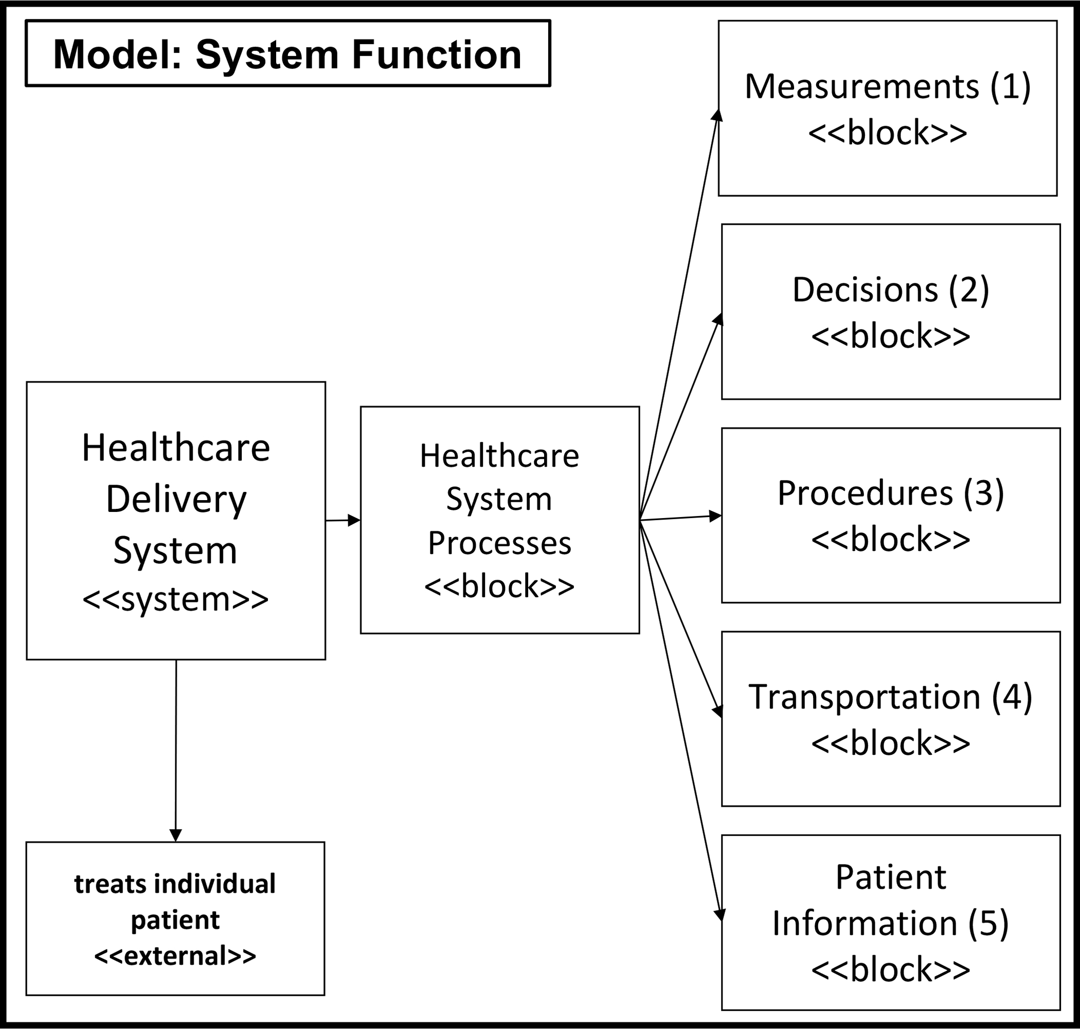
Adapted block diagram of healthcare delivery functions as described in [20].
By way of background, the engineering systems literature often groups processes into five categories: transformation, transportation, storage, control, and exchange [23]. Translating this into healthcare, 4 processes have been identified: transformation, transportation (which includes storage), decisions, and measurement [20]. Briefly, these functions were based on a clinical diagnostic model [24] that, first, examines the patient’s complaint (measure), second, attempts to determine its cause (diagnose and decide) and, third, applies a treatment regimen to that cause (treat or transform). Sequentially, these processes include (1) measurement, to understand, quantify or classify an individual’s health state, (2) decision, to determine what to do for the individual and when, (3) transformation, to perform service(s) for the individual, and (4) transportation, to hold and move the individual between any of these processes.
Formally, function is defined as process + operand [23]. We defined processes in the last paragraph. Here, we define a single operand as the patient. The patient-operand is a critical aspect of the system model because it captures an individual’s “clinical” health state evolution [20]. While many other systems deduce the state of the operand by where the operand is in the system, this is not the case for a patient operand in the healthcare system. Notably, the patient-operand state needs to be continually evaluated. The patient-operand health state describes a patient’s clinical state in terms of functional abilities, diagnosed conditions, as well as other important fixed qualities. These qualities may include age, ethnicity, geographical location, and social determinants of health.
In this section, we described the process and operand elements of the functional architecture. In the next section, we instantiate these elements specifically for health and healthcare information found in electronic medical records (EMRs). This instantiation is required because EMRs do not contain a one-to-one mapping from relational database table schemas to the elements in the functional architecture. While EMR table schemas are not standardized, there has been significant effort to develop standards such as CEN ISO 13606 [25], HL7-CDA [26], OpenEHR [27], CIMI [28], SNOMED CT [29], and the more recent HL7’s FHIR [30]–[33]. For this paper, rather than instantiating the model on a hypothetical HL7 FHIR standard, we used a real openly-available EMR dataset [34] and designed our tool to flexibly read other EMR datasets.
B. Instantiating the System Model to EMR Data
In this paper, we instantiate the system model to the openly-available EMR dataset called the Medical Information Mart for Intensive Care (MIMIC)-IV database [34].
The Medical Information Mart for Intensive Care (MIMIC)-IV database [34] is an expansion of the MIMIC-II database, which provided critical care data for over 40,000 patients admitted to intensive care units at the Beth Israel Deaconess Medical Center [34]. The data is provided in de-identified form and with all patient identifiers removed in accordance with the Health Insurance Portability and Accountability Act (HIPPA) Safe Harbor provision. MIMIC-IV incorporates contemporary EMR data and adopts a modular approach to data organization. The MIMIC-IV Database is divided into three modules: core, hospital (Hosp), and intensive care unit (ICU). The core module contains three datasets: patients, admissions, and transfers, which provide information on the location of a patient at any given time and serves as the master list of patients. The hosp module contains lab events, procedure events, as well as diagnoses codes. The ICU module includes a data set called ‘icustays’ which provides a mapping between hospital transfers and ICU stays. In Figure 2, we model each of these EMR data files into one of the 5 processes and operand elements of the functional system model: measurements, decisions, procedures, transportation, or patient.
Fig. 2.

Each EMR data file field is modeled as one of the 4 processes of care delivery or patient-operand. Thus, some files map to several categories.
We accessed MIMIC-IV data through a data use agreement and downloaded the data securely from Physionet through Google Big Query. With a focus on end-of-life care, we used the SQL query to download the data for deceased patients in the MIMIC-IV dataset.
III. Visualization System Development
A. System Design Objectives
We approached the visualization system development with the goal of visualizing a patient’s health and healthcare trajectory from a systems perspective. The objective was to design an interactive user interface that visualizes EMR data into the 4 processes that summarize a patient’s healthcare trajectory and the operand view that summarizes a patient’s health information. To make this tool usable to healthcare personnel, we also included a requirement that allows users to select and plot multiple healthcare events together. This functionality supports users in identifying gaps in care while organizing the events into helpful and relevant categories. Therefore, each element of the EMR data needs to be modeled into one of the 5 element views: (1) Measurements, (2) Decisions, (3) Procedures (or treatments), (4) Transportation, and (5) Patient information. The design of the overall system architecture is detailed in Figure 3.
Fig. 3.

The Architecture of the Visualization System and User Interface. The system currently: takes in as input MIMIC-IV data, categorizes healthcare events into the 5 process+operand elements, and outputs the holistic dynamic representation of a patient and their healthcare delivery in a webpage.
B. System Implementation Details
We coded the visualization system using Python 3.7. To perform the required functions, we installed several dependency packages. These include pandas (version 1.2.4), plotly (version 5.1.0), dash (version 0.29.0), dash core components (version 1.17.1), dash HTML components (version 1.1.4), and matplotlib (version 3.3.4).
We used pandas to read the five CSVs into five Pandas Dataframes to facilitate interactive plotting. We decided to build the visualization framework using the web-based visualization application, Dash. Dash is an open-source library developed by Plotly. Dash applications are rendered in the web browser and can be shared through URLs. Therefore, by using dash, our visualization tool is inherently cross-platform and mobile-ready.
In addition, dash was particularly useful for its interactive graphing and cross-filtering capabilities. Dash allows for plotting based on user selection from drop-down menus. It also allows for the selection of multiple drop-down values and, consequently, the plotting of multiple features on a single plot. Following user selection, dash facilitates the automatic update of a graph. This feature was particularly important to allow users to control the type and amount of information visualized. By doing so, this interactive feature allows the user to study an individual’s health and healthcare trajectory interactively. Such an interactive exploratory functionality supports healthcare clinical and operational decision-making.
Figure 3 shows three steps to the visualization development. In step 1, we process the EMR data into five processed data sets that serve as inputs to the second step of the visualization tool. In step 2, we read each of these processed data sets and extract features for each hierarchical level. In step 3, we designed the interactive visualization based on the features extracted in the previous step, while taking into account the specific data category type. The tool is designed based on these features to meaningfully plot the information for each category.
C. Process Input EMR Data (Step 1)
In the first step, we categorized each MIMIC-IV data element, following the modeling in Figure 2, into one of the five categories of (1) Measurement, (2) Decision, (3) Procedure, (4) Transportation, and (5) Patient information.
The output of step 1 is five data sets corresponding to each of the five categories, as shown in Figure 3. Each of the processed files includes, at least, time information (e.g., start time and end time), an event name (e.g., heart rate, urine), a category for the event name (e.g., vitals, specimen), a value for the event name (e.g., 83, +), and the value units (e.g., rate, none). Despite standardized header names, each file required unique processing. For example, the measurement data set contains numerical data types with a specific unit of measurement. In contrast, the procedure data contains either a string data type for the procedure type or a numerical data type for a treatment quantity (e.g., number of hours on ventilation).
The decision output is unique, in that it includes events from all categories. This is because decision events require that a human provider make a decision to perform any non-automated process in healthcare. In other words, decisions are made to transport, measure, decide and treat. For example, a human provider must make a decision and put that decision into the electronic system to initiate a measurement, implement a treatment plan, initiate a transfer, or place a decision order on a patient’s chart. More concretely, decision events include all the orders for measurement (e.g., order for EKG), all the orders for transportation (e.g., transfer to ICU), orders for decisions (e.g., do not resuscitate order), and orders for procedures (e.g., calling an emergency code).
Decision events log the time the order was placed by the provider, while the actual execution of the event is logged at the time it is carried out. This is essential to identify gaps in care because the user can easily see the time difference between the placement of the order and the actual execution of the order. For example, large gaps in time between orders and execution of orders can indicate gaps in care that can be used by providers or administrators for quality improvement.
D. Read and Extract Features for each Hierarchical Level (Step 2)
In the second step, we read the five CSV files into five data frames. Next, we extract feature hierarchical descriptions from each of the five data frames. These hierarchical descriptions serve to organize the user interface for a convenient selection of features in the interactive plots.
The hierarchical descriptions create categories to more efficiently allow the user to choose from the possible available data features. This process uses hierarchy to minimize long drop-downs and the need to scroll through hundreds of features. This overall hierarchy could also aid a user in plotting and viewing patterns in certain types of healthcare events for a specific individual and their healthcare trajectory. For example, within measurements, a user might want to specifically plot vital signs, because a patient’s vital signs fluctuated abnormally throughout their hospital stay. In that case, the user could select the hierarchy “Routine Vital Signs”, and find within it all the different vital sign measurements captured for that patient (e.g., heart rate, temperature). To accommodate feature selection, we organized each view with dependent drop-down menus for each graph corresponding to the five categories.
Each category visualization has a set of two drop-down menus. The first corresponds to the highest-level category, and the second to specific clinical features. In the measurement section, for example, the highest-level category may include Routine Vital Signs, Labs, or Outputs. The user can select one or more of these high-level measurement categories. Then, the second drop-down menu would automatically update to present only the features that are within the selected categories.
As previously noted, the decision data set is inherently divided into four high-level groups corresponding to the four healthcare processes. Consequently, the decision visualization interface has three drop-down menus instead of the two for all the other process events. The first corresponds to the healthcare event type. The second drop-down menu contains the highest-level categorization within a specific process event type. As an example, box A in Figure 4 illustrates the Decision events with the drop-down capability for the third level.
Fig. 4.

System Visualization Tool illustrating a holistic patient record in a webpage view with Measurement and Decision Events. Box A highlights the third-level dependent drop down menu functionality. Box B shows the hover view functionality with the text result. Finally, Box C highlights the “Select All” functionality in the measurement plot.
E. Design of Interactive Visualization (Step 3)
In the third step, we design an interactive user interface for the visualization. In order to make the visualization tool comprehensive but efficient, it is necessary to plot and view all the EMR data on one single web page. With the volume of EMR data available for any patient, it is not productive to plot all five of our categories of process events on a single plot. Rather, it is more useful to divide each process event into a separate plot vertically on the webpage, while aligning them in time on the x-axis. Additionally, it is more practical to do so because of the differences in data types (e.g., numerical, categorical). We show an example webpage with each of the process events and the patient plots in Figures 4, which continues on the second page. The example case was applied to MIMIC-IV subject number 13859862. We show this example case over two pages for visual clarity for part of the patient’s record. We carefully designed the y-axis visualization for each process event because of the variation in data types across categories.
For measurement events, the y-axis values are typically numerical as the result of specific measurement tests. In this case, the legend contains the measurement test name (e.g., heart rate, urine output), followed by the measurement unit in parentheses. The measurement test name is also visible by hovering the mouse over the data point. The unit of measurement was added to the legend at the end of each trace.
For decision events, the y-axis is organized first, by the type of decision being made (e.g., transportation order, measurement order, care decision order, or procedure order), and second, by the name of the decision (e.g., the name of the ordered medication). The decision name can also be found in the legend or by hovering the mouse over that data point. As we mentioned before, the decisions plot allows a user to view the time difference between when an order for a healthcare event was placed (i.e. a clinical or operative decision was made), and the implementation of the event in another category plot. A large gap between an order for medication and the actual administration of the medication may indicate a gap in care. For example, box B in Figure 4 and corresponding box B in 5. The decision plot illustrates the order for the pharmaceutical drug, Loperamide on March 30th at 8:05 am, while the procedure plot visualizes when the drug was administered on the same day 55 minutes later at 09:00 am.
Fig. 5.

Continued webpage view of the System Visualization Tool for Procedure and Transportation Events and Patient Information. Box B, similar to Figure 4B, highlights the hover view functionality, but shows a numerical value for procedure events instead of a text result in decision events.
For procedure events, the y-axis corresponds to the procedure name. The names of the procedures are ordered chronologically from the bottom to the top. If the procedure corresponds to a numerical value, then that number can be found by hovering the mouse over the data point. For example, the administration of any medication is a procedure that has a numerical input in the ‘value’ column that corresponds to the amount of medication administered to the patient. Similarly, procedures without numerical values contain text in the ‘value’ column, which can also be viewed by hovering over the data point. For example, box B in Figure 5 illustrates how hovering over the data point shows the corresponding value for Loperamide is 4, and the legend shows the unit of measurement as mg.
For transportation events, the y-axis first corresponds to the type of transportation (e.g., admit, discharge, or transfer). The patient’s location is named as the legend for each point (e.g., Emergency Department, Hematology/Oncology). In the case of discharges, the legend simply states “Discharge”.
For Patient Information, the data typically contains patient health attributes that are constant over long periods of time and are therefore listed rather than plotted. Therefore, we display patient information at the bottom of the webpage in tabular form.
Finally, we designed the visualization tool to allow the user to plot all events within a category. This “Select All” functionality allows users to visualize all events without having to select every option of the two-level drop-down menus. The “Select All” button functionality was also added to the second drop-down level. For example, Figure 4, box C illustrates the “Select All” functionality for measurement after the user selected Labs and Output in the first level.
IV. Conclusion
In conclusion, a health and healthcare system model allowed us to develop a tool to visualize an individual patient’s holistic healthcare journey from their EMR data. This work rests upon the instantiation of a health and healthcare system model for EMR data. This was performed by modeling all data hierarchically into five main types of healthcare categories. We developed a flexible and interactive user interface that allows users to visualize selected healthcare delivery events alongside a patient’s overall health information, chronologically. We developed the visualization tool to visualize a patient’s health and healthcare trajectory holistically, a view that is inefficient or lacking in current EMR user interfaces. With this system modeling and tool development, EMR users no longer need to abstractly develop a mental model of the patient’s health record; instead, this work develops a concrete visualization of this holistic view of a patient’s record. This visualization supports clinical and operational decision-making and provides an interactive interface for users.
Acknowledgment
This work was supported by a National Institute of Health, National Institute of Aging NIH R21 grant (R21AG065704). The authors acknowledge the discussions with and role of Dr. Amber Barnato as multiple PI on the R21 grant.
Contributor Information
Georgia A. Mandell, Department of Computer Science, Dartmouth College, Hanover, NH, 03768
Matthew B. Keating, Department of Computer Science, Dartmouth College, Hanover, NH, 03768
Inas S. Khayal, The Dartmouth Institute and Biomedical Data Science, Geisel School of Medicine at Dartmouth, Department of Computer Science, Dartmouth College, Hanover, NH, USA
References
- [1].Carayon P, Bass E, Bellandi T, Gurses A, Hallbeck S, and Mollo V, “Socio-Technical Systems Analysis in Health Care: A Research Agenda,” IIE Transactions on Healthcare Systems Engineering, vol. 1, pp. 145–160, 2011. [DOI] [PMC free article] [PubMed] [Google Scholar]
- [2].Burke T, “The Health Information Technology Provisions in the American Recovery and Reinvestment Act of 2009: Implications for Public Health Policy and Practice,” Public Health Reports, vol. 125, pp. 141–145, 2010. [DOI] [PMC free article] [PubMed] [Google Scholar]
- [3].Menachemi N and Collum TH, “Benefits and drawbacks of electronic health record systems,” Risk Management and Healthcare Policy, pp. 47–55, 2011. [DOI] [PMC free article] [PubMed] [Google Scholar]
- [4].Reisman M, “EHRs: The Challenge of Making Electronic Data Usable and Interoperable,” Pharmacy and Theraputics, vol. 42, pp. 572–575, 2017. [PMC free article] [PubMed] [Google Scholar]
- [5].Helou S, Abou-Khalil V, Yamamoto G, and Kuroda T, “Utilitarian redesign of electronic medical record systems,” The Transactions of Human Interface Society, vol. 22, no. 4, pp. 361–368, 2020. [Google Scholar]
- [6].Jacko JA, Human computer interaction handbook: Fundamentals, evolving technologies, and emerging applications. CRC press, 2012. [Google Scholar]
- [7].Kwon BC, Choi M-J, Kim JT, Choi E, Kim YB, Kwon S, Sun J, and Choo J, “Retainvis: Visual analytics with interpretable and interactive recurrent neural networks on electronic medical records,” IEEE transactions on visualization and computer graphics, vol. 25, no. 1, pp. 299–309, 2018. [DOI] [PubMed] [Google Scholar]
- [8].Mate S, Bürkle T, Kapsner LA, Toddenroth D, Kampf MO, Sedlmayr M, Castellanos I, Prokosch H-U, and Kraus S, “A method for the graphical modeling of relative temporal constraints,” Journal of biomedical informatics, vol. 100, p. 103314, 2019. [DOI] [PubMed] [Google Scholar]
- [9].Dieter J, Ahlbrandt J, Knurr A, Al-Hmad J, and Ückert F, “An interactive timeline visualization for patient cohorts in the oncological routine: A use case on multiple myeloma.” in MedInfo, 2019, pp. 98–102. [DOI] [PubMed] [Google Scholar]
- [10].Rind A, Wagner M, and Aigner W, “Towards a structural framework for explicit domain knowledge in visual analytics,” in 2019 IEEE Workshop on Visual Analytics in Healthcare (VAHC). IEEE, 2019, pp. 33–40. [Google Scholar]
- [11].Wongsuphasawat K, Guerra Gómez JA, Plaisant C, Wang TD, Taieb-Maimon M, and Shneiderman B, “Lifeflow: visualizing an overview of event sequences,” in Proceedings of the SIGCHI conference on human factors in computing systems, 2011, pp. 1747–1756. [Google Scholar]
- [12].Malik S, Du F, Monroe M, Onukwugha E, Plaisant C, and Shneiderman B, “Cohort comparison of event sequences with balanced integration of visual analytics and statistics,” in Proceedings of the 20th International Conference on Intelligent User Interfaces, 2015, pp. 38–49. [Google Scholar]
- [13].Parvinzamir F, Zhao Y, Deng Z, and Dong F, “Myevents: a personal visual analytics approach for mining key events and knowledge discovery in support of personal reminiscence,” in Computer Graphics Forum, vol. 38, no. 1. Wiley Online Library, 2019, pp. 647–662. [Google Scholar]
- [14].Huddleston JM, Diedrich DA, Kinsey GC, Enzler MJ, and Manning DM, “Learning from every death,” Journal of patient safety, vol. 10, no. 1, pp. 6–12, 2014. [DOI] [PubMed] [Google Scholar]
- [15].Duncan BJ, Kaufman DR, Zheng L, Grando A, Furniss SK, Poterack KA, Miksch TA, Helmers RA, and Doebbeling BN, “A micro-analytic approach to understanding electronic health record navigation paths,” Journal of Biomedical Informatics, vol. 110, p. 103566, 2020. [DOI] [PubMed] [Google Scholar]
- [16].Zahabi M, Kaber DB, and Swangnetr M, “Usability and safety in electronic medical records interface design: a review of recent literature and guideline formulation,” Human factors, vol. 57, no. 5, pp. 805–834, 2015. [DOI] [PubMed] [Google Scholar]
- [17].Roman LC, Ancker JS, Johnson SB, and Senathirajah Y, “Navigation in the electronic health record: a review of the safety and usability literature,” Journal of biomedical informatics, vol. 67, pp. 69–79, 2017. [DOI] [PubMed] [Google Scholar]
- [18].Rose AF, Schnipper JL, Park ER, Poon EG, Li Q, and Middleton B, “Using qualitative studies to improve the usability of an emr,” Journal of biomedical informatics, vol. 38, no. 1, pp. 51–60, 2005. [DOI] [PubMed] [Google Scholar]
- [19].Siwicki B, “Pandemic-era burnout: How EHR vendors are redesigning UI and UX to battle stress,” 2021. [Online]. Available: https://www.healthcareitnews.com/news/pandemic-era-burnout-how-ehr-vendors-are-redesigning-ui-and-ux-battle-stress
- [20].Khayal I and Farid A, “Architecting a System Model for Personalized Healthcare Delivery and Managed Individual Health Outcomes,” Complexity, vol. 2018, no. Article ID 8457231, p. 24, 2018. [Google Scholar]
- [21].Khayal IS and Farid AM, “An Architecture for a Cyber-Physical Healthcare Delivery System with Human Agents,” in Proceedings of the 2017 IEEE International Summer School on Smart Cities (IEEE S3C), Natal, Brazil, August 2017. [Google Scholar]
- [22].——, “A dynamic system model for personalized healthcare delivery and managed individual health outcomes,” IEEE Access, vol. 9, pp. 138 267–138 282, 2021. [Google Scholar]
- [23].De Weck OL, Roos D, and Magee CL, Engineering systems: meeting human needs in a complex technological world. Mit Press, 2011. [Google Scholar]
- [24].Buckingham JL, Donatelle E, Thomas A Jr, Scherger JE, Taylor RB et al. , Family medicine: principles and practice. Springer Science & Business Media, 2013. [Google Scholar]
- [25].Muñoz P, Trigo JD, Martínez I, Muñoz A, Escayola J, and García J, “The iso/en 13606 standard for the interoperable exchange of electronic health records,” Journal of Healthcare Engineering, vol. 2, no. 1, pp. 1–24, 2011. [Google Scholar]
- [26].H.L.S. International, “Hl7 standards product brief - cda® release 2,” https://www.hl7.org/implement/standards/product_brief.cfm?product_id=7.
- [27].Beale T, Heard S, Kalra D, and Lloyd D, “Openehr architecture overview,” The OpenEHR Foundation, vol. 3, 2006. [Google Scholar]
- [28].CIMI, “Clinical information modeling initiative,” https://www.hl7.org/Special/Committees/cimi/overview.cfm.
- [29].NIH, National Library of Medicine, “Snomed ct,” https://www.snomed.org/. [DOI] [PubMed]
- [30].FHIR, “Fast healthcare interoperability resources,” https://fhir.org/. [Google Scholar]
- [31].Begoyan A, “An overview of interoperability standards for electronic health records,” USA: society for design and process science, 2007. [Google Scholar]
- [32].Sachdeva S and Bhalla S, “Semantic interoperability in standardized electronic health record databases,” Journal of Data and Information Quality (JDIQ), vol. 3, no. 1, pp. 1–37, 2012. [Google Scholar]
- [33].Gamal A, Barakat S, and Rezk A, “Standardized electronic health record data modeling and persistence: A comparative review,” Journal of biomedical informatics, p. 103670, 2020. [DOI] [PubMed] [Google Scholar]
- [34].Johnson A, Bulgarelli L, Pollard T, Horng S, Celi LA, and Mark R, “MIMIC-IV (Version 1.0). PhysioNet,” 10.13026/s6n6-xd98, 2021. [DOI] [Google Scholar]