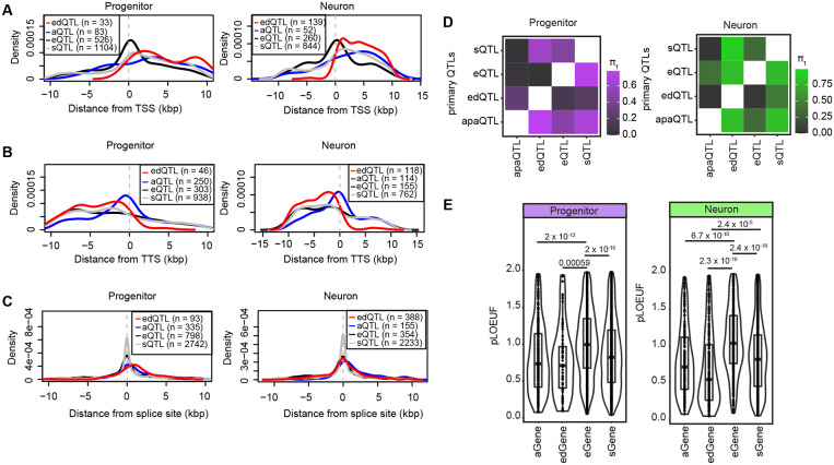
Figure 5. Comparison of cell-type-specific molecular QTLs.
(A) Distribution of primary eQTLs, sQTLs, edQTLs and apaQTLs from transcription start site (TSS) per cell-type, the distance from TSS is shown on the x-axis.
(B) Distribution of primary eQTLs, sQTLs, edQTLs and apaQTLs from transcription termination site (TTS) per cell-type, the distance from TTS is shown on the x-axis.
(C) Distribution of primary eQTLs, sQTLs, edQTLs and apaQTLs from splice sites per cell-type, the distance from splice is shown on the x-axis. Two distances were calculated relative to intron start and end sites, and the shortest distance was used for comparison for each QTL data.
(D) Overlap of primary e/s/ed/apaQTLs via π1 statistics (progenitors in purple and neurons in green). Matrices are colored based on the proportion of progenitor and neuron primary edSNP-edGene, aSNP-aGene, sSNP-sGene, eSNP-eGene pairs that were non-null associations (π1) in each of QTL datasets.
(E) pLOUEF values for aGenes, edGenes, eGenes and sGenes per cell type are shown. P-values from t-test are reported.

