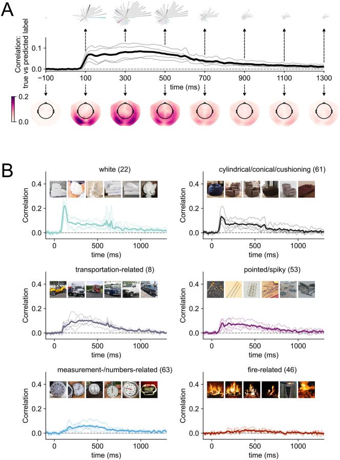
Figure 2. Modelling results for within-participant models of MEG data and multidimensional similarity judgments.
(A) Correlation between the predicted and true behavioral embeddings across all dimensions over time. The thick, black line shows the average across all participants, the thin grey lines individual participants. The rose plots above the timeseries show snapshots of the model performance for each of the 66 dimensions at individual time points. The order of the petals is based on maximum peak amplitude across time (i.e., dimension “white” has the largest peak of all 66 dimensions). Longer petals indicate that there is more information associated with a given dimension in the signal at this timepoint. Petals that are highlighted with individual colors are presented in more detail in panel B. The topographical maps below the timecourses show temporal snapshots of the model performance when it is fitted to individual sensors. Darker colors show a higher correlation between the predicted and true weights at each sensor location. A dynamic version of the topographical plots can be accessed here. (B) Example timecourses for six dimensions. Timecourses were first sorted by peak amplitude, and then we picked every eleventh timecourse to show a representative sample of timecourses with different signal-to-noise ratios. The images within each subplot show the top six stimuli on that dimension. All individual timecourses can be found in the Supplementary Materials (Figure S1). A dynamic version of the rose plots can be accessed here.

