
Extended Data Figure A.3. Average concentration across ZCTAs where different racial/ethnic groups are overrepresented:
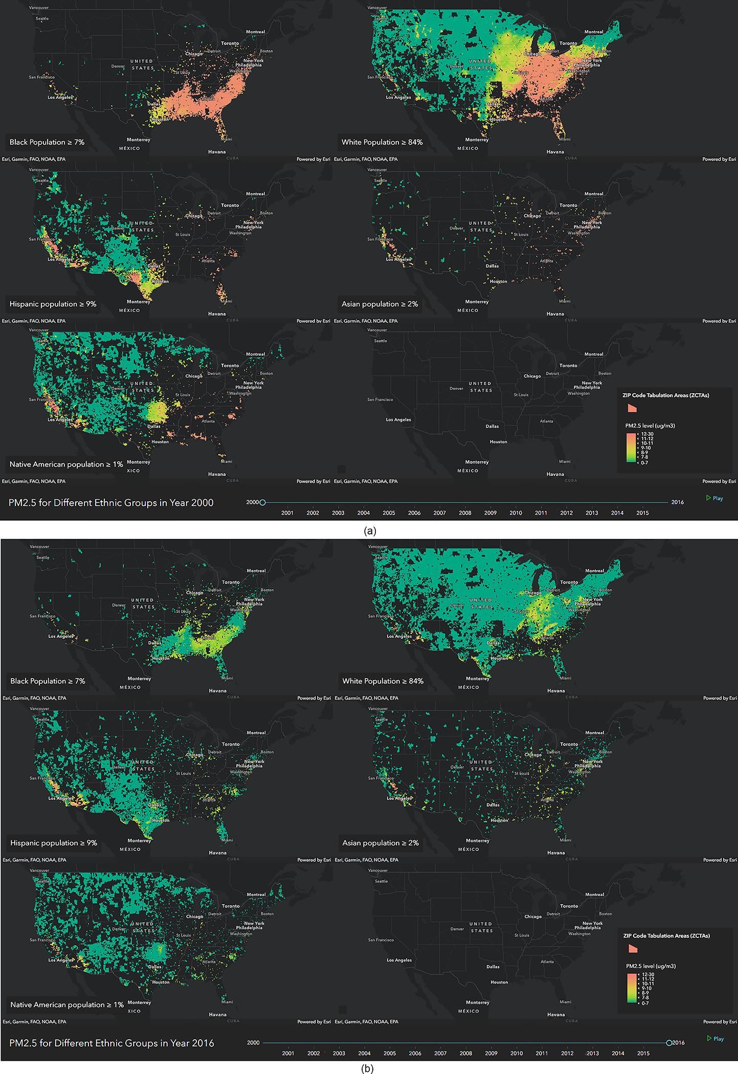
a, Distribution of across five different maps each showing the ZCTAs where one race/ethnicity group is overrepresented for 2000. b, Distribution of across five different maps each showing the ZCTAs where one race/ethnicity group is overrepresented for 2016. We also include an video that shows the change in the distribution of concentration levels across the five maps from 2000 to 2016 (videos 2 and 3).