
Extended Data Figure A.4. Distribution of racial/ethnic populations above a threshold of 8 μg/m3 for 2000 and 2016:
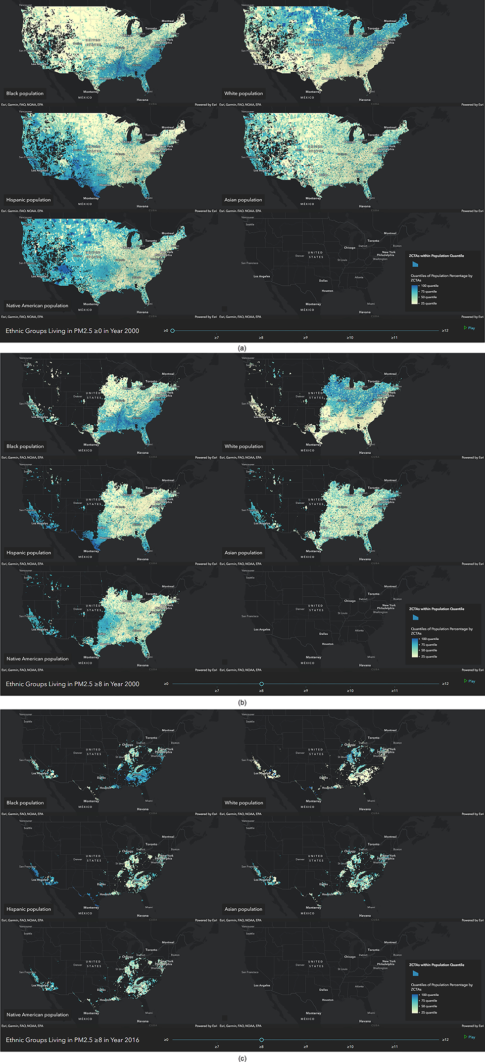
a, US ZCTAs for each race/ethnicity are ranked based on the ratio of the race/ethnicity population to the total ZCTA population. Dark blue indicates fractions close to 1 (ZCTAs where the corresponding race/ethnicity most lives), and light yellow indicates fractions close to 0 (ZCTAs where the corresponding race/ethnicity least lives). b, US ZCTAs above 8 μg/m3 in 2000. c, US ZCTAs above 8 μg/m3 in 2016. We also show the distribution of the different racial/ethnic groups across multiple ranges of concentrations for 2000 and 2016 (videos 5–8).