Abstract
Objectives:
We propose the origami plot, which maintains the original functionality of a radar chart and avoids potential misuse of its connected regions, with newly added features to better assist multicriteria decision-making.
Study Design and Setting:
Built upon a radar chart, the origami plot adds additional auxiliary axes and points such that the area of the connected region of all dots is invariant to the ordering of axes. As such, it enables ranking different individuals by the overall performance for multicriteria decision-making while maintaining the intuitive visual appeal of the radar chart. We develop extensions of the origami plot, including the weighted origami plot, which allows reweighting of each attribute to define the overall performance, and the pairwise origami plot, which highlights comparisons between two individuals.
Results:
We illustrate the different versions of origami plots using the hospital compare database developed by the Centers for Medicare & Medicaid Services (CMS). The plot shows individual hospital’s performance on mortality, readmission, complication, and infection, as well as patient experience and timely and effective care, as well as their overall performance across these metrics. The weighted origami plot allows weighing the attributes differently when some are more important than others. We illustrate the potential use of the pairwise origami plot in electronic health records (EHR) system to monitor five clinical measures (body mass index [BMI]), fasting glucose level, blood pressure, triglycerides, and low-density lipoprotein ([LDL] cholesterol) of a patient across multiple hospital visits.
Conclusion:
The origami plot is a useful visualization tool to assist multicriteria decision making. It improves radar charts by avoiding potential misuse of the connected regions. It has several new features and allows flexible customization.
Keywords: Multivariate data, Radar chart, Ranking, Visualization tool, Polar chart, Star chart, Spider chart
1. Introduction
Data visualization is a critical part of the data analytics lifecycle: synthesizing information, interpreting results, and providing insight into complex data. In many fields, such as health care, marketing, finance, and operations management, data visualization plays an important role in decision-making, which often requires balancing among multiple attributes. Multivariate data can be displayed using a variety of graphical tools, ranging from simple bar charts and pie charts, which directly display numerical values of each attribute [1], to more complex plots that emphasize unique aspects of the data, such as scatter plot matrices [2], heatmaps [3], and radial plots, including radar charts [4,5], target plots [6], and pie charts [6,7].
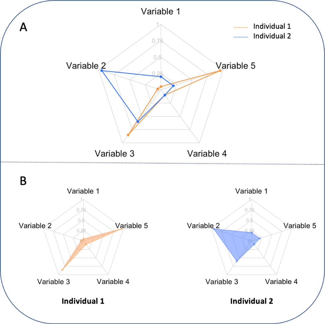
A radar chart, also known as a web chart, spider chart, star plot, or Kiviat diagram, is one of the most commonly used graphical tools for presenting multivariate data, and it is particularly useful for displaying individual performance in consideration of multiple attributes [4]. A radar chart is a circular graphing method presenting multivariate data on axes that are plotted as rays projecting from a central point, with each axis representing an attribute (also referred to as a variable when highlighting its quantitative meaning). A point is placed on each axis at a distance to the central point proportional to the magnitude of the value of the corresponding variable, and all the points are connected to form an enclosed figure (see Fig. 1). Radar charts have been frequently used in biomedical research [6,8–19]. For example, Allen et al. used radar charts for evaluating the performance of hospitals across multiple metrics, including mean in-hospital length of stay, in-hospital mortality rates, 30-day readmission rates, complication rates, and mean costs [17]; Jeong et al. proposed to use radar charts for monitoring the progress of chronic diseases in individual patients, where they provided examples of monitoring measures of metabolic syndromes, such as fasting glucose, blood pressure, triglycerides, and cholesterol level [18] and Seide et al. introduced the utility of radar charts in presenting results from network meta-analyses, in which multiple treatments were compared based on metrics related to efficacy, safety, and cost [19]. Numerous examples of using radar charts to assist with data interpretation are also found in many other areas, including social studies, chemistry, and mechanics [20–22].
Fig. 1.
Sample radar chart. Panel A: two individuals are displayed in one radar plot with two different colours. Panel B: two individuals are plotted side by side with shaded connected regions. (For interpretation of the references to color in this figure legend, the reader is referred to the Web version of this article.)
Information on a radar chart is generally displayed in one of two different formats. The first format visualizes multiple candidates in one chart [8,17]. As shown in Figure 1A, the radar chart compares individuals across several variables. However, when more individuals are compared, the plot becomes crowded and difficult to visually interpret. Another format presents candidates side-by-side (see Fig. 1B), which increases the number of individuals that can be displayed compared to the first type of radar chart [20] but makes it more difficult to compare individuals. Many software tools for creating radar charts also provide options to highlight the connected region by filling them with color (see Fig. 1B). This feature enhances the contrast between the connected region and the region surrounding it, making it easy to read values on each axis and compare their relative lengths, thus providing an overall impression of variables with large values and those with small values [23].
The areas of the connected regions in the radar chart have been used as a primary metric to rank individuals [24], perhaps from the intuition that if an individual has larger values for all variables compared to another individual, the area of the connected region will be larger. In many cases, the area of the connected regions is treated as a measure of the average scoring of all variables (considered as an overall score) when ranking individuals. For example, in Rogliani et al., several therapeutic options for treating chronic obstructive pulmonary disease were evaluated across efficacy and safety outcomes [24]. Each therapeutic option was plotted on a radar chart, and the area of the connected region was used to rank these therapies based on their “combined efficacy/safety profile” [24].
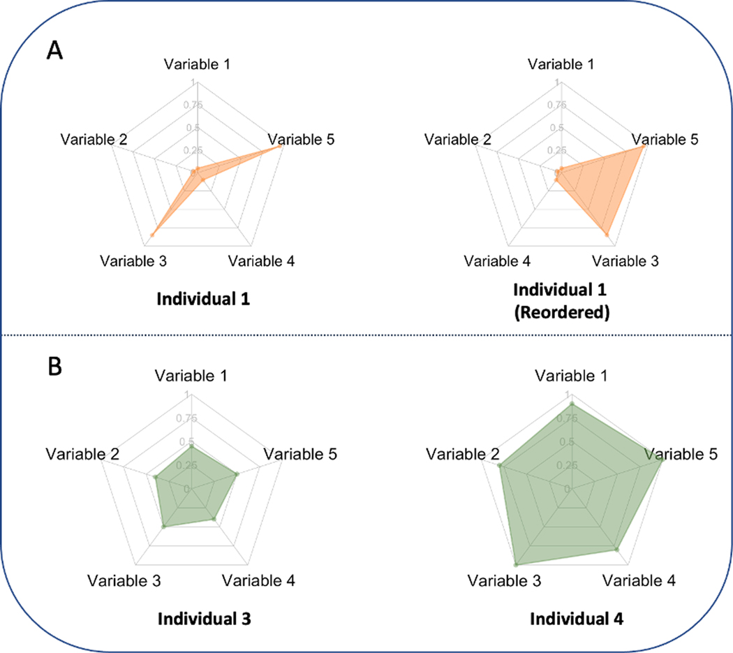
Despite the practical needs of ranking individuals based on an overall score combining all variables in a certain manner, ranking by the area of the connected region in a radar chart is problematic for at least two reasons. First, the areas of the connected regions depend on the order of the axes on the plot. As shown in Figure 2A, the area of the connected region changes after reordering the variables. In fact, the area will be larger if variables with high values are placed on adjacent axes and smaller otherwise. As the order of the axes is often chosen arbitrarily, this can lead to an inconsistent and therefore misleading interpretation of the data. Second, radar charts can distort the interpretation of data, as the area of the connected region is not proportional to the linear variable measures of interest but generally to their squares. As shown in Figure 2B, the shaded area is thus enlarged four-fold when the magnitude of each variable is doubled.
Fig. 2.
Limitations of the radar chart. Panel A: the area of the connected region depends on the order of the axes. Panel B: the area of the connected region is not proportional to the average value across all variables (averaged performance).
In this paper, we suggest a simple and effective alternative, termed the origami plot, which maintains the intuitive visual presentation of the radar chart with a modification that avoids the radar chart’s potentially misleading aspects. The name “origami” derives from the resemblance of the plot to the folded shape of origami art. Unlike the radar chart, the shape and area of a filled-in region of an origami plot are invariant to the relative position of the axes. Further, the area can be used as a valid metric to rank data, with a clear interpretation as the average value of all variables. We can generalize the origami plot to allow specification of weight for each variable and ranking based on the weighted average, which can help to make trade-off decisions. In addition, we create a pairwise origami plot that can easily compare two individuals based on a single variable and the (weighted) average. The proposed origami plot provides a useful tool for visualizing multivariate quantitative variables.
2. Example
We introduce the proposed origami plot using an example of data visualization to assess the performance of health care organizations. The hospital administrative data we use in this example are from the Hospital Compare database developed by the Centers for Medicare & Medicaid Services (CMS), a publicly available source of data on the quality of care provided at over 4,000 Medicare-certified hospitals in the United States. Hospitals are evaluated based on [1] Mortality rates [2]; preventable infections and complication rates due to care provided during hospitalization (infections and complications) [3]; rate of readmission after discharge from the hospital (readmission) [4]; percentage of patients who received appropriate effective care within a certain period (timely and effective care); and [5] patient experiences collected from a national standardized survey (patient experience). More detail regarding the definitions of the five metrics can be found in the Supplementary Material. For each metric, a score is obtained for a hospital as its average percentile rank among all national hospitals. We selected three hospitals from the CMS hospital compare database to illustrate the utility of the new plot. Although the data are fully publicly available (https://data.cms.gov/provider-data/), we mask the names of the hospitals to protect their privacy.
3. Development of the origami plot
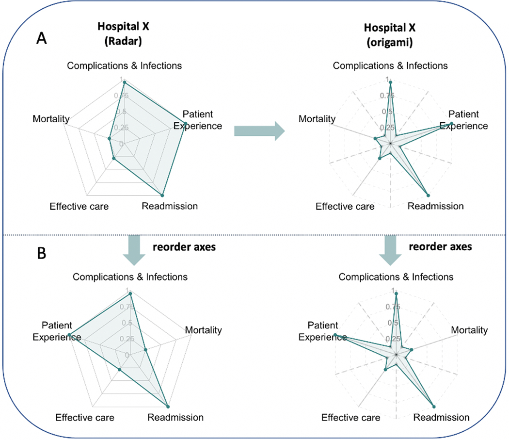
As illustrated in Figure 3A, to construct an origami plot, we first plot the axes of the radar chart as solid lines together with the location of the variable score on each axis as a filled circle or point. We call these axes the main axes of the origami plot. We then add auxiliary axes (dashed lines), equidistant between each pair of adjacent main axes, and place a point on each auxiliary axis equidistant from the centre point at a distance that can be customized by the user. Choosing a shorter distance makes the connected region a star-like shape, which highlights the main axes since the arms will be pointing outward. In some cases, the distance can be chosen to provide additional information. A more detailed discussion on how to choose the distance is included in Appendix C of the Supplementary Material. Then, starting from any of the points on a main or auxiliary axis, we connect all the points in order (i.e., moving clockwise or counter-clockwise) and obtain a connected region that resembles an origami star. Each point (or vertex) on the main axis of the star represents one variable with a length based on its value. In this way, as illustrated by Figure 3B, the filled-in region of the origami plot not only has an area invariant to the arrangement of axes (a proof can be found in the Supplementary Material), but the overall shape of the graph changes only up to a permutation of the axes. Furthermore, the area of the plot is proportional to the average rank across the different variables. This provides readers with a stable impression of each participant with a clear understanding of which variables have relatively larger and/or smaller values. Note that this invariance is not maintained by permuting axes in the radar plot. As with the radar chart, the origami plot maintains the two types of visualization introduced in Section 1. Users can choose to visualize multiple participants in one plot or separate plots. To better assist decision-making, we shade (color) the connected region to aid comparisons based on the average of all variables. We can also place the numerical values or rankings based on single variables next to the corresponding axes and place the overall score or ranking on the top of each plot when necessary.
Fig. 3.
Panel A illustrates a sample radar chart and origami plot using the same dataset from hospital X. For the origami plot, five auxiliary axes (dashed lines) are added in addition to the original five main axes (solid lines) in the radar chart. Each dashed line is placed equidistant between two axes. Points on the main axes are the same in both plots. In the origami plot, an additional five points are added to each auxiliary axis with the same distance to the origin. All points are connected in order. Panel B illustrates that after a change in the order of the axes, the size of the shaded area in the radar chart changes, while the size of the shaded area in the origami plot remains unchanged (a proof is provided in the supplement).
We note that the scale and units of each variable need to be carefully chosen so the area of the connected region is meaningful. Sometimes, the natural scales or units of the variables cannot be properly combined. In our example, the mortality rates are not directly comparable with scores obtained from the patient experience survey. We, therefore, converted the original measures to their percentiles relative to all US hospitals. This puts each variable on a comparable scale when evaluating overall performance. Alternatively, one can normalize the axes relative to the average value of the variable or an external reference such as a national average.
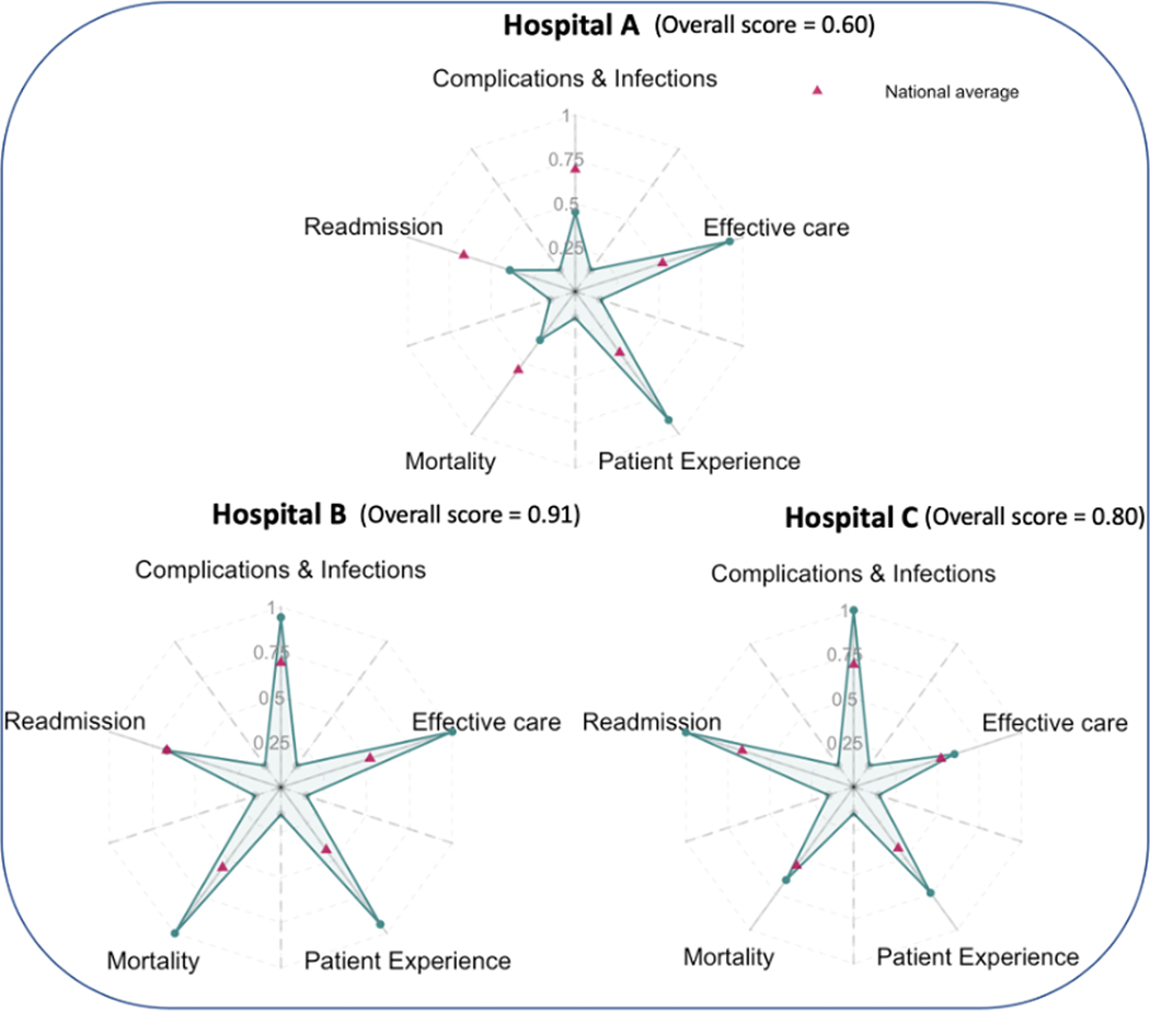
Figure 4 presents origami plots comparing the three different hospitals. In addition to the scores of each hospital, we use pink triangles to indicate the national average performance on the axes to help readers see whether a hospital has scores above or below the national average. In our example, Hospitals B and C scored above the national average for all metrics, while Hospital A’s performance on readmission, complication and infections, and mortality are below the national average. When comparing multiple hospitals based on a single metric, e.g., readmission rate, we could easily rank the three hospitals with hospital C as the best and hospital A as the worst. If all the metrics are valued equally, the areas of the shaded regions show that hospital B has the best overall performance, while hospital A has the worst overall performance. In this way, the origami plot can facilitate the comparison of hospitals on single measures and overall performance based on multiple metrics.
Fig. 4.
Performance of three different hospitals presented using origami plots. Hospitals are compared based on scores evaluating mortality, complications and infections, timely and effective care, readmission, and patient experience. All scores are on a scale from 0 to 1 as percentiles among all the hospitals, with larger values indicating better performance. An overall score is calculated as the average score across five metrics, and it is proportional to the area of the shaded star. Pink triangles on the main axes indicate the average performance across all hospitals in the Centers for Medicare & Medicaid Services hospital compare database. (For interpretation of the references to color in this figure legend, the reader is referred to the Web version of this article.)
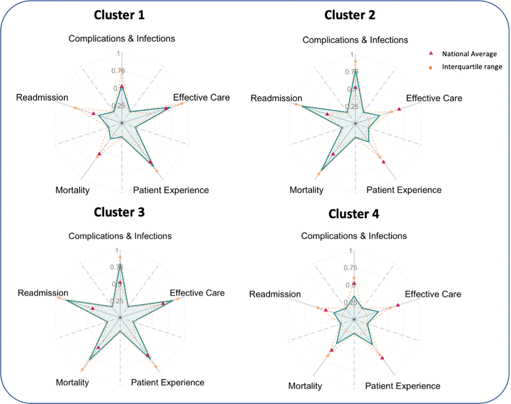
Origami plots can also facilitate comparisons of large numbers of individuals clustered into a small number of groups based on criteria of interest. In our example, a K-means clustering analysis across 4,671 hospitals in the database identified four clusters of hospitals sharing similar profiles [25]. The origami plot in Figure 5 illustrates the performance (average percentiles) of each cluster. In the first cluster, hospitals score well across all five outcomes, with average performance on each metric better than the national average. The second cluster of hospitals has higher scores in mortality (low mortality rates), readmission (low readmission rates), and complication and infection (low complication and infection rates), but low scores in patient experience and timely and effective care. These hospitals provide effective and safe care, but their patients might experience longer wait times before treatment or might have unsatisfactory interactions with doctors or nurses. Conversely, hospitals in the third cluster have high scores in timely and effective care and patient experience but low scores for mortality, readmission and complications, and infections. High mortality and readmission rates could result from either poor care in the hospitals or from sicker individuals presenting to these hospitals. Finally, the fourth cluster of hospitals has scores from all five outcomes below national averages. The variability of the cluster profiles is visualized by the orange-dashed lines representing the interquartile ranges.
Fig. 5.
Performance of four clusters of hospitals using origami plots. Clusters identified by K-means cluster analysis of 4,671 hospitals. Each axis plots the average percentile of the hospitals in the cluster for a particular attribute. Pink triangles on the main axes indicate the average performance across all hospitals in the Centers for Medicare & Medicaid Services hospital compare database. The orange-dashed lines indicate the interquartile range of each cluster. (For interpretation of the references to color in this figure legend, the reader is referred to the Web version of this article.)
4. Weighted origami plot
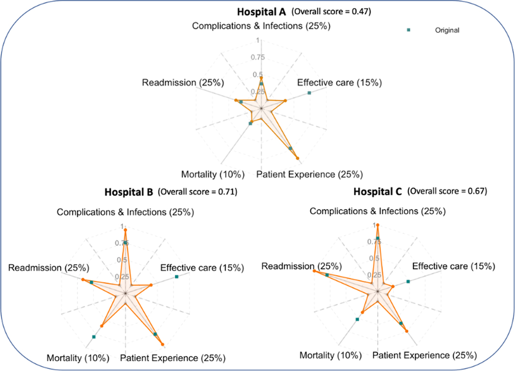
When certain attributes are considered more important than others in making a decision, the attributes comprising the origami plot can be weighted to account for their relative contributions. The area of the connected region in the weighted origami plot is then a weighted average of the different attributes. Weights could, for example, represent decision makers’ beliefs about the relative importance of the different outcomes being considered [26,27]. For a given set of positive weights that sum to one, the lengths of the arms are weighted so that the new length equals the old length times the ratio of the corresponding new weight to the original weight (which was the equal weight given to all attributes). Figure 6 presents the weighted origami plots of the three hospitals compared in Figure 4, where we assign different weights to the five metrics, as indicated in the figure by the percentage weight values assigned to the attributes on each of the plot axes. The shaded regions are now proportional to the weighted sums. The original values of each attribute are plotted as green squares. With less weight assigned to mortality and effective care and more weight assigned to complications and infections, readmission, and patient experience, the weighted overall performance of hospital C becomes comparable to hospital B and hospital A.
Fig. 6.
Performance of three hospitals presented as a weighted origami plot. Metrics including mortality, timely and effective care, readmission, patient experience, and complication & infections are assigned weights 10%, 15%, 25%, 25%, and 25% (summing up to 100%), respectively. An overall score calculated as the weighted average score across five metrics is proportional to the area of the connected regions. The green squares show the original attribute scores. The vertices of the weighted star are the weighted scores. (For interpretation of the references to color in this figure legend, the reader is referred to the Web version of this article.)
5. The pairwise origami plot
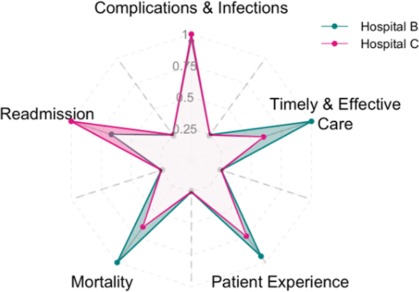
When comparing two individuals, we propose a pairwise origami plot that highlights comparisons based on single variables as well as the (weighted) average. This is a version of the initial plot format in Figure 1 in which only two individuals (hospitals) are pictured to help better visualize the difference between the two individuals. In Figure 7, we compare hospitals B and C in the same plot with two distinct colors (green and pink) using equal weights for all variables. When comparing two candidates, the difference in the performance between two candidates might be of more interest than the actual performance of each candidate. To highlight this, instead of filling in each star, we fill in the additional area covered by the superior candidate on each variable in green if hospital B performs better and in pink if hospital C performs better. In this way, we can observe that hospital B performs better than hospital C for mortality, patient experience, and timely and effective care, while hospital C performs better than B for readmission. The two perform equivalently for and complications and infections. Overall, since the total area in green is larger than the total area in pink, we know that hospital B performs better than hospital C on average when all metrics are considered equally. The pairwise comparison can also be combined with the weighted origami plot to incorporate user-specified weights for each variable.
Fig. 7.
Equally weighted pairwise origami plot. Comparison between hospitals B and C are represented in two distinct colors (green and pink). The shaded regions in green indicate metrics in which hospital B performs better than hospital C, and shaded regions in pink show metrics in which hospital C performs better than hospital B. (For interpretation of the references to color in this figure legend, the reader is referred to the Web version of this article.)
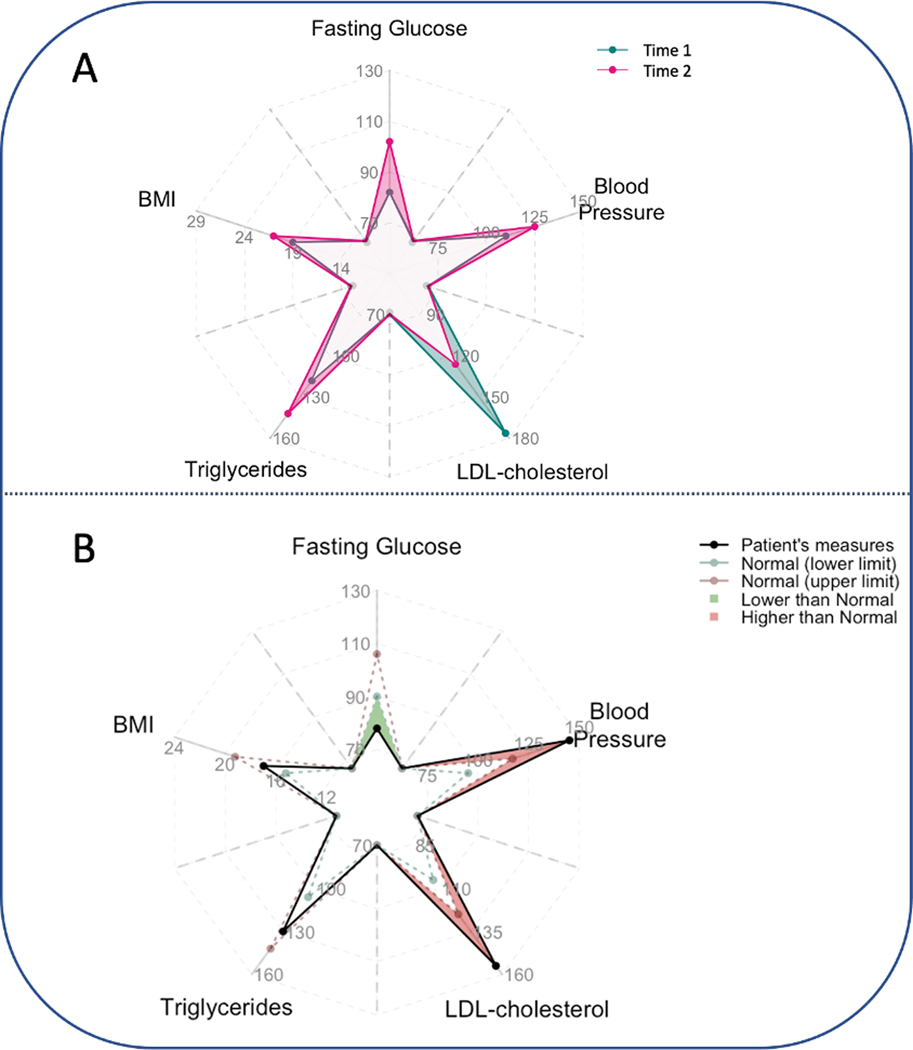
In addition to comparing hospitals or interventions, the pairwise origami plot can also serve as a tool for monitoring health conditions and disease progression. For example, some chronic diseases require long-term care, and monitoring temporal changes of diverse types of laboratory and clinical measures can play an important role in timely disease management and treatment. Suppose we are interested in monitoring five clinical measures (body mass index (BMI), fasting glucose level, blood pressure, triglycerides, and low-density lipoprotein (LDL) cholesterol) of a patient across multiple hospital visits. Figure 8 provides two potential ways of using origami plots to aid data visualization in this context. In panel A, we compare the measures between the two times. We observe that between time 1 and time 2, fasting glucose, blood pressure, triglycerides, and BMI increase but LDL cholesterol decreases. In panel B, we compare the observations with the normal ranges of the lab measures. If one measure is higher than the normal range, we highlight the excess area in red, and if it is below the range, we highlight the area in deficit in green. These plots can potentially be embedded in an electronic health records (EHR) system to assist timely and interpretable clinical decision-making.
Fig. 8.
Two potential use cases of the pairwise origami plot for monitoring clinically relevant health measures (fasting glucose level, BMI, blood pressure, LDL-cholesterol and triglycerides) in a single patient. Panel A: Comparison between two times. From time 1 to time 2, fasting glucose level, blood pressure, and triglycerides increase, while LDL decrease. Panel B: Comparison to normal limits. For each attribute, normal ranges of individual variables are indicated by the dashed lines (green: lower limit; red: upper limit) (black solid line). If one value is higher than its upper limit, the region between the upper limit and the value is shaded in red; if it is lower than its lower limit, the region between the upper limit and the value is shaded in green. (For interpretation of the references to color in this figure legend, the reader is referred to the Web version of this article.)
6. Discussion and conclusion
While radar charts are widely used to visualize multivariate data, these charts have limitations that can cause potentially misleading interpretations and conclusions. The proposed origami plot, as a modified version of the radar chart, maintains all the original functionality of radar charts and avoids potential misuse of the connected region, providing a valid visualization to compare individuals based on the averaged performance of multiple attributes. Extensions of the origami plot, including the weighted origami plot and the pairwise origami plot, allow incorporating more information to better assist decision-making based on multiple attributes. We have also described the potential uses of the origami plot in profiling hospital performance and disease monitoring. The origami plot is an informative and general tool to visualize multivariate data.
Beyond the use cases described in this paper, the origami plot can also be used in other areas, such as comparative effectiveness research for comparing treatment effects, visualizing an individual’s risks for multiple diseases, profiling disease subtypes, etc. Additional customized features might be developed to improve the visualization. For example, if some of the measures are statistics calculated from a sample, proper annotations can be added to indicate statistical significance, or P-values and the 95% confidence intervals (CIs) of the statistics can be shown in the plot to display the potential uncertainty. Instead of using the dashed lines in Figure 8 to represent the upper and lower limits of a reference level, they could represent the lower and upper limits of a CI.
Finally, we emphasize that to make an informed interpretation using the area of the connected region, the scale and unit of each variable need to be carefully chosen such that the (weighted) average is meaningful. We recommend using the original values of variables when they have the same natural units (e.g., scores of exams for different courses) and otherwise converting the original values to comparable units, such as percentiles or rankings. Our software package (https://github.com/Penncil/Origami) for R provides multiple options of variable transformations.
Supplementary Material
What is new?
Key findings
The radar chart, a widely-used circular graphing tool for displaying performance across multiple attributes, can be visually misleading when used to rank candidates based on the area of the connected region.
We propose the origami plot, a new visualization tool for multicriteria decision-making that improves upon the radar chart by avoiding potential misinterpretation and misuse of the area metric.
We developed two useful variants: the weighted origami plot, which allows users to reweight each attribute to define overall performance and rank individuals accordingly, and the pairwise origami plot, which highlights comparisons between two individuals across multiple attributes.
What this adds to what was known?
The origami plot offers a visually appealing and intuitive way to rank individuals based on overall performance across multiple attributes, without the potential for misinterpretation that the radar chart presents.
The weighted origami plot provides greater flexibility by allowing users to customize the relative importance of each attribute.
The pairwise origami plot enables direct comparisons between two individuals across multiple attributes, providing valuable insights for decision-making.
What is the implication and what should change now?
The origami plot should be considered as a useful alternative to radar charts for making trade-off decisions based on a clearer understanding of overall performance across multiple attributes.
Users can take advantage of the customized options available with the origami plot, including the pairwise and weighted variants, as well as additional annotations, to further enhance their decision-making capabilities.
Acknowledgments
This work was supported in part by National Institutes of Health (1R01GM148494, 1R01LM012607, 1R01AI130460, 1R01AG073435, 1R56AG074604, 1R01LM013519, 1R56AG069880, 1U01TR003709). This work was supported partially through Patient-Centered Outcomes Research Institute (PCORI) Project Program Awards (ME-2019C3-18315 and ME-2018C3-14899). All statements in this report, including its findings and conclusions, are solely those of the authors and do not necessarily represent the views of the Patient-Centered Outcomes Research Institute (PCORI), its Board of Governors or Methodology Committee.
Footnotes
Declaration of interests: The authors declare that they have no known competing financial interests or personal relationships that could have appeared to influence the work reported in this paper.
Supplementary data
Supplementary data to this article can be found online at https://doi.org/10.1016/j.jclinepi.2023.02.020.
References
- [1].Friendly M. A brief history of data visualization. Handbook of data visualization. Berlin, Heidelberg: Springer; 2008:15–56. [Google Scholar]
- [2].Elmqvist N, Dragicevic P, Fekete J-D. Rolling the dice: multidimensional visual exploration using scatterplot matrix navigation. IEEE Trans Vis Comput Graph 2008;14(6):1141–8. [DOI] [PubMed] [Google Scholar]
- [3].Wilkinson L, Friendly M. The history of the cluster heat map. Am Statistician 2009;63(2):179–84. [Google Scholar]
- [4].Chambers JM, Cleveland WS, Kleiner B, Tukey PA. Graphical methods for data analysis. New York, NY: Chapman and Hall/CRC; 2018. [Google Scholar]
- [5].Friendly M. Statistical graphics for multivariate data. SAS SUGI 1991;16:1157–62. [Google Scholar]
- [6].Stafoggia M, Lallo A, Fusco D, Barone AP, D’Ovidio M, Sorge C, et al. Spie charts, target plots, and radar plots for displaying comparative outcomes of health care. J Clin Epidemiol 2011;64:770–8. [DOI] [PubMed] [Google Scholar]
- [7].Daly CH, Mbuagbaw L, Thabane L, Straus SE, Hamid JS. Spie charts for quantifying treatment effectiveness and safety in multiple outcome network meta-analysis: a proof-of-concept study. BMC Med Res Methodol 2020;20:1–13. [DOI] [PMC free article] [PubMed] [Google Scholar]
- [8].Saary MJ. Radar plots: a useful way for presenting multivariate health care data. J Clin Epidemiol 2008;61:311–7. [DOI] [PubMed] [Google Scholar]
- [9].Kolence KW, Kiviat PJ. Software unit profiles & Kiviat figures. Perform Eval Rev 1973;2(3):2–12. [Google Scholar]
- [10].Black CJ, Yiannakou Y, Guthrie EA, West R, Houghton LA, Ford AC. A novel method to classify and subgroup patients with IBS based on gastrointestinal symptoms and psychological profiles. Am J Gastroenterol 2021;116(2):372–81. [DOI] [PubMed] [Google Scholar]
- [11].Banerjee P, Eckert AO, Schrey AK, Preissner R. ProTox-II: a web-server for the prediction of toxicity of chemicals. Nucleic Acids Res 2018;46:W257–63. [DOI] [PMC free article] [PubMed] [Google Scholar]
- [12].Zhu B, Song N, Shen R, Arora A, Machiela MJ, Song L, et al. Integrating clinical and multiple omics data for prognostic assessment across human cancers. Sci Rep 2017;7(1):1–13. [DOI] [PMC free article] [PubMed] [Google Scholar]
- [13].Henry A, Kyle S, Chisholm A, Griffiths C, Bundy C. A cross-sectional survey of the nature and correlates of sleep disturbance in people with psoriasis. Br J Dermatol 2017;177(4):1052–9. [DOI] [PubMed] [Google Scholar]
- [14].Wagner R, Heni M, Tabák AG, Machann J, Schick F, Randrianarisoa E, et al. Pathophysiology-based subphenotyping of individuals at elevated risk for type 2 diabetes. Nat Med 2021;27:49–57. [DOI] [PubMed] [Google Scholar]
- [15].Nguyen D-T, Mathias S, Bologa C, Brunak S, Fernandez N, Gaulton A, et al. Pharos: collating protein information to shed light on the druggable genome. Nucleic Acids Res 2017;45:D995–1002. [DOI] [PMC free article] [PubMed] [Google Scholar]
- [16].Karasaki T, Nagayama K, Kuwano H, Nitadori J-I, Sato M, Anraku M, et al. An immunogram for the cancer-immunity cycle: towards personalized immunotherapy of lung cancer. J Thorac Oncol 2017;12:791–803. [DOI] [PubMed] [Google Scholar]
- [17].Allen CJ, Eska JS, Thaker NG, Feeley TW, Kaplan RS, Huey RW, et al. Developing a value framework: utilizing administrative data to assess an enhanced care initiative. J Surg Res 2021;262:115–20. [DOI] [PubMed] [Google Scholar]
- [18].Jeong S, Youn C-H, Kim Y-W, editors. A method for identifying temporal progress of chronic disease using chronological clustering. 2013 IEEE 15th International Conference on e-Health Networking, Applications and Services (Healthcom 2013). Lisbon, Portugal: IEEE; 2013. [Google Scholar]
- [19].Seide SE, Jensen K, Kieser M. Utilizing radar graphs in the visualization of simulation and estimation results in network meta-analysis. Res Synth Methods 2021;12(1):96–105. [DOI] [PubMed] [Google Scholar]
- [20].Mann DL. Better technology forecasting using systematic innovation methods. Technol Forecast Soc Change 2003;70(8):779–95. [Google Scholar]
- [21].Suzuki Y, Chikaraishi Y, Ogawa NO, Ohkouchi N, Korenaga T. Geographical origin of polished rice based on multiple element and stable isotope analyses. Food Chem 2008;109(2):470–5. [DOI] [PubMed] [Google Scholar]
- [22].McCann MR, Flanagan SP. The effects of exercise selection and rest interval on postactivation potentiation of vertical jump performance. J Strength Cond Res 2010;24(5):1285–91. [DOI] [PubMed] [Google Scholar]
- [23].Nakazawa M, Nakazawa MM. Package ‘fmsb’. Available at https://cranr-project.org/web/packages/fmsb/fmsb.pdf. Accessed March 9, 2023. [Google Scholar]
- [24].Rogliani P, Matera MG, Ritondo BL, De Guido I, Puxeddu E, Cazzola M, et al. Efficacy and cardiovascular safety profile of dual bronchodilation therapy in chronic obstructive pulmonary disease: a bidimensional comparative analysis across fixed-dose combinations. Pulm Pharmacol Ther 2019;59:101841. [DOI] [PubMed] [Google Scholar]
- [25].Kodinariya TM, Makwana PR. Review on determining number of cluster in K-means clustering. Int J 2013;1(6):90–5. [Google Scholar]
- [26].Triantaphyllou E. Multi-criteria decision making methods. Multi-criteria decision making methods: A comparative study. New York, NY: Springer; 2000:5–21. [Google Scholar]
- [27].Aruldoss M, Lakshmi TM, Venkatesan VP. A survey on multi criteria decision making methods and its applications. Am J Inf Syst 2013; 1(1):31–43. [Google Scholar]
Associated Data
This section collects any data citations, data availability statements, or supplementary materials included in this article.


