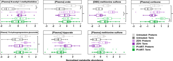
Fig. 4.
Selected metabolite abundances. Boxplots of normalized metabolite abundance values for selected features. Bold lines indicate medians, whiskers indicate 1.5*IQR (interquartile range) from first and third quartiles, and points indicate individual sample values. Statistically significant comparisons are marked with * FDR-adjusted p < 0.05, **FDR-adjusted p < 0.01 for comparison of PTB versus term delivery by treatment group (small brackets) or all PTB versus term delivery (large bracket)

