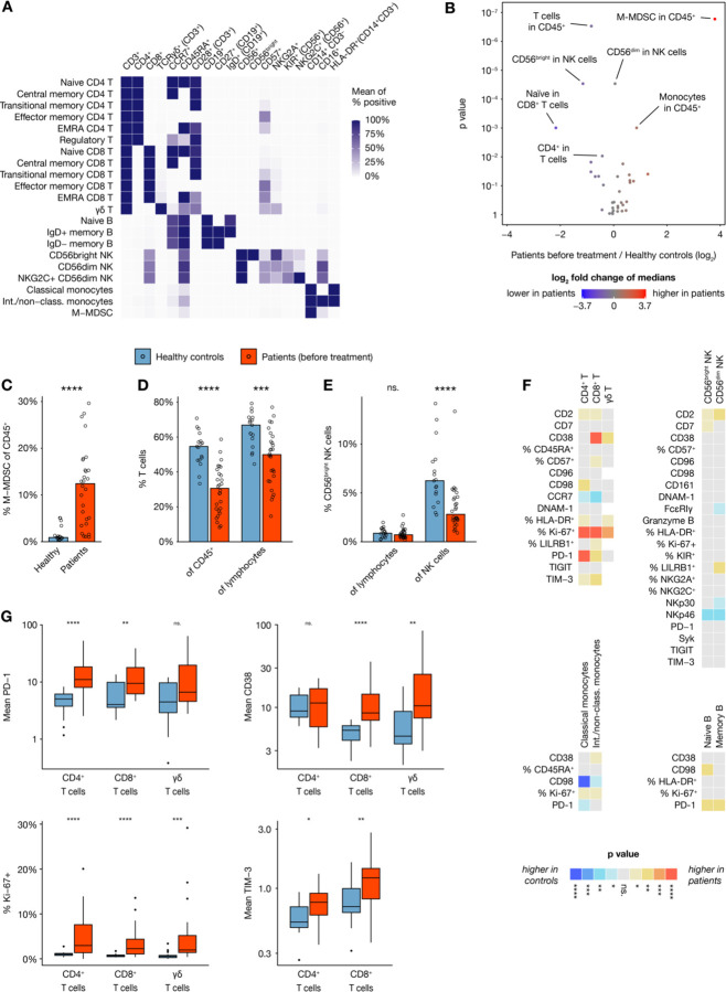
Figure 3. Peripheral blood immune cell composition in DLBCL.
(A) Heat map showing expression of key markers in subsets of analyzed cell types, visualizing how subsets were defined for downstream analysis. (B) Volcano plot showing size differences of 36 key immune cell types between healthy donors and all patients before chemotherapy. (C– E) Bar plots showing percentages of (C) M–MDSC (defined as HLA-DR− CD14+ CD19− CD3− CD56− cells), (D) T cells and (E) CD56bright NK cells, within various parent populations in healthy controls (n=17) and all patients before therapy (n=28). (F) Heatmap showing differences in marker expression between healthy controls (n=17) and patients before therapy (n=21–28) within multiple immune cell subsets, with colors indicating direction of difference and statistical significance from nonparametric tests without p value adjustment. Values are mean intensity values unless otherwise indicated. (G) Box plots showing selected readouts from (F).

