Abstract
Big data have revolutionized the way data are processed and used across all fields. In the past, research was primarily conducted with a focus on hypothesis confirmation using sample data. However, in the era of big data, this has shifted to gaining insights from the collected data. Visualizing vast amounts of data to derive insights is crucial. For instance, leveraging big data for visualization can help identify and predict characteristics and patterns related to various infectious diseases. When data are presented in a visual format, patterns within the data become clear, making it easier to comprehend and provide deeper insights. This study aimed to comprehensively discuss data visualization and the various techniques used in the process. It also sought to enable researchers to directly use Python programs for data visualization. By providing practical visualization exercises on GitHub, this study aimed to facilitate their application in research endeavors.
Keywords: Big data, Data visualization, Matplotlib, Seaborn, Python
INTRODUCTION
This article will cover the following topics: (1) why data visualization is important; (2) data visualization libraries in Python; and (3) method of drawing graphs using data visualization libraries.
WHY IS DATA VISUALIZATION IMPORTANT?
What is data visualization?
Data visualization refers to the graphical representation of ‘raw’ data and simple summary information. It is also useful for data cleaning, exploration of data structures, outlier detection, clustering and pattern discovery, evaluation of modeling results, and presenting findings [1]. Owing to these benefits, effective visualization aids researchers in understanding their data and conveying insights [2]. Additionally, graphics stimulate researchers to propose questions and ideas. However, interpreting graphics requires experience, and to prevent overinterpretation, statistical knowledge is necessary [1].
Data exploration
Through data visualization, complex datasets can be understood more easily. Valuable insights that are difficult to grasp from raw data alone can be obtained. Visual representation facilitates the identification of patterns and correlations more effortlessly.
Identifying trends and anomalies
Data visualization aids in grasping trends, outliers, extreme values, and more. It is useful in identifying sudden increases or decreases in the data, possible performance improvements, and factors influencing specific outcomes.
Effective communication
Visualization is a powerful tool for conveying data to others. It allows complex concepts and results to be presented in a visual and intuitive manner, enabling smooth communication. Data visualization promotes communication and collaboration among experts from various fields, facilitating informed decision-making based on information.
In summary, data visualization is an essential tool for obtaining meaningful insights from data, ultimately leading to better outcomes.
DATA VISUALIZATION LIBRARIES IN PYTHON
Data visualization tools and techniques are essential for analyzing vast amounts of information and making data-driven decisions. Although there are several programming languages available for this purpose, the present study focuses only on data visualization libraries commonly used in Python. This programming language provides rich libraries for data visualization, and we describe the Matplotlib and Seaborn libraries in this study. Using these libraries, we can generate various charts such as bar charts, histograms, and scatter plots.
Matplotlib
Matplotlib [3] is a graphic library for data visualization that has been well-established, undergoing almost 20 years of continuous development. It is the most popular data visualization library in Python and is used by scientists and researchers worldwide [4]. Matplotlib is a comprehensive package with all the modules and libraries included, and it offers great flexibility to precisely control the arrangement and visual appearance of objects within plots.
Seaborn
Seaborn is a Python data visualization library based on Matplotlib and closely integrated with numpy and pandas data structures [5]. It is a specialized interface for creating statistical graphics. Seaborn provides simpler syntax and more appealing designs than Matplotlib. It automatically maps data values to visual attributes like color, size, and style, and internally computes statistical transformations [6].
Method of drawing graphs using data visualization libraries
In this study, we aimed to explain how to implement data visualization using Python’s Matplotlib and Seaborn libraries. Practical code and data can be downloaded from GitHub for learning purposes (https://github.com/soyul5458/Python_data_visualization). The practical exercises were conducted using Google Colab, which is free and can be accessed anytime, anywhere with a Gmail account, without the need to download any separate program.
Matplotlib
Basic visualization
Using Matplotlib, various types of graphs can be easily drawn. The “pyplot” module is a sub-module of Matplotlib that provides a simple and user-friendly interface for generating different types of graphs, such as line plots, bar plots, histograms, and scatter plots. To use it conveniently, we import it with the alias “plt.”
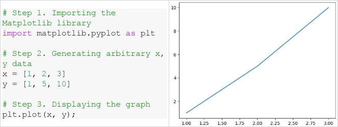
Generally, the visualization process in Fig. 1 consists of three steps: (1) step 1: import the visualization library; (2) step 2: decide which data to display on the x and y axes; and (3) step 3: enter the graph output function.
Fig. 1.
Line graph representation using Matplotlib.
Specifying options for creating figures
When creating graphs for data visualization, there are several options that can be used to effectively present the figures. For example, adding graph titles, x- and y-axis names, legends, and other options can help the reader to better understand the figures.
1) Title (Fig. 2)
Fig. 2.
Setting the graph title.
2) Axis labels (Fig. 3)
Fig. 3.
Setting names for the x and y axes.
3) Legend (Fig. 4)
Fig. 4.
Adding a legend.
The plt.legend() function is used to add a legend, and the label of the added legend is displayed with the name set in the label argument of the plot() function. The position of the legend can be set using the loc argument.
4) Line width (Fig. 5)
Fig. 5.
Setting the line width.
5) Line style (Fig. 6)
Fig. 6.
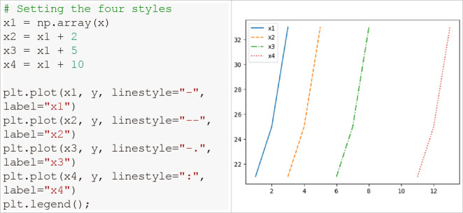
The line graph displays four different line styles.
Four different styles listed in Table 1 can be used. Using the linestyle argument, different line styles can be displayed as shown in Fig. 6.
Table 1.
Line styles in Matplotlib
| Character | Description |
|---|---|
| - | solid |
| -- | dashed |
| -. | dash-dot |
| : | dotted |
6) Marker (Fig. 7)
Fig. 7.
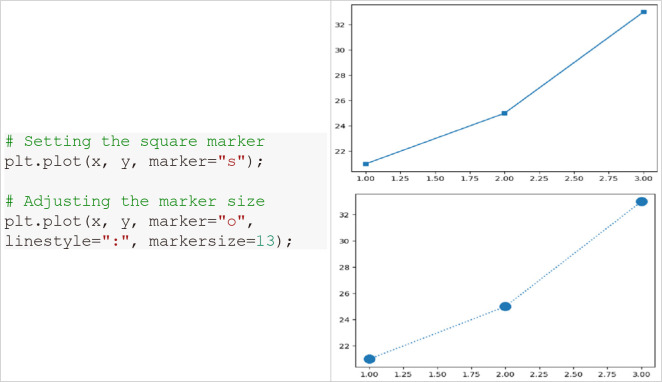
Setting the marker.
If you want to represent points, add the marker argument. The shape of the marker can be changed in various ways, and the types can be found in matplotlib.markers (https://matplotlib.org/stable/api/markers_api.html). The size of the marker can also be set as desired.
7) Color (Fig. 8)
Fig. 8.
Setting color.
Graph color is added to the plot function using the color argument. It is possible to change to default colors using color abbreviations, and various colors can be selected from the Matplotlib gallery. Not only the line color but also the color of the marker and its edge can be changed.
In addition to the above, practical codes for resizing the graph, setting dpi, background color, axis ranges, axis ticks, grid, and saving the graph can be found in the matplotlib.ipynb file on GitHub.
Basic plotting with Matplotlib
1) Line plot (Fig. 9)
Fig. 9.
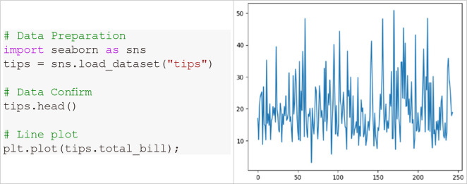
Line graph representation with Matplotlib.
Line graphs are frequently used to represent trends over time.
2) Bar plot
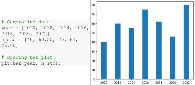
Bar graphs are used to represent group differences. Each bar’s length corresponds to the respective value. Both vertical and horizontal bar graphs can be created. Additionally, patterns can be added to the bars and adjust their widths.
(1) Vertical bar graph (Fig. 10)
Fig. 10.
Vertical bar graph representation with Matplotlib.
(2) Horizontal bar graph (Fig. 11)
Fig. 11.
Horizontal bar graph representation with Matplotlib.
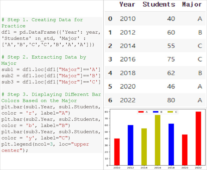
(3) Displaying different bar colors (Fig. 12)
Fig. 12.
Displaying different bar colors based on categorical variables.
Bars can be displayed in different colors based on categorical variables, as demonstrated in the following example, where we will perform a practical code exercise to show colors corresponding to major categories.
3) Box plot
Box plots are exploratory graphs that represent data distributions. They quickly show the range, median, and outliers of the dataset.
(1) Drawing a single box plot (Fig. 13)
Fig. 13.
Visualization of a single box plot with Matplotlib.
(2) Drawing multiple box plots (Fig. 14)
Fig. 14.
Visualization of multiplt box plot with Matplotlib.
4) Histogram
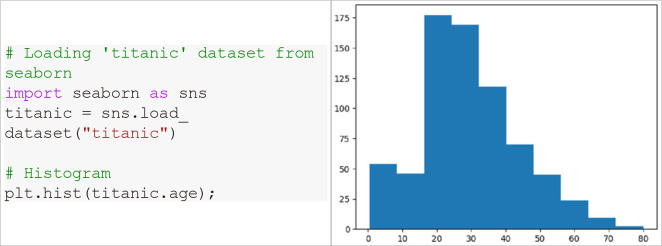
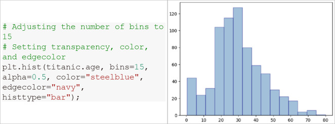
Histograms graphically represent frequency distribution tables. The horizontal axis represents intervals, and the vertical axis represents frequencies. The hist() function can be used to create histograms that divide data values into equal intervals called bins, and the size of bins affects the frequency and shape of the histogram.
(1) Basic histogram (Fig. 15)
Fig. 15.
Visualization of histogram with Matplotlib.
(2) Adjusting the graph using various options (Fig. 16)
Fig. 16.
Adjusting the histogram using various options.
5) Scatter plot (Fig. 17)
Fig. 17.
Visualization of scatter plot with Matplotlib.
Scatter plots graphically represent the correlation between two variables on a coordinate plane using dots. Scatter plots can easily be drawn using the scatter() function. The markers can be changed to different shapes using the marker argument described above.
6) Pie chart
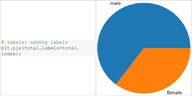
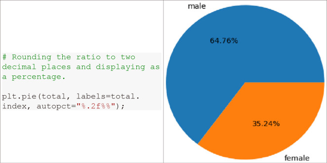
Pie charts are used to visually display the overall proportions of categorical data. They provide a convenient way to see the size and relative proportions of each section. The autopct argument in the pie() function specifies the format of the numbers displayed inside the sectors. The value %.2f displays numbers up to two decimal places. The percentage symbol can be included by inputting %.2f%% consecutively. A legend can also be added using the legend() function.
(1) Data preparation (Fig. 18)
Fig. 18.
Verification of data quantity.
(2) Drawing pie chart (Fig. 19)
Fig. 19.
Visualization of pie chart with Matplotlib.
(3) Displaying percentage (Fig. 20)
Fig. 20.
Displaying percentages in a pie chart.
Seaborn
Figure-level vs. axes-level function
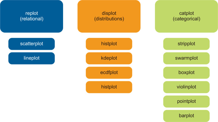
Seaborn functions can be broadly categorized into ‘figure-level’ and ‘axes-level’ functions. The three large boxes at the top in Fig. 21 (replot, displot, catplot) are figure-level functions, and the smaller boxes below are axes-level functions. Figure-level functions create a Seaborn figure separately from Matplotlib and perform plotting on that figure. Therefore, the layout can be changed using facetgrid (Seaborn’s figure). Axes-level functions, on the other hand, specify where to plot using the ax parameter, and thus the layout can be changed using methods such as plt.figure(). Table 2 summarizes the various graphs available in the Seaborn library.
Fig. 21.
Seaborn library structure.
Table 2.
Types of Seaborn graphs
| No | Type | Name | Figure-level function | Axes-level function |
|---|---|---|---|---|
| 1 | Relational plot | Scatter plot | sns.relplot(kind=“scatter”) | sns.scatterplot() |
| 2 | Line plot | sns.relplot(kind=“line”) | sns.lineplot() | |
| 3 | Distribution plot | Histogram plot | sns.displot(kind=“hist”) | sns.histplot() |
| 4 | Kernel density plot | sns.displot(kind=“kde”) | sns.kdeplot() | |
| 5 | Cumulative distribution plot | sns.displot(kind=“ecdf”) | sns.ecdfplot() | |
| 6 | Rug plot | - | sns.rugplot() | |
| 7 | Distribution plot | sns.distplot() | - | |
| 8 | Categorical scatter plot | Strip plot | sns.catplot(kind=“strip”) | sns.stripplot() |
| 9 | Swarm plot | sns.catplot(kind=“swarm”) | sns.swarmplot() | |
| 10 | Categorical distributiona plot | Box plot | sns.catplot(kind=“box”) | sns.boxplot() |
| 11 | Violin plot | sns.catplot(kind=“violin”) | sns.violinplot() | |
| 12 | Letter value plot | sns.catplot(kind=“boxen”) | sns.boxenplot() | |
| 13 | Categorical estimate plots | Point plot | sns.catplot(kind=“point”) | sns.pointplot() |
| 14 | Bar plot | sns.catplot(kind=“bar”) | sns.barplot() | |
| 15 | Count plot | sns.catplot(kind=“count”) | sns.countplot() | |
| 16 | Regression plot | Regression line and scatter plot | - | sns.regplot() |
| 17 | Multiple regression plot | sns.lmplot() | - | |
| 18 | Residual plot | - | sns.residplot() | |
| 19 | Matrix plot | Heatmap | - | sns.heatmap() |
| 20 | Dendrogram and Heatmap | - | sns.clustermap() | |
| 21 | Multi-plot grids | Grid settings | sns.FacetGrid() | - |
| 22 | Multivariable plot | sns.pairplot() | - | |
| 23 | Multivariate grid settings | sns.PairGrid() | - | |
| 24 | Bivariate plot | sns.jointplot() | - | |
| 25 | Bivariate grid settings | sns.JointGrid() | - |
Data type determines visualization
Table 3 summarizes the statistical analysis and visualization methods based on variable types. Understanding variable types is crucial during the visualization process because different graphic methods are used depending on the type. Visualization guides based on variables are well-documented on the Python gallery page, so please refer to it (https://www.data-to-viz.com/).
Table 3.
Visualization by variable type
| Variable | Analysis | Recommended Visualization | |
|---|---|---|---|
| Single Variable | Categorical | Frequency analysis, Cross-tabulation | Countplot |
| Continuous | Descriptive statistics | Histogram | |
| Two Variables | Continuous/Continuous | Correlation analysis | Scatter plot |
| Categorical/Categorical | Chi-square test | Heatmap | |
| Categorical/Continuous | Multivariate analysis | Violin plot | |
| Strip plot | |||
| Swarm plot |
Basic plotting with Seaborn
1) Relational plot: scatter plot (Table 2, No. 1)
Scatter plots represent graphs using points on the x and y axes. In other words, they show the relationship between two different continuous variables using dots. Both codes below are for outputting scatter plots.
· sns.relplot(x, y, data, kind=“scatter”, hue, style, size, sizes)
· sns.scatterplot(x, y, data, hue, style, size, sizes)
relplot is a higher-level function for scatter plots and line plots (Fig. 21). Therefore, both scatter plots and line graphs can be drawn using the replot() function. Note that the kind argument of replot() defaults to “scatter.” The functions’ features are summarized below, and the functionality of each argument can be verified through practice code. When specifying hue, style, and size together, the complexity may increase, making it difficult to understand the relationships between variables. Please be cautious when using them.
- hue: Specifies the column to distinguish features (distinguishes by color).
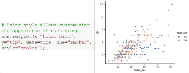
- style: Specifies the column to distinguish features (distinguishes by marker shape).
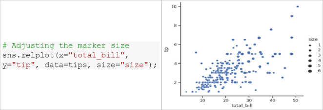
- size: Specifies the variable that sets the size of markers, applicable to both continuous and categorical variables.
- sizes: Specifies the minimum and maximum size of the markers.
(1) hue (Fig. 22)
Fig. 22.
Utilization of the hue option with Seaborn.
(2) style (Fig. 23)
Fig. 23.
Utilization of the style option with Seaborn.
(3) size (Fig. 24)
Fig. 24.
Utilization of the size option with Seaborn.
(4) sizes (Fig. 25)
Fig. 25.
Utilization of the sizes option with Seaborn.
2) Distribution plot: kernel density plot (Table 2, No. 4)
Seaborn provides additional features compared to simple histograms in Matplotlib, such as kernel density, rug display, and multidimensional composite distribution. Among them, the kernel density plot displays a smoother distribution curve than a histogram by overlapping kernels. Both codes below are for outputting kernel density plots.
· sns.displot(kind=“kde”)
· sns.kdeplot(x, y, data, bw_adjust, cumulative)
- bw_adjust: Adjusts the data interval for density estimation (default = 1).
- cumulative: If True, estimates the cumulative distribution function.
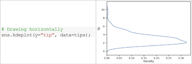
For kernel density plots, by assigning variable values to the y axis instead of the x axis, the graph can also be drawn horizontally or overlapped. Additionally, multiple variables can be overlaid on one graph. Please refer to the GitHub practice code for details.
(1) Kernel density plot (Fig. 26)
Fig. 26.
Visualization of kernel density plot with Seaborn.
(2) Horizontal density plot (Fig. 27)
Fig. 27.
Visualization of horizontal density plot with Seaborn.
(3) Estimate with different colors by category (Fig. 28)
Fig. 28.
Displaying estimations in different colors by categorical variables.
3) Distribution plot: rug plot (Table 2, No. 6; Fig. 29)
Fig. 29.
Visualization of rug plot with Seaborn.
A rug plot is used to describe the distribution of data by showing data positions as small vertical lines (rugs) on the x-axis.
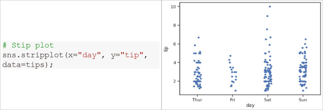
4) Categorical scatter plot: strip plot (Table 2, No. 8; Fig. 30)
Fig. 30.
Visualization of strip plot with Seaborn.
A strip plot is a graph that represents all data points as dots, similar to a scatter plot.
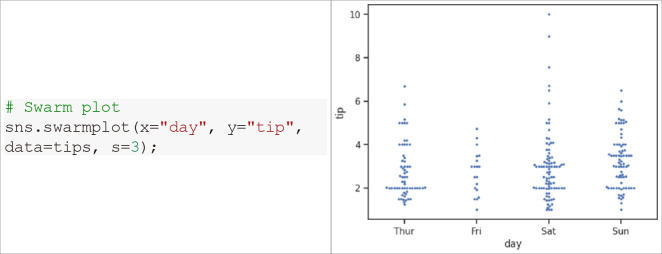
5) Categorical scatter plot: swam plot (Table 2, No. 9; Fig. 31)
Fig. 31.
Visualization of swarm plot with Seaborn.
A swarm plot is similar to a strip plot but arranges the dots horizontally to avoid overlap of data points.
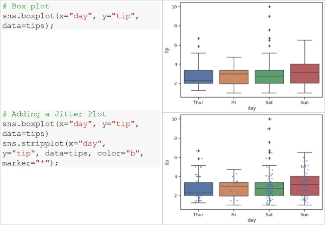
6) Categorical distribution plot: box plot (Fig. 32)
Fig. 32.
Visualization of box plot with Seaborn.
The Seaborn library’s box plot can be used with a strip plot overlaid.
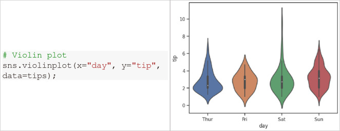
7) Categorical distribution plot: violin plot (Fig. 33)
Fig. 33.
Visualization of violin plot with Seaborn.
A violin plot is a visualization of data distribution, resembling a box plot combined with a kernel density plot.
CONCLUSIONS
In conclusion, data visualization is essential. It presents complex concepts in an easy-to-understand manner, allowing for the identification of patterns and trends, gaining insights, and making better decisions more quickly. In the field of clinical research, large amounts of data are being collected, and Python visualization tools are effective for visual representation. Using appropriate data visualization tools according to data types can significantly improve the quality and impact of research, enabling readers to understand complex concepts easily.
Notes
Authors’ contributions
Conceptualization, Data curation, Formal analysis, Investigation, Methodology, Visualization: SYH
Project administration: IYK
Writing–original draft: SYH
Writing–review & editing: SYH, IYK
Conflict of interest
All authors have no conflicts of interest to declare.
Funding/support
None.
Data availability
The data presented in this study are available at: https://github.com/soyul5458/Python_data_visualization.
REFERENCES
- 1.Unwin A. Why is data visualization important? What is important in data visualization? Harvard Data Sci Rev. 2020;2:1–7. doi: 10.1162/99608f92.8ae4d525. https://doi.org/10.1162/99608f92.8ae4d525. [DOI] [Google Scholar]
- 2.Tukey JW. Exploratory data analysis. Addison-Wesley Pub.; 1977. [Google Scholar]
- 3.Hunter JD. Matplotlib: a 2D graphics environment. Comput Sci Eng. 2007;9:90–95. doi: 10.1109/MCSE.2007.55. [DOI] [Google Scholar]
- 4.Odegua R. DataSist: a Python-based library for easy data analysis, visualization and modeling [Prepint] arXiv. 2019:1911.03655. https://doi.org/10.48550/arXiv.1911.03655. [Google Scholar]
- 5.harkiran78, author. Top 10 libraries for data visualization in 2020 [Internet] GeeksforGeeks; 2020. [cited 2023 Oct 17]. Available from: https://www.geeksforgeeks.org/top-10-libraries-for-data-visualization-in-2020/ [Google Scholar]
- 6.Sial AH, Rashdi SYS, Khan AH. Comparative analysis of data visualization libraries matplotlib and seaborn in Python. Int J Adv Trends Comput Sci Eng. 2021;10:2770–2281. doi: 10.30534/ijatcse/2021/391012021. [DOI] [Google Scholar]


