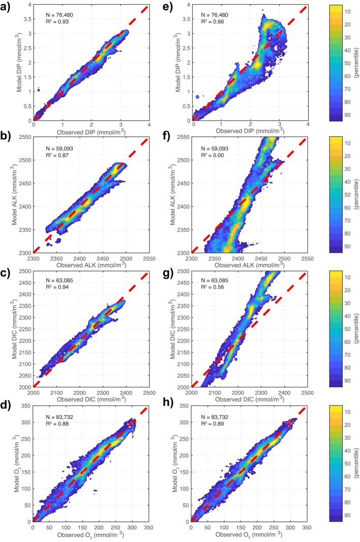
Extended Data Fig. 3. Tracer–tracer comparison for DIP, ALK, DIC and O2.
a–d, Observations and optimal model. e–h, Model constrained using only O2 and DOC based on the SeaWiFS CAFE NPP field. The plot shows the joint density distribution for the modelled and observed tracer concentrations. The volume under the distribution integrates to 100th percentiles. The colour indicates the fraction of the distribution that falls outside the given contour. The dashed red line shows the one-to-one line. The optimal model captures 93%, 87%, 94% and 88% of the spatial variance of the GLODAPv2 DIP, ALK, DIC and O2 data, respectively, whereas the model constrained using only DOC and O2 captures 66%, 0.0%, 56% and 89% of the spatial variance of the GLODAPv2 DIP, ALK, DIC and O2 data, respectively.

