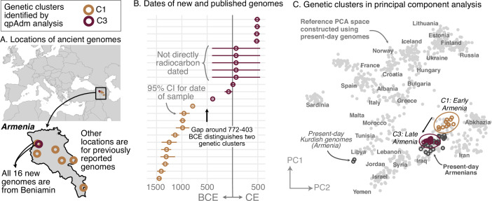
Figure 2. Armenia: two homogeneous genetic clusters distinguished by a temporal shift.
(A) Sampling locations of ancient genomes (open circles) colored by their genetic cluster identified using qpAdm modeling. (B) Date ranges for the genomes: each line represents the 95% confidence interval for the radiocarbon date or the upper and lower limit of the inferred date, and the point represents the midpoint of that range. (C) Projections of the genomes onto a PCA of present-day genomes (gray points labeled by their population). Present-day genomes from Armenia are shown with dark gray open circles.


