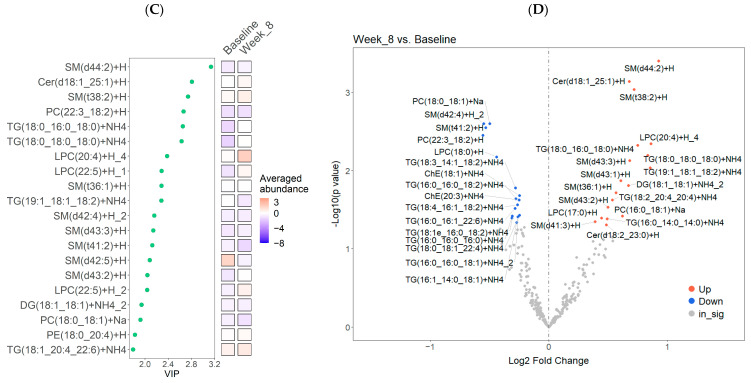
Figure 2.
Identification of differentially abundant lipids in the diet treatment group (n = 20) at baseline compared to Week 8 (post-intervention). (A) Boxplots illustrating all matched paired measurements (baseline and Week 8) for each lipid class, including the median and interquartiles. Paired sample t-tests were used to identify significant differences (p < 0.05) between the means of the matched pairs. Statistically significant p-values are shown in the figure. (B) Supervised PLS-DA analysis of lipidomic data. The first two latent components (Comp 1 and Comp 2) are presented with 95% confidence ellipses surrounding the cluster core. (C) VIP plot illustrating the average normalized values of the top 20 VIP scores from the PLS-DA analysis. (D) Volcano plot showing the log2 fold change versus the −log10(p-value) for pairwise comparisons. Lipid species that significantly increased in abundance are shown in red, while those that significantly decreased are indicated in blue.


