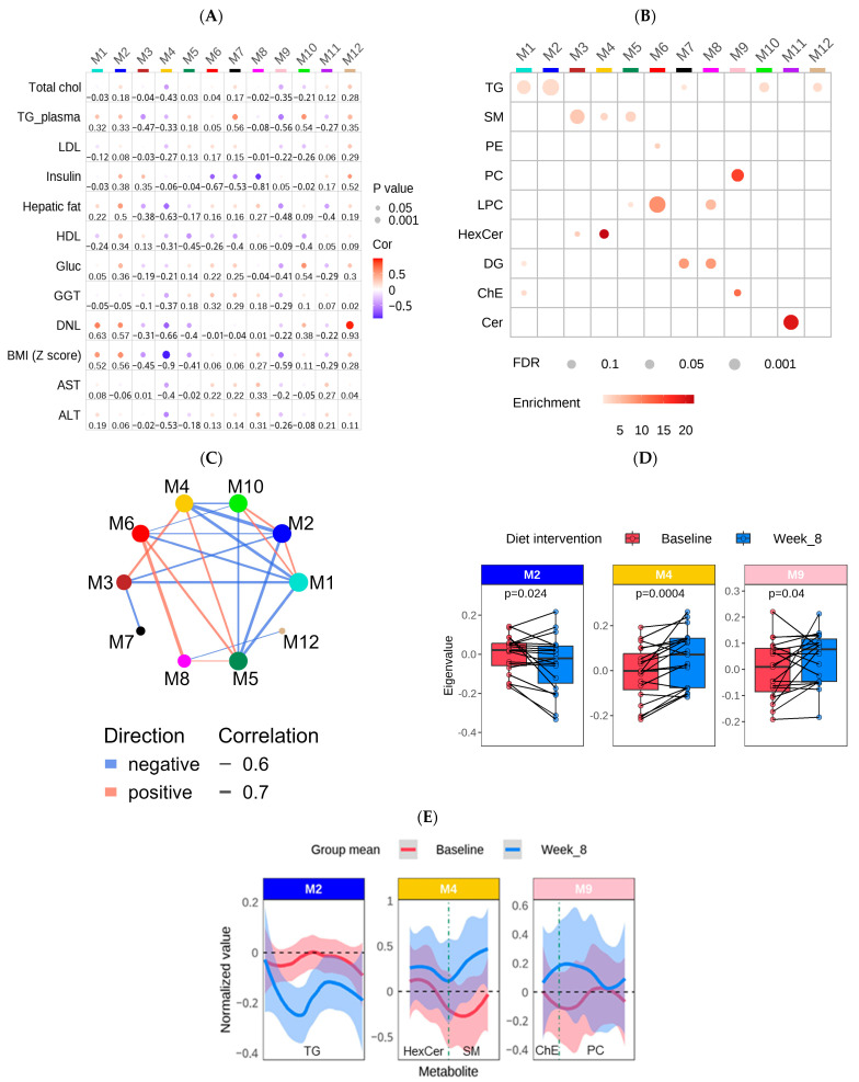
Figure 4.
Network analysis of untargeted lipidomics and clinical data using WGCNA among participants in the diet treatment group (n = 39 samples (20 baseline & 19 week 8; one outlier was removed at week 8)). (A) A bubble heatmap showing the correlations between the lipid modules (M1–12) and clinical traits using a color scale from −1 (blue) to 1 (red). The size of the bubble indicates the p-value (the larger the bubble size, the lower the p-value), and the number indicates the correlation coefficient. (B) A bubble heatmap showing the lipid class enrichment in each of the 12 modules. The size of the bubble indicates the p-value (the larger the bubble size, the lower the p-value), and the color of the bubble indicates the overlap (enrichment) of the lipid classes in each module. p-values were calculated using Fisher’s exact test. (C) The correlations between each module in the network analysis. The correlation cutoff was 0.5 and p < 0.05. (D) Boxplots showing the difference in ME values between pre- (baseline) and post- (Week 8) dietary intervention. p-values achieving statistical significance (p < 0.05) are presented in the figure. (E) Line charts with 95% confidence intervals highlighting the average change in normalized values from baseline to Week 8 for the blue, pink, and yellow modules. Each module’s hub lipid classes (MM > 0.65) are indicated at the bottom of each plot and are separated by a dashed line. The order of the lipids is based on the chain length.

