Few systematic reviews containing meta-analyses are complete without a forest plot. But what are forest plots, and where did they come from?
Summary points
Forest plots show the information from the individual studies that went into the meta-analysis at a glance
They show the amount of variation between the studies and an estimate of the overall result
Forest plots, in various forms, have been published for about 20 years
During this time, they have been improved, but it is still not easy to draw them in most standard computer packages
What is a forest plot?
In a typical forest plot, the results of component studies are shown as squares centred on the point estimate of the result of each study. A horizontal line runs through the square to show its confidence interval—usually, but not always, a 95% confidence interval. The overall estimate from the meta-analysis and its confidence interval are put at the bottom, represented as a diamond. The centre of the diamond represents the pooled point estimate, and its horizontal tips represent the confidence interval. Significance is achieved at the set level if the diamond is clear of the line of no effect.
The plot allows readers to see the information from the individual studies that went into the meta-analysis at a glance. It provides a simple visual representation of the amount of variation between the results of the studies, as well as an estimate of the overall result of all the studies together. Forest plots increasingly feature in medical journals, and the growth of the Cochrane Collaboration has seen the publication of thousands in recent years.1
History
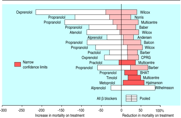
The origin of forest plots goes back at least to the 1970s. Freiman et al displayed the results of several studies with horizontal lines showing the confidence interval for each study and a mark to show the point estimate. This study was not a meta-analysis, and the results of the individual studies were therefore not combined into an overall result.2 In 1982, Lewis and Ellis produced a similar plot but this time for a meta-analysis, and they put the overall effect on the bottom of the plot (fig 1 ).3 However, smaller studies, with less precise estimates of effect, had larger confidence intervals and, perversely, were the most noticeable on the plots.
Figure 1.
First use of forest plot for meta-analysis of effect of β blockers on mortality3 (reproduced with permission from Physicians World/Thomson Healthcare, Secaucus, NJ)
Means of focusing attention on the larger, more precise, studies were sought. Replacement of the mark with a square whose size was proportional to the precision of the estimate may have been first suggested by Stephen Evans at a Royal Statistical Society medical section meeting at the London School of Hygiene and Tropical Medicine in 1983 (S Evans, personal communication). He based the idea on modified box plots.4 Ideas such as radial plots were also proposed.5 6
The first meta-analyses to include squares of different sizes to show the positions of the point estimates were probably those produced by the Clinical Trial Service Unit in Oxford in the 1998 overview of the prevention of vascular disease by antiplatelet therapy.7 The area of each square was proportional to the weight that the individual study contributed to the meta-analysis.
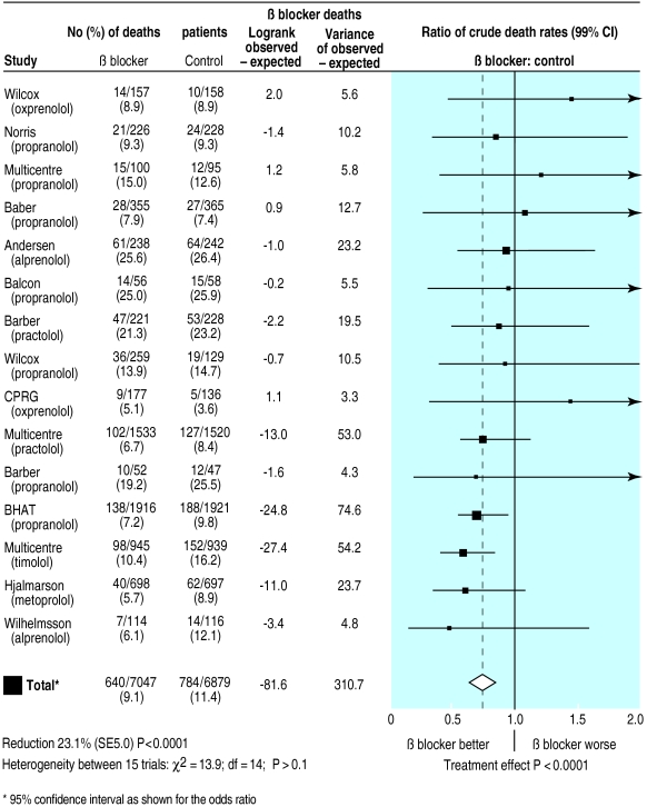
We have updated the original Lewis and Ellis plot3 to show how it might look in the modern style (fig 2 ). We obtained data for most of the component studies from a subsequent paper.8 In the 1980s, no standard computer packages could easily produce these plots, and they came from specially produced computer programs. Even now, most standard statistical packages cannot easily produce such a plot.
Figure 2.
Updated version of Lewis and Ellis's original plot (fig 1 ) showing effect of β blockers on mortality
Why a forest plot?
The plot was not called a “forest plot” in print for some time, and the origins of this title are obscured by history and myth. At the September 1990 meeting of the breast cancer overview, Richard Peto jokingly mentioned that the plot was named after the breast cancer researcher Pat Forrest, and, at times, the name has been spelt “forrest plot.” However, the phrase actually originates from the idea that the typical plot appears as a forest of lines. A contender for the first use of the name “forest plot” in print is a review of nursing interventions for pain that was published in 1996.9 An abstract at the Cochrane colloquium later that year also used this name.10 We would welcome suggestions of precedents to these uses or any other versions of this brief history of the plot.
Acknowledgments
We thank Jon Godwin for preparing figure 2.
Footnotes
Funding: None.
Competing interests: None declared.
References
- 1.Cochrane Collaboration. Cochrane Library. Issue 1. Oxford: Update Software; 2001. [Google Scholar]
- 2.Freiman JA, Chalmers TC, Smith H, Kuebler RR. The importance of beta, the type II error and sample size in the design and interpretation of the randomized control trial: survey of 71 “negative trials”. N Engl J Med. 1978;299:690–694. doi: 10.1056/NEJM197809282991304. [DOI] [PubMed] [Google Scholar]
- 3.Lewis JA, Ellis SH. A statistical appraisal of post-infarction beta-blocker trials. Prim Cardiol. 1982;suppl 1:31–37. [Google Scholar]
- 4.McGill R, Tukey JW, Larsen WA. Variations of box plots. Am Stat. 1978;32:12–16. [Google Scholar]
- 5.DeMets DL. Methods for combining randomized clinical trials: strengths and weaknesses. Stat Med. 1987;6:341–350. doi: 10.1002/sim.4780060325. [DOI] [PubMed] [Google Scholar]
- 6.Galbraith RL. A note on graphical presentation of estimated odds ratios from several clinical trials. Stat Med. 1988;7:889–894. doi: 10.1002/sim.4780070807. [DOI] [PubMed] [Google Scholar]
- 7.Antiplatelet Trialists' Collaboration. Secondary prevention of vascular disease by prolonged antiplatelet treatment. BMJ. 1988;296:320–331. [PMC free article] [PubMed] [Google Scholar]
- 8.Yusuf S, Peto R, Lewis J, Collins R, Sleight P. Beta blockade during and after myocardial infarction: an overview of the randomized trials. Prog Cardiovasc Dis. 1985;275:335–371. doi: 10.1016/s0033-0620(85)80003-7. [DOI] [PubMed] [Google Scholar]
- 9.Sindhu F. Are non-pharmacological nursing interventions for the management of pain effective? A meta-analysis. J Adv Nurs. 1996;24:1152–1159. doi: 10.1111/j.1365-2648.1996.tb01020.x. [DOI] [PubMed] [Google Scholar]
- 10.Bijnens L, Collette L, Ivanov A, Hoctin Boes G, Sylvester R. Proceedings of the 4th Cochrane colloquium, Adelaide, Australia, 1996. Oxford: Cochrane Collaboration; 1996. Optimal graphical display of the results of meta-analyses of individual patient data. [Google Scholar]


