
Figure 1.
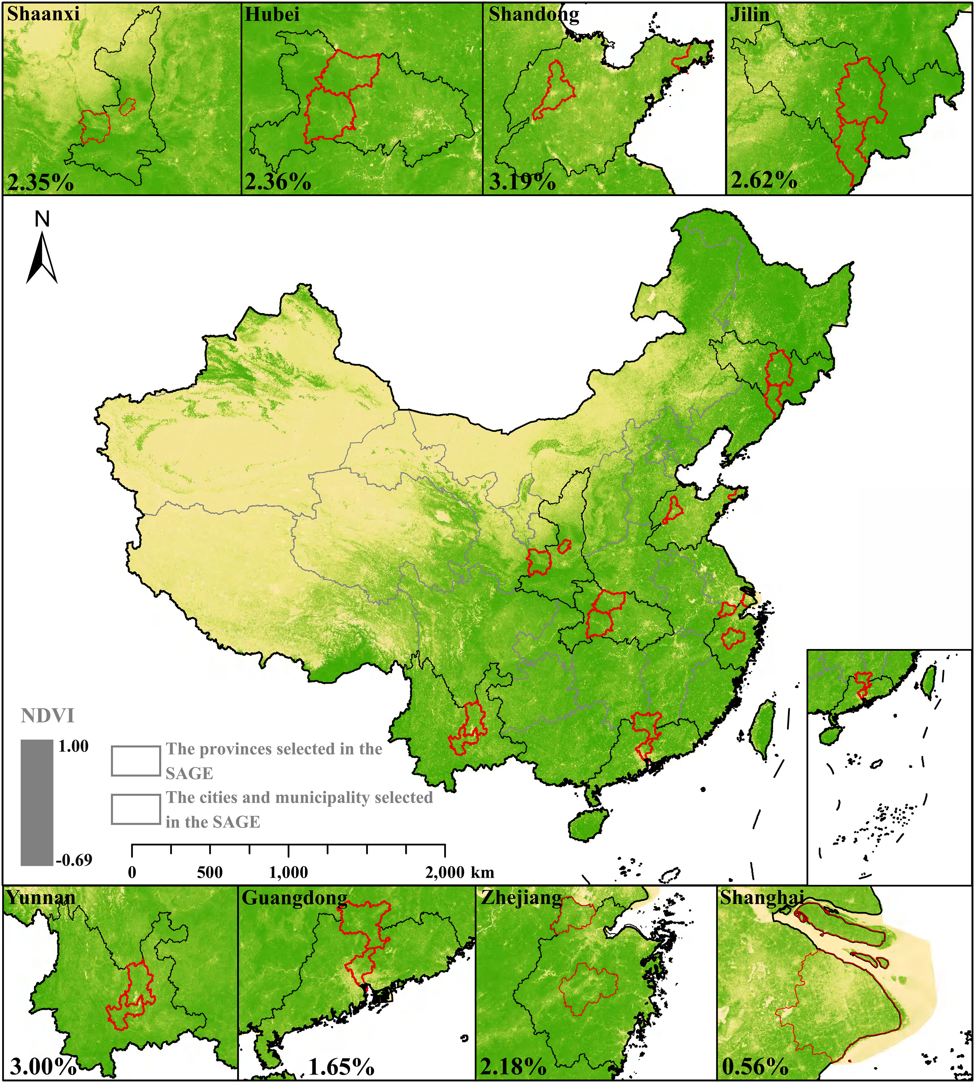
Annual average maximum NDVI across China during the SAGE study period (2007–2018). In the figure, the color shades of yellow and green represent the NDVI, the black ranges represent the provinces where the study was conducted, and the red ranges represent the cities and municipality where the study was conducted. The percentage in each selected province/municipality indicates the incidence rate of depression during the study period. The figure was produced using R software based on the background map (https://www.resdc.cn), NDVI data (http://www.nesdc.org.cn), and results from the study. Note: NDVI, normalized difference vegetation index; SAGE, Study on Global Ageing and Adult Health.