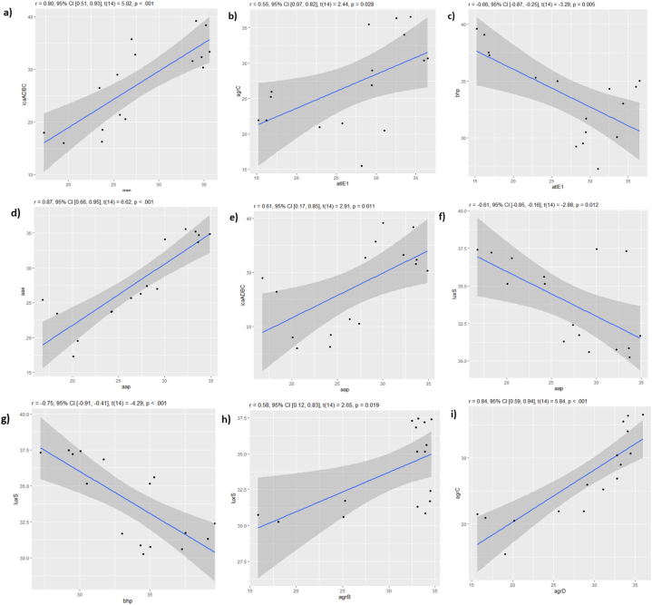
Fig. 8.
Pearson correlation showing the p-value of the correlated genes and its linear distribution using ‘R’ program. Each square represents the correlation between two genes (a–i), the dots indicate the expression of both genes throughout the studied period from day 0 to day 7. The closer the dots come to forming a straight line when plotted, the higher the correlation between the two variables, or the stronger the relationship. r ≥ ±0.5 are said to be correlated, p-value <0.05 the correlation is significant.

