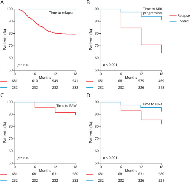
Figure 1. Comparison of Outcome Parameters Between the “Relapse” and “Control” Cohorts.
(A) Kaplan-Meier plot indicating the proportion of relapse-free patients over time among “relapse” (red line) and “control” (blue line) patients. (B) Proportion of patients without new or enlarging T2-hyperintense MRI lesions over time. (C) Proportion of patients without relapse-associated worsening (RAW) over time. (D) Proportion of patients without progression independent of relapse activity (PIRA) over time. Numbers at risk are indicated below the x-axis. Significance levels were calculated using a log-rank test where appropriate.

