Short abstract
Global inequality in both health and wealth began to rise worldwide in the early 1980s and has been exacerbated by AIDS in Africa. This trend is not inevitable, and historical trends show that inequality can be reduced
Inequality in health within the United Kingdom has been widely discussed in medical, health, and social science journals, with the most recent data showing a widening of inequality between areas of the UK.1 Such inequality is also the focus of several government targets. In other wealthy countries inequality in health is both widely studied and subject to government attention.2 Recent political events such as the Make Poverty History campaign, the Live8 concerts, the G8 summit in Scotland, the World Trade talks in Hong Kong, and the broader background of “globalisation” have turned attention towards the global picture. In this article we ask two questions: what is the state of inequality in health and wealth across the globe? and, is inequality increasing or decreasing over time?
Data from the United Nations Organisation can be used to answer the first question,3,4 but a suitable measure of inequality is needed to answer the second question. Moser et al suggest using a novel measure of dispersion to track trends in the distribution of global mortality over time—the dispersion measure of mortality.5 They claim that “the dispersion measure of mortality has advantages over other commonly used summary measures of mortality contrast that only use information from the extremes of the mortality or socioeconomic distribution and do not weight for size of the unit.”5 We use another well established measure of inequality, which has the same attributes but is simpler to interpret and compute and is more informative—the slope index of inequality.6 The index can provide a simple measure of the size of the gap in natural units—in this case—years of life expectancy lost.
Changes over time
Using the UN data, aggregated into six continents (see bmj.com), we calculated the slope index of inequality for life expectancy from 1950 to 2005. Data for 2001-5 form the central projection used and published by various UN statistical agencies. We calculated the index by continent rather than country for several reasons: we do not have a consistent measure of poverty or wealth to rank all countries at all points in time; data for countries in war or crisis (or both) are unreliable; the ranking of continents by gross domestic product per capita is constant over time; and a measure of intercontinental inequality in mortality captures most international inequality. Data on gross domestic product before 1950 are unreliable, so our study starts at 1950.
The index was calculated by ranking the six continents in order of increasing life expectancy: Africa, Asia, Latin America and the Caribbean, Oceania, Europe, and North America. The order did not change over the 50 year study period and reflects the average gross domestic product per capita of the inhabitants of each continent. The population of each continent was calculated as a proportion of the world population in each time period. At the start of the study 8.8% of the world's population lived in Africa (the poorest continent) and the median person in Africa was 4.4% along the world population ranking. For the period 1950-5 these cumulative proportions for the ranked continents were: 8.8%, 64.3%, 70.9%, 71.5%, 93.2%, and 100%. The median person in each ranked continent thus stood at 4%, 37%, 68%, 71%, 82%, and 97%. By the end of the study period the median person in Africa reached 7% along the world population ranking as the population grew. In the years 1950-5 the life expectancies for the ranked continents were 38, 41, 51, 60, 66, and 69 years. The slope index of inequality is the slope coefficient in a simple regression analysis of life expectancy in years against the ranking of the continents (where ranking is expressed as the cumulative proportions of the world population—for example, 0.37 for Asia in 1950-5). Because grouped data are used and heteroskedasticity (unequal variance in regression errors) exists we estimated coefficients by using the transformation proposed by Low and Low.6 In 1950-5 the coefficient was 41.9 years of life expectancy. This means that the hypothetical poorest person in Africa had a life expectancy 41.9 years shorter than the richest person in North America. The slope index of inequality uses the information for all continents rather than simply comparing the extreme life expectancies.
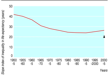
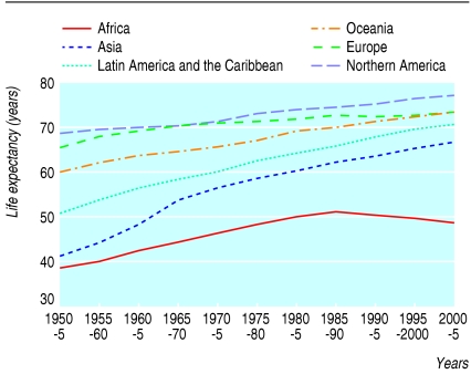
Figure 1 and the table show that global inequality in life expectancy fell between 1950 and 1990, but since then it has risen and is now at the same level as in the late 1970s. For the two most extreme continents (see table)—North America and Africa—the gap in life expectancy fell from 30.6 years in 1950-5 to less than 24 in 1985-90 but has since risen to 28.6; it is now almost at the same level as in the 1950s. The slope index of inequality correlates with the dispersion measure of mortality used by Moser et al: both methods show that global inequality in mortality is rising.5 A plot of life expectancy in the six continents over the study period (fig 2) shows that Africa has been most affected by the widening global inequality in mortality.
Fig 1.
Global life expectancy slope index of inequality (in years). Black triangle shows estimated index in 2000-5 with impact of AIDS removed
Table 1.
Mean life expectancies across the globe
|
Life expectancy at birth (years 2000-5)8
|
|||||||||||||||
|---|---|---|---|---|---|---|---|---|---|---|---|---|---|---|---|
| 1950-5 | 1955-60 | 1960-5 | 1965-70 | 1970-5 | 1975-80 | 1980-85 | 1985-90 | 1990-95 | 1995-2000 | 2000-5 | With AIDS | Without AIDS | Difference | Error* | |
| Continent | |||||||||||||||
| Africa | 38.2 | 40.3 | 42.4 | 44.5 | 46.5 | 48.5 | 50.1 | 51.3 | 50.5 | 49.6 | 48.8 | 50.6 | 56.9 | 6.2 | 1.8 |
| Asia | 41.1 | 44.7 | 48.3 | 53.8 | 56.4 | 58.6 | 60.3 | 62.2 | 63.8 | 65.4 | 67 | 67.7 | 68.3 | 0.6 | 0.7 |
| Latin America and the Caribbean | 50.9 | 53.8 | 56.4 | 58.4 | 60.5 | 62.7 | 64.4 | 66.2 | 67.7 | 69.7 | 71 | 71.8 | 72.3 | 0.5 | 0.8 |
| Oceania | 60.4 | 62.3 | 63.7 | 64.6 | 65.8 | 67.4 | 69.3 | 70.5 | 71.5 | 72.5 | 74 | 74.6 | 74.6 | 0.0 | 0.6 |
| Europe | 65.6 | 68.2 | 69.6 | 70.7 | 71 | 71.5 | 71.9 | 73.1 | 72.4 | 72.9 | 73.3 | 74.3 | 74.6 | 0.3 | 1.0 |
| North America | 68.8 | 69.6 | 70 | 70.4 | 71.5 | 73.3 | 74.2 | 74.7 | 75.4 | 76.6 | 77.4 | 77.6 | 77.9 | 0.3 | 0.2 |
|
Indicators of inequality
|
|
|
|
|
|
|
|
|
|
|
|
|
|
|
|
| Slope index of inequality (95% CI) | 41.9 (28.4 to 55.4) | 39.9 (27.9 to 52.0 | 36.6 (26.7 to 46.5) | 30.9 (23.6 to 38.3) | 28.0 (21.9 to 34.1) | 26.2 (21.0 to 31.3) | 24.7 (20.0 to 29.3) | 24.0 (19.0 to 28.9) | 23.7 (16.7 to 30.6) | 25.1 (15.6 to 34.6) | 26.3 (13.9 to 38.7) | 25.4 (14.1 to 36.7) | 20.0 (13.9 to 26.0) | 5.4 | −0.9 |
| North America minus Africa† | 30.6 | 29.3 | 27.6 | 25.9 | 25 | 24.8 | 24.1 | 23.4 | 24.9 | 27 | 28.6 | 27.0 | 21.0 | 5.9 | 1.6 |
CI=confidence interval.
Numbers may not add up correctly because of rounding.
The small difference between the figures calculated from two different UN sources.
The two most extreme continents in terms of health and wealth.
Fig 2.
Life expectancy (in years)
Effect of AIDS
The last four columns of the table show the effect of AIDS on life expectancy for the six continents. The figures were calculated from a different UN source7; the last column (error) shows the small differences between these figures and those cited previously. These alternative figures show that six years of the difference in life expectancy between Africa and North America is accounted for by AIDS. The estimates of life expectancy at birth without AIDS are the average number of years a person would be expected to live in the absence of mortality related to AIDS.8 Figure 1 shows the predicted slope index of inequality for 2000-5 in the absence of AIDS (triangle): global inequality would have maintained a small downward trend. Even without AIDS, global inequality in life expectancy would be more than five times greater than inequality within the UK for a similar period of time.1 Because of AIDS, global inequality in life expectancy was seven times greater than within the UK by 2001-4, even though inequality within the UK at that time was the highest ever reported.
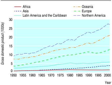
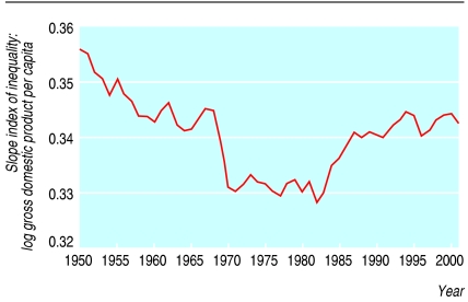
Figure 3 shows average wealth (gross domestic product per capita) for the six continents over the study period and seems to show a continuous widening of inequality since the 1950s.9 However, figure 4 shows the changes in the relative wealth of continents—the slope index of inequality for log gross domestic product per capita standardised by the world average wealth for each period of time—which removes the effect of inflation. This shows that the global distribution of wealth was becoming more equal from 1950 to 1980, but from the early 1980s onwards it became much more unequal.
Fig 3.
Average wealth per capita (in purchasing power parity ($) per capita). $1=£0.6, €0.8
Fig 4.
Slope index of inequality for global wealth (in purchasing power parity ($) per capita; log scale and standardised to world income). 1$=£0.6, €0.8
Effect of health inequality
Importantly, inequality in mortality between continents began to rise shortly after inequality in gross domestic product per capita began to diverge most clearly. This association could reflect the profound impact of AIDS on one continent, Africa. AIDS is a disease of the poor, and global inequality in wealth will have compounded the effect of AIDS on Africa by restricting access to effective treatments and means of prevention. Protected trade advantages for pharmaceutical companies in wealthy countries will contribute to both the distribution of wealth from poor to rich countries and reduced access to effective treatments for AIDS in poor countries, thus exacerbating inequalities in wealth and in death rates. All the data indicate that inequality of health and wealth began to rise worldwide in the early 1980s. Currently the trends towards greater inequality are accelerating, but historic trends can be quickly reversed, as events in the early 1980s showed.
Summary points
Inequality in mortality between continents reflects the inequality in gross domestic product per capita
Inequality of health and wealth between continents began to rise in the early 1980s
Africa has been most affected by the widening global inequality in mortality, probably as a result of the AIDS pandemic, which is exacerbated by inequality in wealth
Supplementary Material
 The nation states of the United Nations in 2002 are listed on bmj.com
Contributors and sources: DD proposed the study as a result of his initial research collecting information and designing the world mapping website www.worldmapper.org. MS and GDS have studied and reported widely on related issues of inequalities in health, medical sociology, and epidemiology. All authors contributed to designing, writing, and rewriting the article. DD is guarantor.
Funding: MS is funded by the South West Public Health Observatory. The views expressed here are those of the authors themselves.
Competing interests: None declared.
References
- 1.Shaw M, Davey Smith G, Dorling D. Health inequalities and New Labour: how the promises compare with real progress. BMJ 2005;330: 1016-21. [DOI] [PMC free article] [PubMed] [Google Scholar]
- 2.Mackenbach J, Bakker M. Reducing inequalities in health: a European perspective. London: Routledge, 2002.
- 3.United Nations. World urbanisation prospects: the 2003 revision population database. http://esa.un.org/unup/ (accessed Jul 2005).
- 4.United Nations. Human development index. http://hdr.undp.org/statistics/data/ (accessed Jul 2005).
- 5.Moser K, Shkolnikov V, Leon D. World mortality 1950-2000: divergence replaces convergence from the late 1980s. Bull World Health Organ 2005;83: 202-9. [PMC free article] [PubMed] [Google Scholar]
- 6.Low A, Low A. Measuring the gap: quantifying and comparing local health inequalities. J Public Health 2004;26: 388-95. [DOI] [PubMed] [Google Scholar]
- 7.United Nations. UN population and HIV/AIDS wall chart 2005.www.un.org/esa/population/publications/POP_HIVAIDS2005/HIV_AIDSchart_2005.pdf (accessed Jul 2005).
- 8.United Nations. World population prospects: the 2004 revision. www.un.org/esa/ (accessed Jul 2005).
- 9.www.eco.rug.nl/∼Maddison/ (accessed Feb 2005). Site no longer exists but similar data can be accessed via www.theworldeconomy.org/publications/worldeconomy/ (accessed Feb 2006).
Associated Data
This section collects any data citations, data availability statements, or supplementary materials included in this article.


