

Abstract
As the extent of human genetic variation becomes more fully characterized, the research community is faced with the challenging task of using this information to dissect the heritable components of complex traits. Genomewide association studies offer great promise in this respect, but their analysis poses formidable difficulties. In this article, we describe a computationally efficient approach to mining genotype-phenotype associations that scales to the size of the data sets currently being collected in such studies. We use discrete graphical models as a data-mining tool, searching for single- or multilocus patterns of association around a causative site. The approach is fully Bayesian, allowing us to incorporate prior knowledge on the spatial dependencies around each marker due to linkage disequilibrium, which reduces considerably the number of possible graphical structures. A Markov chain–Monte Carlo scheme is developed that yields samples from the posterior distribution of graphs conditional on the data from which probabilistic statements about the strength of any genotype-phenotype association can be made. Using data simulated under scenarios that vary in marker density, genotype relative risk of a causative allele, and mode of inheritance, we show that the proposed approach has better localization properties and leads to lower false-positive rates than do single-locus analyses. Finally, we present an application of our method to a quasi-synthetic data set in which data from the CYP2D6 region are embedded within simulated data on 100K single-nucleotide polymorphisms. Analysis is quick (<5 min), and we are able to localize the causative site to a very short interval.
Recent advances in high-throughput technologies and the decrease in genotyping costs have made genomewide association (GWA) studies a feasible tool in the search for the genetic determinants of complex diseases. Several such studies are under way, and more are being planned, whereas some results from studies involving large panels of markers have already been published.1–5 The rationale behind this approach is as follows. Genetic variants that affect a trait of interest arose sometime in the past on a unique stretch of the genome, which was then transmitted to subsequent generations together with flanking variants. Subjects who show variability in a trait of interest, say cases and controls in a study of a dichotomous trait, may be genotyped at a large number of marker positions, mostly SNPs. We expect the genotypes of the two groups to be different around the causative mutation(s) because cases share the ancestral disease-bearing segment(s). We are thus able to map indirectly the (unobserved) disease-susceptibility variants without making any assumptions about their genomic location. The approach provides a more precise localization of disease-susceptibility loci (on the order of a few thousand base pairs) than do linkage studies (millions of base pairs), because chromosomes from unrelated individuals have undergone more recombination events than can be found in any realistically sized pedigree.1,6
Since routine complete resequencing of the genome is still not economically feasible, the success of this strategy relies, to a large extent, on exploitation of the linkage disequilibrium (LD) structure in human populations. Several coordinated efforts have therefore been initiated to characterize the patterns of human variation along the genome.7–10 The goal is to refine our understanding of the extent of genetic variation, both within and across populations, and to inform the selection of markers that capture most of the genetic variability with minimal loss of information to detect disease-susceptibility loci in GWA studies. In practice, the complexity of human evolution introduces many uncertainties.11 For instance, the correlation between adjacent markers or LD along the genome is characterized by considerable spatial heterogeneity, as reported by several recent studies.10,12–15 Regions of tightly linked markers corresponding to haplotype blocks of limited diversity are interspersed with uncorrelated markers, whereas long-range correlations are not uncommon. This has important consequences for our ability to find disease-causing variants. Earlier estimates of the marker density necessary to capture enough genomic variation to be useful in GWA studies appear to have been optimistic, with phase II of the HapMap project now aiming to identify a panel of variants with an average spacing of 1 kb.8 Thus, a typical GWA study is now expected to contain data on ⩾500K assayed SNPs for several thousand individuals. Increasing the marker density is not a panacea, however. If the disease allele has a very low penetrance or is very rare, then the chance of detecting an association even in reasonably sized and well-designed studies is low, independent of the marker density.16
It is nevertheless clear that the potential of GWA studies cannot be fully assessed until statistical methods are available that are able to cope with the size and complexity of the data sets currently being collected. It is desirable that these methods be able to account for the network of local dependencies between markers that are due to LD. On a smaller genomic scale, it may be more powerful to consider multi-SNP interaction terms, since these may capture better the pattern of alleles present around the causative mutation (and therefore better discriminate affected individuals and unaffected ones), as opposed to considering each SNP on its own. The latter strategy, in fact, though scalable to large data sets, fails, by definition, to fully exploit the LD information around a causative locus, if present. In the literature, there are several approaches for multilocus SNP haplotype analysis that exploit the excess haplotype sharing among cases around a causative locus.17–21 However, because of their computational complexity, these approaches are best suited for candidate-gene studies or studies in small candidate regions and will not scale to the size of the data sets discussed above.
The aim of this article is to provide methods that allow for multilocus local dependencies while addressing the scalability problem. Because genotype data collected in GWA studies lack phase information, we focus on case-control studies with unphased genotype data and model the joint distribution of markers and the disease-status indicator as a discrete graphical model. The nodes in the graph correspond to the genotype data and the case-control indicator. The structure of dependencies both between markers (due to LD) and between markers and disease status is then learned from the data by use of a fully Bayesian approach. We are thus able to make probabilistic statements about the presence of certain edges or associations, with primary interest in those involving marker nodes and the disease-status indicator.
The Bayesian approach has several advantages. For example, we are able to incorporate useful prior knowledge of the domain by restricting, for each marker node, the network of dependencies to nodes within a suitable physical distance. This reduces considerably the space of possible graphs and, in turn, the computational complexity, making the approach feasible in large candidate-gene studies or GWA studies. The performance of the proposed method is evaluated using data simulated under different scenarios that vary in marker density, disease-allele frequency, genotype relative risks (GRRs), and mode of inheritance. The results are compared with single-locus χ2 tests for association of each SNP marker with disease, an approach frequently used with large data sets. Considering a single disease variant, we show that our approach leads to a smaller localization error and fewer false-positive results than does a single-locus analysis. Scalability to GWA studies is investigated by applying the approach to a quasi-synthetic data set of 100K simulated markers with embedded real SNP genotype data from a 890-kb region flanking the CYP2D6 gene, which is recessively associated with drug metabolism.22
In the next section, we describe the use of discrete graphical models for mining genotype-phenotype associations, while introducing the notation used throughout. A brief overview of Bayesian learning of discrete graphs relevant to this work is also given. That section is followed by the results from the simulation studies and the application to the synthetic CYP2D6 data. We end with a discussion of the advantages and disadvantages of the proposed method.
Methods
Graphical Models for Case-Control Data
We assume that genotype data are available from a sample of Nd cases and Nc controls at a set of M marker loci, where usually Nd=Nc. The binary variable Di∈{0,1} is a disease-status indicator for individual i with observed value di=0 for a control and di=1 otherwise, i=1,…,N=Nd+Nc. The genotype Gim of subject i at locus m takes value 1 if heterozygous and 0 (2) if homozygous wild-type (mutant), m=1,…,M. For large M, a convenient and powerful framework for representing the joint distribution of G,D over such a complex discrete domain is given by discrete graphical models.23–25
A discrete graph 𝒢 is a mathematical object composed of a set 𝒱 of vertices and a set ℰ of edges comprising ordered pairs of elements from 𝒱. In particular, a graph 𝒢=(𝒱,ℰ) is called “undirected” if the edges present have no orientation—that is, if (a,b)∈ℰ implies (b,a)∈ℰ. The vertices in the graph correspond to discrete random variables, and edges in the graph describe the dependencies and conditional independencies that hold for the joint distribution of variables corresponding to its vertices. In practice, the set of dependencies ℰ is seldom known in advance, and the objective is then to learn it from the data exploiting the graphical formalism. In so-called decomposable graphs, the joint distribution over the vertices 𝒱 can be factorized on lower-dimensional subspaces, thus simplifying considerably the task of evaluating and comparing different dependence structures or models. Thus, if the set 𝒱 and the number of possible graphical models is large, as is the case here, it is desirable to restrict the class of graphs to decomposable ones only. To ensure this, any graph considered should satisfy the running intersection property and admit a junction tree representation.
For M=9 marker loci and the disease-status indicator D, an example of a decomposable graph is given in figure 1. Also shown are the two disconnected junction trees corresponding to the graph, or its junction forest. The graph is composed of five cliques—that is, complete subgraphs with all edges present—given by the sets of vertices 𝒞1,…,𝒞5. The running intersection property is satisfied if, given the set of cliques of a graph 𝒞={𝒞1,…,𝒞L}, there is an ordering of the cliques such that, for each 𝒞l, the set of vertices in common with previous cliques, 𝒮l=𝒞l∩(𝒞1∪…∪𝒞l-1), is contained in at least one previous clique. This is trivially satisfied for the graph in figure 1, which also shows the separator sets 𝒮l, with 𝒮1 and 𝒮5 empty sets. The edges in the graph and the running intersection property imply the conditional independence between cliques given separators between them. Then, if ℛl=(𝒞l\𝒮l) defines the residue of each clique, the joint probability distribution of the vertices factorizes into
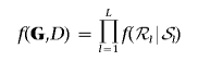 |
or, equivalently,
 |
where R is the number of nonempty separator sets. Thus, the joint distribution associated with a decomposable graph factorizes conveniently into local terms corresponding to marginal densities of cliques and separators.26,27
Figure 1. .

A decomposable graph and the junction tree representation of its cliques 𝒞1,…,𝒞5 and separators 𝒮1,…,𝒮5, with 𝒮1≡𝒮5≡∅. Nodes correspond to genotype data at nine marker loci and a disease-status indicator.
It should be noted that decomposable graphs are limited in the number of dependencies and conditional independencies that they can represent, compared with, say, hierarchical log-linear models.28 However, if the number of vertices is very large, as is the case here, the process of probabilistically learning the graph from data is only possible by acceptance of restrictions of this sort.
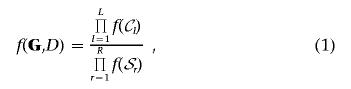
Because all variables are discrete, we adopt a multinomial likelihood for the cell entries of the multiway contingency tables obtained by cross-classifying the genotype and disease-status data (G,D) according to the variables in cliques and separators. Namely, by indicating with nlg and nrg the vector of cell entries of the contingency table corresponding to generic clique and separator Cl and Sr for graph g, with corresponding vectors of cell probabilities θlg and θrg, respectively, from equation (1), the multinomial likelihood is
 |
The subscript for θ in the previous expression highlights the dependence of the factorization on the current graph g.
Mining Disease-Susceptibility Loci
Here, we develop a Markov chain–Monte Carlo (MCMC) algorithm to sample over the space of possible discrete graphs while exploiting our prior knowledge of the domain. The edges in the graph model the joint distribution of G and D, with links between variables in G reflecting the LD structure and those between G and the case-control indicator D suggesting the presence of a disease-susceptibility locus in the region. Our approach is fully Bayesian and yields a sample of graphical models from their posterior distribution conditional on the data, f(g|G,D).24,25 From the posterior sample of graphs, the frequency with which any two vertices are connected by an edge is then an estimate of the posterior probability of association. We therefore exploit the well-known Bayesian model-averaging paradigm, which has been shown to perform better than methods that rely on a single “best” model, in both classification and variable-selection tasks.29–31 Note that we marginalize over the cell probabilities in θ, with the aim of comparing the different structures—and, in particular, identifying which SNPs are associated with D—rather than making probabilistic statements about the distribution of the vector θ. In the literature on graphical models, this is referred to as “qualitative learning.” Indeed, constructing MCMC schemes that sample over the space of both graphical structures and parameter values in large domains is extremely difficult and unfeasible in data-mining applications.32
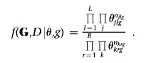
The MCMC scheme uses a Metropolis-Hastings (MH) algorithm as used by Madigan and York,24 with proposal distributions tuned to reflect the spatial features of the data at hand induced by the LD structure. Given the current graphical structure g, a new structure, g′, is proposed and accepted with probability
 |
where f(g) is the prior distribution over structures, f(·|·) is the proposal distribution, and f(G,D|g) is the marginal likelihood or evidence for graph g.
For computational efficiency, it is critical to be able to calculate quickly the latter quantity, which is given by the integral
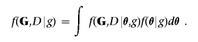 |
To this end, the Bayesian metric is particularly convenient since, under the assumption of a Dirichlet prior on the vector of parameters θ, the integral above is available analytically (appendix A). It is also important that any proposed graph is decomposable, because this facilitates considerably the computation of the marginal likelihood corresponding to any new model, as discussed in the previous section. To ensure this, the MCMC scheme allows only moves in the space of graphs admitting a junction tree representation, which are decomposable by construction. Thus, rather than modifying the current graph by deleting or adding a single edge at a time, our moves involve changes to the set of cliques and separators.
To reduce the space of possible graphs, any clique contains vertices corresponding to a set of possibly noncontiguous markers within a prespecified maximum physical distance. That is, we restrict the set of markers forming each clique to the set of neighboring but not necessarily adjacent markers, where a neighborhood is defined in terms of physical distance. The rationale is to incorporate prior knowledge on the extent of LD likely to exist around a marker while allowing a degree of flexibility by considering cliques of noncontiguous markers.
A clique is then assigned a dichotomous label, T∈{0,1}, depending on whether edges are present between any of its marker vertices and the disease-status indicator D (T=1 if one or more edges are present and 0 otherwise). An example of a possible graph is given in figure 2, in which, for clarity, we have omitted edges connecting all vertices within cliques. The graph contains three cliques, 𝒞1=(G1,G3,G4), 𝒞2=(G2,G5,G6), and 𝒞3=(G5,G6,D), and a separator, 𝒮1=(G5,G6). In this setting, the separator expresses the multilocus association of genotype variables 5 and 6 with disease status and determines the label T=1 currently assigned to 𝒞2 (shaded in the fig.). Finally, we limit the maximum size of each clique and separators, to mitigate problems of sparsity in the corresponding multiway contingency tables. Again, this is not a very restrictive assumption, considering recent results showing that clusters of densely connected common SNPs appear, in most cases, to be made up of few SNPs (⩽10), with minor differences across ethnic groups.10
Figure 2. .
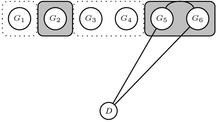
Example of a current graph in the MCMC scheme. A region of six markers is depicted with two cliques containing noncontiguous markers, 𝒞1=(G1,G3,G4) and 𝒞2=(G2,G5,G6). 𝒞2 has label T=1 because it contains markers currently associated with D, 𝒮1=(G5,G6).
Given the current set of cliques and separators, our sampler then iterates randomly among the following three steps:
Merge step: Propose to merge a randomly selected clique with another clique in the graph. The latter is chosen at random from the set of cliques containing neighboring markers of the former. If the size of the proposed clique exceeds the maximum size allowed, the move is rejected.
Split step: Propose to split, at random, a randomly selected clique into two. The move is not attempted if the selected clique is a singleton.
Switch-clique-label step: Propose to change the label T of a randomly selected clique. If the chosen clique contains edges between any marker vertices and D (T=1), these are deleted in the proposed graph. Otherwise (T=0), we select a set of separator markers at random from the vertices of the clique and propose edges between them and D. Note, in passing, that the correct retrospective likelihood for case-control ascertainment is used here when evidence is contrasted in favor of or against association—that is, P(G∣D) versus P(G) for the chosen clique.
It is trivial to check that the resulting graph is decomposable, since all moves involve changes to the set of cliques and separators. Thus, in each case, the marginal likelihood needed to compute the MH ratio in equation (2) is available in closed form. Further details on the prior used over graphical structures, proposal distributions, and expressions for the acceptance probabilities are given in appendix A. At the core of our approach is, therefore, the joint modeling of the dependence structure between genotype markers (the merge and split steps) and between these and the disease-status indicator (the switch-clique-label step). By allowing for single- and multilocus marker-disease associations within each clique, we are able to filter out false association better than by using single-locus methods. This is because, with a high-density marker map, we expect single- and multilocus association to be more prevalent around a true disease-susceptibility locus than around a spurious association. Model averaging then captures this self-reinforcing process as, for each marker, the marginal posterior probability of association is calculated by combining the single- and multilocus evidence around that position. Specifically, we use Bayes factors to measure evidence in favor of association versus no association; this is given by the ratio of posterior to prior odds of association and can be interpreted as the amount by which the prior odds get updated by observation of the data.33
Results
Simulation Studies
In this section, we present results from simulation studies investigating the performance of the proposed method under various scenarios. In particular, we consider different marker densities, GRRs, minor-allele frequencies (MAFs) of the high-risk variant, and disease models. Data consist of unphased genotype data in a 1-Mb region for ∼1,000 cases and controls. The average SNP density is 1 every 5 kb, 2.5 kb, and 1.6 kb, corresponding to data sets with 200, 400, and 600 markers, respectively. For each SNP density, the MAF at the causative locus is either 5% or 10%, and the disease model is dominant or recessive. The genotype data are obtained as follows. We first simulate a pool of 20,000 haplotypes, using the program MS, which simulates a coalescent process with recombination.34 The recombination rate is 1 per cM over the region considered, and the mutation rate is 10-8 per bp for an effective population size of 10,000. Haplotypes are paired to form diplotypes of 10,000 subjects. A causative locus is then selected at random from the set of segregating sites having an MAF of 0.05 or 0.1, depending on the scenario considered, whereas markers are drawn from the set of segregating sites having MAF >0.1, to reflect ascertainment bias. For the dominant model, the case or control status is assigned using the liability model
where Φ is the distribution function of the standard normal density, β∈{0.21,0.37,0.51}, corresponding to GRRs of 1.5, 2.0, and 2.5, respectively, and Z(G)=0 or 1 if G=0 or G∈{1,2}, respectively. The value of α was chosen to give a disease prevalence of 10%. A similar scheme applies to data generated under a recessive mode of inheritance. In all cases, the presence of a single unmeasured causative SNP is assumed. The maximum clique size is restricted to eight vertices, whereas, for the merge step, the neighborhood of each marker includes markers within 100 kb on either side.
We compare our method with single locus χ2 tests for marker-disease association across 100 replicated data sets, using various performance criteria. The results from a single data set are shown in figure 3, with the position of the causative mutation indicated by an asterisk (*) on the X-axis. For the Bayesian analysis, the graph shows both the marginal posterior probability of association and the Bayes factor in favor of association at each marker position. The former is obtained from the posterior sample of graphs that contain an edge between D and the marker in question, and the latter is given by the posterior-to-prior ratio of the probability of association with disease, where we assume a Poisson prior on the number of associated cliques, 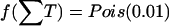 (see appendix A). This ensures that almost all prior mass is put on the event of no association while the possibility of having one or more associated sites in the region is allowed for. Note how, for this particular data set, the single-locus χ2 analysis fails completely to identify the causative locus, whereas the multilocus Bayesian analysis works well.
Figure 3. .

Single-locus χ2 tests ( ), marginal posterior probability (prob) of association and Bayes factor in favor of association from the graphical modeling approach for a single replicated data set in the simulation study. The location of the disease-susceptibility locus is indicated with an asterisk (*).
The first comparison is in terms of mean location error versus the number of false-positive or false-negative results, where, for each replicated data set, we define the location error as follows. We consider a window of width 𝒲=40 kb centered around the causative locus, and, for a given threshold P value for the χ2 or a given threshold Bayes factor for the graphical model, the location error is the mean absolute physical distance between the causative site and those with smaller P values or larger Bayes factors, respectively. Similarly, for the same thresholds, we define as false-positive results those sites with smaller associated P values or larger Bayes factors lying outside the window Mfp. The false-positive rate Rfp of each replicate is then Rfp=Mfp/M. False-positive rates and mean location errors are then determined for different threshold P values or Bayes factors varying over a grid of values between 0.05 and 0.05/M (corresponding to a conservative Bonferroni correction) for the P values or between 1 and 2,000 for the Bayes factors.
Figure 4 presents the overall mean location error versus mean false-positive rates across the 100 replicates for both methods and a dominant disease model. The shaded boxes above each panel identify the combination of marker density and GRR used in that panel. Lower rates correspond to lower threshold P values or larger Bayes factors. As expected, the overall mean location error corresponding to any rate decreases with increasing GRRs (by row from left) or increasing marker density (by column from bottom). However, for any false-positive rate, the Bayesian graphical method yields a lower location error independent of relative risks and marker density.
Figure 4. .

Mean location error (kb) as a function of mean false-positive rates over 100 replicated data sets and a dominant model. The shaded boxes above each panel identify the different scenarios, which vary in GRR at a single causative site (1.5, 2, and 2.5) and SNP marker density (1 every 5 kb, 2.5 kb, and 1.7 kb). The MAF of the high-risk variant is 0.05.
The Bayesian approach also outperforms the single-locus analysis when the location error versus the number of false-negative results over replicates is considered, as shown in figure 5. A false-negative result is now defined as a replicate for which the marker with minimum P value or maximum Bayes factor is not in the window of width 𝒲=40 kb around the causative site. The location error is defined as before, and the plots in figure 5 are obtained by varying the threshold P values or Bayes factors. In this case, too, the location error tends to decrease with increasing marker density and GRR, and, as expected, the maximum false-negative rates decrease with increasing GRRs. The trade-off between false-positive rates, false-negative rates, and location error is evident from figures 4 and 5: small location error and false-positive rates can be achieved using a stringent threshold P value or large Bayes factor (left side of fig. 4) at the cost of higher false-negative rates (right side of fig. 5). Note also the large location error even for reasonable false-negative rates and especially for low GRRs.
Figure 5. .

Mean location error (kb) as a function of false-negative rates over 100 replicated data sets and a dominant model. The shaded boxes above each panel identify the different scenarios, which vary in GRR at a single causative site (1.5, 2, and 2.5) and SNP marker density (1 every 5 kb, 2.5 kb, and 1.7 kb). The MAF of the high-risk variant is 0.05.
The graphical modeling approach discriminates true signals better than do single-locus association tests, as shown in figure 6. The figure plots the mean number of false-positive results over replicated data for different thresholds, where these are now defined as proportions of the minimum P value or maximum Bayes factor starting from 0.6. We condition on replicates where the high-risk variant is correctly identified; thus, all curves converge at x=1. In each panel, different curves correspond to three different window widths, 𝒲=±20 kb, ±50 kb, and ±100 kb, around the causative location for both the Bayesian graphical approach and the single-locus χ2 analysis. For any relative risk, marker density, and window width, the Bayesian graphical model has higher specificity compared with single-locus χ2 tests, since the corresponding curves are closer to the X-axis.
Figure 6. .

Mean false-positive results as a function of proportion of maximum Bayes factor or minimum P value over 100 replicated data sets and a dominant model. Different curves correspond to different window widths around a single causative site used to define a false-positive result: ±60 kb (straight lines), ±30 kb (dashed lines), and ±20 kb (dotted lines). The shaded boxes above each panel identify the different scenarios, which vary in GRR (1.5, 2, and 2.5) and SNP marker density (1 every 5 kb, 2.5 kb, and 1.7 kb). The MAF of the high-risk variant is 0.05. Triangles represent single-locus χ2 analyses; circles represent the Bayesian graphical model.
Similar conclusions were obtained when the MAF of the causative allele was increased to 0.10 and when the data were simulated under a recessive model. Here, we report the results for the location error versus false-positive rates and sensitivity plots in figures 7 and 8, respectively, for a dominant model and an MAF of 0.10. The decrease in mean number of false-positive results with increasing MAF of the high-risk allele is evident in comparison of figures 6 and 8.
Figure 7. .

Mean location error (kb) as a function of mean false-positive rates across 100 replicated data sets and a dominant model. The shaded boxes above each panel identify the different scenarios, which vary in GRR at a single causative site (1.5, 2, and 2.5) and SNP marker density (1 every 5 kb, 2.5 kb, and 1.7 kb). The MAF of the high-risk variant is 0.10.
Figure 8. .

Mean false-positive results as a function of proportion of maximum Bayes factor or minimum P value over 100 replicated data sets and a dominant model. Different curves correspond to different window widths around a single causative site used to define a false-positive result: ±60 kb (straight lines), ±30 kb (dashed lines), and ±20 kb (dotted lines). The shaded boxes above each panel identify the different scenarios, which vary in GRR (1.5, 2, and 2.5) and SNP marker density (1 every 5 kb, 2.5 kb, and 1.7 kb). The MAF of the high-risk variant is 0.10. Triangles indicate single-locus χ2 analyses; circles indicate the Bayesian graphical model.
All the analyses were conducted on an Intel Xeon 1.7-GHz processor with 1 Gb of memory, and, for each replicated data set in the simulations, the method took ∼60 s to run for 106 iterations. Convergence was assessed by monitoring the trace of the number of cliques. This is shown in figure 9 for a single replicate. An R package35 called “Graphminer” that implements the methods described is available at C.J.V.'s Web site (see Web Resources).
Figure 9. .

Trace plots of the number of cliques in a graph corresponding to a single simulation replicate, from two separate MCMC runs. The initial clique size is 1 (solid line) or 8 (dotted line).
Scalability to GWA Studies
To assess the scalability of the graphical modeling approach to GWA studies, we applied the method to a simulated data set consisting of 100K SNPs, obtained by binding together 1-Mb regions simulated in MS as described in the previous section. We embedded in this region real genotype data from the CYP2D6 gene on chromosome 22q13,22 which has a confirmed role in drug metabolism and is frequently used as a benchmark for testing LD-mapping strategies.17,36 In particular, data for 32 markers across a 890-kb region flanking CYP2D6 are available for 1,018 subjects. The region is characterized by a 403-kb high-LD interval that includes CYP2D6, which makes fine mapping of the gene difficult. The phenotype defining the disease status is poor drug metabolism, and all 41 cases are homozygous for one of the four functional variants at CYP2D6, which are not included in the analysis. Here, we consider only the 268 individuals for whom complete marker genotype data are available. Figure 10 shows the Bayes factors in favor of association and the  from the single-locus analyses of marker SNPs. The bottom graphs zoom in on the CYP2D6 region, with the location of the 32 markers indicated on the X-axis and that of CYP2D6 at 525.3 kb indicated by the vertical dashed line. Despite the high-LD interval stretching from about position 280 kb to position 680 kb (on the local scale at the bottom of fig. 10), the Bayesian graphical model narrows the location of the functional variant to a region of 79 kb (from 500 kb to 579 kb) when markers with associated Bayes factors >200 are considered. This compares favorably to the support intervals reported by Maniatis et al.,36 who used a method based on LD units (172 kb), and by Morris et al.,17 who used a coalescent-based hidden Markov model approach (185 kb). Interpolating the positions of the markers with the highest Bayes factors gives an estimated location of the causative site at 525 kb. Finally, in the single-locus analysis, two markers—in addition to the markers close to CYP2D6—reached genomewide significance (based on the conventional threshold of P<10-7), yielding false-positive results. Admittedly, the signal in the CYP2D6 region is much higher than are those likely to characterize complex diseases. Nevertheless, our method provides a computationally feasible approach to assess multilocus patterns of association with disease, which can be important in fine localization of causative variants as for CYP2D6.
Figure 10. .

Bayes factors in favor of association and single-locus  of association for a synthetic data set composed of 100K SNPs and embedded real data from the CYP2D6 gene region. The location of CYP2D6 is indicated by an asterisk (*) and dashed vertical line on the two X-axes in each panel.
For the results in figure 10, the Bayesian method took ∼4 min to run for 107 iterations on the central processing unit detailed above. In general, we expect the approach to scale to GWA studies, since computational time increases linearly with the number of markers if one is not interested in gene-gene interactions. Also, computational time can be reduced if the MCMC run is parallelized by chromosome on a cluster.
Discussion
Although conventional single-locus SNP association tests are widely used in the analysis of large genetic association studies, by definition they are unable to explain the effects of SNP combinations shared among affected individuals around a disease-susceptibility locus. Such effects may be important for identification of low-risk variants underlying complex traits and help filter out true associations from false-positive associations. Multilocus or haplotype-based analyses are likely to be more appropriate in such settings because they attempt to capture the evolution of disease chromosomes, with different degrees of approximation. Approaches that fully utilize haplotype information require phase information that is not available in population-based studies, and, although methods for statistical phase assignment are well established, they do not scale to the size of the data sets being collected in GWA studies. Using unphased genotype data and inspired by data-mining methods, our approach aims to identify patterns of multilocus genotypes around a causative mutation that discriminate cases and controls, in a computationally efficient way. We do so by modeling the joint distribution of markers and disease-status indicator in a discrete graph. Our fully Bayesian approach allows us to make probabilistic statements about the patterns of dependencies and conditional independencies supported by the data and to incorporate prior knowledge to restrict the search space. No attempt is made to model the genealogies of the sampled individuals; therefore, we implicitly assume a star-shaped genealogy. This is an almost inevitable simplifying approximation to achieve computational efficiency, since methods based on the reconstruction of ancestral recombination graphs will not scale to GWA studies.17 Although the approach is particularly suited for the analysis of large data sets, it can be used to analyze data from small genomic regions, and we expect the advantage over single-locus methods to hold. The method is not limited to unphased genotype data; it can be applied to phased data, with graph vertices then being binary variables corresponding to SNP alleles on each haplotype.
The use of graphical models for the analysis of genetic association studies is not new. Thomas and Camp37 used graphical models to learn the pattern of allelic association between markers, and Thomas38 extended the approach to include association with a phenotype. Their method differs from ours in the metric used to score structures, and they consider only small regions in tight LD. The extension to unphased genotype data in the work of Thomas38 includes steps involving the possible phase assignments that are unlikely to be computationally feasible in GWA studies. However, those same authors envisaged the possible use of the graphical models for LD mapping over large regions, provided the set of possible edges of the graph is restricted sensibly a priori, as we do here. Applications of the related class of Bayesian networks to candidate-gene association studies have also been reported by Rodin and Boerwinkle39 and Sebastiani et al.40
Several extensions to our method are possible—for example, to deal with missing genotype or phenotype data. If the mechanism driving the missing data process is at random, in the sense of Little and Rubin,41 and the rate of missingness does not differ across cases and controls, a possible approach is to augment the set of levels of each categorical variable by one, to include a missing status, and then to proceed as for complete data. Otherwise, the analysis should be restricted to subjects with complete records, although simple multiple-imputation schemes could also be used.
Inclusion of categorical environmental predictors into the analysis is straightforward, whereas continuous variables including a continuous phenotype could be discretized using suitable cutoff points. Nodes corresponding to these variables may be given a distinguished status in the graph, and a set of additional proposal moves could assess the importance of any gene-environment interactions. This is unlike directed Bayesian networks in which continuous nodes can be assumed to have a Gaussian distribution conditional on the discrete parent nodes. However, even in that setting, some evidence suggests that a simple discretization of the continuous variables yields good results in terms of structure learning.42 Extensions to allow for gene-gene interactions are also possible, although prior information on plausible gene regulatory networks relevant to the phenotype under study would certainly be needed, to limit the space of possible dependencies. A higher-level neighborhood may then be defined for each clique incorporating knowledge of such long-range dependencies. In summary, graphical models provide a promising framework for the analysis of GWA studies, and further research on their use in this setting is warranted.
Acknowledgments
C.J.V. was supported by postdoctoral research grant GR 068213 from the Wellcome Trust. We thank Dr. Maria De Iorio and Dr. Juliet Chapman for useful conversations.
Appendix A: Details of the MCMC Algorithm
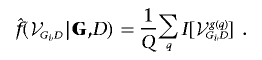
Here, we give details of the MCMC algorithm used to sample from the target distribution of graphical structures conditional on genotype data and disease-status indicator f(g|G,D). The evidence in favor of association between the generic marker genotype Gi and D is given by the sum of the posterior probability of graphs containing an edge between the two nodes:
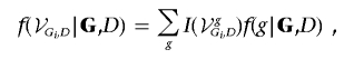 |
where I(·) is the indicator function, equal to 1 if graph g contains an edge between Gi and D and 0 otherwise. This is then estimated from a posterior sample of graphs of size Q as
 |
An MH algorithm is used to sample from f(g|G,D)∝f(G,D|g)f(g). Given the current structure g, a new structure g′ is proposed and accepted with probability
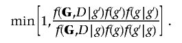 |
For decomposable models, the marginal likelihood f(G,D|g)=f(G,D|θ,g)f(θ|g)dθ factorizes conveniently in terms corresponding to cliques and separators.
For generic graph g, under the assumption of a multinomial likelihood for the vectors of cell entries nlg and nrg of the contingency tables obtained by cross-classifying the data according to the variable in each clique and separator Cl and Sr, l=1,…,L, r=1,…,R, with corresponding vectors of cell probabilities θlg and θrg, the (log) marginal likelihood is given by
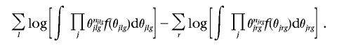 |
The conjugate hyper-Dirichlet prior f(θ|g)=B(α-1)jθαj-1j then leads to the following analytical expression for the (log) marginal likelihood, where we drop the dependence on g for clarity:
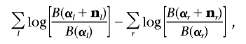 |
where 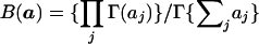 . The hyper-Dirichlet prior ensures that the marginal cell probabilities corresponding to cliques and separators have proper Dirichlet distributions.23,24,33,43
The prior on graphical structures f(g) involves distributional assumptions only about the total number of cliques that contain vertices associated with D,  , where Tl=0 if 𝒞l does not comprise vertices currently associated with D and Tl=1 otherwise. In the simulation, we assume T·∼Pois(0.01).
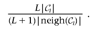
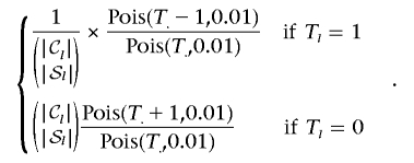
Finally, changes to the current graph involve randomly selecting a clique 𝒞l and proposing, at random, a merge, split, or switch-clique-label step. By indicating with neigh(𝒞l) the set of cliques in the neighborhood of 𝒞l, as defined in the “Methods” section, and with 𝒮l the possibly empty separator set involving 𝒞l and D, the Hastings ratios f(g|g′)/f(g′|g) corresponding to the three steps are as follows.
-
1. Merge step:
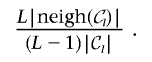
-
2. Split step:
-
3. Switch-clique-label step:
In the simulations, the total chain length was 106 iterations, and the posterior sample of graphical structures is obtained by saving graphs every 1,000 iterations after a burn-in period of 200,000 iterations.
Web Resource
The URL for data presented herein is as follows:
- C.J.V.’s Web site, http://homepages.lshtm.ac.uk/~encdcver/ (for R package Graphminer)
References
- 1.Cheung VG, Spielman RS, Ewens KG, Weber TM, Morley M, Burdick JT (2005) Mapping determinants of human gene expression by regional and genomewide association. Nature 437:1365–1369 10.1038/nature04244 [DOI] [PMC free article] [PubMed] [Google Scholar]
- 2.Farrall M, Morris AP (2005) Gearing up for genomewide gene-association studies. Hum Mol Genet 14:R157–R162 10.1093/hmg/ddi273 [DOI] [PubMed] [Google Scholar]
- 3.Maraganore DM, de Andrade M, Lesnick TG, Strain KJ, Farrer MJ, Rocca WA, Pant PVK, Frazer KA, Cox DR, Ballinger DG (2005) High-resolution whole-genome association study of Parkinson disease. Am J Hum Genet 77:685–693 [DOI] [PMC free article] [PubMed] [Google Scholar]
- 4.Lawrence RW, Evans DM, Cardon LR (2005) Prospects and pitfalls in whole genome association studies. Philos Trans R Soc Lond B Biol Sci 360:1589–1595 10.1098/rstb.2005.1689 [DOI] [PMC free article] [PubMed] [Google Scholar]
- 5.Thomas DC, Haile RW, Duggan D (2005) Recent developments in genomewide association scans: a workshop summary and review. Am J Hum Genet 77:337–345 [DOI] [PMC free article] [PubMed] [Google Scholar]
- 6.Risch N, Merikangas K (1996) The future of genetic studies of complex human diseases. Science 273:1516–1517 [DOI] [PubMed] [Google Scholar]
- 7.Gibbs RA, Belmont JW, Hardenbol P, Willis TD, Yu F, Yang H, Ch’ang LY, et al (2003) The International HapMap Project. Nature 426:789–796 10.1038/nature02168 [DOI] [PubMed] [Google Scholar]
- 8.Gibbs RA, Belmont JW, Boudreau A, Leal SM, Hardenbol P, Pasternak S, Wheeler DA, et al (2005) A haplotype map of the human genome. Nature 437:1299–1320 10.1038/nature04226 [DOI] [PMC free article] [PubMed] [Google Scholar]
- 9.International Map Working Group (2001) A map of human genome sequence variation containing 1.42 million single nucleotide polymorphisms. Nature 409:928–933 10.1038/35057149 [DOI] [PubMed] [Google Scholar]
- 10.Hinds DA, Stuve LL, Nilsen GB, Halperin E, Eskin E, Ballinger DG, Frazer KA, Cox DR (2005) Whole-genome patterns of common DNA variation in three human populations. Science 307:1072–1079 10.1126/science.1105436 [DOI] [PubMed] [Google Scholar]
- 11.Wang WYS, Barratt BJ, Clayton DG, Todd JA (2005) Genomewide association studies: theoretical and practical considerations. Nat Rev Genet 6:109–118 10.1038/nrg1522 [DOI] [PubMed] [Google Scholar]
- 12.Dawson E, Abecasis GR, Bumpstead S, Chen Y, Hunt S, Beare DM, Pabial J, et al (2002) A first-generation linkage disequilibrium map of human chromosome 22. Nature 418:544–548 10.1038/nature00864 [DOI] [PubMed] [Google Scholar]
- 13.McVean GA, Myers SR, Hunt S, Deloukas P, Bentley DR, Donnelly P (2004) The fine-scale structure of recombination rate variation in the human genome. Science 304:581–584 10.1126/science.1092500 [DOI] [PubMed] [Google Scholar]
- 14.Evans DM, Cardon LR (2005) A comparison of linkage disequilibrium patterns and estimated population recombination rates across multiple populations. Am J Hum Genet 76:681–687 [DOI] [PMC free article] [PubMed] [Google Scholar]
- 15.Mueller JC, Lohmussaar E, Magi R, Remm M, Bettecken T, Lichtner P, Biskup S, Illig T, Pfeufer A, Luedemann J, Schreiber S, Pramstaller P, Pichler I, Romeo G, Gaddi A, Testa A, Wichmann HE, Metspalu A, Meitinger T (2005) Linkage disequilibrium patterns and tagSNP transferability among European populations. Am J Hum Genet 76:387–398 [DOI] [PMC free article] [PubMed] [Google Scholar]
- 16.Zondervan KT, Cardon LR (2004) The complex interplay among factors that influence allelic association. Nat Rev Genet 5:89–100 10.1038/nrg1270 [DOI] [PubMed] [Google Scholar]
- 17.Morris AP, Whittaker JC, Xu CF, Hosking LK, Balding DJ (2003) Multipoint linkage-disequilibrium mapping narrows location interval and identifies mutation heterogeneity. Proc Natl Acad Sci USA 100:13442–13446 10.1073/pnas.2235031100 [DOI] [PMC free article] [PubMed] [Google Scholar]
- 18.Morris AP (2005) Direct analysis of unphased SNP genotype data in population-based association studies via Bayesian partition modelling of haplotypes. Genet Epidemiol 29:91–107 10.1002/gepi.20080 [DOI] [PubMed] [Google Scholar]
- 19.Thomas DC, Stram DO, Conti D, Molitor J, Marjoram P (2003) Bayesian spatial modeling of haplotype associations. Hum Hered 56:32–40 10.1159/000073730 [DOI] [PubMed] [Google Scholar]
- 20.Durrant C, Zondervan KT, Cardon LR, Hunt S, Deloukas P, Morris AP (2004) Linkage disequilibrium mapping via cladistic analysis of single-nucleotide polymorphism haplotypes. Am J Hum Genet 75:35–43 [DOI] [PMC free article] [PubMed] [Google Scholar]
- 21.Zöllner S, Pritchard JK (2005) Coalescent-based association mapping of complex trait loci. Genetics 169:1071–1092 10.1534/genetics.104.031799 [DOI] [PMC free article] [PubMed] [Google Scholar]
- 22.Hosking LK, Boyd PR, Xu CF, Nissum M, Cantone K, Purvis IJ, Khakhar R, Barnes MR, Liberwirth U, Hagen-Mann K, Ehm MG, Riley JH (2002) Linkage disequilibrium mapping identifies a 390 kb region associated with CYP2D6 poor drug metabolising activity. Pharmacogenomics J 2:165–175 10.1038/sj.tpj.6500096 [DOI] [PubMed] [Google Scholar]
- 23.Dawid A, Lauritzen S (1993) Hyper-Markov laws in the statistical analysis of decomposable graphical models. Ann Stat 21:1272–1317 [Google Scholar]
- 24.Madigan D, York J (1995) Bayesian graphical models for discrete data. Int Stat Rev 63:215–232 [Google Scholar]
- 25.Giudici P, Green P, Tarantola C (1999) Efficient model determination for discrete graphical models, technical report. University of Pavia, Pavia, Italy [Google Scholar]
- 26.Cowell RG, Dawid AP, Lauritzen SL, Spiegelhalter DJ (1999) Probabilistic networks and expert systems. Springer-Verlag, New York [Google Scholar]
- 27.Borgelt C, Kruse R (2002) Graphical models: methods for data analysis and mining. John Wiley, Chichester, United Kingdom [Google Scholar]
- 28.Dellaportas P, Forster JJ (1999) Markov chain Monte Carlo model determination for hierarchical and graphical log-linear models. Biometrika 86:615–633 10.1093/biomet/86.3.615 [DOI] [Google Scholar]
- 29.Viallefont V, Raftery AE, Richardson S (2001) Variable selection and Bayesian model averaging in case-control studies. Stat Med 20:3215–3230 10.1002/sim.976 [DOI] [PubMed] [Google Scholar]
- 30.Denison DGT, Holmes CC, Mallick BK, Smith AFM (2002) Bayesian methods for nonlinear classification and regression. John Wiley, Chicester, United Kingdom [Google Scholar]
- 31.Verzilli CJ, Stallard N, Whittaker JC (2005) Bayesian modelling of multivariate quantitative traits using seemingly unrelated regressions. Genet Epidemiol 28:313–325 10.1002/gepi.20072 [DOI] [PubMed] [Google Scholar]
- 32.Murray I, Ghahramani Z (2004) Bayesian learning in undirected graphical models: approximate MCMC algorithms. In: Chickering M, Halpern J (eds) Proceedings of the 20th Annual Conference on Uncertainty in Artificial Intelligence, Banff, Canada. AUAI Press, Arlington, VA [Google Scholar]
- 33.O’Hagan A, Forster J (2004) Kendall’s advanced theory of statistics, volume 2B: Bayesian inference. Arnold, London [Google Scholar]
- 34.Hudson RR (2002) Generating samples under a Wright-Fisher neutral model. Bioinformatics 18:337–338 10.1093/bioinformatics/18.2.337 [DOI] [PubMed] [Google Scholar]
- 35.R Development Core Team (2004) R: a language and environment for statistical computing. R Foundation for Statistical Computing, Vienna (http://www.r-project.org/)
- 36.Maniatis N, Morton NE, Gibson J, Xu CF, Hosking LK, Collins A (2005) The optimal measure of linkage disequilibrium reduces error in association mapping of affection status. Hum Mol Genet 14:145–153 10.1093/hmg/ddi019 [DOI] [PubMed] [Google Scholar]
- 37.Thomas A, Camp NJ (2004) Graphical modeling of the joint distribution of alleles at associated loci. Am J Hum Genet 74:1088–1101 [DOI] [PMC free article] [PubMed] [Google Scholar]
- 38.Thomas A (2005) Characterizing allelic associations from unphased diploid data by graphical modeling. Genet Epidemiol 29:23–35 10.1002/gepi.20076 [DOI] [PubMed] [Google Scholar]
- 39.Rodin AS, Boerwinkle E (2005) Mining genetic epidemiology data with Bayesian networks I: Bayesian networks and example application (plasma apoE levels). Bioinformatics 21:3273–3278 10.1093/bioinformatics/bti505 [DOI] [PMC free article] [PubMed] [Google Scholar]
- 40.Sebastiani P, Ramoni MF, Nolan V, Baldwin CT, Steinberg MH (2005) Genetic dissection and prognostic modeling of over stroke in sickle cell anemia. Nat Genet 37:435–440 10.1038/ng1533 [DOI] [PMC free article] [PubMed] [Google Scholar]
- 41.Little RJA, Rubin DB (1987). Statistical analysis with missing data. John Wiley, New York [Google Scholar]
- 42.Monti S, Cooper GF (1999) Learning hybrid Bayesian networks from data. In: Jordan MI (ed) Learning in graphical models. MIT Press, Cambridge, MA [Google Scholar]
- 43.Tarantola C (2004) MCMC model determination for discrete graphical models. Stat Modelling 4:39–61 [Google Scholar]