

Abstract
DNA pooling is a cost-effective approach for collecting information on marker allele frequency in genetic studies. It is often suggested as a screening tool to identify a subset of candidate markers from a very large number of markers to be followed up by more accurate and informative individual genotyping. In this article, we investigate several statistical properties and design issues related to this two-stage design, including the selection of the candidate markers for second-stage analysis, statistical power of this design, and the probability that truly disease-associated markers are ranked among the top after second-stage analysis. We have derived analytical results on the proportion of markers to be selected for second-stage analysis. For example, to detect disease-associated markers with an allele frequency difference of 0.05 between the cases and controls through an initial sample of 1000 cases and 1000 controls, our results suggest that when the measurement errors are small (0.005), ∼3% of the markers should be selected. For the statistical power to identify disease-associated markers, we find that the measurement errors associated with DNA pooling have little effect on its power. This is in contrast to the one-stage pooling scheme where measurement errors may have large effect on statistical power. As for the probability that the disease-associated markers are ranked among the top in the second stage, we show that there is a high probability that at least one disease-associated marker is ranked among the top when the allele frequency differences between the cases and controls are not <0.05 for reasonably large sample sizes, even though the errors associated with DNA pooling in the first stage are not small. Therefore, the two-stage design with DNA pooling as a screening tool offers an efficient strategy in genomewide association studies, even when the measurement errors associated with DNA pooling are nonnegligible. For any disease model, we find that all the statistical results essentially depend on the population allele frequency and the allele frequency differences between the cases and controls at the disease-associated markers. The general conclusions hold whether the second stage uses an entirely independent sample or includes both the samples used in the first stage and an independent set of samples.
GENOMEWIDE case–control association study is a promising approach to identifying disease genes (Risch 2000). For a specific marker, allele frequency difference between cases and controls may indicate potential association between this marker and disease, although other factors (e.g., population stratification) may account for the observed difference. Allele frequencies among the cases and controls can be obtained either through individual genotyping or through DNA pooling. Although individual genotyping provides more accurate estimates of allele frequencies and allows for the inference of haplotypes and the study of genetic interactions, DNA pooling can be more cost effective in genomewide association studies as individual genotyping needs to collect data from hundreds of thousands of markers for each person.
In the absence of measurement errors associated with DNA pooling, there would be no difference between using DNA pooling or individual genotyping for the estimation of allele frequency. However, one major limitation of the current DNA pooling technologies is indeed the errors associated with measuring allele frequencies in the pooled samples. Recent research suggests that for a given pooled DNA sample, the standard deviation of the estimated allele frequency is between 1 and 4% (cf. Buetow et al. 2001; Grupe et al. 2001; Le Hellard et al. 2002; Sham et al. 2002). Le Hellard et al. (2002) reported that using the SNaPshot method, which is based on allele-specific extension or minisequencing from a primer adjacent to the site of the SNP, the standard deviation ranged from 1 to 4%, depending on the specific markers being tested. Our recent studies have found that the errors of this magnitude may have a large effect on the power of case–control association studies using DNA pooling as the sole source for genotyping (see Zou and Zhao 2004 for unrelated population samples and Zou and Zhao 2005 for family samples). Therefore, a two-stage design where DNA pooling is used as a screening tool followed by individual genotyping for validation in an expanded or independent sample may offer an attractive strategy to balance power and cost (Barcellos et al. 1997; Bansal et al. 2002; Barratt et al. 2002; Sham et al. 2002). In such a design, the first stage evaluates a very large number (e.g., 1 million) of markers using DNA pooling, and only the most promising ones are selected and studied in the second stage through individual genotyping. Similar two-stage designs have been considered by Elston (1994) and Elston et al. (1996) in the context of linkage analysis and by Satagopan and Elston (2003) and Satagopan et al. (2002, 2004) in the context of association studies. However, these studies primarily assumed that individual genotyping is used in both stages, which may not be as cost effective as using DNA pooling in the first stage. Moreover, errors associated with genotyping have never been considered in the literature.
When DNA pooling is used as a screening tool in the first stage, the following issues need to be addressed:
How many markers should be chosen after the first stage so that there is a high probability that all or some of the disease-associated markers are included in the individual genotyping (second) stage?
What is the statistical power that a disease-associated marker is identified when the overall false positive rate is appropriately controlled for?
When the primary goal is to ensure that some of the disease-associated markers are ranked among the top L markers after the two-stage analysis, what is the probability that at least one of the disease-associated markers is ranked among the top?
The objective of this article is to provide answers to these practical questions to facilitate the most efficient use of the two-stage design strategy where DNA pooling is used. In genetic studies, the sample in the first stage can be expanded with a set of new samples in the second-stage analysis, or the second stage may involve only a new set of samples for individual genotyping, so both these strategies are considered in our article. We hope that the principles thus learned will provide an effective and practical guide to genetic-association studies.
This article is organized as follows. We first present our analytical results to treat the above three problems and then conduct numerical calculations under various scenarios to gain an overview and insights on these design issues. Finally, some future research directions are discussed.
METHODS
Genetic models:
We consider two alleles, A and a, at a candidate marker, whose frequencies are p and  , respectively. For simplicity, we consider a case–control study with n cases and n controls. Let
  denote the number of allele A carried by the ith individual in the case group, and
  is similarly defined for the ith individual in the control group. Assuming Hardy–Weinberg equilibrium, each
  or
or  has a value of 2, 1, 0 with respective probabilities
  , 2pq, and
  under the null hypothesis of no association between the candidate marker and disease. When the candidate marker is associated with disease, we assume that the penetrance is
  for genotype AA,
  for genotype Aa, and
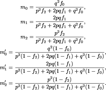
  for genotype aa. Note that these two alleles may be true functional alleles or may be in linkage disequilibrium with true functional alleles. Under this genetic model, the probabilities of having k copies of A among the cases,
  , and those among the controls,
  , are
, are
 |
One-stage designs:
For useful reference, we first formulate the test statistics and derive statistical power on the basis of a one-stage design using either individual genotyping or DNA pooling. These can be considered as special cases or direct extensions of the results in Zou and Zhao (2004).
Individual genotyping:
For individual genotyping, let  and
and  denote the observed numbers of allele A in the case group and the control group, respectively,
  and
and  denote the population allele frequencies of allele A in these two groups, and
  and
and  denote their maximum-likelihood estimates, where
  and
and  .
.
Under the null hypothesis of no association between the candidate marker and disease status,  , and
, and  . On the other hand, under the genetic model introduced above,
 |
and
 |
The statistic to test genetic association between the candidate marker and disease is
 |
where  .
.
Considering a one-sided test and using a significance level of  , the power of the test statistic
  is
is
 |
where  is the expected frequency of allele A under the genetic model, Φ is the cumulative standard normal distribution function, and
  is the upper 100αth percentile of the standard normal distribution.
DNA pooling:
For DNA pooling, we consider m pools of cases and m pools of controls each having size s such that n = ms. We assume the following model relating the observed allele frequencies estimated from the pooled samples to the true frequencies of allele A in the samples,
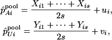 |
where  denotes the number of allele A carried by the jth individual in the ith case group, and
  is defined similarly (i = 1, … , m; j = 1, … , s), and
  and
and  are disturbances with mean 0 and variance
  and are assumed to be independent and normally distributed. Define
 |
and
 |
Under the null hypothesis of no association,  , and
, and  . On the other hand, under the genetic model introduced above,
 |
and
 |
We can use the following test statistic to test genetic association based on DNA pooling data,
 |
where  .
.
If we use a one-sided test and a significance level of  , the power of the test statistic
  is
is
 |
Two-stage designs:
How many markers should be selected after the pooling stage?
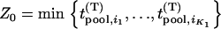
In the first stage, i.e., the DNA pooling stage, we consider m pools of cases and m pools of controls each having size s such that n = ms. The main objective for the first stage is to select the most promising markers on the basis of pooled DNA data to follow up in the second stage to reduce the overall cost. Therefore, the following problem should be addressed: How many of the M markers initially screened should be selected for second-stage analysis so that the probability that the disease-associated markers are selected is high, e.g., 90%? For simplicity, we assume that the associated markers are independent. Let the desired number of markers be  . As in Satagopan et al. (2002, 2004), we choose those markers that have the largest test statistic.
For markers not associated with disease, the test statistic can be approximated by
 |
where  ,
,  ,
,  ,
,  , and
, and  and w are mutually independent. Whereas for markers associated with disease through the genetic model introduced above, the test statistic can be approximated by
 |
where  , and
, and  and w are mutually independent.
Let  be the test statistics corresponding to the
  disease-associated markers,
  be those corresponding to the
  null markers, and
  are the corresponding ordered test statistics. Let
  denote the probability that the specified
  of the
  truly associated markers are among the top
  markers. Furthermore, denote
 |
and
 |
Note that  , where
 |
 |
and  ,
,  , and
, and  are defined as
  ,
,  , and
, and  with allele frequency
  and penetrances
  ,
,  , and
, and  at the truly associated marker j in place of p,
  ,
,  , and
, and  , respectively,
  . In addition,
  ,
,  . For convenience, we denote the distribution and density functions of
  by
by  and
and  and the distribution and density functions of
  by
by  and
and  , respectively. Then it can be shown that the joint density function of
  is
is
 |
where
 |
and
 |
Moreover, the joint density of  is
is
 |
Hence,
 |
(1) |
where
 |
Therefore, the probability that  of the
  disease-associated markers are among the top
  markers is given by
 |
(2) |
From this expression, we can determine the value of  such that
  is higher than or equal to a given level, e.g., 90%.
For a given  , let
, let  denote the number of disease-associated markers included in the top
  markers; then its expectation is
  . Therefore, we can determine the value of
  through this formula such that the average number of disease-associated markers included in the top
  markers is
 ; i.e.,
  disease-associated markers are selected on average.
The above Equations 1 and 2 are exact but somewhat complicated. In the following, we derive their asymptotic expressions so that we can obtain simpler analytical results. It is easy to see that we need only to consider Equation 1.
For a fixed proportion  , let
, let  denote the normal distribution quantile corresponding to
  , that is,
  . Then from the asymptotic property of order statistics, we have
 |
(3) |
and
 |
(4) |
when  tends to infinity, where
  denotes the integer part of
  , and
, and  denotes convergence almost sure.
If we write  , then we have
 |
(5) |
where
 |
(6) |
and
 |
Note that the total number of markers  is usually extremely large, the number of disease-associated markers
  is extremely small compared to M, and
 |
Therefore, taking  top markers is equivalent to taking the top markers in the proportion of
  .
.
In particular, when the number of disease-associated markers is  , we can obtain an analytical expression for the selected proportion
  necessary to attain the desired probability that the disease-associated marker is selected. In fact, when
  , from Equations 5 and 6, we have
 |
Therefore, if we require the probability that the truly associated marker is included in the selected subset from the first stage is at least  , i.e.,
  , then
 |
where  is the normal distribution quantile corresponding to
  . Clearly, the above formula is equivalent to
 |
So the proportion  should satisfy
  . Therefore, a conservative selection of the proportion
  is the maximum of
  over various genetic models and allele frequencies.
It should be noted that the above selection approach for markers is through comparing the values of the test statistics at all the markers and no statistical inference is conducted. If statistical tests are performed to select the promising markers, then one would keep those markers showing stronger statistical significance in the first stage. However, the two methods are actually asymptotically equivalent. This is because, if we take  (where
  is the upper 100
 th percentile of the standard normal distribution corresponding to the significance level
  for each marker tested in the first stage), that is,
  , which means that the selected proportion of markers is the same as the significance level for testing each marker in the first stage, then the asymptotic probability of the specified
  of
of  truly associated markers being selected given in Equation 5 is in fact the statistical power of detecting the specified
  of
of  truly associated markers. So for the case of independent markers, selecting the markers through comparing the values of their test statistics is asymptotically equivalent to selecting the markers through statistical tests, a conclusion similar to that of Satagopan et al. (2004) who considered individual genotyping in the first stage. In other words, the selection approach based on statistical tests is the limiting case of that based on comparing the values of test statistics at the markers when the number of total markers is very large.
The statistical power of the two-stage design:
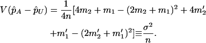
After a set of promising markers is identified through DNA pooling, these markers will be individually genotyped in the second stage. In this subsection, we first derive the statistical power of the two-stage design to detect the disease-associated markers. In the next subsection, we investigate the possibility of at least one disease-associated marker being ranked among the top after the second stage. In addition to the 2 individuals used in the pooling stage, we also consider an additional sample of size 2
 . Under the null hypothesis
  , i.e., the marker is not associated with disease, the test statistic for markers tested in the second stage can be written approximately as
 |
where  and
and  is independent of
  and w, which were defined above in the discussion of pooled DNA analysis.
Similarly, for markers associated with disease under the genetic model introduced above, the test statistic for markers tested in the second stage can be written approximately as
 |
where  , and
, and  is independent of
  and w, which were defined above in the discussion of pooled DNA analysis.
Under the null hypothesis of no association,  has a joint bivariate normal distribution
  , where
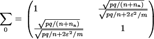 |
Under the alternative hypothesis  ,
,  has a joint bivariate normal distribution
  , where
 |
and
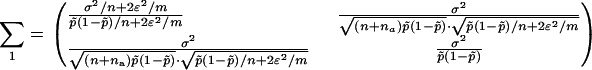 |
For a given sample size  and significance level α1 or power 1 − β1 in the first stage (or a given proportion of markers to be selected for second-stage analysis), we can determine a critical value
  by solving
  or
or  . Then for the overall significance level
  for testing
  markers and an additional sample of size
  , we can determine the critical value
  in the second stage by solving
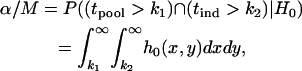 |
where  is the density function of
  under
under  , which is given by
 |
where  is the determinant of the matrix
  , and
, and  is the inverse of
  .
.
The probability that a disease-associated marker is identified by the two-stage design is then given by
 |
where  is the density function of
  under
under  , which is given by
 |
In the above two-stage design, the sample in the first stage is reused in the second stage, and this introduces correlation between the two test statistics,  and
and  . Therefore, we call this two-stage scheme the two-stage dependent design in the following discussion. On the other hand, we may use two separate samples in the two stages with one sample used for screening and another independent sample used for individual genotyping. In this scenario, the two test statistics,
  and
and  , are independent. Hereafter we call such a two-stage scheme the two-stage independent design. For the two-stage independent design, the type I error rate and power are simply the products of those in both stages. That is,
 |
and
 |
The chance of at least one marker associated with disease being ranked among the top L markers after individual genotyping:
We suppose that, among the  markers selected from the first stage, there are
  markers associated with disease and
  null markers. Without loss of generality, we assume that they are
  and
and  , respectively. In this case, let
  and
and  denote
  and
and  , respectively. Let
  be the test statistic for the jth truly associated marker,
  be the test statistic for the jth null marker in the second stage, and
  and
and  be their order statistics. Then in the second stage, the probability that none of the truly associated markers are ranked among the top
  markers is
 |
(7) |
where
 |
and
 |
Like Equation 1, an exact expression for calculating the probability  can be derived (appendix). Therefore, the probability that at least one truly associated marker is ranked among the top
  markers is obtained by
  . Because the exact formula is quite complicated, we provide an approximate one below to simplify the calculation of this probability. First note that
  , where
 |
and
 |
 . We denote the distribution function of
  by
by  . Also, let
  denote the joint distribution function of
  ,
,  .
.
Now for a fixed proportion  , we have
 |
when  is large, where
  is a normal distribution quantile corresponding to
  ; that is,
  , and
, and  denotes the integer part of
  as before. Denote
  and then
  . Therefore, we substitute
  for
for  in Equation 7. This means that as long as
  , we think that no truly associated markers are ranked among the top
  markers, regardless of the null markers chosen from the first stage. On the other hand, we have demonstrated that in the first stage, selecting a proportion
  of the markers through comparing the values of the test statistics is asymptotically equivalent to selecting the significant markers through statistical tests with significance level
  ; that is, the critical value can be taken as
  . Therefore, we obtain
 |
(8) |
where  is given in Equation 6, and
 |
For the two-stage independent design, the probability of at least one truly associated marker being ranked among the top  markers after the second stage can be easily obtained as
 |
where
 |
and
 |
An approximation to  is
is
 |
(9) |
RESULTS
To see how many markers should be chosen from the pooling stage, we conduct some calculations using Equation 5 first under various genetic models and allele frequencies. The following four genetic models are considered: a dominant model with  ,
,  ; a recessive model with
  ,
,  ; a multiplicative model with
  ,
,  ,
,  ; and an additive model with
  ,
,  , and
, and  (Risch and Teng 1998; Zou and Zhao 2004). The population frequency of allele A is varied from 0.05, 0.2, to 0.7. We take the sample size to be
  and assume that the number of the disease-associated markers is
  .
.
Table 1 provides the probabilities of  truly associated markers being among the top 1/1000 markers when we assume the same genetic model and allele frequency at each disease-associated marker and no measurement errors. It is clear from Table 1 that for most cases, the probability that all truly associated markers are among the top 1/1000 markers is high. The probability that these top markers include only some of the truly associated markers is often very low. An explanation is that when there is a signal that the marker is associated with disease, the corresponding test statistic should often be large when the sample size is reasonably large. So the chance for such a marker to be ranked low is rather small. The exceptional cases are the recessive models with small allele frequencies or dominant models with large allele frequencies. This is because the allele frequency difference between the cases and controls is often small in these scenarios and the sample sizes are not large enough to distinguish the signals from noises. However, we can observe from the table that the probability of at least one truly associated marker being among the top 1/1000 markers is uniformly very large except for the recessive models with small allele frequencies. The conclusion still holds for the case in which genetic models and allele frequencies are different at each truly associated marker or the case of different sample sizes (data not shown). So in the following analysis, we consider the chance that at least one truly associated marker is among the top
  of the markers.
TABLE 1.
The probability of 
 disease-associated markers ranked among the top 1/1000 markers for the case of the same genetic model and allele frequency at each truly associated marker
 |
 |
 |
 |
 |
 |
|
|---|---|---|---|---|---|---|
| Dominant | ||||||
| p = 0.05 | 1.000 | 0.000 | 0.000 | 0.000 | 0.000 | 1.000 |
| p = 0.20 | 1.000 | 0.000 | 0.000 | 0.000 | 0.000 | 1.000 |
| p = 0.70 | 0.234 | 0.394 | 0.266 | 0.090 | 0.015 | 0.999 |
| Recessive | ||||||
| p = 0.05 | 0.000 | 0.000 | 0.000 | 0.004 | 0.099 | 0.103 |
| p = 0.20 | 0.995 | 0.005 | 0.000 | 0.000 | 0.000 | 1.000 |
| p = 0.70 | 1.000 | 0.000 | 0.000 | 0.000 | 0.000 | 1.000 |
| Multiplicative | ||||||
| p = 0.05 | 0.970 | 0.030 | 0.000 | 0.000 | 0.000 | 1.000 |
| p = 0.20 | 1.000 | 0.000 | 0.000 | 0.000 | 0.000 | 1.000 |
| p = 0.70 | 0.999 | 0.001 | 0.000 | 0.000 | 0.000 | 1.000 |
| Additive | ||||||
| p = 0.05 | 1.000 | 0.000 | 0.000 | 0.000 | 0.000 | 1.000 |
| p = 0.20 | 1.000 | 0.000 | 0.000 | 0.000 | 0.000 | 1.000 |
| p = 0.70 | 1.000 | 0.000 | 0.000 | 0.000 | 0.000 | 1.000 |
Dominant model,  ,
,  ; recessive model,
  ,
,  ; multiplicative model,
  ,
,  ,
,  ; additive model,
  ,
,  ,
,  . The sample size is
  , and no measurement errors are assumed with the number of disease-associated markers being
  .
.
Figure 1 presents the probability of at least one truly associated marker being included among the top  of the markers for a fixed population allele frequency, p and allele frequency difference between the case and control groups,
  [where
  is taken as 0.01; when
  is taken to be other values, the results are similar (data not shown)]. It can be observed from Figure 1 that for given p and
  , the probabilities are almost the same under different genetic models. This shows that the probability that at least one truly associated marker is included among the top markers depends on the genetic model and allele frequency mostly through the population allele frequency and allele frequency difference between the case and control groups. Because the exact genetic model is often unavailable to researchers, this fact makes it possible to select the proportion
  on the basis of the assumed population allele frequency and allele frequency difference between the cases and controls at the candidate marker. Note that the effect of the number of truly disease-associated markers on the probability that at least one such marker is included is not very small (data not shown). So we require that the value of
  is chosen so that the probability is >80% for the case of having only one truly associated marker and not <99% for the case of five truly associated markers. For the case of five truly associated markers, the allele frequency differences at four markers are assumed to be at least 0.03. Note that when the number of truly associated markers
  is greater than five, the probability that at least one truly associated marker is included is larger.
Figure 1.—

The probability of the truly associated marker being included among the top  of the markers under different genetic models for the same population allele frequency (0.20) and allele frequency difference between the case and control groups (0.05). From top to bottom, the curves correspond to the dominant model, additive model, multiplicative model, and recessive model, respectively. The sample size is
  , the error rate is
  , and the number of pools formed for either the cases or the controls is
  . We assume that the number of disease-associated markers is
  .
.
Figure 2 gives the probability that the disease-associated marker is included among the top  = 6.7% of the markers for various population allele frequencies and allele frequency differences between the cases and controls when there is only one truly associated marker. Figure 2 shows that when the error rate is 0.01, choosing
  can detect the truly associated marker with an allele frequency difference of 0.05 with >80% chance. Furthermore, when there are five disease-associated markers, to detect at least one such marker with >99% chance, the selection proportion should be 7% (data not shown). Therefore, to detect the disease markers with an allele frequency difference of 0.05 at one marker, the selection proportion of 7% is recommended when the error rate is 0.01 and the sample consists of 1000 cases and 1000 controls. To select the truly associated markers with an allele frequency difference of 0.03 at one marker, the proportion
  should be ∼29% (data not shown). If the error rate is reduced to 0.005, the proportion
  can be reduced to 3 or 19% to select the truly associated markers with an allele frequency difference of 0.05 or 0.03 at one marker, respectively. The required proportions for including at least one truly associated marker with an allele frequency difference of
  , 0.05, 0.07, or 0.10 are summarized in Table 2 when the sample size is
  . Generally, the effect of sample size on selecting the disease-associated markers is not very large, especially for the extreme allele frequencies (data not shown). However, it can be seen from Table 2 that reducing the measurement errors can greatly reduce the required proportion
  . Therefore, it is important to reduce the measurement errors in the first stage.
Figure 2.—

The probability of the truly associated marker being included among the top 6.7% of the markers when the number of disease-associated markers is  . The sample size is
  , the error rate is
  , and the number of pools formed for either the cases or the controls is
  . From top to bottom, the curves correspond to allele frequency differences of 0.10, 0.07, 0.05, 0.03, and 0.01, respectively.
TABLE 2.
The recommended proportion  of markers selected from the first stage for including at least one truly associated marker with an allele frequency difference of
  at one marker
 |
ɛ = 0 | ɛ = 0.005 (%) | ɛ = 0.01 (%) | ɛ = 0.03 (%) |
|---|---|---|---|---|
| 0.03 | 15% | 19 | 29 | 58 |
| 0.05 | 2% | 3 | 7 | 40 |
| 0.07 | 0.4% | 0.9 | 3 | 25 |
| 0.10 | 5 × 10⁻⁵ | 0.02 | 0.4 | 18 |
The sample size in the first stage is  , and the number of pools formed for either the cases or the controls is
  .
.
To investigate the statistical power of the two-stage design, we set the sample size in the first stage to be  and the supplemental sample size in the second stage to be
  . Note that the main purpose in the first stage is to screen for those truly associated markers. Therefore, we hope that the probability of the truly associated markers being included is large. Thus, we set the power to be 95% in the pooling stage. The significance level of the two-stage design for a single-marker test is taken to be
  , a level suggested by Risch and Merikangas (1996) for genomewide association studies. The results for the two-stage dependent design under the previous four genetic models are presented in Table 3. Clearly, the power depends on the genetic model and allele frequency. In general, the power is very high for the sample sizes we consider here. The exceptions are the recessive models with a small allele frequency or dominant models with a large allele frequency. From Table 3, we can see that the measurement errors in DNA pooling have little impact on the statistical power of the two-stage design. Our previous studies showed that such an effect can be large for a one-stage design, especially when the error rates are not small (Zou and Zhao 2004). Our finding shows that the impact of measurement errors on the case–control association studies can almost be neglected by using the two-step design, although a larger measurement error will lead to more markers to be selected in the first stage. Compared to the one-stage design, the two-stage strategy has slightly smaller power due to the selection in the first stage (data not shown). When the two-stage independent design is used, the power is higher than that of the two-stage dependent design (Table 4). In our calculation, we assume that the same numbers of the cases and the controls are typed at the second stage for both designs, which implies that more efforts are needed for the two-stage independent design to collect additional cases and controls compared to the two-stage dependent design. Our calculation shows that if we ignore the correlation between the two stages for a two-stage dependent design, then we will slightly overestimate the power. On the other hand, from Table 4, the two-stage independent design is more affected by the measurement errors than the two-stage dependent design but less affected than the one-stage pooling scheme.
TABLE 3.
The power of the two-stage dependent design for the sample sizes of  and
and 
| ɛ = 0 | ɛ = 0.005 | ɛ = 0.01 | ɛ = 0.03 | |
|---|---|---|---|---|
| Dominant | ||||
| p = 0.05 | 0.950 | 0.950 | 0.950 | 0.950 |
| p = 0.20 | 0.950 | 0.950 | 0.950 | 0.950 |
| p = 0.70 | 0.046 | 0.046 | 0.046 | 0.046 |
| Recessive | ||||
| p = 0.05 | 0.000 | 0.000 | 0.000 | 0.000 |
| p = 0.20 | 0.829 | 0.827 | 0.824 | 0.817 |
| p = 0.70 | 0.950 | 0.950 | 0.950 | 0.950 |
| Multiplicative | ||||
| p = 0.05 | 0.600 | 0.599 | 0.595 | 0.584 |
| p = 0.20 | 0.950 | 0.950 | 0.950 | 0.950 |
| p = 0.70 | 0.950 | 0.950 | 0.950 | 0.950 |
| Additive | ||||
| p = 0.05 | 0.941 | 0.939 | 0.936 | 0.931 |
| p = 0.20 | 0.950 | 0.950 | 0.950 | 0.950 |
| p = 0.70 | 0.948 | 0.947 | 0.946 | 0.943 |
The significance level for the two-stage design is α = 5 × 10⁻⁸, and the power in the pooling stage is 1 − β1 = 95%. Dominant model,  ,
,  ; recessive model,
  ,
,  ; multiplicative model,
  ,
,  ,
,  ; additive model,
  ,
,  ,
,  . The number of pools formed for either the cases or the controls is
  .
.
TABLE 4.
The power of the two-stage independent design for the sample sizes of  in the first stage and
  in the second stage
| ɛ = 0 | ɛ = 0.005 | ɛ = 0.01 | ɛ = 0.03 | |
|---|---|---|---|---|
| Dominant | ||||
| p = 0.05 | 0.950 | 0.950 | 0.950 | 0.950 |
| p = 0.20 | 0.950 | 0.950 | 0.950 | 0.950 |
| p = 0.70 | 0.092 | 0.084 | 0.071 | 0.051 |
| Recessive | ||||
| p = 0.05 | 0.000 | 0.000 | 0.000 | 0.000 |
| p = 0.20 | 0.933 | 0.925 | 0.902 | 0.830 |
| p = 0.70 | 0.950 | 0.950 | 0.950 | 0.950 |
| Multiplicative | ||||
| p = 0.05 | 0.833 | 0.767 | 0.678 | 0.593 |
| p = 0.20 | 0.950 | 0.950 | 0.950 | 0.950 |
| p = 0.70 | 0.950 | 0.950 | 0.950 | 0.950 |
| Additive | ||||
| p = 0.05 | 0.950 | 0.949 | 0.946 | 0.933 |
| p = 0.20 | 0.950 | 0.950 | 0.950 | 0.950 |
| p = 0.70 | 0.950 | 0.950 | 0.950 | 0.946 |
The significance level for the two-stage design is α = 5 × 10⁻⁸, and the power in the pooling stage is 1 − β1 = 95%. Dominant model,  ,
,  ; recessive model,
  ,
,  ; multiplicative model,
  ,
,  ,
,  ; additive model,
  ,
,  ,
,  . The number of pools formed for either the cases or the controls is
  .
.
Table 5 gives the statistical power of the two-stage dependent design for the fixed allele frequency and allele frequency difference between the cases and controls (where  is still taken as 0.01). It can be observed from Table 5 that for given p and
  , the power is almost the same under different genetic models. This shows that the power of the two-stage design depends on the genetic model and allele frequency almost only through the population allele frequency and allele frequency difference between the case and control groups. As before, this observation is useful in practice because, although the genetic models are often unknown to us, we can estimate the sample size to attain the desired significance level and power under different genetic models as long as the allele frequencies in the general population and the allele frequency differences between the cases and controls can be assumed.
TABLE 5.
The power of the two-stage dependent design for the fixed allele frequency and allele frequency difference between the case and the control groups
 |
 |
 |
 |
|
|---|---|---|---|---|
| p = 0.05 | ||||
| Dominant | 0.0685 | 0.748 | 0.949 | 0.950 |
| Recessive | 0.0915 | 0.717 | 0.944 | 0.950 |
| Multiplicative | 0.0704 | 0.744 | 0.948 | 0.950 |
| Additive | 0.0697 | 0.746 | 0.949 | 0.950 |
| p = 0.20 | ||||
| Dominant | 0.00115 | 0.0585 | 0.457 | 0.941 |
| Recessive | 0.00174 | 0.0722 | 0.460 | 0.931 |
| Multiplicative | 0.00127 | 0.0618 | 0.458 | 0.938 |
| Additive | 0.00126 | 0.0612 | 0.458 | 0.939 |
| p = 0.70 | ||||
| Dominant | 4.58 ×10⁻⁴ | 0.0301 | 0.352 | 0.926 |
| Recessive | 6.96 ×10⁻⁴ | 0.0389 | 0.376 | 0.934 |
| Multiplicative | 6.24 ×10⁻⁴ | 0.0366 | 0.374 | 0.936 |
| Additive | 6.16 ×10⁻⁴ | 0.0362 | 0.373 | 0.937 |
The significance level for the two-stage design is α = 5 × 10⁻⁸, and the power in the pooling stage is 1 − β1 = 95%. The sample sizes are  and na = 500, the error rate is ɛ = 0.01, and the number of pools formed for either the cases or the controls is
  .
.
We use the approximate Equation 8 to calculate the probability of at least one truly associated marker being ranked among the top  markers after the second stage for the two-stage dependent design. Likewise, the probabilities are almost the same under different genetic models for the same population allele frequency and allele frequency difference between the case and control groups (data not shown). As an example, we consider a recessive model with a population allele frequency of 0.2 and allele frequency difference of 0.05. The results are presented in Figure 3. It can be seen that there is a high probability for the top 50 markers to include at least one truly associated marker when 1% of the markers are selected from the first stage, even though the measurement errors are not small. However, this probability may not be high for detecting disease-associated markers with small allele frequency differences, e.g., 0.03 (data not shown). Essentially, the chance that at least one truly associated marker is ranked among the top
  markers after the second stage is higher for markers with larger allele frequency differences. The conclusion is similar for the two-stage independent design (data not shown). In general, the probabilities are not larger for the two-stage independent design than those for the two-stage dependent design. This can be understood by noting the positive correlation between the two stages for the two-stage dependent design that leads to the smaller value of the right-hand side of Equation 8 than
  .
.
Figure 3.—

The probability of at least one truly associated marker being ranked among the top  markers after the second stage for the two-stage dependent design where the sample sizes are
  and
and  , the error rate is
  , and the number of pools formed for the cases or the controls is
  . The allele frequency difference is 0.05, and the population allele frequency is
  . From top to bottom, the curves correspond to the cases of
  5, 2, and 1, respectively (assume that the number of the whole markers is
  and the top 1% of markers are chosen from the first stage in which
  truly associated markers are included).
DISCUSSION
In this article, we have investigated the two-stage design with DNA pooling used in the first-stage screening. Three related problems have been considered: (i) How many markers should be chosen from the first stage?, (ii) What is the overall statistical power when the two-stage design is used?, and (iii) What is the probability that at least one of the disease-associated markers is ranked among the top after the second stage? Our analyses show that the answers to these questions are dependent on the genetic models and allele frequencies essentially through the population allele frequencies and allele frequency differences between the case and the control groups at the candidate markers. For the first problem, we have derived the proportion of markers that needs to be selected to include the truly associated markers. For instance, when the measurement errors are small (0.005), 3% of the markers need to be selected to include a disease-associated marker with an allele frequency difference of 0.05 between the case and control groups for a sample consisting of 1000 cases and 1000 controls. When the measurement errors are not small, multiple pools can be formed to reduce measurement errors. For the second problem, we have derived the formula for calculating the statistical power of a two-stage strategy. We find that the measurement errors in pooled DNA have little effect on the power when the two-stage design, especially the two-stage dependent design, is used, contrary to the single-stage pooling scheme. Recalling our conclusion that reducing measurement errors can greatly reduce the selection proportion of markers in the pooling stage, we see that for a two-stage design, measurement errors have a large impact only on the first stage. Once the markers are selected, the effect of measurement errors can be very small. Three strategies, the two-stage dependent design, the two-stage independent design, and the one-stage design, have been compared. Overall, the two-stage independent design has the highest power, and the one-stage design with individual genotyping has slightly higher power than the two-stage dependent design. However, their difference in power is not large. On the other hand, the one-stage design will be either too expensive (for individual genotyping) in genomewide search or seriously affected by measurement errors (for DNA pooling). Furthermore, for the two-stage independent design, extra sample collection is needed, although the genotyping cost is the same as in the two-stage dependent design. In fact, if in our calculations, we use exactly the same number of individuals as that in the two-stage dependent design with 500 used to screen and the other 500 for follow-up analyses, the statistical power for such a two-stage independent design can be much lower than that of the two-stage dependent design. For example, the power under the multiplicative model with a population allele frequency of 0.05 and a measurement error rate of 0.005 is 0.209 for the above two-stage independent design but 0.599 for the two-stage dependent design. For the third problem, our studies show that the chance that at least one truly associated marker selected from the first stage is ranked among the top markers after the second stage is high when the allele frequency differences are not <0.05 for samples of reasonable sizes, even though the measurement errors are not small.
It is of practical interest how to allocate the sample sizes in the two stages to maximize the power (or minimize the total cost) for a given cost (or given power), as Satagopan et al. (2002), Satagopan and Elston (2003), and Satagopan et al. (2004) have done. For example, let  be the total cost,
  be the cost of recruiting an individual,
  be the cost of measuring allele frequency at a single marker for a DNA pool,
  be the cost of genotyping a single marker for an individual, and
  be the other cost such as administration. Then we have
 |
for the two-stage dependent design, and
 |
for the two-stage independent design. In particular, we take the number of total markers to be  , the number of the truly disease-associated markers to be
  , and the number of pool pairs to be
  . Further, we take
  (unit: United States dollar),
  ,
,  ,
,  ,
,  , and
, and  . Then our preliminary calculation results showed that for the given cost, the optimal design that leads to highest power is to allocate exactly (nearly) the same sample size to each stage for the two-stage dependent (independent) design (Y. Zuo, J. Wang, G. Zou, H. Zhao and H. Liang, unpublished results). For the two-stage dependent design, this means that all individuals should be used at both stages and no additional sample is needed at the second stage. This is similar to the two-stage individual genotyping design with sample size constraint (Satagopan et al. 2004) but is different from the design with individual genotyping at both stages in which the optimal design maximizing power is to allocate ∼25% of the individuals to the first stage and the remaining individuals to the second stage (Satagopan et al. 2002; Satagopan and Elston 2003). Clearly, an overall investigation is needed in this regard. This warrants our further research.
To simplify our analyses, we have assumed independence among the markers. This would be reasonable when the marker density is low. However, for a genomewide association study, the marker density is high and adjacent markers may be highly correlated. But it is not evident how to model the correlation among markers. One way to avoid this difficulty is to study many subsets of the whole marker set such that they cover the entire genome yet the markers are independent. However, this is clearly less than satisfactory due to the loss of information in the data. On the other hand, this question can be examined empirically to assess the effect of correlations among markers on our results. For example, we have investigated the effect of correlation on the selection of markers in the first stage through the HapMap data. We considered the SNPs on the 500K SNP Array and used the HapMap data to approximate the level of correlations among SNPs. The HapMap data consist of 270 individuals from four populations, and the information for the 500K data can be downloaded from http://www.affymetrix.com/support/downloads/data/500K_HapMap270.zip (For the missing alleles, we imputed them by the corresponding frequencies of the existing alleles). For simplicity, we have considered only the first 300 markers and let the 140th marker be disease associated to illustrate the impact of marker dependence and a more thorough investigation will be reported in future articles. Assuming a dominant model with  , the allele frequency difference between the case and control groups is
  . We considered the sample sizes of the two pools to be
  . Using the results established before under the independence assumption, we found that if we took the top
  , and
, and  of the markers when
  ,
,  ,
,  , and
, and  , respectively, then we would have the chance of
  to select the disease-associated marker (i.e., 140th marker) in the first stage. When we applied these
  's obtained under the independence assumption to the HapMap data, we observed that in 10,000 simulations, we had the chances of
  ,
,  ,
,  , and
, and  to include the disease-associated marker when
  ,
,  ,
,  , and
, and  , respectively. This shows that the correlation among markers can reduce the chance that the truly disease-associated marker is selected but such reduction is not large. Further, the impact of correlation is larger (smaller) for less (more) stringent requirement on the chance of including the disease-associated marker under the independence assumption (data not shown). Clearly, to eliminate the effect of correlation, the best way is to develop similar methods to those given in this article incorporating the correlations among markers, and this will be addressed in our future work.
Throughout this article, we have assumed that measurement errors exist in the DNA pooling stage but not in the individual genotyping stage. How genotyping errors at both stages can affect the efficiency of the two-stage scheme also warrants future research.
Note that family based data are often used in genetic epidemiological studies in addition to population-based data. Association studies using pooled DNA family data have been considered for the one-stage scheme (e.g., Risch and Teng 1998; Zou and Zhao 2005). The research on the two-stage designs using family data is no doubt an interesting topic for future research.
Acknowledgments
The authors are grateful to the associate editor Yunxin Fu and to the two reviewers for their constructive comments and suggestions that led to great improvement of the original manuscript. This work was supported in part by grants DMS0234078 from the National Science Foundation (to Y. Zuo), 70221001 and 10471043 from the National Natural Science Foundation of China (to G. Zou), and GM59507 from the National Institutes of Health (to H. Zhao).
APPENDIX: THE CALCULATION OF THE PROBABILITY THAT NONE OF THE TRULY ASSOCIATED MARKERS ARE RANKED AMONG THE TOP L MARKERS
Clearly,  can be written as
 |
(A1) |
We have known  ∼
∼  ,
,  , and
, and  ∼
∼  ,
,  . We denote the distribution and density functions of
  by
by  and
and  , respectively. The distribution and density functions of
  are still denoted as
  and
and  , respectively. Further, let
  denote the joint distribution of
  ,
,  , and
, and  denote the joint distribution of
  ,
,  . Moreover,
  and
and  denote the corresponding density functions. Then it can be shown that
 |
(A2) |
 |
(A3) |
 |
(A4) |
and
 |
(A5) |
where
 |
with  , and
, and  , and
, and
 |
with  being some
  numbers of
  , and
, and
 |
and  and
and  .
.
Combining (A1) and (A2)–(A5), we can obtain  . Thus, the probability that at least one truly associated marker is ranked among the top
  markers can be calculated by
  .
.
References
- Bansal, A., D. van den Boom, S. Kammerer, C. Honisch, G. Adam et al., 2002. Association testing by DNA pooling: an effective initial screen. Proc. Natl. Acad. Sci. USA 99: 16871–16874. [DOI] [PMC free article] [PubMed] [Google Scholar]
- Barcellos, L. F., W. Klitz, L. L. Field, R. Tobias, A. M. Bowcock et al., 1997. Association mapping of disease loci, by use of a pooled DNA genomic screen. Am. J. Hum. Genet. 61: 734–747. [DOI] [PMC free article] [PubMed] [Google Scholar]
- Barratt, B. J., F. Payne, H. E. Rance, S. Nutland, J. A. Todd et al., 2002. Identification of the sources of error in allele frequency estimations from pooled DNA indicates an optimal experimental design. Ann. Hum. Genet. 66: 393–405. [DOI] [PubMed] [Google Scholar]
- Buetow, K. H., M. Edmonson, R. MacDonald, P. Clifford, P. Yip et al., 2001. High-throughput development and characterization of a genomewide collection of gene-based single nucleotide polymorphism markers by chip-based matrix-assisted laser desorption/ionization time-of-flight mass spectrometry. Proc. Natl. Acad. Sci. USA 98: 581–584. [DOI] [PMC free article] [PubMed] [Google Scholar]
- Elston, R. C., 1994. P values, power, and pitfalls in the linkage analysis of psychiatric disorders, pp. 3–21 in Genetic Approaches to Mental Disorders, edited by E. S. Gershon and C. R. Clonings. Proceedings of the Annual Meeting of the American Psychopathological Association, American Psychiatric Press, Washington, DC.
- Elston, R. C., X. Guo and L. V. Williams, 1996. Two-stage global search designs for linkage analysis using pairs of affected relatives. Genet. Epidemiol. 13: 535–558. [DOI] [PubMed] [Google Scholar]
- Grupe, A., S. Germer, J. Usuka, D. Aud, J. K. Belknap et al., 2001. In silico mapping of complex disease-related traits in mice. Science 292: 1915–1918. [DOI] [PubMed] [Google Scholar]
- Le Hellard, S., S. J. Ballereau, P. M. Visscher, H. S. Torrance, J. Pinson et al., 2002. SNP genotyping on pooled DNAs: comparison of genotyping technologies and a semi automated method for data storage and analysis. Nucleic Acids Res. 30: e74. [DOI] [PMC free article] [PubMed] [Google Scholar]
- Risch, N., and K. Merikangas, 1996. The future of genetic studies of complex human diseases. Science 273: 1516–1517. [DOI] [PubMed] [Google Scholar]
- Risch, N., and J. Teng, 1998. The relative power of family-based and case-control designs for linkage disequilibrium studies of complex human diseases. Genome Res. 8: 1273–1288. [DOI] [PubMed] [Google Scholar]
- Risch, N. J., 2000. Searching for genetic determinants in the new millennium. Nature 405: 847–856. [DOI] [PubMed] [Google Scholar]
- Satagopan, J. M., and R. C. Elston, 2003. Optimal two-stage genotyping in population-based association studies. Genet. Epidemiol. 25: 149–157. [DOI] [PMC free article] [PubMed] [Google Scholar]
- Satagopan, J. M., D. A. Verbel, E. S. Venkatraman, K. E. Offit and C. B. Begg, 2002. Two-stage designs for gene-disease association studies. Biometrics 58: 163–170. [DOI] [PMC free article] [PubMed] [Google Scholar]
- Satagopan, J. M., E. S. Venkatraman and C. B. Begg, 2004. Two-stage designs for gene-disease association studies with sample size constraints. Biometrics 60: 589–597. [DOI] [PMC free article] [PubMed] [Google Scholar]
- Sham, P., J. Bader, I. Craig, M. O'Donovan and M. Owen, 2002. DNA pooling: a tool for large-scale association studies. Nat. Rev. Genet. 3: 862–871. [DOI] [PubMed] [Google Scholar]
- Zou, G., and H. Zhao, 2004. The impacts of errors in individual genotyping and DNA pooling on association studies. Genet. Epidemiol. 26: 1–10. [DOI] [PubMed] [Google Scholar]
- Zou, G., and H. Zhao, 2005. Family-based association tests for different family structures using pooled DNA. Ann. Hum. Genet. 69: 429–442. [DOI] [PMC free article] [PubMed] [Google Scholar]