

Abstract
Two phenomena can be observed in the watercolor illusion: illusory color spreading and figure-ground organization. We performed experiments to determine whether the figure-ground effect is a consequence of the color illusion or due to an independent mechanism. Subjects were tested with displays consisting of six adjacent compartments, three that generated the illusion alternating with three that served for comparison. In a first set of experiments, the illusory color was measured by finding the matching physical color in the alternate compartments. Figureness (probability of ‘figure’ responses, 2AFC) of the watercolor compartments was then determined with and without the matching color in the alternate compartments. The color match reduced figureness, but did not abolish it. There was a range of colors in which the watercolor compartments dominated as figures over the alternate compartments although the latter appeared more saturated in color. In another experiment, the effect of tinting alternate compartments was measured in displays without watercolor illusion. Figureness increased with color contrast, but its value at the equivalent contrast fell short of the figureness value obtained for the watercolor pattern. Thus, in both experiments figureness produced by the watercolor pattern was stronger than expected from the color effect, suggesting independent mechanisms. Considering the neurophysiology, we propose that the color illusion follows from the principles of representation of surface color in the visual cortex, while the figure-ground effect results from two mechanisms of border ownership assignment, one that is sensitive to asymmetric shape of edge profile, the other to consistency of color borders.
Keywords: Watercolor illusion, figure-ground segregation, border ownership, surface color, neural coding of contour
Introduction
The watercolor illusion (Pinna et al., 2001) is a phenomenon that can be observed when a figure is defined by a contour consisting of a pair of parallel lines on white background: a dark line, and a lighter colored line on the inside. The interior of the figure then appears slightly tinted with the hue of the lighter colored line. Pinna and coworkers further showed that configurations of lines that produce the watercolor illusion also influence the perception of figure and ground: In display like the one shown in Fig. 1A, the watercolor regions tend to be perceived as ‘figures’ and the surrounding regions as ground (Pinna et al., 2003).
Fig. 1.
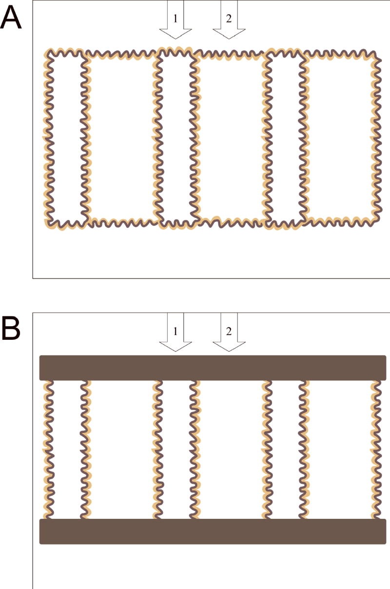
Examples of the stimuli used to study figure-ground organization in the watercolor illusion. The stimuli consisted of six adjacent compartments outlined by wavy double lines. The compartments that were lined orange on the inside are called ‘watercolor compartments’, the others ‘alternate compartments’. The relative width of the two compartments was varied; a ratio of 2:1 is illustrated. Arrows and numbers at the top served to identify the two types of compartments and were displayed 1s after stimulus onset. Stimuli of type A were used in Exp. 2, stimuli of type B in Expts. 3 and 4. Color matching (Exp. 1) was performed for both types of stimuli.
These findings might suggest that the ‘figureness’ effect is a consequence of the color illusion. The appearance of the illusory color tint suggests a filling-in process: color signals generated by the light-colored lines spread in visual cortex until they reach a contour boundary (Gerrits & Vendrik, 1970; Cohen & Grossberg, 1984); the dark lines of the watercolor displays form boundaries that limit the spread of color signals which thus fill the enclosed space evenly. The resulting color signals might then act exactly like real color signals, and the filled-in space would thus stand out as a figure against the surrounding white space, just like a colored region stands out against a white background.
An alternative possibility is that illusory color and figureness are produced in parallel, by independent mechanisms that are both activated by the double lines. The color might be the result of one process (e.g. filling-in, as sketched above), and figure-ground segregation might be produced by another process that is also triggered by the double lines. For example, the double lines of different contrast might activate cortical neurons that respond selectively to edges with asymmetric luminance (or color) profile and such neurons might contribute to the definition of border-ownership (Zhou et al., 2000).
The aim of the present study was to distinguish between these alternative hypotheses. If the figure-ground effect of the watercolor pattern is a consequence of a color filling-in process it should covary with the strength of the color illusion. And if the illusory color behaves just like a veil of physical color, it should be possible to null the color contrast subjectively, for example by adding the appropriate amount of physical color to the white of the surrounding space, and the figure-ground effect should then disappear. However, if a figure-ground effect persists after nulling of the subjective color contrast, this would indicate that at least some of the figure-ground process is independent of the process that generates the color illusion.
General Methods
The stimuli were designed and presented using commercial software (Corel Draw, MS Powerpoint), and displayed on a 19” computer monitor (Gateway VX900), with a resolution of 1280x1024. Subjects were seated in a dimly lit room and viewed the monitor at a distance of 210 cm.
The stimuli consisted of 6 adjacent compartments defined by wavy double lines, as shown in Fig. 1A–B. The colors of the lines were dark purple and orange. In three of the compartments, the orange line was on the inside, and in the alternate compartments it was on the outside. The pattern subtended 7.5 by 5 deg of visual angle. The width ratios of alternating compartments was varied between 1:1, 1:2, and 1:4 (1:2 illustrated). Patterns as shown in Fig. 1A were used in Experiments 1–2, and patterns like the one shown in Fig. 1B were used in Experiments 1 and 3. In Experiment 4 displays similar to that of Fig. 1B were used, but without the orange lines. The colors in CIE (1931) coordinates were (4.4, 0.26, 0.20) for the purple lines, (33, 0.42, 0.43) for the orange lines, and (64, 0.30, 0.32) for the background, where the first number of each triplet is the luminance in cd/m2, and the following numbers are the chromaticities x and y. In the following we use the CIE 1976 (L*a*b*) color space which was designed to reflect better the perceptual differences between colors (Wyszecki & Stiles, 1982). The (L*a*b*) coordinates of our colors were (31.5, 25.3, −25.7) for the purple lines, and (76.8, 5.5, 53.7) for the orange lines, with (100, 0, 0) for the background. The widths of the purple and orange lines subtended approximately 3 and 5 arc min of visual angle, respectively.
Results
We performed four experiments to test the relationship between color illusion and figure-ground effect in the watercolor display. In the Experiment 1 we measured the illusory color change using a matching technique. In Experiments 2 and 3 we determined, for two different configurations, whether figure-ground segregation persists after subjectively nulling the color contrast. In Experiment 4 we reversed the strategy. If the figure-ground segregation is the result of the illusory tint, then a comparable figure-ground effect should result also from a physical tint.
For Experiments 1–3 we used displays of 6 adjacent compartments, each defined by wavy double lines consisting of a dark purple and an orange color component (Fig. 1A–B). In three of the compartments, the orange line was on the inside (producing the watercolor illusion), and in the alternate compartments it was on the outside. This pattern was modeled after Pinna (2003) (who used a row of 8 compartments). For Experiment 4 we used displays without color illusion and measured the strength of figure-ground segregation produced by coloring alternate compartments with a slight tint comparable to the illusory watercolor.
1. Measuring the Illusory Color
Experiment 1
For the color matching, the alternate compartments were tinted with a comparison color, and subjects compared this color with the illusory tint in the watercolor compartments. We used a pattern with a 2:1 width ratio between watercolor and alternate compartments. Based on pilot experiments we assumed that the illusory color could be matched by a color located in color space on the straight line connecting the background white with the color of the orange line of the watercolor pattern. A recent study published after the present results were submitted confirmed this assumption (Devinck et al., 2005). A set of 20 comparison colors distributed along that line was used. Because pilot experiments had shown that some observers perceive very little watercolor tint, if any, we chose a background color that was slightly off white, so that the range of comparison colors couldextend beyond the background color. This assured that the matching color was well within the range of comparison colors for each subject.
Participants
Seventeen subjects participated in this experiment, 16 who were naive about the goals of the study, ranging in age from 13 to 28 yr (median: 16 yr), and one of the authors (RvdH) whose age was 59. All had 20/20 corrected or uncorrected visual acuity.
Procedure
The subjects were instructed as follows: “You will see a computer screen on which slides will be presented. Each slide will show a pattern of six fields separated by wavy double lines. The interiors of the fields have whitish colors, but some have a slight orange tint compared to the others. Two of the fields are numbered at the top. Tell the experimenter the number of the field that has the orange tint. If you cannot tell for sure, guess.”
A simple staircase method was used. After showing a blank field, the watercolor display in which the alternate compartments were tinted with a comparison color was presented. After one second, the numbers 1 and 2 appeared at the top of the two compartments in the center and the subject (S) indicated which of them looked more colored. Then, after display of a blank field for about one second, the watercolor display was shown again with a different comparison color, and so on. E began the sequence with a comparison color from one end of the scale, at which the colors clearly differed for all subjects, as S gave the expected response, say “1”. E then incremented (or decremented) the comparison color until S responded “2” for 3 consecutive presentations. E then recorded that color and reversed the direction of changes until 3 consecutive “1” responses were given, and so on. This was continued for a total of 10 reversals (5 in each direction).
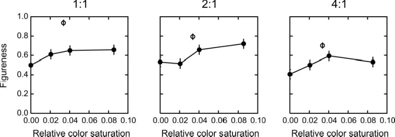
Results
Fig. 2 shows the color matching results for the 17 subjects. The ordinate shows the relative saturation of the comparison color (length of vector from background to comparison color divided by length of vector from background to color of orange lines; negative values represent colors in the direction opposite to orange). Dots represent the means of the reversal points which we took as the matching colors. Vertical lines connect the means of the upper and lower reversal points. These colors were perceived as clearly different from the watercolor tint, either more saturated, or less saturated. The connected pairs of dots represent data from repeated tests of the same subjects taken 5 months apart.
Fig. 2.

The results of the color matching experiment. Dots indicate the contrast of the physical color in the alternate compartments that subjectively matched the illusory watercolor, for each of 17 subjects, including repeats in three subjects (dots connected by lines). Vertical lines connect the means of the reversal points in the matching procedure, that is, the two colors that looked clearly lighter and darker (more saturated), respectively, than the watercolor. Dotted horizontal lines indicate the three colors used in the figure-ground experiments (two sets of colors for two groups of subjects).
It can be seen that for most of the subjects, the watercolor illusion was equivalent to a tint of about 3% of the inducing color. However, the matching color varied considerably between subjects, with two observers showing weak or no illusory color shift (data points on the left), and others showing an illusion of 6% (data points on the right). The close agreement between the data from the repeated tests indicates that the color matches of the individual observers were highly reproducible.
Ten of the data sets were obtained with the original watercolor pattern (to be used in Expt. 2), and the other ten were obtained with displays in which the top and bottom of the pattern were occluded (to be used in Expt. 3). The mean estimated strengths of illusion for the two display types were 3.2% and 3.5%, which was not significantly different (ANOVA, F1,18=0.32, p=0.58).
The horizontal dotted lines in Fig. 2 represent the test colors that were used in Experiments 2–3. Two different sets of test colors were used for the subjects with weak color illusion (Nrs. 1–3 on the abscissa) and for the rest of the subjects.
2. Figure-Ground Segregation with Matching Colors
Experiment 2
In the following experiments we measured the direction and strength of figure-ground organization. The stimuli were derived from the watercolor display of Fig. 1A which was similar to that used by Pinna et al. (2003). Note that we connected the orange lines between compartments, rather than the purple lines, so as to avoid T-junctions of the purples lines which could have induced a figure bias in favor of the watercolor compartments.
The alternate compartments were filled with one of three colors: one that approximately matched the watercolor tint, one that was clearly more saturated, and one that was clearly less saturated, for every subject, as determined in Expt. 1. Patterns without watercolor illusion (no orange lines) and without added tint were included to provide a baseline.
To compare the watercolor illusion with a known factor in figure-ground segregation we also varied the relative width of watercolor and alternate compartments. Width ratios of 1:1, 2:1, and 4:1 were applied, while the sum of the widths was kept constant. With the 2:1 and 4:1 ratios, the expected figure-ground effect of the watercolor illusion was pitted against the Gestalt effect of proximity (cf. Pinna et al. 2003). To control for a possible influence of spatial order, a left-right mirror image version was also presented for each pattern and color, so that in half of the conditions the pattern began with a watercolor compartment on the left and ended with an alternate compartment on the right, and in the other half the order was reversed. Thus, a total of 24 patterns ((3 colors + 1 baseline) x 3 width ratios x 2 spatial orders) were used.
A between-subjects design was used. This design yields the reliability of the conclusions in the case that the experiments would be repeated with other subjects. A 4-way analysis of variance (ANOVA) was performed on the data from the watercolor conditions (factors: color, width ratio, spatial order, and subject), and another 4-way ANOVA to compare the watercolor condition in which the illusory color has been matched with the baseline condition (factors: test condition, width ratio, spatial order, and subject). A significance level of 0.05 was adopted.
Participants
Eight subjects participated, seven who were naive about the purpose of the study and one of the authors, RVDH. All had previously performed the color matching task (Expt. 1).
Procedure
The phenomenon of figure-ground organization was first explained to each subject with the help of five figures from Kanizsa (1979): Figs. 5.19, 5.20a–b, 5.21a–b. These figures are also composed of rows of compartments of alternating figureness, similar to the watercolor patterns, but based on light and dark shades of gray. They were designed to demonstrate the influences of symmetry and convexity of contour on figure-ground perception and produce obvious figure-ground segregation in most observers. The subjects were then instructed as follows: “You will see a computer screen on which slides will be presented. Each slide will show a pattern of six fields separated by wavy lines. In some of the slides, three of the fields may appear as ‘figure’, alternating with fields that appear as ‘ground’. Your task is to decide for each slide which of the fields you perceive as ‘figure’. For each presentation, after one second two arrows numbered 1 and 2 will appear at the top. Tell the experimenter which arrow points to a figure. Try to decide before the arrows appear. Ignore the varying tints or color fringes that may be present.”
Fig. 5.

Results of a similar experiment as described in Fig. 3, but for displays in which the top and bottom of the compartments were occluded by gray bars (Fig. 1B). The figureness values were slightly higher than without the occluding bars, but the results were otherwise similar.
We preferred a simple binary response over the rating method used in previous studies of the watercolor illusion (Pinna et al., 2001; Pinna et al., 2003) because we thought these responses would be quick and reflect the perception more directly than the rating procedure which requires more effort and might invoke reasoning, for example, about the role of the distances between contours, or the color of the compartments.
Each of the 24 stimulus conditions was presented eight times in random order (except for three subjects who received only four presentations/condition).
Results
Fig. 3 summarizes the results of this experiment. The filled symbols represent the degree of ‘figureness’ of the watercolor compartments, as measured by the probability of this compartment being perceived as figure. Figureness is plotted as a function of the width ratio between watercolor and alternate compartments, with the color tint of the alternate compartments as a parameter. Open circles represent the baseline condition, in which all compartments were defined by a single dark line and filled with the background white.
Fig. 3.

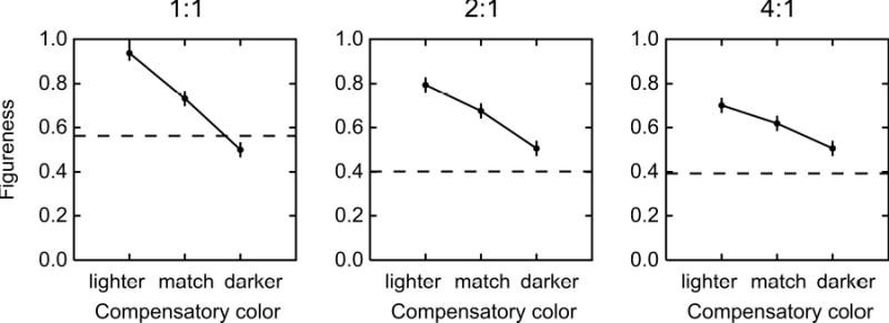
‘Figureness’ (probability of being perceived as figure) of the watercolor compartments plotted as a function of the width ratio between watercolor and alternate compartments. Filled symbols and solid lines represent the results for the three color conditions, one in which the color of the alternate compartments matched the illusory color (squares), one in which it was whiter (upward pointing triangles), and one in which it was darker, or more saturated (downward pointing triangles). Open symbols and dashed lines represent the baseline condition in which the compartments were defined by the dark lines only (without the orange lining). It can be seen that figureness of the watercolor compartments tended to decrease as the width of the alternate compartments was reduced (effect of proximity). Figureness decreased also as the color of the alternate compartments was made more saturated.
It can be seen that the highest value of figureness was obtained for the lightest color (upward pointing triangles), which was virtually equal to the background white, and a width ratio of 1. This is the figure-ground effect of the watercolor illusion that was described earlier (Pinna et al. 2003). As the width ratio is increased, making the alternate compartments narrower than the watercolor compartments, figureness of the watercolor compartments decreases. This is because the watercolor effect is pitted against the effect of proximity (Pinna et al. 2003).
When the alternate compartments are tinted with the color that matched the illusory tint, figureness of the watercolor compartments drops (squares), and when the color of the alternate compartments is made more saturated, figureness of the watercolor compartments is further decreased (downward pointing triangles). However, it can be seen that figureness of the watercolor compartments in the color matching condition (filled squares) is consistently higher than that of the corresponding compartments in the baseline condition (open circles) (F1,7 = 10.8, p<0.025).
The color dependence of figure-ground segregation can be seen more clearly in Fig. 4 where figureness is plotted as a function of the compensatory color for the three width ratios. The dashed lines indicate the corresponding probabilities of figure responses in the baseline condition. The graphs show that the figure-ground effect of the watercolor illusion would be neutralized only with colors that are more saturated than the matching color.
Fig. 4.

Figureness of the watercolor compartments as a function of the color condition, for three width ratios. Dashed line represents baseline condition. Data replotted from Fig. 3. Note that figureness of the watercolor compartments in the color-matching condition was higher than figureness of the corresponding compartments in the baseline condition.
Analysis of the data of the watercolor conditions showed a significant effect of the compensatory color (F2,14 = 4.2, p<0.05), but not the width ratio (F1,14 = 2.19, p>0.1). Figureness was slightly higher for compartment #1 (the third from the left) than for compartment #2 (the fourth from the left), suggesting a left-to-right segmentation strategy, but the effect of spatial order did not reach significance (F1,7 = 5.48, 0.05<p<0.1).
Experiment 3
We were surprised that the width ratio did not produce a more reliable effect. The Gestalt principle of proximity would predict the alternate compartments to become figures for higher width ratios, thus decreasing the figureness of the watercolor compartments. Such a decrease can be seen in the curves of Fig. 3, but it is not very consistent. We thought that the reason for the modest variation of figureness in Expt. 2 might be the continuity of the contours at the top and bottom which might hinder perceptual segregation of the compartments. We therefore performed another experiment in which the top and the bottom of the compartments were occluded, thus eliminating the horizontal borders and the contour junctions (Fig. 1B).
Participants and Procedure
Ten subjects (nine naive, and RVDH) participated in this experiment. Seven were new subjects, three had already served in Experiment 2. All had previously performed the color matching (Expt. 1). The instructions and the procedure were the same as in Expt. 2. Each of the 24 stimulus conditions was presented eight times in random order.
Results
Figs. 5–6 summarize the results of this experiment. The figureness values for the watercolor conditions are slightly higher in this experiment than in Exp. 2, producing an even larger separation from the baseline data, but otherwise the results are similar. Figureness of the watercolor compartments in the color matching condition (filled squares) is considerably higher than that of the corresponding compartments in the baseline condition (open circles) (F1,9 = 11.4, p<0.01). As in Exp. 2, the compensatory color had a significant effect (F2,18 = 12.3, p<0.01), but the effect of width ratio was not reliable (F2,18 = 1.74, p>0.1). The factor of spatial order was not significant (F1,9 = 2.9, p>0.1). Thus, the experiment confirmed the findings of Exp. 2. Occluding the contour junctions in the watercolor pattern did not change the pattern of results in any significant way. The figure-ground effect of the watercolor illusion survives compensation of the color illusion.
Fig. 6.
Figureness of the watercolor compartments as a function of the color condition for displays in which the top and bottom of the compartments were occluded by gray bars (Fig. 1B). Data replotted from Fig. 5. Note that figureness of the watercolor compartments in the color-matching condition was higher than figureness of the corresponding compartments in the baseline condition.
3. Color-Induced Figure-Ground Segregation
Experiment 4
The hypothesis formulated at the beginning, that figure-ground segregation in the watercolor illusion is a consequence of the (illusory) color spreading, implies that filling a region with a tint of color makes it stand out as figure. Although we have seen in the previous experiments that compensating the illusory tint does not completely cancel the figure-ground effect, it did reduce figureness of the watercolor compartments. Thus, adding tint in the alternate compartments increased their figureness.
In Experiment 4 we studied the effect of color on figure-ground segregation in itself. We used a similar display as in Expt. 3, but without the orange lines that induce the watercolor illusion, and measured the strength of figure-ground segregation produced by various color tints in alternate compartments. This enabled us to compare the strength of figure-ground segregation produced by the tint that matched the watercolor illusion with the strength of figure-ground segregation in the actual watercolor display.
Participants and Procedure
Eight subjects participated in this experiment, seven that were naive about the goals of the experiment, and one of the authors (RVDH). Each of them had also participated in Expt. 2 or 3. Instructions and procedure were the same as in Expt. 2.
Results
Fig. 7 shows the probability of “figure” responses for the tinted compartment as a function of the color contrast, for each of the three width ratios. For the 2:1 and 4:1 ratios only the data for the case that the wider compartments were tinted are shown. It can be seen that figureness increases with contrast, but only weakly. The width ratio has the opposite effect, decreasing figureness, as expected from the law of proximity (figureness=1 means wider compartments are figure), but this effect is also quite weak. Neither effect reached significance. (However, if all the data from this experiment are taken together, and contrast is coded positive if the wide compartments were tinted, and negative if the narrow compartments were tinted, the contrast effect was significant: F6,42 = 2.97, p<0.025).
Fig.7.
Figureness produced by color tint. Compartments were defined by single dark lines and alternate compartments were tinted with diluted orange. Filled symbols show the probability of the tinted compartments being perceived as figures as a function of the color contrast. Open symbols show the figureness values for the watercolor displays at the equivalent contrast. It can be seen that the watercolor illusion produced higher figureness values than the corresponding color tint.
The open circles in Fig. 7 indicate the figureness values obtained for the similar displays with the watercolor illusion (data from Exp. 3). It is plotted at the contrast that was found to be equivalent to the illusory tint (Exp. 1). It is apparent that tinting alternate compartments with the color equivalent to the color of the illusion produces far less of a figure effect than the watercolor display itself.
Discussion
We tested the hypothesis that the watercolor display is a consequence of the illusory color spreading. We determined the color tint that is perceptually equivalent to the illusory watercolor (Exp. 1) and then applied this tint to test the figure-ground effect with two different strategies. First, we compensated the subjective color of the watercolor compartments by adding physical color to the alternate compartments, thus nulling the subjective contrast between the compartments, and then measured figure-ground segregation (Expts. 2–3). Second, we applied the equivalent tint to alternate compartments of a pattern that does not produce a watercolor illusion to see how much of a figure-ground effect would result from the coloring itself (Exp. 4).
The results of both types of test showed that the figure-ground effect of the watercolor illusion was stronger than predicted from the hypothesis. Nulling the subjective contrast did not neutralize the figureness of the watercolor compartments, and the figureness produced by just the color tint fell short of the figureness measured for the watercolor display. Thus, the results of these experiments argue against the hypothesis, and we conclude that at least part of the figure-ground effect of the watercolor illusion is due to a mechanism that is independent of the one that generates the color illusion.
This is not to say that the illusory color tint is neutral with respect to figure-ground perception. Expt. 4 showed that even slight coloring of a region relative to the surrounding areas does increase figureness of that region, and Expts. 2–3 showed that figureness of the watercolor compartments is significantly reduced when the color contrast is compensated. Thus, color tint, even of low contrast, enhances figureness, but in all three experiments this effect was weak compared to that of the watercolor pattern.
By varying the width of the compartments we tested the Gestalt factor of proximity. The effect of this factor, although clearly visible in the averaged results, was not statistical reliable across subjects. The figure-ground effect of the watercolor illusion was stronger than the effect of proximity, as shown previously (Pinna et al., 2003).
While we achieved a dissociation of the figure-ground effect from the color illusion by compensating the illusory color, Pinna (2005) has used variations of the watercolor theme to show that the figure-ground effect does not depend on the colors being similar along the contours of a compartment. In this ingenious study he varied the color of the lighter lines within a compartment so as to weaken the color illusion. Even fringes of opponent colors, combined in the same compartment, produced strong figure-ground segregation. He also concluded that the figure-ground effect is relatively independent of the color illusion.
A Possible Explanation for the Watercolor Illusion
The watercolor illusion seems to reveal important characteristics of the neural representation of visual surfaces. Our results and those of (Pinna, 2005), showing that figure-ground effect and color illusion can be dissociated, indicate that the two phenomena are due to at least partially different mechanisms. In the following we will discuss the possible origin of the two aspects of the illusion.
The Color Illusion
The observation that a thin color seam along the contour of a figure can change the color over the whole area of the figure demonstrates the importance of border signals in color surface perception. Phenomenal spreading of color over large distances in visual space can be observed also under a variety of other conditions (Spillmann & Werner, 1996). We have previously argued (von der Heydt et al., 2003a) that these phenomena can in principle be explained by two alternative theories: One that assumes that color and brightness signals actually spread within a retinotopic neural representation (isomorphic coding theory), and another that postulates that color and brightness are represented at a higher level as attributes of object surfaces, and assumes that the phenomenal color spreading corresponds to a change in this abstract representation (symbolic coding theory). A review of the literature on color filling-in shows that it is not easy to distinguish between these alternatives by psychophysical experiments (Spillmann & Werner, 1996; Pessoa et al., 1998; von der Heydt et al., 2003a).
Neurophysiological experiments have shown that uniform image regions are represented in the visual cortex by activity corresponding to the borders of the regions rather than the interior (Hubel & Wiesel, 1968). This holds not only for light and dark, but also for colored stimuli (Michael, 1978a; 1978b; Friedman et al., 2003). Also, and perhaps more importantly, the vast majority of color coded neurons in the top layers of area V1 and in area V2 are orientation selective (Gegenfurtner et al., 1996; Friedman et al., 2003). This is contrary to earlier claims that color and form tend to be separated in the visual cortex (Livingstone & Hubel, 1984; Hubel & Livingstone, 1987). The recent studies show that the same neurons that represent the form of a stimulus to a large extend code also for its color. This does not fit well with the isomorphic theory in which the highly non-uniform spatial distribution of brightness and color signals is considered only as a transitory representation which is subsequently transformed into a uniform distribution. A comparison of the color coding in V1 and V2 shows that the contour-based color coding scheme is preserved, and nothing suggests such a transformation (Friedman et al., 2003).
It could be argued that the (relatively sparse) neural activity corresponding to the interior of uniform regions might be the result of neural signal spreading, and this ‘color surface activity’ might thus correlate with the perception of surface color. Von der Heydt et al. (2003a) have examined this possibility by recording the neural activity under conditions in which the perceived color of a stimulus patch changes spontaneously (for example, from red to green) due to perceptual filling-in (Troxler’s effect). Behavioral experiments indicated that macaques perceive filling-in under these conditions just like humans (Friedman et al., 1999). The recordings showed that the color surface signals in V1 and V2 did not change in parallel with the perceptual color change, but stayed rather constant, just like the color signals at the entrance to the cortex. In contrast, the signals of oriented color neurons representing the color step at the boundary of the test patch did show a decline that correlated with the time course of the perceived filling-in.
While the isomorphic filling-in theory is clearly at variance with the behavior of neuronal signals during Troxler fading, it has received support from neurophysiological studies using brightness induction and brightness illusion paradigms with temporally modulated stimuli (Rossi & Paradiso, 1999; Kinoshita & Komatsu, 2001; Roe et al., 2005). These studies found that the activity of neurons of V1 and V2 could often be modulated by distant surround stimuli even when the receptive field was located within a region of constant luminance (although in many neurons the response modulation was in anti-phase with the brightness illusion). We are not aware of neurophysiological studies of the watercolor illusion.
Under the symbolic coding theory, the diverse findings of phenomenal color spreading are easy to reconcile with the basic neurophysiological data. In the case of Troxler’s effect, filling-in is explained by the decay of the color border signals of the test patch. When these signals decay, the representation of the test patch vanishes altogether, and what remains is the representation of the ‘underlying’ surface which is sustained by its proper border signals (von der Heydt et al., 2003a). The color effect of the watercolor illusion can be explained by the responses of the various color edge selective neurons to the double-line contours: Cells with narrow, even-symmetrical receptive fields will signal the colored purple and orange lines, whereas cells with relatively broad, odd-symmetrical receptive fields (Friedman et al., 2003) will signal a small color contrast (in the direction purple-orange) across the contour, and their signals give rise to the illusory color veil.
How exactly the color border signals have to be integrated to explain the watercolor illusion needs to be worked out by a quantitative model. Devinck et al. (2005) have measured how the illusory color depends on the color and luminance of the inducing lines. Further details on the influence of the widths of the lines, the size of the compartments, the undulations of the contour etc. would be most helpful. Sometimes, complex perceptual phenomena can be explained by rather simple and physiologically plausible mechanisms (Blakeslee & McCourt, 2004). Montag (1997) proposed a model of color signal integration that might explain the watercolor illusion, but it is not clear how it can be related to the physiology.
The Figure-Ground effect
What could be the mechanisms underlying the figure-ground segregation in the watercolor illusion? Psychophysical studies have emphasized the importance of border assignment in vision. Images of 3D scenes consist of regions bounded by contours, and the regions often correspond to surfaces at different depths. As a consequence, a region can be bounded by ‘intrinsic’ and ‘extrinsic’ contours (Nakayama et al., 1989). A contour is intrinsic to a region if it is the contour of the corresponding physical surface, it is extrinsic if it is the contour of an occluding object. It is clear that the understanding of an image depends on the ability to distinguish these contours. Thus, the assignment of ‘border ownership’ (a term that goes back to the early Gestalt psychologists) may be the primary process underlying figure-ground segregation. The way the borders are assigned profoundly influences how an image is interpreted, which in turn determines the recognition of objects in the image. It was recently discovered that border ownership is encoded in the firing rate of edge selective neurons in visual cortex (Zhou et al., 2000; Qiu & von der Heydt, 2005). In essence, each contrast edge is represented by two groups of cells with opposite border-ownership preference (Fig. 8). The differential activity between the two reflects the border-ownership assignment at this stage of processing. This simple coding scheme might be the basis of perceptual figure-ground organization (von der Heydt, 2003; von der Heydt et al., 2003b).
Fig. 8.

Hypothetical explanation of the figure-ground effect in the watercolor illusion as a result of the neural processing of border ownership. See Discussion for further explanation.
Local and Global Mechanisms
To understand the watercolor illusion it is important to understand that cortical neurons generally combine different mechanisms for the exploitation of different figure-ground cues. The interpretation of images is generally ambiguous and the visual system has to infer border ownership from the given information which can be quite variable. Sometimes, the depth order of surfaces is given by stereoscopic cues, or, in the case of motion, by the pattern of dynamic occlusion. This information can in principle be derived by processing a small neighborhood of a border (i.e., by small receptive fields). It specifies border ownership directly (the nearer surface owns the border). In other situations local depth cues may be absent, and the system then seems to rely on the image context, using rules that specify what shapes are likely to be object shapes, and which of the contours are likely to belong to the same object. In general, the system combines local and global cues for the assignment of border ownership. For example, neurons of V2 use stereoscopic depth and global form criteria (Qiu & von der Heydt, 2005). We argue that the figure-ground effect in the watercolor illusion results from two such mechanisms, one that analyzes the local edge profile, and another that evaluates consistency of color along contours. The first is a local mechanism, the second requires global processing.
The special form of the watercolor contours, consisting of a pair of lines of high and low contrast, creates an asymmetric edge profile similar to edge profiles that are characteristic of 3D objects (Fig. 8A–B). In the case of the 3D objects, the gradual luminance transition is on the object side, and the abrupt transition on the background side. Asymmetric edge profiles can be detected by local processing, and it is likely that neurons with appropriate selectivity exist in the visual cortex. We assume that these neurons provide part of the input to the border ownership cells of V2.
This is essentially the explanation given by Pinna (2005), who points out that the asymmetric luminance profile of the double lines creates a three-dimensional percept, with the regions on the side of the low-contrast line appearing elevated or bulging out, and suggests that it plays a role in figure-ground segregation.
We conclude that at least some of the figure-ground effect in the watercolor illusion might be explained by a contribution from edge profile selective mechanisms to the neural border ownership signals. However, the results of Exp. 2, showing that figureness of the watercolor compartments is reduced when the illusory color is compensated by color in the adjacent compartments, indicate that another mechanism must be involved that is based on color. This was confirmed by Exp. 4, showing that figureness of a region can be enhanced by a tint of color (Fig. 7). Surface color per se may not be a strong predictor of objectness (objects of color A seen against a background of color B may be as common as objects of color B seen against a background of color A). However, consistent edge color along a stretch of contour indicates objectness. This rule is based on the assumption that color tends to vary less within objects than between objects, and hence, since backgrounds are usually composed of multiple objects, color variation tends to be greater on the background side of contours than on the foreground side. Accordingly, we assume that border ownership cells receive contributions from mechanisms that sense the global consistency of color edges (Fig. 8C). The existence of such mechanisms is suggested by studies of the formation of illusory contours, showing that consistent edge polarity enhances amodal completion (He & Ooi, 1998). The neurophysiology shows that a large proportion of cells that integrate image context for border ownership assignment are color coded and selective for the polarity of edge contrast (Zhou et al., 2000). This indicates that edge color and polarity are important ingredients in the neural process of border assignment. Interestingly, Pinna’s (2005) results, principally showing that a strong figure-ground effect can be obtained without consistent edge color, also indicate that figureness of the watercolor compartments was reduced when the light-colored line varied in hue along the contour, compared to the regular watercolor pattern in which the color was the same all around. This is further evidence that consistent edge color contributes to figureness.
Recent theoretical studies demonstrate that the neurophysiological findings and a range of observations on perceptual figure-ground organization can be simulated by simple, neurophysiologically plausible models (Craft et al., 2005; Zhaoping, 2005). In essence, these models implement Gestalt rules, such as good continuation of contour, compactness of form, and proximity. The model of Craft et al. (2005) assumes a network of ‘grouping cells’ which integrate local edge signals according to concentric templates and in turn regulate the amplitude of the local edge signals, thereby enhancing or reducing the local edge responses when a figure is detected, as observed in the neurons of V2. The principle of consistent edge color could be easily implemented in this model by making some of the input to the grouping cells selective for edge color and polarity.
As can be seen in Fig. 8D, the pattern of the watercolor illusion simultaneously activates these two hypothetical figure-ground mechanisms: The first is stimulated by the asymmetrical profile of the contour, and the other is activated by the consistent purple-orange gradient all around the contour. The convergence of the two mechanisms explains the robust figure-ground bias towards the compartments that are lined with a bright color on the inside. It also explains why compensating the illusory color reduces the dominance of the watercolor compartments, but does not eliminate it completely, and why a color tint by itself enhances figureness.
The response properties of cortical neurons also explain the effect of the width ratio of the compartments on figure-ground perception (Experiments 2–4). In the case of a simple figure such as a square, the strength of the border-ownership signals tends to decrease when the size of the figure increases (Qiu & von der Heydt, 2005). Thus, in our experiment, the narrow compartments probably generated stronger border-ownership signals than the wide compartments (Gestalt principle of proximity).
In conclusion, our results suggest that the color illusion and the figure-ground effect of the watercolor display are due to partially separate mechanisms. Based on recent neurophysiological data we propose that the color illusion can be explained by the general principle that the system computes surface color from color border signals, the same principle that explains phenomenal color filling-in under various other conditions. We further propose that the figure-ground effect results from two different mechanisms of border ownership assignment; one is sensitive to asymmetric shape of edge profiles, the other to consistency of edge color inside contours. This theory predicts that both kinds of mechanisms should be detectable in border ownership selective neurons and that their assignment of side of ownership should agree.
References
- Blakeslee B, McCourt ME. A unified theory of brightness contrast and assimilation incorporating oriented multiscale spatial filtering and contrast normalization. Vision Research. 2004;44:2483–2503. doi: 10.1016/j.visres.2004.05.015. [DOI] [PubMed] [Google Scholar]
- Cohen MA, Grossberg S. Neural dynamics of brightness perception: features, boundaries, diffusion, and resonance. Perception & Psychophysics. 1984;36:428–456. doi: 10.3758/bf03207497. [DOI] [PubMed] [Google Scholar]
- Craft E, Schuetze H, Niebur E, von der Heydt R. Neural mechanisms of border ownership representation: a computational model. Neuron. 2005 under review. [Google Scholar]
- Devinck F, Delahunt PB, Hardy JL, Spillmann L, Werner JS. The watercolor effect: quantitative evidence for luminance-dependent mechanisms of long-range color assimilation. Vision Research. 2005;45:1413–1424. doi: 10.1016/j.visres.2004.11.024. [DOI] [PMC free article] [PubMed] [Google Scholar]
- Friedman HS, Zhou H, von der Heydt R. Color filling-in under steady fixation: Behavioral demonstration in monkeys and humans. Perception. 1999;28:1383–1395. doi: 10.1068/p2831. [DOI] [PubMed] [Google Scholar]
- Friedman HS, Zhou H, von der Heydt R. The coding of uniform color figures in monkey visual cortex. Journal of Physiology - London. 2003;548:593–613. doi: 10.1113/jphysiol.2002.033555. [DOI] [PMC free article] [PubMed] [Google Scholar]
- Gegenfurtner KR, Kiper DC, Fenstemaker SB. Processing of color, form, and motion in macaque area V2. Visual Neuroscience. 1996;13:161–172. doi: 10.1017/s0952523800007203. [DOI] [PubMed] [Google Scholar]
- Gerrits HJM, Vendrik AJH. Simultaneous contrast, filling-in process and information processing in man’s visual system. Experimental Brain Research. 1970;11:411–430. doi: 10.1007/BF00237914. [DOI] [PubMed] [Google Scholar]
- He ZJ, Ooi TL. Illusory-contour formation affected by luminance contrast polarity. Perception. 1998;27:313–335. doi: 10.1068/p270313. [DOI] [PubMed] [Google Scholar]
- Hubel DH, Livingstone MS. Segregation of form, color, and stereopsis in primate area 18. Journal of Neuroscience. 1987;7:3378–3415. doi: 10.1523/JNEUROSCI.07-11-03378.1987. [DOI] [PMC free article] [PubMed] [Google Scholar]
- Hubel DH, Wiesel TN. Receptive fields and functional architecture of monkey striate cortex. Journal of Physiology - London. 1968;195:215–243. doi: 10.1113/jphysiol.1968.sp008455. [DOI] [PMC free article] [PubMed] [Google Scholar]
- Kanizsa, G. (1979). Organization in Vision. Essays on Gestalt Perception. New York: Praeger.
- Kinoshita M, Komatsu H. Neural representation of the luminance and brightness of a uniform surface in the macaque primary visual cortex. Journal of Neurophysiology. 2001;86:2559–2570. doi: 10.1152/jn.2001.86.5.2559. [DOI] [PubMed] [Google Scholar]
- Livingstone MS, Hubel DH. Anatomy and physiology of a color system in the primate visual cortex. Journal of Neuroscience. 1984;4:309–356. doi: 10.1523/JNEUROSCI.04-01-00309.1984. [DOI] [PMC free article] [PubMed] [Google Scholar]
- Michael CR. Color vision mechanisms in monkey striate cortex: Simple cells with dual opponent-color receptive fields. Journal of Neurophysiology. 1978a;41:1233–1249. doi: 10.1152/jn.1978.41.5.1233. [DOI] [PubMed] [Google Scholar]
- Michael CR. Color-sensitive complex cells in monkey striate cortex. Journal of Neurophysiology. 1978b;41:1250–1266. doi: 10.1152/jn.1978.41.5.1250. [DOI] [PubMed] [Google Scholar]
- Montag ED. Influence of boundary information on the perception of color. J Opt Soc Am A Opt Image Sci Vis. 1997;14:997–1006. doi: 10.1364/josaa.14.000997. [DOI] [PubMed] [Google Scholar]
- Nakayama K, Shimojo S, Silverman GH. Stereoscopic depth: its relation to image segmentation, grouping, and the recognition of occluded objects. Perception. 1989;18:55–68. doi: 10.1068/p180055. [DOI] [PubMed] [Google Scholar]
- Pessoa L, Thompson E, Noe A. Finding out about filling-in: a guide to perceptual completion for visual science and the philosophy of perception. Behavioral and Brain Sciences. 1998;21:723–748. doi: 10.1017/s0140525x98001757. [DOI] [PubMed] [Google Scholar]
- Pinna B. The role of Gestalt principle of similarity in the watercolour illusion. Spatial Vision. 2005;21:1–8. doi: 10.1163/1568568053320639. [DOI] [PubMed] [Google Scholar]
- Pinna B, Brelstaff G, Spillmann L. Surface color from boundaries: a new ‘watercolor’ illusion. Vision Research. 2001;41:2669–2676. doi: 10.1016/s0042-6989(01)00105-5. [DOI] [PubMed] [Google Scholar]
- Pinna B, Werner JS, Spillmann L. The watercolor effect: a new principle of grouping and figure-ground organization. Vision Research. 2003;43:43–52. doi: 10.1016/s0042-6989(02)00132-3. [DOI] [PubMed] [Google Scholar]
- Qiu FT, von der Heydt R. Figure and ground in the visual cortex: V2 combines stereoscopic cues with Gestalt rules. Neuron. 2005;47:155–166. doi: 10.1016/j.neuron.2005.05.028. [DOI] [PMC free article] [PubMed] [Google Scholar]
- Roe AW, Lu HD, Hung CP. Cortical processing of a brightness illusion. Proc Natl Acad Sci U S A. 2005;102:3869–3874. doi: 10.1073/pnas.0500097102. [DOI] [PMC free article] [PubMed] [Google Scholar]
- Rossi AF, Paradiso MA. Neural correlates of perceived brightness in the retina, lateral geniculate nucleus, and striate cortex. Journal of Neuroscience. 1999;19:6145–6156. doi: 10.1523/JNEUROSCI.19-14-06145.1999. [DOI] [PMC free article] [PubMed] [Google Scholar]
- Spillmann L, Werner JS. Long-range interactions in visual perception. Trends in Neurosciences. 1996;19:428–434. doi: 10.1016/0166-2236(96)10038-2. [DOI] [PubMed] [Google Scholar]
- von der Heydt, R. (2003) In The Visual Neurosciences (Werner, J. S. & Chalupa, L. M.) 1139–1150. Cambridge, Mass.: MIT press.
- von der Heydt, R., Friedman, H. S., & Zhou, H. (2003a) In Filling-in: From Perceptual Completion to Cortical Reorganization (Pessoa, L. & De Weerd, P.) 106–127. Oxford: Oxford University Press.
- von der Heydt, R., Zhou, H., & Friedman, H. S. (2003b) In Perceptual Organization in Vision: Behavioral and Neural Perspectives (Behrmann, M., Kimchi, R., & Olson, C. R.) 281–304. Mahwah: Lawrence Erlbaum Associates.
- Wyszecki, G. & Stiles, W. S. (1982). Color Science: Concepts and Methods, Quantitative Data and Formulae. New York: Wiley.
- Zhaoping L. Border ownership from intracortical interactions in visual area V2. Neuron. 2005;47 doi: 10.1016/j.neuron.2005.04.005. in press. [DOI] [PubMed] [Google Scholar]
- Zhou H, Friedman HS, von der Heydt R. Coding of border ownership in monkey visual cortex. Journal of Neuroscience. 2000;20:6594–6611. doi: 10.1523/JNEUROSCI.20-17-06594.2000. [DOI] [PMC free article] [PubMed] [Google Scholar]