Abstract
Genome-wide gene expression profile studies encompass increasingly large number of samples, posing a challenge to their presentation and interpretation without losing the notion that each transcriptome constitutes a complex biological entity. Much like pathologists who visually analyze information-rich histological sections as a whole, we propose here an integrative approach. We use a self-organizing maps -based software, the gene expression dynamics inspector (GEDI) to analyze gene expression profiles of various lung tumors. GEDI allows the comparison of tumor profiles based on direct visual detection of transcriptome patterns. Such intuitive “gestalt” perception promotes the discovery of interesting relationships in the absence of an existing hypothesis. We uncovered qualitative relationships between squamous cell tumors, small-cell tumors, and carcinoid tumor that would have escaped existing algorithmic classifications. These results suggest that GEDI may be a valuable explorative tool that combines global and gene-centered analyses of molecular profiles from large-scale microarray experiments.
1. INTRODUCTION
The simultaneous measurement of expression levels of tens of thousands of genes in a biological sample enabled by DNA microarray technology has provided a new and powerful way to characterize the molecular basis of diseases such as cancer [1, 2]. In the past decade, mRNA expression profiles of tumor tissues have been successfully used to distinguish tumor types or subtypes [3–5]. They also appear to hold great promise as a method for predicting clinical outcomes [6–8]. For example, gene expression profiles have been used to classify lung adenocarcinoma into subgroups that correlated with the degree of tumor differentiation as well as patient survival [9].
Gene expression profile analysis initially emphasized the identification of groups of genes that are differentially regulated in different experimental conditions or patient samples. Coexpression across a variety of samples implied coregulation or similar function [10, 11]. An approach complementary to this “gene-centered” view is to take a “sample-centered” perspective in which one treats the genome-wide profiles of each sample as the entities to be classified with respect to their gene expression patterns. The goal here is to assign samples (rather than genes) to groups based on the high-dimensional molecular signature determined by the thousands of individual gene expression values. While the gene-centered perspective is useful for understanding the molecular pathways in which individual genes are involved, the sample-centered view is more relevant for biological and clinical questions, such as in the study of the developmental and pathogenetic relationship between tissues as a whole [12, 13] or the identification of prognostic or diagnostic signatures of tumors based on entire gene expression profile portraits [4, 14–19].
The notion of “molecular portraits” has gained importance as gene expression profiles for increasingly large numbers of samples or conditions (eg, experimental variables, patients, treatment groups, etc) have become available [18, 20, 21]. However, the analysis of large numbers of gene expression profiles as integrated entities poses a challenge in terms of how to best organize and graphically present the high-dimensional data without loss of the notion of an individual profile as an independent entity. It would be desirable to capture the global picture of sample clusters within one visual representation while simultaneously presenting the specific expression pattern within each individual sample, and hence, simultaneously allowing gene-specific analysis.
Current representations, such as the widely used heat maps in two-way hierarchical clustering [22, 23] or coordinate systems in principal component analysis (PCA), multidimensional scaling (MDS) and their variants [24–26], compress the expression profile information of a sample into a single quantity, such as a scalar value for the distance (dissimilarity) between the sample, a branch in a dendrogram, a narrow column in a heat-map, or a point in reduced-dimensional space. Such aggregate displays discard possibly relevant information immanent in the complex, higher-order (system-level) genome-wide expression pattern. This intrinsic but hidden information reflects the collective behavior of genes orchestrated by genome-scale gene regulatory networks that govern cell behavior [27]. As pathology and radiology teach us, the implicit visual cues present within a complex image (eg, histological section, radiograph) cannot be reduced to a set of numerical variables without loss of system-level information content. Thus, it is possible that some “irreducible” information contained within high-dimensional gene profiles of patient or experimental samples may be lost in current clustering and representation methods.
In the absence of specific questions or hypotheses, it would therefore be desirable to be able to directly compare microarray results of individual tumor samples with their complete feature-richness in the same “holistic” way as pathologists compare histological tumor samples, namely, based on human gestalt perception [28]. In contrast to histological patterns, the thousands of expression values in a microarray measurement are too dense and irregular to be directly interpreted in a holistic manner. Hence, they must be presented in a form appropriate for human pattern recognition without discarding the global, higher-order information.
Self-organizing maps (SOMs) have the capacity to display information-rich diagrams. In the case of microarray data they can present individual samples as an entity and, at the same time, display high-resolution patterns within the transcriptome. A self-organizing map is a neural network algorithm for unsupervised machine learning with a strong visualization capability [29]. In brief, it assigns a set of N input objects (eg, genes) to a number K (K < N) rectangular or hexagonal “tiles” (SOM nodes), each of which represents a cluster of objects (genes), arranged so as to form a coherent pattern within a two-dimensional “mosaic” (SOM grid). The patterns arise because the distances between the tiles on the mosaic are a function of the similarity between the gene clusters that the tiles represent, with most similar clusters being adjacent to each other in the mosaic.
Early applications of SOMs for visualization of gene expression profiles emphasized the gene-centered perspective (clustering of genes) and used each tile to represent one cluster of genes in order to identify gene clusters with interesting expression patterns or to link them to gene functions [30]. As in k-means clustering [31], the number of clusters K is chosen in this approach to approximate the number of expected number of gene clusters, for example, K = 12 on a 3 × 4 = 12 node grid. Other studies used SOM in the sample-centered mode to map individual tumor samples onto the SOM grid and thereby classify tumor samples into a small number of diagnostic or prognostic groups [32, 33]. In both cases, an entire experiment consisting of multiple samples (expression profiles) was represented by one single SOM grid, and the sample-specific visualization capabilities of SOM were not explored. In another study, SOMs were used in the gene-centered mode to analyze lymphoma samples, but the number of clusters (K = 22 × 14) was much larger than the expected number of biological clusters. This use of SOM generated “high-resolution” mosaics, one for each sample in an experiment. The characteristic SOM mosaics contained coherent patterns generated by the colored tiles ordered so as to reflect the clustered gene expression profile of the individual samples [34]. But while this approach used the visual representation of SOM, it still focused on finding subset of genes for classifying tumors. In these cases the SOM maps were used as graphical representation mostly to illustrate a particular algorithm of analysis, much as dendrograms serve to give evidence of hierarchical clustering, but are not actually read by the human eye to obtain specific information. Instead, we propose that SOM displays can be specifically treated as new, complex objects for a next level analysis, namely, visual gestalt recognition. Thus, we do not use computer algorithm in the sense of “artificial intelligence,” but more as “intelligence enhancement” for the human brain in the holistic comparison of the transcriptomes.
To enable such an integrative analysis based on visualization of each tumor sample as a unique and complex molecular portrait, we adapted GEDI—a SOM-based tool developed for visualizing the dynamics of genome-wide gene expression profiles [35]—to represent “static” microarray samples as two-dimensional high-resolution SOM mosaics. Using published gene expression profiles from a large set of lung tumor samples [5], we offer a first assessment of the usefulness of this type of holistic visual analysis of tumor gene expression profiles. These studies reveal that human gestalt perception can lead to discovery of novel biological features without a preconceived hypothesis, and uncover new relationships between lung tumor subtypes that had previously escaped the analysis using conventional algorithmic classification techniques [5, 36].
MATERIALS AND METHODS
GEDI analysis software
GEDI is a bioinformatics software package that was originally developed to visualize multiple parallel time courses of gene expression profiles (or other high-dimensional molecular portraits) experiments [35]. In the currently available version it uses unsupervised machine learning algorithms based on SOM [29] to cluster N genes into K “miniclusters” (or metagenes, see below) and map the results on a two-dimensional displays, one for each profile.
The SOMs assign similarly behaving genes to the same clusters k (k = 1, 2,…, K) and place similarly behaving clusters in close vicinity to each other on a two-dimensional, rectangular SOM grid of a × b nodes, where a × b = K. Thus, the objects that are being clustered are gene vectors gi = [x1i, x2i,…, xMi] (with i = 1, 2,…, N), where xji represents the expression value of gene i in sample j (with j = 1, 2,…, M). Once the SOM have assigned all the genes into K miniclusters, each minicluster is represented by a metagene vector ck = [y1k, y2k,…,yMk], (k = 1, 2,…, K), where yjk is the centroid value of minicluster k in sample j. To visualize one microarray sample j as one mosaic, GEDI slices the clustered data volume consisting of the bundle of the k metagene vectors ck into slices j across all the K metagenes to create individual SOM mosaics for each sample j. Each mosaic j displays in each of its K tiles k the jth component yjk of each metagene vector ck (see Figure S1 in supplementary information; available online at DOI 10.1155/JBB/2006/69141). The value of yjk is reflected by the color of the tile. Since the SOMs arrange the metagenes on the grid based on similarity of behavior in the various samples, the K tiles collectively create a coherent visual pattern for each microarray j. In accordance with previous usage [12, 35], such SOM mosaics that display a characteristic visual pattern for each individual expression profile representing a sample are referred to as “GEDI maps.” Each corresponding tile k on each GEDI map represents the same metagene, and hence, the same minicluster of genes.
The original Matlab-based prototype program [35] was redesigned and rewritten in Java to generate a user-friendly platform-independent program with improved performance, stability, and convenient user interface. Results presented here were obtained with GEDI version 3.0 that is freely available to members of the academic community for noncommercial use and can be downloaded via the web (http://web1.tch.harvard.edu/research/ingber/GEDI/gedihome.htm). This new program version contains a series of added functionalities that facilitate comparison of samples and retrieval of gene-specific information for individual genes that exhibit interesting patterns. These functions include real-time navigation through both the sample and gene dimension to view either a sample or gene as an individual object. With one mouse click, the name, functional annotations, and behavior in sample space of every individual gene can be retrieved directly. The new version also allows multiple result output formats and exposes the internal parameters for expert users to optimize the SOM.
Dataset
Gene expression profile data from normal lung and pulmonary tumor from the previous work of Bhattacharjee and coworkers [5] (http://www.broad.mit.edu/mpr/lung) were used. The data were obtained as Affymetrix array raw image (DAT) files and analyzed, scaled to a target intensity of 1500 using the microarray suite (MAS) 5.0 program (Affymetrix). A total of M = 25 samples were used in this analysis, comprising 4 different tissues: squamous cell lung carcinoma (Sq, n = 6), pulmonary carcinoid (Car, n = 6), small-cell lung carcinoma (SmC, n = 6), and normal lung (Lung, n = 7). Thus the input data matrix for clustering was (N = 12562) × (M = 25).
Preprocessing of data
The N×M data matrix was log2-transformed to obtain a normal distribution of the originally log-normally distributed “signal” values to prevent bias by outlier genes in the clustering. Each sample was standardized to the z-score to further minimize global sample-to-sample variability due to external factors. The resulting value xji for gene i in sample j was used for further calculations. To avoid bias by explicit selection of genes that can differentiate between the tissues, we present here analysis based on the unfiltered list of 12562 genes. Although GEDI performed well without filtering, a prefiltering step (eg, removing genes that never change significantly in all samples) in general improved the performance of sample clustering, as is the case with other clustering algorithms.
Analysis by GEDI and hierarchical clustering
The data was analyzed using the program GEDI [35] (http://web1.tch.harvard.edu/research/ingber/GEDI/gedihome.htm) (Version 3.0) and by hierarchical clustering. In the GEDI analysis, 31 × 30 grid configuration of SOM was used, giving rise to 930 miniclusters. For specific parameters, see supplementary information. Hierarchical clustering was performed with the program Clustan Graphics 6.0. (Clustan Ltd, Edinburgh, Scotland; http://www.clustan.com) [37]. The clustering was performed in the “sample dimension,” using Euclidean distance as a (dis)similarity measure between globally normalized samples and the “average linkage” method to build the dendrogram [37].
Correlation matrix Cgene of size M × M = 25 × 25 is calculated from the original gene expression data matrix of size N × M = 12562 × 25. The entry correlation coefficient rjk between the samples j and k was calculated as
| , | (1) |
where i is the index of the N gene vectors, and are the mean gene expression values of samples j and k, respectively.
Similarly, correlation matrix Cmetagene of size M × M = 25 × 25 is calculated from the metagenes data matrix of size K × M = 930 × 25 exported from GEDI program.
RESULTS
GEDI analysis of static gene expression profiles
Starting from an N × M matrix of data from the analysis of N genes across M samples (mRNA expression profiles), GEDI transforms each sample's expression profile into a map that contains a visually recognizable color pattern, referred to as a “GEDI map” [35]. These maps are mosaics generated by self-organizing maps (SOMs) (see Materials and Methods). In brief, this was achieved by (i) a moderate reduction of dimensionality with respect to the genes, from N genes into K gene clusters, which are represented by “metagenes,” and (ii) by a spatial reordering of these metagenes onto a two-dimensional space represented by an a-by-b grid (with a × b = K) using SOM [29]. Each mosaic represents the gene expression profile of a sample [34]. The “expression values” of the metagenes are the centroids of the corresponding clusters [30] and are displayed as one of the K colored “tiles” in the mosaic. Since the SOMs assign the same metagene to the same tile for each mosaic, they can be compared to each other. Moreover, since metagenes that exhibit a similar behavior with respect to the M samples are placed next or close to each other on the mosaic, the tiles collectively create a coherent pattern on each mosaic that is characteristic for each sample [29, 38].
Importantly, in contrast to conventional cluster analysis using k-means or SOM, where typically K < 30 clusters [30], here K is many folds higher than the expected or desired number of biologically significant clusters, and hence, each of the K metagenes can be viewed as representing a “minicluster” of just a few genes (with a typical median of around 10 genes). A minicluster is thus not meant to represent some biologically relevant gene cluster. Instead, the SOM algorithm is used to “pixelate” the expression profile into K pixels and rearrange them, which is why K is required to be high: typically, K = 100 s to 1000 s [12, 13]. These miniclusters consequently contain an order of magnitude fewer genes than in conventional gene clustering [30] and are hence more homogeneous, warranting the representation as a metagene. Accordingly, the patterns formed by the metagenes on a GEDI map will be referred to as “metapattern.”
Based on the characteristic visual metapatterns, GEDI maps allow the direct comparison of the biological samples, as well as immediate identification of biologically interesting groups of genes.
Visual identification of lung cancer types
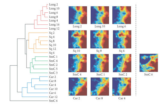
The genome-wide gene expression profiles of 25 samples of normal lung tissue (Lung) and different pulmonary tumors, carcinoid (Car), squamous cell carcinoma (Sq), and small-cell cancer (SmC) [5], were visualized as 25 GEDI maps, each consisting of a 31-by-30 mosaic, representing 930 miniclusters. Discrete differences in patterns of gene expression between normal lung and tumor samples are immediately detected upon visual inspection of the GEDI maps (Figure 1). Each sample exhibits characteristic spatial and color patterns, reflecting genome-wide transcriptional behavior of the respective tissue sample. The visual patterns of the GEDI maps of these different tissue samples remained distinct when the analysis was performed with a wide range of SOM parameters and the SOMs were run to convergence (not shown).
Figure 1.
Comparison of GEDI maps and hierarchical clustering. Left: dendrogram from hierarchical clustering, computed from 12 562 genes showing 4 main clusters of samples indicated by colors (Lung = normal lung, Sq = squamous cell carcinoma, SmC = small cell lung cancer, Car = carcinoid). Most samples from the same tissue type (diagnosis) form dense clusters. Note that one outlier, SmC6, did not cluster together with the other SmC samples. Right: GEDI maps. Three representative samples of each tissue type (diagnosis) are shown. The outlier sample SmC6 is shown on the right of the other SmC samples.
Inspection of GEDI maps allows a straightforward classification of the samples into subgroups without the aid of a clustering algorithm, but simply based on the visual differences in the metapatterns. Samples grouped together with members of the same category, with the exception of one outlier, a small-cell lung cancer sample, SmC6 whose GEDI map looked different (Figure 1). As previously demonstrated [5], hierarchical cluster analysis reliably arranged these lung tumor samples into distinct clusters which corresponded well to the different clusters identified using GEDI (Figure 1).
A known drawback of hierarchical clustering is that the linear arrangement of the clustered objects (samples) at the terminal branches of the dendrogram can be presented in multiple ways (orderings). This can make the unbiased global assessment of intersample similarity across all the samples difficult. Although this arbitrariness can be eliminated by using a one-dimensional SOM, k-means clustering, or other optimization algorithm to achieve some objective branch ordering [39, 40], this method is not often used. By contrast, because there is no a priori clustering structure in GEDI, sample clustering is directly obvious and robust and avoids bias suggestion of relatedness—a known problem with hierarchical clustering.
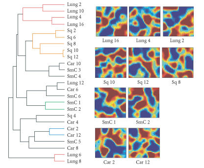
Another shortcoming of hierarchical clustering is that the hierarchical relationship displayed in the dendrograms does not necessarily have a biological meaning. For example, hierarchical clustering forces the randomly permuted data into a tree structure with similar overall structure (albeit with a higher distance score between the branches) even though the “samples” have now random attributes and have no meaningful relation (Figure 2). In contrast, in this case the GEDI maps immediately reveal the poor quality of clustering: the samples that were clustered together by hierarchical clustering do not exhibit any consistent global pattern (Figure 2). Therefore, GEDI also provides a first-line sample-centered quality control for traditional clustering methods.
Figure 2.
A hierarchical dendrogram computed from the same data as in Figure 1, but with randomly permutated genes. Mixed tissue types can be seen in the same branches of the tree. On the right, random patterns in GEDI maps from three representative samples of each tissue type.
Because GEDI maps provide a global view of the gene expression profiles of each sample, they immediately present an explanation for why a particular sample behaves as an outlier (when sample diagnosis is known) and which genes account for that behavior. For example, the dramatic difference between the GEDI map of an outlier, SmC6 (Figure 1), relative to samples within the cluster of nominal small-cell lung cancers immediately reveals that SmC6 deviates from the other small-cell carcinomas and the different pattern of tiles explains why.
Fidelity of GEDI maps in representing tissue transcriptomes
In addition to visually comparing GEDI maps as individual entities, one can extract the numerical centroid values yjk in sample j of each metagene k to analyze GEDI maps quantitatively. By utilizing the metagenes instead of the “real” genes to characterize a transcriptome, the complexity is reduced, in our case from the original data matrix N × M = 12562 × 25 to 930 × 25.
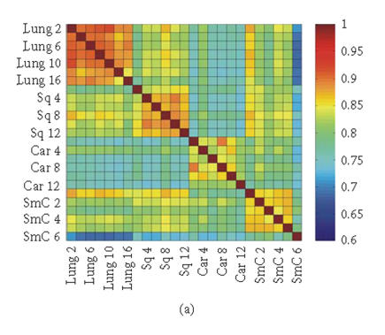
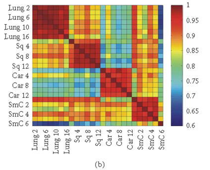
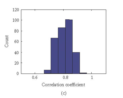
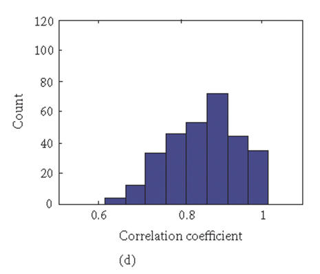
To evaluate the “fidelity” of GEDI mosaic patterns in representing the expression profiles established by all the genes, we calculated the correlation coefficients rjk for every pair of samples (j, k) using either (1) the expression data for all of the individual genes or (2) the metagenes. If the GEDI mosaic patterns of metagenes faithfully represent the genome-wide gene expression profiles, the correlation coefficients for all sample pairs calculated in these two ways will be similar. In fact, the GEDI patterns preserved the correlation between samples obtained from the real gene expression data (Figures 3(a), 3(b)). The correlation of the values and the ranks of rjk between the two methods were 0.909 and 0.960, respectively.
Figure 3.
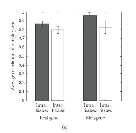
Correlation coefficients of samples using simple gene approach or gene pattern approach. (a), (b) Matrix of correlation coefficient values rjk for the correlation between all pairs of sample j versus k, based on “real” gene expression values (a) or metagene (centroid) values (b). (c), (d) Histograms of all the correlation coefficient values from (a) (histogram (c)) and (b) (histogram (d)), respectively. (e) Average correlation of intra-tissues (n = 66) and inter-tissues (n = 234) sample pairs when real gene and metagene data are used, respectively.
Interestingly, the values of the correlation coefficients (profile similarity between samples) calculated from metagenes spanned a considerably broader range than those from the “real” gene expression dataset, as apparent in the histograms of the correlation values (Figures 3(c), 3(d)). This is also manifested in the better “color contrast” of the correlation matrix color map (Figure 3(b) versus 3(a)). Thus, it appears that the discriminating power of this technique using metagenes may be increased relative to standard microarray analysis. The differences in the average correlation between sample pairs within the same tissue groups (“intratissue pairs”) and across tissue groups (“intertissue pairs”) were considerably larger when metagenes (0.127, 95% confidence interval: 0.109 to 0.145) were used for calculating the correlation, compared to when real genes (0.069, 95% confidence interval: 0.058 to 0.080) are used (Figure 3(e)). It remains to be determined statistically in extended data sets whether metagene-based analysis consistently has a greater discriminating power by using larger test sets of tissue samples for patient groups with established diagnosis.
In summary, the GEDI maps based on metagenes faithfully recapitulate gene expression profiles of the entire gene dataset despite dimension reduction. Thus, the visual patterns capture the real similarity relationships among samples with a high fidelity.
Second-level GEDI maps
To further validate how well metapatterns can represent the transcriptome, we applied a “second-level” GEDI analysis to categorize GEDI maps automatically using the (N = 930 metagenes × M = 25 samples) matrix as input data. For comparison, we also performed a PCA on the original gene data matrix (with sample columns as the “objects” and gene rows as the “attributes”). The second-level GEDI analysis differed from the first-level GEDI analysis performed on the (N = 12562 real genes ×M = 25 samples) matrix in that the objects of clustering were the samples but not genes, and thus a smaller SOM grid was used. Given the discriminatory power of the metagenes, using them as input variables may improve the quality of sample clustering.
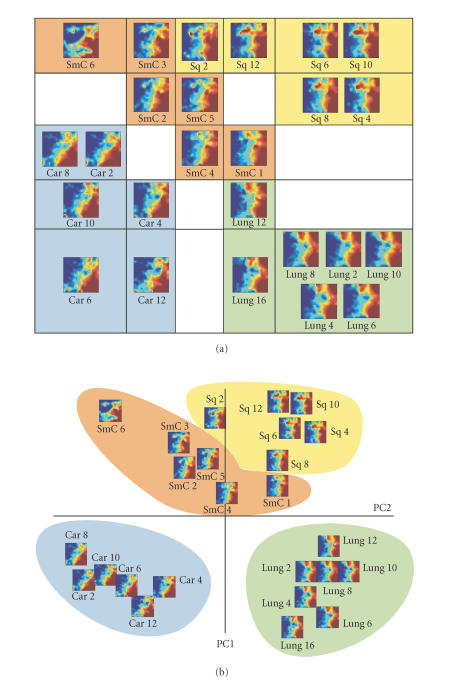
The 25 samples were assigned to a 5 × 5 SOM grid according to their metagene expression profiles. In the resulting second-level GEDI map, the tissue samples (the first-level GEDI maps) of the same diagnosis were grouped within the same neighborhood of the map (Figure 4(a)). The map distances from each tumor-specific sample cluster to that of normal lung (Lung) were roughly similar, while among the tumors, the carcinoid (Car) and squamous cell carcinoma (Sq) samples were most distant from each other, with small-cell lung cancer (SmC) in between.
Figure 4.
Grouping GEDI maps of different tissue types using a second-level GEDI. (a) The 25 different samples were assigned to a 5 × 5 SOM grid according to their metagene expression profiles using GEDI. The GEDI maps of the individual tissues are shown placed in the second-level SOM grid. Same types of tissues are grouped in the same neighborhood of the second-level map. (b) Principle component analysis. Each sample is mapped onto the plane spanned by the two first principal components (PC1 and PC2). Instead of representing a sample by a symbol, the GEDI map of each sample is shown. Note the similarity in sample position between (a) and (b).
Interestingly, the spatial distribution of these samples in the two-dimensional second-level map was very closely mirrored in the PCA in which the samples were projected on the plane spanned by the two first eigenvectors (Figure 4(b)). There was good agreement even with respect to the relative position of the individual samples within each tumor and tissue type (Figure 4(a) versus 4(b)).
Importantly, such information revealed by the 2D sample plane, be it the SOM grid of the second-level GEDI or the PCA plane, can be directly read from the metapatterns of the GEDI maps. Visual inspection of the GEDI maps readily confirms the notion that Sq2 displays significant feature similarity to the SmC samples based on the fine structure of the patterns of upregulated genes. Specifically, the GEDI metapattern showed that Sq2 lacked the extension of the red areas (highly expressed genes) from the right half into the upper-left quadrant of the GEDI map that is characteristic for the other Sq samples (Figure 4). Interestingly, this group of metagenes that was not expressed in Sq2 contained multiple keratin-related genes, consistent with the squamous cell origin of these tumors. Without the GEDI maps, the samples would be represented by dots in the PCA which would be identified solely by their position in the abstract eigenvector space. Thus, GEDI allows the rapid toggling between gene-centered and sample-centered perspectives, which is an important feature for an integrative yet gene-specific analysis.
Qualitative differences between gene profiles
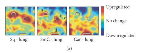
Like small-cell carcinoma, lung carcinoid tumors are also classified as (low-grade) neuroendocrine tumors [41], while squamous carcinoma appears to be unrelated to this group. However, in both hierarchical clustering as well as in PCA, SmC was closer to Sq than to Car (Figures 1 and 4), which is consistent with the idea that small-cell lung carcinoma may have an epithelial origin [42], but competes with the notion of the common neuroendocrine property of SmC and Car. To examine this dualism we used GEDI to analyze the relationship between these three pulmonary tumors and normal lung to compare not only by how much but also how each of these tumors qualitatively differed from normal lung tissue and from each other. The GEDI software environment allows the user to easily perform algebraic operations on whole mosaic patterns based on metagene expression values, and for instance to calculate “average mosaics” from a group of samples with the same diagnosis or “difference mosaics” to reveal differential expression patterns between two samples (or averages of two groups). Here we obtained “GEDI difference maps” (Figure 5(a)) by subtracting the averaged GEDI maps of normal lung samples from that of SmC, Car, or Sq, respectively. The red areas in the difference maps indicate genes that were upregulated in these tumors compared to normal lung tissue. The outlined areas on the maps represent four islands (labeled a, b, c, d in Figure 5(a)) that contain the top 5% differentially expressed genes in SmC versus Lung.
Figure 5.
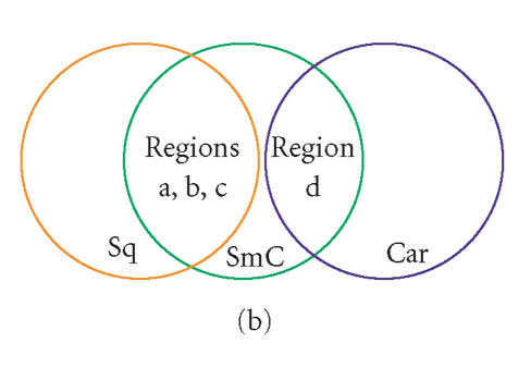
GEDI maps reveal a qualitative aspect in the quantitative difference between tumor types with respect to expression of prominent marker genes. (a) Difference maps were obtained by element-wise subtraction of the average metagene expression levels, averaged for all samples in the same diagnosis group of tumor tissues and normal tissues respectively. The circled regions a–d represent four “gene islands” containing the 5% most upregulated genes in SmC compared to normal lung. Color bar represents centroid values after subtraction. (b) Schematic of the qualitative relationship between 3 types of tumor samples: SmC appears to be the union set of Sq and Car with respect to the selected genes that are differentially overexpressed in SmC relative to normal lung.
These studies revealed that SmC and Sq share a set of features, representing a number of genes located within regions a–c that are commonly overexpressed in both tumors relative to normal lung. This is consistent with the vicinity of these two tumors in the dendrogram (Figure 1) and in the PCA sample plane (Figure 4); it also is in line with the proposed epithelial origin of small-cell lung cancer [42]. The specific genes represented by metagenes of the islands a–c included growth-related genes (involved in cell proliferation, cell cycle, DNA replication, etc). Such functional enrichment of genes in the “gene islands” underscores the biological meaning of pattern features in GEDI maps. Interestingly, the SmC samples while globally close to Sq samples, shared with the Car samples the island d, which contained neuroendocrine-related genes (involved in synaptic vesicle, neuromuscular physiological process, etc), consistent with the neuroendocrine nature of small-cell lung carcinoma [41].
This example illustrates how GEDI can extract relationship features that are not revealed by traditional hierarchical clustering or any reduction of sample comparisons to a similarity metric. Specifically, while three islands (a–c) that represent the regions of metagenes upregulated in SmC compared to normal lung also were found in Sq (a, b, c), they were absent from Car. Conversely, the island d that was enriched for the neuroendocrine genes was overexpressed in Car but not in Sq. Thus, the GEDI analysis exposed a novel facet of relationship between the samples with respect to these signature gene clusters: SmC appears to be the union set of the sets of Car and Sq (Figure 5(b)), sharing the gene cluster d with Car and the clusters a, b, and c with Sq. With respect to these growth-related gene islands, there was essentially no overlap between Car and Sq. Thus, despite the overall higher similarity between SmC and Sq, when considering the subfeature d with the neuroendocrine genes, SmC was closer to Car than to Sq. Such information on a qualitative relationship is lost in conventional clustering dendrograms that reduce relationships to a numerical similarity between two samples [42]. Without an a priori hypothesis, such qualitative relationships are almost impossible to identify in the widely used heat maps, but they immediately spring to eye in the differential GEDI maps.
DISCUSSION
Genome-scale gene expression profiles are not simply high-dimensional sets of variables that provide an opportunity for multivariate statistical analysis. Instead, they are the biological manifestation of the constrained dynamics of the underlying complex and hierarchical gene regulatory networks that govern developmental potentials of cells and tissues [27]. Tumors arise from mutational rewiring of this molecular network and therefore, display specific, coordinated deviations from the normal transcriptome patterns. To visualize coherent, genome-scale alterations of the transcriptome structure, we used here an integrative visual representation for gene expression profiles. As a test example we analyzed expression profiles of three lung tumor samples as a case study. We show that by delegating the actual process of pattern recognition to human gestalt perception in the format of SOM-based GEDI mosaics, interesting features in the relationship between tumor types can be revealed. Specifically, we found that with respect to pathological deviation from normal gene expression, small-cell carcinoma represents the union set of squamous cell carcinoma and carcinoids. Such information on higher-order transcriptome changes, which may be useful for understanding developmental relationships and differences in drug responsiveness between tumor types, spring to eye in the GEDI maps, but would not have been revealed in conventional algorithms without explicitly asking the appropriate question.
Microarray-based molecular profiles are increasingly used to capture characteristic high-dimensional molecular “portraits” to identify diagnostic and prognostic groups in cancer. Most existing methods reduce complex relationships to a numerical value, typically, a distance metric or a visual distance between points in a reduced dimension space. While this is useful for explicitly extracting specific information, these methods may lose potentially useful, unanticipated information inherent in the high-dimensional expression profiles, such as particular higher-order patterns of expression. Similarly, even the search for a multigene signatures [15] instead of a single marker gene to improve discrimination between diagnostic groups may miss some of the distributed (“holistic”) information in the profiles. In fact, maximal accuracy of multiclass tumor classification may require that the predictor utilizes all the genes [43].
The GEDI visualization software was developed to circumvent the problem of discarding implicit, potentially irreducible information inherent in genome-wide expression profiles in the absence of a specific hypothesis. It provides the opportunity for a holistic, yet molecular exploration of a set of gene expression profiles (or other high-dimensional data sets) that can be used to test existing tissue-level biological hypotheses [12] or establish new ones. Although GEDI uses a SOM algorithm at its core, it differs fundamentally from the traditional use of SOM to find biologically meaningful clusters [30, 32, 33, 38]. The metagenes in GEDI are miniclusters that are smaller by an order of magnitude than the explicitly predefined clusters in the conventional cluster analysis, hence they are very tight and of high quality. The identification of biological clusters is not the result of the clustering algorithm per se, but is achieved at a later stage of analysis, namely, by visual inspection and gestalt perception of the metapatterns that emerge from the SOM-generated metagenes. Hence, ambiguities in clustering of samples are not built into the algorithm, but are subject to direct and interactive analysis by the interpreter.
GEDI provides several technical benefits relative to existing high-dimensional data analysis methods.
(a) By presenting metapatterns, GEDI maps provide a visual engram of each sample's particular molecular profile, and hence, establish a molecular portrait in the very sense of the word, with a particular visual identity for each sample (eg, tumor type, patient, treatment condition).
(b) Although classification of samples into groups is achieved by human gestalt perception of the metapatterns, it can be supported by an algorithmic approach applied on the metagenes.
(c) The direct visual monitoring of the portrait of a sample allows GEDI to intercept algorithmic idiosyncrasies, such as the dependence of the branching structure of dendrograms on the particular tree-building algorithm used in hierarchical clustering.
(d) Despite a moderate dimension reduction, GEDI preserves most of the information richness of entire molecular portraits, allowing detailed, multivariate explorative comparisons between samples. This in turn can help define qualitative differences (in addition to measuring quantitative dissimilarity between samples) that may provide additional biological information on the relationships between samples.
(e) GEDI allows the rapid and seamless switching between an integrative, sample-oriented analysis and the more traditional gene-centered analysis. This is facilitated by the interactive user interface that permits retrieval of genes that contribute to metapattern features of interest.
(f) Finally, using GEDI to compare the samples and relate them to each other does not require specific knowledge of the underlying algorithm, and thus is an intuitive tool for nonbioinformaticians, such as pathologists and clinicians that will increasingly confront microarray analysis. This is specifically relevant for the explanation of anomalies in cluster analysis, such as outlier samples. The reason for misclassification is usually directly evident in the GEDI map and does not require familiarity with the details of the algorithm.
GEDI does not replace, but complements, existing algorithmic clustering methods. Although biologists have begun to use GEDI maps [12, 13, 44] to ask biological questions, further systematic elucidation of its application, notably, the choice of optimal size of miniclusters is needed. Moreover, it is at the moment not yet optimized for visual discrimination. Other methods to create the mosaics can be envisioned. Future use of GEDI in studies of the genome-scale molecular signature of both normal and disease samples will ultimately help assess the true value of a “holistic” interpretation of molecular profiles that systems biology is advocating.
Supplementary Material
Additional relevant information and results
This PDF file provides additional relevant information and results: the parameters in the GEDI software, the results of GEDI maps produced with different parameters, results showing the differences between Sq2 and other Sq samples in more details, and the description of the method of GO-based EASE functional enrichment analysis.
Detailed gene information
This is a Microsoft Excel spreadsheet containing the detailed gene information of the 4 “gene islands” in the SmC-Lung difference map and the result of EASE analysis of functional enrichment for these 4 islands. The first 4 sheets contain the gene information, such as Affymetrix ID, GEDI Map coordinates, gene symbols, and gene ontology terms for genes on each of the 4 islands. The last 4 sheets contain the results of GO based EASE functional enrichment analysis of the 4 islands.
ACKNOWLEDGMENTS
This work was supported by grants from the Air Force Office of Scientific Research (F49620-01-1-0564 to SH), NIH (CA55833 to DEI), and NASA (NN A04CC96G to DEI).
References
- 1.Lockhart DJ, Winzeler EA. Genomics, gene expression and DNA arrays. Nature. 2000;405(6788):827–836. doi: 10.1038/35015701. [DOI] [PubMed] [Google Scholar]
- 2.Lander ES. Array of hope. Nature Genetics. 1999;21(suppl 1):3–4. doi: 10.1038/4427. [DOI] [PubMed] [Google Scholar]
- 3.Golub TR, Slonim DK, Tamayo P, et al. Molecular classification of cancer: class discovery and class prediction by gene expression monitoring. Science. 1999;286(5439):531–537. doi: 10.1126/science.286.5439.531. [DOI] [PubMed] [Google Scholar]
- 4.Alizadeh AA, Eisen MB, Davis RE, et al. Distinct types of diffuse large B-cell lymphoma identified by gene expression profiling. Nature. 2000;403(6769):503–511. doi: 10.1038/35000501. [DOI] [PubMed] [Google Scholar]
- 5.Bhattacharjee A, Richards WG, Staunton J, et al. Classification of human lung carcinomas by mRNA expression profiling reveals distinct adenocarcinoma subclasses. Proceedings of the National Academy of Sciences of the United States of America. 2001;98(24):13790–13795. doi: 10.1073/pnas.191502998. [DOI] [PMC free article] [PubMed] [Google Scholar]
- 6.Dave SS, Wright G, Tan B, et al. Prediction of survival in follicular lymphoma based on molecular features of tumor-infiltrating immune cells. New England Journal of Medicine. 2004;351(21):2159–2169. doi: 10.1056/NEJMoa041869. [DOI] [PubMed] [Google Scholar]
- 7.van de Vijver MJ, He YD, van't Veer LJ, et al. A gene-expression signature as a predictor of survival in breast cancer. New England Journal of Medicine. 2002;347(25):1999–2009. doi: 10.1056/NEJMoa021967. [DOI] [PubMed] [Google Scholar]
- 8.Garber K. Genomic medicine: gene expression tests foretell breast cancer's future. Science. 2004;303(5665):1754–1755. doi: 10.1126/science.303.5665.1754. [DOI] [PubMed] [Google Scholar]
- 9.Garber ME, Troyanskaya OG, Schluens K, et al. Diversity of gene expression in adenocarcinoma of the lung. Proceedings of the National Academy of Sciences of the United States of America. 2001;98(24):13784–13789. doi: 10.1073/pnas.241500798. [DOI] [PMC free article] [PubMed] [Google Scholar]
- 10.DeRisi JL, Iyer VR, Brown PO. Exploring the metabolic and genetic control of gene expression on a genomic scale. Science. 1997;278(5338):680–686. doi: 10.1126/science.278.5338.680. [DOI] [PubMed] [Google Scholar]
- 11.Iyer VR, Eisen MB, Ross DT, et al. The transcriptional program in the response of human fibroblasts to serum. Science. 1999;283(5398):83–87. doi: 10.1126/science.283.5398.83. [DOI] [PubMed] [Google Scholar]
- 12.Barnés CM, Huang S, Kaipainen A, et al. Evidence by molecular profiling for a placental origin of infantile hemangioma. Proceedings of the National Academy of Sciences of the United States of America. 2005;102(52):19097–19102. doi: 10.1073/pnas.0509579102. [DOI] [PMC free article] [PubMed] [Google Scholar]
- 13.Camphausen K, Purow B, Sproull M, et al. Influence of in vivo growth on human glioma cell line gene expression: convergent profiles under orthotopic conditions. Proceedings of the National Academy of Sciences of the United States of America. 2005;102(23):8287–8292. doi: 10.1073/pnas.0502887102. [DOI] [PMC free article] [PubMed] [Google Scholar]
- 14.Perou CM, Sørile T, Eisen MB, et al. Molecular portraits of human breast tumours. Nature. 2000;406(6797):747–752. doi: 10.1038/35021093. [DOI] [PubMed] [Google Scholar]
- 15.Ramaswamy S, Ross KN, Lander ES, Golub TR. A molecular signature of metastasis in primary solid tumors. Nature Genetics. 2003;33(1):49–54. doi: 10.1038/ng1060. [DOI] [PubMed] [Google Scholar]
- 16.van't Veer LJ, Dai H, van de Vijver MJ, et al. Gene expression profiling predicts clinical outcome of breast cancer. Nature. 2002;415(6871):530–536. doi: 10.1038/415530a. [DOI] [PubMed] [Google Scholar]
- 17.Chung CH, Bernard PS, Perou CM. Molecular portraits and the family tree of cancer. Nature Genetics. 2002;32(suppl 4):533–540. doi: 10.1038/ng1038. [DOI] [PubMed] [Google Scholar]
- 18.Rhodes DR, Chinnaiyan AM. Integrative analysis of the cancer transcriptome. Nature Genetics. 2005;37(suppl 6):S31–S37. doi: 10.1038/ng1570. [DOI] [PubMed] [Google Scholar]
- 19.Bucca G, Carruba G, Saetta A, Muti P, Castagnetta L, Smith CP. Gene expression profiling of human cancers. Annals of the New York Academy of Sciences. 2004;1028:28–37. doi: 10.1196/annals.1322.003. [DOI] [PubMed] [Google Scholar]
- 20.Stoughton RB, Friend SH. How molecular profiling could revolutionize drug discovery. Nature Reviews Drug Discovery. 2005;4(4):345–350. doi: 10.1038/nrd1696. [DOI] [PubMed] [Google Scholar]
- 21.Elfilali A, Lair S, Verbeke C, La Rosa P, Radvanyi F, Barillot E. ITTACA: a new database for integrated tumor transcriptome array and clinical data analysis. Nucleic Acids Research. 2006;34(Database issue):D613–D616. doi: 10.1093/nar/gkj022. [DOI] [PMC free article] [PubMed] [Google Scholar]
- 22.Eisen MB, Spellman PT, Brown PO, Botstein D. Cluster analysis and display of genome-wide expression patterns. Proceedings of the National Academy of Sciences of the United States of America. 1998;95(25):14863–14868. doi: 10.1073/pnas.95.25.14863. [DOI] [PMC free article] [PubMed] [Google Scholar]
- 23.Alon U, Barkai NI, Notterman DA, et al. Broad patterns of gene expression revealed by clustering analysis of tumor and normal colon tissues probed by oligonucleotide arrays. Proceedings of the National Academy of Sciences of the United States of America. 1999;96(12):6745–6750. doi: 10.1073/pnas.96.12.6745. [DOI] [PMC free article] [PubMed] [Google Scholar]
- 24.Landgrebe J, Wurst W, Welzl G. Permutation-validated principal components analysis of microarray data. Genome Biology. 2002;3(4):research0019.1–research0019.11. doi: 10.1186/gb-2002-3-4-research0019. [DOI] [PMC free article] [PubMed] [Google Scholar]
- 25.Alter O, Brown PO, Botstein D. Generalized singular value decomposition for comparative analysis of genome-scale expression data sets of two different organisms. Proceedings of the National Academy of Sciences of the United States of America. 2003;100(6):3351–3356. doi: 10.1073/pnas.0530258100. [DOI] [PMC free article] [PubMed] [Google Scholar]
- 26.Dawson K, Rodriguez RL, Malyj W. Sample phenotype clusters in high-density oligonucleotide microarray data sets are revealed using Isomap, a nonlinear algorithm. BMC Bioinformatics. 2005;6:195. doi: 10.1186/1471-2105-6-195. [DOI] [PMC free article] [PubMed] [Google Scholar]
- 27.Huang S, Eichler GS, Bar-Yam Y, Ingber DE. Cell fates as high-dimensional attractor states of a complex gene regulatory network. Physical Review Letters. 2005;94(12):128701. doi: 10.1103/PhysRevLett.94.128701. [DOI] [PubMed] [Google Scholar]
- 28.Moore P, Fitz C. Gestalt theory and instructional design. Journal of Technical Writing and Communication. 1993;23(2):137–157. [Google Scholar]
- 29.Kohonen T. Self-Organizing Maps. 2nd ed. Berlin, Germany: Springer; 1997. [Google Scholar]
- 30.Tamayo P, Slonim D, Mesirov J, et al. Interpreting patterns of gene expression with self-organizing maps: methods and application to hematopoietic differentiation. Proceedings of the National Academy of Sciences of the United States of America. 1999;96(6):2907–2912. doi: 10.1073/pnas.96.6.2907. [DOI] [PMC free article] [PubMed] [Google Scholar]
- 31.Tavazoie S, Hughes JD, Campbell MJ, Cho RJ, Church GM. Systematic determination of genetic network architecture. Nature Genetics. 1999;22(3):281–285. doi: 10.1038/10343. [DOI] [PubMed] [Google Scholar]
- 32.Buckhaults P, Zhang Z, Chen Y-C, et al. Identifying tumor origin using a gene expression-based classification map. Cancer Research. 2003;63(14):4144–4149. [PubMed] [Google Scholar]
- 33.Covell DG, Wallqvist A, Rabow AA, Thanki N. Molecular classification of cancer: unsupervised self-organizing map analysis of gene expression microarray data. Molecular Cancer Therapeutics. 2003;2(3):317–332. [PubMed] [Google Scholar]
- 34.Wang J, Delabie J, Aasheim H, Smeland E, Myklebost O. Clustering of the SOM easily reveals distinct gene expression patterns: results of a reanalysis of lymphoma study. BMC Bioinformatics. 2002;3(1):36. doi: 10.1186/1471-2105-3-36. [DOI] [PMC free article] [PubMed] [Google Scholar]
- 35.Eichler GS, Huang S, Ingber DE. Gene Expression Dynamics Inspector (GEDI): for integrative analysis of expression profiles. Bioinformatics. 2003;19(17):2321–2322. doi: 10.1093/bioinformatics/btg307. [DOI] [PubMed] [Google Scholar]
- 36.Shoemaker JS, Lin SM. Methods of Microarray Data Analysis IV. New York, NY: Springer; 2005. [Google Scholar]
- 37.Wishard D. Mode Analysis: A Generalization of Nearest Neighbor Which Reduces Chaining Effects. New York, NY: Academic Press; 1969. [Google Scholar]
- 38.Nikkilä J, Törönen P, Kaski S, Venna J, Castrén E, Wong G. Analysis and visualization of gene expression data using self-organizing maps. Neural Networks. 2002;15(8-9):953–966. doi: 10.1016/s0893-6080(02)00070-9. [DOI] [PubMed] [Google Scholar]
- 39.Bar-Joseph Z, Gifford DK, Jaakkola TS. Fast optimal leaf ordering for hierarchical clustering. Bioinformatics. 2001;17(suppl 1):S22–S29. doi: 10.1093/bioinformatics/17.suppl_1.s22. [DOI] [PubMed] [Google Scholar]
- 40.Bar-Joseph Z, Demaine ED, Gifford DK, Srebro N, Hamel AM, Jaakkola TS. K-ary clustering with optimal leaf ordering for gene expression data. Bioinformatics. 2003;19(9):1070–1078. doi: 10.1093/bioinformatics/btg030. [DOI] [PubMed] [Google Scholar]
- 41.Cerilli LA, Ritter JH, Mills SE, Wick MR. Neuroendocrine neoplasms of the lung. American Journal of Clinical Pathology. 2001;116(suppl):S65–S96. doi: 10.1309/BPY4-VGTB-PATF-VUXU. [DOI] [PubMed] [Google Scholar]
- 42.Anbazhagan R, Tihan T, Bornman DM, et al. Classification of small cell lung cancer and pulmonary carcinoid by gene expression profiles. Cancer Research. 1999;59(20):5119–5122. [PubMed] [Google Scholar]
- 43.Ramaswamy S, Tamayo P, Rifkin R, et al. Multiclass cancer diagnosis using tumor gene expression signatures. Proceedings of the National Academy of Sciences of the United States of America. 2001;98(26):15149–15154. doi: 10.1073/pnas.211566398. [DOI] [PMC free article] [PubMed] [Google Scholar]
- 44.Björkbacka H, Fitzgerald KA, Huet F, et al. The induction of macrophage gene expression by LPS predominantly utilizes Myd88-independent signaling cascades. Physiological Genomics. 2004;19(3):319–330. doi: 10.1152/physiolgenomics.00128.2004. [DOI] [PubMed] [Google Scholar]
Associated Data
This section collects any data citations, data availability statements, or supplementary materials included in this article.
Supplementary Materials
Additional relevant information and results
This PDF file provides additional relevant information and results: the parameters in the GEDI software, the results of GEDI maps produced with different parameters, results showing the differences between Sq2 and other Sq samples in more details, and the description of the method of GO-based EASE functional enrichment analysis.
Detailed gene information
This is a Microsoft Excel spreadsheet containing the detailed gene information of the 4 “gene islands” in the SmC-Lung difference map and the result of EASE analysis of functional enrichment for these 4 islands. The first 4 sheets contain the gene information, such as Affymetrix ID, GEDI Map coordinates, gene symbols, and gene ontology terms for genes on each of the 4 islands. The last 4 sheets contain the results of GO based EASE functional enrichment analysis of the 4 islands.


