

Abstract
In fluorescence microscopy, images often contain puncta in which the fluorescent molecules are spatially clustered. This article describes a method that uses single-molecule intensity distributions to deconvolve the number of fluorophores present in fluorescent puncta as a way to “count” protein number. This method requires a determination of the correct statistical relationship between the single-molecule and single-puncta intensity distributions. Once the correct relationship has been determined, basis histograms can be generated from the single-molecule intensity distribution to fit the puncta distribution. Simulated data were used to demonstrate procedures to determine this relationship, and to test the methodology. This method has the advantages of single-molecule measurements, providing both the mean and variation in molecules per puncta. This methodology has been tested with the avidin-biocytin binding system for which the best-fit distribution of biocytins in the sample puncta was in good agreement with a bulk determination of the avidin-biocytin binding ratio.
INTRODUCTION
The need for quantitative tools in biology is growing as the information drawn from biological measurements becomes more precise. Fluorescence microscopy images of cells often contain puncta (1–5), in which the fluorescent molecules of interest are spatially concentrated. The ability to count both the absolute number and the variation in the number of molecules present in these puncta, or regions of interest (ROIs), will advance quantitative biological measurements (6–14). Knowing the concentration of proteins within a ROI provides the opportunity to study a biological system at a level of detail that is inaccessible to traditional biochemical techniques. Such precise quantitative information is particularly important in systems biology and in the computational modeling of cellular function.
To count fluorescent molecules present at one or a few copies, one approach is to use sequential single-molecule photobleaching (15). In principle, each bleaching event should result in a step decrease in the observed fluorescence intensity. The number of bleach steps observed would therefore correspond to the number of molecules present in a particular ROI. In practice, however, it is difficult to apply this method to count molecules that are present at more than a few copies. Because each fluorescent molecule is slightly different with variable photostability and number of emitted photons, the size of the observed bleach step is not homogeneous and often it can be difficult to determine whether a particularly large bleach step corresponds to more than one bleached molecule. Such ambiguities become more problematic with an increasing number of molecules present. This method requires good signal/noise to be obtained for each and every puncta, and the required careful optimization of the laser powers employed constrains the technique for use with fluorophores that are highly emissive and photostable. Another complication arises if the fluorescent molecule to be counted has been labeled with multiple fluorophores, as is often the case with fluorescently labeled antibodies. For example, if the antibodies were each labeled with six fluorophores, then counting five labeled antibodies in a ROI by sequential photobleaching requires recognizing ∼30 steps in the intensity trace for the ROI. Finally, it can be tedious to perform this measurement over a large number (hundreds to thousands) of ROIs, which can be required to arrive at a statistically significant biological conclusion for systems where there is a significant variability in the number of fluorophores per ROI.
On the other extreme in copy number, it is possible to count molecules that are highly abundant (hundreds to thousands) within a ROI using traditional calibration methods. Here, the observed fluorescence intensity from a ROI is calibrated against the intensity measured from fluorescent beads of known properties. In combination with green fluorescent protein (GFP) fusion techniques, this method has been used recently to estimate the amount of high-copy number proteins in cells (13,14,16–18). These methods for measuring protein number use the average fluorescence intensity obtained during calibration. As a result, the presence of intensity distributions about the mean value complicates calibration, which can lead to large uncertainties in the actual number of the measured fluorescent proteins. This problem is especially acute when dealing with proteins that are of low to intermediate abundance (approximately a few to tens of copy numbers). It also precludes the use of probes that have a broad initial fluorescence intensity distribution, such as dye-tagged antibodies. For example, recent measurements of local protein concentration are based on fusion with fluorescent proteins, which guarantees at most one fluorophore per protein (19,20). In contrast, fluorescently tagged antibodies are labeled via primary amines and the number of fluorophores per antibody can vary significantly (21). Therefore, fluorescently tagged antibodies can give rise to even broader fluorescence intensity distributions than single GFPs, which can lead to an even greater error in the estimation of the actual number of proteins present and thus precludes their use in protein counting. We emphasize the usefulness of using fluorescent antibodies for counting because the use of GFPs can perturb the native number of proteins present in a particular ROI (22).
The goal of this work is to develop and characterize a method to extract the distribution of the number of labeled fluorescent molecules per puncta, which can provide important information about a biological system, such as how tightly the expression of a particular protein is regulated. The method uses the emission intensity distribution from puncta containing single labeled molecules as a calibrating distribution to fit the intensity distribution of the sample puncta. To apply proper fitting, it is necessary to understand the nature of the relationship between the intensity distribution of puncta containing single labeled molecules (i.e., the calibrating distribution) and puncta containing multiple labeled molecules (i.e., the sample distribution). This article discusses ways of determining this relationship and uses simulated intensity distributions to demonstrate and characterize the method. We found this method to work well for counting molecules present in a single copy to tens of copies.
MATERIALS AND EXPERIMENTAL METHODS
Single fluorophores and antibody complexes
Alexa Fluor 488 carboxylic acid, succinimidyl ester was obtained from Invitrogen (Carlsbad, CA). Samples for the single-antibody images were obtained by reacting anti-synaptic vesicle protein 2 (anti-SV2) (23) (0.5 μl at 1 mg/ml) with fluorescently labeled Alexa Fluor 488 labeled goat anti-mouse (GAM) (Invitrogen) (1 μl at 2 mg/ml).
Antibody complexes and vesicles
Synaptic vesicles were prepared from rat brains using the procedure of Hell et al. (24) as modified by S. A. Mutch, J. C. Gadd, B. S. Fujimoto, R. M. Lorenz, C. L. Kuyper, J. S. Kuo, P. Kensel-Hammes, S. M. Bajjalieh, and D. T. Chiu (unpublished results). Briefly, 10 frozen rat brains (Pellfreeze, Rogers, AR) were pulverized into a fine powder by blending in liquid nitrogen. The powder was resuspended in homogenization buffer (0.3 M sucrose, 50 mM HEPES, pH 7.4, 2 mM EGTA, 8.5 ml/brain) and homogenized using a Teflon-glass homogenizer. The homogenate was centrifuged in a 45 Ti rotor (Beckman Coulter, Fullerton, CA) at 30 K rpm (100,000 × g) for 1 h at 4°C. The resulting supernatant was loaded in 26 ml centrifuge bottles with a 10 ml 1.5 M/0.6 M sucrose step gradient, then spun in a 60 Ti rotor (Beckman Coulter) at 50 K rpm (260,000 × g) for 2 h at 4°C. The synaptic vesicles were collected from the interface of the 0.6 M/1.5 M sucrose step gradient. The total protein concentration of the enriched vesicle fraction was ∼3 mg/ml as determined by Bradford's method (25) (Bio-Rad protein assay kit; Hercules, CA) with bovine serum albumin as a standard. The isolated synaptic vesicles were frozen and could be stored at −80°C for up to 6 months.
Vesicles were dialyzed overnight at 4°C in 150 mM phosphate buffered saline (PBS), 0.1 M phosphate, 0.15 M NaCl, pH = 7.2 using a membrane with a 10 kDa molecular mass cutoff. The primary antibody, (anti-SV2), was added to the dialyzed vesicles (at a ratio of 1:100 by volume) and incubated overnight at 4°C. To this mixture, the secondary fluorescently labeled antibody (GAM-488) was then added (1:100 v/v) and reacted overnight at 4°C. To remove excess dye-tagged secondary antibodies, mouse IgG conjugated agarose beads (Sigma; St Louis, MO) were added and allowed to react for 30 min at room temperature. The agarose beads were then removed by centrifugation at 8,000 × g, and the supernatant was collected.
Labeling of avidin with Alexa Fluor 488 biocytin
Avidin (Invitrogen) was reacted with Alexa Fluor 488 biocytin (Invitrogen) in a 1:8 (avidin/biotin) ratio for 16 h at 4°C. Excess biocytin was removed with a 5 cm × 0.5 mm s100HR sephacryl size exclusion column (Bio-Rad). To label avidin with a single biocytin, we mixed a 5:1 solution of avidin to labeled-biocytin, and the solution was reacted overnight at 4°C. We used the intensity data from avidin having one bound biocytin as our single-molecule calibrating intensity distribution (i.e., for the c = 1 basis histogram), which will take into account any fluorescence quenching that may have occurred when the labeled biocytin is bound to avidin. The degree of labeling (bulk average) was determined by measuring the absorbance for the avidin/Alexa Fluor 488 tagged biocytin complexes and the Alexa Fluor 488 tagged biocytin. The concentration of the biocytin in the complexes is obtained from the absorbance measurements using the extinction coefficient at 494 nm for the Alexa Fluor 488-tagged biocytin (71,000 cm−1M−1; Invitrogen), because avidin absorption is minimal at 494 nm. To measure the concentration of avidin, we used extinction coefficient for avidin at 282 nm, which is 96,000 cm−1M−1 (26). To account for the presence of absorption at 282 nm from Alexa-tagged biocytin, we measured the ratio of the absorbances, A282/A494, for the Alexa-tagged biocytin and found it to equal 0.15. We used this ratio to correct the measured A282 of the avidin/biocytin complexes, which allowed us to obtain the concentration of avidin. These two absorbance measurements provided an independent measurement of the average number of biocytins bound per avidin.
Fabrication of microchannel
Microfluidic channels were fabricated in poly (dimethylsiloxane) (PDMS) with rapid prototyping (27). Briefly, a high-resolution mask was generated from a computer-aided drawing file imprinted with the channel design. The mask was used in contact photolithography with SU-8 photoresist (MicroChem, Newton, MA) to create a master that consisted of the positive features of the 200 micron-wide and 75 micron-high straight channel on a silicon wafer. From the master, PDMS channels were molded and then sealed irreversibly to a borosilicate glass coverslip by oxidizing the PDMS surface in oxygen plasma. Before sealing, the glass coverslip was cleaned thoroughly by boiling for 1.5 h in a 1:1:1 mixture of water, ammonium hydroxide, and 30% hydrogen peroxide, followed by thorough rinsing with ultrapure water. To form the reservoirs at both ends of the microchannel, a punch made from aluminum tubing (∼5 mm diameter) was used to make holes in the PDMS. Gravity driven flow was induced by placing 100 μL of PBS into the inlet reservoir. A dilute solution of the molecules or vesicles was placed in a PDMS well, upon which gravity driven-flow introduced the molecules into the microchannels where they nonspecifically adsorbed onto the floor (coverslip) of the channel. To remove any nonadsorbed vesicles, PBS (or water for antibodies) was subsequently flowed through the channel. The channel remains filled with buffer or water while the images are being acquired, therefore fluorophores are capable of rapid motions and the image will be an average over the allowed positions and orientations of the tethered fluorophores. The preparation of the microchannels used for the biocytin/avidin complexes included an additional step. Before bonding the PDMS channel to the glass, we exposed the cleaned glass to ultraviolet (UV) light for 2 h to induce photobleaching of any fluorescent contaminants present on the glass surface.
Single molecule fluorescence imaging
Single molecules and vesicles were imaged using a home-built total internal reflection fluorescence (TIRF) microscope system and a high sensitivity charge-coupled device (CCD) camera (28). Briefly, 488-nm light from a solid-state diode-pumped laser (Coherent Sapphire, Santa Clara, CA) was focused at the back-focal plane and directed off-axis into a Nikon 100× TIRF objective (NA 1.45). The light was incident at an angle just slightly greater than the critical angle, thus resulting in total internal reflection (28,29). Fluorescence from the plane of excitation was collected with the objective and passed through a dichroic mirror (z488rdc, Chroma, Rockingham, VT) and filtered by a band-pass filter (HQ550/100M, Chroma) before being imaged by the CCD camera (Cascade 512B CCD camera, Roper Scientific, Duluth, GA). Rather than using epifluorescence, we used TIRF because it offers higher sensitivity and an increased signal/background ratio, which, in turn, permitted us to use lower laser powers to minimize photobleaching. The laser power, measured after the objective, was 88 μW and the integration time was 300 ms per image. To obtain the fluorescence emission intensity of each puncta, we took the maximum measured intensity from the ROI containing the single molecule, antibody, vesicle, or labeled avidin. The maximum intensity from each molecule was measured by first circling a ROI around the molecule, after which the imaging software (MetaMorph, Molecular Devices, Sunnyvale, CA) automatically selected the brightest pixel from each ROI and subtracted the average background intensity from each image.
BACKGROUND
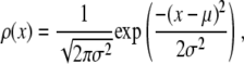
In an ideal system where all of the fluorophores exhibit a single well-defined fluorescent intensity, the number of fluorophores within a single ROI can be determined simply by dividing the fluorescent intensity of the ROI by the fluorescent intensity of a single fluorophore. The distribution of the number of fluorophores per ROI for this ideal system can be represented by a normalized histogram created by simply counting the number of ROIs with one fluorophore, two fluorophores, etc. This method requires that it be possible to determine the number of fluorophores contained by each ROI. In practice, however, single fluorophores typically exhibit a broad distribution of intensities. Assignment of a definite number of fluorophores to a given ROI is no longer possible since, due to the broad intensity distribution, it is possible for ROIs with c fluorophores to each exhibit a larger fluorescent intensity than one or more ROIs with c + 1 fluorophores. In this situation, it is still possible, in principle, to extract the distribution of the number of fluorophores per ROI if we understand the relationship between the fluorescent intensity distribution of single-fluorophore puncta, and the fluorescent intensity distribution of sample puncta with c fluorophores.
Intuitively, one might expect that the intensity,  , of the ROI located at (x,y) in an image could be described as simply the sum of the intensities of the enclosed fluorophores
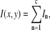 |
(1) |
where c is the number of fluorophores in the ROI. That is,  is expected to be the sum of independent, identically distributed random variables. In this case, the
  will have no dependence on its position in the image and the coordinates are simply a method of identifying the different puncta in the image. For example, if a collection of ROIs all contain exactly 10 fluorophores, one would expect that the observed ROI intensity distribution could be generated from the set of single-fluorophore intensities by simply randomly choosing the intensities of 10 fluorophores, adding these 10 intensity values together to obtain a single 10-fluorophore intensity, repeating until sufficiently large number of intensity values is obtained, and then plotting out the resulting distribution. The underlying assumption in this case is that the fluorophores behave independently of each other. From the central limit theorem, we would expect that for a sufficiently large number of fluorophores in the ROI, the distribution of intensities for the ROIs would be well approximated by a normal distribution. The process of obtaining ROI intensity distributions when the fluorophore intensities are all independent (Eq. 1) shall be denoted the random addition or RA process.
Experimentally, however, we never observe a normal distribution of intensities in our TIRF images. Instead, we observed lognormal intensity distributions for both single fluorescent molecules and single-particle images spanning a range of values of c. The expected (according to Eq. 1) change in the fluorescence intensity distribution from lognormal to normal with increasing value of c was not observed. We also found reported lognormal fluorescent intensity distributions in the literature (30–32). Fig. 1 shows several measured fluorescence intensity distributions, which were obtained by imaging the adsorbed molecules or vesicles on a glass coverslip using TIRF microscopy. Fig. 1 A shows a sample image of single Alexa Fluor 488-tagged antibody molecules with sample ROI circled around each molecule. Fig. 1, B–D, plots the background-subtracted fluorescence intensity distribution in histogram form. Each bin covers a range of intensities, and the value associated with each bin is the probability of observing a puncta whose intensity lies within that bin. The measured probability distribution functions shown are from single Alexa Fluor 488 carboxylic acid succinimidyl ester molecules (Fig. 1 B), single Alexa Fluor 488-tagged antibody molecules (Fig. 1 C), and single synaptic vesicles labeled with primary (anti-SV2) and Alexa Fluor 488-tagged secondary goat anti-mouse antibodies (Fig. 1 D). We can observe the on-off blinking of ROIs in images of single Alexa Fluor 488 molecules, which indicates that the data in Fig. 1 B are for single-dye molecules. Despite the fact that the antibodies have an average of six dye molecules and the vesicles have an average of three antibodies (and therefore an average of 18 fluorophores) attached to them, the intensity distributions for the antibodies and vesicles (Fig. 1, C and D) are still poorly fitted by a normal distribution. A lognormal distribution such as is observed for the single fluorophores is also observed even when larger numbers of fluorophores are present in a ROI. Indeed, we found the measured intensity distributions of 100 nm fluorescent beads (which contain hundreds of fluorophores per bead) to also follow a lognormal distribution.
FIGURE 1.

Fluorescence intensity distributions of single molecules and particles. (A) Image of GAM labeled with multiple Alexa Fluor 488; the right panel shows each molecules being circled automatically by the imaging software to define a region of interest. The plots are intensity distributions of (B) single Alexa Fluor 488 carboxylic acid succinimidyl ester molecules, (C) single goat anti-mouse IgG molecules labeled with multiple Alexa Fluor 488, and (D) single synaptic vesicles tagged with anti-SV2 primary antibody and Alexa Fluor 488-labeled GAM secondary antibody. For B–D, the dashed line is the best fit lognormal distribution to the data, and the dash-dot line is the best fit normal distribution to the data. The distribution of the intensity data is better fit by a lognormal distribution in all cases, despite the increase in the number of fluorophores per ROI between B and D. The images of the single fluorophores were faint when collected at the same excitation power as used for C and D, and thus images of the single fluorophores were collected using a higher laser power, so that the shape of the intensity distribution in B could be more easily compared with those in C and D.
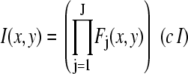
To address this discrepancy, we propose an alternate relationship between the single fluorophore intensity distribution and the intensity distribution of a ROI with c fluorophores. In this alternate relationship, the intensity distribution for ROIs with c fluorophores is obtained by scaling (or multiplying) the intensity distribution function for the single fluorophore by c. Unlike the RA process described above, in this case,  is affected by its position in the image
 |
(2) |
where the product runs over the set of J independent, random variables ( ), I is the intensity of a single fluorophore (assumed to be the same for all fluorophores), and c is the number of fluorophores in the ROI. The
  are assumed to be due to the measurement process, with each value of j referring to a different measurement artifact (such as defocusing, or a variation in detector efficiency). The point is that although the
  will depend on where the ROI is located in the image, they are independent of c. From the central limit theorem, we would expect that if the
  are similarly distributed over the image, then for sufficiently large J the distribution of the product in Eq. 2 would be well approximated by a lognormal distribution. Since the remaining terms on the right-hand side of Eq. 2 are constants, we would expect that for this case that the distribution of intensities would be well approximated by a lognormal distribution, and this is what we observe experimentally. In this alternative case, the
  , which are independent of the number of fluorophores in a puncta, would produce a broad distribution, and any distribution associated with the individual fluorophores is too narrow to be observed. The process of scaling or multiplying single fluorophore intensities to obtain the intensity distribution of a ROI (Eq. 2) shall be denoted the multiplied distribution or MD process.
There is an intrinsic distribution associated with the number of fluorophores associated with each antibody complex in Fig. 1 C, which would be expected to manifest itself as a normal distribution. However, the poor fit between the data and the normal distribution in Fig. 1 C and the significantly better fit of the data to a lognormal distribution suggests that this intrinsic distribution is much narrower than the overriding multiplicative distribution. Therefore, the distribution in the number of fluorophores per antibody complex cannot be observed and does not need to be accounted for.
With these two proposed relationships between the single fluorophore and sample-puncta intensity distribution functions, we can envision two scenarios that can account for the presence of the lognormal distributions observed in Fig. 1 for the antibodies and vesicles. The first is that any variation in emission intensity between different fluorophores within the same ROI is small compared to the variations among different ROIs and thus has little effect on the observed intensity distribution. The relationship between the single fluorophore and ROI intensities is given by Eq. 2, and is a MD process. Even for the case where the ROIs are monodisperse in c, the ROIs will exhibit an approximately lognormal intensity distribution. If the ROIs were polydisperse, then the distribution of c (distribution of number of fluorophores per puncta) can be obtained from the fitting procedure described below. In most situations, we believe this scenario correctly explains the occurrence of lognormal intensity distributions.
The second scenario to explain the presence of lognormal intensity distributions, which is likely rare, is that the number of fluorophores in each ROI is polydisperse and happens by chance to be distributed in a lognormal fashion such that the intensities that result from the application of Eq. 1 result in a lognormal intensity distribution. If the distribution of ROIs were monodisperse, then the observed intensity distribution would approach a normal distribution for larger values of c. Therefore, in this scenario the appearance of a lognormal distribution requires that the ROIs be polydisperse, because the origin of the observed lognormal intensity distribution is caused by the lognormal distribution in the number of fluorophores in the ROIs. Although the distribution of c in this scenario can likewise be obtained from the fitting procedures described below, the results of the fit (the distribution of c) depend critically upon the assumed relationship between the single fluorophore and ROI intensity distributions (RA versus MD).
The second scenario is likely rare, since it requires not only a polydisperse distribution of fluorescent molecules per ROI, but also that the distribution happens to take on the shape of a lognormal distribution. Therefore, the presence of a lognormal distribution for the ROIs is a strong indication that the single-molecule and single-ROI intensities are related via a MD process. Likewise, a normal distribution is a strong indication that the calibrating and ROI distributions are connected via a RA process.
These different distributions have different shapes and relative widths: The MD distribution for monodisperse ROIs with c fluorophores always has the same shape and relative width (width of the distribution divided by its mean) as the intensity distribution of the single fluorophores regardless of the value of c (this is shown in the section, “Simulation results”). In contrast, the shape of the RA distribution for monodisperse ROIs with c fluorophores always converges to a Gaussian, and the relative width of the distribution becomes smaller as the value of c increases. This creates the possibility that fitting procedures might determine whether a ROI intensity distribution resulted from a MD process or an RA process. In addition, it should be possible to distinguish between MD and RA processes from measurements on an experimental system for which the distribution of fluorophores in the ROIs is known. The biocytin-avidin binding system is one possible system, which we will describe in later sections.
For the purposes of context, we should note that another system where distribution functions are fit to model functions of a discrete nature is the quantal analysis of synaptic transmission (33). An example of this is the study of the inhibitory postsynaptic currents of neurons in rat hippocampal slices (34). Histograms of the magnitude of the currents were fitted to a sum of Gaussians with different mean values to demonstrate that the magnitude of the currents was quantal in nature. However, it should be pointed out that in our system, unlike that of Edwards et al. (34), the apparent fine structure observed in our histograms is noise. As will be seen for our results on the avidin/biocytin binding system, good fits were obtained despite the presence of such noise and it was possible to distinguish between a MD process and a RA process, and obtain good agreement with a bulk determination of the binding ratio.
THEORY AND SIMULATION METHODS
In the following discussion, we refer to the distribution used for calibration as the single-molecule distribution or single-fluorophore distribution. Note that calibration distributions are composed of the fluorescent units we wish to “count” in the ROIs. For example, single antibodies labeled with multiple fluorophores generate calibration curves for antibody-labeled samples, whereas single synaptic vesicles (e.g., labeled with FM dyes) would be used to generate a calibration curve to count the number of vesicles per synapse in cultured neurons or tissue slices.
Fluorescence intensity distributions
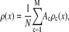
The distribution of fluorescence emission intensities of a set of ROIs shall be denoted  , where
  is the probability that a ROI in the set will exhibit an intensity between x and x + dx. For the case where each of the ROIs can contain different numbers of fluorophores,
  can be written as a weighted sum of intensity distributions:
 |
(3) |
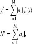
where  is the probability that a ROI with c fluorophores will exhibit an intensity emission between x and x + dx; the coefficient
  is the actual number of ROIs in the set with c fluorophores; N is the total number of ROIs in the set, and M is the largest number of fluorophores contained by any ROI in the set. The actual intensity data will be a set of values that can be converted into a histogram with elements
  , the number of ROIs whose emission intensity falls into the ith bin.
  is obtained from a measurement of isolated single fluorophores, and the
  are calculated from
  as described below. The
  can be expressed as discrete probability distributions or normalized histograms with elements
  . The histograms are composed of bins, each of which spans a range of intensities chosen so that collectively the bins span the observed range of intensities. Each
  is the probability that a ROI with c fluorophores will exhibit an intensity that falls into ith bin of the histogram. The histogram will be referred to as a basis histogram for c fluorophores and denoted by
  . These basis histograms will be used later for fitting the measured intensity distributions (see “Data fitting” section).
With these changes we can write
 |
(4) |
 |
(5) |
where L is the number of bins in the histograms. Because the basis histograms are normalized,
 |
(6) |
and therefore
 |
(7) |
The intensity distribution for single fluorophores,  , can be obtained by fitting the set of measured single-fluorophore intensities to an appropriate functional form. This operation prevents any noise in the measured set of single fluorophore intensities from being propagated into the basis histograms where they could increase the uncertainty in the results of data fitting. On the other hand, if the single-fluorophore intensity distribution cannot be described by a suitable functional form, then the set of single fluorophore intensities can be used directly to form the basis histograms. The
  (or
(or  ) will be obtained from measurements of the single fluorophore intensity distribution
  (or
(or  ) by procedures described below.
Normal distribution of fluorescence intensities
Properties of normal distribution
The normal distribution, which is defined for  , is
, is
 |
(8) |
where μ is the mean and σ is the standard deviation for the distribution. By the central limit theorem, a random variable, which is itself the sum of J independent random variables drawn from identical distribution functions, will be normally distributed for sufficiently large J. What constitutes a sufficiently large J depends on the shape of the parent distribution function.
Possible sources of a distribution in intensity for which the fluorophores within a single ROI would be regarded as independent of each other include polarization effects and the random orientation of the fluorophore. The fluorescence intensity of a dipole excited by an evanescent wave in TIRF microscopy, for example, depends sensitively on the orientation of the dipole moment (35,36). This mechanism of combining emission intensities from fluorophores in a single ROI is the RA process.
RA basis histograms
The RA basis histogram for ROIs with exactly c fluorophores is a convolution of c copies of  . If an accurate analytical form exists for
  , then
  can be obtained from the convolution integral (6)
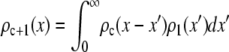 |
(9) |
by setting c = 1. Successive applications of Eq. 9 with increasing values of c will produce a set of  . Normalized histograms can be calculated from the
  and used as basis histograms. If an accurate analytical form for
  does not exist, a random number generator can be used to generate a set of intensity values corresponding to
  . For each value of c, c intensity values are randomly selected from the c = 1 basis, which can either be a data set of single-fluorophore emission intensities or a functional representation of the single-molecule intensity distribution (
 ). The selected intensities are then summed to create a single emission intensity for the c basis. This process is repeated until a sufficiently large number of intensity values have been generated (typically 10,000) after which a normalized histogram is made from the values. The resulting basis histograms shall be denoted
  .
.
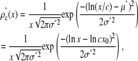
Lognormal distribution of fluorescence intensities
Properties of lognormal distribution
The lognormal distribution, which is defined for  , is
, is
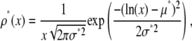 |
(10) |
where μ* is the scale parameter and σ* is the shape parameter of the distribution. The average value of x for the lognormal distribution is
 |
(11) |
where  . A random variable, which is itself the product of J independent random variables drawn from identical parent distribution functions, will exhibit a lognormal distribution for sufficiently large J (37).
One example of a process that would manifest itself as a random multiplicative factor in the fluorescence intensity measurements is the modest defocusing that can occur when collecting a fluorescence image. The defocusing results in a variation in the collection efficiency for the ROIs, so that the intensity of each ROI would be multiplied by a factor (one of the  in Eq. 2), which depends on its position in the image, but not on the number of fluorophores present. That is, defocusing introduces another distribution into the measurement. Another example is the slight difference in the distance of the fluorophores from the glass/water interface owing to irregularities of the glass surface, which can affect significantly the collected fluorescence intensity in TIRF microscopy (35,36). Other processes that would be manifested as multiplicative factors include variations in the pixel quantum efficiency in the CCD camera, dirt and aberrations in the optics, and any spatial variation in the intensity of the illuminating evanescent wave (29). All of these things will combine multiplicatively to produce different excitation/collection efficiencies for different locations in the image. The multiplicative factor in Eq. 2, which incorporates all of these effects, is
 |
(12) |
where the index j refers to a particular effect and J is the number of such effects. In this case, the observed intensity distribution for monodisperse ROIs with c fluorophores would be obtained from the distribution of  by scaling it by c, where I is the average emission intensity of a single fluorophore, and the scaling process is described below. It is not required that any of one these effects be large, but they might combine to produce a lognormal distribution or a reasonable approximation of one, and the results in Fig. 1 suggest that this is in fact occurring. This mechanism of combining emission intensities from fluorophores in a single ROI is the MD process.
MD basis histograms
The basis histograms for the MD process can be obtained from the single fluorophore distribution function,  , by scaling it by c. For the formation of basis histograms by the MD process, we use the relationship
 |
(13) |
where  is the probability that a ROI with c fluorophores will exhibit an emission intensity between x and x + dx.
  is converted into the normalized histogram,
  , which is the basis histogram for c fluorophores in the ROI for the MD case.
If a data set of emission intensities for the single fluorophores, rather than a function, is being used for  , then
  is obtained by multiplying each intensity in the set of single-fluorophore emission intensities by c and then forming a normalize histogram from the resulting set of intensity values. In this procedure, the MD basis histogram for c = 1 is simply the normalized histogram of the single fluorophore emission intensities.
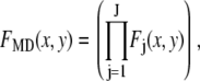
Data fitting
The histogram of intensity distribution is modeled by
 |
(14) |
where the coefficients  are the adjustable parameters that represent an estimate of the number of ROIs containing c fluorophores,
  is the model's estimate of
  , and N′ is the estimate of N, the number of ROIs in the set. The absolute value of the coefficients is used to simplify the fitting procedure, because this is simpler than restraining the fit to consider only physically reasonable (i.e., positive) values of the coefficients.
A fitting algorithm is used to minimize  , which for our purposes is defined as
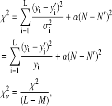 |
(15) |
where  is the variance associated with the measurement of
  . (L − M), the difference between the number of bins and the number of variable parameters, is called the number of degrees of freedom for the fit, and
  is the reduced chi-squared for the fit (38). α is a small positive parameter that penalizes the fit if N′ deviates from the actual number of puncta in the data set. Typical values of α that were tried during our fits ranged from 10−6 to 10−1. For most of our fits, values of α < 10−3 appeared to have little effect on N′. For most fits, using α = 10−3 was sufficient to ensure that N′ was within 1% of N. For a few fits, a larger value of α was necessary to ensure that N′ was within 1% of N, and for those the results reported below are for fits with α = 10−2.
We approximated the error in the intensity distributions by setting  . The range of bins included in the fit was chosen to be large enough to include all bins that have any intensity values from either the intensity distribution being fitted or from any of the basis histograms being used. The fitting program varies the coefficients,
  in Eq. 14, to minimize
  . The best fit values of the
  are then the model's estimates of the
  , the actual number of ROIs in the data set with c fluorophores.
Reduced chi-squared
Ordinarily, it is expected that  should be ∼1 for a satisfactory fit. Two complications exist, however, that can affect the magnitude of
  . First, the basis histograms used in the fit are an approximation to the actual intensity distribution for each value of c. That is, the
  obtained from the fit reflects errors in the measured distribution functions of both the ROIs and the single fluorophores (which are used to generate the basis histograms). This fact could result in an elevated value of
  , even if the correct functional form is used for
  and when only statistical noise is present. The second complication arises from the fact that in practice the actual number of basis histograms necessary is not known in advance. Consequently, the range of basis histograms used in Eq. 14 must be large enough to ensure it will encompass the range of species present in the sample. This consideration would generally result in the use of more basis histograms than there are species in the system. To reflect this fact, all the simulated distributions were fit using at least eight basis histograms, even though the simulated distributions were generated from only 1–4 basis histograms. The fitting program used the additional flexibility provided by the extra basis histograms to fit the noise in the simulated distribution, potentially reducing
  below 1.
These two complications do not cancel, and for some of the fits presented below,  is significantly <1 for some of the fits. This is a result of the flexibility provided by the extra basis histograms. More statistically reasonable values of
  are obtained when only the minimum number of basis histograms required are used in the fits.
Simulated annealing
Owing to the large number of basis histograms that might be used and the possible existence of local minima in  , it is important that the search algorithm is capable of finding a global minimum. Initially the fits were performed using either the FMINSEARCH function of MATLAB (The MathWorks, Natick, MA) or the AMOEBA subroutine from Press et al. (39), both of which employed the Nelder-Mead downhill simplex algorithm. The subroutine MRQMIN (39), which uses the Levenberg-Marquardt algorithm, was also used. These algorithms will search only downhill in
  where sets of coefficients that increase
  are discarded.
To test if the algorithm has found a global minimum, we repeated the fitting procedure with six different initial guesses for the variable parameters in these fits. If all of the fits converge on the same set of best-fit coefficients, then it suggests the best-fit results do in fact represent a global minimum in  . If the different initial guesses for the coefficients lead to different “best-fit” results, then these are local minima, and further tests are necessary to determine if one of them is the global minimum, or if there is another undetected local minimum that is the real global minimum. For most cases, the search results for the six different initial guesses converged, but there were instances when the search algorithms found a local minimum in
  , but not the global minimum.
To address this issue, we used the simulated annealing minimization program AMEBSA (39), which appears to be more robust than the other two methods described above. Simulated annealing algorithms require that the user supply an initial temperature parameter, T, and a cooling schedule. Using a procedure similar to the Metropolis algorithm for Monte Carlo simulations, the search algorithm will always retain a move that results in a decrease in the value of  , and also will retain a move that results in an increase in the value of
  with probability
 |
(16) |
where  is the increase in
  associated with a particular search move. As a result, for nonzero values of T, the search algorithm will search both up and downhill in
  , which will enable the search algorithm to explore multiple minima in
  if they exist. If there are multiple local minima, the search algorithm will spend more steps near the local minimum that has the smallest
  . Then as T is reduced, the search algorithm will progressively be confined near the local minimum with the smallest
  . Running AMEBSA with T = 0 is equivalent to using the Nelder-Mead algorithm (39).
For a given set of initial guesses of the coefficients,  was calculated and T was set to
  . The temperature was then reduced by a factor of 0.90 until T was <0.005 times (L − M) the number of degrees of freedom in the fit. This choice was motivated by the fact that for a good fit,
  . From Eq. 15,
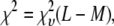 |
(17) |
so the terminating value of T was chosen to be ∼0.5% of what  would be if a satisfactory fit were to be obtained.
The simulated annealing program, AMEBSA, like the Nelder-Mead simplex method to which it is related, maintains a list of (M + 1) sets of the variable parameters (no two of which are identical). This list is referred to as a simplex, with each set of parameters corresponding to a vertex of the simplex. For finite temperatures, there is no guarantee that the best set of parameters (smallest  ) encountered during the search will always be a vertex in the simplex. Therefore, following a suggestion of Press et al. (39), we checked the simplex each time the temperature parameter has been reduced by a factor of three. If the best set of parameters encountered during the fit is not a vertex in the simplex, the vertex in the simplex with the largest
  was replaced by the best set of parameters encountered during the fit.
The result of this fit was assumed to lie near, but not necessarily at the global minimum in  , and one additional run with T = 0 was used to locate the global minimum. This procedure gave satisfactory results, and other possible initial and final temperatures or cooling schedules received only limited tests.
SIMULATION RESULTS
Using single-molecule intensities to form MD and RA basis histograms
We will illustrate the results of combining single-molecule intensities by the MD and RA processes on the observed ROI intensity distributions by first considering the case where all the ROIs have an identical number of fluorophores, and that the distribution of single-molecule intensities is lognormal.
For a MD process, the lognormal distribution in Eq. 10 can be transformed using Eq. 13 to obtain the lognormal distribution for c fluorophores,
 |
(18) |
where we have used  to show that the effect of MD on a lognormal distribution is to multiply the average value of x by c, so that Eq. 11 becomes
 |
(19) |
Thus this operation changed the scale ( ), but not the shape (σ*) of the distribution.
The relative width of a lognormal distribution is unchanged by MD, which is illustrated in Fig. 2 A, where we have plotted the  generated from a lognormal distribution for values of c increasing from 1 to 5. For the data in Fig. 2, a set of single fluorophore emission intensities is simulated by randomly selecting 10,000 values from a lognormal distribution with
  and
and  . The normalized distribution of these values is
  and the normalized histogram formed from these values is
  . The remaining basis histograms are generated from simulated single fluorophore emission intensities as described in the text after Eq. 13. Fig. 2 B shows an alternate method of plotting the data. This lognormal scaled probability plot (40) clearly illustrates that the shape (which is described by the slope of the data) of distribution is not changed with increasing value of c. The invariance of the relative width on c is true for all distributions that result from a MD process, not just those that result in lognormal distributions. From Eq. 13, the moments of the distribution for c = 1 and arbitrary c are
 |
(20) |
 |
(21) |
where the substitution y = x/c is used in Eq. 21. Because the standard deviation equals  , it follows that both the standard deviation and the mean of the distribution will be proportional to c, and that the relative width of the distribution is the same for all c whenever the distribution is the result of a MD process.
FIGURE 2.

(A) MD basis histograms,  , for c = 1–5. (B) Lognormal cumulative probability plots of
  for c = 1–5. The slope of the lognormal cumulative probability plot is proportional to the shape,
  . For a MD process, the slopes are independent of c, which indicates that the relative width of the MD basis histograms is the same regardless of the number of fluorophores in the puncta.
Fig. 3 shows the effect of combining fluorescence intensities by a RA process. For the data in Fig. 3, a set of single fluorophore emission intensities is simulated by randomly selecting 10,000 values from a lognormal distribution with  and
and  . The normalized distribution of these values is
  and the normalized histogram formed from these values is
  . The remaining basis histograms are generated from simulated single fluorophore emission intensities as described in the text after Eq. 9. Fig. 3 A plots the resulting probability functions and Fig. 3 B plots the corresponding lognormal probability plots.
FIGURE 3.

(A) RA basis histograms,  , for c =1−5. (B) Lognormal cumulative probability plots of
  for c=1–5. The slope of the lognormal cumulative probability plot is proportional to the shape,
  . For a RA process, the slope decrease as c increases, which indicates that the relative width of the RA basis histograms decreases with increasing c.
In this RA case, the width of the distribution grows more slowly than its mean, so the width of the distribution becomes smaller relative to its mean. This is expected, because as c increases, the distribution progressively becomes better approximated by a normal distribution. Fig. 3 B illustrates the change in the shape of the distribution with increasing c, as evinced by the change in the slope of the cumulative probability plot.
To show the difference in shape between the MD- and RA-generated basis histograms, Fig. 4 A plots the probability densities for c = 2 and 3. A measure of the shape can be obtained by calculating the relative width of each distribution. To calculate the shape and scale parameters, a lognormal distribution with  and
and  was sampled 100,000 times. Those values were then used as the c = 1 basis histogram and the MD and RA processes were used to obtain basis histograms for values of c ranging from 2 to 8. The resulting σ- and μ-parameters were calculated and the ratio is plotted in Fig. 4 B. Here the steady change in shape of the RA basis histograms away from the MD basis histograms is evident, and indicates the RA basis histograms are converging toward a normal distribution. In contrast, the MD basis histograms retain the original shape parameter. This result is expected, because the central limit theorem predicts the RA basis histograms will convert into a normal distribution for sufficiently large c. It is this change in shape that creates the possibility of being able to distinguish between a MD process and a RA process, even when there are multiple and variable number of species present in each ROI.
FIGURE 4.

Comparison of RA and MD basis histograms. (A) Probability plots of the basis histograms generated by the MD (solid curves) and RA (dashed curves) process for c = 2 and 3. (B) Ratio of  of the MD and RA basis histograms for c = 1–8. The decrease in the ratio for RA basis histograms indicates a decrease in the relative width of the distribution.
It is useful to note that a more quantitative measure of shape can be obtained by calculating the skewness ( ) and kurtosis (
 ) of the basis histograms as a function of c. These can be expressed in terms of
  , the nth moment of the distribution about the mean as
 |
(22) |
For a normal distribution, both  and
and  are zero. Calculations (not shown) of
  and
and  for the basis histograms in Figs. 2 and 3 behave as expected; for the MD basis histograms,
  and
and  are independent of c, and for the RA basis histograms both
  and
and  decrease as c increases.
Simulation of intensity distributions
To study the differences in shape of the intensity distributions for MD and RA processes, eight sets of the coefficients,  , were first selected. We selected a broad range of starting values simulating both monodisperse and polydisperse samples. For each set, an intensity distribution was then calculated using both the MD and RA process as described below.
Generating distributions
A lognormal distribution with  and
and  was used as
  . We selected randomly 50,000 values from the distribution and used them to generate simulated distributions with each containing 3,000 intensity values. Table 1 lists the sets of coefficients and the ratio of
  for each simulated intensity distribution. For each nonzero
  in a MD simulation,
  values were selected at random from the set of 50,000 and multiplied by c. This operation was repeated for all nonzero
  in the set of coefficients. We added Poisson-distributed noise to each member of the set of intensity values and we sorted the results into bins to form a histogram of the simulated intensity distribution for the MD process.
TABLE 1.
Sets of coefficients for simulated intensity distributions
|
σ/μ*
|
||||
|---|---|---|---|---|
| Coefficient Set | Simulation value | MD | RA | |
| 1 |  |
1500 | 0.56 | 0.48 |
 |
1500 | |||
| 2 |  |
1500 | 0.48 | 0.33 |
 |
1500 | |||
| 3 |  |
1500 | 0.45 | 0.26 |
 |
1500 | |||
| 4 |  |
1500 | 0.43 | 0.21 |
 |
1500 | |||
| 5 |  |
3000 | 0.43 | 0.30 |
| 6 |  |
3000 | 0.43 | 0.23 |
| 7 |  |
200 | 0.52 | 0.41 |
 |
1200 | |||
 |
1200 | |||
 |
400 | |||
| 8 |  |
200 | 0.46 | 0.26 |
 |
1200 | |||
 |
1200 | |||
 |
400 | |||
List of the sets of coefficients used for generating the simulated intensity distributions for MD and RA processes; coefficients that are not listed equaled zero in that set. We denote the distributions by the process (MD or RA) used to generate them and the number of the coefficient set as listed in the table. 3RA, for example, denotes the distribution generated from the RA basis histograms using the third set of coefficients listed in the table (i.e., with  ,
,  ,
,  , and
, and  ).
).
Ratio of the standard deviation to the mean of the resultant distributions, which should be compared to the ratio (0.42) calculated for the simulated single-fluorophore distribution.
For each nonzero  in a RA simulation, c values would be selected at random from the set of 50,000 and added to create an intensity value. This process was repeated
  times for each nonzero
  in the set of coefficients. Again we added Poisson-distributed noise to the elements of the set of intensity values and sorted the results into bins to form a histogram of the simulated intensity distribution for the RA process.
Three types of distributions
The ratio  in Table 1 serves as a measure of the relative width of each distribution, which can be compared to
  for the single fluorophore distribution,
  . Our results indicate there are three classes of distributions, so we categorized the simulation into three cases. Case I includes all of the simulated distributions whose relative width,
  , is smaller than the relative width of
  . All of the examples in Case I occur for distributions generated using the RA process. As we will show later, these distributions cannot be fitted satisfactory using MD basis histograms, and so a reduction in relative width constitutes an indicator that a RA process is occurring.
For the other two cases,  . For Case II, the fits to the two different sets of basis histograms result in significantly different values of
  , in which case MD and RA processes can be distinguished and confirmed using the
  values. Case III is the scenario where the
  from both MD and RA fits are of comparable magnitude. To distinguish MD and RA processes for Case III requires either additional information about the biological system (e.g., there is an upper bound in the number of molecules within a ROI) or experimental calibration of the microscope and the measurement process (which will be discussed later in the article).
Fitting of distributions
To fit the distributions, two sets of basis histograms (MD and RA) were generated by randomly selecting a set of 2,000 values from the lognormal distribution ( ,
,  ), which were then used to generate the MD and RA basis histograms as described above. The set of 2,000 values used to generate the basis histograms is distinct from the 50,000 values used to generate the intensity distribution. The basis histograms (either
  or
or  ) are used in Eq. 14 to model the observed intensity distribution for the ROIs. An example of the different initial guesses of the ac is given in Table 2, which lists the six different guesses used to fit 6 RA and 6 MD. For those fits in which the correct basis histograms are used, the results of the fit are in good to excellent agreement with the values used to generate the simulated intensity distributions. So for cases where the statistical noise is more significant than any other experimental distortions in the data, this method would be expected to provide a reasonable estimate of the distribution of labeled molecules per puncta.
TABLE 2.
Example of starting configurations for fit
| Initial configuration used for fit
|
||||||
|---|---|---|---|---|---|---|
| Coefficient | 1 | 2 | 3 | 4 | 5 | 6 |
 |
375 | 0 | 0 | 0 | 1800 | 0 |
 |
375 | 0 | 0 | 1000 | 750 | 0 |
 |
375 | 750 | 1500 | 0 | 450 | 0 |
 |
375 | 1500 | 0 | 1000 | 0 | 0 |
 |
375 | 750 | 1500 | 0 | 0 | 0 |
 |
375 | 0 | 0 | 1000 | 0 | 450 |
 |
375 | 0 | 0 | 0 | 0 | 750 |
 |
375 | 0 | 0 | 0 | 0 | 1800 |
Set of starting configurations for fitting the intensity data simulated using coefficient set 6 in Table 1.
As mentioned earlier, the inclusion of additional basis histograms in a fit beyond those used to generate the simulated distribution can result in  that are much smaller than what might seem statistically reasonable. Several examples of this can be seen in Tables 3 – 5. For these cases, the fits were repeated to include only those basis histograms used to generate the distribution. The resulting value of
  all increased into a more statistically reasonably range (0.6–1.7). The larger values of
  reflect the other problem discussed earlier, namely the fact that the basis histograms are only an approximation to the parent distribution function and so
  reflects errors present in both sets.
TABLE 3.
Simulated intensity distributions and best fit results for Case I
| Simulated distribution fit with
|
||||
|---|---|---|---|---|
| Simulation | Simulation value* | MD histograms | RA histograms | |
| 2RA |  |
1500 | 1417 | 1438 |
 |
1500 | 1553 | 1511 | |
| N′ | − | 2970 | 3000 | |
 |
− | 0 | 51 | |
 |
− | 15.3† | 0.12 | |
| 3RA |  |
1500 | 613 | 1428 |
 |
1500 | 2255 | 1518 | |
| N′ | − | 2868 | 2995 | |
 |
− | 0 | 49 | |
 |
− | 66.2† | 0.64 | |
| 4RA |  |
1500 | 0.02 | 1375 |
 |
1500 | 2803 | 1580 | |
| N′ | − | 2803 | 2997 | |
 |
− | 0 | 42 | |
 |
− | 98.3† | 0.48 | |
| 5RA |  |
3000 | 2944 | 2951 |
| N′ | − | 2994 | 2997 | |
 |
− | 0 | 46 | |
 |
− | 27.6† | 0.41 | |
| 6RA |  |
3000 | 1362 | 2852 |
| N′ | − | 2567 | 3000 | |
 |
− | 1205 | 48 | |
 |
− | 215† | 0.41 | |
| 8RA |  |
200 | 0.002 | 238 |
 |
1200 | 876 | 1062 | |
 |
1200 | 2036 | 1243 | |
 |
400 | 0.13 | 448 | |
| N′ | − | 2912 | 2994 | |
 |
− | 0 | 3 | |
 |
− | 36.4† | 0.59 | |
Simulated intensity distributions and best-fit results for examples in Case I, where  . Each set of coefficients was used to generate intensity distributions using both the MD and RA process, and both resulting distributions were then fitted using both MD and RA basis histograms. The list of coefficients includes only those that had nonzero values in the simulated intensity distribution, and their sum is 3000 for all simulations. N′ is the sum of all best-fit coefficients.
  is the sum of the unlisted coefficients, that is,
  is the sum of those best-fit coefficients that would have been zero for a perfect fit. In some instances, the sum of the coefficients listed exceeds N′ due to rounding. Eight basis histograms were used for all fits listed in this table; α = 0.001 unless otherwise stated.
Values of  used to generate the simulated distribution.
With α = 0.001, this fit converged with to an N′ that differed from N = 3000 by >1%; increasing α to 0.01 improved the agreement, but the resulting N′ were still not within 1% of N. Because increasing α further would increase the already very large value of  , we did not test the fits for larger values of α and the results shown are for a fit with α = 0.01.
TABLE 4.
Simulated intensity distributions and best fit results for Case II
| Simulated distribution fit with
|
||||
|---|---|---|---|---|
| Simulation | Simulation value* | MD histograms | RA histograms | |
| 1RA |  |
1500 | 1376 | 1440 |
 |
1500 | 1618 | 1552 | |
| N′ | − | 2994 | 2998 | |
 |
− | 0 | 6 | |
 |
− | 2.66† | 0.29 | |
| 7RA |  |
200 | 86 | 191 |
 |
1200 | 1038 | 1169 | |
 |
1200 | 1866 | 1219 | |
 |
400 | 0.002 | 418 | |
| N′ | − | 2990 | 2997 | |
 |
− | 0 | 0 | |
 |
− | 5.01† | 0.25 | |
| 2MD |  |
1500 | 1390 | 1738 |
 |
1500 | 1592 | 701 | |
| N′ | − | 2991 | 2986 | |
 |
− | 9 | 547 | |
 |
− | 0.65 | 1.88 | |
| 5MD |  |
3000 | 2993 | 2575 |
| N′ | − | 2995 | 2994 | |
 |
− | 2 | 419 | |
 |
− | 0.34 | 5.62† | |
Simulated intensity distributions and best-fit results for examples in Case II, where  but where there is a significant difference in
  between the MD and RA fits. Each set of coefficients was used to generate intensity distributions using both the MD and RA process, and both resultant distributions were then fit using both the MD and RA basis histograms. The list of coefficients includes only those that had nonzero values in the simulated intensity distribution, and their sum is 3000 for all simulations. N′ is the sum of all best coefficients.
  is the sum of the unlisted coefficients, that is,
  is the sum of those best-fit coefficients that would have been zero for a perfect fit. In some instances, the sum of the coefficients listed exceeds N′ due to rounding. Eight basis histograms were used for all fits listed in this table, and α = 0.001 unless otherwise stated.
Values of  used to generate the simulated data.
With α = 0.001, this fit converged to an N′ that differed from N = 3000 by >1%. Increasing α to 0.01 improved the agreement, but the resulting N′ was still not within 1% of N. Because increasing α further would increase the already very large value of  , we did not test the fits for larger values of α and the results shown are for a fit with α = 0.01.
TABLE 5.
Simulated intensity distributions and best fit results for Case III
| Simulated distribution fit with
|
||||
|---|---|---|---|---|
| Simulation | Simulation value* | MD histograms | RA histograms | |
| 1MD |  |
1500 | 1478 | 1721 |
 |
1500 | 1515 | 1059 | |
| N′ | − | 2995 | 2994 | |
 |
− | 2 | 214 | |
 |
− | 0.34 | 0.74 | |
| 3MD |  |
1500 | 1291 | 1209 |
 |
1500 | 1595 | 598 | |
| N′ | 2992 | 2992 | ||
 |
6 | 1185 | ||
 |
0.55 | 0.89 | ||
| 4MD |  |
1500 | 1385 | 738 |
 |
1500 | 1482 | 736 | |
| N′ | − | 126 | 2993 | |
 |
− | 2993 | 1519 | |
 |
− | 0.47 | 0.73† | |
| 6MD |  |
3000 | 2402 | 535 |
| N′ | − | 2988 | 2973 | |
 |
− | 586 | 2438 | |
 |
− | 0.95 | 0.44 | |
| 7MD |  |
200 | 202 | 329 |
 |
1200 | 1165 | 1354 | |
 |
1200 | 1278 | 795 | |
 |
400 | 287 | 299 | |
| N′ | − | 2992 | 2990 | |
 |
− | 60 | 213 | |
 |
− | 0.52 | 1.22 | |
| 8MD |  |
200 | 144 | 824 |
 |
1200 | 1516 | 650 | |
 |
1200 | 753 | 773 | |
 |
400 | 579 | 66 | |
| N′ | − | 3000 | 3000 | |
 |
− | 8 | 687 | |
 |
− | 0.39 | 0.57‡ | |
Simulated intensity distributions and best-fit results for examples in Case III, where  but there is no significant difference in
  between the MD and RA fits. Each set of coefficients was used to generate intensity distributions using both the MD and RA process, and both resultant distributions were then fit using both the MD and RA basis histograms. The list of coefficients includes only those that had nonzero values in the simulated intensity distribution, and their sum is 3000 for all simulations. N′ is the sum of all best coefficients.
  is the sum of the unlisted coefficients, that is,
  is the sum of those best-fit coefficients that would have been zero for a perfect fit. In some instances, the sum of the coefficients listed exceeds N′ due to rounding. Eight basis histograms were used for all fits listed in this table, and α = 0.001 unless otherwise stated.
Values of  used to generate the simulated intensity distribution.
Ten RA basis histograms were used in this fit.
Fourteen RA basis histograms were used in this fit.
Case I
Table 3 lists the best-fit values of the coefficients  , N′, and
  for those simulations belonging to Case I (2RA, 3RA, 4RA, 5RA, 6RA, and 8RA; see Table 1), which clearly indicates it is not possible to obtain a reasonable fit using MD basis histograms when the distribution is RA and has a relative width that is smaller than that of the single-molecule calibrating distribution. Fig. 5 illustrates an example, where the simulated distribution for 3RA is plotted along with the best-fit results obtained using both the MD and RA basis histograms.
FIGURE 5.

Best-fit results for simulated distribution 3RA (see Tables 1 and 3; a Case I example) fitted with (A) MD basis histograms and (B) RA basis histograms. The vertical bars are the simulated data  , the dashed line is a plot of the best-fit result,
  , the solid lines are plots of
  (see Table 3), and the dotted line is a plot of the residuals of the fit (
 ).
).
Case II
Unlike Case I, knowing that the relative width of the ROI distribution is larger than that of the single-molecule distribution, does not provide an indication as to whether the fluorophore intensities were combined by a MD or RA process. Although measuring a lognormal intensity distribution for both single molecules and single clusters suggests strongly a MD process, it is not conclusive. For the examples in Case II, we will see that we can distinguish between the RA and MD process using the resultant goodness of fit.
Table 4 lists the results of fits for Case II, which shows cases for which  is consistently smaller when the distribution is fit with the correct basis histograms. This result indicates that for some cases if the shapes of the basis histograms are sufficiently different, then it is possible to distinguish between the MD and RA processes by comparing the
  of the resultant fits using the MD and RA basis histograms. Fig. 6 illustrates a Case II example, where the simulated distribution for 5MD is plotted along with the best-fit results using both the MD and RA basis histograms. The difference in
  listed in Table 4 is reflected in Fig. 6, where the best-fit result using the RA basis histograms cannot adequately describe the tails of the distribution generated from the MD basis histograms.
FIGURE 6.

Best-fit results for simulated distribution 5MD (see Tables 1 and 4; a Case II example) fitted with (A) MD basis histograms and (B) RA basis histograms. The vertical bars are the simulated data  , the dashed line is a plot of the best fit result,
  , the solid lines are plots of
  (see Table 4); and the dotted line is a plot of the residuals of the fit (
 ).
).
Case III
Table 5 lists the results for fits in Case III. All of these are examples of simulated distributions generated by the MD process, but for which modest and similar values of  could be obtained in fits with either the RA or MD basis histograms. Two situations can result in this type of ambiguity. The first is illustrated by simulated distribution 1MD. Because
  , it is not surprising that any distribution with a significant number of ROIs with c = 1 (as is the case with 1MD) could be fit with either set of basis histograms and result in a modest and similar values of
  . The second situation is illustrated by 4MD. Although a modest value of
  can be obtained using RA basis histograms, it requires nonzero coefficients for 9 of the 10 RA basis histograms used in the fit, instead of the 2MD histograms used to generate it. Fig. 7 A plots the coefficients used to generate 4MD, and the best-fit results using RA and MD basis histograms. The small differences between the
  used to generate the simulated distribution and the
  obtained from the fit with MD basis histograms are an illustration of the statistical errors inherent in the fitting process, and which should be kept in consideration once it is resolved whether MD or RA basis histograms are appropriate.
FIGURE 7.

Distribution of coefficients from MD and RA fits of (A) 4MD and (B) 8MD (see Tables 1 and 5; a Case III example). The open bars are  , the actual number of ROIs in the set with c fluorophores. The vertical bars are
  , the best-fit number of ROIs in the set with c fluorophores for the fit using MD basis histograms. The solid bars are
  , the best fit number of ROIs in the set with c fluorophores for the fit using RA basis histograms.
The results for the fit using MD histograms to 8MD illustrate an important aspect of the fitting process. If the values of  ,
,  ,
,  , and
, and  were viewed as four separate experimental entities, then the fits with MD histograms do not appear to be particularly good, even though the correct basis histograms were used. However, the best fit average single-fluorophore/ROI ratio is 4.6, which equals that for the values input into the simulation. Furthermore, simulated distribution has a peak near 4.5, whereas the best fit result has its peak slightly above 4. This shift of <0.5 is modest when compared with the full width of the distribution, which equals 2. This example does raise the cautionary note that care should be taken not to overinterpret structure obtained from such fits, and the comparison of the results for 8MD with 7MD indicates that this limitation would be more of a concern as the average number of single-fluorophores/ROI increased.
Resolving the ambiguity for Case III results requires either some a priori knowledge about the system or a method to calibrate the instrument and the experimental condition to verify independently whether MD or RA is the underlying process.
A priori knowledge
It is important to note that the fit with RA basis histograms would require contributions from a much wider range of c values than for the fit with MD basis histograms. In addition, the shape of the fitted distribution varies greatly when MD versus RA basis histograms is used. Therefore, if one knows there is a maximum number of fluorophores per ROI or if the shape (e.g., unimodal) of the ROI distribution is known, then oftentimes this additional information may be sufficient to rule out the result obtained from using the incorrect basis histograms. The measurement of avidin-biotin binding discussed later is a good example, in which the fit using RA can be discarded because the result requires the presence of ROIs with more biocytins than the maximum number of binding sites present.
We have explored the shape of the resultant fits, in which distributions were simulated using a unimodal distribution of MD basis histograms with an average of 20 fluorophores per ROI. The fit with RA basis histograms yielded a multimodal distribution of RA histograms (data not shown). Here if it were known that the distribution of fluorophores should be unimodal, then the multimodal distribution from a fit using RA basis histograms could be rejected.
EXPERIMENTAL MEASUREMENTS OF BIOTIN-AVIDIN BINDING
If no a priori knowledge exists, then one needs to separately determine whether the instrument and experimental conditions would give rise to the RA or MD process. There are two approaches:
Use a known system to calibrate the experiment. Below we describe a calibrating system using biotin-avidin binding, in which we can saturate the binding to ensure there are mostly four dye-labeled biotins per avidin. By taking single-biotin and single avidin/biotin measurements, then fitting the resultant distributions with MD and RA basis histograms, we can determine the correct basis histograms to use in subsequent experiments with unknown systems.
Measure the ROI distribution for multiple unrelated systems. Here we rely on the fact that the presence of a lognormal distribution for the ROIs is a strong indication of the MD process and the presence of a normal distribution is a strong indication of the RA process. If the ROI distributions for multiple unrelated systems are all lognormal, then one may say with high confidence that the MD basis histograms should be used. For example, one may measure the intensity distributions of fluorescent GFP clusters for different types of cells with different GFP-tagged proteins. If they all exhibit lognormal distribution, then MD is most likely the correct basis histograms.
To demonstrate our method and to devise a calibration system, we have measured the number of fluorescently labeled biotin molecules bound to a single avidin protein. Avidin binds biotin with a stoichiometry of 1:4, and the affinity is one of the strongest known interactions between a protein and a ligand (26). To ensure a 1:4 binding ratio, we incubated avidin with excess Alexa Fluor 488-tagged biocytin overnight after which unbound biocytin was subsequently removed using size-exclusion chromatography.
We used avidin having one bound biocytin as our single-molecule calibrating intensity distribution (i.e., as the c = 1 basis histogram), which will take into account any dye-protein fluorescence quenching that may occur when the labeled-biocytin is bound to avidin. The data sets consisted of 800 intensity values from the single labeled-biocytin images, and 1191 intensity values from the avidin/biocytin complex images. Visible and UV absorbance measurements of bulk solutions of our sample provide an independent determination of the biocytin/avidin ratio. From UV/visible absorbance measurements of our biocytin/avidin complexes in bulk solution, and literature values of the extinction coefficients, we obtain a binding ratio of 3.7. The ratio of the average intensity of the labeled-biocytin/avidin complexes divided by the average intensity of the single biocytin puncta in our TIRF measurement was only 2.01. The discrepancy between the two binding ratios was attributed to dye-dye quenching in the fluorescence measurement, where the quenching ratio implied by these measurements (assuming no aggregation) is 2.01/3.7 = 0.54.
We obtained the quenching ratio independently from bulk measurements of fluorescence intensities from two series of solutions, which were avidin/Alexa Fluor 488-labeled biocytin and control solutions containing 488-labeled biocytin only (no avidin) At a given concentration of biocytin, the quenching ratio is derived from the decrease in the observed fluorescence from the control solution (biocytin only) to the solution that contained avidin/biocytin complex. We carried out this titration in which we started the two series of solutions with identical concentrations of biocytin, then added avidin that ranged in molar ratios of biocytins per avidin from 0.5 to 4.0. At the molar ratio of 3.7, which correspond to an average of 3.7 biocytins per avidin, we obtained a quenching ratio of 0.53, which is in good agreement with the value we obtained from the puncta in our TIRF measurements. The good agreement between the two measured quenching ratios argues against the presence of significant numbers of aggregates in the TIRF images. If the labeled-biocytin/avidin puncta included a noticeable number of agregates, then the resulting average intensity would lead to a quenching ratio closer to 1 than that obtained from the titration experiment. To correct for dye-dye quenching, the intensities of the single biocytin puncta were multiplied by 0.54, after which the data was used to create the MD and RA basis histograms as described earlier.
Fig. 8, A and B, shows the results of our analysis when the avidin/biocytin data were fit with MD and RA basis histograms, respectively. It is important to note that the apparent structure in the data and the best fit using MD basis histograms is noise. The basis histograms (whose contributions to the fit are the solid lines in the plots) are much broader than any of the apparent structure in the avidin/biocytin data. The process of forming the RA basis histograms (cf. text after Eq. 9) involves summing c randomly selected single fluorophore intensities, and then repeating this 10,000 times to get 10,000 intensity values for each RA basis histogram. This has the effect of smoothing out the noise in the single fluorophore intensity histogram, as can be seen in Fig. 8 B. No such smoothing is possible for the MD basis histograms, where the 800 single fluorophore intensities are simply multiplied by c to obtain the 800 values used for the cth MD basis histogram (cf. text after Eq. 13).
FIGURE 8.

Single-molecule measurements of the binding of Alexa Fluor 488-tagged biocytin to avidin. (A) Results of fitting avidin/labeled-biocytin emission data using MD basis histograms. (B) Results of fitting avidin/labeled-biocytin emission data using RA basis histograms. (C) Histogram showing the percentage of avidin with c biocytins obtained from the fits using MD (solid vertical bars) and RA (open vertical bars) basis histograms. For A and B, the vertical bars are the simulated data  , the dashed line is a plot of the best-fit result
  , the solid lines are plots of
  , and the dotted line is a plot of the residuals of the fit (
 ).
).
We measured a lognormal intensity distribution for the avidin molecules, which implies a MD process. Fig. 8 A shows the result of the fitting using MD basis histograms, which resulted in 95% four and 5% three biocytin molecules per avidin, with a reduced chi-squared value of 1.18 and a nonphysical parameter of 0%. The nonphysical parameter is the percentage of avidin molecules that have more than four bound biocytin. Fig. 8 B shows the result of the fit using RA basis histograms, which resulted in 6.3% 2, 73% 3, 8.3% 5, 8.3% 6, and 4% 10 biocytin per avidin, with a reduced chi-squared value of 1.49 and a nonphysical parameter of 20.6%. From this we conclude that the avidin-biocytin system is best fit by MD basis histograms, since the results of fits using MD basis histograms are in good agreement with our independent measurement of the binding ratio, whereas the results of fits using RA basis histograms yield significantly poorer results. Because we believe that MD processes are the result of the measurement process, this implies that other TIRF measurements on our instrument should also be fit using MD basis histograms. Therefore, avidin-biocytin binding may serve as one suitable calibration system for TIRF microscopy to determine whether MD or RA basis histograms should be used for fitting.
CONCLUSION
The primary requirement for applicability of this method is that whichever process (RA or MD) is responsible for the observed intensity distributions operates similarly in measurements of single-molecule intensity (calibrating distribution) and sample puncta intensity. The results of fits of the simulated distributions demonstrate that if it is known whether the distributions are the result of a MD or RA process, then data can be deconvolved to obtain a good estimate of the underlying distribution of the number of labeled-molecules per puncta. In many cases, the shape (i.e., whether the distribution is normal or lognormal) of the single-ROI (sample puncta) distribution serves as a good indicator as to whether the two distributions are related additively or multiplicatively. In addition to using the shape of the ROI distribution to determine the relationship between the two distributions, we can also use goodness of fit (reduced chi-squared) as a statistical criteria to determine the correct relationship. Here, a general procedure for deconvolving intensity distributions is the following:
Calculate the
 ratio for the intensity distribution of both experimentally measured ROIs and the calibrating fluorophores. If the ratio is greater for the intensity distribution of the single fluorophores than the puncta (Case I), then RA basis histograms should be used.
Otherwise, create both the RA and MD basis histograms from the single-fluorophore distribution to fit the measured cluster distribution. If the
 obtained from the two fits are very different (Case II), then the one with the smaller
  represents the correct basis histograms.
If the values of
 for both fits are comparable (Case III), then one needs to distinguish the RA and MD process with external information as described above, which includes any a priori knowledge about the system or the use of a known system to calibrate the instrument and experimental conditions.
It is worth emphasizing that our TIRF imaging experiments with single molecules and single particles almost invariably give rise to lognormal distributions. Obtaining lognormal distributions for both calibration fluorophores and experimentally measured ROIs is a strong indication that MD basis histograms should be used for data fitting. Although we focused our analysis on experimental images observed with TIRF microscopy, the statistical framework we have presented here should apply equally well to other modes of microscopy, such as confocal and epi-fluorescence imaging. This method requires that it be possible to subtract any background (such as might arise from autofluorescence) from the total fluorescence from each ROI and obtain accurate estimates of the emission intensity due only to the fluorophores of interest. So long as that is possible, then it should be straightforward to perform a calibration as was done here for our TIRF measurements to determine whether MD or RA basis histograms should be used. In addition, although we focused on the counting of single fluorescent molecules, this method can be applied to the counting of other fluorescent units, such as signaling complexes, synaptic vesicles, or other intracellular organelles. Given the prevalence of puncta in fluorescence images of cells, we believe our method for extracting copy numbers from puncta offers a level of quantitative information in microscopy that was previously unattainable.
Acknowledgments
Support from the Keck Foundation, the National Institutes of Health (NS052637), and the National Science Foundation (CHE 0342956) is gratefully acknowledged.
References
- 1.Selinummi, J., J. R. Sarkanen, A. Niemisto, M. L. Linne, T. Ylikomi, O. Yli-Harja, and T. O. Jalonen. 2006. Quantification of vesicles in differentiating human SH-SY5Y neuroblastoma cells by automated image analysis. Neurosci. Lett. 396:102–107. [DOI] [PubMed] [Google Scholar]
- 2.Krzan, M., M. Stenovec, M. Kreft, T. Pangrsic, S. Grilc, P. G. Haydon, and R. Zorec. 2003. Calcium-dependent exocytosis of atrial natriuretic peptide from astrocytes. J. Neurosci. 23:1580–1583. [DOI] [PMC free article] [PubMed] [Google Scholar]
- 3.Antonova, I., O. Arancio, A. C. Trillat, H. G. Wang, L. Zablow, H. Udo, E. R. Kandel, and R. D. Hawkins. 2001. Rapid increase in clusters of presynaptic proteins at onset of long-lasting potentiation. Science. 294:1547–1550. [DOI] [PubMed] [Google Scholar]
- 4.Ogoshi, F., and J. H. Weiss. 2003. Heterogeneity of Ca2+-permeable AMPA/kainate channel expression in hippocampal pyramidal neurons: fluorescence imaging and immunocytochemical assessment. J. Neurosci. 23:10521–10530. [DOI] [PMC free article] [PubMed] [Google Scholar]
- 5.Axelrod, D. 2001. Total internal reflection fluorescence microscopy in cell biology. Traffic. 2:764–774. [DOI] [PubMed] [Google Scholar]
- 6.Schmidt, T., G. J. Schütz, H. J. Gruber, and H. Schindler. 1996. Local stoichiometries determined by counting individual molecules. Anal. Chem. 68:4397–4401. [Google Scholar]
- 7.Kask, P., K. Palo, D. Ullmann, and K. Gall. 1999. Fluorescence-intensity distribution analysis and its application in biomolecular detection technology. Proc. Natl. Acad. Sci. USA. 96:13756–13761. [DOI] [PMC free article] [PubMed] [Google Scholar]
- 8.Muller, J. D., Y. Chen, and E. Gratton. 2000. Resolving heterogeneity on the single molecular level with the photon-counting histogram. Biophys. J. 78:474–486. [DOI] [PMC free article] [PubMed] [Google Scholar]
- 9.Hillesheim, L. N., and J. D. Muller. 2003. The photon counting histogram in fluorescence fluctuation spectroscopy with non-ideal photodetectors. Biophys. J. 85:1948–1958. [DOI] [PMC free article] [PubMed] [Google Scholar]
- 10.Muller, J. D. 2004. Cumulant analysis in fluorescence fluctuation spectroscopy. Biophys. J. 86:3981–3992. [DOI] [PMC free article] [PubMed] [Google Scholar]
- 11.Wu, B., and J. D. Muller. 2005. Time-integrated fluorescence cumulant analysis in fluorescence fluctuation spectroscopy. Biophys. J. 89:2721–2735. [DOI] [PMC free article] [PubMed] [Google Scholar]
- 12.Iino, R., I. Koyama, and A. Kusumi. 2001. Single molecule imaging of green fluorescent proteins in living cells: E-cadherin forms oligomers on the free cell surface. Biophys. J. 80:2667–2677. [DOI] [PMC free article] [PubMed] [Google Scholar]
- 13.Sugiyama, Y., I. Kawabata, K. Sobue, and S. Okabe. 2005. Determination of absolute protein numbers in single synapses by a GFP-based calibration technique. Nat. Methods. 2:677–684. [DOI] [PubMed] [Google Scholar]
- 14.Wu, J. Q., and T. D. Pollard. 2005. Counting cytokinesis proteins globally and locally in fission yeast. Science. 310:310–314. [DOI] [PubMed] [Google Scholar]
- 15.Gordon, M. P., T. Ha, and P. R. Selvin. 2004. Single-molecule high-resolution imaging with photobleaching. Proc. Natl. Acad. Sci. USA. 101:6462–6465. [DOI] [PMC free article] [PubMed] [Google Scholar]
- 16.Chiu, C. S., K. Jensen, I. Sokolova, D. Wang, M. Li, P. Deshpande, N. Davidson, I. Mody, M. W. Quick, S. R. Quake, and H. A. Lester. 2002. Number, density, and surface/cytoplasmic distribution of GABA transporters at presynaptic structures of knock-in mice carrying GABA transporter subtype 1-green fluorescent protein fusions. J. Neurosci. 22:10251–10266. [DOI] [PMC free article] [PubMed] [Google Scholar]
- 17.Dundr, M., J. G. McNally, J. Cohen, and T. Misteli. 2002. Quantitation of GFP-fusion proteins in single living cells. J. Struct. Biol. 140:92–99. [DOI] [PubMed] [Google Scholar]
- 18.Chiu, C. S., E. Kartalov, M. Unger, S. Quake, and H. A. Lester. 2001. Single-molecule measurements calibrate green fluorescent protein surface densities on transparent beads for use with ‘knock-in’ animals and other expression systems. J. Neurosci. Methods. 105:55–63. [DOI] [PubMed] [Google Scholar]
- 19.Yu, J., J. Xiao, X. Ren, K. Lao, and X. S. Xie. 2006. Probing gene expression in live cells, one protein molecule at a time. Science. 311:1600–1603. [DOI] [PubMed] [Google Scholar]
- 20.Newman, J. R., S. Ghaemmaghami, J. Ihmels, D. K. Breslow, M. Noble, J. L. DeRisi, and J. S. Weissman. 2006. Single-cell proteomic analysis of S. cerevisiae reveals the architecture of biological noise. Nature. 441:840–846. [DOI] [PubMed] [Google Scholar]
- 21.Panchuk-Voloshina, N., R. P. Haugland, J. Bishop-Stewart, M. K. Bhalgat, P. J. Millard, F. Mao, and W. Y. Leung. 1999. Alexa dyes, a series of new fluorescent dyes that yield exceptionally bright, photostable conjugates. J. Histochem. Cytochem. 47:1179–1188. [DOI] [PubMed] [Google Scholar]
- 22.Pennuto, M., D. Bonanomi, F. Benfenati, and F. Valtorta. 2003. Synaptophysin I controls the targeting of VAMP2/synaptobrevin II to synaptic vesicles. Mol. Biol. Cell. 14:4909–4919. [DOI] [PMC free article] [PubMed] [Google Scholar]
- 23.Buckley, K., and R. B. Kelly. 1985. Identification of a transmembrane glycoprotein specific for secretory vesicles of neural and endocrine cells. J. Cell Biol. 100:1284–1294. [DOI] [PMC free article] [PubMed] [Google Scholar]
- 24.Hell, J. W., P. R. Maycox, H. Stadler, and R. Jahn. 1988. Uptake of GABA by rat brain synaptic vesicles isolated by a new procedure. EMBO J. 7:3023–3029. [DOI] [PMC free article] [PubMed] [Google Scholar]
- 25.Bradford, M. M. 1976. A rapid and sensitive method for the quantitation of microgram quantities of protein utilizing the principle of protein-dye binding. Anal. Biochem. 72:248–254. [DOI] [PubMed] [Google Scholar]
- 26.Bayer, E. A., and M. Wilchek. 1980. The use of the avidin-biotin complex as a tool in molecular biology. Methods Biochem. Anal. 26:1–45. [DOI] [PubMed] [Google Scholar]
- 27.Fiorini, G. S., and D. T. Chiu. 2005. Disposable microfluidic devices: fabrication, function, and application. Biotechniques. 38:429–446. [DOI] [PubMed] [Google Scholar]
- 28.Kuyper, C. L., J. S. Kuo, S. A. Mutch, and D. T. Chiu. 2006. Proton permeation into single vesicles occurs via a sequential two-step mechanism and is heterogeneous. J. Am. Chem. Soc. 128:3233–3240. [DOI] [PubMed] [Google Scholar]
- 29.Axelrod, D. 1989. Total internal reflection fluorescence microscopy. Methods Cell Biol. 30:245–270. [DOI] [PubMed] [Google Scholar]
- 30.Willig, K. I., S. O. Rizzoli, V. Westphal, R. Jahn, and S. W. Hell. 2006. STED microscopy reveals that synaptotagmin remains clustered after synaptic vesicle exocytosis. Nature. 440:935–939. [DOI] [PubMed] [Google Scholar]
- 31.Schuler, B., E. A. Lipman, and W. A. Eaton. 2002. Probing the free-energy surface for protein folding with single-molecule fluorescence spectroscopy. Nature. 419:743–747. [DOI] [PubMed] [Google Scholar]
- 32.Ren, X., H. Li, R. W. Clarke, D. A. Alves, L. Ying, D. Klenerman, and S. Balasubramanian. 2006. Analysis of human telomerase activity and function by two color single molecule coincidence fluorescence spectroscopy. J. Am. Chem. Soc. 128:4992–5000. [DOI] [PMC free article] [PubMed] [Google Scholar]
- 33.Del Castillo, J., and B. Katz. 1954. Quantal components of the end-plate potential. J. Physiol. 124:560–573. [DOI] [PMC free article] [PubMed] [Google Scholar]
- 34.Edwards, F. A., A. Konnerth, and B. Sakmann. 1990. Quantal analysis of inhibitory synaptic transmission in the dentate gyrus of rat hippocampal slices: a patch-clamp study. J. Physiol. (Lond.). 430:213–249. [DOI] [PMC free article] [PubMed] [Google Scholar]
- 35.Hellen, E. H., and D. Axelrod. 1987. Fluorescence emission at dielectric and metal-film interfaces. J. Opt. Soc. Am. B. 4:337–350. [Google Scholar]
- 36.Mertz, J. 2000. Radiative absorption, fluorescence, and scattering of a classical dipole near a lossless interface: a unified description. J. Opt. Soc. Am. B. 17:1906–1913. [Google Scholar]
- 37.Limpert, E., W. A. Stahel, and M. Abbt. 2001. Log-normal distributions across the sciences: Keys and clues. Bioscience. 51:341–352. [Google Scholar]
- 38.Bevington, P. R. 1969. Data Reduction and Error Analysis for the Physical Sciences. McGraw-Hill, New York.
- 39.Press, W. H. 2001. Numerical Recipes in Fortran 77: The Art of Scientific Computing. Cambridge University Press, Cambridge, UK; New York, NY.
- 40.D'Agostino, R. B., and M. A. Stephens. 1986. Goodness-of-Fit Techniques. M. Dekker, New York.