Abstract
Segregation distortion is a phenomenon that has been observed in many experimental systems. How segregation distortion among markers arises and its impact on mapping studies are the focus of this work. Segregation distortion of markers can be considered to arise from segregation distortion loci (SDL). I develop a theory of segregation distortion and show that the presence of only a few SDL can cause the entire chromosome to distort from Mendelian segregation. Segregation distortion is detrimental to the power of detecting quantitative trait loci (QTL) with dominance effects, but it is not always a detriment to QTL mapping for additive effects. When segregation distortion of a locus is a random event, the SDL is beneficial to QTL mapping ∼44% of the time. If SDL are present and ignored, power loss can be substantial. A dense marker map can be used to ameliorate the situation, and if dense marker information is incorporated, power loss is minimal. However, other situations are less benign. A method that can simultaneously map QTL and SDL is discussed, maximizing both use of mapping resources and use by agricultural and evolutionary biologists.
SEGREGATION distortion, a common phenomenon in genome analysis, is the deviation of the segregation ratio of a locus from the expected Mendelian ratio. Depending on the type of population investigated, the Mendelian segregation ratio can vary from 1:1 for backcrosses to 1:2:1 for F2 and 1:1:1:1 for four-way crosses. Segregation distortion observed for markers is a phenomenon only because markers, by definition, have no functions. If markers themselves cause segregation distortion, they become candidate genes for viability selection and thus are no longer neutral markers. The actual causes of the observed segregation distortions for markers are genes subject to gametic or zygotic selection. These loci are called segregation distortion loci (SDL) or, simply, segregation distorters. Just like quantitative trait loci (QTL), they are hidden, but carry an important function in evolution because they control the viability of individuals bearing different genotypes of the locus. The segregation of marker loci appears to be distorted as a result of the linkage between the neutral markers and the SDL.
So, even considered alone, segregation distortion loci may be influential. Consequently, methods have been developed to map these SDL using marker information (Fu and Ritland 1994; Lorieux et al. 1995a,b; Vogl and Xu 2000; Luo and Xu 2003; Luo et al. 2005; Wang et al. 2005). The methods are similar to the methods of QTL mapping (Lander and Botstein 1989). Most scientists, however, are more interested in the effect of SDL on the result of marker and QTL mapping than in the SDL themselves. It is well understood that SDL will affect the estimated recombination fractions between marker loci (Wang et al. 2005). But it is less understood how SDL affect the order of marker loci. And so common practice in marker mapping is to use Mendelian marker loci to construct a marker map and then to insert non-Mendelian markers in the existing map. The recombination fractions between markers are then reestimated after adjusting for the segregation distortion (Wang et al. 2005). This approach increases the marker coverage of the genome. Wang et al. (2005) found that regions of the genome with severe segregation distortion are equally if not more likely to contain QTL. If markers in these regions are deleted from the map in QTL analysis, more QTL will be missed. Wang et al. (2005) proposed to use the adjusted marker map after inserting the distorted markers. This method will recover QTL contained in the segregation-distorted regions of the genome.
A theory of QTL mapping in the presence of SDL has not been developed. Even if an adjusted marker map is used for QTL mapping, we lack an explanation of the ways in which the SDL affects the result of QTL mapping. If the effect is significant, we need a method to incorporate SDL in QTL mapping. If the effect is negligible, distorted markers may be used effectively in QTL mapping. In this study, I propose a theory of QTL mapping in the presence of SDL and investigate the consequence of SDL on the result of QTL mapping.
RESULTS
Model of segregation distortion:
SDL:
Let  ,
,  ,
,  , and
, and  be the four genotypes of an SDL in an F2 population derived from the cross of two inbred lines. For some technical reasons, we separated the two phases of the heterozygote,
  and
and  , although they are not distinguishable. These four genotypes are ordered according to the male and female derived gametes. The linkage phase between markers and QTL will then be incorporated. Let
  ,
,  ,
,  , and
, and  be the proportions of the four genotypes of the SDL, where
  and
and  . The four proportions are collected in a vector called
  . Let
. Let
 |
be the Mendelian segregation ratio. The deviation of  from
from  represents the severity of segregation distortion. Assume that there is a QTL in the same chromosome as the SDL but
  M away from the SDL. The recombination fraction between the QTL and the SDL is denoted by
  (see Haldane 1919 for the relationship between
  and
and  ). Let
  ,
,  ,
,  , and
, and  be the four genotypes of the QTL and
  ,
,  ,
,  , and
, and  be their corresponding proportions in the F2 population, where
  and
and  . Let us denote the proportions of the four genotypes by a vector
  . The following relationship holds between
  and
and  ,
,
 |
(1) |
where  is a
is a  transition matrix (see Xu 1998). This matrix is symmetric and thus
  . Another property of the transition matrix is that when
  is enforced, the constraint
  automatically holds. The symmetry of the above transition matrix is the very reason that we decide to deal with four genotypes rather than three. It can be shown that
  and
and  . Therefore, deviation from the Mendelian ratio for a QTL may be caused by linkage between the QTL and an SDL. This deviation will eventually affect the conditional probabilities of QTL genotypes calculated on the basis of flanking marker information.
Let us assume that a QTL is flanked by two SDL with the distances between two consecutive loci denoted by  and
and  , which translates into recombination fractions of
  and
and  . Let
. Let  and
and  be the segregation ratios of the two SDL. The segregation ratio of the QTL flanked by the two SDL is predicted using the equations
 |
(2) |
where  is a
is a  diagonal matrix with the kth diagonal element being unity and zero elsewhere. It can be shown that the relationship between a QTL and a single SDL is a special case of the relationship between a QTL and two flanking SDL.
Using Equations 1 and 2, we are able to compute the genotype frequencies for all putative loci across the genome if the number, the locations, and the sizes of SDL are known.
Conditional probability of QTL genotype in the presence of SDL:
Recall that the four ordered genotypes for an SDL are denoted by  . These four genotypes are now numerically labeled as
  . For example, if an SDL has a genotype of
  , we say
  ; if the genotype is
  , we say
  . Using similar notation, we say
  if the QTL has a genotype of
  . The same notation also applies to marker loci. Let
  ,
,  , and
, and  be the genotypes of the two flanking markers and the QTL. We assume that the SDL overlaps with the QTL (pleiotropy). We now provide the conditional probability of
  given
given  and
and  for
for  :
:
 |
(3) |
Let  be the kth row and the uth column of matrix
  . Similarly,
  denotes the kth row and the vth column of matrix
  . The above equation is rewritten as
 |
(4) |
The conditional probability used in the classical QTL mapping procedure (Lander and Botstein 1989) is simply a special case of this equation with  replaced by
  .
.
Because the two phases of the heterozygote are not distinguishable, when a marker is heterozygous, Equation 4 is confusing because it involves missing values. We now modify the above equation so that it can handle missing values (phases). Let us define  , where
  is a
is a  matrix with the kth diagonal element being unity and zero elsewhere. Let us also define a diagonal matrix,
  . The matrix version of Equation 4 is
 |
(5) |
where  and
and  are vector representations of the genotypes of the two flanking markers. For example, the actual observed three genotypes of the left marker (
 ,
,  , and
, and  ) are represented by
  ,
,  , and
, and  , respectively, where the heterozygote
  actually contains two phase-specific configurations (
 and
and  ). Vector
  is defined similarly, but for the second marker genotype. If a marker has a missing genotype, its genotype is represented by
  or
or  . It can be shown easily that when both flanking markers have missing genotypes, i.e.,
  , we have
  . Recall that segregation distortion of a QTL is most likely caused by an SDL nearby. If the size of the SDL and the relative distance between the SDL and the QTL is known, we can calculate
  from
from  and then use
  as the prior information to compute the conditional probability of the QTL.
We now examine the conditional probability of QTL genotype in a situation where the SDL does not overlap with the QTL, but is located in the same marker interval as the QTL. Let us assume that the order of the four loci is  ; i.e., the SDL is located between the QTL and the marker in the right-hand side. Let
  be the three transition matrices between consecutive loci. The conditional probability of
  is
is
 |
(6) |
where  is a diagonal matrix and
  . This conditional probability may be calculated in two steps. First, we calculate
  using Equation 1; i.e.,
  . Second, we calculate
  using Equation 5.
When the SDL is located outside the marker interval, it has no effect on the conditional probability of QTL genotype due to the Markov chain property. The effect will be blocked by the marker that separates the QTL and the SDL.
QTL mapping in the presence of SDL:
Let  be the conditional probability of QTL genotype given marker information for individual j (
 ), where n is the sample size. The QTL model for the phenotypic value of individual j is
 |
(7) |
where  is the intercept,
  is the QTL effect, and
  is the residual error with an assumed
  distribution. The x variable is defined as
 |
(8) |
We have ignored the dominance effect in the model because the additive model is sufficient to demonstrate the effect of segregation distortion on the results of QTL mapping. Although the correct method for interval mapping of QTL is the mixture model maximum-likelihood method of Lander and Botstein (1989), the simple regression method of Haley and Knott (1992) is a good approximation of the maximum likelihood (ML). Therefore, we use Haley and Knott's method to demonstrate the result of QTL mapping under SDL. The simple regression method simply substitutes the missing  by
by  , the conditional expectation of
  given flanking marker information, which is
  . Therefore, Haley and Knott's estimation of parameters is asymptotically equal to
  ,
,  , and
, and  .
.
We now examine the properties of these asymptotic estimates. The covariance between  and y is
  . This leads to
  , because
  . Therefore, properly incorporating segregation distortion into the QTL mapping model leads to unbiased estimation for the QTL effect. For the intercept, we have
 |
which is due to  . Finally, the residual variance is
 |
Since  , we have
 |
Therefore, the residual variance estimate is biased.
When segregation distortion is present but ignored in the QTL mapping, the conditional expectation of QTL genotype is denoted by  , which is calculated using the same formula as for
  except that
  is replaced by
  . It is shown that
  and
and  . Therefore, in the presence of SDL, all parameter estimates are biased if SDL are ignored. The QTL effect is
  , which is biased by a factor
  . The regression coefficient of
  on
on  is not necessarily <1. Therefore, the bias can be either downward or upward. The bias in the intercept can be seen in the equation
  . Finally, the residual error variance is also biased, as demonstrated by
  .
.
Statistical power of QTL detection:
Let  be the estimate of
  and thus of
  (due to the unbiased nature of
  ). The F-test statistic is approximated by
 |
(9) |
Under the null hypothesis that  ,
,  will follow approximately an F-distribution with 1 numerator d.f. and n denominator d.f., assuming that n is relatively large. Under the alternative hypothesis that
  ,
,  will follow approximately a noncentral F-distribution with a noncentrality parameter of
 |
(10) |
(Xu and Vogl 2000). Given a type I error rate of  , the statistical power is computable for a given set of parameters. Let
  be the F-distribution function with degrees of freedom 1 and n and noncentrality parameter 0 (central F-distribution). The inverse relationship is
  , which is the
  percentile of the F-distribution. The statistical power is defined as
  .
.
When segregation distortion is present but ignored, the power is calculated in the same way as above but the noncentrality parameter becomes
 |
(11) |
The statistical power is  .
.
Numerical evaluation:
Assume that one QTL is bracketed by two markers in a chromosome. Present is an SDL that either overlaps with the QTL (pleiotropic effect) or is positioned close to the QTL in the same marker interval (linkage). When the locations of the QTL and the SDL are known, properties of variable  or
or  are computable numerically without having to resort to Monte Carlo simulation.
The SDL leads to distorted markers:
We assume that there is an SDL in the middle of a 300-cM chromosome (the exact location of the SDL is 150 cM). Let  be the segregation ratio of the SDL; i.e.,
  ,
,  , and
, and  . We now predict
  for every position of the genome using Equations 1 and 2. Note that
  ,
,  , and
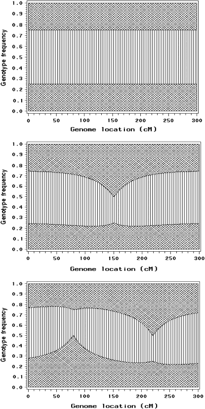
, and  . The proportions of the three genotypes are plotted in Figure 1 (middle plot) across all positions of the genome. We can see that the locus close to the SDL (150 cM) has a segregation ratio close to
  . As the locus travels away from the SDL, its segregation ratio progressively approaches
  .
.
Figure 1.—
Genomewide segregation distortion caused by segregation distortion loci (SDL). Top: genotype frequencies across the genome when there is no SDL. Middle: distorted genotype frequencies caused by a single SDL (at 150 cM). Bottom: distorted genotype frequencies caused by two SDL (at 80 and 220 cM). Areas with cross-hatched lines represent homozygotes and the area with parallel lines represents the heterozygote.
For the same chromosome, we now assume that there are two SDL, one located at position 80 cM and the other at position 220 cM. The first SDL has a segregation ratio of  and the second one has a ratio of
  . Using Equation 2, we predict the segregation ratio of every locus of the entire genome. The plots of the three genotype frequencies are shown in Figure 1 (bottom). The top plot in Figure 1 is the control, showing the genotypic frequencies in the absence of segregation distortion.
Pleiotropic effect:
We now examine the properties of QTL mapping when the QTL itself is also an SDL, a phenomenon called pleiotropy, a single locus controlling both the variation of a quantitative trait and segregation distortion. We assume that the QTL is in the middle of a 20-cM marker interval (the QTL is 10 cM away from either marker). Assume that the QTL contributes  of the total phenotypic variance in a Mendelian F2 population. If
  , this
  converts into a QTL effect of
  . The sample size is assumed to be
  . First, we examine the pattern and strength of SDL on the result of QTL mapping. In one scenario, we fix the heterozygote frequency at
  , but vary the frequencies of the homozygote under the constraint
  :
:
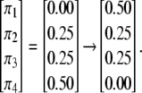 |
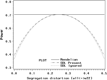
The extreme case finds that one of the two types of homozygote is completely knocked out. As the proportion of the homozygote varies from one extreme to another, the power ( ) starts at ∼40%, increases to 70% in the middle, and drops back to 40% at the other end (Figure 2). When segregation distortion is ignored, the power (
 ) profile shows a similar pattern of change, but slightly less than the power (
 ) when the segregation distortion is properly incorporated. The power reaches its maximum value of 70% where no segregation distortion is present.
Figure 2.—
Changes of statistical power caused by segregation distortion. An SDL overlaps with a QTL in the middle of a marker interval of 20 cM in length. Change of  from 0.0 to 0.5 is shown under the restriction that
  while
while  (heterozygote) remains.
In another scenario, we let  (of course
  is always the same as
  ) and vary the relative proportion of the homozygote to the heterozygote. We start with a population that has lost almost all of the homozygote (
 ) and end with a population nearly fixed for the homozygote (
 ),
),
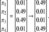 |
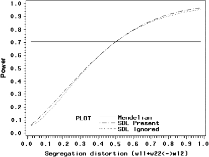
The power profile is shown in Figure 3. When the homozygote frequency is very low, the method has no power (close to zero). The power starts to increase as the homozygote frequency increases and reaches 100% when the population is fixed for the homozygote. When there is no segregation distortion, the power is ∼70%. Therefore, segregation distortion does not necessarily have a negative effect in QTL mapping. It can increase the statistical power as long as  , where
  is the variance of variable x in the absence of segregation distortion.
Figure 3.—
Changes of statistical power caused by segregation distortion. An SDL overlaps with a QTL in the middle of a marker interval of 20 cM in length. Change of  (heterozygote) from 0.98 to 0.02 is shown under the restriction that
  . The power reaches it maximum value when
  .
.
Again, we let the marker interval size be fixed at 20 cM, but now vary the QTL position from one end of the interval to the other end:
 |
Other parameters are fixed at values described before; i.e.,  ,
,  ,
,  ,
,  , and
, and  . Under this value of
  , the variance of x is
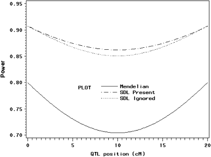
  . Therefore, we expect that QTL mapping will benefit from segregation distortion. The power profiles are shown in Figure 4. The solid line depicts the power when segregation distortion is absent, which is much lower than the lines that illustrate segregation distortion as present. Again, incorporating information from segregation distortion can increase the power slightly relative to the situation where the SDL is present but ignored. The power reaches its minimum when the QTL is in the middle of the interval.
Figure 4.—
Changes of statistical power as QTL (also SDL) position changes from one end to the other end of a marker interval (20 cM long). The SDL overlaps with the QTL. The genotype frequency array is  .
.
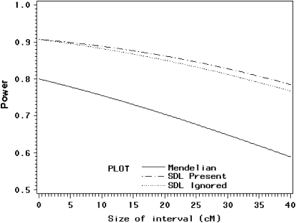
With all parameters (except the size of the marker interval) fixed at previous values, we place the QTL in the middle of an interval and progressively increase the marker interval from 0 to 40 cM. When the interval size is 40 cM, the QTL is in the position of 20 cM. The change of interval size is
 |
When the interval size is zero (the two markers and the QTL occupy the same location of the genome), the power is maximum (90%). The power decreases as the interval size increases. QTL mapping still benefits from segregation distortion because the solid line where segregation distortion is absent is lower than the lines that reflect segregation distortion as present (Figure 5).
Figure 5.—
Changes of statistical power as the size of the marker interval changes from 0 to 40 cM. The QTL (also SDL) position is in the middle of the marker interval. The genotype frequency array is  .
.
Linkage between QTL and SDL:
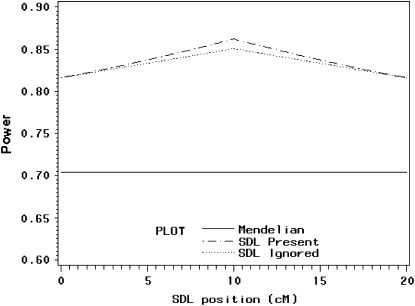
When the QTL does not overlap with the SDL, segregation distortion of QTL remains, not due to pleiotropy but due to linkage. We assume that the SDL is in the same marker interval as the QTL. Again the length of the marker interval is 20 cM. The QTL position is fixed in the middle of the interval but the SDL varies from one end of the interval to the other end. All other parameters remain the same as described before. The change of SDL position can be demonstrated as
 |
The power profile is shown in Figure 6. The power reaches its maximum value of 86% where the SDL overlaps with the QTL. Again, taking into account segregation distortion when it is present can increase the power relative to the situation where it is ignored.
Figure 6.—
Changes of statistical power as the SDL position changes from one end to the other end of a marker interval of 20 cM in length. The QTL position is fixed in the middle of the interval (at position 10 cM). The genotype frequency array is  .
.
DISCUSSION
Our theoretical investigation shows that because SDL can decrease as well as increase the statistical power of QTL mapping, the presence of SDL is not necessarily detrimental to QTL mapping. Recall that the statistical power (or the noncentrality parameter) of QTL mapping is proportional to the variance of the independent variable x. In the absence of segregation distortion, the variance of x is  under our scale of the defined x. SDL will cause this variance to deviate from
  . The deviation can be in either direction. If
  , the SDL is detrimental to QTL mapping. However, if
  , the SDL is beneficial to QTL mapping. The domain that the SDL is beneficial is
 |
(12) |
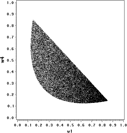
under the restriction that  . The area that this condition holds is shown in the shaded half circle in Figure 7. If segregation distortion is a random event (uniform distribution of
  and
and  within
  ), the SDL is beneficial to QTL mapping 44% of the time; i.e., the half circle accounts for 44% of the triangle.
Figure 7.—
The fitness zone [ ] where SDL can increase the statistical power of QTL detection. The half circle represents the domain that
  under
under  .
.
The effect of SDL on QTL mapping is analogous to that of selective genotyping. Under the additive genetic model, choosing both extreme phenotypes for QTL mapping is equivalent to eliminating some of the heterozygote and thus increases the power of additive QTL detection. Choosing one tail of the extreme phenotypes, in contrast, is equivalent to eliminating part of the homozygote and thus decreases the power of QTL detection. Contrary to the common belief that the SDL is always harmful to QTL mapping, QTL mapping can potentially but not necessarily benefit from SDL. What is the consequence of SDL on the detection of dominance QTL? The effect is negative; i.e., the SDL is detrimental to the power of dominance QTL detection. Let  be the QTL model that includes the dominance effect, where variable
  is defined as an indicator variable for the heterozygote (1 for heterozygote and --1 for homozygote) and
  is the dominance effect. Under Mendelian segregation,
  , which is already at its maximum value. Any deviation from Mendelian segregation will lead to
  .
.
Selective genotyping is a cost-effective approach to QTL mapping. Mapping QTL using regular QTL mapping procedures on a selected population (two extreme phenotypes) will increase the power relative to that using an unselected population. If for some reason we know a priori that an F2 population is Mendelian (before selective genotyping), and if some loci are distorted in a selected subset of the F2 population (after selective genotyping), we may conclude that these distorted loci are QTL for the trait whose phenotype is being selected. Therefore, SDL mapping using a selectively genotyped population may serve as an alternative QTL mapping strategy. Because significance of either QTL or SDL implies the presence of QTL, combining both QTL and SDL mapping on a selectively genotyped population can further improve the statistical power of QTL detection. Phenotype selection acts on all QTL controlling the trait. If SDL mapping is used on a selected population as a tool to map QTL, we will detect multiple SDL because any quantitative trait is expected to be controlled by more than one QTL. The SDL model developed applies only to a single SDL of a chromosome. How can we detect multiple SDL? The question is exactly the same as this: How can interval mapping (a single-QTL model) detect multiple QTL? Both questions can be answered by the use of genome scanning, in which we evaluate the numbers of significant peaks occurring in the test statistic profiles to infer the number of QTL.
The effect of SDL on the segregation ratio of QTL also applies to the segregation ratio of a linked marker. In fact, this statement should be more appropriately rephrased as the effect of SDL on the segregation ratio of a linked locus (either a QTL or a marker). Figure 1 presents the actual segregation of markers because no QTL is implied in that figure. SDL may cause linked markers to distort, but the conditional probability of QTL genotype given flanking marker genotype has not taken into account distorted markers. In fact, the same formula (conditional probability) applies to both distorted markers and undistorted markers, because once the genotype of a marker is observed, the effect of SDL becomes irrelevant.
If the SDL is present but ignored when QTL mapping is conducted, the power will be decreased but only slightly. If the marker map is dense, the power loss is negligible. Therefore, one can safely use the classical method of QTL mapping without concern for the presence of SDL. A dense marker map is less prone to SDL because the distorted proportions of QTL genotypes affect only the prior probability of QTL genotype. The prior probability plays a lesser role in calculating the conditional probability given marker information. In the extreme case where the QTL overlaps with a marker, the QTL genotype is completely determined by the marker genotype, rendering irrelevant the prior probability. If the marker map is sparse, incorporating SDL into QTL mapping can increase the power. This increase, although small, is worthy of consideration. The regression method may help us to understand the effect of SDL on QTL mapping, but it is not the actual QTL mapping method we can use because the SDL parameters are assumed to be known. The actual method should be the maximum-likelihood or the Bayesian method because these methods facilitate algorithms to estimate the distorted segregation ratio. The difference between the classical method and the method that incorporates SDL occurs only in the calculation of the posterior probability of QTL genotype. Here, we cannot calculate the QTL genotype probability given flanking marker information first and then use this probability to update the ultimate posterior probability. The posterior probability of QTL genotype must be calculated in a single step conditioned on both the markers and the phenotype. For example, given the phenotype y and the flanking markers  and
and  , the posterior probability of
  is
is
 |
(13) |
where  is a normal density when the QTL genotype is k. Let
  be the posterior probability of QTL genotype for individual j. The proportion of QTL genotype k in the population is estimated by
 |
(14) |
Therefore, incorporating SDL into QTL mapping requires only modifying the posterior probability and estimating the distorted segregation ratio. The additional effort is negligible, and so there is little reason to ignore SDL in QTL mapping. We have incorporated segregation distortion into our QTL mapping software package, PROC QTL. To perform QTL mapping under segregation distortion, users must enable the DISTORTION option under the ML method. When this option is not enabled, Mendelian segregation is assumed.
As mentioned, ignoring SDL in QTL mapping results in only a slight power loss. Why, then, do we even bother to incorporate SDL in QTL mapping? Our argument is that because the incorporation is technically trivial, it is a one-stone-kills-two-birds scenario to do so. A single analysis of the QTL mapping data can map both QTL and SDL. Agricultural biologists are interested in QTL controlling the variation of agronomy traits, while evolutionary biologists also explore genes for viability selection. It may be beneficial, then, to modify existing QTL mapping software packages to map QTL and SDL jointly, resulting in extracting a greater amount of information from the same amount of resources.
Acknowledgments
This research was supported by the National Science Foundation grants (DBI-0345205) and the U.S. Department of Agriculture (USDA) National Research Initiative competitive grants (USDA Cooperative State Research, Education, and Extension Service 2007-35300-18285).
References
- Fu, Y., and K. Ritland, 1994. On estimating the linkage of marker genes to viability genes controlling inbreeding depression. Theor. Appl. Genet. 88 925–932. [DOI] [PubMed] [Google Scholar]
- Haldane, J. B. S., 1919. The combination of linkage values, and the calculation of distances between the loci of linked factors. J. Genet. 8 299–309. [Google Scholar]
- Haley, C. S., and S. A. Knott, 1992. A simple regression method for mapping quantitative trait loci in line crosses using flanking markers. Heredity 69 315–324. [DOI] [PubMed] [Google Scholar]
- Lander, E. S., and D. Botstein, 1989. Mapping Mendelian factors underlying quantitative traits using RFLP linkage maps. Genetics 121 185–199. [DOI] [PMC free article] [PubMed] [Google Scholar]
- Lorieux, M., B. Goffinet, X. Perrier, D. d. L. Gonzalez and C. Lanaud, 1995. a Maximum-likelihood models for mapping genetics markers showing segregation distortion. 1. Backcross population. Theor. Appl. Genet. 90 73–80. [DOI] [PubMed] [Google Scholar]
- Lorieux, M., X. Perrier, B. Goffinet, C. Lanaud and D. d. L. Gonzalez, 1995. b Maximum-likelihood models for mapping genetics markers showing segregation distortion. 2. F2 population. Theor. Appl. Genet. 90 81–89. [DOI] [PubMed] [Google Scholar]
- Luo, L., and S. Xu, 2003. Mapping viability loci using molecular markers. Heredity 90 459–467. [DOI] [PubMed] [Google Scholar]
- Luo, L., Y.-M. Zhang and S. Xu, 2005. A quantitative genetics model for viability selection. Heredity 94 347–355. [DOI] [PubMed] [Google Scholar]
- Vogl, C., and S. Xu, 2000. Multipoint mapping of segregation distorting loci using molecular markers. Genetics 155 1439–1447. [DOI] [PMC free article] [PubMed] [Google Scholar]
- Wang, C., C. Zhu, H. Zhai and J. Wan, 2005. Mapping segregation distortion loci and quantitative trait loci for spikelet sterility in rice (Oryza sativa L.). Genet. Res. 86 97–106. [DOI] [PubMed] [Google Scholar]
- Xu, S., 1998. Iteratively reweighted least squares mapping of quantitative trait loci. Behav. Genet. 28 341–355. [DOI] [PubMed] [Google Scholar]
- Xu, S., and C. Vogl, 2000. Maximum likelihood analysis of quantitative trait loci under selective genotyping. Heredity 84 525–537. [DOI] [PubMed] [Google Scholar]


