Abstract
In many genomic studies, one works with genome-position-dependent data, e.g. ChIP-chip or ChIP-Seq scores. Using conventional tools, it can be difficult to get a good feel for the data, especially the distribution of features. This article argues that the so-called Hilbert curve visualization can complement genome browsers and help to get further insights into the structure of one's data. This is demonstrated with examples from different use cases. An open-source application, called HilbertVis, is presented that allows the user to produce and interactively explore such plots.
Availability: http://www.ebi.ac.uk/huber-srv/hilbert/
Contact: sanders@fs.tum.de
Supplementary information: Supplementary Data are available at Bioinformatics online.
1 INTRODUCTION
A feature of modern experimental techniques such as ChIP-Seq is that the data produced by a single experiment now routinely covers, say, a whole vertebrate genome while still reaching base-pair resolution. Typically, each base pair is assigned a numerical value. For example, in the case of ChIP-Seq, this score would be the number of reads aligned to this position. Another example is base-by-base conservation scores, which are calculated using programs such as phastCons (Siepel et al., 2005). All the scores of a given chromosome can be thought of as forming one extremely long vector. Good tools to visualize such a vector are essential to explore the data, assess its quality, note peculiarities and form hypotheses. A common approach is to load the data into a genome browser such as Affymetrix's IGB, navigate to one's ‘favourite’ genes and check whether the data meets one's expectations there.
This can be very time-consuming as one has to study many loci to get an overview from representative samples. Furthermore, one might easily miss noteworthy aspects of the arrangement and spacing of the features when one looks at only a single feature at a time. In order to get an overview, one might try to plot large portions of a chromosome, but then features typically blend into each other, giving rise to an uninformative plot.
In the present article, a visualization technique is described that complements genome browsers by presenting the whole chromosome at once but still giving access to details. This is achieved by mapping the data from its one-dimensional arrangement along the chromosome onto a two-dimensional shape in order to make more efficient use of the plotting space. This so-called Hilbert curve visualization (HCV) was first suggested by Keim (1996) to display stock market prices. While it has already been used in genomics before (Deng et al., 2008; Wong et al., 2003), these applications have not caught on. There seem to be two reasons for this: on the one hand, there is a lack of flexible and easy-to-use software to produce such plots, and on the other hand, the HCV might have not been that appropriate for the use cases discussed in these articles.
The remainder of this article is organized in four sections. In Section 2, an example of a Hilbert plot is discussed to motivate why HCV is useful. Then, Section 3 explains how HCV is done and how these plots should be interpreted. Section 4 discusses for which genomics applications HCV is suitable. Finally, Section 5 introduces HilbertVis, an open-source application to explore data with the help of HCV.
2 INTRODUCTORY EXAMPLE
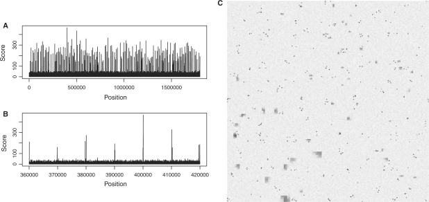
Figure 1 shows some fictive data to demonstrate the purpose of HCV. The data, a vector of length 1.8 millions, is plotted in Figure 1A with its whole length condensed to the width of the plot. One cannot infer much from this: it is neither possible to see whether the peaks are all similar nor how they are spaced. One cannot even judge the number or density of peaks as all the needles merge with each other. The standard solution is to zoom in, creating many plots like the one in Figure 1B.
Fig. 1.
A data vector with constructed example data to demonstrate the use of HCV. (A) A standard plot of the whole vector only shows that the data seems to contain many peaks. (B) A zoom-in offers only limited insights. (C) The HCV shows (see main text) that the data contains narrow, tall peaks which appear in clusters, as well as wide peaks that are distributed randomly but have even larger width in one quarter of the vector.
Figure 1C is the Hilbert plot for the vector. Each of its 256 × 256 pixels represents a ‘bin’ of 1.8mio/2562≈27 consecutive vector elements. The shade of a pixel represents the maximum value within the bin (from white for 0 to black for 320). As explained in more detail in Section 3, the pixels are arranged such that bins that are close to each other on the data vector are represented by pixels that are close to each other in the plot. Especially, adjacent bins are mapped to adjacent pixels. Hence, each of the many dark spots in the figure is a peak; the area of the spot in the two-dimensional plot is proportional to the width of the peak in the one-dimensional data, and the darkness of the spot corresponds to the height of the peak.
Thus, one can infer the following facts from Figure 1C, which are not easily noticed otherwise: there are two populations of peaks. The small spots that consist of only a single or occasionally two pixels correspond to narrow peaks with a width of typically at most the bin width (27 bp). These peaks are numerous and occur in clusters: there are usually 2–5 peaks in close proximity to each other. On the other hand, there are larger patches, with an area, i.e. peak width, 10–30 times larger than the narrow peaks. These are lower in peak height (lighter in colour) and do not appear in clusters. Furthermore, their width depends on the position within the data vector: those in the bottom left-hand quadrant of the plot (which corresponds to the second quarter of the data vector's length, see below) are much wider.
Even though this example data was constructed to show these properties, it is the kind of properties one might want to check first, before forming any specific hypotheses during the analysis of, e.g., ChIP-chip or ChIP-Seq experiments: are there wide or narrow peaks, tall or low ones? Are they all the same or are there sub-populations? Are they equally spaced or do they cluster? HCV allows one to judge such questions at a glance because, by spreading the vector out in a two-dimensional square, it provides enough detail to be able to distinguish individual peaks but still allows for an overview of the whole data.
Section 3 explains the manner in which the pixels are arranged in the square.
3 PRINCIPLE OF HCV
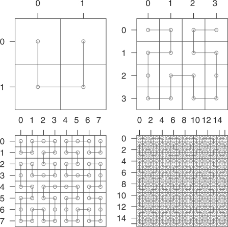
Space-filling curves caused significant excitement among mathematicians when Peano noticed their existence in 1890 (Peano, 1890). These curves are continuous and bijective mappings of the unit interval onto the unit square, i.e. a one-dimensional line is ‘folded up’ (infinitely often) such that it passes through every point of the square. Their existence blurs the distinction between one- and two-dimensional objects, which was a starting point towards the theory of fractal geometry. For our purposes, we take out a specific example of such a curve, the one proposed by Hilbert (1891) shortly after Peano's discovery. The Hilbert curve is constructed in a recursive way (Fig. 2): in the first iteration, the curve is divided into four parts, which are mapped to the four quadrants of the square. In the next iteration, each quadrant is divided up into four sub-quadrants, which, in a similar way, each hold 1/16 of the curve, and the quadrants of these sub-quadrants each hold 1/256, etc.
Fig. 2.
The first four iterations in the construction of the Hilbert curve. Note how each iteration consists of four rotated repetitions of the curve of the previous iteration.
The square in the Hilbert plot in Figure 1C consists of 28 × 28 pixels, i.e. the data vector is folded into the square according to the 8-th iteration of the Hilbert curve.
Due to this highly symmetric construction principle, a regularly or randomly spaced arrangement of peaks results in a pattern that appears regular or random, allowing us to infer properties of the spacing in the data from the appearance in the plot. As the curve is continuous, bins which are in close distance to each other on the vector will stay close in the square. Hence, a peak in the data gives rise to a small connected patch of dark (or coloured) pixels that is easily perceived. (One might expect that simply filling the square line by line with the data serves the same purpose but, in fact, the patches would then be horizontal streaks that are harder to perceive as distinct entities.) It is unavoidable that some pairs of pixels in close proximity correspond to distant loci on the vector (that happens whenever the curve ‘folds back’ towards already covered regions). However, compared with simple line-by-line filling or other space-filling curves such as Peano's original curve or Morton's Z curve, the Hilbert curve keeps these distortions to a minimum. They are also easily spotted, as they give rise to typical ‘chequerboard-like’ patterns (e.g. in Fig. 3B). Furthermore, if one is interested in small distinct peaks, it happens only rarely that two such peaks meet due to a distortion and mislead the viewer into perceiving a single, wider peak.
Fig. 3.
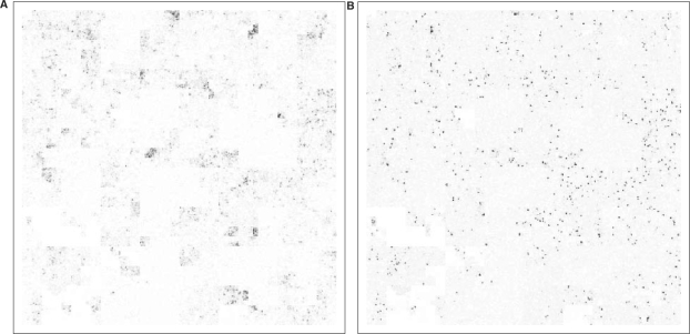
Hilbert plot the methylation marks (A) H3K4me1 and (B) H3K4me3 on human chromosome 10 according to the raw ChIP-Seq data reported by Barski et al. (2007). It is easy to see qualitative differences between mono- and tri-methylation peaks: the latter are very sharp, narrow and tall, while the former are blurred, wide and less intense. (The image is sharper on screen than in a print-out.)
Apart from the discussed distortions, the obvious disadvantage of HCV is that it is rather hard to relate a position on the plot back to a position on the vector. This limits applicability when absolute positions are of interest but is not an issue if one is interested in judging relative positions, i.e. spacing, homogeneity, etc. Note also that the HilbertVis tool discussed below allows the user to move the mouse cursor to any position in a Hilbert plot and read off the corresponding absolute position from a gauge.
4 USE CASES
To demonstrate HCV with real data, I have re-analysed the ChIP-Seq data for histone methylation marks H3K4me1 and H3K4me3 reported by Barski et al. (2007). After remapping the reads (taken from the national center for biotechnology information (NCBI) Short Read Archive, accession number SRA000206) to the human genome with MAQ (Li et al., 2008), Figure 3 was produced with HilbertVis. The colour saturation shows the coverage of the bins with aligned reads. H3K4me3 is known to mark the transcription start sites of active genes and hence has narrow, sharp and strong peaks. H3K4me1 is believed to be associated with active genes in a more general sense and the peaks are much more diffuse and less clearly localized. Thus, HCV is shown to be helpful in quickly noticing the stated facts and forming hypotheses for further tests. Furthermore, when one knows roughly what to expect, such a plot helps to do a first quality assessment of newly acquired data.
Another application is the comparison of data vectors: one might be especially interested whether me1 and me3 marks usually coincide and whether they are restricted to exonic regions. Figure 4 addresses these questions by overlaying the two plots in red and green and marking exonic regions in blue. Note how the additive colour mixing allows to assess co-location of features.
Fig. 4.
Three-colour overlay of the plots from Figure 3: H3K4me1 is displayed in red, H3K4me3 in green and exonic regions in blue. The colours are additive, i.e. bins with both me1 and me3 marks appear in yellow. The sparsity of yellow pixels indicate that the two marks do not tend to occur close to each other. Furthermore, the blue colours for exons mixes with the red for me1 to purple. Comparing purple and red shows that me1 marks spread well into non-coding areas. (Colours are optimized for display on screen, not on paper.)
Overlay plots are useful again to assess the quality of raw data. In a Chip-Seq experiment, one might, for example, be interested in the uniformity of the coverage of the reads from the input control. In a HCV, one could display coverage in one colour and mark out in another colour the parts of the chromosome that are repetitive on the length scale of the reads and hence cannot be aligned to.
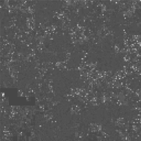
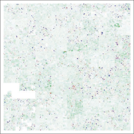
Application is not limited to ChIP-Seq. Experiments involving tiling arrays (e.g. ChIP-chip and array-CGH) gives rise to similar data vectors. Results from computational genomics can also be visualized, e.g. base-by-base conservation scores, gene density and repetitive element density. Please see Figure 5 and the Gallery section of the HilbertVis web site http://www.ebi.ac.uk/huber-srv/hilbert/, for examples.
Fig. 5.
Use of HCV to illustrate how little of the highly conserved part of the human genome is coding. Depicted is the 44-way vertebrate conservation track from the UCSC Genome Browser (Kent et al., 2002) for human chromosome 10, together with the position of the exons. For non-exonic region, the conservation score is depicted with a scale from white (score 0) to green (score 1), for exons, the colour ranges from blue (score 0) via purple to red (score 1).
The common characteristic of the suggested applications is that the visualized vectors contain from hundreds up to tens of thousands of features, which can be seen as distinct entities in the plot. HCVs of a quantity that varies in a very smooth manner, without pronounced localized features, will not be very informative. This may apply to the previous appearances of HCV in genomics literature (Deng et al., 2008; Wong et al., 2003), which were restricted to visualizing the base composition of chromosomes, an application which, I believe, does not demonstrate the strengths of HCV well.
5 HILBERTVIS
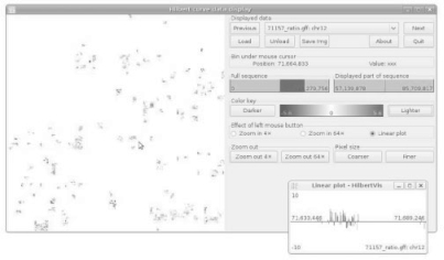
When one finds an interesting feature in a Hilbert plot, one may want to explore it in detail, i.e. zoom in, learn its genomic coordinates, or obtain an ordinary linear plot of it. Hence, I have developed an application, named ‘HilbertVis’, that not only allows to generate Hilbert plots but also to explore them in an interactive manner with the help of a graphical user interface (GUI; Fig. 6).
Fig. 6.
The GUI of the HilbertVis application (stand-alone version).
Two variants are offered, a stand-alone version, and a package for the statistical environment ‘R’ (R Development Core Team, 2008). Both are available as open-source software under the GNU General Public License, version 3, with binaries being provided for Mac OS X, Linux and Microsoft Windows.
The stand-alone version allows one to read in data in the formats GFF, BED and Wiggle, and the ‘map’ output format of the MAQ alignment program (Li et al., 2008). In order to facilitate displaying data in other formats or pre-processing the data, the R packages ‘HilbertVis’ (for batch processing) and ‘HilbertVisGUI’ (for interactive exploration) are available as part of the Bioconductor project (Gentleman et al., 2004). With these, the functionality of R and Bioconductor can be used to produce the data vectors as R variables, which can then be displayed with HilbertVis. For more information, see the package vignette (manual) supplied with the HilbertVis package.
A few special features of HilbertVis should be pointed out: if the mouse is moved over the plot, a pointer in the ruler on the right-hand side of the GUI (Fig. 6) shows the position of the mouse cursor within the displayed part of the sequence, giving visual feed-back that helps the user to keep oriented in the Hilbert curve. Another important feature are the buttons labelled ‘Lighter’ and ‘Darker’. They allow the user to change the palette in order to explore either low- or high-intensity features. This is important because the limited dynamic range of human colour perception makes it difficult otherwise to analyse data with different intensity scales.
If one wishes to compare many data sets corresponding to the same chromosome, e.g. ChIP data for related transcription factors, one can load them simultaneously and flip back and forth between them. A caching mechanism makes this smooth and fast such that it is easy to look for differences between the vectors.
Finally, a call-back facility to R is provided that allows one to use custom routines to inspect or analyse features selected with the mouse. For example, one may want to use the GenomeGraphs package (Durinck et al., 2009) to automatically load gene annotation data and display it along with the feature.
For source code, binaries, documentation and further example images, please see the following web page: http://www.ebi.ac.uk/huber-srv/hilbert/
Funding: The European Union's Marie Curie Research and Training Network ‘Chromatin Plasticity’ (to S.A.).
Conflict of Interest: none declared.
REFERENCES
- Barski A, et al. High-resolution profiling of histone methylations in the human genome. Cell. 2007;129:823. doi: 10.1016/j.cell.2007.05.009. [DOI] [PubMed] [Google Scholar]
- Deng X, et al. DHPC: a new tool to express genome structural features. Genomics. 2008;91:476. doi: 10.1016/j.ygeno.2008.01.003. [DOI] [PubMed] [Google Scholar]
- Durinck S, et al. GenomeGraphs: integrated genomic data visualization with R. BMC Bioinformatics. 2009;10:2. doi: 10.1186/1471-2105-10-2. [DOI] [PMC free article] [PubMed] [Google Scholar]
- Gentleman RC, et al. Bioconductor: open software development for computational biology and bioinformatics. Genome Biol. 2004;5:R80. doi: 10.1186/gb-2004-5-10-r80. [DOI] [PMC free article] [PubMed] [Google Scholar]
- Hilbert D. Über stetige Abbildungen einer Linie auf ein Flächenstück. Mathematische Annalen. 1891;38:459. [Google Scholar]
- Keim DA. Pixel-oriented visualization techniques for exploring very large data bases. J. Comp. Graph. Stat. 1996;5:58. [Google Scholar]
- Kent W, et al. The human genome browser at UCSC. Genome Res. 2002;12:996. doi: 10.1101/gr.229102. [DOI] [PMC free article] [PubMed] [Google Scholar]
- Li H, et al. Mapping short DNA sequencing reads and calling variants using mapping quality scores. Genome Res. 2008;18:1851–1858. doi: 10.1101/gr.078212.108. [DOI] [PMC free article] [PubMed] [Google Scholar]
- Peano G. Sur une courbe qui remplit toute une aire plaine. Math. Ann. 1890;36:157. [Google Scholar]
- R Development Core Team (2008) R: A Language and Environment for Statistical Computing. R Foundation for Statistical Computing, Vienna, Austria. [Google Scholar]
- Siepel A, et al. Evolutionarily conserved elements in vertebrate, insect, worm, and yeast genomes. Genome Res. 2005;15:1034. doi: 10.1101/gr.3715005. [DOI] [PMC free article] [PubMed] [Google Scholar]
- Wong PC, et al. Global visualization and alignments of whole bacterial genomes. IEEE Trans. Vis. Comput. Graph. 2003;9:361–377. [Google Scholar]


