

Abstract
Background
To help oncologists and breast cancer patients make informed decisions about adjuvant therapies, online tools such as Adjuvant! provide tailored estimates of mortality and recurrence risks. However, the graphical format used to display these results (a set of four horizontal stacked bars) may be suboptimal. We tested whether using simpler formats would improve comprehension of the relevant risk statistics.
Materials and Methods
1,619 women ages 40-74 completed an Internet-administered survey vignette about adjuvant therapy decisions for a patient with an ER+ tumor. Participants were randomized to view one of four risk graphics: a base version that mirrored the Adjuvant! format or alternate graphs that showed only two options (those that included hormonal therapy), used a pictograph format, or included both changes. Outcome measures included comprehension of key statistics, time required to complete the task, and graph perception ratings.
Results
Both simplifying format changes significantly improved comprehension, especially when they were implemented together. Compared to participants who viewed the base 4-option bar graph, respondents who instead viewed a 2-option pictograph version were more accurate when reporting the incremental risk reduction achievable from adding chemotherapy to hormonal therapy (77% vs. 51%, p<0.001), answered that question quicker (Median time = 28 sec. vs. 42, p<0.001), and liked the graph more (M=7.67 vs. 6.88, p<0.001).
Conclusions
Although most patients will only view risk calculators such as Adjuvant! in consultation with their clinicians, simplifying the graphical design could significantly improve patients’ comprehension of statistics essential for informed decision making about adjuvant therapies.
Keywords: decision aids, risk, patient education as topic, audiovisual aids
INTRODUCTION
One of the most difficult decisions faced by post-operative breast cancer patients concerns whether, and in what form, to take adjuvant therapy to reduce the likelihood of cancer recurrence. The decision involves a tradeoff between the risk reduction achievable by chemotherapy (which is a function of tumor and patient characteristics) and the morbidity associated with these treatments. For patients with ER+ tumors, hormonal therapy is an additional option used either singly or in conjunction with chemotherapy agents. Patients’ preferences, specifically the relative value the patient places on reducing the risk of recurrence versus treatment burden, directly influence which choice is optimal.[1-3]
To help guide decisions about adjuvant therapies, many clinicians use online tools to calculate tailored estimates of the mortality risks, recurrence risks, and potential benefits of each therapy option. These estimates are based on complex algorithms that account for (at a minimum) tumor size, grade, and ER status, lymph node status, patient age, and patient health status. One of the most commonly used tools, Adjuvant! Version 8 (www.adjuvantonline.com),[2-4] presents this information to clinicians (and to patients via printable handouts) in a complex graphical format similar to that shown in Figure 1. The graph uses horizontal bars to represent 10 year outcomes for each of four possible options: no adjuvant therapy, hormonal therapy only, chemotherapy only, and both chemotherapy and hormonal therapy. The no therapy bar describes how many out of 100 women would be alive (green section), dead due to breast cancer (red section), or dead due to other causes (blue section) in 10 years. The remaining bars repeat this information but also show how the number of women alive would increase due to each adjuvant therapy (as compared to no therapy) in yellow.
Figure 1.

Baseline risk graphic based on the 4-option horizontal bar format used by Adjuvant!
While this format presents a complete picture of the risks and benefits associated with the adjuvant therapy decision, the risk communication literature suggests that the graphical format used may be suboptimal, inhibiting accurate comprehension of the relevant information. Several studies have shown that horizontal bars are more difficult to comprehend than alternate formats like pictographs (sometimes called icon arrays or image matrices).[5-9] In addition, the standard Adjuvant! format always displays information about three treatment options, each compared to a no therapy option, even though in most cases the therapeutic decision is only between two options (e.g., between hormonal therapy only vs. combined therapy if the patient is ER+ or chemotherapy and no therapy if the patient is ER-). Such extraneous information increases the cognitive effort required to interpret the graph, which may therefore result in reduced understanding.[10-12]
Risk calculators such as Adjuvant! are designed for use by clinicians, and practicing oncologists are undoubtedly able to correctly interpret the complex graphic with regular exposure. However, many clinicians use Adjuvant! as a tool to facilitate discussion of adjuvant therapy options, either by presenting and discussing the patient handout or by going online with the patient during a consultation. Because patients lack specific experience with the Adjuvant! tool, their understanding of the risk information may be inhibited by the complexity of the graph.[13] If so, patients’ misinterpretations of the risk statistics could bias their subsequent adjuvant therapy decisions.
In this study, we tested whether presenting the possible outcomes of different adjuvant therapy options using alternate formats would improve comprehension of the relevant risk statistics as compared to the format currently used in the Adjuvant! tool. We used a randomized experimental design to systematically vary how the risks and benefits of adjuvant therapy options were presented in a short hypothetical vignette presented to a demographically diverse population of middle-aged and older women participating in an Internet-administered survey. This methodology holds constant the specific risk numbers being displayed, thus allowing direct identification of the effect of different graphical formats without having to adjust for the variation in prognoses associated with actual cancer patients’ diverse tumor characteristics. It also narrows the field of possible graphical formats to a specific recommended format which can be validated in future research using a patient population.
MATERIALS AND METHODS
Overview of Study Design
Each participant was asked to imagine being diagnosed with breast cancer after a routine mammogram. The scenario described surgical removal of the tumor and then presented different options for adjuvant therapy. We randomly varied the format of the graph used to present the mortality risks associated with different adjuvant treatment options and then assessed participants’ knowledge of the risk statistics and their preference ratings for the graph type shown. In addition, to measure ease of use, we electronically timed how long participants spent on a key knowledge question. This design received Institutional Review Board exempt status approval as anonymous survey research.
Participants
Study participants were women 40-74 years old who were drawn from a panel of Internet users administered by Survey Sampling International (SSI) and who voluntarily agreed to receive invitations to fill out questionnaires. Email invitations were sent to a stratified random sample of panel members with the goal of approximating the U.S. census on education level, race, and income in the final subject pool. To ensure at least moderate demographic diversity (but not representativeness) and offset large expected variations in response rates (especially for African-Americans and Hispanic-Americans), we established target response levels roughly matching the prevalence of these racial/ethnic groups in the U. S. population. We also drew three distinct age samples within each race (one-third each ages 40-49, 50-59, and 60-74) to offset differential response rates across age groups. The number of email invitations in each demographic sub-sample was dynamically adjusted until all quotas were achieved, such as requiring at least 180 completed surveys from both the African-American and Hispanic-American subgroups. Upon completion, participants were entered into both an instant contest and a monthly drawing administered by SSI for modest cash prizes.
Intervention
In our scenario, the respondent was asked to imagine going for a routine mammogram, finding a lump, having a biopsy, and being diagnosed with breast cancer. Respondents were then told that the tumor was removed by surgery (although it was undefined whether the surgery was breast conserving or a mastectomy) and told that the tumor tested as ER positive (but no other tumor characteristics). The scenario then described the doctor as making a strong recommendation that the patient take hormonal therapy but leaving the question of whether or not to also take chemotherapy up to the patient. Respondents then viewed the target graphic along with explanatory text.
To create the graphs, we used mortality risk statistics derived from Adjuvant! for a 59 year old patient in good health with a 2.5cm Grade 3 ER+ tumor but no lymph nodes involved. All study participants received identical risk information. We used a randomized experimental design (subjects were randomly assigned by computer to one of four experimental conditions) to compare the format used in Adjuvant! (Figure 1) versus three alternative graphs that varied either the format used to display the risk statistics, the number of adjuvant therapy options shown, or both.
Graph Format
Our base graph (Figure 1) replicated the horizontal stacked bar format used in standard Adjuvant!, with similar layout, proportions, colors and legend text as are printed on the patient handout page. Our alternative pictograph format used 10 × 10 matrices of small rectangles to represent the possible outcomes. (See tools.cbdsm.org for examples.) The graphic included four pictographs, one for each treatment option, arranged with the no therapy graph on the left and the three adjuvant therapy options to the right. Overall image size was approximately the same as the bar format, and the same color scheme was used to represent outcomes. Consistent with our previous work on the communication of incremental risks,[6] however, we modified the legend text to read “X% more women out of 100 are alive because of therapy.”
Number of Options Shown
In addition to the 4-option bar graph and pictographs described above, we also created two simpler graphs, one in each format, that only displayed two bars or pictographs rather than four. Because the doctor in our scenario strongly recommended hormonal therapy, the two critical options that respondents needed to consider were hormonal therapy only and combined therapy. In the simpler 2-option graphs, only those two options were displayed. In addition, since the no therapy option was omitted, the entire chance of remaining alive was now colored green in the hormonal therapy bar/pictograph, and the yellow incremental benefit area on the combined therapy graph was recalculated to show the marginal increase in survival versus hormonal therapy (instead of versus no therapy). Doing so clarifies the pragmatic meaning of the graph by removing extraneous information[10] and displays the incremental benefit using more easily interpreted graphical-perception tasks.[14] The 2-option pictograph image which illustrates both manipulations is shown in Figure 2.
Figure 2.
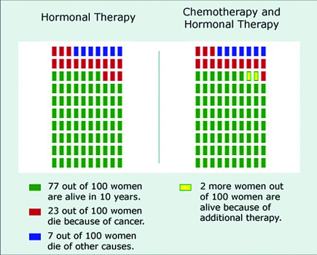
Simplified risk graphic using a 2-option pictograph format
Outcome Measures
Our primary outcome measures were three questions that assessed respondents’ ability to accurately report key statistics relevant to the adjuvant chemotherapy decision: the chance that the respondent would be alive in 10 years with hormonal therapy only, the chance they would be alive with both chemotherapy and hormonal therapy, and how many fewer women out of 100 would die from cancer if they took both chemotherapy and hormonal therapy instead of hormonal therapy only. Since exact numerical information sufficient to calculate these answers was provided in the graph legends, responses were only coded as accurate if exactly correct.
We also gathered data on two secondary outcome measures. First, as a measure of the cognitive information processing required to interpret the graphs,[15] we electronically recorded the number of seconds that the respondent took to answer the risk difference question, which was on a separate page from all other questions. Second, we asked respondents to provide three perception ratings about the graph they saw. Respondents rated how well the graph described the benefits of different additional treatments, whether the respondent would prefer to see risk information in this type of graph, and how clearly the graphs represented the increase in the chance of being alive, answering each question on a 10 point scale.
Covariates
Individuals vary in terms of their numeracy, i.e. their facility and comfort with quantitative health information such as risk statistics. To assess this important covariate, study participants completed the Subjective Numeracy Scale (SNS),[16, 17] a validated measure of quantitative ability and of preferences for receiving information in numerical form. The SNS is comprised of 8 questions, four assessing perceived numerical ability (e.g., “How good are you at calculating a 15% tip?”) and four assessing preferences for quantitative information (e.g., “How often do you find numerical information to be useful?”). SNS scores range from 1 (least numerate) to 6 (most numerate). The SNS has previously been shown to correlate with the ability to recall and comprehend both textual and graphical risk communications.[17]
In addition, participants completed demographic measures including level of education. For analysis purposes, we modeled education as a three level variable: High School or less, some post-HS education but no Bachelor’s degree, and Bachelor’s degree or more.
Hypotheses
Based on prior research using pictographs,[5-9] we expected that this format would facilitate study participants’ efforts to comprehend the risk information provided. Thus, we predicted that women who were shown risk information in pictograph form would be both more accurate on the comprehension questions and quicker to complete the accuracy tasks than women shown the horizontal bar format. Because of these advantages, we also hypothesized that respondents would rate pictographs as a more preferred format than horizontal bar graphs.
Our simpler, 2-option graphs eliminated non-essential information and reframed the incremental benefit to make comparing hormonal therapy only with combined therapy easier. Because these changes facilitate direct comprehension of the risk tradeoff between hormonal therapy and combined therapy,[18-20] we hypothesized that respondents who received 2-option graphs would also have increased comprehension accuracy, faster task completion times, and higher graph preference ratings than respondents viewing 4-outcome graphs.
Statistical Analysis
We utilized chi-square tests of proportions to test whether graph format affected comprehension of risk statistics, t-tests to compare graph preference ratings, and Wilcoxon rank-sum tests (to compensate for highly skewed distributions) to compare the distributions of time spent answering the knowledge question regarding the marginal benefit of treatment. We also used a logistic regression analysis to assess whether participants’ comprehension of different graphs was mediated by numeracy. All analyses were performed using STATA 10,[21] and all tests of significance were two-sided and used alpha = 0.05.
RESULTS
A total of 2,251 individuals reached the survey website and viewed the first content page. Of these, 603 (27%) failed to complete the survey. In addition, 5 were excluded for completing the survey too quickly to have paid attention, 16 were male and hence excluded, and 8 were excluded for reporting ages outside of the requested sample range. (See Figure 3 for details of participant flow through the survey instrument.) Completion rates did not differ significantly across the four arms of our RCT design. Our analyses focus on the remaining 1,619 participants.
Figure 3.
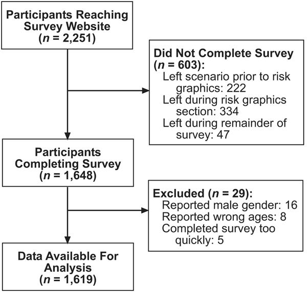
Study flow diagram
Sample demographic characteristics are described in Table 1. We observed a wide range of educational achievement, with 27% having completed a Bachelor’s or higher college degree but also 25% with only a High School education or less. While 23% of respondents reported having had a prior breast biopsy, 4% had a prior diagnosis of breast cancer, and 19% reported having a first-degree relative with a prior diagnosis of breast cancer, a sensitivity analysis showed that exclusion of these groups did not qualitatively change the results reported below. As expected given our experimental design, there were no significant variations in sample demographics across the experimental conditions.
Table 1.
Sample characteristics
| Characteristic (continuous) | Mean (Std. Dev.) / Median |
|---|---|
| Age (range: 40-74) | 54.5 (8.6) / 54 |
| Subjective Numeracy Score (range: 1-6) | 4.14 (1.13) / 4.38 |
| Characteristic (binary) | N (%) |
| Race: | |
| Caucasian | 1339 (82.7%) |
| African-American | 185 (11.4%) |
| Other / mixed race | 283 (17.6%) |
| Hispanic ethnicity (any race) | 178 (11.1%) |
| Education: | |
| HS diploma or less | 404 (25.0%) |
| Some college | 779 (48.2%) |
| Bachelor’s degree or more | 434 (26.8%) |
| Prior breast cancer experience: | |
| Prior breast biopsy | 365 (22.6%) |
| Prior breast cancer diagnosis | 69 (4.3%) |
| First-degree relative with breast cancer | 313 (19.4%) |
Comprehension of Risk Statistics
Since our scenario described a patient with an ER+ tumor, our first two comprehension questions assessed participants’ ability to report the total chance of being alive in 10 years if the patient took hormonal therapy only and if she took both chemotherapy and hormonal therapy. The results are shown in Table 2. The accuracy rates among participants viewing the base 4-option bar graph were strikingly low: approximately 17% of respondents answered each question correctly. However, significantly improved accuracy was observed with each of our alternative graph formats, especially the 2-option pictograph.
Table 2.
Proportion of respondents correctly reporting total survival rates, by graph type
| Four Option Graph | Two Option Graph | |||
|---|---|---|---|---|
| Question | Horizontal Bar |
Pictograph | Horizontal Bar |
Pictograph |
| (1) | (2) | (3) | (4) | |
| Total # Alive with Hormonal Therapy Only |
69/393 (17.6%) |
130/389 (33.4%) |
267/405 (65.9%) |
234/364 (64.3%) |
|
χ2test (1 df) vs Column 1 |
- | 25.93** | 191.43** | 171.89** |
| Total # Alive with Combined Therapy |
67/401 (16.7%) |
128/405 (31.6%) |
153/410 (37.3%) |
188/378 (49.7%) |
|
χ2test (1 df) vs Column 1 |
- | 24.38** | 43.56** | 96.39** |
Notes: Significant at p<0.001
Perhaps the most critical information related to the adjuvant therapy decision presented in our scenario is the difference between these two numbers, i.e., the incremental risk reduction achieved by adding adjuvant chemotherapy to hormonal therapy. The percentage of respondents correctly noting that 2 fewer women out of 100 would die if they took chemotherapy in addition to hormonal therapy is shown in Figure 4. While respondents viewing 4-option graphs (whether bar or pictograph) were only able to correctly answer this question about half of the time, accuracy was significantly improved among participants shown the 2-option bar graph (×2(1)=14.95, p<0.001) and again especially among those who viewed the 2-option pictograph (×2(1)=57.23, p<0.001).
Figure 4.
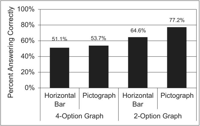
Comprehension of the risk reduction due to addition of chemotherapy to hormonal therapy
A logistic regression analysis (Table 3) showed that these format effects remain highly significant after controlling for both a strong and significant effect of individual numeracy as well as a weaker independent effect of education. All race, ethnicity and breast cancer experience variables were non-significant predictors of comprehension. An expanded model (not shown) showed no significant interactions between numeracy and any of the graph formats. As a result, respondents who saw 2-option pictographs were more accurate than those who viewed 4-option bar graphs, regardless of whether they scored above median on the Subjective Numeracy Scale (Comprehension rates: 85.3% (2-option pictograph) vs. 62.4% (4-option bar)) or below median (69.0% vs. 43.1%).
Table 3.
Logistic regression analysis of respondents’ comprehension of the risk reduction due to adding chemotherapy to hormonal therapy
| Comprehension of Benefit of Adding Chemotherapy to Hormonal Therapy |
|||
|---|---|---|---|
| Variable | Odds Ratio | 95% C. I. | z-statistic |
| 4-Option Pictograph (vs. Base) | 1.06 | [0.79, 1.42] | 0.37 |
| 2-Option Bar (vs Base) | 1.72 | [1.27, 2.32] | 3.53** |
| 2-Option Pictograph (vs Base) | 3.27 | [2.36, 4.54] | 7.08** |
| Numeracy (1-6) | 1.65 | [1.48, 1.83] | 9.37** |
| Education (1-3) | 1.26 | [1.07, 1.48] | 2.84* |
| African-American (vs. Caucasian) | 0.71 | [0.41, 1.25] | −1.19 |
| Other/Mixed Race (vs. Caucasian) | 0.92 | [0.57, 1.48] | −0.35 |
| Hispanic Ethnicity | 0.86 | [0.60, 1.24] | −0.81 |
| Age (per 10 years) | 1.02 | [0.89, 1.16] | 0.25 |
| Prior Breast Biopsy | 1.27 | [0.95, 1.70] | 1.63 |
| Prior Breast Cancer Diagnosis | 0.77 | [0.42, 1.40] | −0.87 |
| Close Relative with Breast Cancer | 0.88 | [0.67, 1.16] | −0.93 |
Notes:N = 1568.
p<0.001
p<0.05.
Base graph is a 4-option horizontal bar graph.
Timing Data
The median time spent completing the risk difference question (which was asked on a separate web page from the rest of the survey) is shown in Figure 5. Presenting all four treatment options in a pictograph instead of the base horizontal bar format had no effect on time spent. However, Wilcoxon rank-sum tests showed that respondents who viewed simplified images that only presented information about two options were able to complete the question in significantly less time (Bar: z=4.69, Pictograph: z=7.89, both p’s<0.001), with the shortest time (28 seconds) observed in the group who received the 2-option pictographs. In addition, among respondents who viewed the 2-option graphs (but not among respondents who viewed 4-option graphs), knowledge accuracy was significantly higher among participants who completed the task in 30 seconds or less (Bar: 78.2%, Pictograph: 84.0%) as compared to participants who took more than 30 seconds to complete the task (Bar: 54.0%, ×2(1)=25.82, p<0.001; Pictograph: 68.6%, ×2(1)=12.53, p<0.001).
Figure 5.
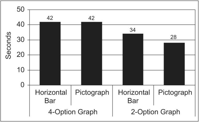
Median time to complete the risk reduction question
Ratings of Different Formats
Participants ratings on the three graph perception questions were highly correlated, so we combined all three questions into a single scale with very high reliability (alpha=0.91). The 4-option and 2-option pictograph graphics received the highest scores (M=7.68 & 7.67, respectively), significantly higher than those for the base 4-option bar graph (M=6.88; t=4.62 vs. 4-option pictograph, t=4.43 vs. 2-option pictograph, both p’s<0.001). The 2-option bar graph was also significantly preferred to the 4-option base graphic, although the effect was not as large (M=7.33 vs. 6.88, t=2.49, p=0.01).
DISCUSSION
While decision support tools such as Adjuvant! use graphical displays to communicate the mortality risks that patients face with different adjuvant therapy options, our research shows that women had difficulty interpreting the 4-option horizontal bar format currently used by Adjuvant!. Two simple changes, displaying only risk information related to treatment options that included hormonal therapy (since the scenario described an ER+ tumor) and using pictographs instead of horizontal bars, resulted in significant improvements in both comprehension accuracy and speed of use in our demographically diverse sample. Furthermore, respondents showed strong preferences for pictograph formats over the currently used horizontal bar format. It is important to note, however, that sizeable knowledge deficits were still observed even when risk information was presented using the best format tested in this study, the 2-option pictograph. Further research is clearly needed to explore even more simplified formats to determine whether we can further improve patient understanding of the risk tradeoffs associated with adjuvant therapy decisions.
We draw particular attention to the fact that the participants who viewed the 2-option pictographs not only took the least time to complete knowledge tasks (Figure 5) but also had the lowest error rates (Figure 4). Together, these data demonstrate that reading and interpreting the 2-option pictographs required less cognitive effort than the 4-option bar graphs did. The task of making complex treatment decisions is both cognitively demanding and emotionally stressful, and evidence suggests that people’s decision making performance is often degraded under such conditions.[22, 23] Moreover, studies have shown that cognitive effort induces negative emotions in many people, and that these emotions can cause them to withdraw from making decisions.[24] Thus, even if patients could figure out more complex graphics given time and support from their clinicians, their ability to use this information in their decision making would be impeded by the cognitive effort required to obtain it. Using simpler graphical formats may help to offset this unwanted effect.[25, 26]
While individual numeracy levels were strongly predictive of risk knowledge, the design of the risk graphic affected both high numerate and low numerate individuals similarly. Such findings reinforce our belief that optimal design of risk graphics is essential for all users, not just those less educated or less numerate.
Our research has several limitations. First, although our Internet sample contained significant demographic diversity, we did experience some significant dropout during the survey. Those individuals who failed to complete the survey (and hence did not provide comparable demographic information) may have had different characteristics than those who completed it. Our participants may also be non-representative in unidentified ways (for example, because they enjoy taking surveys). However, we ensured internal validity by using an experimental design. Furthermore, our previous research using this panel has shown that Internet survey responses from this panel closely match those of representative samples.[27] Second, most participants (75%) reported having had at least some education beyond High School, a trait which may limit our ability to generalize these findings to a less educated population. Third, our scenario was entirely hypothetical, and actual cancer patients may be more motivated to correctly interpret risk graphics presented to them by clinicians. Patients also have the opportunity to discuss such graphs in face-to-face consultations with their oncologist, which undoubtedly leads to better comprehension than we observed. Nevertheless, our experimental results suggest that the use of non-optimal risk communication graphics can significantly inhibit comprehension of key statistics, whereas simpler graphics may enable clinicians to spend less time explaining risk information to patients and more time discussing its implications for each patient’s adjuvant therapy decision.
The results presented here support the concept that simpler information displays can make it easier for decision makers to implement optimal decision strategies.[22] Specifically, focusing patients’ attention on those treatment options currently under consideration while removing information related to options which have been already eliminated from consideration (for medically appropriate reasons) may be particularly beneficial.[24, 28, 29] In the context of adjuvant therapy decisions, such an approach would imply that clinicians should discuss the decision in two stages: a first stage in which hormonal therapy is considered and a second stage in which the incremental benefit of chemotherapy is evaluated. The 2-option pictograph tested here would be highly appropriate for the second stage of this discussion, and a similar graphic showing no therapy vs. hormonal therapy outcomes could be used to improve patient comprehension of the first stage.
Adjuvant! and other online risk calculators enable oncologists and patients to receive individually tailored estimates of mortality and recurrence risks, information that is essential to informed decision making about adjuvant therapy options. Yet, the full potential of these modeling applications cannot be realized if users misinterpret the statistics provided.[13] Our results show that using certain graphical formats with patients can preclude comprehension, and clinicians may face similar difficulties when using statistics presented in these formats for clinical decision making. Developers of risk communication and decision support tools should incorporate evidence-based, simplifying design elements, such as removal of information not required for the current decision and the use of pictograph formats, into both existing and future tools.
ACKNOWLEDGEMENTS
The authors would like to acknowledge Ellen Peters, Isaac Lipkus and Mick Couper for helpful discussions and comments, Rosemarie Pitsch for her project management, and Bob Burbach and Aaron Pearlman for creating the risk graphics and for programming, testing and implementing the survey.
Financial support for this study was provided by the National Institutes for Health (R01 CA87595 and P50 CA101451). Dr. Zikmund-Fisher is supported by a career development award from the American Cancer Society (MRSG-06-130-01-CPPB) and Dr. Fagerlin was supported by an MREP early career award from the Department of Veterans Affairs. The funding agreements ensured the authors’ independence in designing the study, interpreting the data, and publishing the report. The authors have no conflicts of interest to report. The views expressed in this article are those of the authors and do not necessarily reflect the position or policy of the Department of Veterans Affairs.
Footnotes
CONDENSED ABSTRACT The commonly used Adjuvant! risk calculator displays tailored estimates of breast cancer patients’ mortality and recurrence risks using a suboptimal graphical format (a set of four horizontal stacked bars). Simplifying the graphical design could significantly improve patients’ comprehension of statistics essential for informed decision making about adjuvant therapies.
REFERENCES
- [1].O’Connor AM, Stacey D, Entwistle SD, Llewellyn-Thomas H, Rovner D, Holmes-Rovner M, et al. Decision aids for people facing health treatment or screening decisions. Cochrane Database Syst Rev. 2003:CD001431. doi: 10.1002/14651858.CD001431. [DOI] [PubMed] [Google Scholar]
- [2].Peele PB, Siminoff LA, Xu Y, Ravdin PM. Decreased use of adjuvant breast cancer therapy in a randomized controlled trial of a decision aid with individualized risk information. Med Decis Making. 2005;25:301–7. doi: 10.1177/0272989X05276851. [DOI] [PubMed] [Google Scholar]
- [3].Siminoff LA, Gordon NH, Silverman P, Budd T, Ravdin PM. A decision aid to assist in adjuvant therapy choices for breast cancer. Psychooncology. 2006;15:1001–0103. doi: 10.1002/pon.1040. [DOI] [PubMed] [Google Scholar]
- [4].Ravdin PM, Siminoff LA, Davis GJ, Mercer MB, Hewlett J, Gerson N, et al. Computer program to assist in making decisions about adjuvant therapy for women with early breast cancer. J Clin Oncol. 2001;19(4):980–91. doi: 10.1200/JCO.2001.19.4.980. [DOI] [PubMed] [Google Scholar]
- [5].Fagerlin A, Wang C, Ubel PA. Reducing the influence of anectodal reasoning on people’s health care decisions: Is a picture worth a thousand statistics? Med Decis Making. 2005;25(4):398–405. doi: 10.1177/0272989X05278931. [DOI] [PubMed] [Google Scholar]
- [6].Zikmund-Fisher B, Fagerlin A, Roberts TR, Derry HA, Ubel PA. Alternate methods of framing information about medication side effects: Incremental risk versus total risk occurence. J Health Commun. 2008;13(2):107–24. doi: 10.1080/10810730701854011. [DOI] [PubMed] [Google Scholar]
- [7].Feldman-Stewart D, Brundage MD, Zotov V. Further insight into the percetption of quantitative information: Judgments of gist in treatment decisions. Med Decis Making. 2007;27:34–43. doi: 10.1177/0272989X06297101. [DOI] [PubMed] [Google Scholar]
- [8].Waters EA, Weinstein ND, Colditz GA, Emmons KM. Reducing aversion to side effects in preventive medical treatment decisions. J Exp Psychol Appl. 2007;13(1):11–21. doi: 10.1037/1076-898X.13.1.11. [DOI] [PubMed] [Google Scholar]
- [9].Price M, Cameron R, Butow P. Communicating risk information: The influence of graphical display format on quantitative information perception - accuracy, comprehension and preferences. Patient Educ Couns. 2007;69:121–8. doi: 10.1016/j.pec.2007.08.006. [DOI] [PubMed] [Google Scholar]
- [10].Kosslyn SM. Understanding charts and graphs. Appl Cogn Psychol. 1989;3:185–226. [Google Scholar]
- [11].Tufte ER. The Visual Display of Quantitative Information. Second Graphics Press; Cheshire, CT: 2001. [Google Scholar]
- [12].Kosslyn SM. Graph Design for the Eye and Mind. Oxford University Press; New York: 2006. [Google Scholar]
- [13].Belkora J, Rugo HS, Moore DH, Hutton D, Esserman L. Risk communication with patients with breast cancer: cautionary notes about printing Adjuvant! estimates. Lancet Oncol. 2008;9:602–3. doi: 10.1016/S1470-2045(08)70158-X. [DOI] [PubMed] [Google Scholar]
- [14].Cleveland WS, McGill R. Graphical perception and graphical methods for analyzing scientific data. Science. 1985;229:828–33. doi: 10.1126/science.229.4716.828. [DOI] [PubMed] [Google Scholar]
- [15].Bassili JN, Scott BS. Response latency as a signal to question problems in survey research. Public Opin Q. 1996;60(3):390–9. [Google Scholar]
- [16].Fagerlin A, Zikmund-Fisher BJ, Ubel PA, Jankovic A, Derry H, Smith DM. Measuring numeracy without a math test: Development of the subjective numeracy scale (SNS) Med Decis Making. 2007;27(5):672–80. doi: 10.1177/0272989X07304449. [DOI] [PubMed] [Google Scholar]
- [17].Zikmund-Fisher BJ, Smith DM, Ubel PA, Fagerlin A. Validation of the subjective numeracy scale (SNS): Effects of low numeracy on comprehension of risk communications and utility elicitations. Med Decis Making. 2007;27(5):663–71. doi: 10.1177/0272989X07303824. [DOI] [PubMed] [Google Scholar]
- [18].Hollands JG, Spence I. Judging proportions with graphs: The summation model. Appl Cogn Psychol. 1998;12:173–90. [Google Scholar]
- [19].Hollands JG, Spence I. Judgments of change and proportion in graphical perception. Hum Factors. 1992;34(3):313–34. doi: 10.1177/001872089203400306. [DOI] [PubMed] [Google Scholar]
- [20].Waters EA, Weinstein ND, Colditz GA, Emmons K. Formats for improving risk communication in medical tradeoff decisions. J Health Commun. 2006;11:167–82. doi: 10.1080/10810730500526695. [DOI] [PubMed] [Google Scholar]
- [21].Stata Statistical Software. 10 Stata Corporation; College Station, Texas: 2007. [Google Scholar]
- [22].Payne JW, Bettman JR, Johnson EJ. The adaptive decision maker: Effort and accuracy in choice. In: Hogarth RM, editor. Insights in Decision Making: A Tribute to Hillel J Einhorn. University of Chicago Press; Chicago, IL: 1990. pp. 129–53. [Google Scholar]
- [23].Luce MF, Bettman JR, Payne JW. Choice processing in emotionally difficult decisions. J Exp Psychol Learn Mem Cogn. 1997;23(2):384–405. doi: 10.1037//0278-7393.23.2.384. [DOI] [PubMed] [Google Scholar]
- [24].Iyengar SS, Lepper MR. When choice is demotivating: Can one desire too much of a good thing? J Pers Soc Psychol. 2000;79(6):995–1006. doi: 10.1037//0022-3514.79.6.995. [DOI] [PubMed] [Google Scholar]
- [25].Carpenter PA, Shah P. A model of the perceptual and conceptual processes in graph comprehension. J Exp Psychol Appl. 1998;4(2):75–100. [Google Scholar]
- [26].Wise K, Pepple K. The effect of available choice on the cognitive processing of pictures. Comput Human Behav. 2008;24:388–402. [Google Scholar]
- [27].Lacey HP, Smith DM, Ubel PA. Hope I die before I get old: Mispredicting happiness across the lifespan. J Happiness Stud. 2006;7(2):167–82. [Google Scholar]
- [28].Keller KL, Staelin R. Effects of quality and quantity of information on decision effectiveness. J Consum Res. 1987;14(2):200–13. [Google Scholar]
- [29].Schwartz B. 1st Harper Collins; New York: 2004. The Paradox of Choice: Why More is Less. [Google Scholar]