Abstract
Scientific problem solving often involves concordance (or discordance) analysis among the result sets from different approaches. For example, different scientific analysis methods with the same samples often lead to different or even conflicting conclusions. To reach a more judicious conclusion, it is crucial to consider different perspectives by checking concordance among those result sets by different methods. In this paper, we present an interactive visualization tool called ConSet, where users can effectively examine relationships among multiple sets at once. ConSet provides an overview using an improved permutation matrix to enable users to easily identify relationships among sets with a large number of elements. Not only do we use a standard Venn diagram, we also introduce a new diagram called Fan diagram that allows users to compare two or three sets without any inconsistencies that may exist in Venn diagrams. A qualitative user study was conducted to evaluate how our tool works in comparison with a traditional set visualization tool based on a Venn diagram. We observed that ConSet enabled users to complete more tasks with fewer errors than the traditional interface did and most users preferred ConSet.
Keywords: set concordance, permutation matrix, Fan diagram, Venn diagram, cluster comparison
1 INTRODUCTION
Visualization of the concordance or discordance of different empirical analysis methods can help integrate important knowledge from different perspectives. Researchers can have a more judicious view on their research problems by comparing different analysis results on the same data set. This paper presents an interactive visualization tool called ConSet that enables researchers to visually analyze concordance of different empirical analyses that produce sets.
When scientists run an experiment, there may be several semi-standard methods (or algorithms) to acquire numerical values from a measurement device. Since the choice of a data acquisition method can profoundly change the result values, it is crucial to check the concordance of the results from different acquisition methods to avoid high false positive rates. For example, for an Affymetrix microarray experiment, biologists can use several algorithms (e.g. probe set signal algorithms) to acquire numerical values from microarrays, which represent gene activities (Seo et al., 2006). Subsequent analyses such as identification of important genes and power analysis depend on these numerical values. Using set operations and various concordance measures to compare result sets from different signal algorithms, biologists can identify concordant/discordant genes across different signal algorithms. While this can help significantly lower false positive rates, there is no interactive visualization tool for this purpose yet.
Similar problems occur after the data acquisition step. Biologists may use clustering algorithms to identify important patterns in the acquired dataset. Different algorithms might come up with very different patterns depending on how they detect clusters. Therefore, using only one clustering algorithm could bias the result. Comparison between two clustering algorithms can be formulated as a set concordance problem since most clustering algorithms generate disjoint sets (or clusters). For example, if we look at all sets together from the two clustering algorithms, the concordance can be checked by how many sets from one clustering result are similar to those from the other result. A detailed example will be presented in section 5 to show how set concordance analysis helps compare clustering results.
Another example is when one data element can be classified into multiple categories. For example, a gene or a protein can be related to many gene ontology categories. Similarly, a web resource can be mapped to multiple categories in the Open Directory (www.dmoz.org). Treating each category as a set containing many elements, concordance analysis to see how individual data elements are distributed in the categories helps users identify important categories as well as unveil the features of unknown elements.
In existing information visualization tools, brushing and linking techniques (Becker and Cleveland, 1987) were used to show concordance. Coordinated highlighting of different representations for the same (or similar) dataset helps users reveal intersection and difference of those representations. For example, HCE (Hierarchical Clustering Explorer) compared hierarchical clustering results using paired dendrograms (Seo and Shneiderman, 2002) and TreeJuxtaposer compared phylogenic trees using paired tree views (Munzner et al., 2003). However, they were specifically designed for comparing two binary hierarchical structures. Graph visualization can also be used to show concordance if we represent each set as a node and the relationship (similarity) between sets as links. While graph drawing techniques combined with a clustering approach can show an overview of relationships, such as similarities among sets, it is not easy to support important set operations. We thought that a more general set visualization tool was necessary to support concordance analysis for multiple sets with a large number of elements: (1) to show an overview of relationships among sets, (2) to aggregate and filter sets/elements according to users’ interests, (3) to efficiently perform fundamental set operations such as intersection and difference, and (4) to generate a deeper insight into the original problem from the concordance visualization.
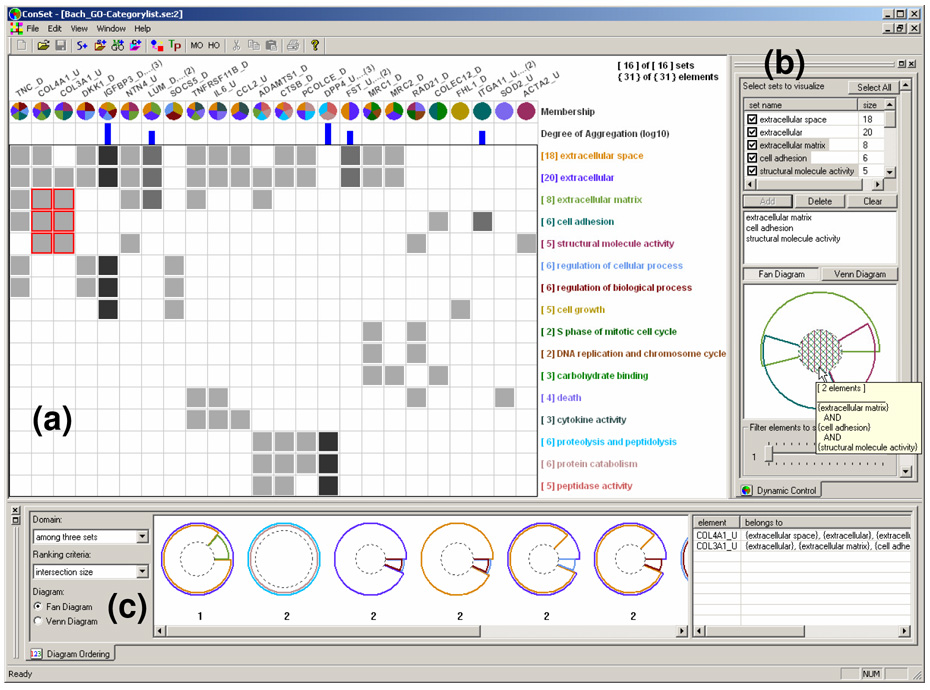
ConSet (Figure 1) supports those tasks for set concordance analysis with an improved permutation matrix (Bertin, 1981) and a novel diagram – Fan diagram. We organize this paper to present ConSet as follows. In the next section, we present related work and possible improvements. We then present our approach using permutation matrices, Fan diagrams, and matrix reordering techniques. Followed is the detail on how that approach is implemented in ConSet using various interaction techniques and the rank-by-feature framework (Seo and Shneiderman, 2005). After presenting an application example with two different clustering results, we summarize the result of a preliminary qualitative user study that we performed to identify usability problems of ConSet. We conclude this paper with discussion and future work.
Figure 1.
ConSet with 16 sets and 31 elements, (a) Permutation Matrix view shows an overview of the relationships among sets and elements. (b) Dynamic Control view enables users to filter sets and elements. (c) Diagram Ordering view shows the top 10 ranked diagrams of two or three sets by a selected ranking criterion. The elements list shows the name of the selected elements and their set membership information.
2 RELATED WORK
Many classical information visualization techniques have been used to reveal concordances between datasets. For example, coordinated multiple views provide users with ways to understand relationships between datasets behind the views (Baldonado et al., 2000). HCE shows two hierarchical clustering results (or dendrograms) at once. When users click on a branch of a dendrogram, HCE highlights the corresponding terminal nodes in the two dendrograms and shows the mapping between matching nodes with connecting lines (Seo and Shneiderman, 2002). TreeJuxtaposer (Munzner et al., 2003) applies brushing and linking techniques as well as Focus+Context techniques (Furnas, 1986) to compare two large phylogenic trees with guaranteed visibility. Users can easily see the discordance of the two hierarchical structures by examining the highlights and/or connections. Sometimes, the main purpose of selecting an internal node on a tree visualization is to select a set of terminal nodes reachable from the internal node. This problem can be generalized as a set visualization problem and the main task can be checking concordance between sets.
Visualization tools to show results from multiple search engines have been developed. MetaCrystal (Spoerri, 2004) based on the InfoCrystal layout (Spoerri, 1993) helps users fuse together search results from different search engines. It utilizes various visual features such as shape, size, color, proximity, and orientation to show the degree of overlap among different search results. Overlapping search results are expected to provide a more comprehensive, relevant, and effective view on the subjects delivered by the search terms. While these tools tackle the problems that can be interpreted as set concordance problems, they are not designed for general set visualizations.
The Venn diagram is the de facto standard in set visualization. A Venn diagram is a special case of an Euler diagram. Venn diagrams, by definition, should have areas to represent all possible combinations of sets regardless of whether that area is actually empty or not. This restriction is loosened in Euler diagrams, where empty areas do not have to appear. These diagrams are applied to various problems in bioinformatics, information retrieval, and information visualization. Some applications may require additional restrictions on how to draw Euler diagrams. For example, the shape of the contour should be a circle and more information such as cardinality is coded as size (area). It is important to mention that the terms Venn diagram and Euler diagram are often used in a confusing way. Euler diagrams, where each contour is a circle, are often called Venn diagrams. Even though this is theoretically not correct, in this paper, we follow this general perception of Venn diagram and use the term Venn diagram for the Euler diagram, in which each contour is a circle.
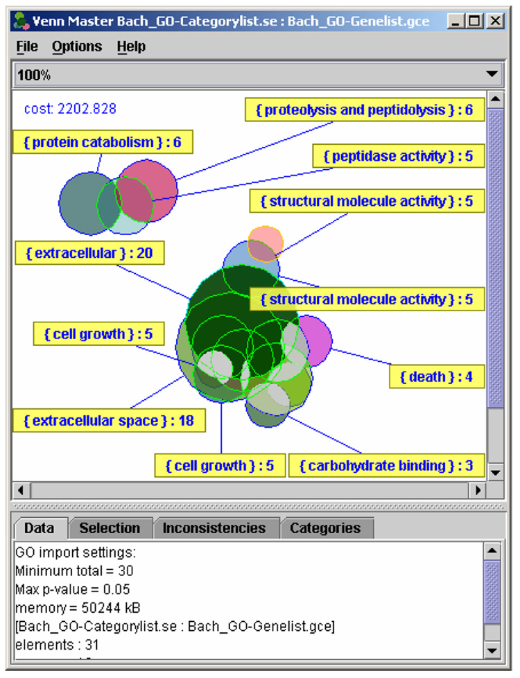
Venn diagrams usually have three sets, but there have been many approaches to represent many more sets in Venn diagrams. Recently, Verroust and Viaud showed that there was a way to draw extended Euler diagrams for up to 8 sets (Verroust and Viaud, 2004). VennMaster (Figure 2) is to our knowledge the only visualization tool that shows an arbitrary number of sets in Venn diagrams, where each set is represented as a polygon with a user-defined number of edges (Kestler et al., 2005). When there are enough edges, each set looks like a circle. The size of each polygon is proportional to the cardinality of the corresponding set. All properly size-coded polygons are placed in a way that the size of each intersection area is also proportional to the number of elements in the intersection. Since the optimal size coding and layout determination are too expensive to be solved in a pure analytical way, they resort to genetic algorithm techniques.
Figure 2.
VennMaster with the same dataset as in Figure 1. We manually placed labels of some sets using VennMaster.
VennMaster was developed to improve users’ interpretation and visualization of the output of the bioinformatics tool GoMiner (Zeeberg et al., 2003). GoMiner enables researchers to query the gene ontology database (www.geneontology.org; comprehensive annotation of genes or gene products) for associated categories in a cellular context. Given the fact that one gene can be associated with multiple gene ontology categories, the associations between the vast amount of genes and categories could be very complex and their interpretation is a challenging task. VennMaster translated this problem into a set-relationship visualization problem by treating a gene ontology category as a set and a gene product as an element. Since this approach turned out to be very useful, VennMaster was integrated into GoMiner. However, it has significant drawbacks from an information visualization perspective: (1) since it uses regular convex polygons, there are intersections of polygons where no element is mapped, which will be explained in the next section, (2) it is not guaranteed that all possible intersections are visible in the generalized Venn diagram display, so those inconsistent intersections are shown in a separate list view, and (3) the resulting layout of diagrams can be different in each run of the program because it uses a genetic algorithm to optimize the layout.
A matrix-based representation was often used to show relationships between items by using both rows and columns to represent items, and values in each cell to show the relationship. For example, Abello and Korn presented matrix and color map based techniques to visualize phone calls made between states (Abello and Korn, 2002). Van Ham used multilevel call matrices in the management of large software projects (van Ham, 2003). Kincaid applied an extended permutation matrix to the task of exploratory data analysis of multi-experiment microarray studies (Kincaid, 2004). Ghoniem et al. used adjacency matrices to interactively visualize and explore relations between constraints and variables in constraint problems (Ghoniem et al., 2004). Henry and Fekete recently developed a visualization system called MatrixExplorer that combines node-link diagrams with matrices to support the exploration of social networks (Henry and Fekete, 2006). Since previous works showed the potential of the matrix-based approach, we decided to use a matrix-based representation to visualize set relationships. We also evaluated how our tool works because none of the previous works have been evaluated.
We help users improve experience in interpreting complex set relationships without the overburden of drawing a lot of circles in proper scale and location. We apply the permutation matrix display to set concordance visualization to address the drawbacks mentioned above while providing a better overview of sets and elements. We also maintain the familiarity of simple diagrams such as Venn diagrams. Interaction techniques such as dynamic filtering enable users to narrow down to a handful of sets. The detail is shown as a general Venn diagram or our new Fan diagram once users select two or three sets.
3 VISUALIZING CONCORDANCE OF SETS
In this section, we present issues and problems that we try to address in this paper as well as system capabilities required to resolve those problems. At first, we present a new diagram called “Fan Diagram” to address problems in Venn diagrams. Then we describe our improved permutation matrix, which provides a special aggregation function for a large number of elements. Lastly, we discuss various reordering methods to support important set operations in the permutation matrix.
3.1 Avoiding Inconsistencies with Fan Diagrams
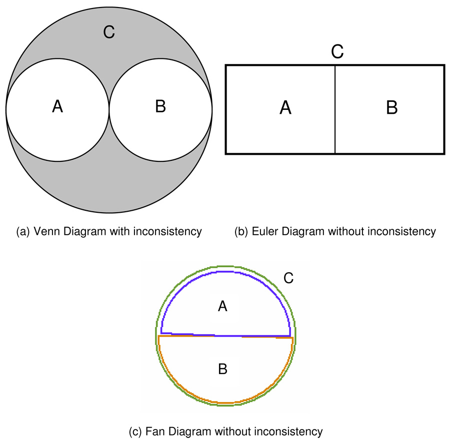
Venn diagrams are widely used to represent set relationships. While they are intuitive and familiar to users, Venn diagrams have the drawback of inconsistencies: (1) showing invalid areas (2) missing valid areas, and (3) size inconsistency. First, let’s assume relationships among three sets A, B and C; where A∩B=Ø and A∪B=C. If we represent this relationship in a Venn diagram, an empty set (C−(A∪B)=Ø) is shown as a region (a gray region in Figure 4a). If we loosen the constraint that each set should be a circle, this relationship can be represented in a Venn diagram without such inconsistency (Figure 4b). Then, however, the diagram loses the advantage that users are used to it. The second inconsistency is incurred by the fact that it is almost impossible to achieve a valid Venn diagram when there are a large number of sets. Thus, it is common that some valid areas are missing in Venn diagrams especially when many sets have intersections with many others. The last inconsistency, or the size inconsistency is due to not being able to accurately size-code all possible zones.
Figure 4.
Inconsistency of Venn Diagrams, (a) and (b) show the same set relationships (A∩B=Ø & A∪B=C). There is no element in the gray area at (a), but there is no way to avoid this inconsistency in Venn Diagrams. By loosening the constraint that each set should be a circle, it is possible to avoid the inconsistency in Euler Diagrams (b) and in Fan Diagrams.
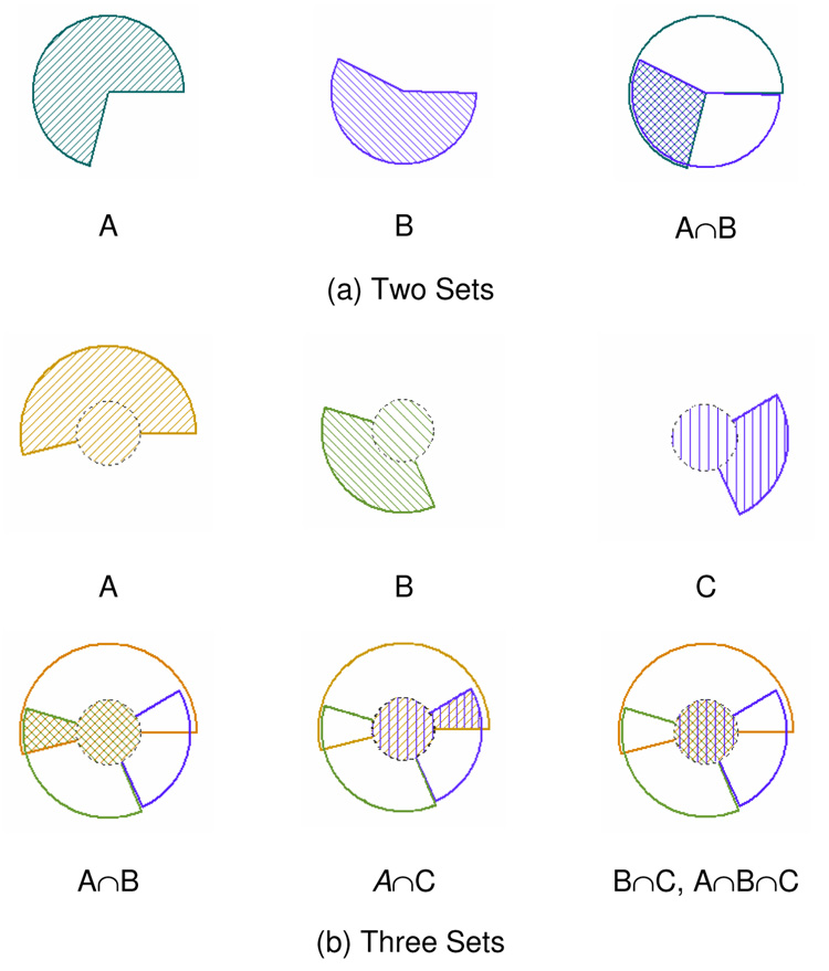
To maintain users’ familiarity with Venn diagrams while avoiding the three inconsistencies, we suggest applying the Visual Information Seeking Mantra (overview first, zoom and filter, then detail-on-demand) (Shneiderman, 1996). We use a permutation matrix view to show an overview. Dynamic queries, manual selections, and ranking of sets allow users to narrow down to two or three sets to have an easy-to-understand diagram. However, even with three sets, Venn diagrams still suffer from the inconsistencies explained above. To address these issues, we propose a new diagram called Fan diagram (Figure 5). It looks like a roulette wheel, where each set is represented as a fan-like shape. Fan diagrams have two major advantages over Venn diagrams.
They do not contain any invalid intersection areas
They accurately size-code every sub-region by the number of elements in the sub-region.
Figure 5.
Fan Diagrams for three sets. Each set is exactly size-coded by the number of elements in the set. In (b), the size of the inner circle clearly visualizes the amount of intersection of three sets.
For example, inconsistency in a Venn diagram shown in Figure 4a can be easily resolved with a Fan diagram (Figure 4c). We achieve the accurate size coding as follows. For two sets A and B, a circle represents the union (A∪B). The center angle of the fan for A is calculated as follows:
, where n(A) is the cardinality of set A. The center angle of the fan for B is calculated in the same way. If the intersection (A∩B) is not empty, the two fans for A and B overlap. The center angle for the overlapping fan is calculated as follows.
Therefore, all regions split by the fans of the sets A and B are accurately size-coded.
For three sets A, B and C, a circle represents the union (A∪B∪C). The intersection (A∩B∩C) is represented as a smaller concentric circle. If the outer circle has the radius of R, the radius of the inner circle (r) is calculated as follows.
Thus, the area of the center circle for the set (A∩B∩C) is exactly proportional to the cardinality of (A∩B∩C). A doughnut-shaped region between the inner and outer circles represents the set ((A∪B∪C)−(A∩B∩C)). In the doughnut-shaped region, there are three doughnut segments for the three sets (A−(A∩B∩C)), (B−(A∩B∩C)), and (C−(A∩B∩C)). Each doughnut segment has a center angle in proportion to the cardinality of the corresponding set. The center angle of the doughnut segment for the set (A−(A∩B∩C)) is calculated as follows.
Thus, we can accurately size-code all regions split by the inner and outer circles and three doughnut segments.
While Fan diagrams have advantages such as no inconsistencies and accurate size-coding as shown above, there are some problems with this approach. For example, circles and doughnut-shape regions are, in theory, drawn within a circle and a part of some outer arcs can overlap each other. Thus, sometimes it is difficult to know the exact bounds of a region. This problem can be attenuated by drawing region boundaries with a tiny displacement as shown in Figure 5.
3.2 Untangling Overlaps with Permutation Matrices
While significant overlaps of many sets in the general Venn diagram visualization tool clearly show high similarity among sets, those overlaps make it difficult to see the details on set memberships of the elements. Moreover, non-overlapped areas are hard to select when overlaps cover most of the elements. We thought that a permutation matrix, a proven multidimensional visual structure, could help untangle overlaps while carrying similarity information. For our set concordance visualization, each column represents an element and each row represents a set (Figure 3). If an element ej belongs to a set Si, we fill the cell C(i, j) with gray, otherwise C(i, j) is empty. Each set is given a distinctive color and the set name is displayed at the end of its corresponding row in its own color. We make a pool of 32 colors to paint set names and we use bit vector operations on 32 bit integer to perform set operations. Thus users can deal with up to 32 sets in our permutation matrix based visualization. While human eyes can distinguish many more colors, they are not reliable matching more than 11–20 colors on a geographic map with legend (Davies and Medyckyj-Scott, 1994). We also found that using more than 20 colors made users confused differentiating sets in the permutation matrix view.
Figure 3.
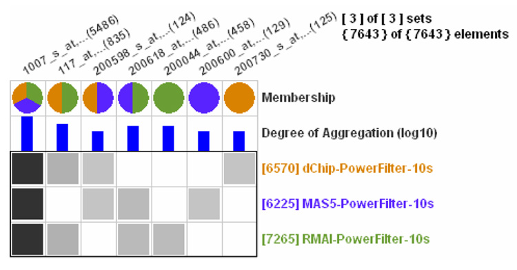
Permutation Matrix view shows the concordance of three power analysis results by three probe set signal algorithms with 7643 genes. Each row represents a power analysis result (SET) and each column represents a gene (ELEMENT). Aggregation drastically reduced the number of columns from 7643 to 7. The degree of aggregation is shown as histograms in log scale and as the intensity of cell darkening.
We summarize information regarding elements in column headers. These include, from top to bottom, Element Name, Set Membership, and Degree of Aggregation, each in a separate row. The set membership row shows pie-chart-like glyphs, where each pie piece represents a set to which the corresponding element belongs and is filled with the color of the set. With the color-coded set membership information, users can easily grasp how many sets an element belongs to.
Since all elements are visible unlike Venn diagram visualizations, it is necessary to implement a method to accommodate a large number of columns. When the number of elements is significantly larger than the number of sets, it is reasonable to assume that many elements will share the same set membership. Thus, by aggregating those elements into a single column, it is possible not only to save a significant amount of screen space but also to have a clear overview in a compact form. When several elements are aggregated to a single column, only the representative element that comes first in alphabetical order is shown in the permutation matrix, and other aggregated elements are hidden (Figure 3). The name of the representative becomes the corresponding column name. The number of aggregated elements is not only given in parentheses at the end of the representative element’s name but also visualized as a blue bar in the Degree of Aggregation row. The height of each bar is proportional to the number of aggregated elements and users can show the bars either in log scale or in linear scale. The intensity of a cell in the permutation matrix is also proportional to the number of aggregated elements. We linearly map the number of aggregated elements to the cell intensities in a RGB gray scale range from 50 to 170. Since human eyes can distinguish many less gray tones than colors (Davies and Medyckyj-Scott, 1994), we decided to use an intermediate range instead of the full range (0~255), where it made a more aesthetic impression.
3.3 Ordering Sets and Elements
The ordering of columns and rows significantly influences the observable pattern in a permutation matrix. Generally, the goal of reordering in a permutation matrix is to move significant cells to the diagonal of the matrix (Card et al., 1999). Set concordance analysis requires more flexible rearrangement to support important concordance analysis tasks. Thus, we propose four reordering methods for sets: HAC (Hierarchical Agglomerative Clustering) ordering (Eisen et al., 1998), moving a row to the top, order by name, and order by cardinality. For elements reordering, we also propose similar methods: HAC ordering, moving a column to the right end, order by name, and order by the number of set memberships. By putting similar elements (sets) close together, a permutation matrix display can provide users with a succinct and clear overview of sets and elements. We use a hierarchical agglomerative clustering algorithm to determine the order of rows and columns (Seo and Shneiderman, 2002). We define two different similarity functions, one for rows (or sets) and the other for columns (or elements). The similarity function for elements is defined as follows.
As the number of sets that have both em and en increases, the similarity value becomes larger (i.e. two elements are more similar). Once the clustering is done, we use the ordering of leaf nodes of the binary tree (or a result of the clustering) as a linear ordering for columns of the permutation matrix view, so that similar elements are close together in the view.
For sets reordering, sets are ordered in the same way as elements except for the similarity function, which is defined as the following:
Since HAC orderings of sets and elements significantly improve the overview of the permutation matrix, users can start a concordance analysis among sets and among elements with a better overview. Other clustering algorithms such as OPTICS (Ankerst et al., 1999) that give a linear ordering can be used instead of HAC. Heuristic reordering methods for permutation matrix (or “reorderable matrix”) (Mäkinen and Siirtola, 2005) can also be used to generate a linear ordering to achieve a similar goal. Henry and Fekete recently suggested an automatic reordering method for a symmetric matrix based on HAC and TSP (traveling salesman problem) (Henry and Fekete, 2006). Since their ordering is performed on each connected component separately, it can also be a good alternative to generate block-based linear ordering.
While HAC ordering helps users identify similar elements and sets, more reordering methods are needed for other important tasks. The ability to select a row or column and move the row to the top or the column to the right end can help users efficiently figure out where the element belongs or what elements the set has, respectively. Ordering by names facilitate users’ search on a set (or element) with a specific name. Ordering by cardinality (or the number of set memberships) speeds up frequent queries based on the quantity.
4 CONSET INTERFACE
ConSet enables users to examine the concordance of sets visually and interactively. ConSet consists of three views: Permutation Matrix view, Dynamic Control view, and Diagram Ordering view (Figure 1). The Permutation Matrix view shows an overview of all the visible sets. The Dynamic Control view on the right contains the sets list, the diagram area, and the filter controls. The Diagram Ordering view at the bottom shows the top 10 ranked diagrams. The elements list in the Diagram Ordering view shows the name of the selected elements and their set membership information.
4.1 Interaction, Brushing and Linking for Sets and Elements
ConSet, by default, rearranges the sets by HAC ordering. Since this places sets with more common elements closer to each other, users can easily find similar sets. In addition, the sets can also be ordered by their name and cardinality either by clicking on column-headers of the sets list in the Dynamic Control view or by using a pop-up menu on the Permutation Matrix view.
ConSet also provides four element reordering methods. When users right-click on a column header, a pop-up menu for element reordering shows up. Selecting the first menu item (“move to the right end”), users can move the corresponding element to the right end of the column. This enables users to easily compare several elements of interest by putting them side by side and right next to the set names. Elements can also be sorted by three criteria; alphabetically, by the number of set memberships, and by HAC ordering.
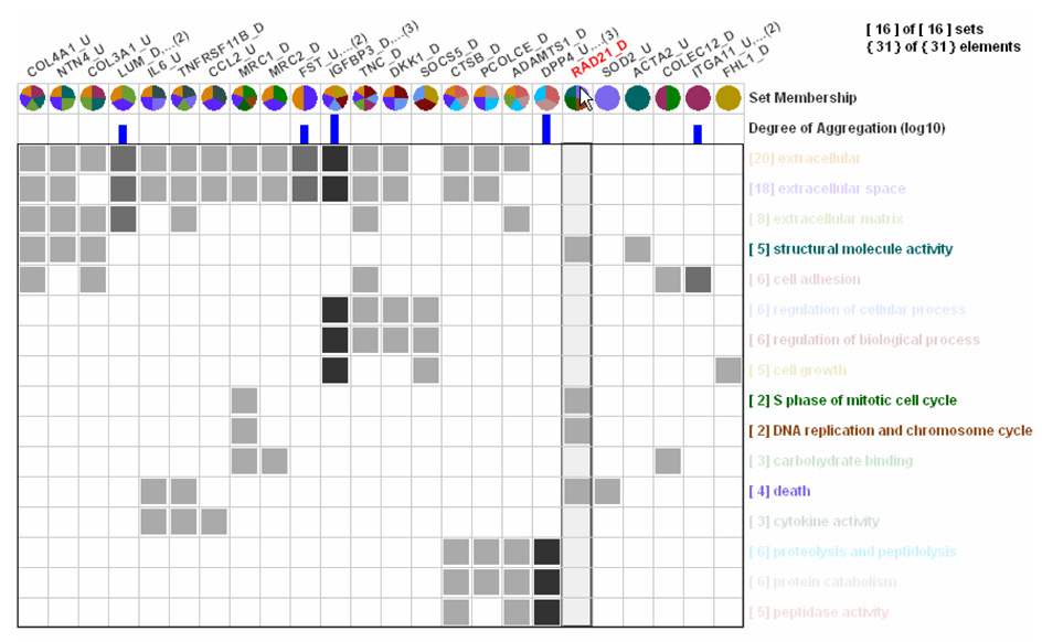
When users move the mouse over a column header of an element, ConSet highlights the corresponding column with a greenish-gray rectangle. In addition, the names of sets that do not contain that element are grayed out (Figure 6). This helps users identify all the sets that an element belongs to. The name of the element is also shown in the elements list in the Diagram Ordering view along with their set membership information. If the column is aggregated, the names of all the aggregated elements are shown.
Figure 6.
When users mouse over on a column header for an element, names of the sets (rows) containing the element are highlighted by diluting all other set names.
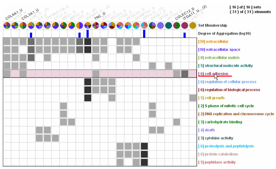
Similarly, if users move the mouse over a set name, the corresponding row is highlighted with a rectangle in the set’s own color. The names of elements that do not belong to the highlighted set are grayed out (Figure 7). The names of all the elements of the highlighted set come in the elements list. If users move the mouse over a gray-filled cell C(i, j) in the Permutation Matrix view, the cell is highlighted by a red rectangle with the j-th element’s name highlighted in red and the i-th set’s name underlined in red. The name of the j-th element and the names of its aggregated, if any, elements are shown in the elements list.
Figure 7.
When users mouse over on a set name, names of all elements in the set are highlighted by diluting all other element names.
4.2 Dynamic Filtering of Sets and Elements
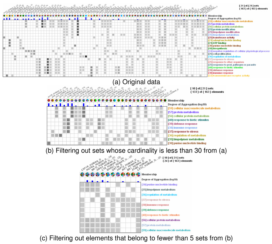
ConSet, by default, shows the names of all the sets in the sets list in the Dynamic Control view (Figure 1b). It allows users to change the visibility of sets in the Permutation Matrix view. For example, if users check (or uncheck) a check box right before a set name in the sets list, ConSet shows (or hides) the set in the Permutation Matrix view. This enables users to manually filter out uninteresting sets to reduce the number of sets to examine. For example, the number of sets was reduced from 21 (Figure 8a) to 10 (Figure 8b) when we hid the sets whose cardinality is less than 30. This task can be easily done after sorting the list by the “size” column. The aggregation of elements is based on their memberships to the visible sets, not to all the sets. So, whenever the visibility of sets changes, ConSet re-computes the aggregation of elements. In addition, ConSet reassigns the set colors. It was because we do not expect users to remember the color for each set. We use colors to help users differentiate sets.
Figure 8.
Filtering of sets and elements with human muscular dystrophy dataset of 21 sets and 163 elements.
ConSet also enables users to dynamically filter elements to be shown in the Permutation Matrix view. For example, the “Filter elements to show” slider control with a value t filters to show only elements that belong to at least t sets. Filtered elements or sets can either be removed from or be grayed out in the Permutation Matrix view. The number of elements was further reduced from 133 (Figure 8b) to 24 (Figure 8c) when we filtered out the elements that do not belong to at least 5 sets.
4.3 Showing Relationships between Sets
ConSet visualizes the relationship of two or three sets in the diagram area in the Dynamic Control view. Users can add up to three sets into the diagram area from the sets list. When users select a set in the sets list, the corresponding set is highlighted in the Permutation Matrix view while the names of all the elements of the selected set are shown in the elements list (Figure 1c). When they click the “Add” button at the bottom of the sets list, selected sets are added to the diagram area. The names of added sets are displayed in the upper window of the diagram area and a diagram of their relationship is drawn in the lower window of the diagram area. Users can remove sets from the diagram area by clicking the “Delete” button after selecting them from the upper window. They can also clear the diagram area by clicking the “Clear” button.
When users move the mouse over a set in a Venn diagram or a Fan diagram, a tooltip appears to show its name and cardinality. At the same time, the set is highlighted in the Permutation Matrix view and the elements information in the set is shown in the elements list. When users move the mouse over a region for an intersection, the elements in the intersection are highlighted in the Permutation Matrix view and their information appears in the elements list. If users click on a region in a diagram, the corresponding region is selected and the selection is toggled on another click. This enables users to examine all elements in the elements list when scrolling is required.
4.4 Diagram Ordering using the Rank-by-Feature Framework
We applied the Rank-by-Feature Framework (Seo and Shneiderman, 2005) to ConSet. The Diagram Ordering view shows the top 10 diagrams ranked by some criterion (Figure 1c). From the “Domain” combo-box at the top left corner of the view, users can select the ordering of diagrams between two or among three sets. Two ranking criteria are provided in the “Ranking criteria” combo-box. The criterion “intersection size” ranks diagrams by the size of the intersection, and the criterion “overlap metric” orders diagrams by the ratio of the intersection set size to the union set size. This helps users easily capture a collection of important sets that meets the ranking criteria. Users can see each of the top 10 ranked diagrams in two ways: as a Venn diagram and a Fan diagram.
5 APPLICATION EXAMPLE: CLUSTERS AS SETS
We extended ConSet to help users compare clustering results by adding a special functionality. An output of a clustering algorithm is in most cases a group of disjoint clusters, each of which is treated as a set in ConSet. ConSet arranges sets to form several groups where a set from one clustering result is put together with one or more similar sets from the other clustering result.
In the beginning, among all clusters of two different clustering results, say CR1 and CR2, a cluster (say c_anchor) with the most elements is selected as an anchor for a new group. For example, let’s assume that the first anchor cluster c_anchor is from the clustering result CR1. Then the clusters from CR2, all of whose elements belong to c_anchor are added to the group. A cluster from CR2 which is not a subset of c_anchor but has more intersections with c_anchor than with any other clusters in CR1 is also added to the group. After completing a group with the current anchor cluster c_anchor, a new group formation begins by finding a new anchor cluster from remaining clusters with the most elements.
ConSet arranges these groups row by row and groups are separated by bold horizontal lines. ConSet adds a special row called Cluster Concordance to the column header (Figure 9). Each matching element within a group is projected onto the Cluster Concordance row. If an element is not matched within its group, the corresponding cell is left unfilled. If it is matched, the cell is filled in red and it is color-coded by the ratio of the cardinalities of the two sets, one from each clustering result, that have the matching element. This color-coding is intended to give an appropriate penalty to the cases where one big cluster from one clustering result overlaps with several small clusters from the other clustering result, which is a less concordance.
Figure 9.
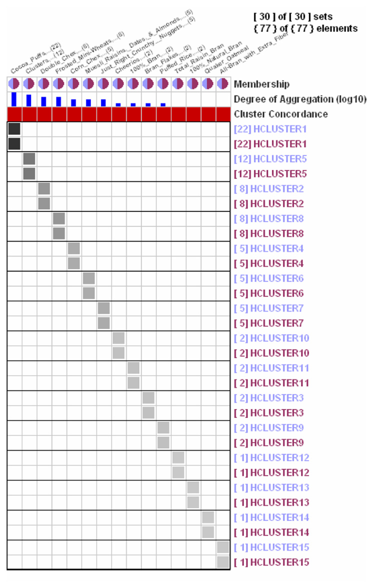
Clustering results comparison when two methods produce identical clusters. The Cluster Concordance row consists of all dark red cells since each element (or aggregated elements) is matched in two clustering results with the same cardinality. Gray-shaded cells are perfectly aligned along the diagonal line.
ConSet allows users to visually examine concordance between two clustering results by skimming though the Cluster Concordance row. As shown in Figure 9, if the two clustering results are identical (or completely concordant), all the cells on the Cluster Concordance row should be dark red. In addition, all gray-filled cells in the permutation matrix should be aligned along the diagonal line. Cells deviating from the diagonal line indicate discordant elements. Through these two display measures ConSet enables users to examine the concordance between two clustering results.
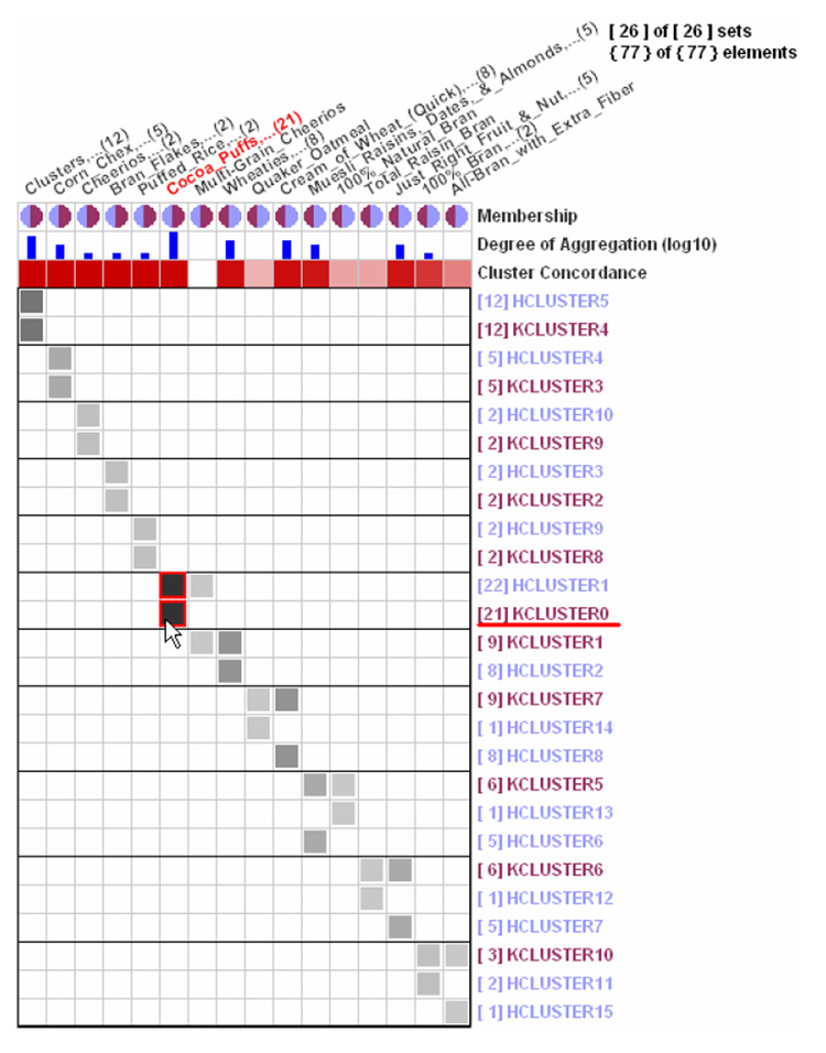
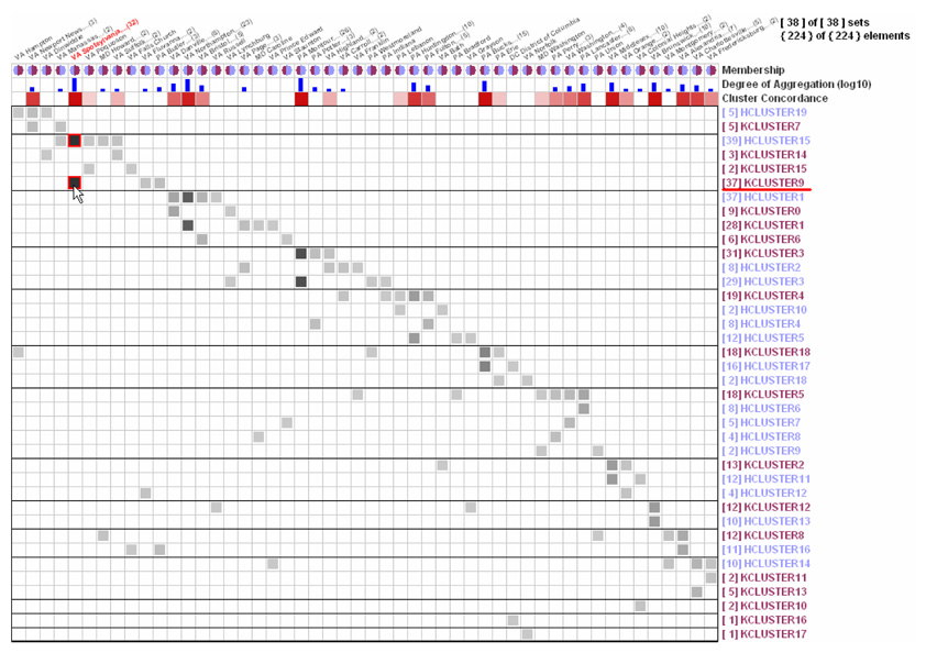
Figure 10 and Figure 11 show the concordance between the hierarchical clustering result and K-means clustering result with Euclidean distance measure with 77 breakfast cereals data and with Census data of 224 US eastern counties near MD, respectively. Many dark red cells at the Cluster Concordance row in Figure 10 indicate that those two results are very concordant with each other despite an outlier, “Multigrain_Cheerios,” which does not belong to any matching clusters pair. On the other hand, Figure 11 shows that, overall, the two clustering results for the census dataset are not so concordant even though there are several strong matching counties groups with dark red cells on the Cluster Concordance row. Gray cells below the diagonal line are the ones that break down the concordance between two clustering results.
Figure 10.
Clustering Results Comparison (HCLUSTER: Hierarchical Clustering, KCLUSTER: K-means Clustering) with 77 breakfast cereals data. Two clustering results are quite consistent with each other because (1) the Cluster Concordance row is almost filled with dark red cells except for the empty cell for “Multi_Grain_Cheerios” and four other thin red cells, and (2) gray-filled cells are well aligned, though not perfectly, along the diagonal line.
Figure 11.
Clustering Results Comparison (HCLUSTER: Hierarchical Clustering, KCLUSTER: K-means Clustering) with Census data of 224 US eastern counties in or near Maryland. These two clustering results are not very consistent with each other. Gray cells deviating from the diagonal line with corresponding empty cells in the Cluster Concordance row are the ones that differentiate the two clustering results.
The same approach can also help users identify statistical associations between categorical variables or between a clustering result and a categorical variable. Users can partition a dataset into disjoint sets according to a categorical variable. For example, the census data for all US counties can be partitioned into disjoint sets according to categorical variables, such as “poverty level” and “education level.” Since an integer- or real-type variable can be converted to a categorical variable by a simple binning, ConSet can be used to visualize statistical associations between a categorical variable and an integer- or real-type variable.
In summary, clustering results comparison in ConSet provides an overview where users can see elements as well as sets, together with a compact one-dimensional overview (the Cluster Concordance row) for the comparison. We note here that there could be a simple alternative to our approach. As presented in various information visualization systems (Guo, 2003;Seo and Shneiderman, 2005), we can implement a set-set matrix to show the correlation between sets where clusters from one algorithm are arranged in row and clusters from the other algorithm are arranged in column. We can color-code each cell by the number of common elements. Then users can check the overview of the concordance of the two clustering results on the matrix.
6 CONSET EVALUATION
We conducted a qualitative usability study to understand how well ConSet works and to identify any usability issues. During individual test sessions, the experimenter took notes on usability issues that participants experienced during the walk through of the system. We compared ConSet to VennMaster (Figure 2) to augment our usability study since VennMaster is the only comparable tool to ConSet. We measured the time to complete each task using a stopwatch and counted the number of wrong answers, time-outs, and give-ups. We have to note that the number of subjects is too small to perform a statistical analysis on those measurements, thus we only report on raw numbers without referring to statistical significance.
6.1 Data and Participants
We used two similar datasets exported from GoMiner for this user study. Each GoMiner dataset consists of two text files, the category summary file and the gene summary file. ConSet combines the two text files to generate sets of genes (gene ontology categories), as VennMaster does. One dataset had 16 sets and 31 elements and the other had 23 sets and 28 elements.
We recruited 8 biologists (5 males and 3 females) including 1 male pilot subject. They had used neither VennMaster nor ConSet before this study. The pilot data is not included in the reporting of the experimental task data because the interfaces and tasks were improved after the pilot.
6.2 Procedure and Tasks
Each participant used both interfaces; interface order was counterbalanced. Participants first received training on the first interface and were allowed to play with the program to learn the basic features. They were allowed to ask questions during the training. For each interface, participants spent about 10 minutes on average. Next, they were asked to conduct 9 tasks as quickly as they could. Each task had a 3-minute time limit and participants were allowed to give up a task at any time. After a short break, the same procedure was repeated with the second interface. Preferences, comments, and suggestions were collected during debriefing. Each session lasted 38 minutes on average.
To evaluate our tool with realistic tasks, we chose the tasks through a semester-long task analysis with biologists, who were often required to do concordance analyses for their research projects in a large biology laboratory. After performing a genome wide expression profiling project or a proteomics project, biologists usually want to know what cellular components or biological processes in the gene ontology database are involved in their data. In addition to identifying which genes or proteins are associated with a specific gene ontology term, they need to figure out associations with more than two gene ontology terms. This requires biologists to go through long manual tasks using GoMiner, one of the most commonly used tools.
The list of tasks follows.
What are the top three biggest sets?
What is the size of the biggest set?
What are the top three elements that belong to the most sets?
Name the sets that have a given element.
Name the sets that have two given elements.
What are three sets that share the most elements?
Name the elements in the intersection of two sets.
Name the elements in the intersection of three sets.
Name the elements that are in A but not in B.
6.3 Results
6.3.1 Usability Issues
We observed several usability issues in ConSet that needed to be addressed. There was clear user frustration around the selection of sets in the Dynamic Control view on the right. Three participants had difficulty choosing sets to show in the diagram view. Even though the check box in front of the set name is to filter sets to show in the main Permutation Matrix view, some of the participants thought that the checked sets would be added into the diagram area.
Another issue is that there is no way to select the difference area (A–B). This is because single click behaves differently depending on where users select; click on the intersection area selects the intersection but click on the difference area selects the entire set. To address this issue, we can introduce a more consistent interaction style to select areas in the Venn and Fan diagrams. First, a single click should select the smallest containing area. So, if users click on the difference or intersection area, the difference or intersection will be selected. Second, users should be able to combine two areas by clicking an area with the control key. Lastly, a double click on an area should select all the sets that contain the area. So, users can select an entire set by double clicking on the difference area.
There is no efficient way to find elements/sets with their names. Even though ConSet enables users to sort elements/sets by their name, four participants did not use the sort feature and sequentially scanned element names for task 4. This would be a bigger problem when the number of elements is large. We can address this issue by providing a simple search on the element and set name.
The familiarity with the traditional Venn diagram makes it hard for users to utilize the new Fan diagram. In addition, the tasks used in the study were easy enough to be completed with the Venn diagrams. However, we believe that instantaneous highlighting of the area on mouse-over along with informative tooltip text helped users understand how to interpret the diagram. It was encouraging to observe that some users utilized the Fan diagram after a short tutorial.
6.3.2 Error, Task times, and Preferences
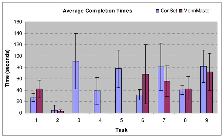
Participants with ConSet completed more tasks with fewer errors. Out of 63 questions across participants, while there were only 6 time-outs and 5 incorrect answers with ConSet, there were 30 time-outs and 10 incorrect answers with VennMaster. With VennMaster no one could complete task 3, 4, and 5 within the 3 minute time limit. However, 7, 6, and 5 participants answered correctly with ConSet for task 3, 4, and 5 respectively. We believe this is because ConSet provides good support for showing the names of elements. For task 6, two participants forgot how to use diagram ordering in ConSet. Two participants were not able to complete for task 9 and one for task 1 and 5 with ConSet. Figure 12 shows average task completion times (time-outs were not included in the task time analysis).
Figure 12.
Average task completion times. Seven subjects performed nine tasks with ConSet and VennMaster. No one could complete task 3, 4, and 5 within the 3 minute time limit with VennMaster while 7, 6, and 5 participants answered correctly with ConSet respectively.
When asked which interface they preferred overall, 6 out of 7 participants chose ConSet over VennMaster. The reasons from participants include “I was able to complete all tasks,” “I like interactive highlighting,” “more user-friendly,” and so on. One participant who preferred VennMaster said that it is simple and she got used to it. She also said that she might change her preference if she gets comfortable with the Permutation Matrix view by using it more. And one other participant who preferred ConSet said that more training time is needed to get used to ConSet.
6.4 Limitations
As we mentioned at the beginning of this section, we performed a preliminary usability study on ConSet, but we also tried to augment our study by comparing the most comparable tool, VennMaster. Since we measured the time and accuracy, our study could be considered as a controlled user study. From that perspective, there are limitations of our study. First of all, seven subjects and a total of 63 data points per UI can certainly cause some concern over the solidity of the analysis. It is necessary to increase the number of subject at least to the double to make the findings valid and generalizable. Secondly, the emphasis on task completion time over accuracy in the instructions to subjects might be unrealistic since getting an answer correctly is more important than getting it quickly in reality. Lastly, while we allowed subjects to use the two tools until they felt comfortable with the tool after the training session, 10 minute training time still might be too short for subjects to get familiarized with the UIs.
7 CONCLUSION AND FUTURE WORK
We developed a general set visualization tool called ConSet built upon the permutation matrix, which supports important tasks for concordance analysis of sets and elements. ConSet shows an overview of relationships among sets and helps users efficiently perform fundamental set operations such as intersection and difference. It provides the top 10 collections of sets that are most similar, measured either by the number of common items or by the overlap metric. ConSet also enables users to aggregate and filter sets and elements, which improves the scalability.
Permutation matrix display makes it possible to avoid the problem that too many sets overlap in the general Venn diagrams. Another strength of the permutation matrix is that it provides better support for showing the names of elements. ConSet performed much better when tasks required users to access information through elements. Our Fan diagram addresses the inconsistencies that may occur in Venn diagrams: showing invalid areas, missing valid areas, and the size inconsistency. It also provides exact size coding of all areas. The intersection of three sets is clearly visualized as an inner concentric circle.
We conducted a qualitative user study to evaluate how our tool works in comparison with a traditional set visualization tool based on a Venn diagram. In addition to the usability problems identified in ConSet, we observed that users completed more tasks with fewer errors with ConSet than with the traditional interface and most users preferred ConSet. However, our user study had several limitations to be considered a controlled user study. Our future work includes improving ConSet by fixing the usability issues identified and performing more thorough controlled user study with enough subjects. Furthermore, we believe that Fan diagrams alone deserve a controlled user study in comparison with traditional Venn diagrams. Another interesting future work regarding evaluation could be a longitudinal case study with ConSet. Such case studies can complement controlled user studies with predefined simple tasks in a short period of time, since they are done in more realistic settings with actual datasets for a long period of time.
Footnotes
Publisher's Disclaimer: This is a PDF file of an unedited manuscript that has been accepted for publication. As a service to our customers we are providing this early version of the manuscript. The manuscript will undergo copyediting, typesetting, and review of the resulting proof before it is published in its final citable form. Please note that during the production process errors may be discovered which could affect the content, and all legal disclaimers that apply to the journal pertain.
Contributor Information
Bohyoung Kim, Seoul National University Bundang Hospital, 300 Gumi-dong, Bundand-gu, Seongnam-si, Gyeonggi-do, 463-802, Korea, Email: bhkim@snubhrad.snu.ac.kr.
Bongshin Lee, Microsoft Research, One Microsoft Way, Redmond, WA 98052, Email: bongshin@microsoft.com.
Jinwook Seo, Research Center for Genetic Medicine, Children’s Research Institute, 111 Michigan Ave NW, Washington, DC 20010, USA, Email: jseo@cnmcresearch.org Phone: +1-202-884-4942, Fax: +1-202-884-6014.
REFERENCES
- Abello J, Korn J. MGV: a system for visualizing massive multigraphs. IEEE Transactions on Visualization and Computer Graphics. 2002;8(1):21–38. [Google Scholar]
- Ankerst M, Breunig MM, Kriegel H-P, Sander J. OPTICS: ordering points to identify the clustering structure. ACM SIGMOD Record. 1999;28(2):49–60. [Google Scholar]
- Baldonado M, Woodruff A, Kuchinsky A. Guidelines for using multiple views in information visualization. Proceedings of Advanced Visual Interfaces; Palermo, Italy. 2000. pp. 110–119. [Google Scholar]
- Becker RA, Cleveland WS. Brushing scatterplots. Technometrics. 1987;29:127–142. [Google Scholar]
- Bertin J. Graphics and Graphic Information-Processing. New York: de Gruyter, Berlin; 1981. [Google Scholar]
- Card SK, Mackinlay JD, Shneiderman B. Readings in Information Visualization: Using Vision to Think. San Francisco, California: Morgan-Kaufmann; 1999. [Google Scholar]
- Davies C, Medyckyj-Scott D. Introduction: The importance of human factors. In: Hearnshaw HM, Unwin D, editors. Visualization in geographical information systems. New York: Chichester; 1994. pp. 189–192. [Google Scholar]
- Eisen MB, Spellman PT, Brown PO, Botstein D. Cluster analysis and display of genome-wide expression patterns. Proceedings of the National Academy of Sciences of the United States of America. 1998;95(25):14863–14868. doi: 10.1073/pnas.95.25.14863. [DOI] [PMC free article] [PubMed] [Google Scholar]
- Furnas GW. Generalized fisheye views. Proceedings of the Conference on Human Factors in Computing Systems; Boston, MA, USA. 1986. pp. 18–23. [Google Scholar]
- Ghoniem M, Jussien N, Fekete J-D. VISEXP: visualizing constraint solver dynamics using explanations. Proceedings of the Seventh International Florida Artificial Intelligence Research Society Conference; Miami, FL, USA. 2004. [Google Scholar]
- Guo D. Coordinating computational and visual approaches for interactive feature selection and multivariate clustering. Information Visualization. 2003;2:232–246. [Google Scholar]
- Henry N, Fekete J-D. MatrixExplorer: a dual-representation system to explore social networks. IEEE Transactions on Visualization and Computer Graphics. 2006;12(5):677–684. doi: 10.1109/TVCG.2006.160. [DOI] [PubMed] [Google Scholar]
- Kestler HA, Muller A, Gress TM, Buchholz M. Generalized Venn Diagrams: a new method of visualizing complex genetic set relations. Bioinformatics. 2005;21(8):1592–1595. doi: 10.1093/bioinformatics/bti169. [DOI] [PubMed] [Google Scholar]
- Kincaid R. VistaClara: an interactive visualization for exploratory analysis of DNA microarrays. Proceedings of the ACM Symposium on Applied Computing; Nicosia. Cyprus: 2004. pp. 167–174. [Google Scholar]
- Mäkinen E, Siirtola H. The barycenter heuristic and the reorderable matrix. Informatica. 2005;29(3):357–363. [Google Scholar]
- Munzner T, Guimbretiere F, Tasiran S, Zhang L, Zhou Y. TreeJuxtaposer: scalable tree comparison using Focus+Context with guaranteed visibility. ACM Transactions on Graphics. 2003;22(3):453–462. [Google Scholar]
- Seo J, Gordish-Dressman H, Hoffman EP. An interactive power analysis tool for microarray hypothesis testing and generation. Bioinformatics. 2006;22(7):808–814. doi: 10.1093/bioinformatics/btk052. [DOI] [PubMed] [Google Scholar]
- Seo J, Shneiderman B. Interactively exploring hierarchical clustering results. Computer. 2002;35(7):80–86. [Google Scholar]
- Seo J, Shneiderman B. A rank-by-feature framework for interactive exploration of multidimensional data. Information Visualization. 2005;4(2):99–113. [Google Scholar]
- Shneiderman B. The eyes have it: a task by data type taxonomy for information visualizations. Proceedings of IEEE Symposium on Visual Languages; Boulder, CO, USA. 1996. pp. 336–343. [Google Scholar]
- Spoerri A. InfoCrystal: a visual tool for information retrieval. Proceedings of the IEEE Visualization Conference; San Jose, CA, USA. 1993. pp. 150–157. [Google Scholar]
- Spoerri A. MetaCrystal: Visualizing the degree of overlap between search engines. Proceedings of the ACM International World Wide Web Conference; New York, NY, USA. 2004. pp. 378–379. [Google Scholar]
- van Ham F. Using multilevel call matrices in large software projects. Proceedings of IEEE Symposium on Information Visualization; Seattle, WA, USA. 2003. pp. 227–232. [Google Scholar]
- Verroust A, Viaud M-L. Ensuring the drawability of extended euler diagrams for up to 8 sets. Lecture Notes in Computer Science. 2004;2980:128–141. [Google Scholar]
- Zeeberg B, Feng W, Wang G, Wang M, Fojo A, Sunshine M, Narasimhan S, Kane D, Reinhold W, Lababidi S, Bussey K, Riss J, Barrett J, Weinstein J. GoMiner: a resource for biological interpretation of genomic and proteomic data. Genome Biology. 2003;4(4):R28. doi: 10.1186/gb-2003-4-4-r28. [DOI] [PMC free article] [PubMed] [Google Scholar]


