

Abstract
Background
The recent development of semiautomated techniques for staining and analyzing flow cytometry samples has presented new challenges. Quality control and quality assessment are critical when developing new high throughput technologies and their associated information services. Our experience suggests that significant bottlenecks remain in the development of high throughput flow cytometry methods for data analysis and display. Especially, data quality control and quality assessment are crucial steps in processing and analyzing high throughput flow cytometry data.
Methods
We propose a variety of graphical exploratory data analytic tools for exploring ungated flow cytometry data. We have implemented a number of specialized functions and methods in the Bioconductor package rflowcyt. We demonstrate the use of these approaches by investigating two independent sets of high throughput flow cytometry data.
Results
We found that graphical representations can reveal substantial nonbiological differences in samples. Empirical Cumulative Distribution Function and summary scatterplots were especially useful in the rapid identification of problems not identified by manual review.
Conclusions
Graphical exploratory data analytic tools are quick and useful means of assessing data quality. We propose that the described visualizations should be used as quality assessment tools and where possible, be used for quality control.
Keywords: flow cytometry, high throughput, quality assessment, visualization, exploratory data analysis, statistics, software
Traditionally, flow cytometry (FCM) has been a tube-based technique limited to small-scale laboratory and clinical studies. High throughput methods for FCM have recently been developed for drug discovery and advanced research methods (1-4). As an example, flow cytometry high content screening (FC-HCS) can process up to a thousand samples daily at a single workstation, and the results have been equivalent or superior to traditional manual multiparameter staining and analysis techniques. The amount of information generated by high throughput technologies, such as FC-HCS, need to be transformed into executive summaries, which are brief enough for creative studies by a human researcher (5). Quality control and quality assessment are crucial steps in the development, and use of new high throughput technologies and their associated information services (5-7). Quality control in clinical cell analysis by FCM has been considered (8,9). As an example, Edwards et al. (9) proposed some quality scores for monitoring the quality of immunophenotyping process (e.g., blood acquisition, cell preparation, lymphocyte staining). They showed that a low degree of temporal parameter variation exits within individual whereas significant variations can exist between donors with respect to the parameter monitored. However little has been done with high throughput FCM. For example, quality control of FCM experiments should include the assessment of instrument parameters that affect the accuracy and precision of data. In that respect, Gratama et al. (10) have proposed some guidelines such as monitoring the fluorescence measurements by computing calibration plots for each fluorescent parameter. However, such procedures are not yet systematically applied, and data quality assessment is often needed to overcome a lack of data quality control. The aim of data quality assessment is to detect whether any measurements of any samples are substantially different from the others, in ways that were not likely to be biologically motivated. The rationale is that such samples should be identified, investigated, and potentially removed from any downstream analyses. Quality control, on the other hand, measures such quantities during the assaying procedure and can alert the user to problems at a time where they can be corrected.
Data quality assessment in high throughput FCM experiment is complicated by the volume of data involved and by the many processing steps required to produce those data. Each instrument manufacturer has created software to drive the data acquisition process of the cytometer (e.g., CellQuest Pro by BD Biosciences, San Jose, CA; Summit by DakoCytomation, Fort Collins, CO; or Expo32 by Beckman Coulter, Fullerton, CA). These tools are primarily designed for their proprietary instrument interface and offer few, or no, data quality assessment functions. Third party analysis and management tools, such as FlowJo (Tree Star, Ashland, OR), WinList (Verity Software House, Topsham, ME) or FCSExpress (Denovo Software, Thornhill, Canada) provide researchers with more capable “offline” analysis tools but remain limited in term of data quality assessment.
We propose a number of one- and two-dimensional graphical methods for exploring the data in the hope that they would be of some use to the investigators. The basis of our approach is that, given a cell line, or a single sample, divided in several aliquots, the distribution of the same physical or chemical characteristics (e.g., side light scatter - SSC-or forward light scatter -FSC-) should be similar between aliquots. To test this hypothesis, we made use of graphical exploratory data analysis (EDA). Five distinct visualization methods were implemented to explore the distributions and densities of ungated FCM data: Empirical Cumulative Distribution Function (ECDF) plots, histograms, boxplots, and two types of bivariate plots. These different graphical methods should provide investigators with different views of the data. ECDF plots have been widely used in the analysis of microarray data where they help to detect defective print tips, or plates of reagents that have not been well handled (11). These plots can quickly reveal differences in the distributions, but are not particularly useful for understanding the shape of a distribution. Histograms help to visualize the shape of the distribution and can reveal structure, such as the mode. Boxplots summarize the location of the distribution and can reveal asymmetry but are mainly applicable to unimodal distributions. Boxplots are also commonly used in the processing of microarray data where they help to identify hybridization artifacts and assess the need for between-array normalization to deal with scale differences among different arrays (11). Finally, we use bivariate plots representation in two different ways. In fact in some cases, when comparing two samples, we found two-dimensional displays more informative, i.e., two-dimensional summaries can show differences in samples, while the one-dimensional summaries, mentioned earlier, are similar. One common use of bivariate plots in FCM experiments is to display the joint distribution of two continuous variables as dot plots (e.g., FSC versus SSC). However the analysis of such dot plots might be a challenge as the high density of plotted data points (an average of 10,000 data points per sample) might form a blot and the frequency of the observations might not be easily appreciated. To overcome this issue we propose to use contour plots where contour lines might be interpreted as the frequency of observations with respect to the x–y plane. The second use of bivariate plots, for high throughput FCM data, is to render per well summary statistics for a particular plate in the format of a scatterplot. In this view each point represents a single well and the x and y values are chosen to be various summary statistics.
We illustrate the need and usefulness of those visualization tools to assess FCM data quality through examination of two FC-HCS datasets. Our results demonstrate that the application of these graphical analysis methods to ungated FCM data provides a systematic and efficient method of data quality assessment, preventing time-consuming gating and further analysis of unreliable samples. Although the methods we propose are primarily aimed at the discovery of data quality problems, they may detect differences that are biologically motivated. Hence, we discourage the automatic removal of aberrant samples and emphasize the need to check whether such underlying biological causes are present.
MATERIALS AND METHODS
The basis of our methodology is to compare different samples, aliquots, or variables where few, if any differences, should be observed. We propose to use visualization methods where it is easy to detect departures from this anticipated behavior.
Flow Cytometry High Content Screening
The details of the FC-HCS technique have been published by Gasparetto et al. (2). In FC-HCS, all procedures have been miniaturized so that small numbers of cells can be stained in 96-well plates with fluorescently conjugated antibodies using robotic fluid handlers. Fluorescence activated cell sorter (FACS) analysis has been automated using a robotic device termed a Multiwell Auto-Sampler (MAS, Becton Dickinson) that allows sample acquisition from 96-well plates. FCM data acquisition was performed using MPM Flow (Becton Dickinson). FSC and SSC parameters were recorded in linear mode and fluorescent intensities were recorded in four-decade log.
Graft Versus Host Disease Dataset
The FC-HCS technique was used to identify biomarkers that would predict the development of GvHD; one of the most significant clinical problems in the field of allogeneic blood and marrow transplantation. The GvHD dataset is a collection of weekly peripheral blood samples obtained from 31 patients following allogeneic blood and marrow transplant. Samples were taken at various time points before and after transplantation. On average, there were 14 (±3) time points per patient, collected approximately every 10 days (±14). Samples were collected from 0 to 16 days (average 6 ± 4 days) before the transplantation and until 49–400 days (average 125 ± 81 days) after transplantation. Twenty-three different cluster of differentiation (CD) were targeted to assess immune cell lineages and functional states. At each time point, every patient blood sample was divided into 8 to 10 aliquots. Each aliquot was labeled with four different fluorescent probes and the fluorescent intensity of each biomarker was determined for at least 10,000 cells per sample.
Rituximab Dataset
The Rituximab dataset is based on a FC-HCS screening of a 2,000 compound chemical library to identify agents that would enhance the anti-lymphoma activity of the therapeutic monoclonal antibody Rituximab (2). Daudi cells (derived from Human Burkitt Lymphoma) were placed in 96-well plates with 10 μM BrDU. Samples were incubated for 12 h, and then two duplicate plates were prepared, one with compound alone and one with 10 μg/ml Rituximab. After incubation cells were harvested and stained with anti-BrDU and 7-ADD. Cells were delivered directly from 96-well plates to a FACSCalibur using a Microtiter Well Plate Device (BD Biosciences).
Graphical Methods
We present five distinct visualization methods for exploring the densities of ungated FCM data: (i) ECDF plots, (ii) histograms, (iii) boxplots, (iv) scatterplots of summary statistics, and (v) contour plots.
ECDF plot shows the proportion of the observed data less than each x value, as a function of x. ECDF plots were grouped by 96-well plate, time points and/or stains but can be grouped by any other important variables.
A unity normalized histogram provides an estimate of the probability that a cell measurement will fall into a particular channel. If one empirically measures values of a continuous random variable repeatedly and produces a histogram depicting relative frequencies of output ranges, then this histogram will resemble the random variable’s probability density (assuming that the variable is sampled sufficiently often and the output ranges are sufficiently narrow).
A boxplot, also known as a box-and-whisker diagram, is a one dimension reduction of a distribution. The central box of the plot extends from the first (25%) to the third quartile (75%), with the median (50%) represented as a horizontal bar. Vertical lines (also called whiskers) extend to 1.5 times the interquartile range, i.e., the box width from both ends of the box (12).
-
Scatterplots of descriptive statistics were used to summarize the distribution of one or two parameters of the different samples stored in the same 96-well plate. The dots in the resulting scatterplot can be colored according to their position in the 96-well plate (row or column number). Either one descriptive statistic can be used to compare two different variables (e.g., FSC versus SSC) or two descriptive statistics computed on the same variable, can be plotted. Some proposed descriptive statistics are as follows:
- mean: the arithmetic or average of a set of values, or distribution;
- median: the number such that at most half the population have values less than the median and at most half have values greater than the median;
- mode: the value obtained by the largest number of observations in a distribution. The mode is not necessarily unique, since the same maximum frequency may be attained at different values;
- interquartile range (IQR): the difference between the third and first quartile of the distribution, 75 and 25% respectively. It is a measure of statistical dispersion.
The scatterplot function is implemented so that one can plot any of those statistical summaries against each other for a better exploration of the data.
Contour plots can be used to compare values obtained per cell, on two variables. Since the number of data points is often very large we recommend using hexagonal binning or smoothing techniques such as contour plots to enhance visual perception. Contour plots can be used in combination with shaded colors, which correspond to a range of values. They are often a better way than dot plots or three-dimensional surface plots in the sense that it is easier to estimate the population frequency from them.
Algorithms
The EDA tools and plotting functions were implemented in R (13). They are freely available as part of the rflowcyt package, which is part of the Bioconductor project, an open source and open development software project, for the analysis and comprehension of genomic data (http://www.bioconductor.org). In addition to the described EDA tools, rflowcyt can import data from the FCS 2.0 and 3.0 files. It provides a preliminary and programmatic interface for gating, computing post gating, distributional tests for two-sample comparisons and offers standard and novel visualizations for FCM data.
Statistical Methodology
The nonparametric Kolmogorov–Smirnov test (14) was used to evaluate the difference in the medians of the FSC or SSC parameters between samples store in different columns of a 96-well plate. For each well the median value of the FSC and SSC parameters were calculated. The median values were then grouped by columns, and pairwise comparisons were done between columns or between one column and the rest of the plate. The analysis was performed using the KS test function implemented in the rflowcyt package.
The Grubbs’ test (15) was used to test for two outliers on opposite tails of a sample. It is based on the calculation of the ratio of the sample range to the sample standard deviation. For each aliquots of each blood sample, taken over six time points 8 days before and after the graft (0, 5, 27, 39, 46 days), we calculated the median value of the FSC parameters and looked for outliers. This analysis was performed using the R package outliers available at http://www.r-project.org.
RESULTS
One-Dimensional Summaries
In the GvHD dataset, given that at each time point one blood sample was divided in several aliquots, the FSC distribution should be similar for every aliquot from the same sample. If the distribution of one aliquot deviates from the others it should be identified and the corresponding aliquot should be further investigated and potentially removed from any downstream analyses if no biological reasons for the observed behavior can be ascertained. Other patterns, such as grouping of some aliquots, would also warrant further investigation. ECDF plots were used to compare the distributions of the FSC parameter for the different aliquots of each patient, for each time point (Fig. 1). The different plots overlap except for one curve. In the example shown, at 46 days after transplantation, one aliquot is substantially different from the others. It presents only a few cells with forward light scatter in the interval [0, 200] whereas in the other aliquots cells have a larger amount of cells in that same interval. A Grubbs’ statistical test was also performed to test for outlying values. The median values of the FSC parameter were calculated for each aliquot, and the test was used to detect whether the lowest and highest medians were outliers. The test identified the first aliquot of Day 46 as an outlying value [P-value < 2.2 10−16] which supports the effect we observed in Figure 1. However, the result also points out aliquots 3 and 4 at Day 39 which do not appear to be problematic in Figure 1. This suggests that caution should be exercised with respect to such statistical test as it is for normal univariate distribution and our data highly deviate from normality. Nevertheless, the observed effect in Figure 1 seems to be a quality issue, likely a mislabeling of that particular aliquot, and it should probably be removed from further analysis.
Fig. 1.

ECDF plots of the FSC values for the aliquots (A1–A8) from one patient at different time points (GvHD experiment). Each panel corresponds to a particular time point, in days before or after transplantation. In each panel, each curve represents one of the eight aliquots obtained from the blood sample of one particular patient. At day 46 after graft, the ECDF for aliquot A1 deviates from the others; it should be investigated further.
Likewise, we examined the intensity distributions of the CD molecules targeted by the phycoerythrin (PE) fluorochrome for one patient across time points (Fig. 2). Changes in the subpopulations, over time, will generally be reflected by changes in the observed ECDF plots. We believe that this is observed for CD45, CD8beta, and CD2. In cases where the graft had no effect we expect to see no changes in the ECDF over time, e.g., CD20, TCRgamma-delta, CD25, and CD122. However CD134 is unusual, with a single very aberrant ECDF. The plot suggests very few low intensity observations (since it is low and flat up to an intensity of ~600), the other values are all below 600. This could be biological, but it is also potentially an experimental artifact. Indeed its similarity to the CD45 ECDFs, suggests a staining error, but clearly there are many other possible explanations.
Fig. 2.

ECDF plots of the intensities of the phycoerythrin (PE) parameter for the stains from one patient, across time (GvHD experiment). Each panel corresponds to one particular CD molecule (attached to a specific subpopulation of cells) targeted by the PE fluorochrome. Inside a panel, each curve represents a different time point, in days before and after transplantation. The ECDF for CD134 at 19 days dramatically deviates from the rest, suggesting a staining error.
Although ECDF plots reveal differences in distributions (Fig. 1), they are not good for visualizing the shape or multimodality of a distribution. Unity normalized histograms are more appropriate to visualize the asymmetry and the multimodal aspects of a distribution. Histogram plots were then used to compare aliquots from a GvHD patient (Fig. 3). Each aliquot was labeled to identify a particular immune cell lineage of interest (e.g., natural killer, leukocyte). Often the same stain was used in several aliquots which can be used as a basis for comparison. Figure 3 displays the distributions of the intensities of that particular stain, for one patient at a given time point. In this case we hypothesized to observe overlapping distributions for all the aliquots. Figure 3 shows in fact that the majority of the distributions superimpose. However, two aliquots disagree with this hypothesis. While the majority of the distributions are tri-modal (the first mode representing dead cells), one aliquot is clearly bimodal. Upon further investigation it was determined that this aliquot was not properly stained. The second unusual distribution presents a shift to the left suggesting that a lower concentration of antibodies was dispensed into the well during the staining procedure leading to a decrease in the intensity of fluorescence.
Fig. 3.
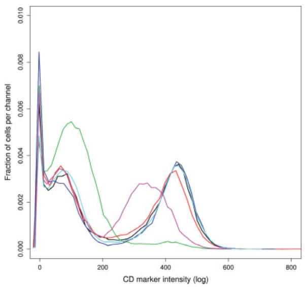
Unity normalized histogram plots of the intensities of one CD molecule targeted in several aliquots of one particular sample to identify different immune cell lineages of interest (GvHD experiment). Each curve represents one particular aliquot of a sample at a particular time point. The curves are multimodal. The first mode represents dead cells. The other modes correspond to different populations of cells.
Finally, another commonly used one-dimensional summary, to assess the quality of data, is the boxplot representation. In the GvHD dataset, some samples were divided in 10 aliquots and scattered between two plates. Figure 4 displays side-by-side boxplots of the 10 FSC measurements for one patient, at one time point. In that case, plate effects are noticeable by examining the height of the boxplots. The FSC distributions look different in the second plate for the days at the time and after the graft. The spread of the FSC measurements is notably larger after the graft. This phenomenon may be due to stickiness of the cells, which happens in some samples after freeze–thaw procedures.
Fig. 4.

Boxplots of the FSC parameter for the 10 aliquots obtained from one patient (GvHD experiment). Each boxplot displays the three quartiles of the distribution. The whiskers extend to 1.5 times the interquartile range. The central box of the plot extends from the first (25%) to the third (75%) quartile and encompasses the median (50%) of the data. Boxplots are colored according to the plate location of the aliquot (grey: plate no. 1; white: plate no. 2).
All three visualization approaches give different views and each presents different properties of the distribution of the data. In fact, any graphical visualization is good at presenting a few of the many different aspects of a dataset. Table 1 summarizes the properties and limitations of the proposed methods. Visualizing those different graphics together allows us to better investigate the structure of the data, to search for artifacts and potentially their source. As an example, Figure 5 presents three different one-dimensional views of a subset of the GvHD data. The ECDF plot reveals only subtle differences in the lower hand of the distributions (Fig. 5A). The density plot clearly shows that the data are bimodal (Fig. 5B). For example, the two populations are asymmetric, but have equivalent spread. The box-plot representation facilitates the comparison between samples as they are horizontally aligned (Fig. 5C), however, we again note that the presence of multimodality is completely obscured in these plots. We observe that the relative location of the distributions and the shape are different for the first four samples (wells) compared with the last four. Moreover the distribution of the data is more asymmetric in those last four wells as the median of the samples seems to be closer to the upper quartile. Figure 5B shows that these effects are largely due to a higher content in cells at the left mode for these four aliquots.
Table 1.
Properties and Limitations of the Proposed Graphical EDA Methods
| Methods | Properties | Limitations | |
|---|---|---|---|
| One-dimensional plots |
ECDF | Nonparametric estimate of the cumulative distribution. All estimates are on the same scale Reveals differences in distributions. Easy to find the location of the quantiles |
Not good for visualizing the shape of the distributions. Not easy to adjust for other variables |
| Histogram | Reveals most frequent values. Good for visualizing: the location of the distributions-multimodality and asymmetry |
Depends on user defined bandwidth. Not good to directly assess center and spread |
|
| Boxplot | Substantial reduction of distribution. Good for visualizing: the relative location of the distributions–asymmetry. Samples are compared on a vertically aligned scale |
Relevant for unimodal distributions. Not good for visualizing the shape of the distributions. The x-axis is typically arbitrary |
|
| Two-dimensional plots |
Scatterplot | Statistical summary of multidimensional data. Detection of outliers and their relationship (e.g., plate effect) |
Low throughput visualization. Comparison of many data sources is difficult (require multiple plots). Relevant for bivariate distributions (can be extended). |
| 2D view (contour plot) |
Deals with large number of data points. Detection of spatial variation and association |
Two-dimensional. Difficult to compare many different views |
Fig. 5.

Different ways of viewing the 8 aliquots (A1–A8) of the same sample (GvHD experiment). Each curve or boxplot represents one particular aliquot of a sample taken at one time point. (A) The ECDF plot of the FSC values reveals subtle differences at the lower hand of the distributions; (B) The density plot of the FSC intensities presents the multimodal aspect of the distributions; (C) The boxplots of the FSC intensities show their asymmetries and their differences in location.
Two-Dimensional Summaries
While one-dimensional summaries are useful, they do not tell the whole story. For example, some samples will be normal with respect to either FSC or SSC, but will be unusual with respect to the joint distribution. In the case of FC-HCS, one possible two-dimensional view is a scatter-plot of summary statistics such as the median, the mean, the mode or the IQR. The median is a resistant measure of the middle of the distribution, but other statistical summaries could be more appropriate as the median may be affected by changes in measurements at the low end of the spectrum (e.g., the number of dead cells or other debris). The mean is often the most efficient estimate of the center of a distribution but can be adversely affected by a few outlying values. The mode (or major mode) is not often used but it is often more resistant to the spread of the distribution (i.e. long tails and outliers) and its location is resistant to changes in mixtures of populations of cells, as seen in Figure 5B. The mode is not necessarily unique as high frequency can be attained at different values, which in the case of FCM data usually correspond to different populations of cells. Therefore, for examining ungated data the mode might be a better choice than the mean or the median. IQR is a reasonable summary of spread, but one could use others, such as the standard deviation or median absolute deviation about the median.
Using scatterplots of descriptive statistics, we attempted to identify experimental artifacts in the Rituximab dataset (2). In this experiment, every sample originated from a cell line and was stored in 96-well plates with different compounds. If the compounds have no effect on the population of cells the FSC versus SSC distribution for each aliquot should be similar. We chose the median value for each of the FSC and SSC measurements as our summary statistics (but other summaries can be used) and we looked for plate specific effects, such as edge effects. Visually identifying plate specific effect can be achieved using different color for each column (row), or using one color for edge wells and a different one for the interior wells. Then, in the plot, clustering of observations by color is suggestive of a problem. In Figure 6 the data points from the 11th column cluster at the top. The same representation using the major mode as the summary statistic is slightly more variable than when using the median (data not shown) but also detects the column effect. We examined if there was a difference between the medians (or modes) of the 11th column and the rest of the plate using a Kolmogorov-Smirnov test. For the FSC channel the P-value, for testing both the median and the mode were larger than α = 0.05. However for the SSC parameter, there is evidence of a difference between the median of the 11th column and the medians of the rest of the plate with a P-value = 0.02. This plate-specific effect might be due to nonrandom compound dispersion to this particular plate; in fact compounds included on this plate were specifically selected to effect cell cycle.
Fig. 6.
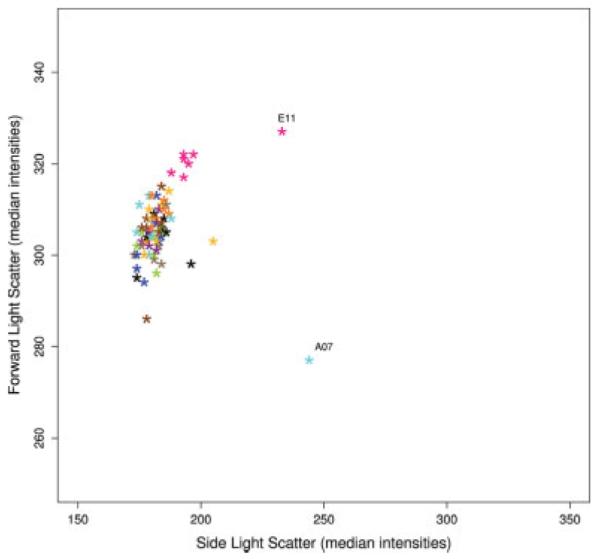
Scatterplot of the median intensity values of the FSC versus SSC parameters for each well of a 96-well plate (Rituximab experiment). The dots representing the median intensities of the samples are colored according to their column position in the plate.
In that same Figure 6, we can also observed that while the majority of the samples fall in a single group, samples A07 and E11 are far from the others. To further investigate those particular aliquots, we make used of the two-dimensional contour plot method. Two-dimensional contour plots of FSC versus SSC parameters were plotted for nine wells of the questionable plate, the two outlier samples, and seven randomly selected samples (Fig. 7). The figure shows that samples A07 and E11 have wider contour lines than the others. Sample A07 even shows two modes whereas the others tend to be unimodal. In this case, the underlying cause was biological and not because of quality issues. Samples A07 and E11 were identified as biological variants of interest in the analysis performed by Gasparetto et al. (2).
Fig. 7.

Contour plots of the FSC versus SSC parameters for 9 wells of a 96-well plate (Rituximab experiment). The title of each panel corresponds to the well position in the plate. A07 and E11 are the two previously described outlier wells while the other seven were randomly selected. The color scale goes from light to dark according to the density of cells per well, from low to high respectively.
DISCUSSION AND CONCLUSION
In this article we have concentrated on one- and two-dimensional views to summarize ungated FCM data. Table 1 summarizes their different properties and limitations. We believe these plots are an intuitive and good first approach for quality assessment of high throughput FCM data. We also understand that some of the samples identified by our proposed procedures will be anomalous for biological reasons, as in Figure 6. However the main thrust of this article is the identification of problems in data quality. Any point identified are worth studying further, and some determination as to whether the sample presents data quality issues or rather presents real biological significance, should be made.
When assessing the quality of any high throughput FCM experiment, one-dimensional summaries should come first. They allow us to display several samples together in one graphic, facilitating comparison between groups. For example, Figure 1 presents ECDF plots of 8 FSC measurements at 12 different time points, for one patient. Any sample unusual in any one of these plots should be further investigated. We also demonstrated that boxplots can help identify plate specific biases (Fig. 4). The spacings between the different parts of the box can help indicate variance, skew and identify outliers. However, we note that in the context of ungated FCM data the use of summary statistics (summary scatterplots or boxplots) might be problematic, since such data are often mixtures of populations and thus give rise to multimodal distributions as revealed by the density plots (Fig. 3). In such cases the interpretation of most summary statistics is problematic and most will change depending on the mixture present, even when each subpopulation is unchanged and conversely they may change little even when the corresponding subpopulations change substantially. Further research into developing good summary statistics for such data is needed.
While analyzing samples stored in 96-well plates, one should look for row, column, plate effects etc. (Figs. 6 and 7). On one hand, samples that are divided in aliquots should be compared for any and all sensible comparisons, e.g., ECDF plots of FSC values across all replicates in Figure 1. On the other hand, two-dimensional scatterplots should be used for comparisons across samples, as shown in the scatterplot of summary statistics in Figure 6. Two or higher dimensional summaries are usually more complex to visualize but they can reveal unusual samples that are not anomalous in either one-dimensional projection (the same is true for higher dimensions). Contour plots or other enhanced high density scatterplots could be used to further investigate a particular sample, as seen in Figure 7. However, they typically require separate plots for each sample and thus are more difficult to use and interpret.
In conclusion, artifacts from sample preparation, handling, variations in instrument parameters or other factors may confound experimental measurements and lead to erroneous conclusions. Methods designed to detect problematic samples are an important, yet difficult, application. The role of EDA and quality assessment is to provide knowledge that the data are as anticipated. We found that coupling graphical representations together provides a useful approach for assessing the quality of the data in high throughput experiments, as each plot highlights different characteristics of the data (Fig. 5 and Table 1) and can reveal substantial nonbiological differences in samples. Such screening tools are particularly valuable for high throughput technologies as they allow rapid evaluation of a large number of samples. We thus propose that the described visualizations should be used as quality assessment tools and used as quality control procedures where possible. It is likely that some summaries can be developed and specialized to particular situations and settings using interactive visualization tools like GGobi (16), which have an elegant interface with R via the Rggobi package.
ACKNOWLEDGMENT
R. R. Brinkman is an ISAC Scholar.
Grant sponsor: NIH-NIBIB; Grant number: R01 EB005034.
LITERATURE CITED
- 1.Edwards B, Oprea T, Prossnitz E, Sklar L. Flow cytometry for high-throughput, high-content screening. Curr Opin Chem Biol. 2004;8:392–398. doi: 10.1016/j.cbpa.2004.06.007. [DOI] [PubMed] [Google Scholar]
- 2.Gasparetto M, Gentry T, Sebti S, O’Bryan E, Nimmanapalli R, Blaskovich MA, Bhalla K, Rizzieri D, Haaland P, Dunne J, Smith C. Identification of compounds that enhance the anti-lymphoma activity of rituximab using flow cytometric high-content screening. J Immunol Methods. 2004;292:59–71. doi: 10.1016/j.jim.2004.06.003. [DOI] [PubMed] [Google Scholar]
- 3.Kuckuck FW, Edwards BS, Sklar LA. High throughput flow cytometry. Cytometry. 2001;44:83–90. [PubMed] [Google Scholar]
- 4.Waller A, Simons P, Prossnitz ER, Edwards BS, Sklar LA. High throughput screening of G-protein coupled receptors via flow cytometry. Comb Chem High Throughput Screen. 2003;6:389–397. doi: 10.2174/138620703106298482. [DOI] [PubMed] [Google Scholar]
- 5.Brazma A. On the importance of standardisation in life sciences. Bioinformatics. 2001;17:113–114. doi: 10.1093/bioinformatics/17.2.113. [DOI] [PubMed] [Google Scholar]
- 6.Chicurel M. Bioinformatics: Bringing it all together. Nature. 2002;419:751–755. doi: 10.1038/419751a. [DOI] [PubMed] [Google Scholar]
- 7.Boguski MS, McIntosh MW. Biomedical informatics for proteomics. Nature. 2003;422:233–237. doi: 10.1038/nature01515. [DOI] [PubMed] [Google Scholar]
- 8.Keeney M, Barnett D, Gratama JW. Impact of standardization on clinical cell analysis by flow cytometry. J Biol Regul Homeost Agents. 2004;18:305–312. [PubMed] [Google Scholar]
- 9.Edwards B, Altobelli K, Nolla H, Harper D, Hoffman R. Comprehensive quality assessment approach for flow cytometric immunophenotyping of human lymphocytes. Cytometry. 1989;10:433–441. doi: 10.1002/cyto.990100411. [DOI] [PubMed] [Google Scholar]
- 10.Gratama JW, D’hautcourt JL, Mandy F, Rothe G, Barnett D, Janossy G, Papa S, Schmitz G, Lenkei R. Flow cytometric quantitation of immuno-fluorescence intensity: Problems and perspectives. Eur Working Group Clin Cell Anal Cytometry. 1998;33:166–178. doi: 10.1002/(sici)1097-0320(19981001)33:2<166::aid-cyto11>3.0.co;2-s. [DOI] [PubMed] [Google Scholar]
- 11.Gentleman R, Carey V, Huber W, Irizarry R, Dudoit S, editors. Statistics for Biology and Health. Springer; New York: 2005. Bioinformatics and Computational Biology Solutions Using R and Bioconductor. [Google Scholar]
- 12.Tukey JW. Behavioral Science—Quantitative Methods. Addison-Wesley; Reading, MA: 1977. Exploratory Data Analysis. [Google Scholar]
- 13.R Development Core Team . R: A Language and Environment for Statistical Computing. R Foundation for Statistical Computing; Vienna, Austria: 2005. [Google Scholar]
- 14.Conover WJ. Practical Nonparametric Statistics. Wiley; New York: 1971. [Google Scholar]
- 15.Grubbs F. Sample criteria for testing outlying observations. Ann Math Stat. 1950;21:27–58. [Google Scholar]
- 16.Swayne D, Lang DT, Buja A, Cook D. GGobi: Evolving from XGobi into an extenxible framework for interactive data visualization. J Comput Stat Data Anal. 2003;43:423–444. [Google Scholar]