Abstract
Summary
Automated analysis of flow cytometry (FCM) data is essential for it to become successful as a high throughput technology. We believe that the principles of Trellis graphics can be adapted to provide useful visualizations that can aid such automation. In this article, we describe the R/Bioconductor package flowViz that implements such visualizations.
Availability
flowViz is available as an R package from the Bioconductor project: http://bioconductor.org
Contact
dsarkar@fhcrc.org
1 INTRODUCTION
Traditionally, flow cytometry (FCM) has been a tube-based technique limited to small-scale laboratory studies. High throughput methods have recently been developed and are now used in both basic and clinical research. One of the long-standing challenges in the analysis of FCM data has been calibration, or normalization, as the measurements made on each cell vary by non-biological factors such as machine, experimenter and date. The traditional approach has been to manually curate each sample, usually through the process of hand-gating. This approach is untenable in the high-throughput paradigm, and research on automating analysis of FCM data is ongoing. However, any automated method, however efficient, is bound to fail on occasion. Thus, it is important to have diagnostic tools that can quickly identify such failures so that they can be dealt with appropriately. In this article, we give examples of graphical diagnostics and quality assessment applications using the Bioconductor package flowViz, which adapts principles of Trellis graphics (Becker et al., 1996; Cleveland, 1993) to FCM data. The primary challenges in implementation arise from the need to handle the high volume of data typical in FCM experiments and the multivariate nature of the data.
2 DATA STRUCTURES
flowViz uses data structures defined in the flowCore package, also available from Bioconductor. FCM data are typically stored in the form of FCS files, which are represented as flowFrame objects in flowCore. Experiments, usually consisting of multiple FCS files, are organized using the flowSet class, which can efficiently host multiple flowFrames. Like most Bioconductor organizational classes, a flowSet also contains experimental meta-data.
As an example, we use the GvHD dataset available in flowCore. The data are a subset of an experiment (Brinkman et al., 2007) that originated from a collection of weekly peripheral blood samples from patients following allogenic blood and marrow transplant. The goal of the study was to identify cellular markers that would predict the development of Graft versus Host Disease (GvHD). Samples were taken at various time points and labeled with four different fluorescent markers whose intensities were determined in addition to the usual forward and side scatter measurements.
Transforming the measured fluorescent intensities is often helpful, especially for visualization. flowCore provides a number of commonly used parameterized transforms in an abstract form that can be applied to all flowFrames in a flowSet:
> data (GvHD)> GvHD.trans 5 <–transform(“FSC – H” = asinh, “SSC – H” = asinh, “FL1 – H” = asinh, “FL2 – H” = asinh, “FL4 – H” = asinh) %on% GvHD
3 VISUALIZATION
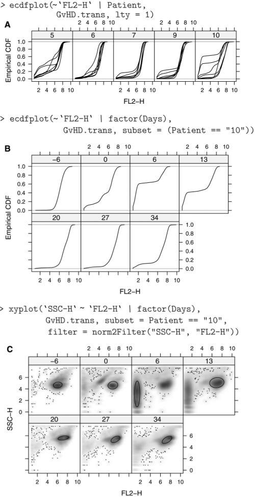
Figure 1 A plots the empirical CDF of the FL2-H channel for all samples, using one panel for every patient. Noting that patient 10 seems to have unusual samples, Figure 1 B has one panel per visit, just for patient 10. These plots are implemented in the flowViz package using the infrastructure from the R package lattice, which also provides the model for the deceptively simple formula interface.
Fig. 1.
(A) ECDF plots of FL2-H for five patients; each line represents a different visit. Patient 10 has two samples (visits) that look different from the others. (B) ECDF plots of FL2-H restricted to Patient 10. We can now see that the samples taken 6 and 13 days after transplant were the unusual ones. (C) Smoothed scatter plots of SSC-H and FL2-H for patient 10. The result of a data-driven filter is superposed, and we can see that a different population has been identified for the sample taken at day 6.
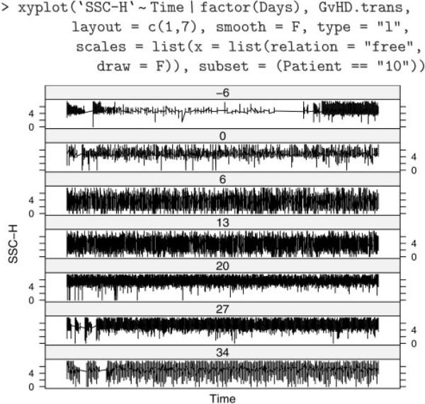
A common task in the analysis of FCM data is some form of filtering (gating), either to obtain summary statistics about the number of events that meet a certain criteria or to perform further analysis on a subset of the data. flowCore implements some data-driven filters not usually found in flow cytometry software; for example, norm2Filter implements a robust method for finding a region that most resembles a bivariate Normal distribution. Such filters can be applied to a dataset with the intent of defining a population of ‘live cells’, e.g. and restricting further analysis to it. Filters can also be supplied to certain visualization methods that include it in the display, as we do in Figure 1C. As we can see, the samples previously noted as ‘unusual’ (Days 6 and 13) seem to have two distinct populations, and the automated filter has chosen a different one in each. Depending on the purpose of the analysis, the user may wish to manually intervene at this point. These plots are complemented by numerical summaries, such as the IQR values in Table 1. Another useful piece of information is the time associated with each observation. Figure 2 plots side scatter values over time for each sample from patient 10, showing not only different distributions across samples, but also an unusual artifact for the sample taken 6 days before transplant.
Table 1.
Interquartile range of all channels for patient 10
| Days | FSC.H | SSC.H | FL1.H | FL2.H |
|---|---|---|---|---|
| –6 | 0.60 | 0.83 | 1.51 | 1.10 |
| 0 | 0.89 | 0.91 | 1.10 | 2.61 |
| 6 | 0.50 | 1.94 | 0.72 | 5.34 |
| 13 | 0.77 | 1.58 | 1.15 | 5.87 |
| 20 | 0.64 | 0.49 | 3.36 | 1.40 |
| 27 | 0.81 | 0.66 | 3.23 | 1.35 |
| 34 | 0.75 | 0.90 | 2.98 | 1.56 |
Note the unusually high (compared to the others) values for SSC-H and FL2-H in rows 3 and 4, representing days 6 and 13 past transplant.
Fig. 2.
Side scatter values over time (scaled separately for each sample) for patient 10. The first sample (labeled –6) possibly had problems (e.g., bubbles, clogs, etc.) in the initial period of collection.
ACKNOWLEDGEMENT
The work on this manuscript was supported by NIH 1 R01 EB005034, Bioinformatics Standards for Flow Cytometry.
Footnotes
This is an Open Access article distributed under the terms of the Creative Commons Attribution Non-Commercial License (http://creativecommons.org/licenses/by-nc/2.0/uk/) which permits unrestricted non-commercial use, distribution, and reproduction in any medium, provided the original work is properly cited.
Conflict of Interest: none declared.
REFERENCES
- Becker RA, et al. The visual design and control of trellis display. JCGS. 1996;5:123–155. [Google Scholar]
- Brinkman RR, et al. High- content flow cytometry and temporal data analysis for defining a cellular signature of graft-versus-host disease. BBMT. 2007;13:671–700. doi: 10.1016/j.bbmt.2007.02.002. [DOI] [PMC free article] [PubMed] [Google Scholar]
- Cleveland WS. Visualizing Data. Hobart Press; Summit, New Jersey: 1993. [Google Scholar]


