Abstract
Communicating effectively and efficiently on air quality and its health impacts is an important but difficult and complex task. It requires careful consideration of the audience one wants to reach, the messages one is trying to present, the venue through which the message will be delivered. The audience, context, technique, and content factors may affect how well it is heard and how appropriately it is interpreted. In this short paper, I describe many of these concerns and provide some suggestions for how best to address them. However, since every audience differs in goals, characteristics, and nature, what is most important is implementing an effective communications program. This program should include frequent two-way communication, repeated and on-going evaluation of how well the audience understands the messages, and consideration of how to improve the delivery.
Keywords: Air pollution, Communication, Graphics, Health impact
Introduction
One of the most important goals of the Centers for Disease Control and Prevention’s (CDC’s) Environmental Public Health Tracking Program (EPHT) is to effectively and efficiently communicate information about ambient air quality, both in terms of the estimated potential public health impact on the general population as well as highly susceptible subgroups and to allow for the variation in air quality from place to place and over time. Indeed, one goal of any surveillance or screening program is to develop data and information appropriate for the design, implementation and evaluation of useful interventions. Typically, interventions will be implemented only if their relevance and impact can be conveyed clearly and convincingly to those empowered to set policy, the people responsible for implementation, and those likely to be affected by the intervention.
The EPHT was created from a vision developed by The Pew Environmental Health Commission (Pew Environmental Health 2000). The Commission argued that there was a “gap in critical knowledge” that was impeding effective management of environmental risks for chronic diseases and conditions and that the impact on the nation in terms of human suffering and healthcare costs was staggering. It proposed the development of a national network through which members could research these issues, identify critical environmental exposure–disease associations, and communicate this information to the public and to policy-makers, with the goal of effecting changes in public health policy and increasing prevention of environmentally caused disease. In response, the U.S. Congress provided funds to the CDC to develop such a program, which became EPHT. Fundamental to this vision is the clear and effective communication of the impact of environmental exposures on health. The initial focus of EPHT was to develop a network of data sharing and data linkage, as described by the Pew Commission, to better study the scientific basis for these concerns and develop appropriate interventions. While the Pew Environmental Health Commission strongly advocated for the accessibility and wide dissemination of the study results produced through the network, it did not provide specific guidance as to how best to achieve this. This paper addresses some of the considerations that need to be taken into account in communicating these results, their strengths, weaknesses, applicability, and generalizability, with a specific focus on air pollution.
In the case of ambient air quality, data are collected routinely from monitoring stations throughout the USA, compiled and interpreted by local, state, and federal officials, and usually made freely available on the Internet. However, such data are complex and technical and may not be easily interpreted by the public. In making these data more available and useful to the public, it is important to determine how best to make them accessible and understandable by considering how the data are presented and to suggest strategies for making presentations that will be interpretable by the wide range of audiences interested in the content. For the purposes of this paper, the discussion is based on consideration of two air pollution constituents, ozone (O3) and particulate matter (PM2.5) as well as estimates of population health impact.
Several groups of researchers have addressed these issues in earlier studies. For example, Payne-Sturges and colleagues conducted a local air pollution exposure study in Baltimore, Maryland. To develop effective communication, they partnered with a well-recognized community organization and held two meetings with community residents to discuss the study design and clarify expectations. Because the community wanted both individual and community-wide results, the researchers selected a risk assessment framework for communicating the results as the best approach to meet the goals. This risk-based approach took toxicity into account, provided a common denominator so that risks and exposures can be compared and priorities identified, and facilitated the aggregation of risks and exposures for a community-wide assessment. Their approach “helped residents interpret exposure assessment measurements and gave them the raw materials to effect change in their community”(Payne-Sturges et al. 2004).
Sanderson and colleagues, working within the European Commission-supported thematic network project AIRNET, used a stakeholder survey to identify key questions and issues of concern with respect to air pollution and health within Europe (Sanderson et al. 2006a,b). The aim of the survey was to identify questions and issues of importance to those surveyed, and they used the information to select specific study activities. What emerged from this effort was the need for all environmental and health professionals to frequently refine the communications among scientists, policy-makers, and stakeholders. Further, taking stakeholders’ perspectives into account early on in the process increased engagement and trust and encouraged public participation in the policy debate.
Subsequent workshops with stakeholders facilitated the identification of the issues of greatest interest, such as the health impact of traffic-related air pollution, asthma and allergy, and child/infant health (Sanderson et al. 2006a,b).
A third effort that is more similar in structure to EPHT is the APHEIS Project (Air Pollution and Health: A European Information System; APHEIS 2004) At the very outset of this project, researchers noted differences between potential audiences in terms of goals, scientific background, and culture. They suggested that to be accessible to these audiences the information needs to be presented in a variety of formats, including a non-scientific publication format. It is common knowledge that people learn in different ways: visual, verbal, reading, doing, interacting, among others. Older people rely more on effect (emotions, reactions, memory triggers), while younger people typically rely more on cognitive skills. Therefore, to reach these audiences, the messages always have to be multi-modal. This paper draws heavily from the APHEIS report and more generally from the knowledge generated through the repeated observations by psychologists, educators, and social scientists, who observe how people learn.
The remainder of this paper summarizes some of the methods and considerations used in communicating with stakeholders about air pollution and health in the projects cited above and some others mentioned later in this text. These approaches can be applied to the EPHT program, with the goal of engaging stakeholders in the air pollution and health effects debate in the USA in order to reach acceptable and effective solutions.
Communication considerations
At the outset, it is helpful to identify key issues that warrant consideration: (1) goals of the communication; (2) intended audience(s); (3) types of information to be used and/or conveyed (e.g., emissions, monitoring observations, health impacts, indicators); (4) scoping issues (e.g., geographic and temporal scale); (5) health effect measures (e.g., acute vs. chronic effects; body counts vs. life expectancy vs. quality of life; healthcare costs); (6) major substantive messages (e.g., what people can and should do, general information, trends, regulatory violations, health alerts); (7) vehicles through which to convey information (e.g., scientific papers, reports, press releases, websites—text and graphics, newsletters or other periodic communications, and presentations; (8) factors that affect the perception of and behavioral reaction to this information (e.g., local vs. more broad-based data). In addition, given the vagaries and idiosyncrasies of human populations, it is important that there be an on-going evaluation of the communications, reception by the intended audiences and others, and consideration of audience reactions, interpretations, and planned responses. One also may consider querying the audience to assess whether supplemental information might be desired and/or helpful. In other words, one always should have an on-going assessment of how well the communication plan is or is not working and initiate two-way communication. Unfortunately, these last steps of the evaluation are often not implemented effectively. I consider each issue, in turn.
Goals of the communication. There can be as many goals as there are distinct audiences and issues to be addressed. These may include, for example, identifying data needs for the underlying purpose of the monitoring, trying to help the audiences understand the main scientific and health issues of concern, if not the details, providing a context for comparing risks/hazards for potential policy development or funding decisions, and possible implementations, prompting individuals or communities to change behaviors or actions to reduce pollutant levels and/or health risks, and possibly obtaining some measure of the response to these messages in order to provide feedback to those who are targeted to take actions. Messages may be crafted differently depending on which of the goals are most important. For EPHT, critical goals are to provide a non-technical audience with information that conveys differences in health impacts that are attributable to variations in air quality at a regional or local level, such as asthma, cardiovascular disease, or lung cancer, for possible policy considerations and protection of public health, and suggestions for actions that individuals may take.
Intended audience. There are many intended audiences, which makes this task quite daunting. While it might be most effective to develop separate messages for each audience, it is often not cost effective to summarize the science and develop and test the messages for each of these audiences simultaneously. Instead, researchers often first work with a small number of audiences, while banking messages specific to other groups for future evaluation and use. Therefore, it is important to look at the goals and locus of control of each audience to determine how best to group them in terms of targeting the messages. The APHEIS Project conducted a careful review of this issue for their study. Target audiences were considered to include: government policy-makers and those who influence them, media, environmental and health professionals, industry and transport sectors (pollution source managers and workers), healthcare providers, the public, and vulnerable populations. Each has a particular stake in this issue of health effects of air pollution as well as a different level of knowledge, experience, and connection to the issues. In addition, one should consider scientific professionals from non-health fields, such as physicists and atmospheric scientists, who may have extensive technical knowledge but less direct experience with the assessment and interpretation of health effects attributable to exposure to air pollution. A further complexity in identifying audiences is that those with particular susceptibilities (e.g., children, the elderly, those with particular disabilities) may react more strongly to situations that directly affect their susceptibilities (e.g., people with asthma or emphysema). Therefore, great care should be taken crafting strategies to communicate with these and other high-risk populations, i.e., to being sensitive to their particular concerns.
Although all of these different audiences have concerns about the health effects attributable to exposure to air pollution, each has a different level of concern, a different knowledge base, a different constituency, and different primary goals. These differences can affect what individuals want to hear about, what they do hear, how they interpret the specific information provided to them, the degree to which they believe that the specific information provided addresses their concerns, and the technical level at which the information can be understood. For example, some US-based research shows that even though people make a distinction between state and local conditions (Weinstein 1986), they may erroneously infer local implications from statewide indicators (Johnson and Chess 2006). Technical modeling results only rarely are appropriate for—or understandable by—most members of the public, but failure to provide a scientist with details on the model for testing and validation likely would raise concerns and doubts. Yet, it would be most effective to have several different messages with the same general core content, each tailored specifically to each group, highlighting their specific interests, goals, and expertise. To that end, APHEIS identified “four key objectives” that it applies to each audience: (1) identify the information needs; (2) assess how well APHEIS is meeting those needs; (3) understand what is needed to better meet the information needs; (4) develop a communication strategy to do so. Initially, APHEIS decided to focus on one audience, government policy-makers, and those that influence government policy-makers. We recommend a similar strategy for EPHT but suggest that the initial focus be slightly larger, including the public as well as policy-makers, and influencers, given that public access was one of the goals of the Pew Report (Pew Environmental Health 2000) and the Congressional funders.
-
(3)
Types of information. There are several types of messages that one may wish to deliver to each of the audiences. For clarity, it is useful to determine specifically what type of information one wishes to convey, prior to focusing on the detailed content. Some possibilities are pollutant emissions or ambient air quality data, ambient air monitoring observations, integrated/modeled emissions and ambient air data, suspected or observed health impacts, indicators (or combined summary measures), and the statistical uncertainties for each of these measures. Each measure has strengths and limitations. Direct monitoring data are viewed by some as the “gold standard” because they reflect directly what is in the air we breathe. However, they are costly to collect and tend to have limited spatial and temporal relevance. In addition, they may be the most complex to interpret and/or relate to specific health impacts. Alternatively, emissions data reflect what is released to the environment, which is not directly relevant to exposures or health effects but which does capture the true source function. These data can be used to model fate, transport, and eventual disposition for estimation of ambient levels of pollutants, and they may provide higher spatial and temporal resolution than typically can be measured cost effectively. The models which use emissions data to estimate ambient levels can be merged with and calibrated to ambient measurements, validated, even if to a limited extent, and used to predict or forecast values over larger space–time domains, while also providing estimates of uncertainty and precision. However, the results produced by models are sometimes seen as suspect, since they can be biased towards developers’ goals, and those biases, which may be unintentional, are generally difficult to identify, even for technical experts. Both models and monitoring data are often used for exposure evaluations, and they drive the health concerns.
Data on health impacts focus on the public health consequences of exposure to ambient air pollutants. Generally, this is of greater concern than the exposures themselves, but they may be harder to assess, can involve multiple risk factors of which only some are air pollutants, and the actual health impacts may take from years to decades to manifest themselves, for eventual validation. Further, individuals with existing health conditions are sometimes more susceptible and respond to lower levels of—and in a more extreme manner to—the same exposures than do healthier members of the public. Impacts on individuals also can be mediated by other factors, such as the presence or absence of air conditioning, particularly in the case of excessive heat and air pollution. Rather than relying only on direct measurement of health effects, models also can be used to estimate or project health effects. However, these models are also subject to concerns of appropriateness, accuracy, reliability, and validity, not to mention interpretability. Finally, there are indicators which are summary health and/or exposure measures that typically provide space–time averages. These can be perceived as more limited in that generally they do not provide the same resolution and variability as direct measurements, but they are much simpler in concept, construction, and interpretation. Assessing the variability and uncertainty in indicators can be quite difficult. Further, as noted above, even those with substantial knowledge on these issues may inappropriately extrapolate data from regional or broad-scale indicators to local situations.
One also might want to report regulatory compliance information, such as whether or not, and how often ambient levels meet or exceed specified standards or levels that the government sets, which are typically based on the likelihood that they will cause health effects. This information addresses regulatory requirements for emissions or ambient levels, rather than health impact, but often the specific levels implemented in such regulations are designed to prevent health impacts and, as such, may be useful in addressing the underlying health concerns. Compliance data are relatively easy to report but contain less information than most of the measures mentioned above, and they do not address modifying factors, such as existing health conditions, or implementing preventive interventions, such as the placement of air conditioners.
The availability of all of these types of data differs greatly from place to place, time to time, across substances, and in terms of impacts. For example, at the national level, data are available for ambient levels of criteria pollutants, usually within about 1 year of collection. However, at the state level, these data are limited by the number of monitors available in each state. Nationwide, there are several hundred monitors, but not all monitors report all pollutants. The emissions of certain toxic substances are reported annually, with location information, once they exceed a specified threshold. However, location information often refers to corporate offices rather than the exact location of the emission source, and recent legislation in the USA may reduce the frequency of reports and the accessibility for researchers and the public. State reporting varies in terms of the number of monitors, frequency of readings, location, and substance reported.
For health concerns, the availability of data varies greatly by the outcome of interest. At a national level, vital records data are made available within a couple of years of collection through the National Center for Health Statistics (NCHS). Historically, they were available for public download with city, county and state of event, as well as day of event. More recently, at the request of some states, the geographical and temporal resolution of the public access data have been degraded so that much of the data do not have geographic information below state of occurrence, and temporal data report only month of event. More fine-scaled data are still potentially available to researchers who request access to more restricted databases for specific research projects. Again, state policies vary greatly. National cancer incidence data are available to researchers for most states at the county level, with date of diagnosis, through the SEER Program (Surveillance, Epidemiology and End Results) and other registries. For other health outcomes, such as hospitalizations, emergency room visits, etc., access varies.
-
(4)
Scoping issues. Another important consideration in developing a communication strategy is determining the most appropriate space and time scales with which to report the data and effects. In many cases, more than one may be appropriate. For example, one may want to use a national map for context, but then provide insets of areas of particular regions or localities of interest or concern. Similarly, with time, one may want to provide data portraying long-term trends (e.g., weekly, monthly, or yearly), but also show short-term variability (e.g., daily or hourly) when the amount and rate of change of air pollutants is greater, such as for summer months. For some of the measures, it may be particularly helpful to include the space–time scales that are used by some of the standards and regulations, such as particular averaging times for reporting air pollutants. For example, ozone is reported based on 1-h and 8-h averaging times, but one may also want to consider daily, weekly, monthly, seasonal, and annual averages. One also needs to explain what “averaging time” means. In addition, at least with respect to health data, one must be sensitive to concerns of privacy and confidentiality. One must be careful not to provide data at so fine a scale that they may facilitate the identification of individuals. Decisions for the most appropriate space-time scales to use vary according to the audience one is trying to reach, the particular questions of concern, and the audience’s degree of technical background. Some testing of the audiences’ goals and appreciation of different space–time scales may help immeasurably in designing effective communication. Many want the data at as fine a scale as possible and as rapidly as possible. However, it takes substantial time to adequately validate the reported information, summarize patterns and trends, and provide even limited interpretations. This often frustrates the public, who may lose interest or question why the raw data are not available in a more timely manner. However, many do suggest that a more rapid response increases the effectiveness of the communication.
-
(5)
Health effect measures. There are various considerations to be taken into account in reporting on health effects. First, one has to determine the type of effect one wishes to evaluate; for example, morbidity (e.g., breathing problems) versus mortality (e.g., death), and acute (e.g., myocardial infarction) versus chronic (e.g., lung cancer) end points, depending on the nature of the particular concern. One also needs to decide whether to report for the whole population, the most sensitive subgroup (e.g., those with active lung disease), or those of greatest concern to the larger population (e.g., children or other sensitive subgroups). Within each of these realms, one also needs to consider what information is most useful and/or interpretable. For example, for a long time, researchers reported the number of deaths attributable to air pollution (i.e., the body counts) as the most striking formulation. However, more recently, researchers have begun to consider more detailed aspects of impact, such as not simply whether someone is thought to have died prematurely from air pollution, but also how prematurely they died (i.e., how many years early), years of life adjusted for disabilities (DALYs) or for quality (QALYs), and other types of health-adjusted life years (HALYS). Some of these measures can be combined into a burden of disease assessment that considers the impact more broadly than only that of specific diseases. Some researchers question the validity of these measures, while others argue that they better capture people’s feelings and experiences (McMichael et al. 1998; Gold et al. 2002; Arnesen and Trommald 2004; Brunekreef et al. 2007). Another measure that occasionally is of particular interest to policy-makers is the healthcare costs likely to be incurred (or saved) as the result of changes in the levels of air pollutants, both with respect to an individual and a population. Choosing among these often depends on the audience, the context, the particular pollutant of concern, the characteristics of the population under consideration, and the intended use of the data.
-
(6)
Major messages. In developing messages for a communications program, one must be clear about what message one wishes to deliver and what response one would like to elicit. For example, the objective may be to provide a community with information about the environmental status of their community. There may not be clear data available on health effects, but the audience is likely to understand the qualitative changes or trends in the background levels of certain substances so that when health effects data become available, they will have a context from which to compare their community with others. Alternatively, the goal may be to provide information about the hazards likely to be encountered, small though they may be, and let the community decide how they want to respond to them. In more serious pollution situations, with compounds of known health consequences, the objective could be to encourage individuals to take personal actions to limit exposure and to encourage the community to advocate for political action because they are being exposed and/or affected disproportionately. Providing context about regulatory compliance may be helpful, so that residents can decide whether or not action or mitigation is appropriate and/or necessary, and if the current regulations are sufficiently protective, in their view. Finally, helping people understand the meaning and implications of air pollution alerts and the benefits of behavior changes can lead to reductions in exposures through changes in personal behaviors as well as more broad-based actions. All of these options require careful thought and consideration as they each have consequences, as does the failure to alert people to these issues.
-
(7)
Vehicles through which to convey information. One of the most critical considerations in any communication strategy is how to present the information in a manner that is clear, comprehensive, accurate, precise, understandable, and relevant to the concerns at hand, with some indication of reliability or uncertainty. At the outset, the APHEIS report suggests that it is important that scientific papers be available as primary sources as well as a back-up and/or support for communications (APHEIS 2004). The report suggests that communications should include a variety of vehicles, including complete scientific reports, summary scientific reports, peer-reviewed scientific papers, brochures with a policy focus, PowerPoint presentations with a scientific focus, PowerPoint presentations with a policy focus, Questions and Answers (Q&As)/Frequently Asked Questions (FAQs) with a scientific focus, and Q&As/FAQs with a policy focus. They also suggest that presentations should include “a few key messages presented simply and clearly in easy-to-understand terms, using bullet points and supported, when appropriate, by simple graphs, charts and/or tables.” One of their respondent groups suggested that, “reports should use simpler language, and more boxes, graphs, maps and colors.”
We strongly believe that the use of simple, clear maps, charts, and graphs can be among the most effective ways to present information and make it relevant to audiences. However, such an approach requires substantial work to achieve an acceptable standard for these displays to be useful and convey the appropriate information. These displays may also be supported by a small number of bullets highlighting key features, a brief narrative or discussion, and suggestions for where to get more information.
A substantial literature documents many of the mistakes that have been made in developing displays (Tufte 1990; Monmonier 1997; Tufte 2001), and presenters must be careful not to repeat these mistakes, both for credibility and to be effective communicators. There are well-researched methods that can be used to make effective displays, from using understandable color combinations on maps, even for audiences with color-blind members (www.colorbrewer.com), to using formats that highlight specific aspects of the display (Bell et al. 2006). One asset of maps as communication tools is that viewers usually like to identify the area where they live, as a way of validating one aspect of the display. Maps often make people feel more comfortable than do scientific charts and tables because we all are used to reading road maps and have experience interpreting the features and patterns on them. The perception of familiarity and simplicity makes them particularly good and effective vehicles for communication. However, maps that try to present too much information and require cognitive reasoning to interpret multiple pieces of information can frustrate users and block the intended message of the communication. The use of maps is an approach that also requires special attention to detail as well as an in-depth review by both technical and non-technical staff and, ideally, by a small sample of the intended audience.
Figures 1, 2, 3, 4, 5, 6, 7, 8 demonstrate some of the strengths and weaknesses of displays. Note that different types of data are displayed in these figures. Most data types (e.g., air quality, compliance, health outcomes) could be displayed in each of these types of figures. The choices for these particular figures are arbitrary. These examples were not chosen because they are particularly good or bad examples; rather, they were chosen to demonstrate that even the best displays have limitations and weaknesses, and even the worst displays have strengths and can convey some important information. The figures are provided to show some real world examples from which we can learn, copying features from some and modifying our displays to avoid problems with others.
Fig. 1.
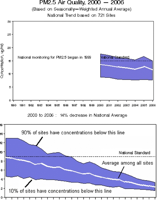
U.S. Environmental Protection Agency (USEPA): trends in particulate matter with a diameter of 2.5 μm (PM 2.5) (Available at: http://www.epa.gov/air/airtrends/pm.html). Top panelNational trends in particulate matter levels. Using a nationwide network of monitoring sites, the Environmental Protection Agency (EPA) has developed ambient air quality trends for particle pollution, also called PM. Trends from 1990 to 2007 are shown here for PM2.5 and PM10. Under the Clean Air Act, EPA sets and reviews national air quality standards for PM. Air quality monitors measure concentrations of PM throughout the country, and the EPA, state, tribal, and local agencies use that data to ensure that PM in the air is at levels that protect public health and the environment. Nationally, average PM concentrations have decreased over the years. For information on PM standards, sources, health effects, and programs to reduce PM, the reader is referred to: www.epa.gov/air/particlepollution. Bottom panel How to interpret the graphs. The blue band shows the distribution of air pollution levels among the trend sites, displaying the middle 80%; the white line represents the average among all the trend sites. In all, 90% of sites have concentrations below the top line, while 10% of sites have concentrations below the bottom line
Fig. 2.
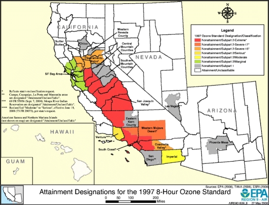
USEPA Region 9: ozone attainment areas. Available at: http://www.epa.gov/region9/air/maps/r9_o3.html
Fig. 3.
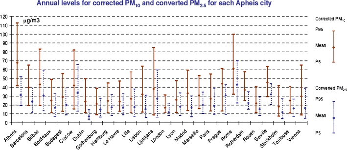
Air Pollution and Health: A European Information System (APHEIS) September 2006. APHEIS 3: health impact assessment (HIA) of long-term exposure to PM2.5 in 23 European cities. Available at: http://www.apheis.net/
Fig. 4.
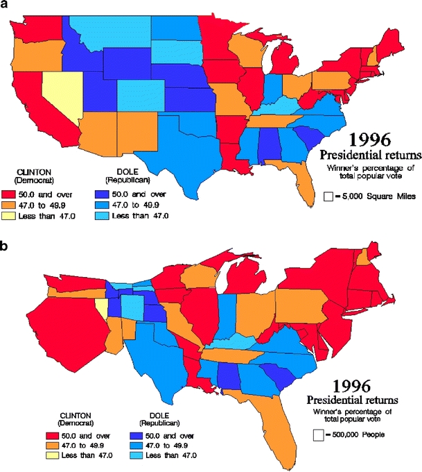
a A choropleth map of voting percentages. b A cartogram of voting percentages
Fig. 5.
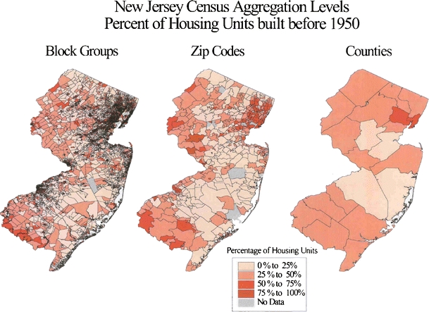
Comparative maps of the same data at different spatial scales (Elliott and Wartenberg 2004)
Fig. 6.
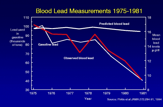
The impact of removal of lead from gasoline—a data linkage display (Pirkle et al. 1994)
Fig. 7.
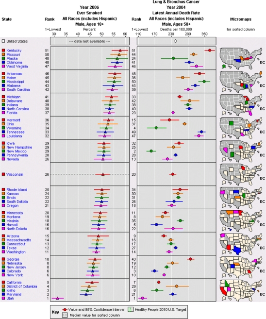
Linked micromap sorted by exposure (Carr et al. 2000; Carr 2001; Bell et al. 2006). Available at: http://statecancerprofiles.cancer.gov/micromaps/
Fig. 8.
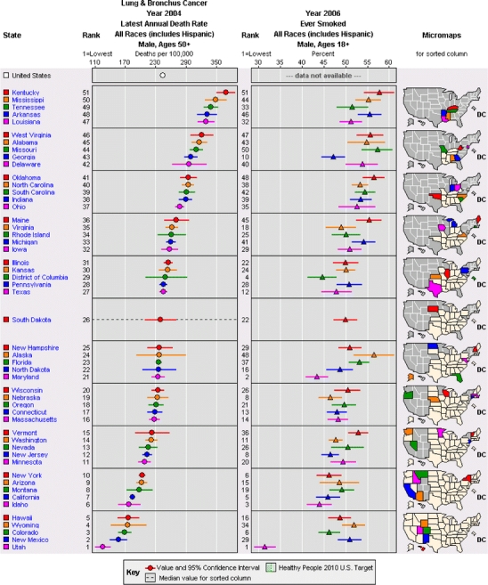
Linked micromap sorted by mortality rate (Carr et al. 2000; Carr 2001; Bell et al. 2006) Available at: http://statecancerprofiles.cancer.gov/micromaps/
Figures 1 and 2, which were taken from EPA websites (with EPA commentary), display two aspects of air pollution information. Figure 1 shows the time trend of average concentrations of air pollution across sampling sites. They also show the values that 10% and 90%, respectively, of the sampling sites exceed. To assist viewers of this webpage, EPA appropriately included the “How to Interpret the Graphs” description along with this graph of variability. However, from this simple and easy to interpret graph, it is not possible to infer where the sample sites are, whether the high areas are close to one another, nor how much variation there is at each individual site (i.e., is the variability due to consistent differences among the same sites, each of which is fairly stable, or are all sites highly variable, and in an unpredictable pattern?).
Figure 2 depicts areas of regulatory attainment within one of EPA nine administrative regions, displaying a geographic rather than a temporal pattern. This map also conveys a relatively simple message—but again without much outside context. For example, it does not address the stability of the pattern depicted, report at what scale it is evaluated, or whether there are any short-, medium-, or long-term variations that increase, decrease, or change the locations of the non-attainment areas. It is possible that a series of seasonal or annual maps or inclusion of a small time trend plot for one of the areas would help clarify these various points.
Figure 3, which is from the APHEIS Project, has a more complex message, providing comparisons across a number of cities and also showing the impact of data adjustments, although these are not described on the graph. This figure was targeted for a more technical audience, for whom it conveys a wealth of information about two different pollutant measures, their geographic and statistical variability, and their comparability or correlation. For the public, it might display useful information about a particular city and how it compares to the others, but the complexity of the lines needed to do so may make it more difficult to decipher. It would be helpful to know—in a few words—in what way the PM10 values were corrected, how they were corrected, and from what information the PM2.5 values were computed. The title does explain that the data are annual. It is interesting that, for variability (or uncertainty), the 5th and 95th percentiles are shown along with the central tendency, but it is surprising that the central tendency is not analogously the central distributional value (i.e., the median); rather, it is the arithmetic mean, which can be more susceptible to distortion or bias. While the names of the cities are provided, an inset map of the locations of those cities would make it easier to compare values across cities and to assess whether there are broad, regional patterns, possibly suggesting transport-mediated effects, or much variation among neighboring cities, suggesting effects due to local sources.
Figure 4 a and b show other the considerations that must be addressed in mapping: whether to adjust mapping areas to reflect population characteristics (e.g., using a cartogram) and the scale of data display or averaging, which can result in different interpretations from the same base data. Figure 4a is a choropleth map that shows reported percentages for each geographic unit (state) based on its true geographic boundaries. The values are grouped by color into six ordered categories for simple evaluation. However, because the data reported are only percentages, one has no idea whether, in any one given state, they represent 1, 10, 100, or 10,000,000 voters. Figure 4b shows a cartogram of the same data, with the identical color coding for each state, but the area of each state is scaled to reflect the size of the state’s population, while also trying to maintain its approximate shape so it can be recognized. Note that given our current voting system, the choropleth map is more relevant for Electoral College voting (all of each state’s electoral votes are awarded to the candidate that has the most votes within that state), while the cartogram is more relevant for the popular vote (each individual vote is awarded to the candidate chosen, irrespective of the votes of others in a given state).
Figure 5 shows the impact of the spatial scale of the data on patterns and interpretation. For an evaluation of housing age, the authors (Elliott and Wartenberg 2004) obtained U.S. Census housing age data at the census block group level and mapped these as obtained. Next, they combined the values for all of the block groups contained within a zip code and mapped these data. Finally, they combined values for all the block groups within a county and mapped these values. Note that even a cursory visual examination shows markedly different patterns, although the most broad-scale patterns remain.
Figure 6 shows a plot that demonstrates the association of two variables, demonstrating how removal of lead from gasoline, a policy intervention, is associated with decreasing childhood blood lead levels, a health effect measure. This approach is most appropriate for EPHT “data linkage” studies to provide the users with additional information. It would have been helpful to include information on the number of children upon which the graphs are based, to describe the statistical variability of the numbers, as well as some of the demographic characteristics of the children. This would facilitate interpretation of the data and their applicability to subpopulations. Fortunately, much of this information is available in the reference that is listed in the figure.
Figures 7 and 8 are examples of a very rich but complex display method called linked micromaps.(Carr 2001) Due to their complexity, these are more appropriate for technical experts rather than the general public. What this formulation does is: (1) display the central value and 95% confidence interval for two specified measures, separately, allowing for comparison of their values across all 50 states; (2) shows the association of these two measures by plotting the measures for the same state next to each other; (3) shows the geographic context of these data by highlighting similar values in the adjacent map, which shows small subsets of states that have similar values in color, with states that have greater values for the primary (left most) measure showing the higher values in white and lower values in grey. However, without experience in reading these maps, they likely will be extremely confusing and possibly misleading.
For specific messages, one needs to determine what is of greatest importance and identify the graphic approach that highlights this most effectively. One particularly important aspect of plots in general is that they show confidence intervals or some other measure of reliability for the central values for each geographic unit. I do not know of any method that shows clearly the geographic distribution of confidence intervals, and particularly not for two variables simultaneously. The issue of confidence intervals, and uncertainty, is an important issue to address as it relates to the accuracy and generalizability of the specific representation of the data, but one that often gets overlooked in mapping applications.
Finally, one may want to consider various modes of transmission of the information, from print (e.g., fact sheets) to electronic (e.g., web pages) to oral (e.g., public service announcements), how to balance descriptive information with quantitative information and graphics, and whether displays should be static or interactive. These different approaches all have advantages and disadvantages. The specific application of linked micromaps shown here is from an interactive, public website maintained by the National Cancer Institute. One goal for EPHT could be to develop a similar venue for various air pollutants and demographic characteristics nationally, and at the county level.
-
(8)
Factors that affect perception of this information. A substantial amount of research has been conducted on the issue of which factors external to a presentation or display affect the perception of the information depicted, with the aim of providing a guide those wishing to effectively communicate specific information or messages. For example, investigators have considered what is heard in presentations and how people react to it based on the characteristics of the audience, such as gender and race (Johnson 2002) as well as the local context of the problem (Bickerstaff and Walker 1999; Bickerstaff and Walker 2001; Howel et al. 2002) among other factors. Other investigators have considered the formats in which the data are presented, such as the Pollutant Standards Index (PSI) (Johnson 2003), and the utility of comparisons to existing standards or benchmarks (Johnson and Chess 2003). Some investigators have looked at whether such information is likely to result in changes in personal behavior (Skov et al. 1991). Still others have studied the ways the public links air pollution to health effects (Howel et al. 2003). Depending on one’s purpose, one might want to use this information in guiding the structure and content of a presentation. One way to address this most directly is, when designing indicators for the public, to work directly with the public (Elliott et al. 1999). After all, the public ought to be the best gauge of what they want to know and how well the message is being delivered.
In addition, one must consider the structure, format, and content of the presentation and display. As noted above, issues including text versus graphs versus maps are important, as well as the style, color, and geographic and temporal scope. Perceptions may differ if the material presented is spoken, if it includes visual aids (e.g., graphs or maps), and if there are handouts available during and/or after the presentation that summarize or explain further the main points that are presented. Again, which approaches work best varies greatly among audiences, and focused testing may be the most effective way to determine the best approach(es) for a particular situation.
Evaluation
The only way to be sure that the desired message is both believed and received as desired is to evaluate whether the desired audience has gotten and understood the message. Unfortunately, even though this is perhaps the most important approach for making sure your message is heard and understood, it often is not undertaken. Admittedly, although methods for doing this efficiently and effective exist, but they are complex. They should be the subject of a separate essay. However, without this direct validation, one cannot be sure that one had done an adequate job in conveying the information. This evaluation should involve some members of the audience so that they can articulate clearly from the perspective of those affected just what is needed, what worked in this specific context, what did not work, and why. This should help researchers better understand the process and how to improve their efforts over time and across multiple audiences.
Final recommendations
Effective communication of air pollution and health impact data is a complex task that requires skilled practitioners, time, and dedicated resources. From this overview of issues, it is clear that research is limited, approaches used vary widely, and interpretations differ both within and between methodologies. Two-way communication is a must as is frequent evaluation of the effectiveness of the effort from the perspective of both the presenters and the audiences. To be acceptable and effective, communication tools and approaches should be developed jointly by scientists and stakeholders. As both concerns and interest grow, it is important that additional research be conducted to better understand how to identify the best strategies to communicate the desired messages and engage audiences and how to most usefully evaluate the effectiveness of the communication approaches. The EPHT program offers a valuable opportunity for developing, testing, and improving communications tools on the topics under study. Perhaps, by using the EPHT program, its state and national portals, and the public engagement and dialogue process, we can better explain, address, and develop effective policies for addressing concerns about exposures to air pollutants and subsequent health effects.
Acknowledgments
I thank Dr. Michael Greenberg and Dr. Brandon Johnson for providing comments on earlier drafts of this manuscript, and other EPHT researchers for providing feedback. This work was supported by cooperative agreement U19 EH000102, from NCEH, Centers for Disease Control and Prevention and grant P30ES005022 for the NIEHS sponsored UMDNJ Center for Environmental Exposures and Disease.
Open Access
This article is distributed under the terms of the Creative Commons Attribution Noncommercial License which permits any noncommercial use, distribution, and reproduction in any medium, provided the original author(s) and source are credited.
References
- APHEIS Group (2004). APHEIS Health Impact Assessment of Air Pollution and Communication Strategy. Third year report 2002–2003. Institut de Veille Sanitaire, Saint Maurice
- Arnesen T, Trommald M. Roughly right or precisely wrong? Systematic review of quality-of-life weights elicited with the time trade-off method. J Health Serv Res Policy. 2004;9(1):43–50. doi: 10.1258/135581904322716111. [DOI] [PubMed] [Google Scholar]
- Bell BS, Hoskins RE, et al (2006) Current practices in spatial analysis of cancer data: mapping health statistics to inform policymakers and the public. Int J Health Geogr 5:49. doi:10.1186/1476-072X-5-49 [DOI] [PMC free article] [PubMed]
- Bickerstaff K, Walker G. Clearing the smog? Public response to air-quality information. Local Environ. 1999;4(3):279–294. doi: 10.1080/13549839908725600. [DOI] [Google Scholar]
- Bickerstaff K, Walker G. Public understanding of air pollution: the ‘localisation’ of environmental risk. Glob Environ Change. 2001;11:133–145. doi: 10.1016/S0959-3780(00)00063-7. [DOI] [Google Scholar]
- Brunekreef B, Miller BG, et al. The brave new world of lives sacrificed and saved, deaths attributed and avoided. Epidemiology. 2007;18:785–788. doi: 10.1097/EDE.0b013e3181570d88. [DOI] [PubMed] [Google Scholar]
- Carr DB. Designing linked micromap plots for states with many counties. Stat Med. 2001;20(9–10):1331–1339. doi: 10.1002/sim.670. [DOI] [PubMed] [Google Scholar]
- Carr DB, Wallin JF, et al. Two new templates for epidemiology applications: linked micromap plots and conditioned choropleth maps. Stat Med. 2000;19(17–18):2521–2538. doi: 10.1002/1097-0258(20000915/30)19:17/18<2521::AID-SIM585>3.0.CO;2-K. [DOI] [PubMed] [Google Scholar]
- Elliott P, Wartenberg D. Spatial epidemiology: current approaches and future challenges. Environ Health Perspect. 2004;112(9):998–1006. doi: 10.1289/ehp.6735. [DOI] [PMC free article] [PubMed] [Google Scholar]
- Elliott SJ, Cole DC, et al. The power of perception: health risk attributed to air pollution in an urban industrial neighbourhood. Risk Anal. 1999;19(4):621–634. doi: 10.1023/a:1007029518897. [DOI] [PubMed] [Google Scholar]
- Gold MR, Stevenson D, et al. HALYS and QALYS and DALYS, Oh my: similarities and differences in summary measures of population health. Annu Rev Public Health. 2002;23:115–134. doi: 10.1146/annurev.publhealth.23.100901.140513. [DOI] [PubMed] [Google Scholar]
- Howel D, Moffatt S, et al. Urban air quality in North-East England: exploring the influences on local views and perceptions. Risk Anal. 2002;22(1):121–130. doi: 10.1111/0272-4332.t01-1-00010. [DOI] [PubMed] [Google Scholar]
- Howel D, Moffatt S, et al. Public views on the links between air pollution and health in Northeast England. Environ Res. 2003;91(3):163–171. doi: 10.1016/S0013-9351(02)00037-3. [DOI] [PubMed] [Google Scholar]
- Johnson BB. Gender and race in beliefs about outdoor air pollution. Risk Anal. 2002;22(4):725–738. doi: 10.1111/0272-4332.00064. [DOI] [PubMed] [Google Scholar]
- Johnson BB. Communicating air quality information: experimental evaluation of alternative formats. Risk Anal. 2003;23(1):91–103. doi: 10.1111/1539-6924.00292. [DOI] [PubMed] [Google Scholar]
- Johnson BB, Chess C. How reassuring are risk comparisons to pollution standards and emission limits? Risk Anal. 2003;23(5):999–1007. doi: 10.1111/1539-6924.00376. [DOI] [PubMed] [Google Scholar]
- Johnson BB, Chess C. Evaluating public health responses to environmental trend indicators. Sci Commun. 2006;28(1):64–92. doi: 10.1177/1075547006291346. [DOI] [Google Scholar]
- McMichael AJ, Anderson HR, et al. Inappropriate use of daily mortality analyses to estimate longer-term mortality effects of air pollution.[see comment] Int J Epidemiol. 1998;27(3):450–453. doi: 10.1093/ije/27.3.450. [DOI] [PubMed] [Google Scholar]
- Monmonier M. How to lie with maps. Chicago: The University of Chicago Press; 1997. [Google Scholar]
- Payne-Sturges DC, Schwab M, et al. Closing the research loop: a risk-based approach for communicating results of air pollution exposure studies. Environ Health Perspect. 2004;112(1):28–34. doi: 10.1289/ehp.6354. [DOI] [PMC free article] [PubMed] [Google Scholar]
- Pew Environmental Health Commission (2000). America’s environmental health gap: why the country needs a nationwide health tracking network. Johns Hopkins School of Hygiene and Public Health, Baltimore
- Pirkle JL, Brody DJ, et al. The decline in blood lead levels in the United States. The National Health and Nutrition Examination Surveys (NHANES) JAMA. 1994;272(4):284–291. doi: 10.1001/jama.272.4.284. [DOI] [PubMed] [Google Scholar]
- Sanderson EG, Fudge N, et al. Stakeholder needs for air pollution and health information. J Toxicol Environ Health A. 2006;69(19):1819–1825. doi: 10.1080/15287390600631557. [DOI] [PubMed] [Google Scholar]
- Sanderson EG, Fudge N, et al. Meeting report: national workshops for the communication of air pollution and health information: summary of four workshops in different regions of Europe. Environ Health Perspect. 2006;114(7):1108–1112. doi: 10.1289/ehp.8524. [DOI] [PMC free article] [PubMed] [Google Scholar]
- Skov T, Cordtz T, et al. Modifications of health behavior in response to air pollution notifications in Copenhagen. Soc Sci Med. 1991;33(5):621–626. doi: 10.1016/0277-9536(91)90220-7. [DOI] [PubMed] [Google Scholar]
- Tufte ER. Envisioning Information. Cheshire: Graphics Press; 1990. [Google Scholar]
- Tufte ER. The Visual Display of Quantitative Information. Cheshire: CT, Graphic Press; 2001. [Google Scholar]
- Weinstein ND (1986). Public perceptions of environmental hazards: Study 1 final report: Statewide poll of environmental perceptions. Research Contract C29510, New Jersey Department of Environmental Protection, New Brunswick.


