Abstract
We introduce Generalized Activity Monitoring Operating Characteristic (G-AMOC) curves, a new framework for evaluation of outbreak detection systems. G-AMOC curves provide a new approach to evaluating and improving the timeliness of disease outbreak detection by taking the user’s response protocol into account and considering when the user will initiate an investigation in response to the system’s alerts. The standard AMOC curve is a special case of G-AMOC curves that assumes a trivial response protocol (initiating a new and separate investigation in response to each alert signal). Practical application of a surveillance system is often improved, however, by using more elaborate response protocols, such as grouping alerts or ignoring isolated signals. We present results of experiments demonstrating that we can use G-AMOC curves as 1) a descriptive tool, to provide a more accurate comparison of systems than the standard AMOC curve, and 2) as a prescriptive tool, to choose appropriate response protocols for a detection system, and thus improve its performance.
Introduction
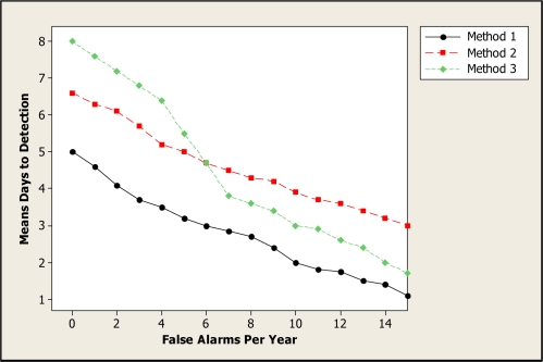
Activity Monitoring Operating Characteristic (AMOC) curves1 are commonly used to measure the performance of event surveillance systems, evaluating the tradeoff between timeliness of detection and the false positive rate. These two measures are important when evaluating the performance of systems designed for the automatic detection of disease outbreaks. Public health officials must detect an emerging outbreak as early as possible, thus enabling a rapid response to reduce the spread and impact of disease, while keeping the number of false alerts (due to noise in the data or non-outbreak events) to a minimum. An AMOC curve is a graphical display of the relationship between detection time (e.g., mean days to detection) and false positive rate (e.g., number of false alerts per year). Figure 1 shows example AMOC curves for three detection methods. In this example, Method 1 outperforms Methods 2 and 3, achieving lower mean days to detection for the entire range of false positives considered. Method 2 outperforms Method 3 for low false alert rates (less than 6 per year) but performs worse for higher false alert rates.
Figure 1.
Example AMOC curves for three methods.
To construct an AMOC curve, let us assume that the detection system derives a real-valued signal st (which we call a score) for each day of data t, and produces an alert (notifying the user of a potential event to be investigated) whenever st exceeds some threshold Z. A lower threshold value will cause the system to produce more frequent alerts, increasing the false positive rate, but will also typically reduce the time to detect a true event. We assume that the background data contains no true events worthy of an alert, and any alerts produced by the system are assumed to be false positives. Thus we compute the false positive rate for a given alert threshold Z as the proportion of background days with st > Z. For a given threshold Z, we compute the number of days needed to detect each simulated event by injecting that event into the background data, computing the score st for each day of the event’s duration, and determining the first day when st > Z. If st ≤ Z for the entire duration of the event, we treat that event as requiring D + P days to detect, where D is the event duration and P ≥ 0 is an optional penalty for failure to detect an event. We then average over all simulated events to compute the average number of days to detection for the given alert threshold. Each alert threshold Z defines a point (x, y) on the AMOC curve, where x is the false positive rate and y is the mean days to detection. The curve is produced by varying Z over a range of false positive rates that might be acceptable to a public health user.
VUTROCS2 are related to AMOC curves. These curves are 3 dimensional with sensitivity, specificity, and mean day to detection plotted. Another related method3 involves plotting on the y axis the time between an alert and when practitioners are expected to detect a given outbreak on their own.
Generalizing the AMOC curve
While the standard AMOC curve is a useful tool for evaluating event detection systems, it does not account for the way in which public health officials use a disease surveillance system when they are investigating a possible disease outbreak based on the system’s outputs. Typically public health officials will follow some (implicit or explicit) response protocol in which they look at certain features of the time series of system outputs s1. . .st (where t is the current time step), and only investigate an alert if certain criteria are met. For example, they may only investigate if the output signal is high for two consecutive days, or if the score is high and has increased from the previous day.
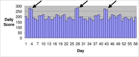
As an example where the standard AMOC does not present an adequate picture of detection performance, consider the case in which the background data has several highly anomalous scores (e.g., due to data entry errors), and the system produces alerts on two consecutive days in response to each anomaly (Figure 2). For example, a space-time scan statistic4 might produce an alert for each day that the score falls within its temporal window. The standard AMOC curve would count these alerts as six distinct false positives. However, most public health practitioners, having investigated the first alert and concluded that there is no real outbreak, would ignore the second alert. Thus only three investigations would be initiated in response to these incorrect alerts. In such a case, standard AMOC curves do not provide a fair evaluation of the detection system because they overstate the number of meaningful false positives.
Figure 2.
One possible way isolated jumps in scores could occur when there is no outbreak.
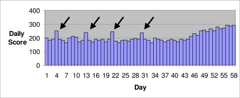
A second example is when an outbreak detection system produces many isolated (single day) alerts corresponding to noise in the background data, whereas a true outbreak produces sustained (multiple day) alerts (Figure 3). If a public health user chooses to investigate each of the isolated alerts, the system will produce a large number of false positives, and the standard AMOC curve correctly reports a high false positive rate for the given alert threshold. However, public health officials, based on their experience using a surveillance system, may ignore isolated signals and wait for a sustained signal before initiating an investigation. For example, Shaffer et al.5 defined an alert as at least two consecutive days of a score exceeding a threshold. In this case, the combination of the system and user response protocol is able to eliminate the false positives while successfully detecting the true outbreak. If we used this protocol, none of the isolated spikes in Figure 3 would be considered an alert, and an investigation would only be initiated several days into the true outbreak. Again the AMOC curve does not accurately depict the system’s performance in practice.
Figure 3.
An outbreak starts on about the 45th day.
Thus a system that performs poorly according to a standard AMOC curve may actually be more useful in day-to-day practice, and an evaluation method that directly accounts for user response is warranted.
Our solution is to assume that users follow a simple response protocol in which they compute some function f(s1...st) based on the most recent t signals s1...st, where st represents the current day’s signal and s1 represents the signal t-1 days earlier. Typically, the function f returns a real number, and the user initiates an investigation when the value of f exceeds some threshold value Z. In this case, we then compute the false positive rate for a given alert threshold Z to be the proportion of background (non-outbreak) days in which f(s1...st) > Z, that is, the fraction of days where an investigation was initiated in response to false positive alerts. Similarly, the time to detect a given outbreak for a given alert threshold Z is measured by finding the first outbreak day t such that f(s1...st) > Z, that is, the first outbreak day where an investigation was initiated in response to the system’s alerts. We determine a curve by varying the threshold Z and computing the false positive rate and average days to detection for each threshold value. We call this graph a generalized AMOC (G-AMOC) curve.
Some simple examples of response protocols and corresponding response functions follow. We note that these examples are not meant to be exhaustive, and many other response protocols are possible:
Example 1: “Initiate an investigation if the score exceeds threshold Z.” This is the response protocol represented by the standard AMOC curve, which only takes the current day’s score into account. This corresponds to the function f(s1...st) = st, and our criterion for an investigation is f > Z.
Example 2: “Initiate an investigation only if the score exceeds threshold Z for k straight days.” This corresponds to the function f(s1...st) = min(st-k+1...st), and our criterion for an investigation is f > Z.
Example 3: “Initiate an investigation if the score exceeds threshold Z and the score has not exceeded threshold Z for the past k days.” This corresponds to the function f(s1...st) = (f1, f2), where f1 = st and f2 = max(st–k...st–1). Our criterion for an investigation is f1 > Z and f2 ≤ Z.
These examples, although not exhaustive of possible response protocols, demonstrate that we can use G-AMOC curves to evaluate detection performance of a system in real-world scenarios where the user must choose whether or not to investigate each alert, assuming a variety of non-trivial, but realistic, response protocols. Thus, one use of generalized AMOC curves is as a descriptive tool to evaluate the performance of a detection method, or to compare the performance of multiple methods. A second use is as a prescriptive tool to compare several different response protocols (represented by different functions f) for a given surveillance system, in order to suggest an appropriate protocol which enables timely detection with few false positives. We present experiments illustrating both these potential benefits.
Experiments
Example 2 showed that we can use G-AMOC curves to evaluate the performance of a system when an investigation is not initiated until a score has exceeded a threshold for several consecutive days. Next we present the results of experiments showing how we can use G-AMOC curves which assume these simple, but non-trivial, response protocols as 1) a descriptive tool, to provide a more accurate comparison of two systems than that obtained only by showing a standard AMOC curve, and 2) a prescriptive tool, to choose an appropriate response protocol for a system by optimizing the number of days we should require a threshold be exceeded before initiating an investigation.
Three Systems Involved
In these experiments, we investigated the performance of three systems when detecting simulated outbreaks that occurred in small spatial subregions of a monitored region. All the methods perform spatial event surveillance. That is, they individually monitor both small and large subregions of a large region.
The first system is a frequentist method for spatial cluster detection called the spatial scan statistic6, which was implemented in the SaTScan software package7. This system investigates whether there is a cluster of occurrences of some event of interest in any subregion. For example, it may look for clusters of patients visiting the emergency department (ED) with respiratory symptoms. The system finds the subregion that maximizes a Poisson likelihood ratio statistic.
The second system is the Bayesian spatial scan statistic (BSS)8. The Bayesian spatial scan statistic is a Bayesian method for spatial cluster detection, which allows us to incorporate prior information and to calculate the posterior probability of each spatial subregion. Furthermore, this statistic assumes a hierarchical Bayesian model in which the disease rates are drawn from Gamma distributions.
The third system is the outbreak detection system PCS9, which was derived from a system called PC10. PC is a disease outbreak detection system that uses a Bayesian network to model the relationships among the events of interest and those observed. PC monitors each individual patient case in the population. PC is a multiple-disease outbreak detection system, which monitors simultaneously 12 outbreak diseases and their variations. PCS is a spatial extension of PC which monitors spatial subregions of a larger region.
We configured SaTScan and BSS to look for a cluster of individuals arriving in the ED with one of the three chief complaints that are the best indicators of the outbreak disease based on the probabilities in PCS.
We compared the performance of PCS and BSS when an investigation was initiated each day the score exceeded a threshold (as in a standard AMOC curve), and when we waited to initiate an investigation until a threshold was exceeded on two consecutive days. We investigated the performance of SaTScan when an investigation was initiated as soon as the score exceeded a threshold once, and when we waited for two consecutive alerts, three consecutive alerts, and four consecutive alerts. The probability of an outbreak was used as the score for PCS and BSS, and the likelihood ratio of the most likely subregion was used as the score for SaTScan.
Datasets
We used real ED admission data that we collected from Allegheny County, Pennsylvania in the year 2004 as the background data. This data set contains all 110 zip codes in Allegheny County. The average daily number of ED visits included in this date set is about 580. We added simulated outbreak cases to this background data to create semi-synthetic outbreaks. The outbreaks were semi-synthetic because the background data is real and the outbreak data is synthetic. Influenza and Cryptosporidium outbreak cases were simulated. The observed data for each outbreak consisted of chief complaints presented by patients in the ED. For each disease, we generated 240 outbreaks with varying durations (60 outbreaks each of 30, 40, 50, and 60 days duration).
We developed the outbreaks by injecting simulated outbreak cases into small subregions of Allegheny County. This county, which covers 730 square miles, was modeled using a 16 × 16 grid. Each grid element is one cell. A zip code was mapped to a cell if the zip code’s centroid was in the cell. The outbreaks were simulated to occur in zip codes mapped to rectangles that are 2 cells by 1 cell, 2 cells by 2 cells, and 3 cells by 2 cells. There were 80 outbreaks with each shape.
To control the severity of the outbreaks, we determined the number of daily injected cases using the standard deviation σcell of the number of real background daily ED visits in each cell in the injected subregion. We simulated outbreaks by setting the average daily number of injected ED visits in each outbreak cell to 2 × σcell. We then computed the total number totcell of injected ED visits during the duration dur of the outbreak to be dur × 2σcell.
We assumed that half of the injected ED visits occurred during the first half of the outbreak, and that Δ of them occurred on day one of the outbreak, 2Δ occurred on day two of the outbreak, and so on. Therefore, to determine the value of Δ we solved Δ + 2Δ + ⋯ + (dur / 2)Δ = totcell / 2.
To determine the chief complaint of each injected case, we generated the chief complaint at random using the probability distribution of the chief complaints given the outbreak disease (influenza or Cryptosporidium), according to the PCS model.
Results
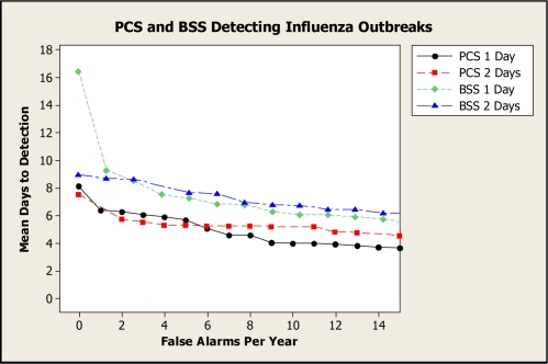
Figure 4 presents G-AMOC curves showing the performance of PCS and BSS when detecting influenza outbreaks. The curve labeled “1 Day” concerns the case where an investigation was initiated after the score exceeded the threshold once, and the curve labeled “2 Days” concerns the case where an investigation was initiated after the score exceeded the threshold on two consecutive days.
Figure 4.
G-AMOC curves showing the performance of PCS and BSS when detecting influenza outbreaks.
We see from these curves that if we only compared PCS and BSS using standard AMOC curves (1 Day), BSS would have compared most unfavorably to PCS, particularly for low false alert rates. However, the 2-Day curves indicate that, by waiting for two alerts, BSS exhibits better performance relative to its own 1-Day performance, and also that its performance relative to PCS is improved. G-AMOC curves are only as meaningful as the protocols that are used to generate them. Nonetheless, this experiment shows that we can obtain a more insightful comparison of alternative systems by evaluating which system performs best under different response protocols.
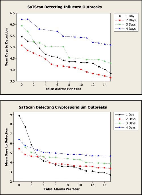
Figure 5 presents G-AMOC curves showing the performance of SaTScan when detecting both influenza and Cryptosporidium outbreaks. These curves indicate that we obtain better performance for 2 Days than for 1 Day for all false alert rates in the case of influenza and for small false alert rates in the case of Cryptosporidium. Based on this analysis, in an outbreak-detection setting we should wait for two consecutive alerts before initiating an investigation for influenza outbreaks, regardless of the tolerated false alert rate. If a very low false alert rate is desired, we should also wait for two alerts in the case of Cryptosporidium outbreaks. Using only an AMOC curve, we would not learn that a two-day wait is best.
Figure 5.
G-AMOC curves showing the performance of SaTScan when detecting outbreaks.
Discussion
We introduced a framework for evaluation of detection systems called Generalized Activity Monitoring Operating Characteristic (G-AMOC) curves. A G-AMOC curve, which is a generalization of the AMOC curve, takes the user’s response protocol into account, assuming that the user applies some function f(s1...st) based on the current day’s score st and past scores s1...st-1 and initiates an investigation when the value of f meets some criterion. Typically, the criterion for investigation is that f exceeds some threshold Z, and the G-AMOC curve is generated by varying Z over an acceptable range of false positive rates. A standard AMOC curve is a special case of a G-AMOC curve assuming the response protocol function f(s1...st) = st.
We showed the results of several experiments illustrating the usefulness of G-AMOC curves. Using G-AMOC curves as a descriptive tool, we compared the systems BSS and PCS assuming several different response protocols. Using G-AMOC curves as a prescriptive tool, we compared several response protocols for SaTScan, and found that its performance is best when we wait for two consecutive alerts before initiating an investigation.
Acknowledgments
This research was supported by the National Science Foundation Grant No. IIS-0325581.
References
- 1.Fawcett T, Provost F. Proceedings of the Fifth SIGKDD Conference on Knowledge Discovery and Data Mining. ACM Press; San Diego, California: 1999. Activity monitoring: Noticing interesting changes in behavior. [Google Scholar]
- 2.Kleinman K, Abrams A. Evaluating outbreak-detection methods using simulations: Volume under the time-ROC surface. Advances in Disease Surveillance. 2006;1:39. [Google Scholar]
- 3.Shen Y, Wong W, Cooper GF. A generalization of the AMOC curve. Advances in Disease Surveillance. 2006;1:65. [Google Scholar]
- 4.Kulldorff M. Prospective time periodic geographical disease surveillance using a scan statistic. J R Statist Soc A. 2001;16:4. [Google Scholar]
- 5.Shaffer L, et al. Early outbreak detection using an automated data feed of test orders from a veterinary diagnostic laboratory. In: Zeng D, et al., editors. Intelligence and Security Informatics: Biosurveillance. Springer; Berlin: 2007. [Google Scholar]
- 6.Kulldorff M. A spatial scan statistic. Communications in Statistics: Theory and Methods. 1997;26(6):1481–1496. [Google Scholar]
- 7.Kulldorff M, SaTScan v. 4.0: Software for the spatial and space-time scan statistics, Technical Report, Information Mgmt. Services, Inc., 2004
- 8.Neill DB, Moore AW, Cooper GF. A Bayesian spatial scan statistic. Advances in Neural Info. Proc. Systems (NIPS) 2005;18 [Google Scholar]
- 9.Jiang X, Cooper GF, Neill DB.A Bayesian network model for spatial event surveillance Int J of Approximate Reasoning 2009. doi:10.1016/j.ijar.2009.01.001. [Google Scholar]
- 10.Cooper GF, Dowling JN, Lavender JD, Sutovsky P. A Bayesian algorithm for detecting CDC category A outbreak diseases from emergency department chief complaints. Advances in Disease Surveillance. 2007;2:45. [Google Scholar]


