

Abstract
Color preference is an important aspect of visual experience, but little is known about why people in general like some colors more than others. Previous research suggested explanations based on biological adaptations [Hurlbert AC, Ling YL (2007) Curr Biol 17:623–625] and color-emotions [Ou L-C, Luo MR, Woodcock A, Wright A (2004) Color Res Appl 29:381–389]. In this article we articulate an ecological valence theory in which color preferences arise from people’s average affective responses to color-associated objects. An empirical test provides strong support for this theory: People like colors strongly associated with objects they like (e.g., blues with clear skies and clean water) and dislike colors strongly associated with objects they dislike (e.g., browns with feces and rotten food). Relative to alternative theories, the ecological valence theory both fits the data better (even with fewer free parameters) and provides a more plausible, comprehensive causal explanation of color preferences.
Keywords: aesthetic preference, color vision, ecological theory
Color preference is an important aspect of visual experience that influences a wide spectrum of human behaviors: buying cars, choosing clothes, decorating homes, and designing websites, to name but a few. Most scientific studies of color preference have focused on psychophysical descriptions (1–8), which may be sufficient for marketing applications but provide no explanation of why people like the colors they do or even why they have color preferences at all. More recently, a few speculations have been offered about the cause of color preferences.
Humphrey (9) proposed that color preferences stem from the signals that colors convey to organisms in nature: Sometimes colors send an “approach” signal (e.g., the colors of a flower attracting pollinating insects), and sometimes they send an “avoid” signal (e.g., the colors of a poisonous toad deterring predators). Humphrey suggested that, even though the colors of many modern artifacts are almost completely arbitrary (e.g., the color of a shirt or car) and thus do not have significant signal value, deeply ingrained natural color signals (e.g., the redness of a blushing face) may be strong enough to influence color preferences.
Hurlbert and Ling (10) reported findings that they interpreted as support for the kind of evolutionary/behaviorally adaptive theory of color preferences that Humphrey suggested would arise based on behavioral adaptations. They suggested that color preferences are wired into the human visual system as weightings on cone-opponent neural responses that arose from evolutionary selection. Their hypothesis is essentially that the color vision system adapted to improve performance on evolutionarily important behavioral tasks (e.g., females finding ripe red fruits and berries against green leaves) and that genetic tuning to optimize such behaviorally significant discriminations resulted in preferences for the colors of those objects against the colors of their backgrounds, independent of their original context (10, 11).
Hurlbert and Ling (10) analyzed their preference data in terms of the two cardinal dimensions of opponent cone-contrasts: the LM-axis (L-M) that runs roughly from red to blue-green and the S-axis [S-(L+M)], that runs roughly from violet to yellow-green (12, 13), where “S,” “M,” and “L” refer to the outputs of short-, medium-, and long-wavelength cone types, respectively. The cone-contrast model explained 70% of the variance in Hurlbert and Ling’s preference data on a limited gamut of colors. Both males’ and females’ preferences weighted positively on the S-axis, meaning that both sexes preferred colors that were more violet to colors that were more yellow-green. On the LM-axis, however, females weighted somewhat positively, preferring redder colors, and males weighted somewhat negatively, preferring colors that were more blue-green. This gender difference formed the basis of Hurlbert and Ling’s evolutionary/behaviorally adaptive hypothesis, in that they attributed the difference to hardwired mechanisms that evolved in hunter-gatherer societies: Females like redder colors because their visual systems are specialized for identifying ripe fruit/berries against green foliage. Hurlbert and Ling (10–11) did not speculate, however, on why males prefer colors that are more blue-green or why both genders prefer colors that are more violet to colors that are more yellow-green. Later, Ling and Hurlbert (14) showed that for a more diverse set of colors, the fit of the cone-contrast model improved if they added two more dimensions to the S-axis and LM-axis predictors: a lightness predictor (S+L+M) and a saturation predictor (Suv from CIELUV color space).
Ou et al. (15, 16) proposed an account based on “color-emotions,” which they defined as “feelings evoked by either colors or color combinations.” Color-emotions can be linked causally to color preferences if colors are preferred to the extent that viewing them produces positive emotions in the observer. They found that 67% of the variance in their color preference data could be predicted from three factor-analytic dimensions derived from color-emotion data: active/passive (active preferred), heavy/light (light preferred), and warm/cool (cool preferred). They did not explain how color-emotions arise from viewing colors, however, or why some color-emotions predict color preferences better than others.
In this article we propose a more coherent and comprehensive theory of human color preferences that we call the “ecological valence theory” (EVT) and report an empirical test of the theory. The EVT is related to but is different from both previous theories. Consistent with Humphrey’s (9) and Hurlbert and Ling’s (10, 11) ideas, the EVT is grounded on the premise that human color preferences are fundamentally adaptive: People are more likely to survive and reproduce successfully if they are attracted to objects whose colors “look good” to them and avoid objects whose colors “look bad” to them. This ecological heuristic will, in fact, be adaptive, provided that how good/bad colors look reflects the degree to which objects that characteristically have those colors are advantageous/disadvantageous to the organism’s survival, reproductive success, and general well-being. Whereas Humphrey’s (9) and Hurlbert and Ling’s (10, 11) hypotheses address an evolutionary time scale (i.e., genetic adaptations across generations resulting in hardwired neural mechanisms), the EVT extends the range of potentially adaptive mechanisms to include individual organisms learning color preferences on an ontogenetic time scale. An analogy to taste preferences is apt: Taste preferences have both an evolutionary component, because some genetic variations in taste are more adaptive than others, and a learned component resulting from experiences that arise from eating various flavored foods that have affectively different outcomes (17). The connection of the EVT to the emotion-based theory of Ou et al. (15, 16) is that the environmental feedback required for a learning-based heuristic to work for color preferences is provided by the emotional outcomes of color-relevant experiences during a person’s lifetime. The more enjoyment and positive affect an individual receives from experiences with objects of a given color, the more the person will tend to like that color.
In this article we test the EVT by determining how well it can account for average preferences across individuals for a wide gamut of colors. The EVT implies that the average preference for any given color over a representative sample of people should be determined largely by their average affective responses to correspondingly colored objects. Accordingly, people should be attracted to colors associated with salient objects that generally elicit positive affective reactions (e.g., blues and cyans with positively valued clear sky and clean water) and repulsed by colors associated with salient objects that generally elicit negative reactions (e.g., browns with negatively valued feces and rotting food). As reported here, we tested this central prediction of the EVT and compared its fit with those of three other theories: the cone-opponent contrast model, a color-appearance theory based on our observers’ ratings, and the color-emotion theory.
Results and Discussion
Each of 48 participants rated each of the 32 chromatic colors of the Berkeley Color Project (BCP) (Fig. 1 A and B) in terms of how much the participant liked the color using a line-mark rating scale that was converted to numbers ranging from −100 to +100 with a neutral zero-point. Average preference ratings (Fig. 1C) show that the saturated (s), light (l), and muted (m) colors produced approximately parallel functions with a broad peak at blue and a narrow trough at chartreuse. The s colors were preferred to the l and m colors [F(1,47) = 9.20, P < 0.01], which did not differ from each other (F < 1). Although the pattern of hue preferences across s, m, and l cuts† did not differ [F(14, 658) = 1.66, P > 0.05], it did vary for the dark (d) cut relative to the other three [F(7,329) = 17.87, P < 0.001]. In particular, dark orange (brown) and dark yellow (olive) were significantly less preferred than other oranges and yellows [F(1,47) = 11.74, 41.06, P < 0.001, respectively], whereas dark red and dark green were more preferred than other reds and greens [F(1,47) = 15.41, 6.37, P < 0.001, 0.05, respectively].
Fig. 1.

(A) The present sample of 32 chromatic colors as defined by eight hues, consisting of four approximately unique hues (Red, Green, Yellow, Blue) and their approximate angle bisectors (Orange, cHartreuse, Cyan, Purple), at four “cuts” (saturation-lightness levels) in color-space: saturated (s, Upper Left), light (l, Upper Right), dark (d, Lower Right), and muted (m, Lower Left). (B) The projections of these 32 colors onto an isoluminant plane in CIELAB color-space. (C) Color preferences averaged over all 48 participants. Error bars show SEM. (D) WAVEs for the 32 chromatic colors estimated using data from independent participants performing three different tasks.
The central assumption of the EVT is that color preferences, averaged across people, are determined by the average affective valence of people’s responses to objects that are strongly associated with each color. We tested this claim by measuring the weighted affective valence estimate (WAVE) for each of the 32 chromatic BCP colors (Fig. 1D) and correlating the result with the corresponding average color preferences (Fig. 1C). Calculating the WAVEs of the 32 BCP colors required collecting and analyzing the results of three different tasks: an object-association task, an object-valence rating task, and a color-object matching task.
In the object-association task, 74 naïve participants saw each color individually against the same neutral gray background and were instructed to write as many descriptions as they could of objects that characteristically contained the color displayed on the screen. They were asked to limit their responses to objects whose color generally would be known to others from the description without naming the color (e.g., not “my favorite sweater”) and objects whose color would be relatively specific to that object type (e.g., not “crayon” or “T-shirt,” which could be any color). They also were encouraged explicitly not to suppress naming unpleasant objects. The responses were categorized into 222 object descriptions (the criteria we used are described in Materials and Methods).
In the subsequent object-valence rating task, 98 other participants were shown each of the 222 object descriptions in black text on a white background and were asked to rate how appealing each referent object was on a line labeled “negative” on the left end to “positive” on the right. Color was not mentioned in the instructions, and color names appeared in the descriptions only when necessary to disambiguate the category (e.g., red apples vs. green apples).
In the color-object matching task, a third group of 31 additional observers was shown each of the descriptions together with a square of the color to which that object description had been given as an associate. They were asked to rate the strength of the match (degree of similarity) between the color of the described objects and the color shown on the screen. Ratings were made using the same line-mark task as for the other tasks and converted to a 0–1 scale, such that descriptions whose referents most closely matched the screen color received weights closer to unity, and those whose referents were most dissimilar received weights closer to zero.
The WAVE for each color (Wc) was calculated as follows:
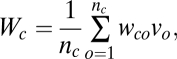 |
where wco is the average color-object match value for each pairing of a color (c) and an object description (o), vo is the average valence rating given to object o, and nc is the number of object descriptions ascribed to color c. The striking similarity of these WAVE functions (Fig. 1D) to the corresponding preference functions (Fig. 1C) is supported by the high positive correlation between the WAVE data and color preference data (r = +0.893), accounting for 80% of the variance with a single predictor. This fit is especially impressive considering that, despite its internal complexity, no free parameters were estimated in calculating the WAVE; it is simply the outcome of a well-defined procedure for determining a quantity theoretically implied by the EVT. To compare its performance with alternatives theories, we fit the same preference data to three other models.
We used the method of Hurlbert and Ling (9, 10) to analyze the average color preference ratings in terms of cone-opponent contrast components by calculating the contrasts of the test colors against the gray background for the L-M, S-(L+M), (S+L+M) opponent systems and CIELUV saturation. This extended model accounted for only 37% of the variance in our data: 21% by the S-(L+M) output (r = 0.46, P < 0.05, colors that were more violet preferred), 4% more by the S+L+M output (lighter colors preferred), a further 8% by CIELUV saturation (higher-saturation colors preferred), and a final 4% by the L-M output (colors that were more blue-green preferred). This model’s markedly poorer performance on our data (37%) than on Hurlbert and Ling’s own data (70%) results largely from the wider gamut of our color sample. When their original cone-contrast model (10) was applied just to the narrow set of eight BCP colors that are analogous to Hurlbert and Ling’s colors in having the same saturation and similar luminance (muted orange, muted yellow, muted chartreuse, muted green, saturated cyan, light red, light green, and light purple), it was able to explain 64.4%‡ of the variance, comparable to its performance on Hurlbert and Ling’s own data. When the additional 24 colors in the present sample were included in the analysis, however, the cone-contrast model’s performance decreased precipitously.
Next we predicted average preference ratings using a color-appearance model derived from our participants’ average ratings of classic, high-level dimensions of color appearance: red/green, yellow/blue, light/dark, and high/low saturation.¶ The color-appearance model accounted for 60% of the variance (multiple-r = 0.774, P < 0.01) for the full set of 32 colors with three predictors: 34% for blue-yellow (bluer colors preferred), an additional 19% for saturation (higher-saturation colors preferred), and a final 7% for light-dark (lighter colors preferred). This color-appearance model thus outperformed the cone-contrast model, suggesting that preferences are better modeled by higher-level color appearances, at least when the colors are widely sampled over color space. Although this color-appearance model explains a good deal of variance, it fails to predict the salient interaction between hue preferences in the d cut relative to the other cuts. It also fails to explain why people prefer the colors they do; it merely provides a better description of the preference pattern than does the cone-contrast model.
We also fit Ou et al.’s (15, 16) color-emotion model to our average color preference data using our participants’ direct ratings of their three factors: active/passive, heavy/light, and warm/cool. This model accounted for 55% of the variance, about the same as the color-appearance model and more than the cone-contrast model. Active/passive§ explained 22% of the variance (more active colors preferred), warm/cool explained an additional 26% (cooler colors preferred), and heavy/light explained a further 7% (lighter colors preferred).
The EVT’s WAVE predictor, which accounted for 80% of the variance, thus outperformed all three other models we tested—the cone-contrast model (37%), the color-appearance model (60%), and the color-emotion model (55%)—and it did so with two fewer predictors and free parameters. The WAVE is by far the best predictor of average color preferences, and it nicely captures the primary features of the complex color preference functions: the pronounced peak at blue, the trough at chartreuse, higher preference for saturated colors, and the pronounced minimum around dark yellow (Fig. 1 C and D). Its main deficiencies are underpredicting the aversion to dark orange (possibly because chocolate and coffee are often judged as quite appealing) and underpredicting the positive preference for dark red (possibly because blood is usually judged as unappealing).
Perhaps most importantly, the EVT provides a clear and plausible explanation of color preferences: The preferences are caused by affective responses to correspondingly colored objects. Although the present evidence is correlational, it seems unlikely that causality runs in the opposite direction. If object preferences were caused by color preferences, then chocolate and feces should be similarly appealing because they are similar in color. Clearly this is not the case. Some third mediating variable conceivably might cause the strong correlation, but it is unclear what that might be.
These results show that average color preferences of modern Americans, sampled from Berkeley, CA, correlate strongly with object preferences of an independent but similar sample of people. The degree to which these color preferences are hardwired, as opposed to learned during an individual’s lifetime, is an open question, however. The fact that the basic hue preference pattern we have measured largely agrees with earlier studies (1–8, 10, 11) and with the pattern of looking biases found in infants (18–20) suggests that at least some aspects of human color preferences may be universal. For example, blues and cyans may be universally liked because clear sky and clean water are universally appealing, and browns and olives may be universally disliked because feces and rotting food are universally disgusting. It is not yet clear, however, whether such universals are innate or learned. Even so, there are many ways in which we can evaluate whether someone’s personal experiences influence color preferences during his/her lifetime by studying cultural, institutional, and individual differences, all of which we are currently investigating.
Culturally, the EVT implies that the correlation between color preferences and WAVEs obtained from the same cultural group should be higher than the correlation between color preferences and WAVEs obtained from different cultural groups, provided that the two groups have different color-object associations or different preferences for the same objects (Fig. 2). For example, American WAVEs should predict American color preferences better than they predict Japanese color preferences, and Japanese WAVEs should predict Japanese color preferences better than they predict American color preferences. We currently are testing such predictions for our 32 colors in Japan, Mexico, India, and Serbia in addition to the United States. Preliminary results from Japan support this pattern of predictions: American WAVEs predicted American preferences (r = 0.89) better than they predicted Japanese preferences (r = 0.74), and Japanese WAVEs predicted Japanese preferences (r = 0.66) better than they predicted American preferences (r = 0.55).
Fig. 2.

Diagram showing a central tenet of the EVT: The correlation between WAVEs and color preferences obtained within a group should be stronger than the correlation between WAVEs and color preferences obtained from different groups. The correlations are obtained from individuals with similar color preferences as determined by hierarchical clustering (21). (Fig. S1 shows plots of the color preferences and WAVEs of these two groups.)
By the same logic, WAVE data from groups of American participants who have similar color preferences should be able to account for their own color preferences better than for other groups’ color preferences. To test this prediction, we measured both color preferences (obtained first) and object valences for our 222 object descriptions (obtained later) from a single set of participants. We used a hierarchical clustering algorithm (21) to define two internally homogeneous groups, j and k (containing 17 and 12 individuals, respectively), based on the correlations between color preference for each pair of the 29 participants studied thus far. We then computed the average WAVE data for each group, based on their own valence ratings of the same 222 object descriptions. As predicted by the EVT, the correlations between the WAVEs and color preferences within groups were higher (r = 0.77 and 0.83) than the correlations between groups (r = 0.47 and 0.64) (Fig. 2). It is clear from the plots showing the color preferences and WAVEs for the two groups (Fig. S1) that the within-group WAVEs and preference functions are more similar than the between-group WAVEs and preference functions.
This result also answers a possible objection that the high positive correlation between the WAVE data and color preferences might result from a valence-consistency bias in the object-association task: Perhaps people simply list more desirable objects for colors they like and list less desirable objects for colors they dislike. The results from these two groups demonstrate that this possibility cannot provide a full account, because both groups rated the very same set of objects. Any selection bias in the 222 object descriptions, therefore, cannot account for the differences in correlations between the WAVE and preference data for these two groups.
The EVT also implies that people’s allegiances to social institutions with strong ties to specific colors also should affect their color preferences. If a group of people has a strong positive (or negative) emotional investment in an important social institution that has powerful and consistent color associations (e.g., universities, athletic teams, street gangs, religious orders, and even holidays), then the EVT predicts that this group should come to like the associated colors correspondingly more (or less, depending on the polarity of their affect) than a neutral group. The rationale for this prediction is that thriving in modern society involves a great deal more than just meeting biological needs; social connections can matter as much or even more.
Preliminary results with university colors suggest that social investments can and do influence people’s color preferences: Among University of California, Berkeley undergraduates, the amount of “school spirit,” as assessed by a questionnaire administered after they rated color preferences, correlated positively with preference for Berkeley’s own blue and gold colors and negatively with preference for the red and white of Berkeley’s arch-rival, Stanford University. The inverse pattern was found among Stanford undergraduates. This finding supports two crucial predictions of the EVT. First, it shows that sociocultural institutional affiliations can affect color preferences during an individual’s lifetime. Second, it provides further evidence of the causal direction, because it is wildly improbable that student attitudes toward universities are caused by their color preferences. Student’s who like Berkeley do not do so because they like blue and gold; they like blue and gold because they like Berkeley.
Further preliminary evidence that object preferences cause color preferences comes from results indicating that color preferences can be changed by showing people biased samples of pictures of colored objects. All participants first rated the 32 BCP colors for aesthetic preference, then saw a slide show in which they made various judgments about pictures of colored objects, and then rated the same 32 BCP colors again. For one group, the slide show contained 10 pictures of desirable red objects (e.g., strawberries and cherries), 10 pictures of undesirable green objects (e.g., slime and mold), and 20 neutral objects of other colors. The other group saw 10 desirable green objects (e.g., trees and grassy fields), 10 undesirable red objects (e.g., blood and lesions), and the same 20 neutral objects of other colors. Both groups were told that the slide show was part of a separate experiment on spatial aesthetics, during which they were asked to decide whether a given label was appropriate to the picture, to indicate the location of the center of the focal object with the cursor, to rate the visual complexity of the focal object, and to rate how much they liked the focal object. The results thus far show that preference ratings for red increased significantly for the group that saw desirable red objects, and the preference ratings for green increased significantly for the group that saw desirable green objects. There also were decreases in preference ratings of the color of the undesirable objects, but these decreases were not statistically reliable. These findings demonstrate that color preferences can be influenced by experience and support the claim that object preferences cause color preferences.
It is important to note that the EVT does not deny the possibility that color preferences can causally influence object preferences. Clearly there are many situations in which colors do influence object preferences, especially for artifacts in which color is the only feature that differentiates otherwise identical instances (e.g., paint, clothes, and furniture). The EVT actually predicts that preference for a color will be reinforced via positive feedback to the extent that people ultimately like something they bought, made, or chose because of its color. Color preferences thus tend to be self-perpetuating, at least until other factors, such as boredom, new physical or social circumstances, and/or fashion trends, change the dynamics of aesthetic response, as indeed they inevitably do.
Materials and Methods
Participants.
The same 48 participants took part in the color preference, color–emotion association (active/passive, heavy/light, and warm/cool), and color appearance (red/green, blue/yellow, dark/light, and saturation) tasks. Their mean age was 32 years (range, 18–71 years), and there were equal numbers of males and females. Some participants were University of California, Berkeley undergraduates, but most were research volunteers from the greater San Francisco Bay area. All were screened for color deficiency using the Dvorine Pseudo-isochromatic Plates, and none was color deficient. A second set of 74 participants took part in the object-description task, all of whom were University of California, Berkeley undergraduates who volunteered to participate during section meetings of a cognitive psychology course. Although participants in this set were not screened individually for color blindness, they were asked to not participate if they believed they had or might have a color deficiency. A third set of 98 University of California, Berkeley undergraduates participated in the valence-rating task to fulfill a partial course requirement. Their mean age was 20 years (range, 18–36 years), and 42 were female. No colors were presented in this task, so participants were not screened for color blindness. A fourth set of 31 participants took part in the color-object matching task. Their mean age was 23 years (range, 18–28 years), and 19 were female. All were screened for color deficiency using the Dvorine Pseudoisochromatic Plates, and none was color deficient. All participants gave informed consent, and the Committee for the Protection of Human Subjects at the University of California, Berkeley, approved the experimental protocol.
Design.
The 32 colors (Fig. 1 A and B) were chosen systematically as specified by the perceptually salient dimensions of color experience: hue, lightness, and saturation, where hue was further specified in terms of the Hering primitives of red versus green (R/G) and blue versus yellow (B/Y). The colors were sampled roughly according to the dimensional structure of the Natural Color System (22), although they actually were chosen from the Munsell Book of Colors, Glossy Series (23) and were translated into CIE xyY coordinates to generate them on our computer (Table S1) using the Munsell Renotation Table (24). The sample included highly saturated colors of the four Hering primaries approximating the unique hues: red (R), green (G), blue (B), and yellow (Y), (Munsell hues 5R, 5Y, 3.75G**, and 10B, respectively). We also included four well-balanced binary hues that contained approximately equal amounts of the two adjacent unique hues: orange (O) between Y and R, purple (P) between R and B, cyan (C) between B and G, and chartreuse (H) between G and Y (Munsell hues 5YR, 5GY, 5BG, and 5P, respectively). We then defined four “cuts” through color space that differed in their saturation and lightness levels, as follows. Colors in the “saturated” (s) cut were defined as the most saturated color of each of the eight hues that could be produced on our monitor. The eight colors in the “muted” (m) cut were those that were approximately halfway between the s color and the Munsell value of 5 and chroma of 1 for the same hue. The eight colors in the “light” (l) cut were those that were approximately halfway between each s color and the Munsell value of 9 and chroma of 1 for the same hue. The eight colors in the “dark” (d) cut were those that were approximately halfway between each s cut and Munsell value of 1 and chroma of 1 for the same hue. The l, m, and d colors within each Munsell hue were equivalent in Munsell chroma (saturation). This set comprised the 32 chromatic colors that were studied.
Displays.
For the color-preference, color-appearance, and color-emotion rating tasks, participants viewed the computer screen from ≈70 cm. The monitor (Dell M990) was 18 inches diagonally with a resolution of 1,024 × 768 pixels. The colors always were presented as squares (100 × 100 pixels) on a gray background (CIE x = 0.312, y = 0.318, Y = 19.26). The monitor was calibrated using a Minolta CS100 Chroma Meter. A ratings scale (400 pixels long), with a demarcated center and end points, was located at the bottom of each display. A response cursor was constrained to move only along the scale and to stop at the endpoints. Text below each endpoint specified what that end of the scale represented, as described below.
For the object-description, valence-rating, and color-object matching tasks the displays were presented on an Apple iMac computer with a 20-inch monitor that was calibrated and programmed to produce the same colors as before. The dimensions of the colored squares were increased from 100 × 100 pixels in the color-rating and color-object matching tasks to 300 × 300 pixels in the object-description task because participants in the object-description task were run in small groups, and the subjects were farther from the screen than in the color-rating tasks. The rating scale was removed from these larger displays because participants recorded their object descriptions with pencil and paper. Care was taken to ensure that the appearance of the colors for participants seated off-axis did not differ substantially from those seated directly in front of the monitor. For the valence-rating and color-object matching tasks, object descriptions were presented as black text (22-point Times New Roman font) on a white background. For the valence-rating task, a line-mark rating scale was located a the bottom of the screen with the words “negative” and “positive” displayed below the left and right endpoints, respectively. For the color-object matching task, the words “very poorly” and “very well” were displayed below the left and right endpoints, respectively. Participants viewed the computer screen from ≈70 cm. All displays were generated and presented using Presentation (www.neurobs.com) software.
Procedure.
For each of the color-related rating tasks (color-preference, color-appearance, and color-emotion ratings), subjects were presented with each of the 32 colors, one at a time, in a random order. For the color-preference task, participants rated how much they liked each color on a scale from “not at all” to “very much” by sliding the cursor along the response scale and clicking to record their response. For the color-appearance tasks, participants rated each color’s appearance on the following scales: “red” to “green,” “yellow” to “blue,” “light” to “dark,” and “saturated” to “desaturated.” For the color-emotion tasks, participants rated colors on the following scales: “active” to “passive,” “strong” to “weak,” and “warm” to “cool.” Trials were separated by a 500-ms intertrial interval. Trials were blocked by rating scale so that participants rated all the colors along a particular dimension before going on to the next dimension. Color-preference ratings were obtained first, followed by color-appearance ratings. Color-emotion ratings were obtained last, on a different day. The other tasks were run using different groups of participants.
In the object-description task, naïve participants were run in six groups ranging from 11 to 13 people. They were instructed to write down the name or a brief description of as many objects as they could in a 20-s period that characteristically had that color. They were told to name objects whose color would be widely known (not, for example, the color of one’s own bedroom walls) and would be judged to be similar to the color they were viewing. They were also told not to name objects that could be any arbitrary color (e.g., crayons or T-shirts). A tone sounded at the start of each new trial so that participants knew to look up from their response sheet for the next color. The experimenter monitored the participants to make sure they did not copy responses from their neighbors.
All 3,874 object descriptions then were compiled into a single list of 222 items (Table S2) using the following procedure. First, reported items were discarded from the list if they (i) could be virtually any color (e.g., crayons, paint, cars), (ii) were abstract concepts instead of objects (e.g., peace, winter, Christmas), (iii) were color names instead of objects (e.g., “Cal Blue,” “teal”), (iv) were not (or remotely similar to) the color that was on the screen when they were reported (e.g., “grass at noon” for dark purple), or (v) were not mentioned by more than one participant for any of the colors.
After exact repeats were combined, 851 descriptions remained. These descriptions then were categorized to reduce the number that needed to be rated in the valence-rating and color-object matching phases of the experiment. Descriptions that seemed to refer to the same object were combined into a single object category. For example, the category “algae” included the descriptions “algae,” “algae water,” “algal bloom,” “algae-filled fish bowl,” and “algae floating on top of water.”
In addition, descriptions were combined into a superordinate category if there were many exemplars referring to the same type of object. In these cases, exemplars that were named were included in the category description. For instance, “dry/dead foliage (grass, leaves, pine needles)” was used as a single category instead of separate categories for each type of foliage that people described as dry and/or dead (i.e., dry/dead grass, dry/dead leaves, dry/dead pine needles). This grouping produced a total of 222 unique object categories, not including repeats of the same objects for different colors.
For the valence-rating task, participants were presented with each category of object descriptions one at a time on a computer screen. Their task was to rate their emotional response to each object, which we defined as how positive or appealing each object was, on a scale from “negative” to “positive.” No mention of color was made in the instructions, although a few descriptions did contain a color word, such as “purple flowers (e.g., lavender, violets, lilacs, irises).” The same line-mark slider scale that was used for the color-rating tasks was used in this experiment. Before the experiment began, participants were presented with the following example object descriptions, which spanned the range from very positive to very negative, so that they could anchor the endpoints of the scale (“sunset,” “bananas,” “diarrhea,” “sidewalk,” “boogers/snot,” “wine (red),” “chalkboard,” “chocolate”), but they were not told in any way how any of these examples should be rated. The valence-rating task was performed alone, with no other task before it, to be sure that colors were not primed in any way before their ratings.
In the color-object matching task, participants were tested individually. They were instructed to rate the degree to which the color of the verbally described object category matched the colored square that was simultaneously presented on the monitor. They used a line-mark rating scale similar to that for other tasks, except that the left and right endpoint were labeled “very poorly” to “very well,” respectively.
Supplementary Material
Acknowledgments
We gratefully acknowledge the help of anonymous reviewers for their valuable suggestions for improving this manuscript, Joseph Austerweil for performing statistical analyses, Yazhu Ling in testing the cone-contrast model on our data, William Prinzmetal for allowing us to collect data on the object-description task in sections of his course, and Rosa Poggesi, Christine Nothelfer, Patrick Lawler, Laila Kahn, Cat Stone, Divya Ahuja, and Jing Zhang for testing participants. This research was funded in part by National Science Foundation Grant BCS-0745820, by gifts from Google and from Dan Levitin to S.E.P. and by the generous gift of product coupons from Amy’s Natural Frozen Foods (Santa Rosa, CA) to K.B.S., with which we “paid” many of our participants.
The authors declare no conflict of interest.
*This Direct Submission article had a prearranged editor.
This article contains supporting information online at www.pnas.org/lookup/suppl/doi:10.1073/pnas.0906172107/-/DCSupplemental.
†We use the term “cut” (through color space) to refer to the four combinations of lightness and saturation levels we used (Fig. 1 A and B).
‡We thank Yazhu Ling (Institute of Neuroscience, Newcastle University, Newcastle upon Tyne, UK) for providing this analysis.
¶This model is similar to Ling and Hurlbert’s (14) extended model, in that both contain predictors for hue, lightness, and saturation. In their model, however, hue and lightness were defined by objective cone-contrast values whereas in the present model they are defined by subjective color-appearances ratings.
§Consistent with Ou et al.’s (15, 16) specifications, we first transformed the active-passive ratings by the hyperbolic tangent function specified in their model.
**We calculated 3.75 G by interpolating between 2.5 G and 5 G in the Munsell Renotation Table.
References
- 1.Guilford JP, Smith PC. A system of color-preferences. Am J Psychol. 1959;73:487–502. [PubMed] [Google Scholar]
- 2.McManus IC, Jones AL, Cottrell J. The aesthetics of color. Perception. 1981;10:651–666. doi: 10.1068/p100651. [DOI] [PubMed] [Google Scholar]
- 3.Camgöz N, Yerner C, Güvenç D. Effects of hue, saturation, and brightness on preference. Color Res Appl. 2002;27:199–207. [Google Scholar]
- 4.Granger GW. Objectivity of colour preferences. Nature. 1951;170:778–780. doi: 10.1038/170778a0. [DOI] [PubMed] [Google Scholar]
- 5.Granger GW. An experimental study of colour preferences. J Gen Psychol. 1955;52:3–20. [Google Scholar]
- 6.Eysenck HJ. A critical and experimental study of color preference. Am J Psychol. 1941;54:385–391. [Google Scholar]
- 7.Chandler AR. Beauty and Human Nature. New York: Apple-Century-Crofts; 1934. [Google Scholar]
- 8.Helson H, Lansford T. The role of spectral energy of source and background color in the pleasantness of object colors. Appl Opt. 1970;9:1513–1562. doi: 10.1364/AO.9.001513. [DOI] [PubMed] [Google Scholar]
- 9.Humphrey N. The colour currency of nature. In: Porter T, Mikellides B, editors. Colour for Architecture. London: Studio-Vista; 1976. [Google Scholar]
- 10.Hurlbert AC, Ling YL. Biological components of sex differences in color preference. Curr Biol. 2007;17:623–625. doi: 10.1016/j.cub.2007.06.022. [DOI] [PubMed] [Google Scholar]
- 11.Ling Y, Hurlbert A, Robinson L. Sex differences in colour preference. In: Pitchford NJ, Biggam CP, editors. Progress in Colour Studies 2: Cognition. Amsterdam: John Benjamins; 2006. [Google Scholar]
- 12.Webster MA, Miyahara E, Malkoc G, Raker VE. Variations in normal color vision. II. Unique hues. J Opt Soc Am A. 2000;17:1545–1555. doi: 10.1364/josaa.17.001545. [DOI] [PubMed] [Google Scholar]
- 13.Wuerger SM, Atkinson P, Cropper S. The cone inputs to the unique-hue mechanisms. Vision Res. 2005;45:3210–3223. doi: 10.1016/j.visres.2005.06.016. [DOI] [PubMed] [Google Scholar]
- 14.Ling YL, Hurlbert AC. 15th Color Imaging Conference Final Program and Proceedings. Springfield, VA: Society for Imaging Science and Technology; 2009. A new model for color preference: Universality and individuality; pp. 8–11. [Google Scholar]
- 15.Ou L-C, Luo MR, Woodcock A, Wright A. A study of colour emotion and colour preference. Part 1: Colour emotions for single colors. Color Res Appl. 2004;29:232–240. [Google Scholar]
- 16.Ou L-C, Luo MR, Woodcock A, Wright A. A study of colour emotion and colour preference. Part 3: Colour preference modeling. Color Res Appl. 2004;29:381–389. [Google Scholar]
- 17.Garcia J, Lasiter PS, Bermudez-Rattoni F, Deems DA. A general theory of taste aversion learning. Ann N Y Acad Sci. 1985;443:8–21. doi: 10.1111/j.1749-6632.1985.tb27060.x. [DOI] [PubMed] [Google Scholar]
- 18.Bornstein M. Qualities of color vision in infancy. J Exp Child Psychol. 1975;19:401–419. doi: 10.1016/0022-0965(75)90070-3. [DOI] [PubMed] [Google Scholar]
- 19.Teller DY, Civan A, Bronson-Castain K. Infants’ spontaneous color preferences are not due to adult-like brightness variations. Vis Neurosci. 2004;21:397–401. doi: 10.1017/s0952523804213360. [DOI] [PubMed] [Google Scholar]
- 20.Zemach I, Chang S, Teller DY. Infant color vision: Prediction of infants’ spontaneous color preferences. Vision Res. 2007;47:1368–1381. doi: 10.1016/j.visres.2006.09.024. [DOI] [PubMed] [Google Scholar]
- 21.Carroll JD. Spatial, non-spatial and hybrid models for scaling. Psychometrika. 1976;41:439–463. [Google Scholar]
- 22.Hård A, Sivik L. NCS - natural color system: A Swedish standard for color notation. Color Res Appl. 1981;6:129–138. [Google Scholar]
- 23.Munsell AH. The Munsell Book of Color-Glossy Finish Collection. Baltimore, MD: Munsell Color Company; 1966. [Google Scholar]
- 24.Wyszecki G, Stiles WS. Color Science. New York: John Wiley; 1967. [Google Scholar]
Associated Data
This section collects any data citations, data availability statements, or supplementary materials included in this article.