

Abstract
Objective
Advances in healthcare information technology have provided opportunities to present data in new, more effective ways. In this study, we designed a laboratory display that features small, data-dense graphics called sparklines, which have recently been promoted as effective representations of medical data but have not been well studied. The effect of this novel display on physicians' interpretation of data was investigated.
Design
Twelve physicians talked aloud as they assessed laboratory data from four patients in a pediatric intensive care unit with the graph display and with a conventional table display.
Measurements
Verbalizations were coded based on the abnormal values and trends identified for each lab variable. The correspondence of interpretations of variables in each display was evaluated, and patterns were investigated across participants. Assessment time was also analyzed.
Results
Physicians completed assessments significantly faster with the graphical display (3.6 min vs 4.4 min, p=0.042). When compared across displays, 37% of interpretations did not match. Graphs were more useful when the visual cues in tables did not provide trend information, while slightly abnormal values were easier to identify with tables.
Conclusions
Data presentation format can affect how physicians interpret laboratory data. Graphic displays have several advantages over numeric displays but are not always optimal. User, task and data characteristics should be considered when designing information displays.
Keywords: Data display, clinical laboratory information systems, user-computer interface, intensive care, sparklines
Introduction
Electronic health records, computerized provider order entry, clinical decision support systems, and other types of health information technology (IT) have the potential to reduce errors, reduce costs, enhance communication, increase efficiency, and support research and training.1 2 Evaluation studies of such systems have demonstrated improvements in practitioner performance, and to a lesser extent, patient outcomes.3 4 Researchers have also identified several negative consequences resulting from implementing health IT, including the creation of new types of errors, additional workload, disruption of workflows, and changes in communication patterns and power structures.5–9 A number of these drawbacks can be linked to the design of the technology, particularly poor human-computer interfaces.5 8 10
With paper documents, a single mechanism often supports both data entry and data retrieval, which imposes a design trade-off to better support one function or the other. Electronic systems open up new avenues for data presentation by decoupling these functions. Data entry has presented considerable logistical challenges, and has consequently garnered the bulk of research interest. As these issues are being resolved, concurrent study of the optimal ways to present data should occur.
In this study, we examined the impact of display format on physicians' interpretations of clinical laboratory data from patients in a pediatric intensive care unit (PICU). Participants were asked to talk aloud as they provided an assessment of four patients based on laboratory data using a graphic display and using a conventional table display. The most prominent elements of the graphic display are compact trend graphs called sparklines.11 Rather than evaluating physicians' assessments, we analyzed the aspects of the display conditions that affected their assessments. Knowledge of the way display format impacts clinical decision-making processes will inform the design of novel clinical information displays.
Background
Poorly designed informatics tools can lead to frustration and errors by causing data overload,12 navigational issues, and loss of situational awareness.13 Resolving these interconnected problems is not trivial. Intelligently designed screens must present task relevant data at the appropriate level of abstraction. In other words, displays should be carefully constructed to present the right information to the right people at the right time. Determining whether data are relevant or superfluous in dynamic, complex tasks is challenging. Large-scale integrated systems require comprehensive frameworks to generate and fulfill these information requirements, such as human-centered distributed information design.14 The methodology involves multiple levels of analysis, including system functions, tasks, users, and representations. While consideration was paid to all of these aspects, this study focuses primarily on representation.
The manner in which data are represented can have a profound effect on what information is perceived and the ease or difficulty of a task, a phenomenon known as the representational effect.15 Task information can be represented internally, in the mind, or externally through constructed artifacts. Displays are most effective when they represent all necessary task information externally, minimizing the need for internal representations.16 Their value also depends on the appropriateness of the mappings between representations and their referents.16 17 The vast number of possible representations and equally broad contexts of use are barriers to developing specific design recommendations for a given situation. One particular contrast, performance differences between graphs and tables, has received considerable attention in several fields. Findings about their relative efficacy have been inconclusive with some studies showing tables leading to better performance, some finding an advantage for graphs, and others showing no difference.18 19 Task, data, and user characteristics have been recognized as factors that influence performance with information displays; therefore, evaluation studies should attempt to replicate the actual application context along these dimensions.20–24
Numerical representations are ideal for tasks that require precise values but can impede higher-level comparisons and synthesis. Laboratory data are typically presented in tables, but physicians often simplify exact values by rounding and qualitatively coding them as normal or abnormal, and improving or worsening.25 Graphs can present such relational information externally; however, most graphs that have been incorporated in available electronic systems are ineffective for presenting more than a few variables. This represents a significant limitation for ICUs and other data-rich environments. Frequently, problems stem from poor aspect ratios due to presenting variables with widely different ranges on the same scale, considerable overlap of visual elements, and visual clutter. Graph size is often increased to compensate for these issues, which further limits the data available in a single view. An alternative solution is using small, simplistic graphs of individual variables to efficiently summarize patient data.26
Sparklines, which Tufte describes as “data-intense, design-simple, word-sized graphics”11 have recently been applied within healthcare and other industries. Typically, sparklines are condensed line graphs or bar graphs with most of the non-data elements removed (eg, axes, tick marks, and labels). The design concurrently visualizes both details and global patterns. In his chapter on sparklines, Tufte uses a clinical laboratory example to illustrate the efficacy of the design technique. Thomas and Powsner used sparklines to display glucose measurements for 100 patients on a single page.27 Other suggested uses include monitoring platelets during heparin administration, displaying intraocular pressure control and visual field changes for glaucoma management, and showing the prevalence of respiratory viruses by season.28 Despite the recent utilization and promotion of sparklines, no formal evaluation studies have been reported.
Flowsheets
Intensive care units require complex and timely coordination of people, technology, and information. One of the most important sources for managing patient information in intensive care are bedside flowsheets, which bundle together key physiological parameters and interventions.29 As central repositories for information distributed across time and space, flowsheets serve as a form of information exchange across providers. In the PICU that we observed, the flowsheet contains vital signs, laboratory results, ventilator data, inputs and outputs, nursing assessments, notes and checklists; however, flowsheet data differ by unit and hospital. These data are synthesized in a multitude of ways depending on the task at hand. A key benefit of the paper flowsheet is that data are either already in close proximity or can be viewed together by folding the document. The same is not true for electronic flowsheets that spread data across multiple pages. See Bauer, Guerlain, and Brown30 for a more detailed analysis of the structure and use of paper flowsheets.
This study focused on the laboratory section of the flowsheet. Arterial blood gases and other metabolic and hematologic parameters that can be measured from point-of-care blood gas analyzers are among the most frequently measured labs in the PICU we observed and in ICUs in general.31 Physicians use these data to identify trends, track responses to therapies, diagnose new problems, and determine patient state. To support all of these tasks, visualizations should emphasize trends and relationships among variables while also providing access to individual numerical values.
Methods
Participants
Twelve physicians in a large academic medical center participated in the study, including two PICU attending physicians, one PICU fellow, and nine pediatric residents. Seven residents were near the end of their third post-graduate year and two were near the end of their second. The residents' PICU experience ranged from 4 to 12 weeks (mean=7.9) and the time since their last PICU rotation was between 0 and 42 weeks (mean=18.6). The attendings had 8 and 10 years of PICU experience, including fellowships, and the fellow had 1 year of PICU experience. Participants were paid $75 for their time. The study received institutional review board approval.
Apparatus
Cases
Participants interpreted de-identified laboratory data from five PICU patients obtained during a previous study.30 The panel of tests included 13 variables from a point-of-care blood gas analyzer: pH, partial pressure of carbon dioxide (PaCO2), partial pressure of oxygen (PaO2), bicarbonate (bicarb), lactic acid (lac), sodium (Na), potassium (K), chloride (Cl), ionized calcium (Ca), glucose (gluc), hemoglobin (Hgb), and hematocrit (Hct). The abbreviations listed were used in the experiment and coincide with those used on the paper flowsheet in the unit. Participants were informed that all labs were obtained from arterial samples, and all patients were intubated. Cases also included age and weight, but these values, as well as lab dates and times, were modified from the original patient data. The practice case contained 10 sets of results over 24 h and the four trial cases contained 13 (over 14 h), 9 (over 28 h), 9 (over 19 h), and 21 (over 28 h).
The criterion for selecting cases was that the group of cases must present a wide variety of data characteristics, such as trends of varying duration and magnitude, normal and out-of-range values, and different acid-base statuses. The cases were not chosen to represent particular abnormalities or primary diagnoses. The age and ventilator status of the patients was purposely similar because more distinct cases would be easily recognized in the second display condition. A PICU fellow was consulted to confirm that the cases were representative of patients seen in the unit. While we asked physicians to provide patient assessments, we were actually interested in the interpretation of each individual variable, rather than overall diagnostic assessment. Evaluating assessment quality would require physicians to have more patient information; however, we felt that with more information we would have more difficulty isolating the effects of the display.
Experimental testbed
The system developed for the experiment presented cases in the Mozilla Firefox web browser and stored case data, and data from the experiment in a MySQL database. Each trial screen showed the patient's age and weight, displayed the lab data in either the graph or table format, and provided an input box for entering assessments. Participants used a laptop with a 15.4″ widescreen display (1280×800 resolution, 98 dpi) and an external optical mouse. All data fit on one screen except for one case in the table format, which required horizontal scrolling to see the high and critical reference limits. Audio recording and screen-capture were obtained using CamStudio V.2.0.32
Displays
The graph display, created in Adobe Flash, presents results for each variable on a separate sparkline. Figure 1 shows a zoomed-in view of part of the display with explanatory annotations, and figure 2 shows all four cases in graph format followed by Case 4 in table format. For the graph display, a timeline indicates when results were obtained, the currently selected set of results, a scale indicating the last 8 and 24 h, and the times of the most recent and oldest results. Different sets of results can be selected by moving the cursor over the timeline or one of the sparklines. Each sparkline contains the variable name, a line indicating the test results, a gray bar representing normal limits, a blue dot indicating the selected result, and the numerical value of the selected result. Numbers outside normal limits are followed by an H (high) or L (low), and numbers outside the critical limits are red. The values of the normal and critical limits can be displayed on the far right by moving the cursor over the variable name. Lines turn red when outside critical limits. Since the normal limits of each lab are different and all the bars are the same height, each graph has a different vertical scale.
Figure 1.

Annotated graph display.
Figure 2.

Cases 1 through 4 in the graph display and Case 4 in the table display.
A second graphic that corresponds to the currently selected results is located to the right of the sparklines. The vertical gray bar indicates normal limits, and the length of horizontal bar represents the difference between the selected value and the midpoint of the normal limits. The intent of the second graphic is to provide a status-at-a-glance for a single panel of tests, which is not facilitated as well by the sparklines. The minimum and maximum values are listed to the right of the second graphic.
In the table display (bottom half of figure 2), the variable names appear on both the left and right of the test results, which are in chronological order from left to right. The date and time of each set of results are located in the top two rows. The minimum and maximum values are shown on the right. The normal and critical limits can be displayed or hidden by clicking a button. Reference limits are not displayed when the case loads. Results outside normal limits are identified by an H or L to the right of the value, and the text color is red for values outside critical limits. To help visually separate the data, row backgrounds were alternately colored white and light blue and blank rows were inserted between lactate and Na and between glucose and Hgb. When the cursor is moved over any value the corresponding row is highlighted and clicking on a row keeps it highlighted until another row is selected.
The size difference between the displays depends on the number of variables and measurements. Tables become larger in one dimension with more variables and in the other dimension with more measurements per variable. The sparklines are rescaled horizontally as more measurements are taken, and therefore the graph display only increases in size with additional variables. The two displays are of approximately equal size when showing three sets of results, excluding the minimum and maximum values and reference ranges in the table display. With those elements included, the graph display is always smaller.
Experimental design and procedure
The study used a 2 (display)×4 (case) experimental design with repeated measures on both factors. Participants completed the practice case with each display and then completed four cases in one display followed by slightly altered versions of the same cases (ie, each pH value shifted down by 0.02) in the second display. The purpose of the modified versions was to help prevent participants from recognizing cases when viewing them for a second time. Display order was balanced across participants to minimize fatigue and ordering effects. Case order was randomized at runtime for the first display type, and the order for the second display type was based on three rules: at least two cases must appear before a case is seen again, a case cannot be in the same rank order as it was in the first display, and a case cannot precede the same case that it did in the first display. Using these rules with four cases, the only permissible order is the second case seen in the first display followed by the first, fourth and third.
Each experimental session was conducted in a private room and lasted about 1 h. Participants first received an introduction to the task, during which time the experimenter provided the normal and critical limits that were used in the experiment. Physicians examined the reference limits and were instructed to note any that did not correspond with the limits they would assign. None of the physicians disagreed with the limits, but some commented that they depended on the particular patient and situation. Participants were instructed to talk aloud as they described and interpreted patient laboratory data and to provide a short typed assessment of the patient. They were asked to say everything that came to mind, but not to plan what they were going to say or explain their thinking to the experimenter. The experimenter then described the displays and asked a series of questions to test the participant's comprehension of the displays. Before beginning the trial cases, they were then told which display they would be viewing for the first four cases. After the fourth case, a message indicated that the other display would be used for the remaining cases. Once all eight trial cases were completed, participants filled out a brief questionnaire on the displays and cases.
Measures
Assessment time was measured from the time a case appeared until the submit button was clicked. Verbalizations were classified as L or H if one or more values of a single variable were identified as abnormal. Statements describing a decreasing trend (D), increasing trend (I), or fluctuating values (F) were also coded. Fluctuating values referred to changes over time that did not follow a structured pattern, such as, “the pH is all over the place”. A set of interpretations of a variable consisted of all of the codes used to describe that variable, although each code was only included once. For example, if a participant said a patient's pH was high initially, then trended down to normal, and then trended back to being high, the set of interpretations would be H, D, I. If a parameter was only described as normal or nothing was said about it, the interpretation was coded as normal and was not analyzed further.
Interpretations were then compared across displays and labeled as matched if the set of interpretations was the same in both the graph and table display and non-matched otherwise. The Hct and Hgb values for Case 3 were not analyzed due to an error in displaying one Hct result in the graph display. Since only 11 parameters were analyzed in Case 3 and the other cases had 13, the percent of non-matched interpretations was computed for each case rather than the total number of non-matches. To look for patterns across participants, the total number of participants who used each of the five codes (L, H, D, I, F) was calculated for each of the 50 variables. Instances where a code was mentioned by at least three more participants for a variable in one display than in the other were examined further.
Results
Assessment time
Assessment times and descriptive statistics are presented in table 1. A 2 (display)×4 (case) repeated measures analysis of variance with both display and case as within-subject factors was used to analyze differences in assessment time. Mauchly's test of sphericity indicated the sphericity assumption was met. The interaction of display and case was not significant, so the parameters were refit without the interaction term. Physicians were able to assess patients significantly faster with the graph display, F(1, 11)=5.304, p=0.042. Average assessment times were 4.4 min (SD=2.0) with the table display and 3.6 min (SD=1.2) with the graph display.
Table 1.
Assessment times (in minutes) by display and case
| Sub | Exp | Ord | Table | Graph | ||||||||
| Case 1 | Case 2 | Case 3 | Case 4 | M (SD) | Case 1 | Case 2 | Case 3 | Case 4 | M (SD) | |||
| 1 | Res | T | 1.4 | 2.3 | 6.1 | 5.2 | 3.7 (2.2) | 2.7 | 2.9 | 3.5 | 1.6 | 2.7 (0.8) |
| 2 | Res | G | 3.5 | 4.6 | 6.2 | 6.0 | 5.1 (1.3) | 3.5 | 2.9 | 3.9 | 3.8 | 3.5 (0.4) |
| 3 | Res | T | 6.5 | 5.7 | 8.0 | 5.7 | 6.5 (1.1) | 3.0 | 5.5 | 3.2 | 5.1 | 4.2 (1.3) |
| 4 | Res | G | 4.3 | 5.4 | 4.2 | 5.7 | 4.9 (0.8) | 4.0 | 5.1 | 5.4 | 5.9 | 5.1 (0.8) |
| 5 | Res | T | 3.5 | 3.5 | 3.1 | 2.8 | 3.2 (0.4) | 3.6 | 4.0 | 3.9 | 3.5 | 3.7 (0.2) |
| 6 | Res | G | 2.8 | 2.8 | 2.7 | 3.1 | 2.8 (0.2) | 3.3 | 3.1 | 4.0 | 3.4 | 3.4 (0.4) |
| 7 | Res | T | 6.6 | 6.3 | 9.1 | 7.0 | 7.3 (1.3) | 3.4 | 3.8 | 4.5 | 4.9 | 4.1 (0.7) |
| 8 | Res | G | 5.7 | 8.0 | 7.4 | 9.6 | 7.7 (1.6) | 5.4 | 6.3 | 5.9 | 6.1 | 5.9 (0.4) |
| 9 | Res | T | 2.2 | 2.4 | 2.4 | 2.0 | 2.3 (0.2) | 2.8 | 2.8 | 2.5 | 1.8 | 2.5 (0.5) |
| 10 | Att | G | 3.0 | 3.0 | 3.6 | 4.3 | 3.5 (0.6) | 2.6 | 1.8 | 3.2 | 2.6 | 2.5 (0.6) |
| 11 | Att | T | 3.3 | 2.9 | 3.6 | 4.4 | 3.5 (0.6) | 3.0 | 2.7 | 3.0 | 4.1 | 3.2 (0.6) |
| 12 | Fel | G | 2.3 | 2.2 | 2.4 | 2.4 | 2.3 (0.1) | 1.8 | 1.7 | 2.4 | 3.2 | 2.3 (0.7) |
| M | 3.8 | 4.1 | 4.9 | 4.8 | 4.4 | 3.2 | 3.5 | 3.8 | 3.8 | 3.6 | ||
| SD | (1.7) | (1.9) | (2.4) | (2.2) | (2.0) | (0.9) | (1.4) | (1.0) | (1.5) | (1.2) | ||
Sub, subject; Exp, experience; Res, resident, Att, attending, Fel, fellow; Ord, display order; T, table viewed first; G, graph viewed first; M, mean.
Case was also a significant factor, F(3, 33)=6.793, p<0.001. Average times for Cases 1 through 4 were 3.5 min (SD=1.3), 3.8 min (SD=1.7), 4.3 min (SD=1.9), and 4.3 min (SD=1.9), respectively. Post hoc multiple comparisons were performed using the Bonferroni correction. These tests indicated that the time to assess Cases 3 and 4 was greater than Case 1, p<0.05. Considerable variation existed among participants. The participant with the shortest assessment times had an average of 2.3 min (SD=0.5), and the participant with the longest times had an average of 6.8 min (SD=1.4). Five participants were faster with the graph display across all cases, and the opposite was true for two individuals, with no consistent difference for the remaining five participants.
Two additional factors were initially included in the model but were removed because they were not significant. First, the order in which the displays were presented was not significant, F(1, 8)=0.039, p=0.848, nor was the interaction of order and display, F(1, 8)=0.384, p=0.549. Another binary variable, recognition, was included because half of the participants reported that they recognized that the cases were the same in both display conditions. Neither this factor, F(1, 8)=1.512, p=0.254, nor the interaction of this factor with display, F(1, 8)=0.566 p=0.437, or with order, F(1, 8)=0.753, p=0.411 were significant.
A different model was used to analyze possible carryover effects: 2 (iteration)×2 (recognition)×4 (case), where iteration represents whether the participant was viewing the case for the first or second time, regardless of display. We were specifically interested in the iteration main effect and the interaction of iteration and recognition, which represents whether participants who reported that they recognized the case spent more or less time on the second case. Both iteration, F(1,10)=0.256, p=0.624, and the interaction, F(1,10)=0.003, p=0.958, were not significant.
Interpretations
When comparing interpretations of the 600 total variables (50 variables×12 participants) across displays, 37% (222/600) did not match. Table 2 shows each participant's percentage of non-matched interpretations by case. As an example of how non-matches are calculated, please refer to table 3, which shows the details of how row seven in table 2 was calculated. In Case 1, this subject's set of interpretations did not match for pH, PaCO2, and K, so his percentage of non-matches was 23% (3/13). Friedman's test indicated that the percent of non-matches varied significantly across cases, χ3,12=16.075, p<0.002. Post hoc pairwise comparisons were performed using Nemenyi's procedure with an α level of 0.05. More non-matched interpretations occurred in Case 3 than in Case 2, p=0.015, and in Case 4 than in Case 2, p=0.019.
Table 2.
Percentage of non-matched interpretations by case
| Sub | Case 1 | Case 2 | Case 3 | Case 4 | Total |
| n=13 | n=13 | n=11 | n=13 | ||
| 1 | 15% | 23% | 18% | 62% | 30% |
| 2 | 31% | 15% | 55% | 46% | 36% |
| 3 | 38% | 23% | 55% | 54% | 42% |
| 4 | 23% | 15% | 55% | 31% | 30% |
| 5 | 0% | 15% | 45% | 46% | 26% |
| 6 | 38% | 31% | 55% | 62% | 46% |
| 7 | 38% | 46% | 45% | 31% | 40% |
| 8 | 54% | 46% | 73% | 54% | 56% |
| 9 | 54% | 23% | 36% | 46% | 40% |
| 10 | 23% | 23% | 27% | 38% | 28% |
| 11 | 38% | 23% | 45% | 62% | 42% |
| 12 | 23% | 15% | 45% | 31% | 28% |
| Total | 31% | 25% | 46% | 47% | 37% |
Table 3.
Participant 4's interpretations of laboratory variables
| Case | Display | pH | paCO2 | paO2 | Bicarb | Base | Lac | Na | K | Cl | Ca | Gluc | Hgb | Hct |
| 1 | G | L, D | H | N | N | N | H, D | N | D | N | N | H | N | N |
| 1 | T | H, D | L, D | N | N | N | H, D | N | N | N | N | H | N | N |
| 2 | G | L, I | H, D | N | H | H | N | H | N | L | N | N | N | N |
| 2 | T | L, I | H, D | N | H | H | H | H | N | L | F | N | N | N |
| 3 | G | H, I | D | L | H | N | N | N | L, I, D | L, I | N | I | N* | N* |
| 3 | T | H | H, D | L | H, D | H, D | N | N | L | L, I | N | N | D, I* | D, I* |
| 4 | G | F | F | L | I | L, I | H | N | N | N | N | H, I, D | H, D | N |
| 4 | T | F | F | N | L, I | L, I | F | N | N | N | N | H, F | H, D | H, D |
Bold=unmatched interpretation.
Hgb and Hct not considered for Case 3.
Bicarb, bicarbonate; Ca, ionized calcium; Cl, chloride; D, decreasing trend; gluc, glucose; F, fluctuating; H, high; Hct, hemocrit; Hgb, hemoglobin; I, increasing trend; K, potassium; L, low; Lac, lactic acid; N, normal; Na, sodium; PaCO2, partial pressure of carbon dioxide; PaO2, partial pressure of oxygen.
The percentage of non-matched interpretations could have been influenced by participants being more or less likely to describe features in the data on the second time through the cases, particularly if the cases were recognized as being the same. To estimate this effect, we calculated the total number of statements that were not coded as normal (ie, L, H, D, I, F) for each case, and subtracted the total on the second viewing from the total on the first. For the participants who reported that they recognized the cases were the same in both display conditions, the median difference was 0.5 statements (with an IQR=4.25) compared to a median difference of 0 (IQR=5.25) for participants who did not recognize the cases. Thus, neither order nor recognition of cases appeared to influence participants' description of features.
We then looked at how many physicians noted that a particular variable was high, low, increasing, decreasing, or fluctuating. Table 4 shows the 16 instances where such an interpretation was made at least three more times when using one display than when using the other. These instances can be classified by three patterns, described below.
Table 4.
Interpretations made at least three more times in one display than in the other
|
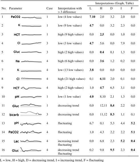
-
Values just outside normal limits are noticed more often in the table display (examples 1–9) unless there is a sharp deviation from variables around it (example 10).
Over half of the instances occurred for values just outside normal limits; in examples 1 through 9, more participants noted abnormal values in the table display. Only a few values are outside the normal range in examples 4, 5, and 8, whereas almost all values in the other examples are just below or above normal. Due to the small size of the sparklines, determining whether a line is within or outside the gray box is difficult. Abnormal values are followed by an H or L in both displays, but in the graph display only the most recent values are visible by default and other results must be actively selected. All the Hs and Ls are visible in the table.
Example 10 involves a similar situation, but in this case only one value is outside the normal range. Four participants identified a low value in the graph display while none of the participants did so with the table. The values preceding the low value are on the upper end of normal and the subsequent values are just above normal, which produces a dip in the graph that may have been more salient than the single L value in the table.
-
Trends within one range are more noticeable in the graph display (examples 11 and 12).
Examples 11 and 12 involve parameters with trends occurring entirely outside the normal range. In each instance, trends were identified more often in the graphs. All of the values for these parameters are marked with Hs or Ls in the table, so participants must compare numerical values to determine trends, instead of focusing on the Hs or Ls.
Example 16 presents a different situation where the most prominent trend occurs from abnormally high to normal values. The trend should be apparent in both displays; however, more participants identified a decreasing trend in the graph display. A possible explanation is that the large amount of data and the overall number of trends in Case 4 may have led to some participants missing the trend in the table.
-
Fluctuating values are more noticeable in the graph display (examples 13, 14, 15, 16).
Examples 13 and 14 were more frequently described as fluctuating with the graph display. Perhaps describing a pattern over time with such erratic data is overwhelming when viewing a table, but is somewhat easier with graphs. In example 15, the lactic acid oscillates between being high and normal but within a relatively narrow range. Participants may have described the parameter as fluctuating more often in the table display because of the alternating series of values with and without H's. These small variations were not prominent in the graph display. A similar phenomenon is seen in example 16, where the value moves between being abnormally high and normal several times.
Questionnaire
The questionnaire asked participants to identify the most positive and negative aspects of each design. The most positive aspects of the graph display were the ease of identifying trends (8 participants) and comparing multiple trends (7), the saliency of abnormal values (5), and the general ease of viewing data (3). The most negative aspects of the graph display were the small size (7) and the inability to see all the numbers at once (5). The most positive aspects of the table display were ability to see all numbers at once (5), the saliency of abnormal values (4) and familiarity (3). The large amount of data (8) and the difficulty of identifying trends (3) were the most negative aspects of the table display. Ten participants said the cases were realistic. The other two said the cases were not realistic because they lacked pertinent patient information. Four additional participants agreed that the cases lacked information, but did not feel that it made the cases unrealistic. Eleven said the cases provided a reasonable test of the displays, while one physician would have liked to see how they would integrate with additional information. Finally, half of the physicians reported that they realized that the cases were the same in both display conditions, and three others thought the cases were somewhat similar but not the same.
Discussion
Physicians were able to assess laboratory data faster with the graph display than with the table display for all cases. Comparisons of other potential factors that could explain this finding (display order, case iteration, number of interpretations, recognition of the cases) were all found to not be significant. This finding differs from the results of other studies of graphs and tables that found participants read individual data points and performed comparison tasks more quickly with a table than with line and bar graphs.18 33 Lohse also showed that participants' response times were lower when viewing a table for determining trends as well. The disparity between their findings and those of the present study could be due to higher task complexity, participants' domain knowledge, or the use of sparklines instead of typical line and bar graphs. The questions used in most studies of graphs and tables direct viewers to a subset of the data, which diminishes any benefit graphs may have for deciphering large data sets. Our task was set up as a general assessment task so as not to point the participants toward particular aspects of the data and used larger data sets with varying trends and characteristics.
More than one-third of physicians' interpretations differed based on the display condition. We were most interested in any systematic representational effects of the displays that accounted for the discrepancies. The patterns that emerged indicated that the graphs were more effective for identifying trends occurring entirely within a normal, abnormal, or critical range, but obscured small deviations from normal. Graphs also made identifying erratic changes over time easier. From a clinical perspective, the ability to identify trends within a range is important and appears to be better supported with the graphs. Many of the physicians also pointed out in the questionnaire that trends were easier to identify with the graphs. The fact that the graphs were significantly faster and take up significantly less room on the screen, points to the potential benefit of these graphs in a clinical display.
It is likely that there is a baseline number of interpretation differences that would be seen if a participant viewed the same case twice under the same experimental conditions. We did not attempt to measure this baseline directly; therefore, the portion of the interpretation differences that are due to the display format alone is unknown. We tried to account for this fact by only investigating patterns where three or more participants acknowledged a feature of the data in one display and not in the other.
In addition to correspondence, we looked for potentially erroneous interpretations. In six instances with the graphs and six with the tables, a participant described a variable as abnormal when it was not outside of the normal range provided. These may not actually be errors if participants have a different threshold for high or low values than the provided range, or if they are adjusting it based on the patient's other values. For instance, hemoglobin in Case 1 ranged from 14 to 15, which is on the higher side of the normal but not out of the provided normal range. Participant 10, who is one of the attending physicians, remarked that the hemoglobin was high when viewing both the table and graph displays. She may have adjusted her range of normal hemoglobin values for that particular patient. In 11 of the 12 instances, at least one value was close to the normal limits, and the explanation of shifting the normal range appears plausible. The other instance may be an artifact of the talk aloud methodology. Participant 4 described the lactic acid as high but could have been referring to the sodium, which was high and located directly below the lactic acid. The participant may have moved on to the sodium without giving a verbal indication of doing so.
Familiarity with a domain and task provides a context in which to place information, and experts have expectations and well-developed mental models that orchestrate data gathering. Gurushanthaiah, Weinger, and Englund found that anesthesiology residents were able to detect parameter changes faster and with more accuracy with two graphical displays than with a numeric display, but the display condition showed no difference for non-medical participants.34 In addition to differences between naïve participants and those with domain knowledge, a physician's experience can affect how he or she interacts with an information display.35 Attendings, residents, and a fellow participated in the study, but experience was not evaluated due to the small sample size.
The number of interpretation differences may be indicative of a lack of training on how to use this type of laboratory data. The amount and use of lab data in ICUs is different from other pediatric rotations. Residents at the hospital we observed were not explicitly taught how to make use of data in the PICU. One resident stated in the questionnaire that “attendings often like trends, but ultimately when they are not there, we make decisions based on single value cut-offs”, while an attending wrote that “a lot of ICU medicine is recognizing trends in oxygen/ventilation or changes in lab values over time, not just a single data point”. Laboratory testing is expensive, and repeated blood draws can have negative consequences. Using cost data in Ezzie, Aberegg, and O'Brien,36 each panel of tests in this study costs $581, which means the data in Case 4 cost $12 201. In addition, multiple blood draws can be harmful to the patient, especially for pediatric patients. Individual tests have value in isolation, but efforts should be made to ensure that physicians are knowledgeable about how to interpret and respond to data over time.
Experience with a particular type of display can also play a role in how data are interpreted. As people gain more experience with an unfamiliar representation like sparklines, they develop a deeper knowledge of how to translate the marks and patterns in the graphs into task-relevant information.37 Participants were more familiar with tables than sparklines and could find additional benefits of the latter through more exposure. For instance, sparklines can aid in tracking acid-base balance, which involves monitoring at least pH, PaCO2, and bicarbonate. One requirement is determining whether the source of a disturbance is metabolic (measured by bicarbonate) or respiratory (measured by PaCO2). A mirror image between pH and PaCO2 can be seen in figure 1, indicating that the changes in pH are due to a respiratory issue.
Another interesting finding was the effect of case on both assessment time and the correspondence of interpretations. These differences are likely due to the complexity of the cases, but defining complexity is challenging. At the least, it involves characteristics of the data, tasks, and users. Several metrics have been proposed for defining complexity based on data characteristics, such as the number of variables and the frequency in which they are measured,23 as well as correlation within a variable and between variables.38 Case 4 contained 273 lab values, over 100 more than the other cases, and was the most time consuming case in both displays. It also accounted for the second most non-matched interpretations and included one half of the examples of marked differences based on the display condition. In addition to features of the data, complexity is also determined by aspects of the task and domain. Cases 2 and 3 have the same number of data points, but Case 3 led to more inconsistent interpretations. One of the features of Case 3 is that the patient's alkalosis begins as metabolic issue, but as it is corrected, a respiratory component emerges and the alkalosis worsens as the bicarbonate improves. The complexity in that situation goes beyond the individual trends or number of data points.
Design changes
While sparklines appear to be effective for displaying laboratory data, participants noted some shortcomings of our sparklines, particularly their small size and only being able to see one set of numbers at a time. The current size obscures slightly abnormal values, but an enlargement should be considered carefully since the large amount of data that can be displayed on the screen at one time is a key benefit of sparklines. An alternative solution would be to introduce another line color for abnormal (but non-critical) values. Other suggested modifications included adding points on each graph to show when results were recorded instead of just in the timeline, indicating where in the graph the minimum and maximum values were obtained, and eliminating the second graphic that was located to the right of the sparklines. The second graphic provided redundant information, but it was intended to support visual comparisons at a single point in time. Use of this feature could increase over time or with training, but alternative uses for the screen space should be pursued. Future versions of the graph display could address some of the current deficiencies, but a formal evaluation of all possible design alternatives is infeasible. An iterative design approach involving users can be effective for evaluating designs.39
The results also have implications for the design of tables, which are often seen as exclusively numerical representations. The tables in this study contained letters for high and low values and a change in color for critical values. These conventions allowed some tasks to be performed using perceptual comparisons instead of numeric comparisons. With the tables, the visual cues only changed when values were in different states (ie, critical, abnormal, and normal), otherwise numeric comparisons were required. The last two examples in table 4 are variables that are oscillating between being just above and below the high limit for most of the case. In both situations, four physicians described the variables as fluctuating when viewing the table, while none did so with the graphs. This conclusion could have been reached because of the alternating sequences of numbers with and without the letter H in the table.
Limitations
The study was limited by the small number of participants, primarily because it was conducted at a single institution with only eight PICU attendings and fellows and 25 pediatric residents with at least one PICU rotation at the time of the experiment. The participant pool was restricted to the PICU because the cases were based on patients from that unit and physicians from other units might have paid attention to different features of the data. Another potential limitation is that the talk-aloud methodology can affect the time to complete a task. The verbal component of the task likely increased assessment times, but the increase should be comparable in both display conditions.
We chose to measure correspondence between interpretations rather than accuracy primarily due to the lack of a gold standard for determining accuracy. Establishing a consensus among physicians of the important features of a case is often difficult, and would likely be exacerbated in the somewhat decontextualized cases presented here. The small portion of patient information that was provided could have led participants to make different assumptions about the patient. The narrow scope of information was intentional to isolate the effect of display format from physicians' pattern matching skills and clinical knowledge. As a consequence, their abilities to assess the data were restricted and the task was not fully reflective of how the displays would be used in practice.
Another reason we avoided accuracy as a measure is that our aim was to determine the features physicians perceived in the data but to stop short of identifying what they thought was clinically relevant. A physician would first have to perceive a feature before determining its relevance. Perception is also guided by top-down processing, so we attempted to balance the need for some context with our goal of finding generalizable effects of display format.
The inability to measure the quality of interpretations also has implications for the observed difference in time between the two display formats. Faster assessments are not necessarily better if speed comes at the cost of accuracy. However, there were few differences in the number and types of interpretations between displays, except for those described in table 4, so we can assume that the faster time was not unduly compromising accuracy, however that is measured. If one classifies accuracy as being able to recognize important trends, it appears from our study that at least some types of trends were more often found in the graph display.
Future work
A key aspect of ICU care is recognizing relationships and trends among several variables, but the methodology in this study did not measure physicians' abilities to identify relationships. Furthermore, laboratory data will be integrated with other types of data, and the coordination of multiple views is a critical aspect of information display design. We hypothesize that sparklines would support these tasks better than tables because relationships can be visually perceived with less effort and more data can be presented on a single screen.
Conclusion
Physicians were able to assess laboratory data faster with sparklines. Furthermore, these compact graphics enable more information to be presented in a single view and thus reduce the need to scroll or flip between screens. Differences in physicians' interpretations of data were found based on the type of information display. Graphs were more useful than tables for identifying trends in situations where visual cues in the table did not provide trend information. Tables were more beneficial for detecting variables that were slightly outside normal limits, an advantage that is often not clinically relevant in the PICU. While more research is needed in how sparklines will integrate with other clinical data and ultimately impact decision making, they appear to be an effective visualization for laboratory data.
Footnotes
Funding: This research is supported by Grant Number T15LM009462 from the National Library of Medicine. Other funders: NIH.
Ethics approval: This study was conducted with the approval of the University of Virginia.
Contributors: The content is solely the responsibility of the authors and does not necessarily represent the official views of the National Library of Medicine, or the National Institutes of Health. The authors would like to thank Richard Lehman, MD, for his significant contribution to the project and Eric Danziger for his assistance with the database.
Provenance and peer review: Not commissioned; externally peer reviewed.
References
- 1.Bates DW, Ebell M, Gotlieb E, et al. A proposal for electronic medical records in US primary care. J Am Med Inform Assoc 2003;10:1–10 [DOI] [PMC free article] [PubMed] [Google Scholar]
- 2.Bates DW, Gawande AA. Patient safety: improving safety with information technology. N Engl J Med 2003;348:2526–34 [DOI] [PubMed] [Google Scholar]
- 3.Garg AX, Adhikari NKJ, McDonald H, et al. Effects of computerized clinical decision support systems on practitioner performance and patient outcomes—a systematic review. JAMA 2005;293:1223–38 [DOI] [PubMed] [Google Scholar]
- 4.Kaushal R, Shojania KG, Bates DW. Effects of computerized physician order entry and clinical decision support systems on medication safety: a systematic review. Arch Intern Med 2003;163:1409–16 [DOI] [PubMed] [Google Scholar]
- 5.Ash JS, Berg M, Coiera E. Some unintended consequences of information technology in health care: the nature of patient care information system-related errors. J Am Med Inform Assoc 2004;11:104–12 [DOI] [PMC free article] [PubMed] [Google Scholar]
- 6.Ash JS, Sittig DF, Poon EG, et al. The extent and importance of unintended consequences related to computerized provider order entry. J Am Med Inform Assoc 2007;14:415–23 [DOI] [PMC free article] [PubMed] [Google Scholar]
- 7.Horsky J, Zhang JJ, Patel VL. To err is not entirely human: complex technology and user cognition. J Biomed Inform 2005;38:264–6 [DOI] [PubMed] [Google Scholar]
- 8.Koppel R, Metlay JP, Cohen A, et al. Role of computerized physician order entry systems in facilitating medication errors. JAMA 2005;293:1197–203 [DOI] [PubMed] [Google Scholar]
- 9.Wachter RM. Expected and unanticipated consequences of the quality and information technology revolutions. JAMA 2006;295:2780–3 [DOI] [PubMed] [Google Scholar]
- 10.Joint Commission on Accreditation of Healthcare Organizations Sentinel event alert: Safely implementing health information and converging technologies, 2008. http://www.jointcommission.org/SentinelEvents/SentinelEventAlert/sea_42.htm (accessed 19 Mar 2009). [PubMed]
- 11.Tufte ER. Beautiful evidence. Cheshire, CT: Graphics Press, 2006 [Google Scholar]
- 12.Woods DD, Patterson ES, Roth EM. Can we ever escape from data overload? A cognitive systems diagnosis. Cogn Tech Work 2002;4:22–36 [Google Scholar]
- 13.Guerlain S. Software navigation design. In: Allen G, ed. Applied spatial cognition. From research to cognitive technology Mahwah, NJ: Lawrence Erlbaum Associates, 2007:317–37 [Google Scholar]
- 14.Zhang JJ, Patel VL, Johnson KA, et al. Designing human-centered distributed information systems. IEEE Intell Syst Mag 2002;17:42–7 [Google Scholar]
- 15.Zhang JJ, Norman DA. Representations in distributed cognitive tasks. Cogn Sci 1994;18:87–122 [Google Scholar]
- 16.Zhang JJ. The nature of external representations in problem solving. Cogn Sci 1997;21:179–217 [Google Scholar]
- 17.Woods DD. Representation aiding: a ten year retrospective. Proc IEEE Int Conf on Syst Man Cybern 1991:1173–6 [Google Scholar]
- 18.Meyer J. Performance with tables and graphs: effects of training and a visual search model. Ergonomics 2000;43:1840–65 [DOI] [PubMed] [Google Scholar]
- 19.Schaubroeck J, Muralidhar K. A meta-analysis of the relative effects of tabular and graphic display formats on decision-making performance. Hum Perform 1991;4:127–45 [Google Scholar]
- 20.Friel SN, Curcio FR, Bright GW. Making sense of graphs: critical factors influencing comprehension and instructional implications. J Res Math Educ 2001;32:124–58 [Google Scholar]
- 21.Jarvenpaa SL, Dickson GW. Graphics and managerial decision-making: research based guidelines. Commun ACM 1988;31:764–74 [Google Scholar]
- 22.Kennedy M, Teeni D, Treleaven JB. Impacts of decision task, data and display on strategies for extracting information. Int J Hum Comput Stud 1998;48:159–80 [Google Scholar]
- 23.Meyer J, Shinar D, Leiser D. Multiple factors that determine performance with tables and graphs. Hum Factors 1997;39:268–86 [Google Scholar]
- 24.Shah P, Hoeffner J. Review of graph comprehension research: implications for instruction. Educ Psychol Rev 2002;14:47–69 [Google Scholar]
- 25.Politser PE. How to make laboratory information more informative. Clin Chem 1986;32:1510–16 [PubMed] [Google Scholar]
- 26.Powsner SM, Tufte ER. Graphical summary of patient status. Lancet 1994;344:386–9 [DOI] [PubMed] [Google Scholar]
- 27.Thomas P, Powsner S. Data presentation for quality improvement. AMIA Annu Symp Proc 2005:1134. [PMC free article] [PubMed] [Google Scholar]
- 28.Radecki RP, Medow MA. Cognitive debiasing through sparklines in clinical data displays. AMIA Annu Symp Proc 2007:1085. [PubMed] [Google Scholar]
- 29.Brown PJ, Borowitz SM, Novicoff W. Information exchange in the NICU: what sources of patient data do physicians prefer to use? Int J Med Inf 2004;73:349–55 [DOI] [PubMed] [Google Scholar]
- 30.Bauer D, Guerlain S, Brown P. Evaluating the use of flowsheets in pediatric intensive care to inform design. Proceedings of the 50th Annual Meeting of the Human Factors and Ergonomics Society; 16-20 October 2006, San Francisco, California. Santa Monica: HFES, 2006 [Google Scholar]
- 31.Frassica JJ. Frequency of laboratory test utilization in the intensive care unit and its implications for large-scale data collection efforts. J Am Med Inform Assoc 2005;12:229–33 [DOI] [PMC free article] [PubMed] [Google Scholar]
- 32.CamStudio (Version 2.0) http://www.camstudio.org/ (accessed 19 Apr 2008).
- 33.Lohse GL. A cognitive model for understanding graphical perception. Hum Comput Interact 1993;8:353–88 [Google Scholar]
- 34.Gurushanthaiah K, Weinger MB, Englund CE. Visual-display format affects the ability of anesthesiologists to detect acute physiological changes: a laboratory study employing a clinical display simulator. Anesthesiology 1995;83:1184–93 [DOI] [PubMed] [Google Scholar]
- 35.Alberdi E, Becher JC, Gilhooly K, et al. Expertise and the interpretation of computerized physiological data: implications for the design of computerized monitoring in neonatal intensive care. Int J Hum Comput Stud 2001;55:191–216 [Google Scholar]
- 36.Ezzie ME, Aberegg SK, O'Brien JM., Jr Laboratory testing in the intensive care unit. Crit Care Clin 2007;23:435–65 [DOI] [PubMed] [Google Scholar]
- 37.Pinker S. A theory of graph comprehension. In: Freedle R, ed. Artificial intelligence and the future of testing. Hillsdale, NJ: Lawrence Erlbaum Associates, Inc., 1990: 73–126 [Google Scholar]
- 38.Jones PM, Wickens CD, Deutsch SJ. The display of multivariate information: an experimental study of an information integration task. Hum Perform 1990;3:1–17 [Google Scholar]
- 39.Wachter SB, Agutter J, Syroid N, et al. The employment of an iterative design process to develop a pulmonary graphical display. J Am Med Inform Assoc 2003;10:363–72 [DOI] [PMC free article] [PubMed] [Google Scholar]