Abstract
During animal development, complex patterns of gene expression provide positional information within the embryo. To better understand the underlying gene regulatory networks, the Berkeley Drosophila Transcription Network Project (BDTNP) has developed methods that support quantitative computational analysis of three-dimensional (3D) gene expression in early Drosophila embryos at cellular resolution. We introduce PointCloudXplore, an interactive visualization tool that supports visual exploration of relationships between different genes’ expression using a combination of established visualization techniques.
Two aspects of gene expression are of particular interest: (i) gene expression patterns defined by the spatial locations of cells expressing a gene, and (ii) relationships between the expression levels of multiple genes. PointCloudXplore provides users with two corresponding classes of data views: (i) Physical Views based on the spatial relationships of cells in the embryo, and (ii) Abstract Views that discard spatial information and plot expression levels of multiple genes with respect to each other. Cell Selectors highlight data associated with subsets of embryo cells within a View. Using linking, these selected cells can be viewed in multiple representations. We describe PCX as a 3D gene expression visualization tool and provide examples of how it has been used by BDTNP biologists to generate new hypotheses.
Index Terms: interactive data exploration, three-dimensional
I. INTRODUCTION
The development of animal embryos is largely controlled by complex networks of transcriptional regulation. In the earliest stages of embryogenesis, a handful of genes are expressed in relatively simple spatial patterns. Over time, these expression patterns become increasingly complex as genes cross-regulate each other and modulate the expression of additional genes in a combinatorial manner. This complex interacting regulatory hierarchy ultimately determines the fate of each cell in the developing embryo [1]. A primary goal of the BDTNP is to computationally model these transcriptional networks. To accomplish this, it is essential to measure levels of gene expression in every cell throughout the embryo over time.
The BDTNP has chosen development of Drosophila melanogaster as a model system to explore the formation of gene expression patterns. The basic Drosophila body plan is defined during blastoderm stage when the embryo is still morphologically simple. The great wealth of existing knowledge about the regulatory interactions and pattern formation of the Drosophila blastoderm make it an ideal model for analyzing genomic regulation of complex patterns. This project has developed a suite of methods (Section 2) for extracting quantitative measurements of spatial gene expression at cellular resolution from imaging data, providing information about the locations of all blastoderm nuclei and associated expression levels of a select set of genes [2], [3]. This results in a compact computationally amenable representation of gene expression patterns, called PointClouds, which require efficient means to visually explore these data. PointCloudXplore (PCX) serves this purpose.
PCX is based on two simple, well-established and powerful basic principles. Multiple views (Section IV, Section V) make it possible to show different data aspects without being overwhelmed by the high dimensionality of PointCloud data. Each view emphasizes different data properties, and the interplay between views makes detailed data analysis possible. The second basic principle is called Cell Selection (called Brushing in Information Visualization) and linking (Section VI). Cell Selection refers to the ability of a user to select data associated with particular groups of cells in any View. Selected data parts (i.e., the Cell Selections) are then highlighted in all data displays. In this way, all views are linked together, making it possible to identify visually which parts of the data in two different views correspond.
Views available in PCX are divided into two groups: (i) Physical Views and (ii) Abstract Views. Physical Views (Section IV) use information about the volume and position of cells (defined here as a nucleus plus the surrounding cytoplasm) to display expression patterns on different representations of an embryo. Gene expression values are visualized in these views either by Color Intensity or by Expression Surfaces (surface plots like available in MATLAB and other data analysis tools). Color can be used on either two- or three-dimensional Physical Views to support qualitative analysis of gene expression values and the identification of spatial expression patterns. Expression Surfaces use dedicated surface height plots defined over two-dimensional representations of the embryo to provide a more easily distinguishable quantitative representation of gene expression data.
Abstract views (Section V) show the quantitative relationships between multiple genes’ expression in one or all cells of the embryo without showing spatial relationships between cells. We describe two Abstract Views: 2D/3D Scatter Plots and the Cell Magnifier (a 2D bar graph plot). 2D/3D Scatter Plots provide a global overview of different genes’ expression levels as a function of each other. The Cell Magnifier allows a user to display expression levels of many genes in a particular cell. A description of a third Abstract View, Parallel Coordinates, is provided elsewhere [4].
While all these techniques are well-established in visualization and widely available in programs such as MATLAB, our integrated system has applied and adapted them specifically to 3D gene expression data. This has made the data more accessible to working biologists who are generally not trained in computational environments such as MATLAB.
II. BACKGROUND: GENE EXPRESSION AND DATA VISUALIZATION PIPELINE
A Single PointCloud file contains information about the x, y, z location of each nucleus in an embryo, the nuclear and cytoplasmic volumes, and the relative concentrations of gene products (mRNA or protein) associated with each nucleus and surrounding cytoplasm [2], [3], [5]. To generate this data, embryos are labeled typically with two fluorophores to detect two gene products and with a third one to detect the nuclei. Embryos are imaged using a confocal microscope, and images are processed to detect all blastoderm nuclei and measure the fluorescent intensities of each gene product in the nucleus and in apical and basal parts of the nearby cytoplasm. For simplicity, in the remainder of this paper we generally refer to the measured fluorescent intensities as gene expression levels, assuming that the two are closely correlated. See Luengo Hendriks et al. [2] for further discussion.
Because it is critical to compare the relationships between regulators and their many target genes in a common coordinate framework, a set of Single PointClouds is registered into one or more Virtual PointClouds using both morphology and a common reference gene to determine correspondences [3]. It is not experimentally practical to obtain the expression of more than a few genes in a single embryo, due to the limited number of different fluorophores we can spectrally distinguish as well as the difficulty in adding multiple labels to embryos. However, a Virtual PointCloud contains averaged expression levels for many genes mapped onto the nuclei of one of the embryos in the set or onto a set of virtual nuclei representing a Drosophila blastoderm. PCX is used for visualization of both Single PointClouds and Virtual PointClouds.
III. PREVIOUS WORK
Linking multiple views for the visualization of high-dimensional data sets is an established concept in information visualization [6]. For example, Henze [7] proposed a system for exploring time-varying computational fluid dynamics (CFD) data sets that uses multiple views (called Portraits in his paper) displaying a data set and various derived quantities. Users can perform advanced queries by selecting data subsets in these portraits. The concept of multiple views was also used in the WEAVE system, where a combination of Physical Views and Information Visualization Views (the equivalent of our Abstract Views) allows exploration of cardiac simulation and measurement data [8]. Both of these systems use linked views to define features in a data set by refining queries based on brushes, which are equivalent to our Cell Selectors, being highlighted subsets of the data. Doleisch et al. formalized the concept of defining features via queries using Information Visualization Views and utilizing logical operations to combine several brushes [9]. Piringer et al. [10] and Kosara et al. [11] introduced a variety of enhancements to 3D scatter plots, improving depth perception and perception of the sample distribution in all dimensions. Our visualization tool was also inspired by GeneBox [12], which uses scatter plots to visualize results of microarray experiments.
IV. PHYSICAL VIEWS: VISUALIZING SPATIAL RELATIONSHIPS BETWEEN GENE EXPRESSION PATTERNS
Overview
Physical Views use a 3D embryo model, or different 2D projections of this 3D model, to convey a sense of the spatial distribution of gene expression on the blastoderm. There are three Physical Views in PCX: (i) 3D View, (ii) Orthographic View, and (iii) Unrolled View. Each view has its strengths and weaknesses in presenting aspects of gene expression patterns. The 3D View provides the most spatially flexible representation of the embryo; the Orthographic View simulates the 2D views of embryos that most biologists are used to; and the Unrolled View allows expression in all blastoderm cells to be most clearly seen at once, even though the 2D cylindrical projection it employs distorts spatial relationships, especially in the termini. All three views use color intensity to show expression levels analogous to the way staining was used to reveal gene expression levels in the original embryo. The 2D views in addition allow graphical Expression Surfaces to be used to portray relative gene expression levels.
3D View
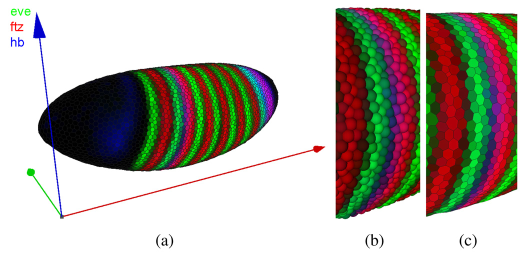
The 3D View utilizes a 3D model of the embryo, which a user can rotate, pan, and scale to obtain an overview of the entire embryo (Fig. 1(a)). Cells can be represented in two ways in this View: as Spherical Cells (Fig. 1(b)) or Polygon Cells (Fig. 1(c)). In the Polygon Cells View, a surface composed of polygonal faces, each of which corresponds to a detected nucleus, represents the embryo. These polygons form an approximate Voronoi tessellation of the blastoderm surface and have a visual appearance similar to that of cells. The blastoderm surface is assumed to be a two-manifold (i.e., a locally flat surface) and polygon size depends on the distribution of cells on the embryo blastoderm. Using spheres, cells can be shown in embryos with more complex morphological structures that do not form a two-manifold surface. The size of each sphere is chosen relative to the nuclear volume of the cell it represents, as opposed to the polygon size, which is based on internuclear distances (nucleus and cytoplasm).
Fig. 1.
3D View (a). Each cell of the embryo is represented by either a sphere (b) or a polygon in a Voronoi-like tessellation of the surface (c).
Orthographic View
Traditionally, biologists have studied expression patterns from photomicrographic images from defined views, e.g., ventral, dorsal, or lateral view, of the embryo. To simulate these familiar views, we provide Orthographic Views.
To generate Orthographic projections, we first identify the anterior/posterior (A/P)-axis of the embryo as the smallest eigenvector of the inertia tensor of all cell locations. This eigenvector is equivalent to the axis with the smallest moment of inertia and determined by eigendecomposition of the inertia tensor. We currently determine an embryo’s dorsoventral (D/V) orientation manually, based on known expression patterns, and store this information as meta-data in each PointCloud file. These parameters can then be used to rotate the embryo into a standard pose.
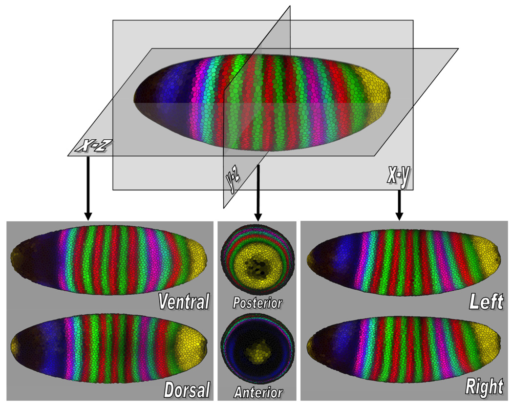
Once the embryo is represented in a standard orientation, we “split” the embryo along its body axes, and project the halves orthographically to allow a user to gain a global overview. For example, if the left/right (L/R) axis is chosen, the halves are projected away from the split and the two resulting images, an outside view of one side and an inside view of the other side, are shown. This process can be performed analogously for each body axis, see Fig. 2. Our tool displays one of these three possible projections at a time: dorsal/ventral, anterior/posterior or left/right.
Fig. 2.
Orthographic projection views show an embryo along its body axes. The projections shown are of the ventral (V), dorsal (D), anterior (A), posterior (P), left (L), and right (R) views of the embryo.
Unrolled View
While orthographic 2D projections along body axes provide an overview of the entire embryo, the resulting views are “split” into two “sub-views” (e.g., the left and right sides of the embryo) making it difficult to examine patterns that reach from one side of the embryo to the other. In addition, information at the edges of orthographic projections is compressed. To alleviate these shortcomings, the Unrolled View maps the entire Drosophila embryo continuously to a plane using cylindrical projection [2], [4] (see Fig. 3). Prior to gastrulation, nearly all the cells in the Drosophila blastoderm lie in an ellipsoidal monolayer surface. We “unroll” this surface by the following process: A standard orientation of the embryo is used as in the Orthographic View and the embryo is surrounded with a cylinder whose axis is aligned with the embryo’s A/P-axis. All detected cells on the blastoderm surface are then projected onto this cylinder. The resulting surface is then cut along a line corresponding to the dorsal midline of the embryo. This process yields a continuous mapping of the embryo surface to a 2D plane and allows users to trace expression patterns over the entire embryo.
Fig. 3.
The Unrolled View uses cylindrical projection to map the entire embryo to a 2D plane.
Visualizing Gene Expression via Simulated Staining
In acquired images, stain brightness indicates the relative expression levels of detected gene products within an embryo. PointCloud data contains corresponding expression information of one or more genes, and this information can be transferred into the graphical representation of the embryo. Users select a subset of genes and the color of a simulated “fluorescent stain” for each gene.
The choice of a color model for effective data visualization has been studied extensively [13], [14]. Considering the advantages and disadvantages of different color models, and the specific objectives for our visualization methods, we decided to use the HSV model for rendering. We use the hue (i.e., the actual color such as red, blue, green or yellow), and value (i.e., the color brightness/intensity) dimensions in an HSV color space to encode gene identity and expression level respectively. This representation allows the user to select manually a set of colors that can be easily distinguished by by specifying a single hue value for each gene. It is then possible to choose independently the brightness of a color according to the expression level of the corresponding gene. If more than one gene is expressed in a cell, we calculate a color at the appropriate brightness for each expressed gene and mix the resulting colors to obtain a color for the cell.
Fig. 4 shows the staining patterns for either three genes (a) or five genes on a 3D View (b, c). If no more than three genes are of interest to the user, it is advantageous to choose staining pattern colors from red (with a hue of 0°), green (with a hue of 120°) or blue (with a hue of 240°), the three basic colors of the additive red-green-blue (RGB) color model, which is used to display colors on the screen (Fig. 4(a)). These colors allow each combination of expression levels to map to a unique mixed color. Furthermore, this choice of colors corresponds to the display of three-channel confocal microscopy images, which are usually displayed as red, green and blue components of an RGB image.
Fig. 4.
Gene expression patterns are mapped onto the iconographic cell representations as color. (a) shows the expression of three genes ftz (red), eve (green) and hb (blue). Here, each combination of expression levels maps to a unique color. In (b) and (c) two additional genes, sna (yellow) and tll (pink), are shown on the embryo. Mixed colors are no longer unique. In (b) most ventral cells are yellow (red and green at full intensity) since snail (sna) expression is mapped to yellow. Consequently, adding more red or green for fushi tarazu (ftz) and even-skipped (eve) stripes does not change the mixed color. In (c) the brightness (i.e., a global weight for each color) is decreased to show variation in the “overexposed” yellow and white regions on the ventral (lower) side of the embryo. The yellow sna pattern no longer corresponds to maximum red and green intensity. Thus, the ftz and eve stripes become visible in the formerly “overexposed” region.
If expression levels of more than three genes are of interest, colors are no longer independent in the RGB color model. Thus, a given mixed color can be obtained by more than one combination of gene expression levels, see Figs 4(b) and 4(c). Moreover, it becomes possible to have “overexposed” cells due to the way colors are mixed in the RGB color model. The intensity of each component is represented by a real value ranging from zero (no contribution of this component) to one (component at full intensity). A cell color is obtained by adding all individual color components for all selected genes. If any given sum component exceeds an intensity of one, it is clamped, i.e., it is set to one. This behavior is visible on the ventral (lower) side of the embryo shown in Fig. 4(b).
To avoid overexposure, the user can specify a global weight for all expression pattern contributions. This weight, ranging from zero to one, is multiplied with all expression level colors before they are mixed. Choosing a smaller weight can be thought of as reducing the exposure time of a photograph. All colors become darker and thus colors need to be clamped less frequently. For example, Fig. 4(c) shows the same genes as (b), but with a smaller display weight. Aside from manual definition of the described global weight, PCX also provides an auto exposure function that automatically sets the global weight to an appropriate value, i.e., the minimum weight such that no cell has a color component exceeding a value of one.
The intensities of expression patterns can be further altered by thresholding of measured fluorescence intensity values. For each gene, we provide the user with a histogram that plots the number of cells in which specific fluorescence intensities were measured. These histograms are overlaid with minimum and maximum cutoff values and sliders that allow the user to alter the threshold for each gene separately. When a user changes the maximum and minimum thresholds, information is provided on the percentage of cells that are below the minimum threshold (i.e., cells that are displayed unstained), the percentage of cells that are above the maximum threshold (i.e., cells that are displayed with maximum stain intensity), and the percentage of cells that are in the chosen threshold interval (i.e., cells that are mapped to an intermediate stain brightness), aiding a user in the appropriate choice of these thresholds. Colors in the various views are updated immediately after changing the minimum or maximum value of a gene, allowing interactive validation of the effects and appropriateness of the values.
Great care must be taken in using this thresholding strategy. The gene expression data in PointCloud files is measured data and as such is subject to noise. Moreover, since all gene expression is normalized from zero to one hundred, regardless of the actual expression levels, expression patterns with lower intensities are obscured with higher levels of noise. Slight biases in attenuation correction are also likely to influence the detectability, symmetry and shape of the patterns (for further discussion, see Luengo Hendriks et al. [2]). Thresholding can be used to reduce noise by, for example, setting a weak background staining to zero, making the strong gene expression pattern clearer, see Figs 5(a) and 5(b). This strategy is most useful when multiple genes are being displayed as the cumulative effect of several backgrounds can confuse the view. However, it is frequently not clear what part of PointCloud data is noise and what is signal. The user must be aware that key biological information can be obscured by thresholding. Yet, thresholding can be helpful in enhancing the view of some “real” features of an expression pattern even if other significant features are at the same time obscured. Extreme thresholding can be used to emphasize certain expression properties. For example, when the maximum threshold is set very low, we see that the inter-stripe expression levels of even-skipped (eve) are actually typically higher than eve expression levels on the anterior and posterior of the embryo (Fig. 5(d)), which is not detectable in a normal view (Fig. 5(c)).
Fig. 5.
Using histograms that show the number of cells expressing a gene as a function of the expression levels makes it possible for a user to choose different cutoff values to allow aspects of the data to be better shown. (a) and (b) illustrate this concept by thresholding hunchback (hb) to reduce background noise. (c) and (d) use an extremely low maximum threshold for even-skipped (eve) (d) to illustrate that the inter-stripe expression levels of eve are typically higher than its expression levels on the anterior and posterior of the embryo.
Gene Expression Surfaces
In addition to providing an overview of the entire embryo, projecting the embryo to a plane has the advantage of freeing one dimension up for displaying additional information. In PCX, this “free” dimension can be used to display gene expression values as surface plots, which we term Gene Expression Surfaces [4], that allow easier quantitative analysis of gene expression data. Individual Expression Surfaces display data for one gene over either the Orthographic or the Unrolled Views. The xy-positions of Expression Surface points are determined by the positions of cells in the underlying views, whereas the height of an Expression Surface is determined by the expression values measured for the gene it represents.
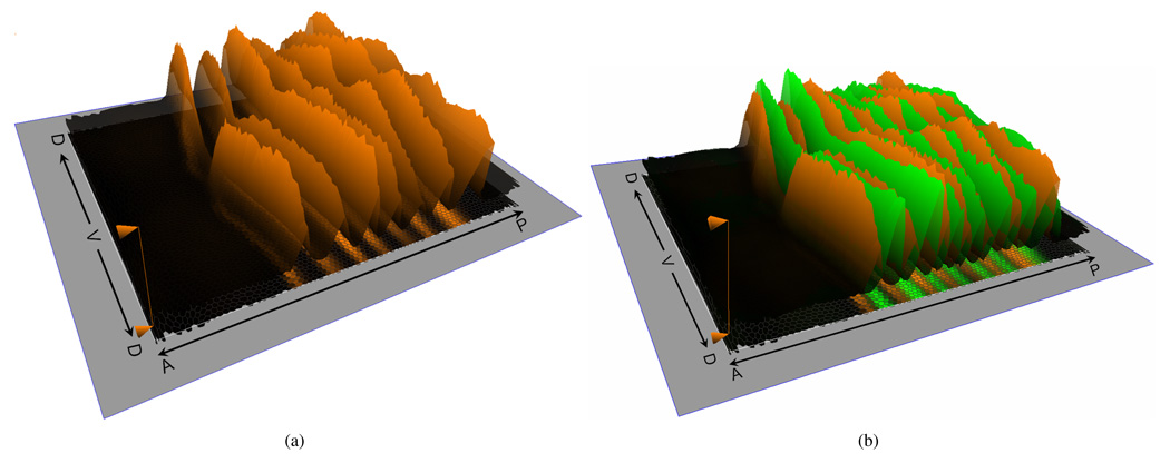
For example, Fig. 6(a) shows the quantitative expression levels of the mRNA expression pattern of the transcription factor eve. Though this gene is usually treated as an anterior-posterior patterning gene, the use of an expression surface clearly demonstrates how its expression level also changes along the dorsal/ventral axis, suggesting interaction between anterior-posterior and dorsal-ventral patterning systems. Though this phenomenon can be computationally detected from raw PointCloud datasets [2], [5], using PCX is faster and easier, especially since most biologists lack sufficient programming skills for independent spatial expression analyses.
Fig. 6.
Gene Expression Surfaces show quantitative gene expression levels. In (a) one surface shows expression levels for eve (orange). In (b), an additional surface shows expressions levels for ftz (green). The direction of the anterior/posterior (AP) axis and the dorsal/ventral (DV) circumference are shown.
Note that the height mapping of Expression Surfaces is defined consistently with the color mapping used on the model of the embryo, i.e., the minimum and maximum gene threshold values described above are also applied here. Thus, Expression Surfaces provide an additional way for assessing the use of threshold values. Moreover, a variety of options are provided to improve the view, including different coloring strategies and changing Expression Surface transparency or intensity values. An Expression Surface can, for example, be of the same color as the gene in the 2D plot, but have an intensity that varies with gene expression levels to allow comparison of expression patterns using both color and height in parallel. Multiple surfaces allow users to compare the quantitative relationship between genes, e.g., Fig. 6(b) shows the quantitative relationship between mRNA expression patterns of the transcription factors ftz (green) and eve (orange) illustrating that these genes do not only exhibit excluding alternating patterns along the A/P body axis but also that variations of these two patterns along the D/V-axis are significantly different [2].
V. ABSTRACT VIEWS
To explore relationships between gene expression independently of their spatial context, we use information visualization techniques in gene expression space. This is particularly useful for characterizing regulatory relationships between genes. We describe two Abstract Views in gene expression space: Scatter Plots and the Cell Magnifier.
2D/3D Scatter Plots
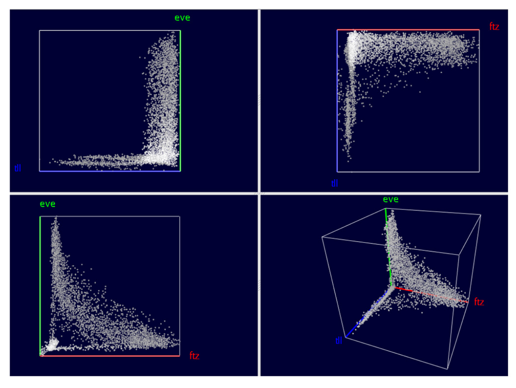
Scatter Plots, see Fig. 7, are conceptually the simplest way to visualize relationships in gene expression space. Three genes are selected and mapped to the three axes of a Cartesian coordinate system where each axis represents one gene’s expression level ranging from no expression at the origin to maximum relative expression. Each cell in the embryo is represented by a single point in the 3D scatter plot with the point location specified by the relative gene expression levels.
Fig. 7.
Scatter Plots show the relationship between up to three genes’ expression levels.
To better distinguish separate points and to estimate their location, we use colors, halos, and alpha blending [10], [11]. To enhance the depth perception of points we decrease their brightness as their distance to the viewer increases. (We only adjust point color brightness since the actual point color is used to convey additional information during Cell Selection, see Section VI.) Drawing a disc around each point (a “halo”) makes it possible to better distinguish points in dense regions where it is otherwise difficult to discern individual points. Points are also partially transparent, i.e., points in the background “shine through” points on the front.
Fig. 7 shows the basic layout of our 3D Scatter Plots. The 3D Scatter Plot (lower-right panel) is augmented with a set of 2D Scatter Plots that show expression relationships between the three possible pairs of genes in the 3D plot. The 2D plots provide a “standard” view on the data, while the viewpoint for the 3D Scatter Plot is chosen by rotating the plot. Furthermore, the 2D Scatter Plots facilitate Cell Selection, see Section VI.
Looking at Scatter Plots of expression levels alone can reveal information about relationships between genes’ expression. For example, Fig. 7 illustrates the relationship between ftz, eve and tailless (tll). The lower-left panel shows the anti-correlation between ftz and eve that express in alternating stripes. However, the Scatter Plot in that panel also shows that cells exist that express neither ftz nor eve strongly. By consulting the 2D Scatter Plots corresponding to the other gene combinations eve/tll (upper-left panel) and ftz/tll (upper-right panel), it becomes obvious that cells expressing high levels of tll usually do not express ftz or eve. The 3D Scatter Plot View, which shows the relationship between all three genes clearly, demonstrates that cells with high tll levels usually do not express either ftz or eve strongly. This is consistent with the fact that high tll expression occurs at the anterior and posterior ends of the embryo away from ftz and eve stripes, see Figs. 1 and 4. The view further shows that not all cells that express neither ftz nor eve express tll either.
Cell Magnifier
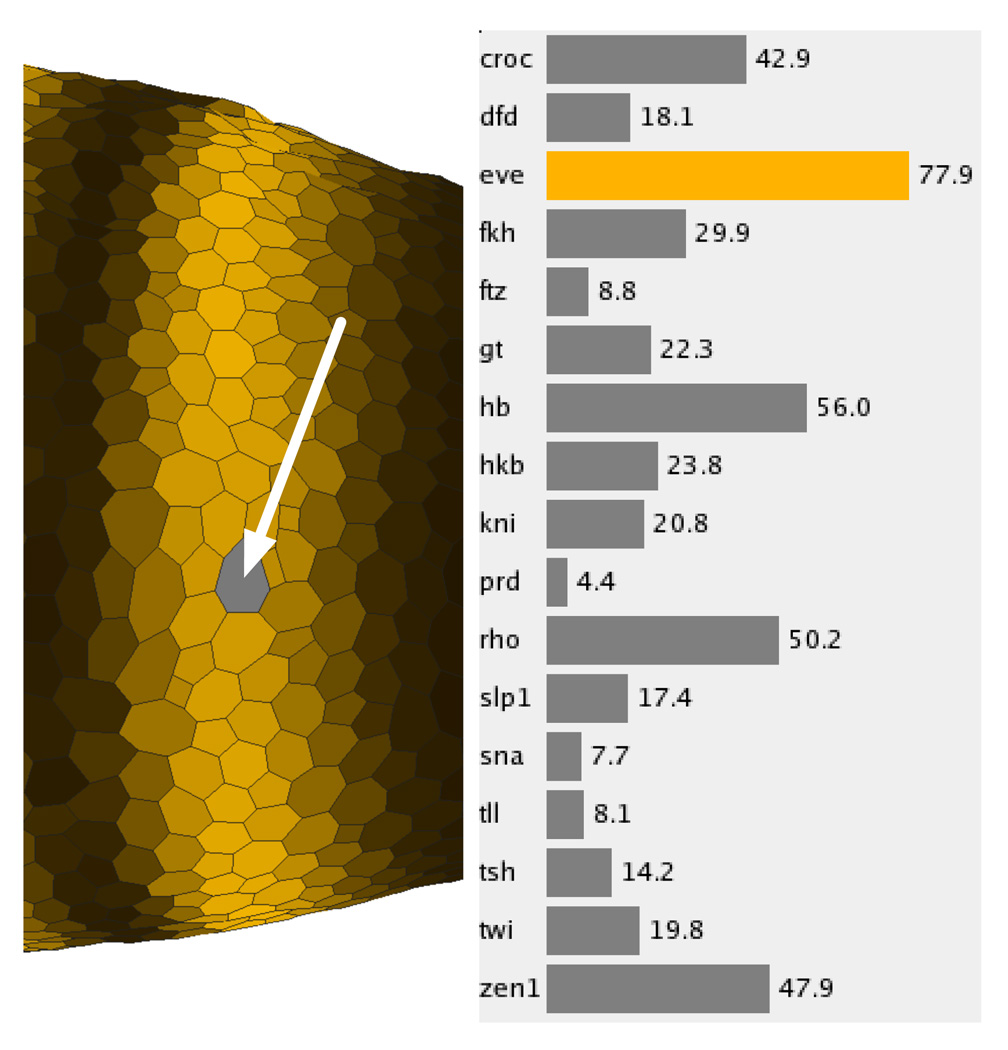
Unlike the other Physical and Abstract Views currently available in PCX, the Cell Magnifier (Fig. 8, right panel) concentrates not on comparing gene expression values in different cells but on comparing expression values in just one cell. Gene expression values are visualized using a bar graph with one bar for each gene, colored according to the user defined stain colors. Since exact expression values can only be roughly estimated from bar size, the exact measured gene expression value is also displayed beside each bar. The cell to be displayed in the Cell Magnifier can be selected in any Physical View and is highlighted by graying it out (arrowed in Fig. 8, left panel). The Cell Magnifier in the right panel of Fig. 8 shows the gene expression profile of a cell in the most anterior eve stripe.
Fig. 8.
The cell magnifier supports comparison of multiple genes’ expression levels within a single cell.
VI. CELL SELECTION AND LINKING
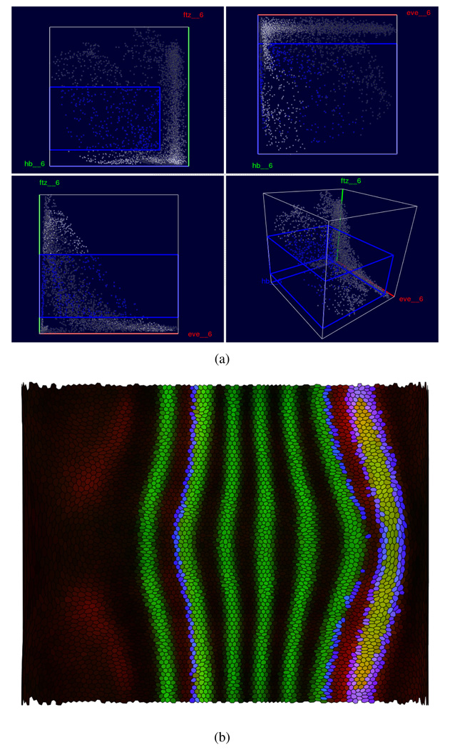
All of the Physical and Abstract Views that we have described are useful in their own right and can be used individually to mine data sets for new information. However, it is often desirable to correlate information shown in different views. For example, when looking at a Scatter Plot View of eve, ftz and hunchback (hb), one might be interested in cells with high hb and medium ftz expression and ask where on the embryo these cells are located (Fig. 9).
Fig. 9.
Cell Selection and Linking allow a user to relate different views to each other. For example, it is possible to select a subset of cells based on expression levels of three genes, such as eve, ftz and hb in a Scatter Plot View (a) while highlighting the same cells in a Physical View, such as the Unrolled View (b) to show their spatial distribution.
Cell Selection and linking provide effective means to perform queries of this type. Cell Selections, highlighted in user specified hues, can be performed in any View. Linking can connect any kinds of views for displaying different aspects of this information. For example, Fig. 9 illustrates how a user can select a rectangular box in the 3D Scatter Plot defining a minimum and maximum threshold for each of the genes hb, eve, and ftz. Since moving a box in a 3D scatter plot with a 2D input device such as a mouse can be difficult, PCX also shows the projection of this box as a rectangle in each 2D Scatter Plot where it is easier to move or resize the region of selected cells.
By linking the selection in the Scatter Plot to a Physical View, such as the Unrolled View in Fig. 9(b), a user can relate the abstract expression level relationships to physical patterns of cells in the embryo. In Fig. 9(a), the selected cells in a Scatter Plot (high hb and medium ftz) are highlighted and colored in blue, and this selection is transferred to the Unrolled View in Fig. 9(b). All views are updated simultaneously during the selection process, allowing a user to follow the changes in the pattern of selected cells during the selection process. We note that showing selected cells in a Physical View adds a new simulated stain corresponding to a binary expression pattern. The final color of a cell is obtained by mixing this “selection stain” with all other “active stains”. Because of this mixing, it is possible that cells in the same selection have different colors in the Scatter Plot View and a linked Physical View.
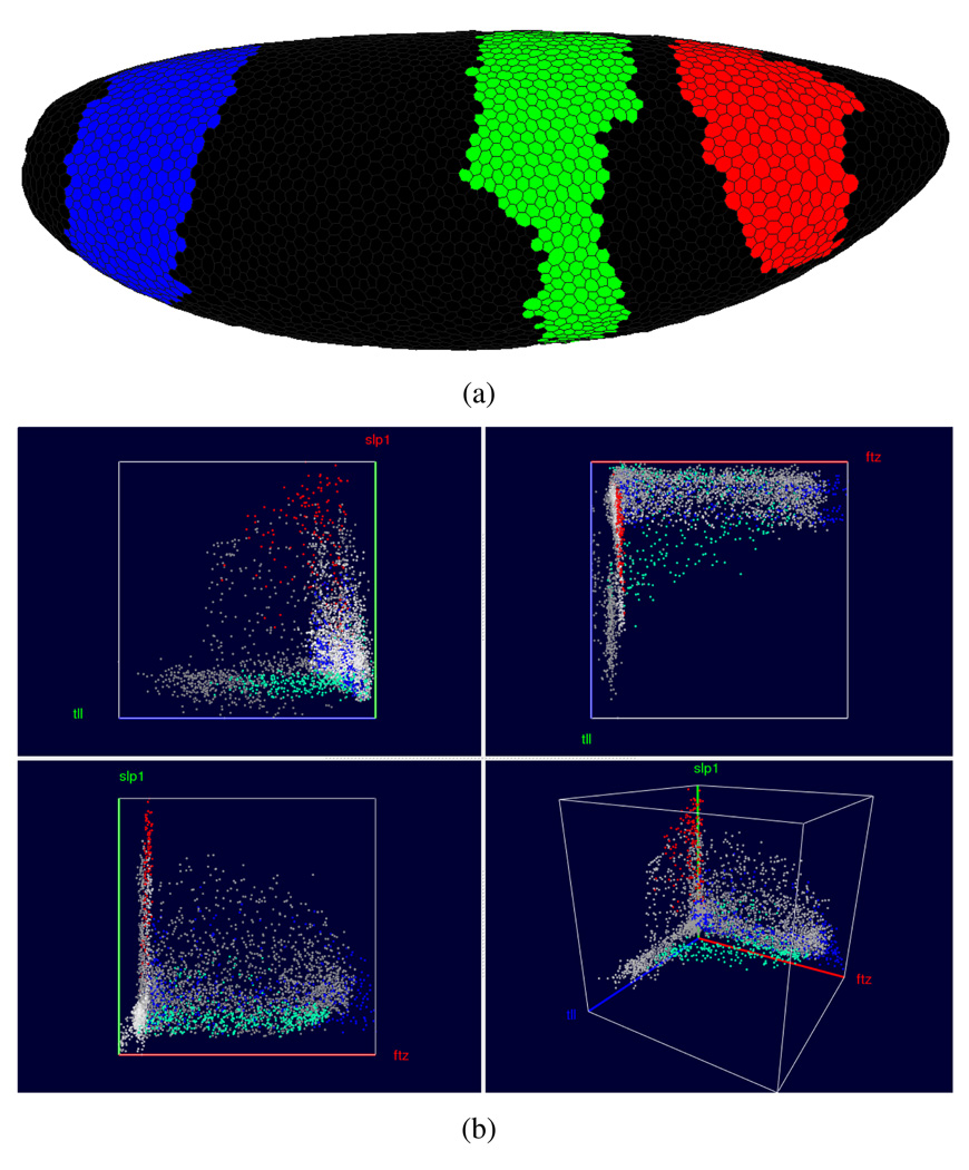
Cell Selection is also possible in Physical and other Abstract Views. In Physical Views, selection is performed by “painting” patterns on the embryo. For example, in Fig. 10 the three domains of higher hb expression have been assigned to three different Cell Selectors shown in red (anterior domain), green (center domain) and blue (posterior domain) in a 3D View. By linking a Scatter Plot View (Fig. 10(b)) to the 3D View it becomes possible to emphasize different expression behavior within the domains. The Scatter Plot in the right panel shows this difference for the genes ftz, slp1, and tll. For example, it becomes apparent that the anterior domain (red) has generally a higher expression of slp1 than the other two domains. Furthermore, when considering this three-gene combination, the three peaks of hb RNA expression seem to separate in the Scatter Plot.
Fig. 10.
Cell Selection in the embryo view. In the embryo view it is possible to “paint” the three hb domains, assign them to three distinct Cell Selectors and show them in three distinct colors. By linking these selections to a Scatter Plot view (here showing ftz, slp1 and tll) a user can determine how these genes are expressed differently within the individual domains.
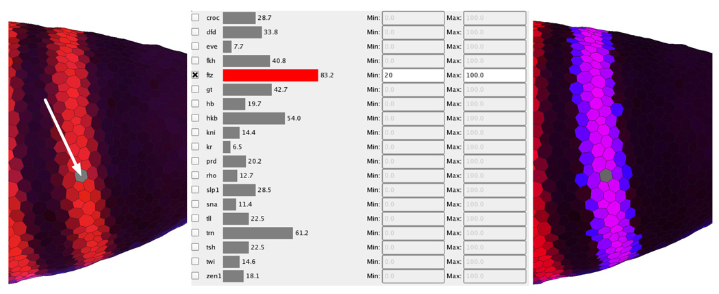
However, painting large numbers of cells manually on the embryo can be rather time-consuming and subjective. If higher accuracy and speed is desired, one can examine cells by thresholding or by means of the cell magnifier and add only those cells with expression levels in a certain range. To automate this process, PCX provides Seed Cell Selection, which employs a cell selected using the Cell Magnifier, see Fig. 11 (left panel). The user then selects one or more genes whose expression level(s) should be considered in defining the region of the embryo (Fig. 11, middle panel). Seed cell selection then uses a flood fill method [15] to identify all cells in a contiguous region whose expression levels lie within the specified expression range(s), as in Fig. 11.
Fig. 11.
Using seed Cell Selection to select all cells belonging to a ftz stripe.
VII. COMBINING CELL SELECTORS INTO COMPLEX QUERIES
All views available in PCX are linked via a central Cell Selector Management System. Cell Selectors of any kind can be accessed here in a unified way and common Cell Selector properties, such as color, can be defined. Furthermore, the central Cell Selector management window allows one not only to perform basic management operations, but also supports combining Cell Selectors using logic operations, such as AND, OR, and NOT. Thus, for example, Cell Selectors defined in a Scatter Plot (DATA Cell Selectors) can be combined with Cell Selectors defined by drawing on the embryo or via seed cell selection (POSITION Cell Selectors), making it possible to define higher-order cell selections within gene expression space.
Logical Cell Selectors are a subset of Cell Selectors that are not manually defined by the user, but are computed by a logical operator using other Cell Selectors as input. The NOT operator, for example, inverts the selection defined by another Cell Selector, i.e., it selects all cells which are not selected by the given Cell Selector. The AND and the OR operations take the selection defined by two Cell Selectors as input. OR combines both selections by computing the union of two Cell Selectors, i.e., it selects all cells that are selected by the first or the second Cell Selector. The AND operator computes the intersection of two Cell Selectors, i.e., it selects only those cells that are selected by both the first and the second cell selector. Since logical operators create new (Logical) Cell Selectors it is not only possible to display results of Cell Selector combinations in any view but also to use Logical Cell Selectors as inputs to other logical operations and form complex queries.
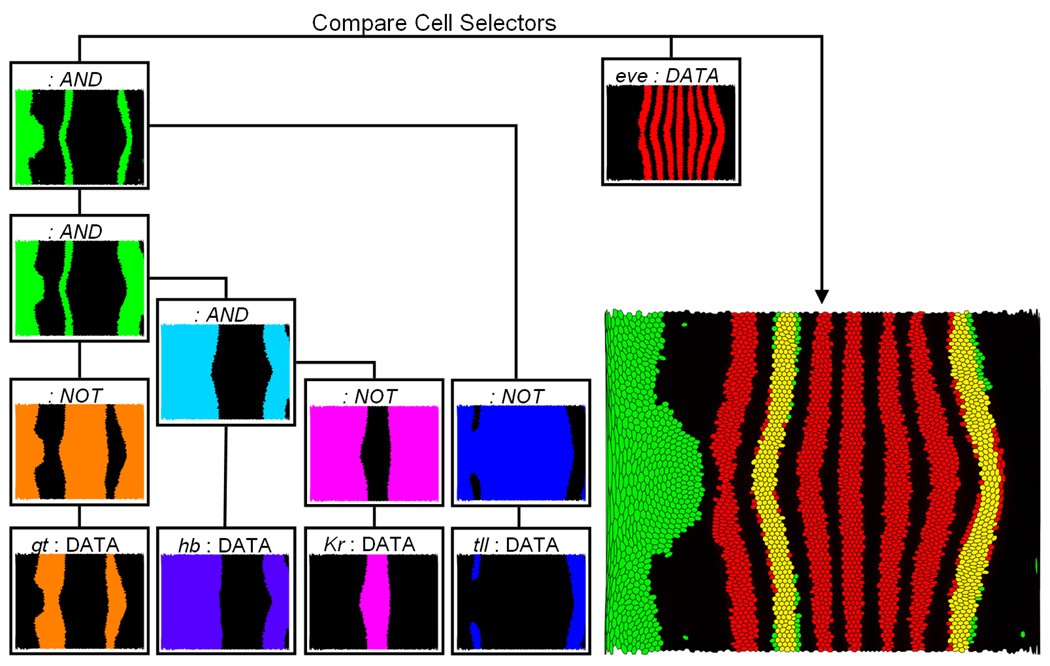
Fig. 13 shows an example of Cell Selector combinations. In general, the genes giant (gt), hb, and Krüppel (Kr) are accepted as regulators of the second stripe of the eve expression pattern from the anterior to the posterior of the embryo. To illustrate this relationship using PCX, we first classify the expression patterns of these three genes by creating an individual Cell Selector for each gene by defining a range of gene expression using a Scatter Plot and linked Unrolled View. For example, we can define a threshold for gt in a Scatter Plot and validate this selection interactively by comparing the spatial pattern defined by the selection with the gt expression pattern using an expression surface (as illustrated in Fig. 14). Genes Kr and gt are both known to be repressors while hb is an activator of eve stripe two [16], [17]. Therefore, as a demostration of Cell Selector function, we first create Data Cell Selectors by using suitable thresholds. Then, we invert the expression patterns of Kr and gt using NOT operations. Afterwards, the hb-Cell Selector and the Logical Cell Selectors that define the inverted patterns of Kr and gt are combined using a sequence of AND operations to compute the intersection of these three patterns (colored green in Fig. 13). Finally, the inverted pattern of tailless (tll) is added to the model using an additional AND operation. The spatial pattern resulting from this selection is then compared to the eve expression pattern (colored red in Fig. 13), which has also been classified by a Data Cell Selector via manual thresholding in a Scatter Plot (Fig. 13, left). The resulting overlay shows that the second eve expression stripe coincides well with a defined stripe-like region (yellow region in Fig. 13) formed by the complex Logical Cell Selector described above, consistent with the view that hb, Kr, and gt regulate eve stripe 2. For eve stripe 7 only the anterior border of the stripe follows the border of another stripe-like region formed by the described selection defined by hb, Kr, and gt. This observation may be interpreted as an indication that hb, Kr, and/or gt are also involved in regulation of eve stripe 7 but that additional regulatory factors are needed for a complete definition of this stripe. By adding suitably thresholded tailless (tll) expression as a NOT-selector, we get an approximation of the posterior border of eve stripe 7. However, it should be remembered that coexpression does not necessarily imply positive regulatory interaction, nor anticorrelation a negative regulatory interaction (for example, high levels of hb are actually known to repress stripe 7), and that these types of observations must be corroborated by experiments. However, by facilitating exploration of these types of correlations, PCX is useful not only for directing in vivo experimentation, but also for directing simulation experiments, where the expression analyses in PCX can additionally be used for validating simulation results. This example demonstrates that it is possible to define and represent complex queries by a simple tree structure. Cell Selectors defined by the user always appear as leaf nodes of such a tree since they do not rely on the input of other Cell Selectors, whereas Logical Cell Selectors are always inner nodes of a Cell Selector tree. Moreover, visual validation of selection results is facilitated when first treating different genes independently before defining more complex cell queries.
Fig. 13.
Using logical operations to examine regulatory relationships for eve stripe 2 and 7. The expression patterns of giant (gt), hunchback (hb), Krüppel (Kr), and tailless (tll) are first classified by defining an independent Cell Selector in Scatter Plots (DATA cell selector) for each gene. Subsequently, the Cell Selectors defining the gt, Kr, and tll patterns are inverted using a NOT operation. Afterwards these Logical Cell Selectors as well the Cell Selector defining the hb pattern are combined using a sequence of AND operations. In this way the overlap of the hb expression pattern, and the inverted gt, Kr, and tll expression patterns can be determined. The result (green) is compared to the eve expression pattern (red) identified by another DATA Cell Selector.
Fig. 14.
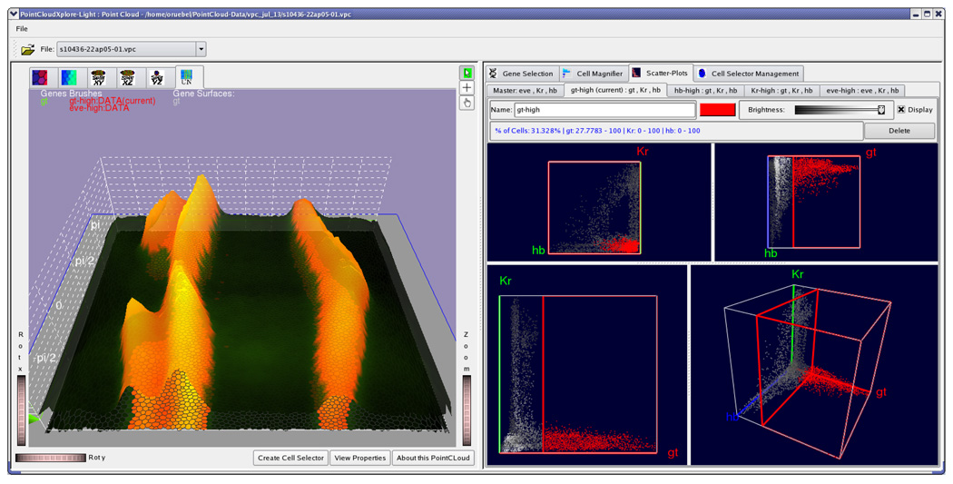
The GUI of PCX. The window is split into two major parts. The left part contains all Physical Views while all other views, as well as additional user controls, are arranged in detachable tabs in the right part of the window. In the Scatter Plot tab one can also create additional sub-tabs each containing one scatter plot. Each of these additional Scatter Plots is responsible for editing one specific Cell Selector.
VIII. FURTHER BIOLOGICAL EXAMPLES
PCX has been received very positively by the BDTNP biologists. Physical Views alone can be used for visualizing any combination of recorded expression patterns from the project’s expression atlas (unpublished data), saving time and effort when embryos need not to be experimentally stained. Likewise, rotation and panning, as well as the Unrolled View are very helpful in gaining insights of the whole pattern, which is more difficult when observing the embryos under microscope. Viewing expression levels as surface plots helps in rapid and accurate detection of the quantitative relationships between individual genes as shown in Fig. 6. Because the amount of the expression data is increasing, PCX will similarly become a more important tool for data mining.
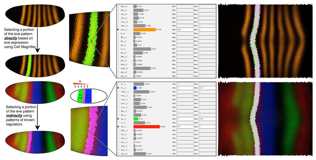
The combination with abstract views like 2D/3D Scatter Plots and Cell Magnifier helps in more rigorous selection of studied expression values, whereas the use of Cell Selectors in spatial views limits the data set into specific parts of the embryo. For example, the upper panel of Fig. 12 shows the use of Cell Magnifier and Seed Cell Selection to select a single eve stripe for further analyses. The bottom panel shows the inverse; by selecting three known regulators of eve, gt, hb and Kr (bottom left panel), we can more or less reproduce the selected eve stripe, as shown in the right panel. Importantly for biologists, the same method can be used for identifying novel interactions between genes with interesting spatial patterns or scatter plot correlations. Using PCX to first identify canditate genes for later experimental validation will often be much cheaper than the traditional methods for selecting canditate genes, such as mutagenesis screens or by staining for coexpression for each gene pair, although there are cases when the older methods are more useful.
Fig. 12.
Using Physical Views and Cell Magnifier to examine regulatory relationships for eve stripe 2.
Interestingly, the same results can be obtained in multiple ways, to suit the questions of the biologists using the tools. In Fig. 13 we see that eve stripe 2 can be detected also using the whole embryo expression data with help of logical operators. However, when we do not limit the spatial data set, we often see additional details. In this case, the logical combination of gt, hb and Kr expression also follow the anterior border of eve stripe 7. While regulation of eve stripe 2 is often understood to be separate from eve stripe 7 regulation, actually there is some evidence that stripe 7 regulatiory region is partially connected to stripe 2 regulatory region [17]. In this case, it makes sense that both stripes also correlate similarly with the expression of stripe 2 transcriptional regulators. Moreover, when we add tll expression to the equation, we obtain the posterior border of stripe 7, in line with earlier 1D simulation results [17]. Notably, normal tll expression has been experimentally shown to upregulate the commonly cited minimal regulator of eve stripe 7, perhaps because of indirect effects, e.g., by inhibition of inhibitors of eve stripe 7 in this minimal regulator. This shows that though computational analysis of data can reveal interesting correlations that might be indicative of novel biological interactions, data mining results should be validated with real experiments. However, PCX is a useful data mining tool, not only for directing the expensive in vivo experimentation, but also for directing simulation experiments, where the expression analyses in PCX can additionally be used for validating the simulation results.
IX. USER INTERFACE
An important consideration during the development of PCX was to keep the graphical user interface (GUI) as simple as possible without limiting its power. We incorporated many rounds of feedback from the biologists who are end-users of our system, in order to provide fast and easy access to all views and system controls. Fig. 14 shows a snapshot of the GUI of PCX. The main window is split into two main areas: The left part contains all Physical Views of the embryo (for example, Expression Surfaces over an Unrolled View in Fig. 14) and the right part all Abstract Views as well as additional user controls (for example, a Scatter Plot View in Fig. 14). These two parts of the window can be resized within the main window by moving a central split bar, allowing the Physical- or Abstract Views to occupy as much screen space as desired by a user. Controls and Abstract Views in the right part are arranged in a series of detachable tabs such that a user can switch between different abstract views or detach them from the main window and show them side-by-side. The Scatter Plot View can hold several sub-tabs corresponding to active Cell Selectors. It always holds a so-called “Master” Scatter Plot tab (leftmost tab in Scatter Plot View), which is used to choose gene combinations for creating new Cell Selectors. Each newly created Cell Selector shows up as a separate tab. For example, Fig. 14 shows four tabs for cell selectors named “gt-high”, “hb-high”, “Kr-high”, and “eve-high”. This strategy has the advantage that it is simple to switch between editing different Cell Selectors (and associated Scatter Plots). To change a Cell Selector, the user simply selects the corresponding tab and does not have to worry about selecting the correct combination of genes in order to edit a cell selector. As described in Section V in each Scatter Plot tab three 2D- and one 3D scatter-plot are shown. These plots are separated by moveable split-bar allowing the user to define how much screen-space should be occupied by the different plots.
X. IMPLEMENTATION
PCX is an interactive exploration tool. Views of the embryo are rendered interactively and all interactions that we described take, at most, a fraction of a second to complete. We implemented PCX as C++ stand-alone application using Trolltech’s Qt 4.2 library (http://www.trolltech.com/) and OpenGL (http://www.opengl.org/) as cross-platform widget and graphics libraries. We have compiled and run PCX successfully on Linux, MacOS X and Windows machines. PCX is currently available from the BDTNP’s web page http://bdtnp.lbl.gov/Fly-Net/bioimaging.jsp?w=pcx as a means to view the project’s release data set. Currently there are 1200 pointclouds of individual embryos available online for browsing.
XI. EXTENSIONS
Scatter Plots are limited in so far that only three genes can be displayed at once. While it is possible to show expression relationships between more than three genes by linking two or more scatter plots, there are other methods for visualizing high-dimensional expression space. Parallel Coordinates are commonly used for that purpose and we have integrated them into PCX. Further details can be found in another paper [4].
XII. CONCLUSIONS AND FUTURE WORK
The combination of several views for visualizing 3D gene expression information has proven to be a valuable tool to members of the BDTNP in finding new relationships in 3D gene expression data. We have released a version of this tool that implements all views discussed in this paper as part of the first data release of the project, allowing biologists from other groups to explore published PointCloud data. As the BDTNP collects PointCloud data for many more genes, several additional challenges will arise that we plan to address. One of these challenges is mapping an even larger number of genes to colors. We are also working on integrating Parallel Coordinate Views into the publicly released version.
Scatter Plots and Parallel Coordinates should allow the relationship between 20–30 genes to be examined. In the future however, we anticipate the need to examine several hundred genes at once in Virtual PointClouds. We hope to address this challenge by combining our visualization tool with automated data analysis methods, such as clustering or self-organizing maps to reduce dimensionality of data sets and define new methods of mapping gene expression level combinations to colors.
ACKNOWLEDGMENT
This work was supported by the National Institutes of Health through grant GM70444, by the National Science Foundation through award ACI 9624034 (CAREER Award), through the Large Scientific and Software Data Set Visualization (LSSDSV) program under contract ACI 9982251, and a large Information Technology Research (ITR) grant; and by the LBNL Laboratory Directed Research Development (LDRD) program; A.H. DePace is funded by a Helen Hay Whitney postdoctoral fellowship. We thank the members of the Visualization and Computer Graphics Research Group at the Institute for Data Analysis and Visualization (IDAV) at the University of California, Davis; the members of the BDTNP at the Lawrence Berkeley National Laboratory (LBNL) and the members of the Visualization Group at LBNL.
Biographies

Gunther H. Weber received his Ph.D. in Computer Science from the University of Kaiserslautern in 2003. His research on visualization of adaptive mesh refinement data and topology-based methods for the exploration of volume data was performed in close collaboration with the Institute for Data Analysis and Visualization (IDAV) at the University of California, Davis and the Lawrence Berkeley National Laboratory (LBNL). Currently, Gunther is a Visualization and Analytics Engineer at the Lawrence Berkeley National Laboratory and the National Energy Research Scientific Computing Center. He is a member of the IEEE Computer Society.

Oliver Rübel received his M.S. degree in computer science from the University of Kaiserslautern, Germany in 2006. He is currently student assistant at the Visualization Group, Lawrence Berkeley National Laboratory (LBNL) and PhD student at the University of Kaiserslautern. He is also collegiate of the International Research Training Group (IRTG 1131) of the University of Kaiserslautern and visiting scholar at the Institute for Data Analysis and Visualization (IDAV), at the University of California, Davis. His current research focus is analysis of high dimensional data by combining visualization and data analysis.

Min-Yu Huang received his B.S. degree in 1995 from the department of Physics; B.S. degree in 1995(double major) and M.S. degree in 1997 from the department of Computer Science at National Tsing-Hua University, Hsinchu, Taiwan. He is currently a Ph.D. candidate in the department of Computer Science and a member of the Institute for Data Analysis and Visualization(IDAV) at University of California, Davis. He is a student member of IEEE.

Angela H. DePace received her B.S. in Molecular Biophysics and Biochemistry from Yale University, and her Ph.D. in Biochemistry from the University of California, San Francisco where she studied with Jonathan Weissman. She is currently conducting her postdoctoral work at the University of California Berkeley with Michael Eisen. She will move to the Systems Biology Department at Harvard Medical School in 2008, where her lab will focus on the mechanism and evolution of gene regulation.

Charless C. Fowlkes received a BS with honors from Caltech in 2000 and a PhD in computer science from the Univeristy of California, Berkeley in 2005. His PhD research was supported by a US National Science Foundation Graduate Research Fellowship. He is currently a postdoctoral scholar at UC Berkeley. His research interests include analysis and modeling of spatial gene expression, computer vision, and the ecological statistics of natural images.

Soile V. E. Keränen is a scientist at the Lawrence Berkeley National Laboratory, and part of the Berkeley Drosophila Transcription Network Project. Her research interests include developing methods for analysis of and discovering rules of spatial pattern formation and evolution of developmental regulatory processes using Drosophila embryos and virtual organisms as model systems. She has background as an evolutionary developmental biologist, and has Ph.D. in genetics from University of Helsinki. She is a member of The Finnish Society for Developmental Biology (expatriate), Genetics Society of America, and International Society for Computational Biology.

Cris L. Luengo Hendriks received his M.Sc. degree in 1998 and his Ph.D. degree in 2004, both from the Department of Applied Physics of the Delft University of Technology, the Netherlands. Currently he is a postdoctoral fellow at Lawrence Berkeley National Laboratory, where he developed the software that obtains the Single PointCloud files used in this paper from three-dimensional fluorescence images. His research interests include image processing, image analysis and gene expression pattern analysis. He is a member of the IEEE and the IEEE Signal Processing Society.

Hans Hagen is a Professor of computer science at the University of Kaiserslautern, where he teaches and conducts research in the areas of scientific visualization and geometric modeling. Professor Hagen has written over 100 scientific articles, and edited several books. He closely cooperates with several institutions and universities worldwide. He received his Ph.D. in mathematics (geometry) from the University of Dortmund in 1982, and M.S. and B.S. in mathematics and B.S. in computer science from the University of Freiburg. Before moving to Kaiserslautern in 1988 he held faculty positions at the University of Braunschweig and at Arizona State University.

David W. Knowles received a Ph.D. degree in Physics from the University of British Columbia, Canada in 1992. He came to Lawrence Berkeley Laboratory in 1994 as a Postdoctoral Fellow to unravel the macromolecular interactions of the red blood cell membrane. In 1999, as Scientist, he established the BioImaging Group at the Berkeley National Lab. His research focuses on developing imaging, image analysis, visual and statistical techniques to quantify and map cellular and subcellular events in biological systems.

Jitendra Malik received the BTech degree in Electrical Engineering from Indian Institute of Technology, Kanpur, in 1980 and the PhD degree in computer science from Stanford University in 1985. In 1986, he joined the University of California at Berkeley, where he is currently the Arthur J. Chick Endowed Professor of EECS. His research interests are computer vision, computational modeling of human vision and analysis of biological images. He received the gold medal for the best graduating student in Electrical Engineering from IIT Kanpur in 1980, a Presidential Young Investigator Award in 1989, and the Rosenbaum fellowship for the Computer Vision Programme at the Newton Institute of Mathematical Sciences, University of Cambridge in 1993. He received the Diane S. McEntyre Award for Excellence in Teaching in 2000. He was awarded a Miller Research Professorship in 2001. At CVPR 2007, he was awarded the Longuet-Higgins Prize for a contribution that has stood the test of time. He is a fellow of the IEEE.

Mark Biggin received a BSc degree in Biochemistry from Lancaster University (1981) and a PhD degree in Molecular Biology from the MRC Laboratory of Molecular Biology, Cambridge University (1985). He was a postdoctoral fellow in Robert Tjian’s laboratory at the University of California, Berkeley (1985–1989) before joining the faculty at Yale as an Assistant then Associate Professor (1989–2000). He moved to Lawrence Berkeley National Laboratory in 2000 to establish interdisciplinary research projects that seek systems level understandings of animal developmental transcriptional networks and bacterial stress response pathways.

Bernd Hamann serves as Associate Vice Chancellor for Research and Professor of Computer Science at the University of California, Davis. His research and teaching interests are visualization, geometric modeling, and computer graphics. He received his Ph.D. degree from Arizona State University in 1991, won a 1992 Research Initiation Award and a 1996 CAREER Award from the National Science Foundation, and obtained a 2006 University of California Presidential Chair in Undergraduate Education.
Contributor Information
Gunther H. Weber, Email: GHWeber@lbl.gov, Computational Research Divisition, Lawrence Berkeley National Laboratory, One Cyclotron Road, Berkeley, CA 94720..
Oliver Rübel, Email: ORuebel@lbl.gov, ruebel@informatik.uni-kl.de, Computational Research Divisition, Lawrence Berkeley National Laboratory, One Cyclotron Road, Berkeley, CA 94720.; International Research Training Group “Visualization of Large and Unstructured Data Sets – Applications in Geospatial Planning, Modeling, and Engineering,” Technische Universität Kaiserslautern, Erwin-Schrödinger-Straße, D-67653 Kaiserslautern, Germany.
Min-Yu Huang, Email: myhuang@ucdavis.edu, Institute for Data Analysis and Visualization (IDAV) and the Department of Computer Science, University of California, Davis, One Shields Avenue, Davis. CA 95616, USA..
Angela H. DePace, Email: adepace@berkeley.edu, Department of Molecular and Cellular Biology and the Center for Integrative Genomics, University of California, Berkeley, 142 LSA #3200, Berkeley, CA 94720, USA..
Charless C. Fowlkes, Email: fowlkes@eecs.berkeley.edu, Computer Science Division, University of California, Berkeley, CA 94720, USA..
Soile V. E. Keränen, Email: SVEKeranen@lbl.gov, Genomics Division, Lawrence Berkeley National Laboratory, One Cyclotron Road, Berkeley, CA 94720..
Cris L. Luengo Hendriks, Email: CLLuengo@lbl.gov, Life Sciences Division, Lawrence Berkeley National Laboratory, One Cyclotron Road, Berkeley, CA 94720..
Hans Hagen, Email: hagen@informatik.uni-kl.de, International Research Training Group “Visualization of Large and Unstructured Data Sets – Applications in Geospatial Planning, Modeling, and Engineering,” Technische Universität Kaiserslautern, Erwin-Schrödinger-Straße, D-67653 Kaiserslautern, Germany..
David W. Knowles, Email: DWKnowles@lbl.gov, Life Sciences Division, Lawrence Berkeley National Laboratory, One Cyclotron Road, Berkeley, CA 94720..
Jitendra Malik, Email: malik@eecs.berkeley.edu, Computer Science Division, University of California, Berkeley, CA 94720, USA..
Mark D. Biggin, Email: MDBiggin@lbl.gov, Genomics Division, Lawrence Berkeley National Laboratory, One Cyclotron Road, Berkeley, CA 94720..
Bernd Hamann, Email: bhamann@ucdavis.edu, Institute for Data Analysis and Visualization (IDAV) and the Department of Computer Science, University of California, Davis, One Shields Avenue, Davis. CA 95616, USA..
REFERENCES
- 1.Lawrence PA. The Making of a Fly: The Genetics of Animal Design. Blackwell Publishing, Inc.; 1992. [Google Scholar]
- 2.Luengo Hendriks CL, Keränen SVE, Fowlkes CC, Simirenko L, Weber GH, DePace AH, Henriquez C, Kaszuba DW, Hamann B, Eisen MB, Malik J, Sudar D, Biggin MD, Knowles DW. Three-dimensional morphology and gene expression in the Drosophila blastoderm at cellular resolution I: data acquisition pipeline. Genome Biology. 2006;vol. 7R124 doi: 10.1186/gb-2006-7-12-r123. [DOI] [PMC free article] [PubMed] [Google Scholar]
- 3.Fowlkes CC, Luengo Hendriks CL, Keränen SVE, Biggin MD, Knowles DW, Sudar D, Malik J. Registering Drosophila embryos at cellular resolution to build a quantitative 3D map of gene expression patterns and morphology. CSB 2005 Workshop on BioImage Data Minning and Informatics. 2005 August [Google Scholar]
- 4.Rübel O, Weber GH, Keränen SVE, Fowlkes CC, Luengo Hendriks CL, Simirenko L, Shah NY, Eisen MB, Biggin MD, Hagen H, Knowles DW, Malik J, Sudar D, Hamann B. PointCloudXplore: Visual analysis of 3D gene expression data using physical views and parallel coordinates. In: Santos B, Ertl T, Joy K, editors. Data Visualization 2006 (Proceedings of Eurographics/IEEE-VGTC Symposium on Visualization 2006); May 2006; Aire-la-Ville, Switzerland: Eurographics Association; pp. 203–210. [Google Scholar]
- 5.Keränen SVE, Fowlkes CC, Luengo Hendriks CL, Sudar D, Knowles DW, Malik J, Biggin MD. Three-dimensional morphology and gene expression in the Drosophila blastoderm at cellular resolution II: dynamics. Genome Biology. 2006;vol. 7:R124. doi: 10.1186/gb-2006-7-12-r124. [DOI] [PMC free article] [PubMed] [Google Scholar]
- 6.Wang Baldonado MQ, Woodruff A, Kuchinsky A. Guidelines for using multiple views in information visualization. AVI ’00: Proceedings of the working conference on Advanced visual interfaces; New York, NY, USA: ACM Press; 2000. pp. 110–119. [Google Scholar]
- 7.Henze C. Feature detection in linked derived spaces. In: Ebert D, Rushmeier H, Hagen H, editors. Proceedings IEEE Visualization ’98; Los Alamitos, CA, USA: IEEE Computer Society Press; 1998. pp. 87–94. [Google Scholar]
- 8.Gresh DL, Rogowitz BE, Winslow RL, Scollan DF, Yung CK. WEAVE: A system for visually linking 3-d and statistical visualizations, applied to cardiac simulation and measurement data. In: Ertl T, Hamann B, Varshney A, editors. Proceedings IEEE Visualization 2000; Los Alamitos, CA, USA: IEEE Computer Society Press; 2000. pp. 489–492. [Google Scholar]
- 9.Doleisch H, Gasser M, Hauser H. Interactive feature specification for focus+context visualization of complex simulation data. In: Bonneau G-P, Hahmann S, Hansen CD, editors. Data Visualization 2003 (Proceedings of the Eurographics/IEEE TCVG Symposim on Visualization); 2003. [Google Scholar]
- 10.Piringer H, Kosara R, Hauser H. Interactive focus+context visualization with linked 2D/3D scatterplots; Proceedings of the Second International Conference on Coordinated & Multiple Views in Exploratory Visualization (CMV’04); Washington, DC, USA: IEEE Computer Society; 2004. pp. 49–60. [Google Scholar]
- 11.Kosara R, Sahling GN, Hauser H. Linking scientific and information visualization with interactive 3D scatterplots; Short Communication Papers Proceedings of the 12th International Conference in Central Europe on Computer Graphics, Visualization, and Computer Vision (WSCG); 2004. pp. 133–140. [Google Scholar]
- 12.Shah N, Filkov V, Hamann B, Joy KI. GeneBox: Interactive visualization of microarray data sets. In: Valafar F, Valafar H, editors. Proceedings of The 2003 International Conference on Mathematics and Engineering Techniques in Medicine and Biological Sciences (METMBS ’03); Computer Science Research, Education, and Applications Press (CSREA); 2003. pp. 10–16. [Google Scholar]
- 13.Healey CG. Choosing effective colours for data visualization; Proceedings IEEE Visualization’96; Los Alamitos, CA, USA: IEEE Computer Society Press; 1996. pp. 263–271. [Google Scholar]
- 14.Healey CG. Combining perception and impressionist techniques for nonphotorealistic visualization of multidimensional data. SIGGRAPH 2001 Course 32: Nonphotorealistic Rendering in Scientific Visualization; 2001. pp. 20–52. [Google Scholar]
- 15.Foley JD, van Dam A, Feiner SK, Hughes JF. Computer Graphics, Principles and Practice. 2nd ed. Addison-Wesley; 1997. ch. 19.5.2. [Google Scholar]
- 16.Ludwig MZ, Patel NH, Kreitman M. Functional analysis of eve stripe 2 enhancer evolution in Drosophila: rules governing conservation and change. Development. 1998;vol. 125(no. 5):949–958. doi: 10.1242/dev.125.5.949. [DOI] [PubMed] [Google Scholar]
- 17.Janssens H, Hou S, Jaeger J, Kim A-R, Myasnikova E, Sharp D, Reinitz J. Quantitative and predictive model of transcriptional control of the drosophila melanogaster even skipped gene. Nature Genetics. 2006;vol. 38(no. 10):1159–1165. doi: 10.1038/ng1886. [DOI] [PubMed] [Google Scholar]


