

Abstract
Motivation: Modern data acquisition methods in biology allow the procurement of different types of data in increasing quantity, facilitating a comprehensive view of biological systems. As data are usually gathered and interpreted by separate domain scientists, it is hard to grasp multidomain properties and structures. Consequently, there is a need for the integration of biological data from different sources and of different types in one application, providing various visualization approaches.
Results: In this article, methods for the integration and visualization of multimodal biological data are presented. This is achieved based on two graphs representing the meta-relations between biological data and the measurement combinations, respectively. Both graphs are linked and serve as different views of the integrated data with navigation and exploration possibilities. Data can be combined and visualized multifariously, resulting in views of the integrated biological data.
Availability: http://vanted.ipk-gatersleben.de/hive/.
Contact: rohn@ipk-gatersleben.de
1 INTRODUCTION
Biological systems are complex systems, which are investigated separately on different levels and with different biological approaches and methods. The cycle of knowledge acquisition in biology starts usually with biological experiments to investigate interesting phenomena. The generated data is used to create a model and build hypothesis, which then can be tested by further experiments. All experiments performed in this cycle result in large datasets from different data domains, such as structural or functional image-based investigations, graph-based modeling approaches, numeric measurements at different time points and spatial resolution such as cell, tissue and organ level. Such data is gathered from different groups around the world in increasing quantity and quality. There is need for an integrated view on several biological data domains to analyze manifold cause-and-effect in the systems. All data gathered from a biological system is in context of each other and therefor data integration may provide a more complete view on the system, facilitating knowledge beyond the intended results of single experiments (Ball et al., 2004). It could be shown that the combination of networks and omics data is useful and leads to novel insight into data and biological systems (Gehlenborg et al., 2010). We expand such approaches by considering spatial data, in order to be able to account for additional spatial systemic properties and often occurring data types.
There have been numerous database-oriented integration approaches developed (for example, Ameur et al., 2006; Shah et al., 2005; Sujansky, 2001; Töpel et al., 2008), which partly provide world-wide integration of multidomain biological data, but many biological researchers are overwhelmed by the number of specialized databases, sheer data flood and unhandy web interfaces. Most researchers seek for broad combination of their own data together with data from selected databases and collaborators, in the best case in one application. Consequently, there is need for an approach, which allows researchers to access and handle their data on their own computer and import data from different sources and collaborators. Complex data and several data types shall be combined and visualized in many ways, not only providing overview and insight, but also publication-ready illustrations. On the one hand, there are quite a number of applications available integrating data on the database level, such as Köhler et al. (2006), local applications combining networks and experimental data [for a list see Gehlenborg et al. (2010)] and 2D/3D data integration tools (Abramoff et al., 2004; Hjornevik et al., 2007; Moore et al., 2007; Stalling et al., 2005). On the other hand, flexible integration of more than two different data types in one application, running locally on standard computers, is sparse. Therefore, we propose a method, which formalizes and supports the biologists workflow from the measurements to a proper visualization of the data (Fig. 1), together with navigation and exploration possibilities, allowing researchers to reproduce and revisit experimental results.
Fig. 1.

Basic workflow of combining multimodal biological data. Step 1) starting with a number of measurements, which are annotated with metadata, the data get integrated into the MetadataGraph, which allows to visualize and explore the relationship between the data on the metadata level (Step 2). Step 3: All measurements from different data domains can be combined together into ‘mappings’ using the MappingGraph. Mappings can be visualized, allowing to create views on integrated biological data. Step 4: These IntegrationViews promote understanding of complex biological system and also serve as publication-ready images.
There are two main requirements: first, it should be possible to integrate data from different experiments, realizing the multipersonal, multimethodological nature of biological data acquisition. Navigation, filtering and exploration possibilities will help to understand how the experiments are structured. Second, it should be possible to combine and visualize data resulting in integrated views on data from different sources and types. Visualization and data mapping approaches will help to understand what the data represent in the real system. In this article, we will focus mainly on methodological and theoretical aspects of the integration and visualization of multidomain data in an application.
The structure of this article is as follows: we propose a method to integrate multimodal data at the metadata (MetadataGraph) and measurement (MappingGraph) level and show how this allows to combine, analyze and navigate through the data by user interaction. After this, IntegrationViews to visualize combined data are explained and an application to barley data is described. Finally, we discuss the implementation and some properties of the presented application.
2 METHODS
In order to investigate the complex biological systems, many different data acquisition approaches are used. Additionally, data come from different data domains, e.g. spaceless numeric information about the metabolome, transcriptome and proteome (so-called *omics data), spatial information of compound distribution and structural information (e.g. pathways or bidirectional protein interactions).
2.1 Data model for measurements and metadata
The structure of biological multidomain data can be expressed in a small data model, described in detail in Rohn et al. (2009). It models four types of measurements (exemplary data are shown in Step 1 in Fig. 1) and metadata annotating these measurements. To formalize this model, we define the set of measurements as 𝔻={d|d∈𝕆∪𝕀∪𝕍∪ℕ}, with 𝕆 = set of numeric measurements, 𝕀 = set of images, 𝕍 = set of volumes and ℕ = set of networks. The metadata (defined as set 𝔸) is used to enable search and navigation through all measurements and provides information about the experiment, contained conditions, taken samples, and measured substances (compare also Fig. 2). We define an object path op(d) with d∈𝔻 as the set of metadata for a certain measurement object, see also Figure 2.
Fig. 2.

Conceptional MetadataGraph structure (see also Step 2 in Fig. 1 for an instance). The MetadataGraph consists of five layers: four layers representing the metadata 𝔸 and one layer representing the measurements 𝔻 (gray background). The MetadataGraph allows to visualize the relationships between biological data on metadata level and supports navigation through and exploration of the data by selection and filtering operations. Dashed edges indicate a merging operation and highlighted nodes depict one object path op(d) (defined in Section 2.1). Measurement nodes are colored according to the measurement types.
2.2 Combination of data on metadata level
Based on the metadata 𝔸, the measurements 𝔻 can be integrated in two attributed graph structures called MetadataGraph (Fig. 2) and MappingGraph (which will be described in detail in Section 2.3). The MetadataGraph combines data from several experiments on the metadata level and allows an integrated view on the available metadata.
As the cardinalities of the data model indicate, each experiment may be connected to several condition objects. Analogue, each condition is connected to several samples. Samples again are connected to a number of measurement objects. The measurement objects are also connected to substance objects, indicating the measured substance, e.g. an image may represent the 2D distribution of a metabolite. For conditions and samples, equal objects have equal attribute values. For substances or experiments, equal objects have equal ‘name’ attributes.
To build up the MetadataGraph, we iteratively add representative nodes for all objects to the graph. First, one experiment node is added. Then all condition nodes of this experiment and edges connecting the experiment node with each condition node are added, indicating the predecessor/successor relation and allowing one to visually track dependencies. In the following, successor sample nodes for each condition are created, together with edges between the condition and sample nodes. Subsequently, for each measurement object a node and edge from the sample node to this node is built. If the measurement object is connected to a substance object, a substance node is created and an edge to the data object node is drawn. This procedure is repeated for all experiments. Every time a node will be added, all nodes representing the same class are checked for equality by the new object node. If there is already a node representing an object with equal attribute values as the new object, no new node is created but the existing node is taken. Then all successor nodes of the new object are added to this existing node. The procedure is performed on all but the measurement object nodes, as they lack any equals operator.
Due to the merging operation, the resulting graph is a directed acyclic graph (Fig. 2), representing all integrated measurements at any time and built up using the metadata of all integrated measurements. As the set of measurements may increase over time, the graph grows accordingly. Additional data enter the graph by sequential user imports or combination of data resulting in new one (see Section 2.3.3). To prevent cluttering because of the increasing number of nodes created over time, the measurement object and substance object nodes are not shown in a view of the MetadataGraph. An instance of such a MetadataGraph can be seen in Step 2 in Figure 1. The tree-like layout was chosen, because it is a simple and convenient layout for the underlying data structure. As the graph structure depicts the relations between metadata objects of respective measurements, it allows to visually inspect the metadata and supports search functionality.
2.3 Combination of data on measurement level
Analogue to the MetadataGraph described in the previous section, we define and formalize the combination of the integrated data on the measurement level on the basis of MappingGraph.
2.3.1 Mappings
Let  +(𝔻) be the non-empty power set of the measurement set. Let op(𝔻) be the set of metadata of all measurement objects in 𝔻. Let 𝕋 be any set of graph element attributes. Then a mapping m∈𝕄 (with 𝕄 as the set of all mappings) is defined as the tuple
By this definition, a mapping m represents a combination of measurements together with its metadata and a set of attributes. A mapping is realized as an attributed graph, in which nodes represent data objects. The nodes' attributes are set according to the object attribute values and eventually to mapping-specific attribute values of the set 𝕋. These attributes might describe the position or size in 2D/3D space, coloring or other. Edges have mapping-dependent meanings, for example, in the ‘Linked Pathway Integration’ mapping (Table 1): this mapping is represented by an overview graph with a node for each pathway and edges represent substances appearing in two different pathways [overview graphs are defined and explained in Klukas and Schreiber (2007)]. Alternatively, for a mapping describing an assembled anatomic body from several 3D volumes, edges may represent connected bodily parts.
Table 1.
Overview of some implemented IntegrationViews
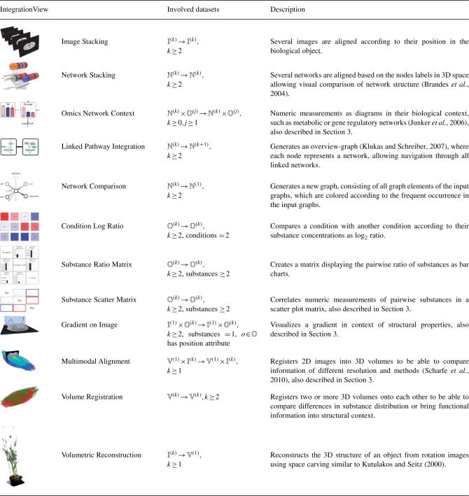 |
IntegrationViews represent combined and visualized multimodal biological data, which provide insight into the data and can be used for publication purposes. Several of the listed IntegrationViews are well-known data visualizations, but also new combinations appeared due to our generalizing approach. All IntegrationViews have been further formalized based on the theoretical foundations in this article. The second column describes the involved input and result measurements of the mapping function, where ℕ(k) represent a set of k networks, 𝕍(k) represent a set of k volumes and so on.
Mapping functions are able to create mappings based on the data of other mappings:
In other words, a mapping function is a projection from at least one mapping to another mapping and, consequently, mappings can be mapped again (see next section). Examples of mapping functions are listed in Table 1. During the mapping procedure, new measurements may be created, which will result in an implicit update of the MetadataGraph by the new measurements' metadata.
2.3.2 MappingGraph
To be able to create, visualize, analyze and select mappings, a simple attributed graph called MappingGraph was defined in Rohn et al. (2009). Here, the definition of the MappingGraph is extended, which now represents all integrated data on the measurement level. The four initial nodes of the MappingGraph integrate all imported data d∈𝔻 and are called measurement import (MI) nodes. If metadata and measurements are integrated into the MetadataGraph, the measurements are also integrated into the MappingGraph. Additional nodes of the MappingGraph can be created by the user and represent mappings (so-called mapping nodes). Edges in the MappingGraph represent the measurement flow. Edges point from a node, which was used as the measurement source, to the mapping node, which's mapping combines this measurements. Consequently, MI nodes have only outgoing edges, as they serve only as sources of measurements for possible mapping functions. It is possible to create a mapping under use of any number of mapping nodes and MI nodes, but at least one edge has to be created (which implies, that a mapping function needs at least one measurement d∈𝔻 as input). Therefore, edges represent the work flow/information flow when creating mappings and the resulting data are used again as input for a mapping function. This directed and successive application of mapping functions as functional modules enables users to realize complex workflows and use cases (Fig. 3). It is, for example, possible to apply a mapping function several times to the same mappings using different parameter sets, in order to compare the resulting mappings. The ‘Volumetric Reconstruction’ mapping may be, for example, tested according to the number of rotation images needed, in order to generate an sufficient or appealing reconstruction.
Fig. 3.

Conceptual overview of mapping and remapping in the MappingGraph. Mappings (white rectangles) contain different measurements (small rectangles, color represent measurement types) and may be used by a mapping function (edge with label ‘MF’) to create new mappings. Mapping functions may be executed several times in order to investigate different parameters. Complex use cases can be realized by remapping the output of mapping functions. Note that mapping functions can change the measurement/data type, e.g. a set of images to one volume.
2.3.3 Generation of mappings
Mappings are generated by the user selecting a number of nodes in the MappingGraph. A temporary set of measurements 𝔻sel is generated from this nodes by extracting all measurements, which are part of the nodes' mapping. The full list of mapping functions is reduced by the mapping functions, which are not able to map at least a non-empty subset of 𝔻sel. The user chooses one mapping function, which takes a subset of the extracted measurements as an input and creates a new mapping, represented by a new mapping node in the MappingGraph. If the new mapping contains new measurements created by the mapping function, the MetadataGraph is updated with the measurements' metadata.
2.4 IntegrationViews
IntegrationViews iv are views on combined measurements and are defined as a tuple (𝕄, ℝi), with i∈{1,2,3} and ℝ = set of real numbers. A visualization function
projects mappings in the Euclidean space. This means, an IntegrationView is a visualization of a mapping m∈𝕄, generated by the visualization function vis. The function uses the graph of the mapping m as input. A user creates an IntegrationView by selecting a mapping node in the MappingGraph and choosing a visualization function, which is able to handle this kind of mapping. There are several visualizations possible for one mapping, e.g. the IntegrationView ‘Network Stacking’ (a stacking of several networks) can be drawn as graphs in a 2D plane (nodes are rectangles, edges are lines) or in 3D space (nodes are cuboids, edges are cylinders). An ‘Image Stacking’ can be displayed as ordinary 2D drawings or planes lying in 3D space. Table 1 shows a number of possible IntegrationViews, of which three examples are explained in the context of barley data in detail in Section 3. Most of the presented IntegrationViews combine only one or two types of data, but combining more than two types of measurements is also possible. As this can be quite complex, usually the IntegrationViews depend on the requirements of biologists for special problems and are often use-case oriented.
IntegrationViews realize both interactive and explorative work with combined multimodal biological data and publication-ready illustrations. Some of them were already developed and implemented in other systems, and also novel IntegrationViews have been developed. Our approach allows to combine the previously separated combination of data together in one application and in one workflow, supported by navigation and exploration possibilities.
3 APPLICATION EXAMPLE
Barley is an important crop plant for food and feeding. Consequently, several interdisciplinary projects are investigating the metabolism from a system-wide perspective, in order to find targets to promote resistance and increased yield. Different data acquisition methods result in multidomain data, which has to be integrated and visualized manifold. We tackle these requirements by applying our approach to a set of barley grain data and demonstrate how this data of one object but of different sources and modalities may be exemplarily brought into context of each other using the described approach. The dataset includes a gradient of oxygen concentration, several measurements of metabolites of primary metabolism, topology-based metabolic pathway information, a cross-section image and an NMR volume imaging the water distribution of barley grain.
The oxygen gradient describes the oxygen concentration across the barley grain, which was measured by a probe moving through the tissue [compare Rolletschek et al. (2004)]. We represent the gradient as numeric measurements with a position attribute. It is useful to show this gradient in the context of the surrounding grain structure [see Fig. 4 in Rolletschek et al. (2004)], but as can be seen in the respective hand-made illustration, due to the 2D approach it is not really clear where the probe has been moved through and what the distributed points indicate. Therefore, we decided to present the gradient on top of the cross-section in 3D. The mapping function takes the numeric measurements and the cross-section as input. The gradient is visualized by a chart and is placed orthogonal to the cross-section in such a way, that it cuts the cross-section image along the line the probe was moved. The position and rotation is set by the user according to the biological experiment. The resulting IntegrationView can be seen in Figure 4Ca.
Fig. 4.

Screenshot of the application Hive, which allows to integrate, combine and visualize data from different biological domains, resulting in views on integrated data. (A) MetadataGraph integrating data at metadata level; (B) MappingGraph integrating data at measurement level, (C) IntegrationViews (a) ‘Gradient on Image’, (b) ‘Omics Network Context’, (c) ‘Scatter Plot Matrix’ and (d) ‘Multimodal Alignment’ of the application example in Section 3; (D) Tab with controls working on the active view.
Other metabolite measurements were also taken from barley at different timepoints (Borisjuk et al., 2005). These data include sugars and amino acids and is modeled as numeric measurements with different samples (representing different time points). To understand the behavior of metabolite concentration changes during barley development at a systemic level, it is useful to bring these time-course data into context of the metabolic pathway structure. This allows one to visually track dependencies between metabolites in different parts of the pathway. The mapping function takes as input numeric measurements and pathways of the primary metabolism of barley from the MetaCrop database (Grafahrend-Belau et al., 2008). As pathway nodes represent single substances, the mapping function integrates all numeric measurements of one substance in the corresponding node of the pathways. A 2D graph visualization function paints the pathway as usual, but shows the integrated numeric measurements of nodes as diagrams painted onto the node. In our case, these diagrams visualize the time-course of one substance. The resulting IntegrationView can be seen in Figure 4Cb (only the TCA cycle pathway is shown). It is easy to image a new mapping based on this mapping, by mapping similar time-course measurements of different species to species-specific pathways and stack these data-enriched pathways in 3D, allowing visual comparison of different species data. This would be an example of the remapping procedure described in Section 2.3.2.
Biologists are often interested in substances, which behave similar for different conditions or time points. As the metabolite measurements represent quantitative concentration values, scatter plots are widely used to visually observe potentially correlated substance. Therefore, scatter plots are created from the set of metabolic measurements. The mapping function takes all metabolite measurements as input and builds up a pairwise substance measurement matrix. One element of the matrix contains all measurements of the two substances. The visualization function displays each element of the matrix in a well-known scatter plot visualization, by plotting points for pairwise measurement values. If the pairwise measurements of the matrix element are part of different conditions, the points will be colored differently. The resulting IntegrationView can be seen in Figure 4Cc. In this figure, only those substances are shown, which were integrated into the nodes of the TCA cycle in Figure 4Cb.
Finally, structural information such as the cross-section may be combined with functional information, allowing to compare quantitative information in the context of the grain structure. Therefore, NMR imaging experiments were carried out (Glidewell, 2006) to obtain information about the water content, which is an important indicator of grain maturity (Bewley and Black, 1994, pp. 136–138). It is possible to combine both spatial information, volumetric and image based, by using a multimodal alignment algorithm: the mapping function takes the volume and the cross-section as input. The cross-section image is positioned in the volume according to the position in the real grain by the user via rotation and translation of both models. To support the visual analysis, the 3D view additionally allows to modify the view (zooming, panning, rotating, etc.) and models (transparency, cutting and clipping planes, color maps, etc.). It is easy to imagine a new mapping, which bases on this mapping and additionally maps a gradient as shown in Figure 4Cd.
The described IntegrationViews realize different views on the integrated barley data of different data domains, promoting understanding and linking knowledge from different experiments. Using this approach, the data can be processed faster and visualized in a more intuitive way. The IntegrationViews may also be part of the publication process, as the complete project may be exported and interactively explored by reviewers and interested scientific staff using our application. As indicated, even more IntegrationViews could be generated from this example dataset. Continuative genomic information and more spatial data can be included, allowing to investigate tissue- or compartment-specific properties during development of barley grain.
4 IMPLEMENTATION
The approach described in the previous sections is implemented as an Add-on for the Vanted system (Junker et al., 2006), called Hive (Handy Integration and Visualisation of multimodal Experimental data). It is written in Java and Java3D, utilizes the Model-View-Controller concept and other Software Design Patterns. Together with the plugin-based structure of Vanted, it is easy to extend the functionality even at run time, such as additional database access, e.g. MetaCrop (Grafahrend-Belau et al., 2008) and DBE (Borisjuk et al., 2005), simulation capabilities, e.g. flux balance analysis (Kauffman et al., 2003), mapping functions and visualization algorithms. The Add-on is available at http://vanted.ipk-gatersleben.de/hive/ and is released under the GPL 2.0 License.
Every type of measurement is assigned to a color (see for example, Fig. 4: color of edges in the MappingGraph). This color code is used throughout the application to provide hints about the data domains tackled. For example, when selecting measurements to be mapped, the description of the measurements is color coded according to the measurement type. The list of available mapping functions (see Tab at the right side of Fig. 4) is also color coded according to the type of measurements, which are needed as input for the mapping functions. Mapping nodes give a hint about the measurements, which are part of the mapping. This is implemented by showing a number of small rectangles colored according to the type of measurements and with a number describing the size of the measurement set of this type (see Fig. 4B and Step 3 in Fig. 1).
To be able to keep an overview of all views and interaction possibilities, the application window layout is divided into three parts (Fig. 4): both views representing the MetadataGraph or MappingGraph, respectively, are aligned stacked at the left part of the application window, which allows the user to quickly comprehend the integration and combination workflow at any time. The middle part provides space for the IntegrationViews and the right part situates the controls working on the active view. Although it is a well-arranged layout, the user is able to maximize, minimize and move the views at own will. During work with these views, several optical indicators help the users to track their actions. For each IntegrationView shown to the user, the mapping node in the MappingGraph will be highlighted. Simultaneously, for all measurements d, which are part of the mapping, the object nodes of op(d) will be highlighted in the MetadataGraph. This allows a user to quickly comprehend the tackled metadata and measurements in context of the Metadata- and MappingGraph. As this highlighting of object nodes links the IntegrationViews to the Metadata- and MappingGraph, it is also possible to use this link backwards, such as selecting highlighted object or mapping nodes and navigate to the corresponding IntegrationViews.
5 DISCUSSION
We presented the theoretical and methodological foundations of an application supporting the integration and visualization of biological multidomain data. Several users with biological and computer science background had time to get used to the workflow and work with a prepared project and example data. After this, personal discussions with the scientists revealed that after a short period of vocational adjustment,. the complex application workflow is logical and productive, despite the unfamiliar graph-based interface, which is similar to the pool window in the Amira application (Stalling et al., 2005). They rated it as a good approach capable of realizing complex use cases given by biological researchers and supporting them in their daily work. At the moment, our scientific partners do not possess comprehensive datasets consisting of all the different data types from the same species. We will evaluate our integration approach when such datasets emerge in more detail.
The scalability of the application is good with the currently considered datasets. Often biological experiments consists of 100–1000 data records, and even tens of such experiments can be handled with standard PCs at any time. As our approach supports measurement working sets (by hiding object nodes in the MetadataGraph), researchers are able to temporarily hide parts of the experimental data they are not interested in, while performing specific tasks. Prospective increase of data quantity can be faced with optimization of the performance and memory consumption of the underlying framework Vanted, improved data storage and increased screen size. Management and persistent storing of hundred of experiments is not intended by our approach, but can be realized by connecting to the DBE database (Borisjuk et al., 2005) using the respective Vanted Add-on. The network sizes are limited by the underlying framework and work up to 50 000 nodes. The implementation of the 3D view provides a variety of interaction and model alteration possibilities, but needs especially for high-resolution volumetric data (>50 million voxels) much memory at the moment. Improvements, such as swapping the data to the graphics card, may be included, but would end in reduced interaction possibilities [similar to Schmid et al. (2010)].
6 CONCLUSION
We described a methodology and an application, which is able to bring together data from different data domains. The integration is realized by the MetadataGraph and the MappingGraph, focusing on different aspects of the data integration. Both graphs support user interaction, allowing to navigate through the data and realizing a workflow from the imported data to combined and visualized data. The application is able to bring several biological data domains together in a formalized way, guiding the user to explore, understand and visualize the data. This approach can also be useful for researchers of different fields of science, such as theoretical biology, systems biology and medicine.
Further extensions are to link the application to other tools, in order to realize complex mapping functions by utilizing problem-specific solutions. We will develop more mapping functions and extent the set of visualization functions, to be able to provide a broader range of biological data combinations and visualizations. This includes working with different domain scientists in order to integrate data of different sources and modalities together. By doing this, the application example can be extended and the approach also validated for other species, such as human or bacterial data.
Funding: BMBF grant (0315044A) (partly).
Conflict of Interest: none declared.
REFERENCES
- Abramoff M., et al. Image processing with ImageJ. Biophotonics Int. 2004;11:36–42. [Google Scholar]
- Ameur A., et al. The LCB data warehouse. Bioinformatics. 2006;22:1024–1026. doi: 10.1093/bioinformatics/btl036. [DOI] [PubMed] [Google Scholar]
- Ball C.A., et al. Funding high-throughput data sharing. Nat. Biotechnol. 2004;22:1179–1183. doi: 10.1038/nbt0904-1179. [DOI] [PubMed] [Google Scholar]
- Bewley J.D., Black M. Seeds - Physiology of Development and Germination. New York, London: Plenum Press; 1994. [Google Scholar]
- Borisjuk L., et al. Integrating data from biological experiments into metabolic networks with the DBE information system. In Silico Biol. 2005;5:93–102. [PubMed] [Google Scholar]
- Brandes U., et al. Proceedings of Joint Eurographics - IEEE TCVG Symposium on Visualization. 2004. Visual triangulation of network-based phylogenetic trees; pp. 75–84. vol. 2912 of Lecture Notes in Computer Science. [Google Scholar]
- Gehlenborg N., et al. Visualization of omics data for systems biology. Nat. Methods. 2010;7:S56–S68. doi: 10.1038/nmeth.1436. [DOI] [PubMed] [Google Scholar]
- Glidewell S.M. NMR imaging of developing barley grains. J. Cereal Sci. 2006;43:70–78. [Google Scholar]
- Grafahrend-Belau E., et al. Metacrop - a detailed database of crop plant metabolism. Nucleic Acids Res. 2008;36:D954–D958. doi: 10.1093/nar/gkm835. [DOI] [PMC free article] [PubMed] [Google Scholar]
- Hjornevik T., et al. Three-dimensional atlas system for mouse and rat brain imaging data. Front. Neuroinformat. 2007;1:1–12. doi: 10.3389/neuro.11.004.2007. [DOI] [PMC free article] [PubMed] [Google Scholar]
- Junker B.H., et al. VANTED: a system for advanced data analysis and visualization in the context of biological networks. BMC Bioinformatics. 2006;7:109. doi: 10.1186/1471-2105-7-109. [DOI] [PMC free article] [PubMed] [Google Scholar]
- Kauffman K.J., et al. Advances in flux balance analysis. Curr. Opin. Biotechnol. 2003;14:491–496. doi: 10.1016/j.copbio.2003.08.001. [DOI] [PubMed] [Google Scholar]
- Klukas C., Schreiber F. Dynamic exploration and editing of KEGG pathway diagrams. Bioinformatics. 2007;23:344–350. doi: 10.1093/bioinformatics/btl611. [DOI] [PubMed] [Google Scholar]
- Köhler J., et al. Graph-based analysis and visualization of experimental results with ONDEX. Bioinformatics. 2006;22:1383–1390. doi: 10.1093/bioinformatics/btl081. [DOI] [PubMed] [Google Scholar]
- Kutulakos K.N., Seitz S.M. A theory of shape by space carving. Int. J. Comput. Vis. 2000;38:199–218. [Google Scholar]
- Moore E.B., et al. Mindseer: a portable and extensible tool for visualization of structural and functional neuroimaging data. BMC Bioinformatics. 2007;8:389. doi: 10.1186/1471-2105-8-389. [DOI] [PMC free article] [PubMed] [Google Scholar]
- Rohn H., et al. Proceedings of the German Conference on Bioinformatics. 2009. Integration and visualisation of multimodal biological data; pp. 105–115. vol. 157 of Lecture Notes in Informatics. [Google Scholar]
- Rolletschek H., et al. Energy state and its control on seed development: starch accumulation is associated with high ATP and steep oxygen gradients within barley grains. J. Exp. Bot. 2004;55:1351–1359. doi: 10.1093/jxb/erh130. [DOI] [PubMed] [Google Scholar]
- Scharfe M., et al. Fast multi-core based multimodal registration of 2D cross-sections and 3D datasets. BMC Bioinformatics. 2010;11:20. doi: 10.1186/1471-2105-11-20. [DOI] [PMC free article] [PubMed] [Google Scholar]
- Schmid B., et al. A high-level 3D visualization API for java and ImageJ. BMC Bioninformatics. 2010;11:274. doi: 10.1186/1471-2105-11-274. [DOI] [PMC free article] [PubMed] [Google Scholar]
- Shah S., et al. Atlas - a data warehouse for integrative bioinformatics. BMC Bioinformatics. 2005;6:34. doi: 10.1186/1471-2105-6-34. [DOI] [PMC free article] [PubMed] [Google Scholar]
- Stalling D., et al. Amira: A Highly Interactive System for Visual Data Analysis. Orlando, FL, USA: Academic Press, Inc.; 2005. pp. 749–767. chapter 38. [Google Scholar]
- Sujansky W. Heterogeneous database integration in biomedicine. J. Biomed. Informat. 2001;34:285–298. doi: 10.1006/jbin.2001.1024. [DOI] [PubMed] [Google Scholar]
- Töpel T., et al. BioDWH: a data warehouse kit for life science data integration. J. Integr. Bioinform. 2008;5:93. doi: 10.2390/biecoll-jib-2008-93. [DOI] [PubMed] [Google Scholar]