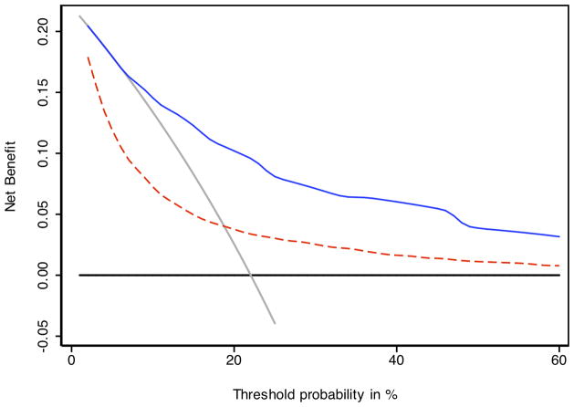
Figure 3.
Decision curve analysis comparing CAPRA-S to postoperative nomogram. The solid blue line indicates the CAPRA-S score predictions, the dashed red line the nomogram predictions. Across the various threshold probabilities, CAPRA-S has greater net benefit (i.e., the net increase in the proportion of patients who would be appropriately identified for adjuvant treatment using the prediction model) than the nomogram. The gray line represents the assumption that all patients would recur, the black line that none would recur. The segment of the nomogram curve which falls below the gray line suggests suboptimal calibration—specifically, over-optimistic prediction—at low predicted levels of risk.

