Abstract
The cartogram, or value-by-area map, is a popular technique for cartographically representing social data. Such maps visually equalize a basemap prior to mapping a social variable by adjusting the size of each enumeration unit by a second, related variable. However, to scale the basemap units according to an equalizing variable, cartograms must distort the shape and/or topology of the original geography. Such compromises reduce the effectiveness of the visualization for elemental and general map-reading tasks. Here we describe a new kind of representation, termed a value-by-alpha map, which visually equalizes the basemap by adjusting the alpha channel, rather than the size, of each enumeration unit. Although not without its own limitations, the value-by-alpha map is able to circumvent the compromise inherent to the cartogram form, perfectly equalizing the basemap while preserving both shape and topology.
Keywords: value-by-alpha map, value-by-area map, cartogram, Cartogram3, visual equalization, transparency, colour perception, representing social data, representing uncertainty
INTRODUCTION
Geographically-referenced social data are typically represented by choropleth maps, a cartographic technique that aggregates individual incidences according to a set of data collection units and then colours each unit by its aggregate value (Slocum et al., 2005). Although a popular thematic mapping choice, choropleth maps often mislead. A choropleth map of a raw incidence count inaccurately reflects the spatial pattern of the mapped phenomenon, as enumeration units containing large populations are capable of having higher incidence counts than their small population counterparts. In such a situation, the displayed pattern is caused as much by the size, shape, distribution, and composition of the enumeration units as the mapped variable itself. To address this issue, raw incidence counts in a variable of interest can be standardized by a second, relevant variable prior to mapping. Though valid, standardization loses information about incidence frequency in the variable of interest, making it impossible to distinguish high incidence-large population areas from low incidence-small population areas.
The cartogram, or value-by-area map, is a common solution to the above problem. Rather than standardizing a variable of interest by a second variable before plotting, the basemap of a cartogram is visually equalized such that each enumeration unit is rescaled in proportion to the second, equalizing variable. The variable of interest may then be represented atop this visually equalized basemap using the choropleth technique, allowing readers to extract information on both variables from the resultant bivariate representation. The cartogram approach has been promoted by human geographers as a mapping form that is “more just socially” (Dorling, 1993: 171). Proper visual equalization has the potential to improve not just the way we see our data, but also the way we see the world. The Worldmapper project (www.worldmapper.org) provides numerous examples of this transformative possibility (Barford and Dorling, 2008).
However, cartograms have well documented limitations, most notably the compromise between shape and topology preservation when visually equalizing the basemap by size. Here we report on an alternative method of visual equalization, termed a value-by-alpha map, which does not suffer from this drawback. Unlike the cartogram, which alters size, a value-by-alpha map adjusts the alpha channel of each enumeration unit according to an equalizing variable. A variable of interest can then be mapped atop this visually equalized basemap using the choropleth technique.
This paper proceeds with five more sections. In the following section, the limitations of cartograms are discussed and a framework for classifying cartograms is presented. In the third section, the value-by-alpha mapping technique is introduced and two examples are provided. The fourth section provides instructions for producing these maps and discusses important design consideration. The limitations of value-by-alpha maps, in relation to cartograms, are presented in the fifth. Concluding remarks and future directions are offered in the final section.
LIMITATIONS OF CARTOGRAMS
Most academic cartographers categorize cartograms as either contiguous or noncontiguous (Slocum et al., 2005, Dent, 1996), with some adding an intermediate pseudo-contiguous category (Muehrcke and Muehrcke, 1998). This classification divides cartograms based on their degree of topology preservation. Topology preservation refers to the perpetuation of enumeration unit adjacencies from the original geography to the cartogram depiction and may be quantified as the percentage of shared nodes on the original geography that are maintained on the transformed cartogram (Keim and Herrmann, 1998). Unfortunately, the above topology-focused classification ignores two other dimensions across which cartogram designs vary: shape preservation and visual equalization.
Shape preservation refers to the perpetuation of shape characteristics (e.g., local angles and edge length ratios) from the original geography to the cartogram depiction. Only noncontiguous cartograms preserve shape perfectly. Many cartogram algorithms commonly allow for massive shape distortion, though many include constraints designed to minimize local and global shape error (e.g., House and Kocmoud, 1998, Keim et al., 2004, Keim et al., 2005). Other designs have taken the radical step of abandoning shape altogether, abstracting enumeration units to rectangles (Heilmann et al., 2004, Raisz, 1934) or circles (Dorling, 1991)
Visual equalization refers to the transformation of the basemap according to a relevant variable (e.g., population in the context of mapping social data) to make enumeration units that are more thematically important more noticeable. Because cartograms achieve visual equalization by manipulating the map area allotted to each enumeration unit, this cartogram property is sometimes more narrowly described as density equalization (Tolber, 2004). Early cartograms contained large area errors due to their manual production. The first computer cartogram algorithm released in the early 1960s also accepted a large amount of deviation from perfect visual equalization (Tobler, 1963). Most subsequent algorithms tolerate small amounts of area error, with some allowing the user to set thresholds for overall or maximum unit area error (e.g., Gastner and Newman, 2004).
All three dimensions – shape preservation, typology preservation, and visual equalization – are important for different map reading tasks. Feature identification is easier on cartograms that preserve shape rather than those that preserve topology. While shape preservation is more important for elemental map-reading tasks, topology preservation is critical for general map-reading tasks, as users may wish to compare regions and understand the overall spatial structure of the mapped variables. Finally, area estimations on cartograms are only meaningful if visual equalization is near perfect.
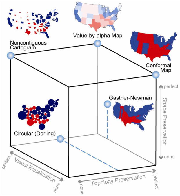
Cartogram3 (read as Cartogram Cubed – see Figure 1) is a graphical portrayal of the inherent tradeoffs to the cartogram (Johnson, 2008). All cartograms can be plotted somewhere within the Cartogram3 space. The ideal cartogram is one that is perfect in all three properties, visually equalizing the basemap while completely preserving shape and topology (Keim and Herrmann, 1998). Unfortunately, the ideal solution is impossible because visual equalization by area is at odds with shape and topology preservation. All extant cartograms thus include non-trivial amounts of shape, topology, and/or visual equalization error.
Figure 1. Cartogram3.
There are three dimensions that are important for accurate reading of cartograms: shape preservation, topology preservation, and visual equalization. Any value-by-area cartogram is a compromise across these three dimensions and can be placed somewhere within the bounds of this cube. A value-by-alpha map is able to achieve each of the three dimensions perfectly without compromise. (recommended size 2 columns)
INTRODUCTION TO VALUE-BY-ALPHA MAPS
What is a Value-by-alpha Map?
A transparent real-world entity allows the uninhibited transmission of light, making the transparent entity appear invisible. Entities that transmit only a portion of light are termed translucent while entities that transmit no light are termed opaque. In practice, transparency and opacity are polar ends of a continuum with all intermediate entities termed translucent. To allow for discrimination within translucency, entities are described by their degree of transparency or opacity.
In computer graphics, the appearance of translucency is simulated using the alpha channel of display objects (Porter and Duff, 1984). At run-time, the red, green, and blue channels of overlapping display objects are blended using the values in their alpha channels. This mixing process, called colour fusion, mathematically combines values in the red, green, and blue channels of overlapping display objects into a single, new RGB colour for output display (Hering, 1964, Metelli, 1974). A larger alpha value means that the display object is more opaque or less transparent.
A value-by-alpha map relates the alpha channel of each displayed enumeration unit to the unit’s value in an equalizing variable. The value-by-alpha map solves the dilemma presented by Cartogram3. Shape and topology are both preserved perfectly because geography is maintained. Further, the map space is perfectly visually equalized by the alpha channel, causing enumeration units with low values in the equalizing variable to dissolve into the background, nearly disappearing from map. This disappearance produces a ‘spotlight’ effect over areas with high values in the equalizing variable, leading the map reader to focus immediately on these areas.
How do they signify?
In order to properly design value-by-alpha maps, it is important to understand how they graphically signify information to the map user. Semiotics provides cartographers with a structured theory for understanding how a map symbol (the sign vehicle) that represents a thing or concept (the referent) comes to mean something (via the interpretant) to the map user (Chandler, 2002). In his seminal work on the semiotics of graphics, Jacques Bertin identified several pre-attentive visual dimensions across which sign vehicles differ, allowing for the theorization of syntactics for graphic sign systems (1967|1983). The original set of fundamental graphical elements, termed retinal or visual variables, included: location, size, grain, orientation, shape, colour hue, and colour value. Cartograms use the visual variable size to signify the equalizing variable. To the original list, Morrison (1974) proposed the addition of arrangement and colour saturation, Caivano (1990), proposed three graphic dimensions of texture or pattern – direction, size, and density – and MacEachren (1992 and MacEachren (1995) proposed three graphic dimensions of focus or clarity – crispness, resolution, and transparency.
It seems initially intuitive that value-by-alpha maps employ MacEachren’s (1992 MacEachren’s (1995) transparency to signify the equalizing variable. The visual variable transparency is dependent on the presence of figural cues in the seen image called x-junctions (Metelli, 1974). X-junctions are locations where a set of four regions connected by a common point are coloured in a way to suggest the overlap of two misaligned features (see Beck and Ivry, 1988, Guiberson, 2007). Transparency qualifies as a visual variable because x-junctions are processed pre-attentively (Guiberson, 2007). Value-by-alpha maps, which dissolve into either a homogenous background layer or an aligned opaque layer, do not provide the x-junctions needed to produce the illusion of transparency. Instead, value-by-alpha maps rely upon the three visual variables associated with colour (colour hue, colour saturation, and colour value) to signify the equalizing variable.
Two Examples
2008 US Presidential Election Results
The representation of political election results is perhaps the best-known application of the cartogram. Election results are typically represented by colouring each political unit according to the candidate that carried it. This approach is problematic because the visual weight of each political unit is based upon the area of the state and not the population of the state. As a result, maps showing US presidential elections often are dominated by one colour, as one party tends to carry vast but sparsely-populated rural areas while the other party tends to carry small but largely-populated urban areas. The overall visual weight of each party is thus not proportional to the actual election results.
Cartograms show the correct balance between parties by sizing the states according their total population or votes cast, producing a visually equalized representation. While the cartogram is better than the non-standardized choropleth approach, it must compromise among shape preservation, topology preservation, and visual equalization. At the state level of aggregation, it may still be possible to identify the voting behaviour of individual locations and broader regions regardless of the distortion (assuming the map reader is familiar with the US basemap). Unfortunately, when looking at a more detailed level of aggregation, such as US counties, these two map-reading tasks become nearly impossible due to the increased level of shape and/or topology distortion.
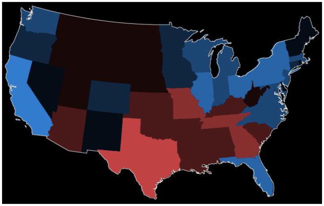
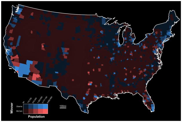
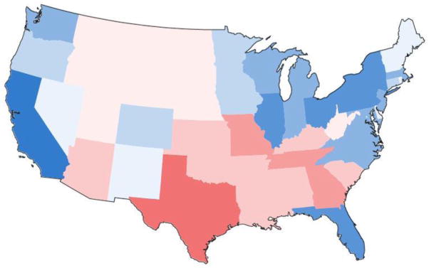
Figure 2 shows an example value-by-alpha map visually equalizing 2008 United States presidential voting by population. Here, only states falling into the highest population class appear as the colour assigned according to presidential voting. All other states are partially blended with the background colour, allowing the colours of both data layers to fuse. The correct geography of the country is maintained, allowing for easy recognition of individual states and broader regional patterns. Because geography is maintained, there is no need to introduce error into the visual equalization, allowing for accurate interpretation of the equalizing variable. Finally, this cartographic representation scales to smaller, more numerous enumeration units. Figure 3 provides an example of the same data aggregated to counties.
Figure 2. A value-by-alpha map of 2008 US Presidential election results aggregated to the state level.
Here, the equalizing variable is the state population. Data source: USA Today. (recommended size: 1 column)
Figure 3. A value-by-alpha map of 2008 US Presidential election results aggregated to the county level.
Unlike cartograms, the value-by-alpha mapping technique scales to smaller, more numerous enumeration units. Data source: USA Today. (recommended size: 2 columns)
2000–2004 US Cervical Cancer Mortality Clustering
The identification and demarcation of clusters of elevated disease risk is a primary objective of the domains of epidemiology and public health. To this end, a number of spatial clustering algorithms have been developed to identify significant groupings of disease incidences and mortalities (e.g., Openshaw et al., 1987, Kulldorff, 1997, Fotheringham and Zhan, 1996). Unfortunately, the incidence of and mortality from chronic diseases is typically reported only in aggregate form due to concerns of personal privacy (Jacquez, 2004). When running spatial clustering techniques on the centroids of enumeration units rather than true point patterns, it is important to examine the sensitivity of the results to clustering parameter settings. Efforts in visualizing this cluster reliability have been restricted to the choropleth method due to the aggregated nature of the data (Boscoe et al., 2003).
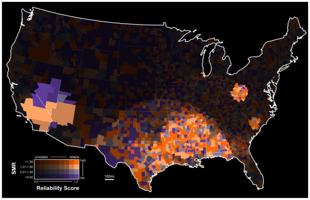
Figure 4 presents the results of a research project completed jointly by the Penn State GeoVISTA Center and the Penn State Milton S. Hershey Medical Center on the geographic distribution of cervical cancer mortality (for details, see Chen et al., 2008). Here, the value-by-alpha technique is employed to show US counties that are reliably included in a cluster of elevated cervical cancer mortality. To generate this map, the Kulldorff spatial scan statistic (Kulldorff, 1997) was run multiple times on the aggregated cervical cancer mortality data using the county centroid.
Figure 4. A value-by-alpha map of 2000–2004 US cervical cancer mortality aggregated to the county level.
Here, the equalizing variable is a reliability score indicating the likelihood that a county is in a geographic cluster of elevated cervical cancer risk. Data source: National Cancer Institute SEER Program. (recommended size: 2 columns)
An important scaling parameter of the Kulldorff spatial scan statistic was adjusted systematically with each run to determine the sensitivity of the results to this parameter. A reliability score was then computed for each county based on the number of times that the county was included in a reported cluster; this reliability score was used to visually equalize the basemap. The ratio between the mortality rate for an individual county and the mortality rate for the entire country (called the standardized mortality ratio or SMR) was then mapped atop this visually equalized basemap. Visual equalization by reliability does not lend itself well to the cartogram method for the same reasons discussed in the previous example (e.g., loss of shape and/or topological relations and inability to scale to smaller, more numerous enumeration units). The value-by-alpha mapping technique could be used in a similar manner to equalize the basemap by other measures of uncertainty as well (for a related example, see Drecki, 2002).
MAKING VALUE-BY-ALPHA MAPS
Two Approaches to Making Value-by-alpha Maps
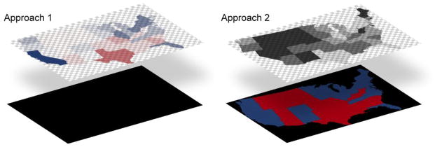
There are two methods for generating value-by-alpha maps, as illustrated by Figure 5. In the first approach, the alpha channel of a single data layer is assigned according to the equalizing variable and the red, blue, and green channels of the same data layer are assigned according to the variable of interest. Here, as the value of the equalizing variable increases, the alpha value of the enumeration unit increases. Colour fusion is generated by the interplay between the top data layer and a completely opaque background layer. The values for the red, green, and blue channels of the background layer must be held constant in order to produce equivalent colour fusion throughout the map – we define this constant RGB value as the modifying colour for future reference. This is the most efficient method for producing value-by-alpha maps programmatically.
Figure 5. Two approaches to making value-by-alpha maps.
The modifying colour is always found in the layer that does not contain the original colour assignment. For the first method, the original colour is assigned to the top data layer, making the RGB values of the bottom background layer the modifying colour. For the second method, the original colour is assigned to the bottom of the two data layers, making the RGB values of the top data layer prior to alpha manipulation the modifying colour. (recommended size: 2 column or stacked 1 column)
In the second approach, the alpha channel of a top data layer is assigned according to the equalizing variable (with the red, green, and blue channels held constant – this RGB constant is the modifying colour when implementing the second approach) and the red, green, and blue channels of a bottom data layer are assigned based on the variable of interest (with the alpha channel held constant). Here, as the value of equalizing variable increases, the alpha value of the enumeration unit in the top layer decreases. Colour fusion is generated by the interplay between the two data layers. This is the most efficient method for producing value-by-alpha maps in graphic design software.
Both methods for producing value-by-alpha maps are relatively straightforward compared to existing methods for generating cartograms. Therefore, value-by-alpha maps have a practical advantage over cartograms in addition to the map-reading advantages of shape/topology preservation and perfect visual equalization.
Choosing a Modifying Colour
The visual variables that are altered during colour fusion depend on the modifying colour that is used. Redundant symbolization in all three colour dimensions is acceptable, and perhaps even recommended, in most graphic representations. However, it is necessary to rely primarily upon a single colour dimension for the equalizing variable in value-by-alpha mapping to allow for signification of the variable of interest using the remaining two colour dimensions. Because of this, we recommend only using black or white as the modifying colour in order to ensure consistent results. Figure 6 shows the same 2008 Presidential state election results from Figure 2, but uses white instead of black as the modifying colour.
Figure 6. White as the modifying colour.
Figures 2 and 6 show the same data, but differ in the modifying colour that is used. With a black modifying colour, the equalizing variable is signified by colour value and the variable of interest is mapped using colour hue and colour saturation. With a white modifying colour, the equalizing variable is primarily (although not completely) signified by colour saturation and the variable of interest is mapped using colour hue and colour value. Research in the semiotics and colour perception would suggest that a black modifying colour would outperform a white modifying colour in both appeal and effectiveness, although both appear to be acceptable options. (recommended size: 1 column)
When black is used as the modifying colour, the equalizing variable is signified by the visual variable colour value after colour fusion. In this case, the term ‘value-by-alpha’ takes on two, accurate meanings: (1) the alpha value prior to colour fusion is determined by the statistical value of the enumeration unit (as in cartograms) and (2) the colour value produced after colour fusion is determined by the alpha value. When white is used as the modifying colour, the equalizing variable is primarily signified by the visual variable colour saturation after colour fusion. Unlike a black modifying colour, the use of white as a modifying colour does not completely isolate a single dimension of colour for signification of the equalizing variable. As colour saturation is adjusted by the modifying colour, so is colour value.
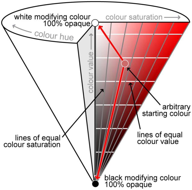
A look at the HSV colour system provides an explanation for shift in colour saturation and value when using a white modifying colour. The HSV (hue-saturation-value) colour system is a mathematical, cone-shaped colour space that is particularly useful from a semiotic point of view because each of the visual variables associated with colour is directly manipulable (Brewer, 2005). Figure 7 shows a triangular slice through the HSV colour space specific to the red hue along with lines of constant value and constant saturation. Here, colour hue varies along the outer circumference of any circular slice of the cone, colour saturation varies from the central point of any circular slice of the cone to the outer circumference, and colour value varies from the middle point of the circular slice forming the flat outer edge of the cone to the tip of the cone. Regardless of the original variant of red, use of black as a modifying colour will leave the saturation value of the resulting colour unchanged. Contrary to this, a white modifying colour will alter colour value along with colour saturation during value-by-alpha mapping unless the original colour does not contain any black prior to modification, (as communicated by the crossing of lines of equal colour value).
Figure 7. A triangular slice through the HSV colour space at the red hue.
Unless the original colour has no black in it, use of white as a modifying colour will change both the colour saturation and colour value of colour after colour fusion. However, colour saturation changes at a much faster rate than colour value as long as the original colour is limited in its initial amount of black. (recommended size: 1 column)
Reliance upon colour saturation for the representation of numerical data is particularly troubling, as only a small number of classes can be discriminated (e.g., Brewer, 2005). Because of this, it is likely that the use of white as the modifying colour will produce images with less visual contrast and will therefore be less effective and appealing than their counterparts that use black as a modifier. However, the value modification that occurs when using white as the modifying colour may actually counterbalance this issue, allowing for improved discrimination among class steps. Therefore, we find that both black and white are acceptable options for the modifying colour.
Design Considerations for the Equalizing Variable
A first important design consideration is selection of an appropriate equalizing variable. The equalizing variable should be one of consequence to the variable of interest. In other words, the equalizing variable should be one that indicates the importance of each enumeration unit to the overall spatial distribution. Value-by-alpha maps are therefore different from traditional bivariate choropleth maps, where two variables of unknown relation are mapped using a two-dimensional colour space to explore their spatial relationship. Cartograms also require an equalizing variable of consequence to produce a meaningful representation.
After the equalizing variable is selected, it is important to consider if and how the equalizing variable should be classified. Most authors agree that 5–7 classes are appropriate for a univariate choropleth map (Brewer and Pickle, 2002, Gilmartin and Shelton, 1989). However, it is argued that only 2–3 classes should be used for each variable on a bivariate choropleth map (Olson, 1975, Eyton, 1984). We found that using only 2–3 classes for the equalizing variable produces a rigid or stepped map that limits the spotlighting effect of the value-by-alpha method. Therefore, we recommend use of 5–7 classes as a compromise between map aesthetics (i.e., a smooth gradient for the spotlighting effect) and map effectiveness (i.e., making it possible to retrieve specific values). As is the case for any data classification, the number of classes should be related to meaningful data values if possible (e.g., 9 classes were used for the value-by-alpha map in Figure 4 because the reliability score was on an integer scale from 0–8). Further perceptual research on the discriminability of transparency steps is needed to determine the exact ceiling on the number of classes.
The positioning of class breaks for the equalizing variable is also important and again should be related to meaningful data values when possible. The lowest class in the equalizing variable (i.e., the one most desaturated or darkened) should not dissolve the enumeration unit completely into the modifying colour so that the boundary of the enumeration unit can still be seen faintly, even if the value in the variable of interest can not be retrieved. We recommend an alpha value of 10–15% for the lowest class if the first approach in Figure 5 is used and an alpha value of 80–85% for the lowest class if the second approach is used. Finally, we recommend the inclusion of an unmodified outer boundary to provide geographic context; we do not recommend inclusion of all enumeration unit borders.
Design Considerations for the Variable of Interest
The success of the bivariate colour scheme produced after alpha blending is dependent on the original univariate colour scheme selected for mapping the variable of interest. Univariate colour schemes fall into three basic categories: (1) sequential (for unipolar numerical data), (2) diverging (for bipolar numerical data), and (3) qualitative (for categorical data) (Brewer, 1994). Maps produced from categorical data are not technically choropleth maps, as the aggregation of individual instances to collection units necessarily makes the data numerical in the form of counts. However, we consider categorical data, and their associated qualitative colour schemes, in the following discussion because they can be visually equalized using the value-by-alpha technique and are commonly mapped atop cartograms.
Sequential colour schemes typically rely upon a single colour hue, modifying the colour value or colour saturation to achieve an ordinal ranking of the colour steps. Diverging colour schemes can be thought of as the combination of two sequential colour schemes, starting with separate hues at each pole and adjusting the saturation or value of the hues towards a central connecting point (which is often a shade of grey). Because value-by-alpha mapping works by adjusting the colour saturation or colour value of the original colour, the number of possible variants for each base hue is much smaller.
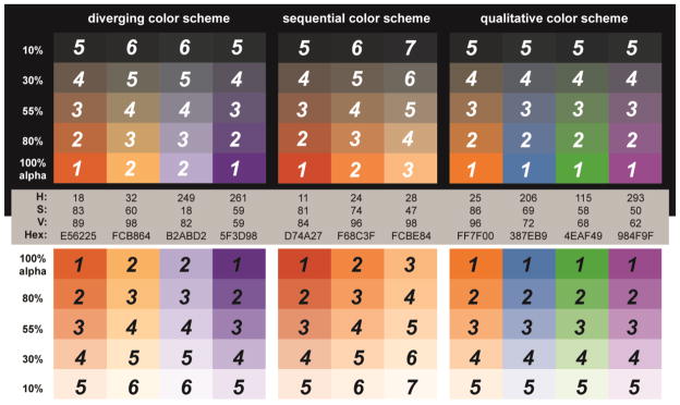
We recommend use of only 2–3 variants of each hue for the univariate colour scheme. Therefore, the original univariate colour scheme should have 2–3 classes if sequential and 4–6 classes if diverging. Further, colour saturation or colour value should not be adjusted beyond 50% from the spectrally pure hue for any colour variant to ensure that the hue is still dominant in the colour. Because qualitative colour schemes rely on colour hue only, the number of colour classes that can be included is limited only by the total number of distinguishable hues. When generating a qualitative univariate colour scheme, it is best to choose hues that have a similar amount of inherent lightness, as some pure hues naturally appear lighter or darker than others (Brewer, 2005). Time-tested sequential, diverging, and qualitative colour schemes are available from ColorBrewer.org (Harrower and Brewer, 2003). Figure 8 presents a viable sequential, diverging, and qualitative colour scheme for use on value-by-alpha maps based upon the ColorBrewer.org recommendations. Hexadecimal, HSV, and transparency values are provided for easy replication. Figure 8 is also labelled to illustrate the intended visual weight of each colour chip on the map (‘1’ meaning the highest visual weighting). These weights can be used to evaluate the effectiveness of a custom scheme.
Figure 8. Recommended colour schemes for representing the variable of interest in value-by-alpha maps.
The provided sequential, diverging, and qualitative colour schemes are derived from ColorBrewer.org. HSV, hexadecimal, and alpha values are provided for easy implementation. These schemes are shown using both a black and white modifying colour. Also provided is a visual weighting ranking system for evaluating custom value-by-alpha mapping colour schemes. (recommended size: 2 columns)
DISCUSSION: VALUE-BY-ALPHA MAPS AS AN ALTERNATIVE TO CARTOGRAMS
Figure 1 makes a compelling argument for the value-by-alpha technique. A value-by-alpha map is able to perfectly preserve shape and topology, while achieving visual equalization. Thus, the value-by-alpha map effectively solves the dilemma presented by the Cartogram3, preserving the three properties that are at odds in all cartograms. The question can be asked, then, if cartograms should be replaced completely by value-by-alpha maps. We do not wish to imply that such replacement is appropriate. Although the purpose of cartograms and value-by-alpha maps is to visually equalize a basemap according to a variable of consequence, they do so by manipulating different visual variables: size versus either colour value or colour saturation. This key difference is the root of several important limitations of the value-by-alpha map that make it an inferior option to the cartogram under particular circumstances.
First, it is generally accepted that it is easier to estimate numerical values from representations using the visual variable size than other visual variables. In his original syntactics, Bertin (1967|1983) identified location and size as appropriate for representation of numerical level data; colour value was listed as appropriate for ordinal level data only (colour saturation is unmentioned). Although subsequently MacEachren (1995) argued that both colour saturation and colour value are at least marginally effective for representing numerical level data, size was still listed as a superior alternative. Because of this, cartograms can use direct mathematical scaling effectively, an unclassed strategy that relates the size of the enumeration unit to its value in the equalizing variable such that each unique value will produce a unique size. Value-by-alpha maps must classify the equalizing variable (i.e., downgrading it to an ordinal level) prior to mapping. Therefore, value-by-alpha maps should not be employed in mapping contexts requiring the users to make numerical level estimations about the equalizing variable. Further, value-by-alpha maps should not be used for univariate mapping – a common, yet less powerful application of cartograms – as the resulting map would essentially be a choropleth map with a greyscale sequential colour scheme.
Second, and perhaps more importantly, the use of size versus colour saturation or colour value impacts the way in which the basemap is visually equalized. A common motivating factor for selection of cartograms over other representation techniques is to ensure readability of enumeration units that are geographically small but thematically important. The cartogram supports this by expanding enumeration units with large values in the equalizing variable and shrinking enumeration units with small values in the equalizing variable. As a result, the map space is dominated by enumeration units with large values in the equalizing variable, regardless of their original geographic size. Enumeration units with large values in the equalizing variable are emphasized directly through this expansion, ensuring their readability regardless of geographic size.
In contrast, value-by-alpha maps work by decreasing the visual weight of enumeration units with small values in the equalizing variable, leaving enumeration units with large values unchanged (i.e., untransformed by colour fusion). Thus, enumeration units with large values in the equalizing variable are emphasized indirectly, becoming more noticeable because of changes to their surroundings. As a result, emphasized enumeration units with small geographic footprints may still be difficult to read, limiting the utility of the value-by-alpha map in such mapping scenarios. This is also results in a map with a lot of dead space, as de-emphasized enumeration units still take up the same amount of room on the map after value-by-alpha transformation. The dead space issue is also a problem on certain designs of noncontinguous cartograms, as enumeration units with large values in the equalizing variable are emphasized indirectly to keep the transformed area within its original bounds.
Finally, the visual variable size holds up well across different digital and print media; the visual variables associated with colour do not (Slocum et al., 2005). The perception of colour is influenced by the inks, paper weight, and viewing conditions on print media and by the colour depth, brightness/contrast settings, and resolution on digital medium. Therefore, when the final display medium is unknown, as is increasingly the case, the cartogram is a safer choice. As a corollary, the dimensions of colour also hold up poorly across map readers, particularly those with colour deficiency.
So, when should a value-by-alpha map be employed instead of a cartogram? Cartograms are popular because they distort reality and “shock” readers, providing an unusual and provocative perspective on an often commonplace topic (Dorling, 1996: 4). Thus, they are useful for presenting a point specifically because they are not geographic maps; they are effective because they necessarily distort shape or topology. As Dorling (1993: 171) notes, “we do not learn from familiarity”. However, such distortion complicates many basic map tasks and therefore limits the application of the cartogram.
The value-by-alpha technique is a viable alternative to the cartogram when preservation of a geographic map is required, as is the case in most contexts of representing and interpreting social data. Because shape is maintained, familiar enumeration units are identified easily. Because topology is maintained, large regions of homogenous attributes or local anomalies can also be identified reliably. Simple cartometrics or more complex spatial analyses, dependent upon either absolute or relative locations, can be performed on the data encoded in value-by-alpha maps. These maps scale well to large sets of enumeration units (e.g., US counties), both in their creation (i.e., a complex algorithm does not need to be applied) and their interpretation (as the shape and location of the enumeration units do not change). The method is also easily extensible to the raster data model. Finally, comparison of multiple value-by-alpha maps is much easier than most cartograms, as the shape, size, and arrangement of all enumeration boundaries are held constant.
In summary, we find cartograms to be extraordinarily effective if the intended goal is to emphasize a small number of extreme geographic disparities, while value-by-alpha maps are more appropriate if the intended goal is a complete understanding of complex and often subtle geographic patterns.
CONCLUSION
Maps shape our basic understanding of the spatial distribution of social phenomena. Cartographers are tasked with the job of ensuring these maps show a complete and unbiased view (or as close as possible) of the represented social data. Visual equalization using the cartogram is one essential method for providing a more informed view of aggregated social data. Unfortunately, all cartograms compromise between shape and topology preservation when perfectly visually equalizing the basemap.
In this paper, we introduced an alternative visual equalization technique to the cartogram termed value-by-alpha mapping. Unlike the cartogram, the value-by-alpha map concurrently can achieve perfect shape preservation, topology preservation, and visual equalization. Further, their generation is much more straightforward than the cartogram alternative and scales better to large numbers of enumeration units. However, the value-by-alpha map is not without its own limitations, as outlined in the discussion section. Thus, while value-by-alpha maps seem to be an appropriate alternative to cartograms in many mapping contexts, they should not be viewed as a replacement for cartograms.
Because this is a new technique, there is still much to learn about how and when value-by-alpha maps should be implemented. In the future, we wish to test differences in effectiveness, efficiency, and preference both among value-by-alpha map design variations and between the cartogram and value-by-alpha maps. Such experimentation will help us refine and expand our design recommendations.
Acknowledgments
We wish to thank Mark Harrower, David Heyman, and Ben Sheesley for their input on and assistance with the 2008 US Presidential election results map. We also wish to thank Jin Chen, Eugene Lengerich, Alan MacEachren, and Adam Naito for their input on and assistance with the 2000–2004 US cervical cancer mortality map.
A portion of this research was supported by grant CA95949 of the National Cancer Institute.
Contributor Information
Robert E. Roth, Email: reroth@psu.edu.
Andrew W. Woodruff, Email: andy@axismaps.com.
Zachary F. Johnson, Email: zach@axismaps.com.
BIBLIOGRAPHY
- BARFORD A, DORLING D. Telling an old story with new maps. In: DODGE M, MCDERBY M, TURNER M, editors. Geographic Visualization: Concepts, tools, applications. West Sussex: John Wiley & Sons; 2008. [Google Scholar]
- BECK J, IVRY R. On the role of figural organization in perceptual transparency. Perception and Psychophysics. 1988;44:585–594. doi: 10.3758/bf03207492. [DOI] [PubMed] [Google Scholar]
- BERTIN J. Semiology of graphics: Diagrams, networks, maps. Madison, WI: University of Wisconsin Press; 1967|1983. [Google Scholar]
- BOSCOE FP, MCLAUGHLIN C, SCHYMURA MJ, KIELB CL. Visualization of the spatial scan statistic using nested circles. Health & Place. 2003;9:273–277. doi: 10.1016/s1353-8292(02)00060-6. [DOI] [PubMed] [Google Scholar]
- BREWER CA. Color use guidelines for mapping and visualization. In: MACEACHREN AM, TAYLOR DRF, editors. Visualization in Modern Cartography. Tarrytown, NY: Elsevier Science; 1994. [Google Scholar]
- BREWER CA. Designing better maps: A guide for GIS users. Redlands, CA, USA: ESRI Press; 2005. [Google Scholar]
- BREWER CA, PICKLE L. Evaluation of methods for classifying epidemiological data on choropleth maps in series. Annals of the Association of American Geographers. 2002;92:662–681. [Google Scholar]
- CAIVANO JL. Visual texture as a semiotic system. Semiotica. 1990;80:239–252. [Google Scholar]
- CHANDLER D. Semiotics: The basics. New York, NY, USA: Routledge; 2002. [Google Scholar]
- CHEN J, ROTH RE, NAITO AT, LENGERICH EJ, MACEACHREN AM. Enhancing spatial scan statistic interpretation with geovisual analytics: An analysis of US cervical cancer mortality. International Journal of Health Geographics. 2008;7:57. doi: 10.1186/1476-072X-7-57. [DOI] [PMC free article] [PubMed] [Google Scholar]
- DENT BD. Cartography: Thematic map design. Boston, MA: WCB/McGraw-Hill; 1996. [Google Scholar]
- DORLING D. The visualization of spatial structure. Department of Geography, University of Newcastle; 1991. [Google Scholar]
- DORLING D. Map design for census mapping. The Cartographic Journal. 1993;30:167–183. [Google Scholar]
- DORLING D. Area cartograms: Their use and creation. Norwich, England: School of Environmental Sciences, University of East Anglia; 1996. [Google Scholar]
- DRECKI I. Visualisation of uncertainty in geographical data. In: SHI W, FISHER P, GOODCHILD M, editors. Spatial data quality. London: Taylor & Fracis; 2002. [Google Scholar]
- EYTON JR. Complementary-color two-variable maps. Annals of the Association of American Geographers. 1984;74:477–490. [Google Scholar]
- FOTHERINGHAM AS, ZHAN FB. A comparison of three exploratory methods for cluster detection in spatial point patterns. Geographic Analysis. 1996;28:200–218. [Google Scholar]
- GASTNER MT, NEWMAN MEJ. Diffusion-based method for producing density-equalizing maps. Proceedings of the National Academy of Sciences. 2004;101:7499–7504. doi: 10.1073/pnas.0400280101. [DOI] [PMC free article] [PubMed] [Google Scholar]
- GILMARTIN P, SHELTON E. Choropleth maps on high resolution CRTs: The effects on number of classes and hue on communication. Cartographica. 1989;26:40–52. [Google Scholar]
- GUIBERSON PF. Geography. Lincoln, NE: University of Nebraska; 2007. An examination of transparency as a visual variable for the mapping sciences. [Google Scholar]
- HARROWER M, BREWER CA. ColorBrewer.org: An online tool for selecting colour schemes for maps. The Cartographic Journal. 2003;40:27–37. [Google Scholar]
- HEILMANN R, KEIM DA, PANSE C, SIPS M. Recmap: Rectangular map approximations. IEEE Symposium on Information Visualization; IEEE Computer Society; 2004. [Google Scholar]
- HERING E. Outlines of a theory of the light sense. Cambridge, MA: Harvard University Press; 1964. [Google Scholar]
- HOUSE D, KOCMOUD C. IEEE Visualization. Research Triangle Park, NC: 1998. Continuous cartogram construction. [Google Scholar]
- JACQUEZ GM. Current practices in the spatial analysis of cancer: Flies on the ointment. International Jounral of Health Geographics. 2004;3:22–31. doi: 10.1186/1476-072X-3-22. [DOI] [PMC free article] [PubMed] [Google Scholar]
- JOHNSON ZF. Cartograms for political cartography: A question of design. Department of Geography; Madison, WI: University of Wisconsin-Madison; 2008. [Google Scholar]
- KEIM DA, HERRMANN A. IEEE Visualization. Research Triangle Park, NC: 1998. The gridfit algorithm: An efficient approach to cartograms. [Google Scholar]
- KEIM DA, NORTH SC, PANSE C. CartoDraw: A fast algorithm for generating contiguous cartograms. IEEE Transactions on Visualization and Computer Graphics. 2004;10:95–110. doi: 10.1109/TVCG.2004.1260761. [DOI] [PubMed] [Google Scholar]
- KEIM DA, NORTH SC, PANSE C. Medial-axes based cartograms. IEEE Computer Graphics and Applications. 2005;25:60–68. doi: 10.1109/mcg.2005.64. [DOI] [PubMed] [Google Scholar]
- KULLDORFF M. A spatial scan statistic. Communications in Statistics – Theory and Methods. 1997;26:1481–1496. doi: 10.1080/03610927708831932. [DOI] [PMC free article] [PubMed] [Google Scholar]
- MACEACHREN AM. Visualizing uncertain information. Cartographic Perspectives. 1992;13:10–19. [Google Scholar]
- MACEACHREN AM. How maps work. New York, NY, USA: The Guilford Press; 1995. [Google Scholar]
- METELLI F. The perception of transparency. Scientific American. 1974;230:90–98. doi: 10.1038/scientificamerican0474-90. [DOI] [PubMed] [Google Scholar]
- MORRISON JL. A theoretical framework for cartographic generalization with the emphasis on the process of symbolization. International Yearbook of Cartography. 1974;14:115–127. [Google Scholar]
- MUEHRCKE PC, MUEHRCKE AJ. Map Use: Reading, analysis, and interpretation. Madison, WI: JP Publications; 1998. [Google Scholar]
- OLSON JM. AutoCarto. Reston, VA: 1975. The organization of color on two-variable maps. [Google Scholar]
- OPENSHAW S, CHARLTON M, WYMER C, CRAFT A. A Mark 1 Geographical Analysis Machine for the automated analysis of point data sets. International Journal of Geographical Information Science. 1987;1:335–358. [Google Scholar]
- PORTER T, DUFF T. Compositing digital images. Computer Graphics. 1984;18:253–259. [Google Scholar]
- RAISZ E. The rectangular statistical cartogram. The Geographical Review. 1934;24:371–80. [Google Scholar]
- SLOCUM TA, MCMASTER RB, KESSLER FC, HOWARD HH. Thematic cartography and geographic visualization. Upper Saddle River, NJ, USA: Pearson Prentice Hall; 2005. [Google Scholar]
- TOBLER W. Geographic area map projections. Geographical Review. 1963;53:59–78. [Google Scholar]
- TOLBER W. Thirty five years of computer cartograms. Annals of the Association of American Geographers. 2004;94:58–73. [Google Scholar]


