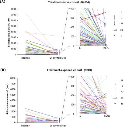
Fig. 3.
Treatment clearance comparisons between treatment-naive and treatment-exposed preschool-age population cohorts with a graphical representation of individual responses: naïve (n=104) and exposed (n=88), the latter had started to receive treatment in the previous year and at 3 and 6 months prior. Each individual is represented by a line which starts at the individual's initial egg count (eggs per gram of stool – EPG) and ends at their egg count 21 days after treatment. The graph to the right zooms in to the ranges 0 to 800 EPG to give more detail at this finer scale. The numbers to the right indicate the number of individuals whose EPG rose (arrow pointing up), decreased not reaching zero (arrow point down), decreased to zero or cleared (arrow pointing to zero) and those that remained with the same intensity (±24 EPG).

