

Abstract
Conveying data uncertainty in visualizations is crucial for preventing viewers from drawing conclusions based on untrustworthy data points. This paper proposes a methodology for efficiently generating density plots of uncertain multivariate data sets that draws viewers to preattentively identify values of high certainty while not calling attention to uncertain values. We demonstrate how to augment scatter plots and parallel coordinates plots to incorporate statistically modeled uncertainty and show how to integrate them with existing multivariate analysis techniques, including outlier detection and interactive brushing. Computing high quality density plots can be expensive for large data sets, so we also describe a probabilistic plotting technique that summarizes the data without requiring explicit density plot computation. These techniques have been useful for identifying brain tumors in multivariate magnetic resonance spectroscopy data and we describe how to extend them to visualize ensemble data sets.
Index Terms: Uncertainty visualization, brushing, scatter plots, parallel coordinates, multivariate data
1 Introduction
Uncertainty can have a critical impact on what can be properly inferred from a data set. Consider the parallel coordinates (PC) plots in Figure 1. A viewer may think that the apparent cluster of values in the second column of the discrete plot is meaningful. Actually, the cluster is statistically indistinguishable from other values on the column when the uncertainty of individual values is considered. Visualization techniques should be designed to prevent such incorrect conclusions by taking into account the reliability of the underlying data. Another example of this comes from basic statistics: if two normal distributions overlap significantly, one cannot confidently argue that they represent different populations. Simple overlapping error bars indicate the difference between the two means, but as data sets grow in size and complexity, encoding uncertainty into visualizations becomes more challenging. Multivariate data poses a particularly difficult problem, as uncertainty estimations may exist on a per-variable, per-sample basis.
Fig. 1.

A false positive. Left: a standard parallel coordinates plot reveals a potential cluster of interesting values on the Glu variable. Right: density plots with mean emphasis reveal that the selection actually is not a cluster when uncertainty is taken into account.
This work proposes several methods for visualizing uncertainty that leverage known characteristics of visual perception. The plots enable viewers to preattentively identify patterns in confident values while preventing them from making false inferences based on uncertain values. The goal is not simply to let viewers distinguish certain values from uncertain values, but to disengage the visual system’s preattentive feature detection mechanisms for uncertain values. This ensures that a data value’s visual saliency is proportional to its certainty.
We propose density plots as the fundamental tool for visualizing uncertain multivariate data. More formally, we use kernel density estimation (KDE, also known as Parzen windowing) techniques to approximate the probability density function (PDF) of the data [24]. Because the PDF describes the likelihood of each value, it naturally deemphasizes unreliable data points in the original data. KDE requires data point uncertainty to be quantified using statistical distributions.
Uncertainty also influences how the user interacts with the plot. The user does not select discrete samples but rather statistical distributions with infinite extent. By integrating a data value’s distribution within the brush area, we can determine the probability that the brush would contain a sample from the distribution. This likelihood is useful as a threshold for selection, meaning that uncertainty values require a larger brush. This paper describes how to efficiently perform this integration in scatter plots and PC plots of uncertain data.
Density plots are useful tools for summarizing extremely large data sets. Whereas normal plots become over-plotted, PDFs always highlight regions of high density. We demonstrate that density-based plots are useful for visualizing uncertain data sets, large or small. However, density plots have two noticeable problems: data values are no longer always individually identifiable and outliers are de-emphasized. We address these problems with two modifications of density plots. First, scaling the distribution mean to a brighter intensity introduces a discrete, identifiable feature that fades in proportion to its uncertainty. Second, a novel animated plot called the probabilistic plot cycles through PDF samples so that outliers draw the viewer’s eye by intermittently flickering in and out. Confident regions remain stable over time. When summed, these random samples aggregate into a histogram approximation of the fully integrated PDF.
Our contributions can be summarized as follows:
Density Plots for Uncertain Data: density plots with mean emphasis preattentively highlight certain values and prevent false conclusions based on uncertain values.
User Interaction in Density Plots: augmented standard brushing techniques select distributions by integrating the PDF within the bounds of the brush.
Probabilistic Plots: an animated plot efficiently cycles through PDF samples, highlights outliers, and converges to the PDF.
Density-based methods are directly applicable when value uncertainty is represented by statistical distributions, which are a common result of statistical analysis. For example, clusters of values can be represented by their mean and variance. Ensemble data sets, which are usually collections of simulations with different parameter settings, can be understood by looking at the distribution of individual samples. The distribution of a sample across an ensemble of simulation runs can be used to describe the sensitivity of a varying parameter.
The design of these uncertainty visualization techniques was driven by the needs of radiologists studying magnetic resonance (MR) spectroscopy. They require a visualization system that enables them to explore the relationships between many variables representing the concentrations of different brain metabolites. Each data point is a normally distributed metabolite concentration, and some of the standard deviations are large enough that they should not contribute to the hypothesis generation process. We show how uncertain scatter plots and PC plots help radiologists identify metabolite relationships that distinguish between tumor tissue and healthy tissue.
2 Related Work
The design of density plots for uncertain data builds on previous work in visual perception, basic statistics, uncertainty visualization, multivariate visualization, scatter plots, and PC plots.
2.1 Image Structure and Preattentive Vision
Visualizations that use simple primitives like lines and points rely on the fact that the human visual system has low-level physiological structures dedicated to the perception of such features [22]. For example, on-center/off-surround cells identify bright points at different scales, and more complex cells identify edges, lines, and bars at different scales and orientations. These structures contribute to preattentive visual processing, a phenomenon in which humans perceive certain visual properties so quickly (~200–250ms) that they do not seem to require conscious attention. The list of properties includes hue, size, luminance, and (most relevantly) blur, among many others [38].
Kosara et al. have shown that preattentive perception of blur can be used to obscure irrelevant image features using a technique called semantic depth of field [16]. In essence, our proposed density plots uses the statistical distributions of uncertain data as the blurring kernel. Uncertain data values with large distributions are blurrier, so the viewer’s attention is drawn to high contrast image features.
2.2 Density Estimation
The visualization techniques described in this work use kernel density estimation (also called Parzen windowing), which is a class of techniques for estimating the probability density function of a data set [24]. For scalar-valued data, KDE superimposes a distribution for each value (Figure 2). The distribution width is a user-controlled parameter that determines the feature size in the density estimate.
Fig. 2.

An example of KDE for multiple normal distributions with different means and standard deviations. The blue lines are individual distributions. The red line is the KDE, computed by summing the distributions.
Histograms are another technique for density estimation that separate the range of data values into regularly spaced bins. Each bin stores how many data points fit into its range of values. After normalizing to a total bin area of one, the histogram approximates the probability density function of the data set. KDE and histograms will be very similar when the histogram bin width is close to the KDE kernel width.
2.3 Uncertainty in Information Visualization
Uncertainty can arise from a number of sources, including errors in simulation models, numerical error, measurement/hardware error, uncertainty due to statistical estimation, and even error due to the visualization algorithm [39, 34]. Pang et al. further classify these uncertainties into three categories: statistical, error, and range [23]. Statistical uncertainty can be represented as a statistical distribution. Error uncertainty is a measured difference with respect to a correct value. Range uncertainty prescribes an interval in which a data value falls, which is similar to a uniform statistical distribution. We describe techniques for visualizing data with uncertainty from any source provided it can be represented using a statistical distribution, which includes uncertainty falling into the statistical and range categories.
The study of statistical uncertainty in information visualization techniques has discussed the use of error bars [25], glyphs [26], scale modulation [29], and ambiguation [21]. While many of these techniques are useful for one-dimensional (1D) data sets, uncertainty annotations can overlap in multivariate plots like the scatter plot and PC plot. Over-plotting becomes more problematic as the number of data points grows. Density plots have been shown to be useful for graph visualization [35] and are a scalable solution for visualizing uncertainty in multivariate plots.
This paper describes an animated plot related to Fisher’s soil map visualizations and PixelPlexing [10, 31]. In Fisher’s maps, each pixel can have one of several classifications that has its own likelihood. Over time, a classification is chosen for each pixel based on those likelihoods. Pixelplexing emphasizes different randomized subsets of a visualization over time. The probabilistic plots described in Section 3.7 quickly sample random data values from the data PDF in a similar manner, and we show how these values can be aggregated into an approximation of the PDF of the data.
2.4 Multivariate Visualization
Visualizing spatial multivariate data is challenging. One approach is to combine multiple univariate visualization techniques such as direct volume renderings [36]. Another is to map the variables to different glyph channels [17, 9]. Researchers often address the challenge of multivariate 3D visualization by linking spatial views to abstract views. Tools such as Spotfire [1], tri-space visualization [2], Xmd-vTool [37], GGobi [33], and a previous MR spectroscopy visualization [8] demonstrate how to combine multiple views of the same data in a single interface. This work addresses the issue of how to incorporate statistical uncertainty into the abstract plots used by these tools.
2.5 Scatter Plots
The scatter plot is a standard technique for graphically representing a bivariate data set that places discrete glyphs on a Cartesian grid. It is commonly used to identify value clusters and trends like linear relationships. The most straightforward and scalable way to incorporate more variables is to use a scatter plot matrix [6]. The scatter plot matrix sacrifices the resolution of a single plot to display more plots comparing other pairs of variables. In this instance, both navigating through the plots [7] and choosing display order become interesting problems [30]. Because our work describes the use of KDEs in a single plot, it can be applied generally to any scatter plot technique.
Bachthaler and Weiskopf propose a modification to the standard scatter plot for use with spatially embedded data sets [3]. The technique, called continuous scatter plots, leverages knowledge of the sample footprint (e.g. voxel, tetrahedron, etc.) to replace discrete glyphs with a composition of all values contained therein. A glyph from a single voxel becomes a shape representing all of the interpolated values within that voxel. The primary contribution of their work is the transformation of complex geometry from the spatial domain into data distributions. Our work uses similar distribution-based scatter plots for visualizing uncertain data. Our distributions come from the statistical uncertainty of the samples themselves rather than spatial interpolation.
2.6 Parallel Coordinates
The parallel coordinates plot is a multivariate visualization technique that bypasses the two-variable limit of the scatter plot. Popularized by Inselberg, PC plots arrange individual variable axes parallel to each other and represent individual samples as a segmented line passing through all of the axes [14]. All variable values are therefore represented in a single plot. These visualizations are useful for identifying clusters and trends between pairs of variables and observing how a collection of lines behaves for all variables.
Heinrich and Weiskopf show how PC plots can be made continuous in the same manner as scatter plots [13]. They create a generic point density model to transform continuous distributions into PC space using the well-known duality between points and lines in PC and scatter plots. We show how data distributions can be used effectively to visualize statistically uncertain data by leveraging such transformations. Miller and Wegman describe the analytical solution to evaluating normal distributions in PC plots [18]. The data set that drove our system design is normally distributed, so we demonstrate uncertainty visualization using Miller and Wegman’s analysis. More general distributions can use Heinrich and Weiskopf’s transformation.
Related work in parallel coordinates addresses over-plotting for large data sets by only plotting lines representing clusters of values [11]. Novotny and Hauser perform this clustering in 2D histograms for adjacent variable pairs and also identify outliers through histogram analysis [20]. Our approach naturally integrates with this technique, as described in Section 3.5.
Previous work visualizes uncertain multivariate data with PC plots [8]. This work generalizes and formalizes those ideas into a methodology based on KDEs that demonstrably applies to other information visualization techniques. Additionally, we describe here how to approximate these visualizations to achieve interactive frame rates with larger data sets.
3 Uncertain Plots
Uncertainty visualizations should prevent viewers from making incorrect observations based on unreliable data. More specifically, they should prevent uncertainty from leading to false positives, in which viewers mistakenly identify a feature, and false negatives, in which viewers fail to identify existing patterns. Figure 1 shows a real-world example of a false positive in real MR spectroscopy data: the glutamate column appears to contain a cluster of values, but the corresponding density plot shows that the cluster is not statistically distinguishable from the rest of the glutamate values. The top of Figure 3 presents a constructed example of a PC plot that results in a false negative. The viewer may incorrectly assume that the data is uncorrelated for all variables. The bottom of Figure 3 presents a density plot that incorporates uncertainty. Viewed in this way, the remaining lines with high certainty show strong correlation between variables. Visualizations that do not incorporate such uncertainty display put their viewers at risk of making false conclusions. We present a method to generate plots that help viewers to preattentively identify trustworthy values while avoiding uncertain values.
Fig. 3.

A constructed example of a false negative. Top: a PC plot of three variables. Bottom: visualization of the PDF using the distributions of values preattentively highlights the more certain values.
3.1 From Scatter Plots to Density Plots
The standard scatter plot overlays a set of glyphs at Cartesian coordinates corresponding to all the (x,y) value pairs in the data set. When the data set is sufficiently large, regions with high densities become over-plotted. The simplest solution to this problem is to make the glyphs partially transparent: as glyphs accumulate, bright regions indicate higher glyph density. Such a plot is similar to a form of KDE with a glyph-shaped kernel. In statistics, the most commonly used kernel is a normal distribution with standard deviation used to control the feature size of the resulting PDF.
For statistically uncertain data, the appropriate kernel is the statistical distribution of each individual sample. In this way, large overlapping distributions become difficult to distinguish and small, high-valued distributions are easy to locate. For the sake of example, we demonstrate using KDE to compute the PDF with normal distributions, which is one of the most common statistical distributions:
| (1) |
| (2) |
where PDF is the probability distribution function, which is the average of the N individual distributions. Di is an arbitrary distribution, here demonstrated as a normal distribution where σxi and σyi are the standard deviations of the μxi and μyi means for the ith sample. This form of the normal distribution assumes that x and y are uncorrelated; a more complex form of Di includes the correlation coefficient ρ. The data sets that drove the development of these techniques (see Section 4) assume uncorrelated data, so Equation 2 applies. However, Di can easily be replaced with any distribution in Cartesian space. The distributions as described must be discretized for display. The simplest way to do so is to subdivide the domain into pixel-sized bins.
Using the PDF as a basis for uncertainty visualization highlights regions of high point probability density, which is useful for discovering clustered values and trends. It also emphasizes points with high certainty (small, bright spots) while de-emphasizing points with low certainty (large, dim spots) by leveraging the human visual system’s ability to preattentively separate high and low contrast image features.
As described in Section 2.1, differences in blur of image features are perceived preattentively. As distributions with high variance tend to overlap, they become harder to distinguish from each other and easier to distinguish from small, high density values. The result makes intuitive sense from a statistical perspective as well: the viewer should not be able to distinguish two distributions that overlap significantly.
Direct visualization of the PDF scales with data set size more effectively than standard opaque glyphs. Whereas traditional opaque glyph scatter plots become easily over-plotted, a one-time cost of sampling the PDF produces a density image that can be displayed at both high and low resolutions. Figure 4 demonstrates the transition from a normal scatter plot to direct PDF visualization.
Fig. 4.

Scatter plot of two MR spectroscopy metabolites. From left to right, means are emphasized by varying amounts. Left: a standard scatter plot of MR spectroscopy data, with choline concentration on the x-axis and creatine concentration on the y-axis. Middle: the PDF of the data with emphasized means, computed using KDE over normal distributions assuming ρ = 0. Right: direct rendering of the PDF.
Encoding uncertainty magnitude with glyph hue may seem like a reasonable alternative to blur. Color is also perceived preattentively, so the viewer will be able to quickly distinguish between certain and uncertain values. However, the uncertainty color scale must be chosen arbitrarily. The viewer will have to refer to the legend to interpret the hue differences they perceive. Worse still, discrete representations of uncertain points can mislead the viewer into identifying unreliable clusters or patterns (false positive), which they must then disregard after consulting the legend. Density plots represent uncertainty magnitude directly in data space, leaving less room for confusion. Finally, using color for uncertainty also makes selection more difficult, as color is often used to distinguish between multiple selections of values.
3.2 Mean Emphasis
For data sets that are small enough to avoid over-plotting, emphasizing distribution means can help viewers see the locations of distributions contributing the density plot. The degree of emphasis should scale with the certainty of the point. For normal distributions, the maximum value is at the mean, and smaller values of σ increase the value of the mean. Therefore, scaling the center of the distribution by a constant factor (e.g. doubling its value) emphasizes the mean more for certain values than it does for uncertain values. The center of Figure 4 depicts a density-based scatter plot with mean emphasis.
Mean emphasis is similar to overlaying points on the PDF with transparency scaled by the height of the distribution mean. When combined with the density plot, such points enable viewers to see directly both the scale of the distributions and the location of their means. If the data set is large enough that many of the means overlap, the viewer can look directly at the density plot for a summary of the data set.
3.3 PDFs in Parallel Coordinates
We now demonstrate how to compute the PDF in PC space as a technique for visualizing uncertain multivariate data. Heinrich and Weiskopf describe how to transform an arbitrary distribution into PC space [13], and Miller and Wegman provide analytical solutions for bivariate normal distributions and uniform distributions [18]. Conceptually, the idea is to use the well-known point-line duality between scatter plots and PC plots to transform samples from one space to the other while maintaining the formal properties of distributions (e.g. a unit integral). For the bivariate normal distribution discussed so far, the analytical form of the distribution is as follows:
| (3) |
| (4) |
| (5) |
where a and b are the horizontal and vertical axes of the PC plot: b is in the space of the data values and a is in a normalized space where the left axis is at a = 0 and the right axis is at a = 1. μa and σa are the mean and variance of the interpolated distribution. This definition of σa assumes that the two variables are uncorrelated. A more complex definition includes the correlation coefficient ρ.
Figure 5 demonstrates the transition of individual distributions into PC plots, in this case differing by the value of their correlation coefficient ρ. The more linear the distribution, the stronger the positive or negative correlation. Notice how significant differences in the scatter plot PDF do not necessarily produce equally noticeable differences when transformed into PC space.
Fig. 5.
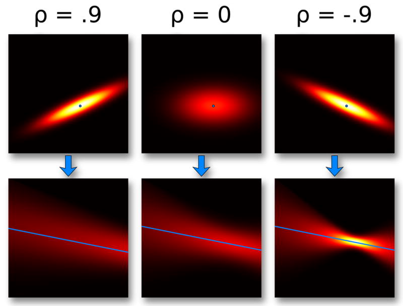
Normal distributions with different values of ρ, the correlation coefficient, mapped from Cartesian space into PC space. ρ = .9 and ρ = 0 look different in the Cartesian plot, despite looking similar in PC.
Many applications use curved PC plots, for example cardinal splines [12, 15] or sigmoid curves [19]. The KDE representation of the PC plot can accommodate both representations, but for brevity we demonstrate only the latter case. The premise is to warp the sample grid of the KDE to match the shape of the curve. Sigmoid curves can be represented by a number of functions, including the logistic function, sinusoid, and cubic polynomial. The following warps a PC plot with a cubic polynomial with a change of variables:
| (6) |
The constants above produce a cubic polynomial that passes approximately through (0,0) and (1,1). It should be noted that such a nonlinear change in variables results in a function which is no longer formally a PDF. This introduces a trade-off between the perceptual benefits of sigmoid curves and mathematical rigor.
For plots with a manageable number of lines, the density representation may remove a seemingly useful feature of the PC plot: the viewer’s ability to follow individual lines through the plot across multiple axes. However, this is in fact a benefit. The density plot discourages the user from following lines that may lead them to incorrect conclusions. When there are a large number of lines, density plots are a reasonable solution to over-plotting. This work demonstrates how to compute density plots for statistically uncertain data. Figure 6 demonstrates the transition from a traditional line-based PC plot to a density-based PC plot. The center of the figure demonstrates a PC density plot with mean emphasis, computed similarly to the meanemphasized density plot.
Fig. 6.

Parallel coordinates plots of four MR spectroscopy metabolites. From left to right, means are decreasingly emphasized. Left: a sigmoidal PC plot of the same data shown in Figure 4 with two additional variables (glutamate and n-acetylaspartate). Center: the estimated PDF mapped into PC space, with means emphasized according to their uncertainty. Right: direct visualization of the PDF.
Previous work by Feng et al. proposes a similar scheme for visualizing uncertain multivariate data in PC plots that linearly interpolates Gaussians between axes. Strictly speaking, this is only correct for normal distributions that are positively correlated with ρ = 1. Figure 5 shows qualitative difference between ρ = 0 and ρ = .9 in PC plots. The formulation described here is correct for all values of ρ and is clearly extensible to other distributions types. Additionally, this work properly derives the plots from a detailed statistical point of view, which leads to the statistical user interaction and plotting techniques described in the following sections.
3.4 User Interaction
Just as density plots emphasize certain values and draw attention away from uncertain values, interaction with the plot should likewise favor certain points over uncertain ones. We now describe how to incorporate uncertainty into three plot-interaction techniques: interval queries, angular brushing, and linear function brushing. While the interaction primitives (lines, boxes, etc.) differ between scatter plots and PC plots, the mathematics of selection is the same. The following discussion assumes a Cartesian space.
Interval queries select values that fall within a prescribed range of values for a set of variables. In Cartesian space, the user either draws a box to define that range or clicks a point to select values within a distance threshold. The PC plot analog is to either manually specify ranges on axes or to draw a representative line segment. When the data values are statistical distributions, deciding whether a point falls within the range of values is no longer a simple inside/outside test. In this case, we must estimate the likelihood that a point drawn from that distribution will fall within the interval.
The problem now becomes estimating a definite integral of a statistical distribution. For the general distribution, this will require numerical integration within the user-specified interval. The data sets that drove the design of these techniques have uncorrelated bivariate normal distributions, for which there is a fast, analytical integral solution using the error function:
| (7) |
erf(x) is available in many mathematical libraries, and is usually implemented as a table lookup. It can be used to compute an area under a normal distribution N(μ, σ) in the range [μ − a,μ +a] as follows:
| (8) |
The integral with arbitrary boundary conditions is:
| (9) |
This extends to 2D for the uncorrelated bivariate normal distribution Nxy(μx,μy,σx,σy) by evaluating the area within a bounding box:
| (10) |
This uses the separability of the uncorrelated distributions to simplify the computation. Because distributions integrate to 1, we can decide if the range has selected enough of the distribution with a simple threshold test. We advocate a 95% confidence for selection (A > .95), which means that the distribution will be selected only if the brush contains at least 95% of the distribution area. This ensures that the viewer is aware of the magnitude of the uncertainty before selection of large, uncertain distributions can succeed.
Angular brushes in PC plots can use a similar set of techniques as interval queries. Also, angular brushing is a subset of the more general linear function brushing, as the latter enables the user to select points using a wider set of linear functions [8]. Angular brushing is equivalent to selecting points within a distance threshold to a line in Cartesian space, which is to say within two bounding lines L1 and L2 around a drawn line L. As with interval queries, we must evaluate how much of the distribution is contained between L1 and L2 via integration.
As before, it is possible to evaluate this analytically for bivariate normal distributions using the error function. In this case the solution is more complex because erf(x) is axis-aligned and selection lines may not be. Therefore, the coordinate space must be transformed so that the distribution is zero-centered and radially symmetric, at which point erf(x) can then be applied to the distance from the line to the origin. In this transformed space, the distance from a point to the origin is called the Mahalanobis distance.
We can derive the transformed distance of a line to the distribution mean using the steps illustrated in Figure 7. The steps are enumerated as follows:
Fig. 7.

Computing the integral of a bivariate normal distribution within a distance threshold to an infinite line. Step 1: translate the line and distribution to the origin. Step 2: rescale the distribution to unit variances. Step 3: estimate the integral from the near and far bounds of the line.
Translate (μx,μy) to the origin.
Scale by (1/σx,1/σy) so the distribution has unit variances.
Compute the distance from the line to the origin.
Rotation of the lines is unnecessary because an isotropic normal distribution is radially symmetric. To evaluate the integral, we need only know the distance from L1 and L2 to the origin. The signed distance for an implicit line (Ax+By+C = 0) in transformed coordinates is:
| (11) |
We can now integrate the area of the distribution within distance t to the line by constructing two lines and taking the difference of their error function results. L1 and L2 will have the same orientation (same A and B), but different values of C:
| (12) |
| (13) |
Using the implicit line equations with coefficients (A,B,C1) and (A,B,C2), we can compute the area between the two lines as follows:
| (14) |
If the user wishes to select all points near a line segment instead of an infinite line, one would only need to repeat the process for two more perpendicular lines that intersect the endpoints of the line segment. Note that this process also applies for normal distributions where ρ ≠ 0, with the additional step of rotating the oriented distribution (and its covariance matrix) to be axis-aligned before the scaling in step 2.
When dealing with large data sets distributed across multiple computers, all user selections should occur in data space rather than in the space of the visualization. For example, selecting all points within a box on a scatter plot is equivalent to a filter on data values that fall within values ranges in x and y. In this manner, the selection operations can occur concurrently on each machine and the results can be combined on a single node and sent to the client. Direct PDF visualization only requires easily parallelizable queries to all machines and subsequent visualization of the compiled results.
3.5 Focus and Context
One difficulty with PDF-based representations is that they emphasize the most likely values while hiding potentially interesting outliers. In the PDF, outliers will manifest as a small range of values with high probability density. A clustered set of distributions with large variances will not be outliers, as their distributions cover a large range of values. The left frame of Figure 6 contains an apparent outlier, but its variances are so large that it cannot confidently be considered interesting. Large data sets exacerbate this problem: as the data set grows and values cluster in the most likely regions, small sets of outliers are de-emphasized even more.
Novotny and Hauser suggest several methods for identifying outliers in multivariate data sets by analyzing pairwise 2D histograms of variables. Their algorithm analyzes the connectivity of the histogram and attempts to discover small islands of histogram bins that contain a small number of values. Because histograms are closely related to PDFs, their techniques can be applied without modification to the PDFs computed above for statistically uncertain values. All distributions that predominantly fit within small, isolated regions can be labeled as outliers and drawn separately. This naturally handles uncertainty: a small isolated cluster of values that would otherwise be considered outliers will be ignored if their distributions are too large.
Integrating outliers with density plots combines both focus (the outliers) and context (the PDF). The outliers should be drawn differently from the rest of the plot. Representing outliers as discrete glyphs does this naturally for direct PDF visualization.
3.6 Scalability and Accelerated Rendering
It is important to consider the scalability of PDF computation, as it is the basis for the techniques described above. Because computational cost grows with grid resolution and data size, PDF computation may be expensive for extremely large data sets. However, the computation is also embarrassingly parallel: if the data is distributed across many nodes, each node can compute a local PDF which can then be averaged on a single node. In a multi-core shared-memory environment, the PDF bins also can be computed in parallel in separate threads.
For PC plots, the PDF computation time has an important effect on plot interactivity. Incurring the precomputation cost of PDF computation may be acceptable, however if the user wishes to interactively rearrange the plot axes, it is no longer a one-time cost. Spawning a background process to compute pair-wise PDFs for potential plot arrangements would address this case.
For data sets that have analytical solutions to PDF computation and are sufficiently small (like our MR spectroscopy data set), graphics processing units (GPUs) are extremely efficient. A scatter-based algorithm renders each distribution into a texture with additive blending and then renders the texture to the screen. The fragment shader quickly and accurately samples the distributions on a per-pixel basis.
3.7 Probabilistic Plots
For extremely large data sets that require significant PDF computation time, we propose the probabilistic plot as one way to quickly summarize the data point distribution. The probabilistic plot is composed of a set of random samples that have the same distribution as the underlying PDF. For a simple PDF composed of a single normal distribution, the random samples will be clustered around the mean and have the same variance as the distribution. If multiple distributions contribute to the PDF, points will similarly cluster around the other distribution means as well. Figure 8 illustrates a discrete scatter plot and PC plot with random points drawn from an underlying PDF.
Fig. 8.

Left: a demonstration of probabilistic scatter plots (here for choline and creatine). The gray-scale image in the background is the PDF of the two variables. Red dots are positions randomly sampled from the PDF. Right: the same random samples from the scatter plot extended to multivariate lines in a PC plot. The gray-scale image in the background is the PDF in PC space.
A single set of random samples will not accurately represent the total variability of the PDF and may contain false patterns. Therefore, we animate the plot by continually replacing old samples with new samples from the distribution. There are two benefits to this type of animated display. First, regions of high density will remain fairly stable over time whereas unlikely values will only appear briefly. Second, any outliers will flicker in and out of existence in regions with local density spikes. Intermittent flickering signals the viewer to look at the outlier region. This animated plot naturally provides a summary of the overall data while also highlighting potentially interesting outliers.
The probabilistic plot depends on the ability to acquire random samples with the same distribution as the PDF quickly without explicitly computing it. Note that in this case we are referring to the N-dimensional (ND) PDF, where N is the number of variables, rather than the simple bivariate PDFs computed in the previous plots. There are several ways to sample a distribution, including inverse transform sampling, rejection sampling, and others [28]. Of course, all of these techniques require that the ND PDF be known a priori, and storing discretized ND PDFs is intractible for even modestly sized data sets.
Fortunately, properties of the MR spectroscopy data set that drove the design of this technique make random sampling of the ND PDF extremely efficient. First, the individual data points have equal weight (1/N) in the kernel density estimate of the PDF. Second, the distribution of each data point is composed of N independent normal distributions. Therefore, we can randomly sample the PDF in two steps:
Pick a random data point p.
Randomly sample all N of p’s independent normal distributions.
Step 1 is trivial, requiring only a single uniform random integer. Step 2 uses the well-known Box-Muller transform to quickly generate N normally distributed values with with μ = 0 and σ = 1 that can be converted to an arbitrary μ and σ with a simple shift and scale [4]. To summarize the entire data set, we simply repeat this process M times to acquire M random data points. Over time, new sets of samples can be acquired and replace the old ones. The result is an animated plot in which regions of high probability density are stable and outliers intermittently flicker in and out of existence.
As new random samples are acquired over time, they can also be accumulated to approximate the underlying distribution, performing Monte Carlo integration of the PDF. As each new set of samples gets added into a floating point buffer, the more likely points will overlap to produce brighter intensities. The result is a line density histogram. Each pixel is a bin, and the sampled lines vote in those bins. The convergence rate of the computation depends on the number of data set samples and the overall magnitude of uncertainty. When the area of the histogram is normalized to one, the histogram closely approximates the PDF. Figure 9 demonstrates the expected ~ convergence of a PC plot with ~250 distributions.
Fig. 9.

Above: randomly sampled lines accumulating into a histogram PDF approximation, labeled with the number of contributing lines. Below: a log plot of mean square error as compared to the correct solution.
A probabilistic PC plot has the benefit that it is composed of discrete lines. Not only are the lines easy to draw, but the viewer can follow cords of lines passing through stable regions of high density. In regions of low density, lines only appear briefly and sporadically, making them difficult to follow. The viewer’s ability to follow lines is directly proportional to probability density.
4 Results: Tumor Segmentation
The application that drove the design of these uncertainty visualization techniques was MR spectroscopy (MRS), for which full metabolite spectra are captured in a regular 3D spatial grid, shown in 2D in Figure 10. Spectral peaks for individual metabolites are useful for understanding the makeup of the tissue contained within the voxel. Radiologists hope to distinguish between tumor tissue and healthy tissue by exploring the relationships among different metabolite concentrations.
Fig. 10.

Background: anatomical MRI containing a stained region defining a probable tumor. Radiologists want to use metabolite spectra (foreground) to understand tumor composition.
Radiologists generate the MR metabolite spectra using a technique based on traditional MRI, which was derived from Nuclear Magnetic Resonance (NMR) spectroscopy. NMR was originally developed to probe the structure of molecules in a sample. Lauterbur and Mansfield extended these principles to provide spatially resolved information, thus creating the field of MRI [5]. MRI utilizes the signal from protons within tissues of interest to produce an anatomical scalar data set. MR spectroscopy uses principles of NMR spectroscopy to probe the underlying metabolic spectrum of spatially resolved tissue [32].
Each magnetic imaging system has unique noise patterns so complex that absolute concentrations of individual metabolite can only be estimated. Provencher designed LCModel, a tool that iteratively optimizes the contributions of pure metabolite spectra for a given in vivo spectrum [27]. The result is that all estimated concentrations are normally distributed. Concentrations with large variances are those that are not well explained by the basis spectra. The data set consists of a set of voxels, each of which contains the means and standard deviations of multiple metabolite concentrations. Although the data has a spatial embedding, it is the relationships among metabolite data values that is of primary interest in this application.
This section demonstrates how a hypothetical viewer familiar with MRS would explore the data set using density-based PC plots and scatter plots with linked interaction. The goal for this data set is to identify and understand the metabolic properties of a glioblastoma, an aggressive type of brain tumor. Figure 1 illustrates how a density-based PC plot of MRS data with mean emphasis prevents the viewer from noticing an erroneous cluster of values in the glutamate column. In fact, the density plot clearly reveals that the glutamate values are all sufficiently uncertain that glutamate should be discounted entirely for investigation. The viewer therefore reorders the axes via click-and-drag to place glutamate off to the side of the plot.
Radiologists are aware that the ratio of choline to creatine is a useful tumor indicator. The viewer therefore examines a density-based scatter plot comparing choline and creatine. Compare the density plot in Figure 12 to the discrete case in Figure 4: the density plot reveals the important features of the traditional scatter plot without drawing attention to uncertain values that manifest as distracting outliers. The lone value in the upper-left of the discrete plot in Figure 4 has extremely large standard deviations and therefore is not visible in the density plot. The density plot retains the meaningful bulk of values with an apparent positive linear relationship, and mean emphasis highlights the subpopulation of values clustered below the large group. The selection of these values using a linear function brush propagates to the PC plot, which enables the viewer to follow the trend on to other axes. These values align well with the contrast-enhanced mass and tend to have lower concentrations of n-Acetylaspartate (NAA). The second row of Figure 12 depicts a second selection in which a separate population of values is selected via an angular brush on the PC plot. This defines a higher relationship between choline and creatine, which tends to select voxels outside of the tumor. This new selection also tends to have higher values of NAA, which supports the hypothesis drawn after the first selection. Applying the same analysis to other brain tumor data sets has confirmed the metabolic makeup of this type of tumor.
Fig. 12.

An example of using a linked density-based scatter plot, PC plot, and 3D view to analyze tumors using MR spectroscopy (upper row). The lines and points in the 2D plots correspond to voxels in the 3D plot. A selection of an unusual cluster of voxels in the scatter plot with a low choline-to-creatine ratio tends to isolate tumor voxels. The PC plot show’s that glutamate is not a useful variable due to high uncertainty, and n-Acetylaspartate (NAA) is lower than normal in tumor voxels. The second row contains the same PC plot, this time with an angular selection. That isolates a different linear relationship in scatter plot space, which tends to select voxels outside of the tumor.
Looking at the MRS data in a probabilistic plot is also useful. As shown in Figure 11, the animated plot reveals outlier values in the PDF. Selection reveals that those voxels are in the center of the tumor despite having a choline-to-creatine ratio that differs from the other tumor voxels. This discovery warrants further scrutiny, as it may indicate that the center of a tumor may have a different signature than invasive tumor tissue. Also, a comparison of the glutamate column in Figure 11 to the glutamate column in the standard PC plot in Figure 1 shows that random sampling has produced no clusters in this frame. While a bad set of random samples may reproduce the cluster, plot animation fills in the region over time on average.
Fig. 11.

Several frames of an animated probabilistic plot. Outliers flicker in and out in the highlighted green region. Compare the red region to the Glu column in Figure 1. The random sampling of lines prevents clusters from appearing on average over time.
While these visual explorations are possible with standard scatter plots and PC plots, density plots enable the viewer to preattentively focus on useful information. They guide the viewer’s search away from unreliable data points and thereby reduce the rate of false conclusions.
5 Conclusion
Incorporating KDEs into plots of statistically uncertain multivariate data using the visualization and interaction techniques described in this work can lead viewers to identify useful and interesting variable relationships. Just as important, they inhibit preattentive perception for uncertain values and therefore prevent viewers from forming false hypotheses. Clusters of very uncertain values combine into a large, low contrast shape, which correctly prevents viewers from distinguishing between the means. Likewise, uncertain values are spread across a wide area and do not draw the viewer’s attention.
The use of normally distributed uncertainty enables simple, parallelizable PDF computation in both scatter plots and PC plots. For extremely large data sets, probabilistic plots are a way of summarizing the data using a fast random sampling technique. Animated over time, these plots help draw viewer attention to outliers while approximating the underlying PDF. Once the PDF has been reasonably approximated, more rigorous density-based multivariate analysis tools for outlier and pattern identification integrate without modification. The probabilistic plot has many potential future areas of exploration. Given that the plot changes over time, a time-aware interface for navigating the space of random plots would be interesting. The interaction techniques described in this work apply to probabilistic plots, however interaction techniques with dynamic plots deserve further consideration.
Although the availability of per-sample statistical distributions makes KDE accurate and simple, it is not a prerequisite to using the visualization techniques described here. Traditional Parzen windowing lets the user manually control the shape of the statistical distribution used for each data point. The selected shape controls the emphasized feature size in the resulting PDF. Ensemble data sets can be summarized with the mean and variance of each sample. Clusters in large multivariate visualizations can be visualized similarly. Any PDF can be used as input for these techniques, regardless of how it is estimated.
We also describe how to augment traditional brushing techniques to incorporate knowledge of uncertainty. Rather than selecting discrete values, brushes select distributions, which requires integration of the distributions within the region of the brush. For normal distributions, integration is often as simple as applying a transform to the brush shape and a few function lookups.
The techniques presented here formalize and extend previously explored techniques and apply them to MR spectroscopy data for the identification of metabolite relationships in MR spectroscopy data. Specifically we have shown that linking these views is useful for understanding glioblastomas, a type of brain tumor. MR spectroscopy is also used for a wide array of other disease processes, including multiple sclerosis and many cancers throughout the body. Outside of MR, another source of uncertain spectroscopy data comes from an optical inspection technique called Matrix-Assisted Laser Desorption/Ionization (MALDI) that decomposes spatially localized tissue samples into their protein spectra. Each point sample is often the average of many local spectral signals, which leads to normally distributed spectral peaks. We hope that continued interdisciplinary collaboration between visualization researchers and domain scientists will help improve multivariate uncertainty visualization to address complex problems such as these.
Density-based plots apply directly to any multivariate data set that includes statistically quantified uncertainty. They have been demonstrated in both scatter plots and PC plots of such data in an interactive, linked-views display. Abstract density plots are a useful technique for exploring this and other uncertain data sets while preventing false conclusions based on untrustworthy values.
Acknowledgments
The authors would like to thank the staff of the UNC Departments of Computer Science and Radiology for supporting this work. Brian Eastwood, Jonathan Herman, Cory Quammen, and the Information Visualization 2010 review committee all provided valuable suggestions for improving this document. All work was supported by Sandia National Laboratories and the Computer Integrated Systems for Microscopy and Manipulation NIH resource (#5-30542).
Contributor Information
David Feng, Email: dfeng@cs.unc.edu, University of North Carolina at Chapel Hill.
Lester Kwock, Email: lester_kwock@med.unc.edu, UNC Hospital Department of Radiology.
Yueh Lee, Email: yzlee@med.unc.edu, UNC Hospital Department of Radiology.
Russell M. Taylor, II, Email: taylorr@cs.unc.edu, University of North Carolina at Chapel Hill.
References
- 1.Ahlberg C. Spotfire: an information exploration environment. SIGMOD Rec. 1996;25(4):25–29. [Google Scholar]
- 2.Akiba H, Ma K-L. A tri-space visualization interface for analyzing time-varying multivariate volume data; EuroVis07 - Eurographics/IEEE VGTC Symposium on Visualization; May, 2007. pp. 115–122. [Google Scholar]
- 3.Bachthaler S, Weiskopf D. Continuous scatterplots. IEEE Transactions on Visualization and Computer Graphics. 2008;14(6):1428–1435. doi: 10.1109/TVCG.2008.119. [DOI] [PubMed] [Google Scholar]
- 4.Box GEP, Muller ME. A note on the generation of random normal deviates. The Annals of Mathematical Statistics. 1958;29(2):610–611. [Google Scholar]
- 5.Castillo M. Neuroradiology. Lippincott Williams & Jenkins; 2002. [Google Scholar]
- 6.Cleveland WC, McGill ME. Dynamic Graphics for Statistics. CRC Press, Inc; Boca Raton, FL, USA: 1988. [Google Scholar]
- 7.Elmqvist N, Dragicevic P, Fekete JD. Rolling the dice: Multidimensional visual exploration using scatterplot matrix navigation. IEEE Transactions on Visualization and Computer Graphics. 2008;14(6):1141– 1148. doi: 10.1109/TVCG.2008.153. [DOI] [PubMed] [Google Scholar]
- 8.Feng D, Kwock L, Lee Y, Taylor RM., II . Linked exploratory visualizations for uncertain MR spectroscopy data. Vol. 7530. SPIE; 2010. pp. 753004–1–753004–12. [DOI] [PMC free article] [PubMed] [Google Scholar]
- 9.Feng D, Lee Y, Kwock L, Taylor RM., II Evaluation of glyph-based multivariate scalar volume visualization techniques. APGV ’09: Proceedings of the 6th Symposium on Applied Perception in Graphics and Visualization; New York, NY, USA: ACM; 2009. pp. 61–68. [DOI] [PMC free article] [PubMed] [Google Scholar]
- 10.Fisher P. Visualizing uncertainty in soil maps by animation. Cartographica: The International Journal for Geographic Information and Geovisualization. 1993;30:20–27. [Google Scholar]
- 11.Fua Y-H, Ward MO, Rundensteiner EA. Hierarchical parallel coordinates for exploration of large datasets. VIS ’99: Proceedings of the conference on Visualization ’99; Los Alamitos, CA, USA: IEEE Computer Society Press; 1999. pp. 43–50. [Google Scholar]
- 12.Graham M, Kennedy J. Using curves to enhance parallel coordinate visualisations. Proceedings of the 7th International Conference on Information Visualization 2003; 10–16, July 2003. [Google Scholar]
- 13.Heinrich J, Weiskopf D. Continuous parallel coordinates. IEEE Transactions on Visualization and Computer Graphics. 2009;15(6):1531– 1538. doi: 10.1109/TVCG.2009.131. [DOI] [PubMed] [Google Scholar]
- 14.Inselberg A. The plane with parallel coordinates. The Visual Computer. 1985;1(4):69–91. [Google Scholar]
- 15.Johansson S, Johansson J. IEEE Transactions on Visualization and Computer Graphics. 6. Vol. 15. Oct, 2009. Scattering points in parallel coordinates; pp. 1001–1008. [DOI] [PubMed] [Google Scholar]
- 16.Kosara R, Miksch S, Hauser H. Semantic depth of field. INFOVIS ’01: Proceedings of the IEEE Symposium on Information Visualization 2001 (INFOVIS’01); Washington, DC, USA: IEEE Computer Society; 2001. p. 97. [Google Scholar]
- 17.Linsen L, Van Long T, Rosenthal P, Rosswog S. Surface extraction from multi-field particle volume data using multi-dimensional cluster visualization. Visualization and Computer Graphics, IEEE Transactions on. 2008 Nov–Dec;14(6):1483–1490. doi: 10.1109/TVCG.2008.167. [DOI] [PubMed] [Google Scholar]
- 18.Miller JJ, Wegman EJ. Construction of line densities for parallel coordinate plots. Springer-Verlag New York, Inc; New York, NY, USA: 1991. pp. 107–123. [Google Scholar]
- 19.Moustafa R, Wegman E. Multivariate Continuous Data - Parallel Coordinates. Statistics and Computing; Springer New York: 2006. pp. 143–155. [Google Scholar]
- 20.Novotny M, Hauser H. Outlier-preserving focus+context visualization in parallel coordinates. IEEE Transactions on Visualization and Computer Graphics. 2006;12(5):893–900. doi: 10.1109/TVCG.2006.170. [DOI] [PubMed] [Google Scholar]
- 21.Olston C, Mackinlay J. Visualizing data with bounded uncertainty. Proceedings of the IEEE Symposium on Information Visualization; Boston, Massachusetts. Oct. 2002.pp. 37–40. [Google Scholar]
- 22.Palmer S. Vision Science: Photons to Phenomenology. MIT Press; 1999. [Google Scholar]
- 23.Pang AT, Wittenbrink CM, Lodh SK. Approaches to uncertainty visualization. The Visual Computer. 1996;13:370–390. [Google Scholar]
- 24.Parzen E. On estimation of a probability density function and mode. The Annals of Mathematical Statistics. 1962;33(3):1065–1076. [Google Scholar]
- 25.Potter K. Methods for presenting statistical information: The box plot. In: Hagen Hans, Kerren Andreas, Dannenmann Peter., editors. Visualization of Large and Unstructured Data Sets, GI-Edition Lecture Notes in Informatics (LNI) S-4. 2006. pp. 97–106. [Google Scholar]
- 26.Potter K, Krueger J, Johnson C. Towards the visualization of multidimentional stochastic distribution data. Proceedings of The International Conference on Computer Graphics and Visualization (IADIS) 2008; 2008. [Google Scholar]
- 27.Provencher S. Estimation of metabolite concentrations from localized in vivo proton NMR spectra. Magn Reson Med. 1993 Dec;30:672–679. doi: 10.1002/mrm.1910300604. [DOI] [PubMed] [Google Scholar]
- 28.Robert CP, Casella G. Monte Carlo Statistical Methods. Springer-Verlag New York, Inc; Secaucus, NJ, USA: 2005. [Google Scholar]
- 29.Sanyal J, Zhang S, Bhattacharya G, Amburn P, Moorhead R. A user study to compare four uncertainty visualization methods for 1d and 2d datasets. IEEE Transactions on Visualization and Computer Graphics. 2009;15(6):1209–1218. doi: 10.1109/TVCG.2009.114. [DOI] [PubMed] [Google Scholar]
- 30.Seo J, Shneiderman B. A rank-by-feature framework for unsupervised multidimensional data exploration using low dimensional projections. INFOVIS ’04: Proceedings of the IEEE Symposium on Information Visualization; Washington, DC, USA: IEEE Computer Society; 2004. pp. 65–72. [Google Scholar]
- 31.Shearer J, Ogawa M, Ma K-L, Kohlenberg T. Pixelplexing: Gaining display resolution through time. IEEE Pacific Visualization Symposium 2008.; 2008. pp. 159–166.pp. 5–7. [Google Scholar]
- 32.Soares DP, Law M. Magnetic resonance spectroscopy of the brain: review of metabolites and clinical applications. Clin Radiol. 2009 Jan;64:12–21. doi: 10.1016/j.crad.2008.07.002. [DOI] [PubMed] [Google Scholar]
- 33.Swayne DF, Temple Lang D, Buja A, Cook D. GGobi: evolving from XGobi into an extensible framework for interactive data visualization. Computational Statistics & Data Analysis. 2003;43:423–444. [Google Scholar]
- 34.Thomson J, Hetzler E, MacEachren A, Gahegan M, Pavel M. A typology for visualizing uncertainty. Vol. 5669. SPIE; 2005. pp. 146–157. [Google Scholar]
- 35.van Liere R, de Leeuw W. Graphsplatting: Visualizing graphs as continuous fields. IEEE Transactions on Visualization and Computer Graphics. 2003;9(2):206–212. [Google Scholar]
- 36.Wan Y, Otsuna H, Chien CB, Hansen C. An interactive visualization tool for multi-channel confocal microscopy data in neurobiology research. IEEE Transactions on Visualization and Computer Graphics. 2009;15(6):1489–1496. doi: 10.1109/TVCG.2009.118. [DOI] [PMC free article] [PubMed] [Google Scholar]
- 37.Ward MO. Xmdvtool: integrating multiple methods for visualizing multivariate data; VIS ’94: Proceedings of the conference on Visualization ’94; Los Alamitos, CA, USA: IEEE Computer Society Press; 1994. pp. 326–333. [Google Scholar]
- 38.Ware C. Information visualization: perception for design. Morgan Kaufmann Publishers Inc; San Francisco, CA, USA: 2000. [Google Scholar]
- 39.Wittenbrink CM, Pang A, Lodha SK. Glyphs for visualizing uncertainty in vector fields. IEEE Trans Vis Comput Graph. 1996;2(3):266– 279. [Google Scholar]