We now have access to vast digital data resources that include geospatial referencing. This referencing ranges from precise geographic coordinates, through street addresses, to codes for administrative or other types of regions (such as zip codes and drainage basin indices). GPS receivers in locations such as vehicles, PDAs, and cell phones generate an increasing portion of these data. Specific examples of geospatially referenced data include
satellite remote sensing readings,
meteorological measurements,
telephone and credit card transaction information (with both purchase and billing addresses),
stream gauge readings,
land use categories,
transportation records (linked to intersections, highway segments, and ticket offices),
health statistics (collected with home and treatment addresses),
tax and property records, and
census enumerations (for population, agriculture, housing, manufacturing, and other topics).
Geovisualization is both a process for leveraging these data resources to meet scientific and societal needs and a research field that develops visual methods and tools to support a wide array of geospatial data applications. While researchers have made substantial advances in geovisualization over the past decade, many challenges remain. To support real-world knowledge construction and decision making, some of the most important challenges involve distributed geovisualization—that is, enabling geovisualization across software components, devices, people, and places.
Integrating and extending perspectives
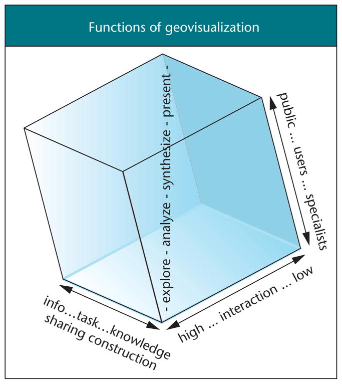
In her May/June 2003 Visualization Viewpoints article, Theresa-Marie Rhyne highlighted some of the commonalities between cartographic and geographic information representation techniques for scientific and information visualization. Geovisualization draws on these cartographic and geographic traditions, integrating their perspectives on representation and analysis of geospatial information with more recent developments in scientific and information visualization, exploratory data analysis (EDA), and image analysis. Geovisualization generally aims to integrate approaches from these domains “to provide theory, methods, and tools for visual exploration, analysis, synthesis, and presentation of geospatial data (any data having geospatial referencing).”1 Figure 1 depicts the four geovisualization functions.
Figure 1.
The central diagonal of this geovisualization-use space depicts four geovisualization functions. The space is defined by task types, user types, and interaction level enabled by the interface. (This figure is a modified version of Figure PIII.1 of MacEachren.2)
The term geographic visualization(as well as the related cartographic visualization) was prompted by a 1987 National Science Foundation report on visualization in scientific computing.3 Research and practice in geovisualization, however, has roots dating at least a decade earlier to the French edition of Bertin’s4 book presenting cartographic and information design ideas for representing and exploring data.5 Early work in geovisualization focused on the role of map-based dynamic visual displays as prompts for scientific insight and on the methods through which dynamic visual displays might leverage perceptual cognitive processes to facilitate scientific thinking.
In 1995, the International Cartographic Association established a Commission on Visualization, which expanded its focus in 1999 to visualization and virtual environments. This commission has played an important role in stimulating geovisualization research and in articulating an international, interdisciplinary research agenda.1 ICA has also collaborated with the ACM Siggraph Carto Project (http://www.siggraph.org/~rhyne/carto/).
The ICA commission prompted research that focused on developing and implementing highly interactive, exploratory methods targeted at knowledge construction by specialists, providing support for visualization functions at the lower left corner of Figure 1 (this work balanced traditional cartographic research that was focused on presentation of existing information to the public).
The interdisciplinary geovisualization research agenda articulated a broader set of challenges that includes attention to visually enabled information retrieval and decision-making tasks for a wide range of users including groups as well as individuals. One component of a recent US National Research Council (NRC) report builds on this agenda to identify challenges for IT research related to human interaction with geospatial information.6 Particular geovisualization issues targeted in this NRC report include
advances in visualization to harness information volume and complexity (including attention to visual representation of knowledge);
universal access and usability (including extensions of visualization to other modalities), mobile information acquisition, access, and use (including design of visualization methods suited to small, wireless devices); and
collaborative work with geospatial information (including attention to the role of visual display as a mediator for same- and different-place group discussion).
Application domains
The wide range of available geospatial data creates a potential for geovisualization to support activities in an equally wide range of application domains. Here, we highlight applications in three domains, using examples from research under way in the GeoVISTA Center at Penn State.
Public health
Geospatial data about health outcomes, interventions, and risk factors offer an opportunity to understand (and do something about) the varied geographic distribution of disease. These data sets, however, are highly multivariate, and the complex multivariate relationships among variables are often unknown. Traditional statistical analysis methods aren’t well suited to uncovering spatial aspects of these relations. Integration of traditional cartographic methods with those from information visualization and EDA can provide researchers and analysts with a range of tools for visually—as well as statistically and computationally—exploring these relationships. To enable such integration, we developed an open source application-building environment, GeoVISTA Studio. This environment provides a visual programming interface for application developers to construct analytical tools (and other forms of visualization applications) by quickly integrating Java components in the form of JavaBeans—see the “GeoVISTA Studio” sidebar for more information.
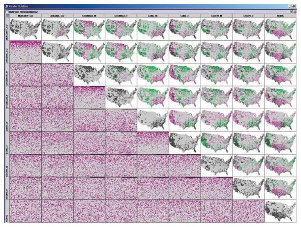
Figure 2 illustrates the use of a multiform bivariate matrix (part of an application built using Studio) to explore spatial and nonspatial relationships in a cancer mortality and risk factor data set. The figure depicts aggregate county data for
Figure 2.
Multiform bivariate matrix with space fill and map.
two potential environmental risk factors (atmospheric emissions for arsenic and mercury),
one health care access variable (proportion of individuals without health insurance), and
a subset of age-adjusted cancer mortality rate data (for male and female stomach, lung, and esophageal cancer).
The matrix extends the well-known scatter plot matrix method into a generic visualization tool that accepts any bivariate representation forms. In this case, we use bivariate maps and space-filling visualizations, with the diagonal depicting univariate maps of each variable.
In Figure 2, we applied a visual classification tool to bin the data (for each bivariate representation) into four classes of counties, with values in
the lower three-quarters of the data range for both variables (light gray on the maps),
the highest quarter of the data range for both variables (dark gray on the maps),
the top quarter on the column variable but not the row variable (purple on the map), and
the top quarter on the row variable but not the column variable (green on the map).
The top row of maps matches data for atmospheric emission of mercury with data for all other variables. In that row, the male lung cancer mortality map (5th column) contains a broad purple region in the southeast US (indicating that this region is in the top quarter for lung cancer mortality but not in the top quarter for mercury emissions). The adjacent map (to the right) contains distinct regions (dark gray) in which the top quarter female lung cancer mortality rates match with the top quarter on mercury emissions (most noticeable in the far west, along the Gulf coast, and in Florida).
The space-fill visualization depicts each county as a grid cell. In contrast to a scatter plot (a tool most potential users are familiar with), this depiction avoids over-plotting of identical or similar data values. Thus, some relationships that a scatter plot would obscure will be evident in a space-fill visualization. The tradeoff is that the tool is less familiar than a scatter plot for most users, thus requiring training to use. In the view shown in Figure 2, scan-line cell order (from the lower left to upper right) depicts the column variable and color depicts the row variable (purple indicating values in the top quarter on that variable). Other orderings (for example, spiral) are user selectable.
The upper left space-fill view shows a strong positive relationship between mercury and arsenic emissions (the purple band at the top of the space fill indicates that the two variables have substantial agreement in the top quarter of counties). Male and female stomach and lung cancers (3rd row, 4th column and 5th row, 6th column) both show similar (but weaker) relationships, while male and female esophageal cancer (7th row, 8th column) shows no relationship.
These and other components developed for integration with GeoVISTA Studio support many dynamic events that user action or input from other components can control. For example, manual highlighting in any map or space-fill will display highlights of selected entities in all displays, the order of matrix columns and rows can be driven computationally, and manual or computational adjustment of the color scheme assigned to one map can propagate to all coordinated views.
A separate coordinator component (that takes advantage of Java’s introspection capabilities) handles these cross-component connections, enabling distribution of visualization functions across software components that don’t need to be developed with specific support for cross-component coordination in mind.
Environmental science
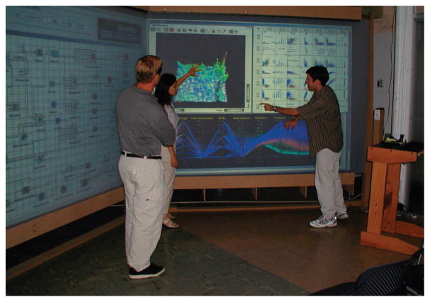
We can apply many of the same EDA methods and tools useful for applications in public health data analysis to support research in environmental science. Figure 3 illustrates the use of these geovisualization methods on large displays to facilitate collaborative land-cover data exploration. The left panel of this large display depicts the design of an application in Studio; the right panel depicts the resulting application. This application includes a dynamically linked scatter plot matrix, parallel coordinate plot, and self-organizing map (depicted in a 3D view). While not shown here, the screens can produce stereo views. The application’s display depicts use of linked brushing among components (a region of dots selected on a scatter plot is highlighted in blue in all other views). The analysis session is focused on land-cover classification and the task of identifying anomalies in a remotely sensed data set that result from the self-organizing map’s failing to distinguish among three similar vegetation types.
Figure 3.
Collaboration in a land-cover classification task. This display, with two large stereo screens, was created by George Otto, manager of the Penn State Information Technology Services Visualization Group.
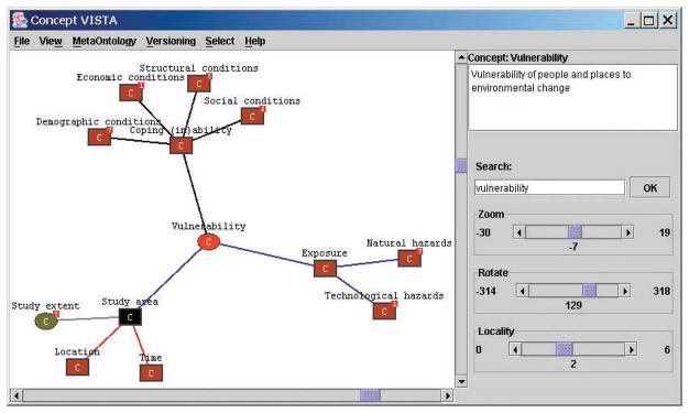
Our recent work in environmental applications has combined data visualization methods and tools derived from EDA and cartography with graph-based concept visualization methods and tools derived from information visualization. We’re developing a distributed concept mapping tool, ConceptVISTA, that runs in a stand-alone mode on a desktop or handheld device and through a Web portal used for scientific collaboration. Figure 4 depicts a portion of one researcher’s concept map representing the vulnerability of people and places to environmental change. Such concept maps provide a vehicle for researcher teams to create and share depictions of complex knowledge. We’re developing concept similarity measures for use within ConceptVISTA that help reveal levels of agreement between concept maps created by different people or for different problems. ConceptVISTA also has the ability to encode semantic relationships between the researchers, places, data, software tools, and analysis tasks depicted in a map; this information can represent a problem-solving approach much as a GeoVISTA Studio design does, but at a different level of abstraction. As a result, we anticipate that users will be able to build visual representations of problems using a ConceptVISTA-style interface, which Studio can use to select and connect appropriate data and components.
Figure 4.
ConceptVISTA graph depicting components of water system vulnerability. This component builds on an open source graph drawing tool called TouchGraph (http://www.touchgraph.com).
Crisis management
Geovisualization is not limited to supporting science. Rapid advances in geographic information systems and related technologies have created a potential for dynamic geovisualization methods to be integrated with GIS in support of a range of decision-making tasks. Crisis management is a prototypical example where we can use a visual, map-based display to integrate, assess, and apply multisource geospatial information.
In time-critical crisis situations, it’s imperative that access to geospatial information is not impeded by constraints in the software or interface. Moreover, emergency operations centers have been outfitted with large screen displays that provide collaborators with up-to-date information about hazards and their impact. In response to both of these factors, we need new interfaces that let users who lack GIS training quickly access complex geospatial information displayed on these large screens. Such interfaces should support untethered access to data exploration tools, such as those shown in Figure 3.
New collaborative geographical visualization environments that support decision-making activities must address two related challenges:
the interruptions in cognitive problem solving and collaborative discourse caused by mouse or keyboard input, and
the potential for cognitive overload from multiple visualization tools and their controls.
First, traditional visualization interfaces (using keyboard and mouse) demand user attention, thus they distract users from thinking about and discussing a problem. Second, geovisualization used in crisis management must often depict complex, multivariate information. Such depictions coupled with a complex interface will force a choice between devoting cognitive resources to understanding the display and understanding the display controls. Particularly for time-critical decision making, it’s important to minimize the cognitive resources that must be directed to geovisualization controls.
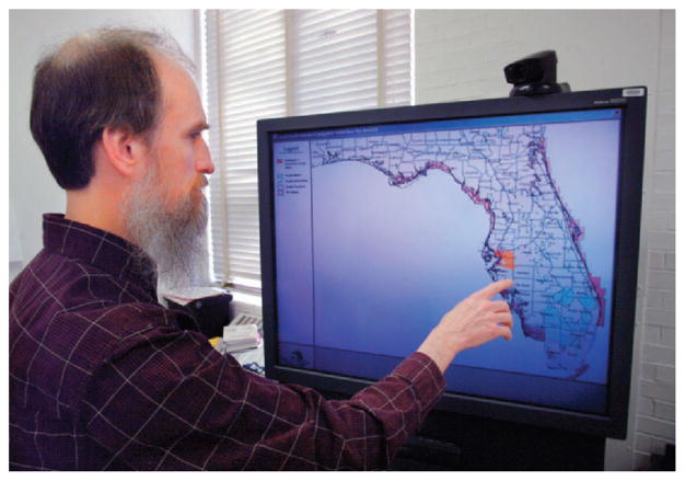
To make GIS and geovisualization tools more accessible to crisis managers working with large screen map displays, we integrated solutions from natural language and speech processing, vision-based gesture recognition, and conversational dialogue technologies to enable multimodal dialogues with interactive maps served from GISs.7 Figure 5 illustrates our Dialogue-Assisted Visual Environment for Geoinformation (DAVE_G). DAVE_G recognizes natural hand gestures and spoken requests, allowing device-free interaction.8 Dialogues between the user and the system are mixed-initiative and collaborative, allowing cognitive load sharing between humans and the system.
Figure 5.
Natural dialogue with a GIS, mediated by a map-based display.
A dialogue manager facilitates the human–map dialogue in DAVE_G. This computational agent plays the role of an intelligent information assistant, similar to the role of human GIS specialists in current emergency operations centers. The dialogue manager recognizes the users’ goals and acts on their behalf in spatial data retrieval as well as generation of visual displays. The system is competent in various human-like dialogue strategies for resolving ill-defined requests, ambiguities, and vagueness of spatial concepts.9 This research aims to free the user from the cognitive burden of complete and accurate data query and GIS command specification, allowing smoother, more natural interaction with the geospatial information. We’re currently extending the system to support multiple users working collaboratively.
Some challenges
In a recent (March/April 2003) Visualization Viewpoints column, Shalf and Bethel argued that
A new grid-aware framework is needed for distributed visualization that’s easy to use, modular, extensible, and permits reuse of existing investments in visualization technology.
We face similar challenges to achieve distributed geovisualization that crosses the boundaries of software applications, devices, distance, and individual use.
Current geovisualization tools start with an assumption that a user’s task will involve geovisualization exclusively (or at least primarily). This is an unrealistic assumption, particularly as geovisualization matures and the potential to play a role in a wide array of activities increases. A component-based approach to geovisualization tools—that distributes functionality among a set of independent modules—could potentially support more flexible integration of geovisualization with other information access and analysis tools as well as geovisualization that works across devices. The distributed Grid-based architecture that Shalf and Bethel envision is also critical to the challenge of support for same-and different-place collaborative visualization.
Like scientific and information visualization, geovisualization is maturing as a research field as well as a domain of practice. The potential is there to apply geovisualization as a tool for addressing critical issues in the fields of public health, environmental science, crisis management, and others. Achieving this potential will require multidisciplinary collaboration that integrates perspectives from cartography and geographic information science with those from computer graphics, information and scientific visualization, computer-supported cooperative work, diagrammatic reasoning, cognitive science, human–computer interaction, cognitive systems engineering, and other domains.
GeoVISTA Studio.
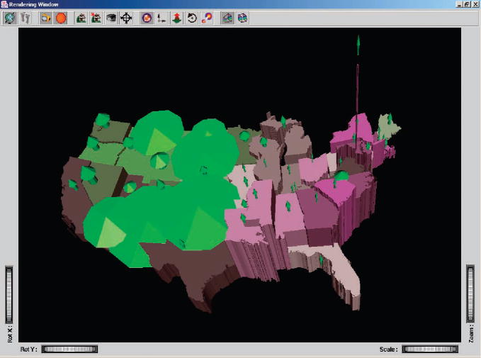
The GeoVISTA Studio project aims to improve geoscientific analysis by providing an environment that operationally integrates a wide range of problem-solving components and activities, including those both computationally and visually based (see Figure A).1 Through support for geographic visualization and knowledge discovery, Studio lets researchers explore data; construct hypotheses; discover, refine, and test knowledge; construct analyses tasks; and evaluate results. It offers numerous specific features and advantages, including
ease of program construction by visual programming—users drag components from a palette into the design box and link them together to create systems that they can run and test in real time;
open (nonproprietary) architecture based on the JavaBeans environment;
shared code-base—the Studio source tree and applications are distributed through SourceForge (http://www.sourceforge.net/projects/geovistastudio);
simple component-based integration using Java introspection methods to expose Bean functionality and a sophisticated event coordination harness that maps user interactions in one component to equivalent actions in others;
on-the-fly design modification; and
advanced deployment methods using serialization, automatic application and applet creation and Java WebStart to facilitate the rapid construction, sharing, and deployment of tools developed.
This versatility could potentially change the nature of systems development, use, and deployment for the geosciences, providing better mechanisms to coordinate complex functionality. As a consequence, analyses and decision-making processes might be improved by closer integration of software tools and better engagement of the human expert.
Figure A.
Bivariate color represents percentage of ages 18 to 29 and percentage of females in each state. The arrows depict percentages for US Census designations Black (height), Divorced (length), and American Indian (thickness).
Reference
- 1.Gahegan M, et al. Introducing GeoVISTA Studio: An Integrated Suite of Visualization and Computational methods for Exploration and Knowledge Construction in Geography. Computers, Environment and Urban Systems. 2002;26(4):267–292. [Google Scholar]
Acknowledgments
Research presented in this article is supported in part by the US National Science Foundation (grants EIA-9983451, BCS-0113030, SBE-9978052, EIA-0306845) and by the National Cancer Institute (grant CA95949).
Contributor Information
Alan M. MacEachren, GeoVISTA Center and Pennsylvania State University
Mark Gahegan, GeoVISTA Center and Pennsylvania State University.
William Pike, GeoVISTA Center and Pennsylvania State University.
Isaac Brewer, GeoVISTA Center and Pennsylvania State University.
Guoray Cai, GeoVISTA Center and Pennsylvania State University.
Eugene Lengerich, GeoVISTA Center and Pennsylvania State University.
Frank Hardisty, University of South Carolina.
References
- 1.MacEachren AM, Kraak MJ. Research Challenges in Geovisualization. Cartography and Geographic Information Science. 2001;28(1):3–12. [Google Scholar]
- 2.MacEachren AM. Visualization in Modern Cartography: Setting the Agenda. In: MacEachren AM, Taylor DRF, editors. Visualization in Modern Cartography. Pergamon; 1994. pp. 1–12. [Google Scholar]
- 3.McCormick BH, DeFanti TA, Brown MD. Visualization in Scientific Computing—A Synopsis. IEEE Computer Graphics and Applications. 1987 July;7(7):61–70. [Google Scholar]
- 4.Bertin J. Graphics and Graphic Information Processing. Walter de Gruyter; 1981. [Google Scholar]
- 5.MacEachren AM. An Evolving Cognitive-Semiotic Approach to Geographic Visualization and Knowledge Construction. Information Design J. 2001;10(1):26–36. [Google Scholar]
- 6.Computer Science and Telecommunications Board. IT Roadmap to a Geospatial Future. Nat’l Academic Press; 2003. [Google Scholar]
- 7.Sharma R, et al. Role of Speech/Gesture Driven Multimodal Interfaces for Crisis Management. Proc IEEE. 2003;91(9):1327–1354. [Google Scholar]
- 8.Rauschert I, et al. Designing a Human-Centered, Multimodal GIS Interface to Support Emergency Management. Proc. 10th ACM Symp. Advances in Geographic Information Systems; ACM Press; 2002. pp. 119–124. [Google Scholar]
- 9.Cai G, Wang H, MacEachren A. Proc Conf Spatial Information Theory (COSIT 03), LNCS. Vol. 2825. Springer-Verlag; 2003. Communicating Vague Spatial Concepts in Human-GIS Interactions: A Collaborative Dialogue Approach; pp. 287–300. [Google Scholar]


