Figure 2.

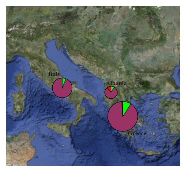
Geographical distribution of haplogroups, circles are proportional to the number of samples. (green: haplogroup A; purple: haplogroup B; red: haplogroup C).

Geographical distribution of haplogroups, circles are proportional to the number of samples. (green: haplogroup A; purple: haplogroup B; red: haplogroup C).