

Abstract
Objective
Rigorous human-computer interaction (HCI) design methodologies have not traditionally been applied to the development of clinical trial participant tracking (CTPT) tools. Given the frequent use of iconic HCI models in CTPTs, and prior evidence of usability problems associated with the use of ambiguous icons in complex interfaces, such approaches may be problematic. Presentation Discovery (PD), a knowledge-anchored HCI design method, has been previously demonstrated to improve the design of iconic HCI models. In this study, we compare the usability of a CTPT HCI model designed using PD and an intuitively designed CTPT HCI model.
Methods
An iconic CPTP HCI model was created using PD. The PD-generated and an existing iconic CTPT HCI model were subjected to usability testing, with an emphasis on task accuracy and completion times. Study participants also completed a qualitative survey instrument to evaluate subjective satisfaction with the two models.
Results
CTPT end-users reliably and reproducibly agreed on the visual manifestation and semantics of prototype graphics generated using PD. The performance of the PD-generated iconic HCI model was equivalent to an existing HCI model for tasks at multiple levels of complexity, and in some cases superior. This difference was particularly notable when tasks required an understanding of the semantic meanings of multiple icons.
Conclusion
The use of PD to design an iconic CTPT HCI model generated beneficial results and improved end-user subjective satisfaction, while reducing task completion time. Such results are desirable in information and time intensive domains, such as clinical trials management.
Keywords: User-computer interface, visual perception, computer graphics, medical informatics, clinical trial, biomedical research
1. Introduction and Background
Clinical trials are an essential component of the translational research cycle, supporting the generation of knowledge and evidence necessary to enable improvements in patient care and public health. As a result of this important role, increasing attention has been focused on improving clinical research and by extension clinical trial productivity [1-3]. Reports concerning issues that serve as impediments to the efficient conduct of clinical trials have focused on both the complexity of workflows and processes executed by clinical investigators and research staff, and socio-technical and usability factors associated with clinical research information management systems [4-6]. A particular aspect of the clinical trials workflow that is frequently cited as a problem is the ability to effectively track participant compliance with complex protocol schemas (e.g., schedules of interventions, encounters, and data collection requirements). Participant attrition as a result of protocol noncompliance is a well-known source of increased costs, delayed completion times, and biased data, and is therefore extremely undesirable [7]. Numerous information technology (IT) applications and approaches intended to support study participant tracking have been developed to address this common problem facing clinical trial conduct.
We define a clinical trial participant tracking (CTPT) tool as a software application that provides passive and/or active decision support concerning the adherence of a given clinical trial participant to a schedule of tasks or events that is required during the course of a clinical trial [8, 9]. Such CTPT tools can take many forms, from alerting mechanisms incorporated into clinical trial management systems or electronic health records [2], to stand-alone applications that end-users access in order to generate and track participant- and study-specific calendars of events [10, 11]. Despite the existence of such tools, prior studies conducted by the authors of this manuscript as well as other research teams have identified significant usability issues that may limit their effective, timely, and accurate use [11]. Therefore, validated methods for developing improved CTPT tools are sorely needed.
Given the preceding motivation, in the following sub-sections, we will briefly review both the information technology (IT) needs commonly associated with clinical trial participant tracking tools, and the design of iconic HCI models, as are commonly found in such tools. We will then go on to introduce the research questions and hypotheses that serve to motivate our study.
1.1 IT Needs Associated With Clinical Trials Participant Tracking
The National Institute of Health (NIH) defines clinical research as studies and trials in human subjects that fall into one of three sub-categories:
-
1.
research conducted with human subjects or on material derived from human subjects in order to understand the mechanisms of human disease or the safety and efficacy of novel therapies and technologies to target specific disease state;
-
2.
epidemiologic and behavioral studies; and
-
3.
outcomes research and health services research.
Within this clinical research paradigm, a clinical trial can be defined as a “scientific study in which physician-researchers study the effects of potential medicines on people; usually conducted in three phases (I, II, and III) that determine safety, whether the treatment works, and if it’s better than current therapies, respectively” [12].
The design and rationale for a clinical trial is commonly formalized in a document known as a protocol. Protocols contain a summary of pertinent background information, as well as a formal statement of the scientific goals, aims, hypotheses and research questions to be addressed by the trial. The protocol also describes study-specific policies, procedures, and data collection or analysis requirements. A summary of tasks and events that must occur during a trial, known as the study schema or calendar, is often included in the protocol document. Such study schemas are commonly visualized using a temporal grid format, an example of which is provided in ►Figure 1.
Fig. 1.

Generic layout of a clinical trial protocol schema, composed of atomic temporal constraints. Event instances are shown as Time Point (T) – Event (E), using the notation: TxEy, where x is the Time Point descriptor, and y is the Event descriptor. In some instances, a transposed version of this grid is used.
Numerous reports have described improved clinical trial data quality and validity as a result of decreased protocol schema deviations associated with the use of targeted decision support mechanisms, such as CTPT tools [1, 2, 7]. A critical issue in the development of CTPT tools is the incorporation of adequate HCI models that can be rapidly, accurately, and reproducibly interpreted by end users [11, 13]. Only a small number of reports have been published focusing on the design of such CTPT HCI models [11]. Currently available clinical trials management systems incorporating CTPT functionality as well as stand-alone CTPT tools commonly use an iconic HCI model organized as either a temporal grid or in a conventional calendar layout. In either of the preceding cases, iconic HCI components are used to convey semantic information concerning the types of events that have either occurred or are scheduled to occur for a given participant or protocol, as well as the event or task status (e.g., already occurred, scheduled to occur in the future, or currently overdue). In a previously published study by the authors of this manuscript [11], significant usability issues surrounding the speed and accuracy of icon interpretation, as well as a lack of reproducibility associated with the interpretation of the semantic meaning of such icons was determined to be a significant impediment to the adoption and efficient use of CTPT tools [14-16].
1.2 Iconic HCI Model Design
The design of optimal HCI models is critical to the overall success and adoption of IT platforms and tools [13]. Numerous methodologies have been proposed to support the design of such HCI models, with the majority of such approaches focusing on what is known as user-centered design (UCD). At a high level, UCD can be defined as a software engineering process by which end-users provide input at all major design, implementation and refinement stages [13, 17]. One frequent strategy during the development of a system using UCD is to engage end-users to aid in the design and subsequent refinement of HCI models. The goal of such end-user participation is to ensure that the resultant HCI model is consistent with user workflows and conceptual models, and that interface components are easily, rapidly and reproducibly understood [13].
A large body of literature concerned with the design of HCI models has illustrated that in complex or information-dense scenarios, the use of icons is advantageous. Several theoretical constructs serve to explain the benefits afforded by iconic HCI models. Broadly, these constructs hypothesize that the ability of end-users to interpret icons is based upon inherent perceptual and cognitive strengths in the areas of categorization [18-20], pattern recognition [20-22], metaphor recognition [23, 24], and mental modeling [20, 22]. Combined, these strengths allow end-users to rapidly and reproducibly understand icons at both the surface and more in-depth conceptual levels with little, if any, training [18, 19, 21, 25]. Several studies have demonstrated the specific benefits of using icons in biomedical application domains, spanning a spectrum from clinical research data monitoring [26] to visual charts for ambulatory care [27] and the summarization of textual radiography reports [28]. In all of these instances, the performance of end users in terms of task completion times and accuracy was found to be superior with icons in comparison to traditional graphics (e.g., bar charts, pie charts, etc.) or tabular data displays.
Despite the many reported benefits associated with the use of iconic HCI models, there is a notable paucity of literature describing rigorous methods for the design and validation of such HCI components. Instead, much of the available literature describing methods for the design of iconic HCI models relies upon the intuition of graphic designers in order to create sufficiently expressive and easily understood graphical elements. In some domains, for example word processing, it is relatively easy to employ graphic designers with domain expertise and an intuitive grasp of the metaphor of reference (i.e., desktop) [29]. However, the biomedical environment is one of many domains that do not share this advantage, due to the existence of a multitude of highly specialized metaphors and workflows. As in other highly technical areas, it is difficult to find individuals who posses both graphic design skills and an intuitive understanding of the given domains concepts. Given these challenges, intuitive approaches to the design of icons for use in biomedical applications [30] are less than ideal. As an alternative to such intuitive design methods, we previously developed a rigorous and structured approach to the design of icons, known as Presentation Discovery (PD) [14, 31], which consists of four major steps:
-
1.
Identification of target domain concepts for use in a HCI model using one or more conceptual knowledge engineering techniques such as conceptual knowledge discovery in databases (CKDD), text mining, or subject matter expert interviews/focus groups.
-
2.
Elicitation of candidate graphical primitives that represent the selected domain concepts from domain experts.
-
3.
Categorical sorting of candidate graphical primitives into “consensus clusters” based upon their visual characteristics, validated using comparisons to computational simulations of random behavior.
-
4.
Extrapolation of representative prototype graphics from the “consensus clusters” that can be used to inform the design of iconic HCI models.
This approach incorporates the conceptual knowledge of domain experts during the identification of targeted domain concepts and the generation of candidate graphical primitives [14]. In addition, PD leverages the personal constructs [20] utilized by the targeted end-users when reasoning or solving problems in a specific application area, during the categorical sorting phase. Ultimately, PD is intended to provide a reproducible and rigorous alternative to intuitive design methods that may become intractable in complex, technical domains. In prior reports, we have demonstrated the reproducibility and efficacy of PD steps 1-3 in both the radiology and clinical research domains [14, 16, 31, 32]. In the study described in this report, we evaluated the impact of PD relative to step 4 and the design of an iconic HCI model using those results. This evaluation was conducted in the specific context of the motivating gap in knowledge concerning the design of CTPT tools as introduced earlier.
2. Methods
Building upon the objectives for this study described above, the specific research questions we intend to address in the remainder of this report are:
-
•
Will an PD-derived iconic HCI model for CTPT tools be quantitatively and qualitatively equivalent and/or superior in terms of task accuracy, completion time and subjective end-user satisfaction in comparison to a CTPT iconic HCI model derived from commonly available commercial software?
-
•
Does the complexity or type of task which end users are performing impact the effectiveness of the PD-derived iconic HCI model for CTPT tools?
It is our hypothesis that a CTPT tool designed using a PD-derived HCI model will exhibit equivalent usability in comparison to tools incorporating intuitively developed HCI models, and in cases where the task being performed required end users interpret the meaning of multiple complex icons, the usability of CTPT tools designed using a PD-derived HCI model will be superior.
In order to address the preceding research questions and evaluate the hypothesis being posed, we used a multi-method study design, culminating in the conduct of a formal usability analysis, as summarized in ►Figure 2. The specific approaches used for each study phase are summarized in the following sub-sections.
Fig. 2.
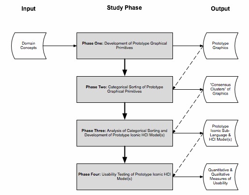
Overview of study methods, including input and output research products.
As was introduced in the preceding discussion of the PD methodology, and indicated in the input required for our first study phase as reflected in ►Figure 2, a critical component of our methodological approach is the identification and selection of targeted domain concepts. For the purposes of this study, we utilized a randomly selected sub-set of 50 concepts derived from a taxonomy of clinical trial tasks and events developed using conceptual knowledge engineering techniques (including text mining and multi-expert categorical sorting exercises) as part of a prior study [33, 34].
2.1 Phase One: Development of Prototype Graphical Primitives
Five subjects with backgrounds in the conduct of clinical research (e.g., physicians, nurses, and study coordinators/managers) were recruited from the Columbia University Medical Center (CUMC). These subjects were each provided with a survey booklet and asked to draw graphics intended to represent each of the 50 selected clinical research task or event concepts. The respondents were also provided with the ability to indicate if they were not able to draw a graphic for a given concept, or felt that there was no appropriate graphical representation for the concept. As an indicator of the suitability of the underlying concepts for inclusion in a HCI model, a simple statistical analysis was performed to determine the frequency with which the subjects were able to draw a graphic for each concept. A threshold was established for determining such suitability. Specifically, if three or more of the subjects (≥ 60%) were either unable to generate a graphic for a given concept, or indicated there was no appropriate graphical representation for a concept, then that concept was censored from subsequent study phases or analyses.
2.2 Phase Two: Categorical Sorting of Prototype Graphical Primitives
Five graduate students with backgrounds in the general biomedical domain (2 clinicians, 3 non-clinicians) were recruited from the Columbia University Department of Biomedical Informatics, and asked to perform an “all-in-one” categorical sort of the graphics generated during the preceding study phase [35]. During the categorical sorting exercise, the subjects were instructed to sort the graphics into groups based upon their visual similarity. The subjects were not given any a-priori criteria for the creation of the groups, or any limits as to their number or size. Subjects did not have access to the textual meanings associated with the graphics during the conduct of the sort, and the order of the set of graphics provided to the sorters was randomized on an individual basis. The results of the categorical sort were represented as a symmetric agreement matrix where each cell was assigned a numerical score indicating the number of sorters who placed the two graphics indicated by the column and row indices together in a group. None of these study participants were involved in the prior study phase.
2.3 Phase Three: Analysis of Categorical Sorting and Development of HCI Model(s)
The agreement matrix generated in the preceding study phase was analyzed using several techniques, as follows:
-
•
Agreement statistics were calculated at the individual graphic level to determine how many sorters agreed on each possible pair-wise grouping of an individual graphic with all remaining graphics. Similar agreement statistics were calculated at the “concept group” level to ascertain how many sorters grouped graphics from one “concept group” with another “concept group”. “Concept groups” are defined as the set of graphics associated with a common unique concept as used in Phase One. Such agreement was calculated as a simple percentage of the number of sorters who agreed, out of the total number of study participants in this phase, on the pair-wise grouping of any two graphics.
-
•
Hierarchical cluster analysis was performed, using an average linkage algorithm as implemented in the JMP 7 statistics package [36], to generate “consensus clusters” at both the individual graphic and “concept group” levels. “Concept group” clustering was performed by collapsing the rows or columns for each “concept group”, and taking the average agreement score for each graphic in that row or column. During this process, a Euclidean distance metric is calculated for the relative “distance” between the graphics comprising a cluster, as well as between clusters. This metric allows for the subjective assessment of the relative strength or “tightness” of each cluster or set of clusters in the ensuing dendrogram [37]. The results of the cluster analysis were visualized using a heat-map.
-
•
The observed sorting behavior was compared to the results of a computational simulation of comparable random sorting behavior, as has been previously described by the authors [32]. The magnitude of difference in standard deviations between the random and observed agreement matrices was calculated.
Based upon the results of the preceding categorical sort and quantitative analysis process, a set of graphical primitives that were strongly correlated with the initial clinical trial event/task concepts selected for this study were identified and used to inform the design of a simple iconic sublanguage. This iconic sub-language was incorporated into two variants of an existing CTPT tool that had previously been developed by the NCI-funded CLL Research Consortium (CLL-RC, cll.ucsd.edu). Both of the variants of the CLL-RC CTPT tool were configured using a temporal grid layout, with the only difference being the inclusion of textual labels for the icons in one of the two variants. For the purposes of comparative analyses, an additional variant of the CLL-RC CTPT tool was populated with icons that had been designed using conventional, intuitive design methods during the initial development of that application by the CLL-RC.
2.4 Phase Four: Usability Testing of Iconic HCI Model(s)
Six subjects with backgrounds in the conduct of clinical research (e.g., physicians, nurses, study coordinators/managers) were recruited from CUMC, and asked to evaluate the usability of the three CTPT tools established in the preceding study phase. None of these participants were engaged in any of the preceding study phases. In order to ensure that study results were not biased, subjects were randomly assigned to one of three testing scenarios in which the order of exposure to the CTPT tools was uniquely randomized. Prior to beginning the usability evaluation process, each subject was given a schema for the hypothetical protocol used to populate the prototype CTPT tools, which was adapted from an active protocol underway within the CLL-RC. The subjects were given 5-10 minutes to explore in an unguided manner the first CTPT tool to which they were exposed. Each instance of the CTPT tools to which the subjects were exposed was populated with differing but comparable data sets representing ten hypothetical patients enrolled in the hypothetical protocol. Each of these data sets was designed to utilize each of the icons included in the prototype iconic sub-language designed during Phase 3. The subjects were provided with a worksheet containing a task set consisting of three information retrieval tasks (►Table 1) of increasing complexity (as defined by domain experts from the CLL-RC), and spaces in which to record their answers for each of those tasks. In this context, complexity corresponded to the number and types of conceptual entities needed to satisfy a given information retrieval and interpretation task. While executing the tasks, the subjects were instructed to “think-aloud”. Both their interactions with each CTPT HCI model, as well as their general activities and verbalizations were recorded using the Morae™ usability testing software suite [38], and conventional audio and video recording equipment which was employed as a back-up measure.
Table 1.
Usability testing information retrieval task types and example questions
| Task | Example Question | |
|---|---|---|
| Complexity | Type | |
| Easy | Count the number of participants who meet a specified criteria. | How many participants have completed all treatment tasks or events for Visit 5 (Day 11)? |
| Moderate | Identify participants who meet one or more specified criteria and interpret specific task or event types or status associated with one or more visits. | Which participants have partially completed Visit 4 (Day 10)? For each such participant, which events or tasks are still pending? |
| Difficult | Integrate the results of two moderate complexity tasks. | For those participants with pending events or tasks for Visit 5 (Day 11), which (if any) have overdue tasks or events for other visits? Which visits? Which tasks or events? |
After each instance where the subjects evaluated a CTPT tool, they were asked to complete a variant of the “Qualitative User Satisfaction” (QUS) survey instrument [39]. The survey contains questions concerning both the overall usability of an HCI model, and the specific usability of the icons being used. Responses to the survey questions were recorded using a 10-point Likert-like scale [40].
After the completion of the preceding usability evaluation, a comparative analysis of the subjects’ performance and responses for each of the three HCI models was performed. This analysis involved the use of both descriptive statistics and significance testing targeting the differences in speed and accuracy of task completion for each CTPT tool, as well as responses to the QUS survey instrument. The specific statistical analyses performed included:
-
•
One-way analysis of variance (ANOVA) for correlated samples to determine if a statistically significant difference in speed of task completion existed among the three HCI models, with further testing of the significance of the differences in task completion times performed using post-hoc t-test comparisons of completion times for the each possible pairing of the CTPT tools (utilizing a Sidak alpha (α) correction to account for the probabilistic effects of performing multiple related t-tests) [41, 42]);
-
•
Fisher exact probability test to assess the significance of the difference in accuracy of task completion among the three interfaces. This test was selected due to the low number of subjects in this study, which precluded the use of a chi-square analysis. In this context, task set accuracy was represented as a categorical variable with the following possible values:
-
–
Correct: the subject correctly answered the question,
-
–
Partially correct: the subject identified the correct number of hypothetical participants or participant identifiers, but did not identify the correct visits or tasks, or
-
–
Incorrect: the subject did not provide a correct or partially correct response, per the previous definitions; and
-
–
-
•
Friedman test to evaluate the significance of the difference in responses to the QUS survey questions for each CTPT tool.
In addition, both the one-way ANOVA for correlated samples and Fisher exact probability tests were repeated to compare the aggregate performance of subjects according to testing scenario. This analysis was performed in order to determine if the order in which the subjects were exposed to the three HCI models resulted in any significant differences in task completion time or accuracy. Finally, a qualitative evaluation of potential usability factors identified by the subjects as captured via audio and video recordings was performed and summarized thematically.
3. Results
In the follow sub-sections, the results for each of the study phases are summarized. As noted earlier, these study phases were informed by the results of a prior study that generated a taxonomy of common clinical trial tasks and event concepts. The selected tasks and events from that taxonomy that were used for this study are included in ►Supplemental Table A.
Supplemental Table A.
Selected clinical trial task and event concepts
| Adverse effects | Immunoglobulin measurement |
| Alpha one fetoprotein measurement | Inclusion and exclusion |
| Assessment procedure, status | Insulin |
| Biological markers | Laboratory procedures |
| Biopsy of liver | Leukapheresis |
| Blood chemical analysis | Lymph nodes, measurement |
| Blood coagulation tests | Medical history |
| Blood pressure determination | Neoplasms, measurement |
| Blood specimen collection | Obtain or verify patient’s informed consent |
| Body weight, height | Ophthalmic examination and evaluation |
| Bone marrow biopsy | Oral glucose tolerance test |
| Clinical examination | Patient outcome assessment |
| Cytomegalovirus, polymerase chain reaction | Phlebotomy |
| Demographics | Pregnancy tests |
| Diagnostic radiologic examination and procedures | Pulse rate |
| Diet | Quality of life |
| Dispensing medication | Questionnaires |
| Drug compliance checked | Radiography, thoracic |
| Drug kinetics | Registration procedure |
| Echocardiography | Screening procedure |
| Electrocardiogram | Therapeutic procedure |
| Endoscopy | Urinalysis |
| Flow cytometry | Urine specimen collection |
| Glucose measurement, fasting | Vital signs |
| Glycosylated hemoglobin A | Waist circumference |
3.1 Phase One: Development of Prototype Graphical Primitives
The five subjects in this phase ranged in age from 28 to 57 years (average age = 36). All but one of the subjects had a graduate level education, with areas of study including nursing, physiology, psychology and public health. The subjects had significant experience in the area of clinical research (on average, 21 years), serving as either research staff (e.g., study coordinator, data manager, research nurse) or clinical investigators. The subjects generated a total of 172 prototype graphics. On average, 68.8 ± 25.6% of the subjects were able to draw a prototype graphic for each concept. In contrast, on average 6.4 ± 12.4 % of the subjects reported that there was no appropriate graphic for a given concept, and 24.8 ± 21.2 % of the subjects reported that they could not draw a graphic for a given concept. There were only four concepts for which more than one subject indicated that there was no appropriate graphical representation (“Drug Kinetics”, “Immunoglobulin Measurement”, “Flow Cytometry”, and “Demographics”). There were no concepts for which there was not at least one graphical primitive generated.
3.2 Phase Two: Categorical Sorting of Prototype Graphical Primitives
The five subjects in this phase ranged in age from 32 to 49 years of age (average age = 36). All of the subjects had a graduate level education within the areas of biomedical informatics, computer science, genetics, medicine or nursing. The subjects had on average 10.6 years of professional experience in the biomedical domain. These subjects conducted an “all-in-one” card sort of the prototype graphics generated in the preceding phase. The subjects created 88 unique groups of graphics, with an average size of 9.7 ± 9.4, and a range of 1 to 47 members.
3.3 Phase Three: Analysis of Categorical Sorting and Development of HCI Model(s)
Based upon the results of the preceding categorical sorting phase, observed aggregate sorter agreement [14] at the graphic level was found to be 79 ± 7%. In comparison, the predicted aggregate agreement generated using a random computation simulation technique was found to be 3.5 ± 1.6%. The average magnitude of difference between the observed and predicted aggregate agreements was 10.7 standard deviations. Similarly, at the “concept group” level the observed aggregate agreement was found to be 61.3 ± 13.7%, while in contrast, the predicted aggregate agreement was found to be 4.4 ± 3.7%, with an average of four standard deviations difference between the observed and predicted aggregate agreement levels.
Cluster analysis was performed at the individual graphic level using a hierarchical average linkage algorithm implemented in the JMP 7 statistics package [36]. This analysis generated 34 “consensus clusters”, with an average size of 3.7 ± 3.5 concepts. These clusters had an average of 1.7 ± 0.9 unique concepts associated with each of the member graphics. The average Euclidean distance between members of the “consensus clusters” was 5.9 ± 5.3, with a range of distances between zero and 20. A similar cluster analysis was performed at the “concept group” level, and generated 11 “consensus clusters”, with an average size of 4.5 ± 3.6 concepts. The average Euclidean distance between members of the “consensus clusters” at the “concept group” level was 8.1 ± 5.3, with a range of distances between zero and 18.2. For the purpose of visually inspecting the “consensus clusters” and their relationships with the underlying concepts used to generate the prototype graphics, a heat-map visualization was constructed [43]. The x-axis of the heat-map was sorted according to the clustering order, or chronology generated during the cluster analysis at the “concept group” level. Similarly, the y-axis of the heat-map was sorted by the clustering order, or chronology generated during the cluster analysis at the individual graphic level. Concepts and “concept groups” that demonstrate potential overlap in the visual manifestation and interpretation of the prototype graphics for those concepts by the sorters are annotated in the heat-map ►Figure 3.
Fig. 3.

Annotated heat-map visualization of “consensus clusters” generated during phase three. Tightly clustered sections of the heat-map (as indicated by increased density) correspond to “consensus clusters” that have a strong correlation between the visual similarity and semantic meaning of a group of prototype icons, and can therefore serve as the basis for informing the design of icons intended to serve as HCI-model metaphors such concepts.
The “consensus clusters” generated in the preceding stage of this analysis were inspected visually through the examination of the heat-map in order to provide a holistic overview. The groupings of prototype graphics that were associated with well defined and distinct “consensus clusters” in the heat-map were then subjected to further visual inspection. This assessment yielded 30 candidate graphical primitives for icons representative of tasks or events included in the initial set of 50 randomly selected concepts. This number roughly paralleled the 34 “consensus clusters” generated via the preceding cluster analysis. Based upon these 30 candidate graphical primitives, a simple iconic sub-language (e.g., a set of symbols related to a domain of conceptual knowledge, with an associated combinatorial syntax [44, 45]) was designed using the design methods previously described by the authors [14, 15] (►Supplemental Table B), and incorporated into two CTPT HCI models (with and without textual labels), arranged in a temporal grid layout. In order to convey task or event status, these prototypical icons were color-coded using prevailing norms to indicate event status as follows:
Supplemental Table B.
PD-derived icons for clinical trial tasks and events
| Hemoglobin A1C (Measurement) |

|
Inclusion/exclusion criteria |

|
| Adverse effects |

|
Laboratory procedures |

|
| Assessment procedure, status |

|
Lymph node measurement |

|
| Blood specimen collection |

|
Medical history |

|
| Bone marrow biopsy |

|
Medication compliance (check) |

|
| Blood pressure (measurement) |

|
Medication (dispense) |

|
| Clinical examination |

|
Ophthalmic exam |

|
| Consent |

|
PCR (testing) |

|
| Demographics |

|
Pregnancy test |

|
| Diagnostic radiology |

|
Quality of life (assessment) |

|
| Diet |

|
Questionnaire |

|
| Electrocardiogram |

|
Therapeutic procedure |

|
| Endoscopy |

|
Urine specimen (collection) |

|
| Fasting blood glucose (measurement) |

|
Vital signs (measurement) |

|
| Height and weight (measurement) |

|
Waist circumference (measurement) |

|
-
1.
yellow: event pending for future completion;
-
2.
green: event completed on schedule; and
-
3.
red: event overdue.
As described earlier, a third CTPT HCI model was instantiated using conventional icons that had been previously designed intuitively during the development of the CLL-RC CTPT tool. Illustrative examples of the PD-derived and conventional iconic CTPT HCI models are provided in ►Figure 4.
Fig. 4.
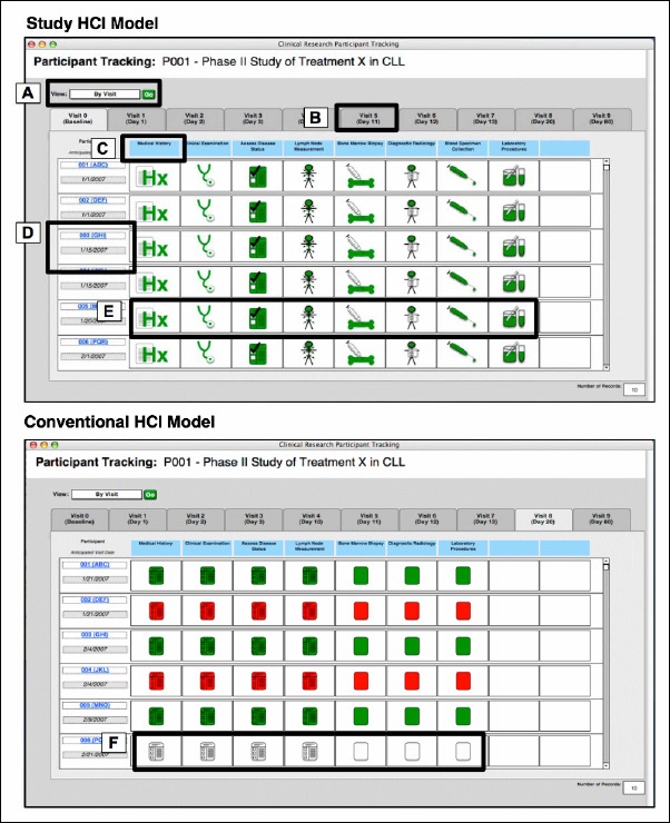
Illustrative example of prototype CTPT HCI models. Notable features include: A) the ability to filter the end-user view of records by visit, protocol or participant; B) a tabbed interface model for navigating between visit days as defined by the study protocol; C) optional textual labels to accompany icons; D) result-set rows corresponding to a specific trial participant; E) prototype icons designed using PD which indicated from left-to-right: medical history, physical exam, case report form, lymph node measurement, bone marrow biopsy, radiology, blood specimen collection and laboratory procedures; and F) conventional icons adapted from commonly available CTPT software.
3.4 Phase Four: Usability Testing of Iconic HCI Model(s)
The six subjects recruited for this final phase ranged in age from 27 to 56 years old (average age = 38.2). All but one of the subjects had a graduate level education, and had on average 12.3 years of professional experience in the biomedical and/or clinical research domains. Five of the subjects identified themselves as expert computer users on a three-category scale consisting of novice, occasional and expert, and the remaining subject identified himself or herself as an occasional computer user. None of the subjects has a primary educational or professional background focusing on the computational or information sciences. Of note, the small number of participants involved in this phase are consistent with best-practices for subject matter expert (SME) oriented usability studies, in which combined quantitative and qualitative analyses support multi-faceted triangulation of findings, thus offsetting limitations related to the ability to make statistical inferences from resulting quantitative data sets [22, 46, 47]. This approach is used in contrast to empirical usability evaluations, which require sufficiently large sample sizes intended to satisfy statistical power requirements, and is preferred when studying new or poorly-defined human-computer interaction phenomena, as is the case in this study [47]. As a result, all statistics reported relative to this particular phase of our work are descriptive in nature, and cannot be used in isolation to draw conclusions regarding broader end-user populations.
Descriptive statistics, as summarized in ►Table 2, were calculated to determine the time taken by each subject to complete the three-question task set for each HCI model instance to which they were exposed. As indicated by the bold italics values in ►Table 2, the lowest average completion time for tasks with a difficulty of “easy” was generated when the participants used the PD-derived HCI model incorporating prototype icons without textual labels. Similarly, for “moderate” or “difficult“ tasks, the HCI model incorporating prototype icons with textual labels exhibited the lowest average completion times. Subsequent to the calculation of the preceding descriptive statistics, a one-way repeated measures analysis of variance (ANOVA) for correlated samples test was run to compare all the task completion times, stratified by both difficulty levels and HCI model. The results of this analysis demonstrated that there was a statistically significant difference in task completion time for tasks with a “moderate” difficulty across the three HCI models (p = 0.033). Post-hoc t-test statistics demonstrated that the differences in task completion time when comparing the conventional HCI model with the PD-derived HCI model including textual labels and the PD-derived HCI model without labels were both statistically significant (p = 0.046 and 0.045, respectively).
Table 2.
Task completion times by HCI model and task difficulty. Optimal values are shown in bold italics
| Interface Model | Task - Difficulty | Average Task CompletionTime (m:s:ms) |
Shortest Task Completion Time (m:s:ms) |
Longest Task Completion Time (m:s:ms) |
|---|---|---|---|---|
| Conventional Icons | Easy | 0:22:49 ± 0:13:37 | 0:10:00 | 0:40:00 |
| Moderate | 1:47:10 ± 0:44:55 | 0:44:00 | 2:38:00 | |
| Difficult | 2:44:40 ± 0:48:37 | 1:56:00 | 4:09:00 | |
| Prototype Icons (without textual Labels) | Easy | 0:21:20 ± 0:13:26 | 0:06:00 | 0:40:00 |
| Moderate | 1:12:50 ± 0:26:15 | 0:45:00 | 1:59:00 | |
| Difficult | 3:18:10 ± 1:55:42 | 1:13:00 | 6:27:00 | |
| Prototype Icons (with textual Labels) | Easy | 0:35:40 ± 0:20:12 | 0:10:00 | 1:02:00 |
| Moderate | 1:09:50 ± 0:58:15 | 0:25:00 | 2:40:00 | |
| Difficult | 2:31:50 ± 0:39:21 | 1:47:00 | 3:22:00 |
The accuracy of each subject’s responses to the task sets for each HCI model was assessed through the assignment of a value of correct, partially correct or incorrect as described previously. The summary statistics shown in ►Table 3 were compiled for these categorical variables, and organized by interface type and task difficulty level.
Table 3.
Accuracy by interface model and task difficulty, showing the number of correct, partially correct and incorrect responses. Optimal values are indicated in bold italics.
| Task Difficulty | Interface Model | Correct | Partially Correct | Incorrect |
|---|---|---|---|---|
| Easy | Conventional | 6 | 0 | 0 |
| Prototype w/o labels | 6 | 0 | 0 | |
| Prototype w/ labels | 5 | 0 | 1 | |
| Moderate | Conventional | 5 | 1 | 0 |
| Prototype w/o labels | 6 | 0 | 0 | |
| Prototype w/ labels | 0 | 5 | 1 | |
| Difficult | Conventional | 4 | 1 | 1 |
| Prototype w/o labels | 4 | 1 | 1 | |
| Prototype w/ labels | 4 | 0 | 2 |
A Fisher’s exact probability test was used to determine the possible significance of the differences in accuracy for each task difficulty level and HCI model. The Fisher’s exact probability test was applied to the contingency tables corresponding to the accuracy for all three HCI models organized by task difficulty level. The results of this test demonstrated a statistically significant difference in task accuracy for tasks with a “moderate” difficulty level (pa = 0.0011 and pb = 0.0003). To further explore this finding, the Fisher’s exact probability test was subsequently applied to contingency tables comparing the task accuracy for each possible pairing of HCI model for moderately difficult tasks. These tests showed a statistically significant difference in task accuracy when comparing the conventional HCI model with the PD-derived HCI model including labels (pa = 0.0152 and pb = 0.0087) as well as the prototype HCI model that did not include labels (pa = 0.0022 and pb = 0.0011).
Upon completion of the task set for each HCI model, the subjects completed an eight-question Qualitative User Interface Satisfaction (QUS) survey (39). This survey used a 10-point Likert-like scoring system (40). The significance in the difference of the subjects’ responses to the eight-question QUS survey was then assessed using a Friedman test, yielding both a p-value and a ranking assignment for each HCI model. These analyses demonstrated that no question on the QUS survey instrument yielded a statistically significant difference (i.e., p ≤ 0.05).
Both the ANOVA test for correlated samples as applied to task completion times, and the Fisher’s exact probability test as applied to task accuracy were repeated for data sets representing aggregate task completion time and accuracy for each testing scenario. These tests were performed to assess what effects, if any, were generated as a result of the order in which subjects were exposed to the HCI models. The results of these analyses indicated that no significant effects were realized in either task performance time or accuracy as a result of the order in which the subjects were exposed to the three interface models.
3.5 Qualitative Analyses
In addition to the preceding formal usability analyses, qualitative analyses were performed based upon the utterances of the participants involved in phase four. Using a grounded theory approach [48], field notes generated during these interviews were analyzed thematically, yielding the following four findings:
-
1.
Participants unanimously preferred the prototype icons in comparison to the traditional ones, referring to them as “fun” and “easy to understand.”
-
2.
Participants were able to quickly ascertain the meaning of the prototype icons, and found them to be intuitive. They described the prototype icons as “easy to understand”, “simple”, and “more fun than the ‘other’ icons”.
-
3.
Participants unanimously indicated that they felt that all of the interface models could benefit from increased density, thus allowing for the review of larger amounts of data in a smaller screen area, as well as the ability to filter or customize the HCI model.
-
4.
Participants found it difficult to complete tasks with a complexity level of “difficult” due to the configuration of the temporal grids in the prototype CTPT tools, which required them to switch multiple times between different view of the data in order to integrate and synthesize the required information.
-
5.
Participants indicated that in the context of moderate or complex tasks, when icons were presented with textual labels, they had a tendency to focus upon those labels, rather than the meta-phoric meaning of the constituent icons. Of interest, this phenomena is reflects in ►Table 3, relative to the superior performance of traditional icons in some instances, as compared to PD-derived icons accompanied by textual labels, for such moderate or complex tasks. This finding may serve as the basis for an argument that textual labels in combination with iconic graphics may actually decrease usability and intuitive understanding of a given presentation model by inducing potentially conflicting contextual information.
4. Discussion
Our findings demonstrate that CTPT tools designed using an PD-derived iconic HCI model were quantitatively and qualitatively equivalent and is some instances superior in terms of task accuracy, completion time and subjective end-user satisfaction in comparison to commonly available CTPT tools. In particular, within the context of use cases with a moderate difficulty level, which required end users to interpret and synthesize the meanings of multiple icons, the usability of the CTPTs designed using PD was significantly better. Of note, the PD-derived iconic HCI model that did not include textual labels performed equivalently to the PD-derived iconic HCI model with labels, indicating that the meaning of the icons was readily and reproducibly understood by the end users involved in the usability testing phase of the study. Given these findings, we can conclude that our hypothesis was correct, in that
CTPT tools designed using a PD-derived HCI model exhibited equivalent usability in comparison to tools incorporating intuitively developed HCI models, and in cases where the task being performed required end users interpret the meaning of multiple complex icons, the usability of CTPT tools designed using a PD-derived HCI model was superior.
An interesting corollary to this finding is the simultaneous conclusion that while such improved task completion time and accuracy correlate with our qualitative findings that participants preferred the icons developed using PD-derived approach, the findings of our survey did not indicate this correlation. Given the other results of our study, it is likely the case that our survey instrument and approach were simply not able to discern this correlation due to insufficient power. Nevertheless, this discrepancy is notable and will have to be explored further in future studies. Nonetheless, given the equivalency of end user satisfaction across all three HCI models evaluated in this study, we do not believe that such a factor would pose a significant barrier to adoption of novel HCI models for CTPT that are designed using PD.
Of note in the context of the qualitative analyses and results described in Section 3.5, such thematic findings are reflective of usability problems previously demonstrated by the authors in studies of CTPT tools. However, given that the objective of this study was to compare and evaluate the iconic components of such HCI models, a conscious decision was made to not make any changes to this particular aspect of prevailing CTPT tool functionality, which would have introduced an additional variable into our analyses.
It is also important to note that this study represents the first time that PD has been applied to actions (essentially verbs). Previous studies had only demonstrated the efficacy of the method for static concepts (essentially nouns).
There are several important limitations that must be considered when interpreting the results of this study, namely:
-
1.
During all phases of the study, a relatively low number of subjects participated.
-
2.
In the case of phases 2-4, there was some reliance on subjective investigator judgment which could introduce an element of bias.
-
3.
In phase three, the comparison of the study results to those of a computational simulation technique for the sake of qualifying them is still very novel and subject to further validation.
-
4.
The statistical analyses performed during phase four to determine the significance of observed quantitative differences in task completion time, accuracy and qualitative user satisfaction are descriptive only, given the small sample size, and therefore cannot be used to draw population-level conclusions.
Despite these limitations, we believe that the findings described in this report serve as a strong indicator of the ability of a PD-derived iconic HCI model to positively impact the conduct and quality of clinical trials by increasing task accuracy and decreasing task completion times, thus serving to support protocol compliance and resulting data quality as well as reduced participant attrition bias. Further empirical usability testing of such PD-derived iconic HCI models will allow for the confirmation of these phenomena at a broader population level.
Based upon our results and conclusions, we believe there are a number of important next steps to be pursued in order to further our understanding of the benefits of applying a rigorous technique like PD to the design of HCI models for semantically complex and information-dense domains such as the management of clinical trials participants, including:
-
•
The further development and validation of a complete clinical trials iconic sub-language for use in CTPT tools and clinical trials management system (CTMS) platforms in general,
-
•
the evaluation of the effects of differing HCI model functionality and physical and/or conceptual organization schemes on task completion and accuracy, especially for more difficult tasks involving the integration of multiple data sets or view of that data, and
-
•
the study of the usability of prototype CTPT HCI models in “real world” settings in order to understand how system-level variables (e.g., existing workflows/processes, communications patterns, the availability/type of information resources used by study investigators or staff) influence the usability of such HCI models.
-
•
Comparative evaluation of PD-derived iconic CTPT HCI models and alternative approaches such as those afforded via dynamic web application technologies (e.g., pop-up windows, mouseover contextual information, etc.) or complex information visualization techniques (e.g., multidimensional or information-dense models).
4.1 Conclusions
This study demonstrates that it is possible to design an iconic sub-language for the domain of clinical trial participant tracking using the PD methodology. Furthermore, our results demonstrate that the usability of CTPT tools incorporating such HCI models as good or better than existing CTPT tools and HCI models that do not incorporate such rigorously designed icons. These results have the potential to inform improvements that can prevent or mitigate protocol non-compliance, thus reducing clinical trial participant attrition and associated sources of bias. Such improvements in the conduct of clinical trials can be directly linked to validity and generalizability of study results, both of which serve to enhance the dissemination and adoption of the evidence generated by such studies that can ultimately improve clinical care and public health outcomes.
Clinical Relevance Statement
The work described in this manuscript provides a framework for the design of highly usable clinical trial participant tracking tools, which have the ability to increased protocol compliance and as a result, the quality and validity of data collected during clinical studies. Clinical trials are the normative mechanism by which medical evidence is generated; ultimately supporting efficacious and optimal clinical guidelines and practices. Therefore, improvements in methods and tools that are able to contribute to increased timeliness, quality, and validity relative to the results of clinical trials have direct and demonstrable impact on clinical care outcomes and/or public health practice.
Conflict of Interest
The authors have no conflicts of interest related to the content or findings reported in this manuscript.
Protection of Human Subjects
All human subject research conducted during the course of the study described in this manuscript was approved by the Columbia University Medical Center Institutional Review Board, and in accordance with the World Medical Association Declaration of Helsinki on Ethical Principles for Medical Research Involving Human Subjects.
Acknowledgments
Acknowledgments
The authors wish to acknowledge the contributions to this work made by David Kaufman (CUMC), Rita Kukafka (CUMC), J. Thomas Bigger (CUMC), Tara Borlawsky (OSU), and Andrew Greaves (UCSD). This work was supported by: the National Library of Medicine (5-T15-LM007079-13); the Chronic Lymphocytic Leukemia Research Consortium (1R01CA134232-01, PI: P. Payne); and the OSU Center for Clinical and Translational Science (1U54RR024384-01A1, PI: R. Jackson).
References
- 1.Chung TK, Kukafka R, Johnson SB. Reengineering clinical research with informatics. J Investig Med 2006Sep 1; 54(6): 327-333 [DOI] [PubMed] [Google Scholar]
- 2.Payne PR, Johnson SB, Starren JB, Tilson HH, Dowdy D. Breaking the translational barriers: the value of integrating biomedical informatics and translational research. J Investig Med 2005May; 53(4): 192-200 [DOI] [PubMed] [Google Scholar]
- 3.Sung NS, Crowley WF, Jr., Genel M, Salber P, Sandy L, Sherwood LM, et al. Central challenges facing the national clinical research enterprise. JAMA 2003Mar 12; 289(10): 1278-1287 [DOI] [PubMed] [Google Scholar]
- 4.Khan SA, Kukafka R, Payne PR, Bigger JT, Johnson SB. A day in the life of a clinical research coordinator: observations from community practice settings. Medinfo 2007; 12(Pt 1): 247-251 [PubMed] [Google Scholar]
- 5.Khan SA, Payne PR, Johnson SB, Bigger JT, Kukafka R. Modeling clinical trials workflow in community practice settings. Proc AMIA Symp 2006; Jan 1: 419-423 [PMC free article] [PubMed] [Google Scholar]
- 6.Kukafka R, Johnson SB, Linfante A, Allegrante JP. Grounding a new information technology implementation framework in behavioral science: a systematic analysis of the literature on IT use. J Biomed Inform 2003Jun; 36(3): 218-227 [DOI] [PubMed] [Google Scholar]
- 7.Chow SC, Liu JP. Design and Analysis of Clinical Trials: Concepts and Methodologies. 2 ed. Hoboken, NJ: John Wiley & Sons, Inc.; 2003 [Google Scholar]
- 8.Brandt CA, Argraves S, Money R, Ananth G, Trocky NM, Nadkarni PM. Informatics tools to improve clinical research study implementation. Contemporary clinical trials. 2006Apr 1; 27(2): 112-122 [DOI] [PubMed] [Google Scholar]
- 9.Payne PRO, Greaves AW, Kipps TJ, CRC Clinical Trials Management System (CTMS): An Integrated Information Management Solution for Collaborative Clinical Research. AMIA 2003Symposium; 2003; Washington, DC, USA: [PMC free article] [PubMed] [Google Scholar]
- 10.Payne PR, Greaves AW, Kipps TJ. CRC Clinical Trials Management System (CTMS): an integrated information management solution for collaborative clinical research. AMIA Annu Symp Proc 2003: 967. [PMC free article] [PubMed] [Google Scholar]
- 11.Starren JB, Payne PR, Kaufman DR. Human computer interaction issues in Clinical Trials Management Systems. 2006 [PMC free article] [PubMed] [Google Scholar]
- 12.NIGMS National Institute of General Medical Sciences. Bethesda, MD: National Institutes of Health; 2010; Available from: http://www.nigms.nih.gov/ [Google Scholar]
- 13.Shneiderman B. Designing the user interface : strategies for effective human-computer-interaction. 3rd ed. Reading, Mass: Addison Wesley Longman; 1998 [Google Scholar]
- 14.Payne PR, Starren JB. Quantifying visual similarity in clinical iconic graphics. J Am Med Inform Assoc 2005; May-Jun12(3): 338-345 [DOI] [PMC free article] [PubMed] [Google Scholar]
- 15.Payne PR, Starren JB. Presentation discovery: building a better icon. CHI ‘06 extended abstracts on Human factors in computing systems; Motreal, Quebec, Canada: ACM; 2006 [Google Scholar]
- 16.Starren JB, Payne PR. Quantifying visual similarity in clinical iconic graphics. AMIA Annu Symp Proc 2003: 1016. [PMC free article] [PubMed] [Google Scholar]
- 17.Gosbee JW. Applying CHI in Health Care: domain issues, resources and requirements. CHI 98 conference summary on Human factors in computing systems; Los Angeles, California, United States: ACM Press; 1998 [Google Scholar]
- 18.Cole WG, editor Metaphor Graphics & Visual Analogy For Medical Data. Annu Symp Comput Appl Med Care; 1987 [Google Scholar]
- 19.Cole WG, Stewart JG. Human performance evaluation of a metaphor graphic display for respiratory data. Methods Inf Med 1994Oct; 33(4): 390-396 [PubMed] [Google Scholar]
- 20.Kelly GA. The psychology of personal constructs. [1st] New York,: Norton; 1955 [Google Scholar]
- 21.Marcus A. Icons, symbols, and signs: visible languages to facilitate communication interactions. 2003; 10(3): 37-43 [Google Scholar]
- 22.Patel VL, Arocha JF, Kaufman DR. A primer on aspects of cognition for medical informatics. J Am Med Inform Assoc 2001; Jul-Aug8(4): 324-343 [DOI] [PMC free article] [PubMed] [Google Scholar]
- 23.Chandler D. Semiotics: The Basics. 1 ed. New York: Routledge; 2003 [Google Scholar]
- 24.Leite JC, editor A Semiotic-based framework to user interface design. NordiCHI; 2002; Arhus, Denmark [Google Scholar]
- 25.Marcus A. Human communications issues in advanced UIs. Commun ACM 1993; 36(4): 100-109 [Google Scholar]
- 26.Elting LS, Bodey GP. Is a picture worth a thousand medical words? A randomized trial of reporting formats for medical research data. Meth Info Med 1991; 30(2): 145-150 [PubMed] [Google Scholar]
- 27.Litt HI, Schmidt DF, editors Application of the Visual Chart in an Ambulatory OB-GYN Clinic. Annu Symp Comput Appl Med Care; 1995 [Google Scholar]
- 28.Abad-Mota S, Kulikowski C, Gong L, Stevenson S, Mezrich R, Tria A, et al., editors Iconic reporting: a new way of communicating radiologic findings. Annu Symp Comput Appl Med Care; 1995 [Google Scholar]
- 29.Barr P, Noble J, Biddle R. Icons R icons. Adelaide, Australia: Australian Computer Society, Inc.; 2003 [Google Scholar]
- 30.Horton WK. The icon book : visual symbols for computer systems and documentation. New York: J. Wiley; 1994 [Google Scholar]
- 31.Starren J. From Multimodal Sublanguages to Medical Data Presentations. New York: Columbia University; 1997 [Google Scholar]
- 32.Payne PR, Starren JB. Modeling categorical sorting behavior. Medinfo 2004; 2004(CD):1805 [Google Scholar]
- 33.Deitzer JR, Payne PR, Starren JB. Coverage of clinical trials tasks in existing ontologies. Proc AMIA Symp 2006; Jan 1: 903. [PMC free article] [PubMed] [Google Scholar]
- 34.Payne PR, Deitzer JR, Mendonca EA, Starren JB. Consensus-based construction of a taxonomy of clinical trial tasks. Proc AMIA Symp 2006; Jan 1: 1059. [PMC free article] [PubMed] [Google Scholar]
- 35.Rugg G, McGeorge P. The sorting techniques: a tutorial paper on card sorts, picture sorts and tiem sorts. Expert Systems 1997; May14(2): 80-93 [Google Scholar]
- 36.JMP 7ed: SAS. [Google Scholar]
- 37.Romesburg HC. Cluster Analysis for Researchers. 2 ed. Raleigh, North Carolina: Lulu Press; 2004 [Google Scholar]
- 38.Morae TechSmith; 2010 [Google Scholar]
- 39.Chin JP, Diehl VA, Normal KL, Development of an instrument measuring user satisfaction of the human-computer interface. CHI Conference on Human Factors in Computing Systems; 1988; Washington D.C.: ACM Press [Google Scholar]
- 40.Likert R. A Technique for the Measurement of Attitudes. Archives of Psychology 1932; 140(June). [Google Scholar]
- 41.Perneger TV. What’s Wrong with Bonferroni Adjustments. BMJ 1998; 316(April): 1236-1238 [DOI] [PMC free article] [PubMed] [Google Scholar]
- 42.Sankoh AJ, Huque MF, Dusbey SD. Some comments on frequently used multipled endpoint adjustment methods in clinical trials. Stat Med 1997; 16(22): 2529-2543 [DOI] [PubMed] [Google Scholar]
- 43.Telea AC. Data visualization : principles and practice. Wellesley, Mass.: A K Peters; 2008 [Google Scholar]
- 44.Harris Z, Mattick P. Science Sublanguages and the Prospects for a Global Language of Science. Annals of the American Academy of Political and Social Science. 1988; Jan495: 73-83 [Google Scholar]
- 45.Harris Z. Theory of Language Structure. American Philosophical Quarterly 1976; 13(4): 237-255 [Google Scholar]
- 46.Hripcsak G, Wilcox A. Reference standards, judges, and comparison subjects: roles for experts in evaluating system performance. J Am Med Inform Assoc 2002; Jan-Feb9(1): 1-15 [DOI] [PMC free article] [PubMed] [Google Scholar]
- 47.Dicks RS. Mis-usability: on the uses and misuses of usability testing. Proceedings of the 20th annual international conference on Computer documentation; Toronto, Ontario, Canada: 584960: ACM; 2002; 26-30 [Google Scholar]
- 48.Glaser B, Strauss A. The Discovery of Grounded Theory: Strategies for Qualitative Research. Piscataway, NJ: Aldine Transaction; 1967 [Google Scholar]